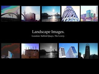
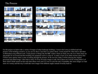
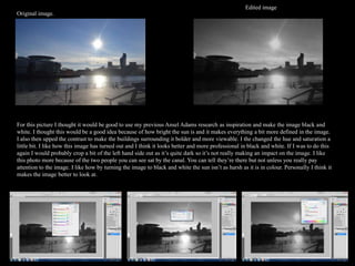
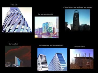
Landscape Images.
Location: Salford Quays, The Lowry.
The Process.


For this project we had to take a variety of images of urban landscape buildings. I went to the Lowry in Salford and took
pictures of the buildings around it, as you can see above I put them on contact sheets. I took around 50. I then had to edit them
on Photoshop using different tools. I took pictures of things like the BBC studios which are fairly new, the river where boats are
and people are sat around and then building site equipment such as a skip etc. to make it more of an urban mixture and so that
I’d have more options when it came to looking through the pictures. In the next few slides I will be showing the original,
processed and edited image. I then had to select 10 of my favourite images to edit. Out of these ten I will be writing about 3 of
them which I think turned out best and what effects were used. If I was to re-do this task I’d probably take more images so I had
more of a variety and that way I could take more images from different angles instead of mostly head on.
Edited image
Here I took a picture of a bridge and after looking it I decided it would be
quite good to experiment with background as it looks quite gloomy,
however I didn’t want it to look too blocky and clumped together so I
decided to use curves as you can see in the print screen below and by using
curves I have the option to draw the curves on myself or do it automatically.
By choosing to draw the curves on myself I could control the sort of colours
that would be on the image and to what extent. I liked making the
background a mixtures of pastel colours as I think it stands out just the right
amount and the bridge and the other buildings in the corner still stand out
and aren’t blocked in any way. To make sure they did stand out I then edited
the brightness and contrast as you can see below they’re quite a lot darker
and bolder in the edited image than they are in the original image. I quite
like the mixture of how it looks both real and then quite cartoony with the
background. I think if I was to edit this again I’d maybe make the curves a
lighter so it doesn’t look as obviously edited and I’d probably make the
colours more different types of blue as it would be more fitting.
           Original Image
                                                                                  Editing Process
Edited image
For this image I quite liked how it looked in the first place so I
just played about with how strong the sun looked in the image,
I made it so the clouds and sky was brighter and the sun
looked more defined. To make the sun more defined I just
added a little curve and then changed the brightness and
contrast. I also really wanted to accentuate the buildings
pattern so by changing the contrast it became more evident
and changed to a gold/bronze colour. In the original image as
you can see it just looks slightly reflective but on the edited
image it’s now one of the key features of the image as you
notice it straight away as being quite unusual. I think my
favourite part of this image is that it looks as though the sun is
causing that pattern and reflection on the building. By editing
the sun and sky I think it looks better as you can see the
outline of the building more as you can see in the original
image the top of the building is obscured by the sun.


   Original Image                                                        Editing
                                                                         process
Edited image
Original image.


For this picture I thought it would be good to use my previous Ansel Adams research as inspiration and make the image black and
white. I thought this would be a good idea because of how bright the sun is and it makes everything a bit more defined in the image.
I also then upped the contrast to make the buildings surrounding it bolder and more viewable. I the changed the hue and saturation a
little bit. I like how this image has turned out and I think it looks better and more professional in black and white. If I was to do this
again I would probably crop a bit of the left hand side out as it’s quite dark so it’s not really making an impact on the image. I like
this photo more because of the two people you can see sat by the canal. You can tell they’re there but not unless you really pay
attention to the image. I like how by turning the image to black and white the sun isn’t as harsh as it is in colour. Personally I think it
makes the image better to look at.
Filter Edit
                                                         Colour balance and brightness and contrast.


                Hue and saturation edit


Curves effect
                  Curves and hue and saturation effect
                                                                         Posterize effect

Landscape images presentation

  • 1.
  • 2.
    The Process. For thisproject we had to take a variety of images of urban landscape buildings. I went to the Lowry in Salford and took pictures of the buildings around it, as you can see above I put them on contact sheets. I took around 50. I then had to edit them on Photoshop using different tools. I took pictures of things like the BBC studios which are fairly new, the river where boats are and people are sat around and then building site equipment such as a skip etc. to make it more of an urban mixture and so that I’d have more options when it came to looking through the pictures. In the next few slides I will be showing the original, processed and edited image. I then had to select 10 of my favourite images to edit. Out of these ten I will be writing about 3 of them which I think turned out best and what effects were used. If I was to re-do this task I’d probably take more images so I had more of a variety and that way I could take more images from different angles instead of mostly head on.
  • 3.
    Edited image Here Itook a picture of a bridge and after looking it I decided it would be quite good to experiment with background as it looks quite gloomy, however I didn’t want it to look too blocky and clumped together so I decided to use curves as you can see in the print screen below and by using curves I have the option to draw the curves on myself or do it automatically. By choosing to draw the curves on myself I could control the sort of colours that would be on the image and to what extent. I liked making the background a mixtures of pastel colours as I think it stands out just the right amount and the bridge and the other buildings in the corner still stand out and aren’t blocked in any way. To make sure they did stand out I then edited the brightness and contrast as you can see below they’re quite a lot darker and bolder in the edited image than they are in the original image. I quite like the mixture of how it looks both real and then quite cartoony with the background. I think if I was to edit this again I’d maybe make the curves a lighter so it doesn’t look as obviously edited and I’d probably make the colours more different types of blue as it would be more fitting. Original Image Editing Process
  • 4.
    Edited image For thisimage I quite liked how it looked in the first place so I just played about with how strong the sun looked in the image, I made it so the clouds and sky was brighter and the sun looked more defined. To make the sun more defined I just added a little curve and then changed the brightness and contrast. I also really wanted to accentuate the buildings pattern so by changing the contrast it became more evident and changed to a gold/bronze colour. In the original image as you can see it just looks slightly reflective but on the edited image it’s now one of the key features of the image as you notice it straight away as being quite unusual. I think my favourite part of this image is that it looks as though the sun is causing that pattern and reflection on the building. By editing the sun and sky I think it looks better as you can see the outline of the building more as you can see in the original image the top of the building is obscured by the sun. Original Image Editing process
  • 5.
    Edited image Original image. Forthis picture I thought it would be good to use my previous Ansel Adams research as inspiration and make the image black and white. I thought this would be a good idea because of how bright the sun is and it makes everything a bit more defined in the image. I also then upped the contrast to make the buildings surrounding it bolder and more viewable. I the changed the hue and saturation a little bit. I like how this image has turned out and I think it looks better and more professional in black and white. If I was to do this again I would probably crop a bit of the left hand side out as it’s quite dark so it’s not really making an impact on the image. I like this photo more because of the two people you can see sat by the canal. You can tell they’re there but not unless you really pay attention to the image. I like how by turning the image to black and white the sun isn’t as harsh as it is in colour. Personally I think it makes the image better to look at.
  • 6.
    Filter Edit Colour balance and brightness and contrast. Hue and saturation edit Curves effect Curves and hue and saturation effect Posterize effect