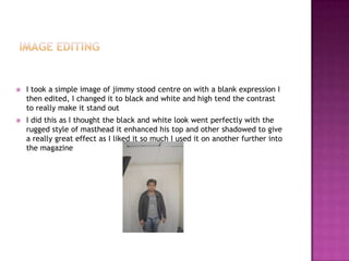
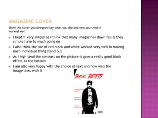
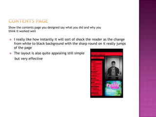
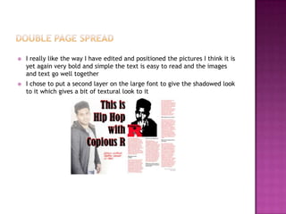
 I asked ten questions to see how I could produce the best magazine
possible they varied so I could get the most information as possible
 First I wanted to find out if people were even interested in magazines I
which they were then I decided to see what sort of genre and music
magazines they were in to the top results were kerrang , drum and bass
and indie I believe this may have been slightly one sided with the sort of
people in which took the questioner
 I also asked them what sort of articles they like to read in magazines and
people seem to be very interested in interviews this Is why I chose to
have my double page spread as very large interview with a celebrity
 As the front cover is the most important part of getting them to buy the
magazine I wanted to know weather male or female cover star was best
even thought there was a few more people interested in a female cover
star there was all so many people who had no preference which made
make the decision to stick with a male
 I looked I at quite a few of the main selling magazines in the music
industry and instantly notice the very bold eye catching mastheads I
chose to go with the colour scheme black red and white as they a very
complementing and make everything stand out
 I also noticed almost every single one had a very large main image of
quite often a celebrity there eyes would follow you round the room and
draw you into the magazine this is why I want for a very bold large centre
image
 A key part to any magazine is obviously the content and a key part of
letting the viewer know what vital information the magazine wants and
to make them want it is th cover lines so I chose to go for very alliterated
catchy cover lines in which would hopefully make them want to read
more
Put your logo design in say why you liked it
 I wasn’t really quite sure at first which font I was going to use so I chose
a few to play around with
 The one above is one I nearly chose but then realised it wasn’t quite the
style I was looking to go with for my mag
 The one I finally chose to you for basic beats is below
 I chose it as I thought it helped describe the words basic beats its simple
and easy to read yet has a deferent sort of style and edginess to it which
is the look I was going for with the magazine
 I took a simple image of jimmy stood centre on with a blank expression I
then edited, I changed it to black and white and high tend the contrast
to really make it stand out
 I did this as I thought the black and white look went perfectly with the
rugged style of masthead it enhanced his top and other shadowed to give
a really great effect as I liked it so much I used it on another further into
the magazine
Show the cover you designed say what you did and why you think it
worked well
 I kept it very simple as I think that many magazines down fall is they
simple have to much going on
 I also think the use of red black and white worked very well In making
each individual thing stand out
 As I high tend the contrast on the picture it gave a really good black
effect at the bottom
 I am also very happy with the choice of text and how well the
image links with it
Show the contents page you designed say what you did and why you
think it worked well
 I really like how instantly it will sort of shock the reader as the change
from white to black background with the sharp round on it really jumps
of the page
 The layout is also quite appealing still simple
but very effective
 I really like the way I have edited and positioned the pictures I think it is
yet again very bold and simple the text is easy to read and the images
and text go well together
 I chose to put a second layer on the large font to give the shadowed look
to it which gives a bit of textural look to it
 I think that the colour scheme I went for went very well
 I also think the way in which I edited and positioned my photographs
worked good
 The fonts were effective in the style I was looking for
 The article fit perfectly and was simple to read
 The simplicity could also be its down fall as the front cover could be seen
as bland I may have decided to use colour if I did it again
 I also think the cover line could of done with more work
 The text on the contents page when printed may be hard to read as its
red on black so I would of potential made sure that this would not
happen

Magazine design evaluation

  • 2.
     I askedten questions to see how I could produce the best magazine possible they varied so I could get the most information as possible  First I wanted to find out if people were even interested in magazines I which they were then I decided to see what sort of genre and music magazines they were in to the top results were kerrang , drum and bass and indie I believe this may have been slightly one sided with the sort of people in which took the questioner  I also asked them what sort of articles they like to read in magazines and people seem to be very interested in interviews this Is why I chose to have my double page spread as very large interview with a celebrity  As the front cover is the most important part of getting them to buy the magazine I wanted to know weather male or female cover star was best even thought there was a few more people interested in a female cover star there was all so many people who had no preference which made make the decision to stick with a male
  • 3.
     I lookedI at quite a few of the main selling magazines in the music industry and instantly notice the very bold eye catching mastheads I chose to go with the colour scheme black red and white as they a very complementing and make everything stand out  I also noticed almost every single one had a very large main image of quite often a celebrity there eyes would follow you round the room and draw you into the magazine this is why I want for a very bold large centre image  A key part to any magazine is obviously the content and a key part of letting the viewer know what vital information the magazine wants and to make them want it is th cover lines so I chose to go for very alliterated catchy cover lines in which would hopefully make them want to read more
  • 4.
    Put your logodesign in say why you liked it  I wasn’t really quite sure at first which font I was going to use so I chose a few to play around with  The one above is one I nearly chose but then realised it wasn’t quite the style I was looking to go with for my mag  The one I finally chose to you for basic beats is below  I chose it as I thought it helped describe the words basic beats its simple and easy to read yet has a deferent sort of style and edginess to it which is the look I was going for with the magazine
  • 5.
     I tooka simple image of jimmy stood centre on with a blank expression I then edited, I changed it to black and white and high tend the contrast to really make it stand out  I did this as I thought the black and white look went perfectly with the rugged style of masthead it enhanced his top and other shadowed to give a really great effect as I liked it so much I used it on another further into the magazine
  • 6.
    Show the coveryou designed say what you did and why you think it worked well  I kept it very simple as I think that many magazines down fall is they simple have to much going on  I also think the use of red black and white worked very well In making each individual thing stand out  As I high tend the contrast on the picture it gave a really good black effect at the bottom  I am also very happy with the choice of text and how well the image links with it
  • 7.
    Show the contentspage you designed say what you did and why you think it worked well  I really like how instantly it will sort of shock the reader as the change from white to black background with the sharp round on it really jumps of the page  The layout is also quite appealing still simple but very effective
  • 8.
     I reallylike the way I have edited and positioned the pictures I think it is yet again very bold and simple the text is easy to read and the images and text go well together  I chose to put a second layer on the large font to give the shadowed look to it which gives a bit of textural look to it
  • 9.
     I thinkthat the colour scheme I went for went very well  I also think the way in which I edited and positioned my photographs worked good  The fonts were effective in the style I was looking for  The article fit perfectly and was simple to read
  • 10.
     The simplicitycould also be its down fall as the front cover could be seen as bland I may have decided to use colour if I did it again  I also think the cover line could of done with more work  The text on the contents page when printed may be hard to read as its red on black so I would of potential made sure that this would not happen