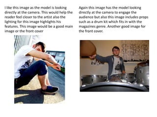
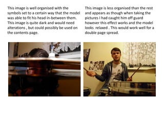
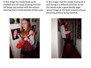
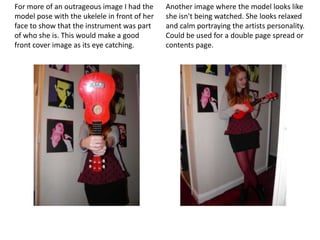
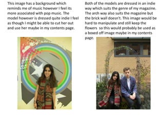
By
Joshua Connolly
I like this image as the model is looking     Again this image has the model looking
directly at the camera. This would help the   directly at the camera to engage the
reader feel closer to the artist also the     audience but also this image includes props
lighting for this image highlights his        such as a drum kit which fits in with the
features. This image would be a good main     magazines genre. Another good image for
image or the front cover                      the front cover.
This image is well organised with the         This image is less organised than the rest
symbols set to a certain way that the model   and appears as though when taking the
was able to fit his head in-between them.     pictures I had caught him off guard
This image is quite dark and would need       however this effect works and the model
alterations , but could possibly be used on   looks relaxed . This would work well for a
the contents page.                            double page spread.
In this image the model looks quite              In this image I had the model leaning on a
shocked and not ready showing that but           wall facing in a different direction to me
still keeps eye contact with the camera          this would make a good double page
meaning that it could possibly still be used .   spread image as she looks relaxed and just
                                                 practising without being watched.
For more of an outrageous image I had the     Another image where the model looks like
model pose with the ukelele in front of her   she isn't being watched. She looks relaxed
face to show that the instrument was part     and calm portraying the artists personality.
of who she is. This would make a good         Could be used for a double page spread or
front cover image as its eye catching.        contents page.
This image has a background which             Both of the models are dressed in an indie
reminds me of music however I feel its        way which suits the genre of my magazine.
more associated with pop music. The           The arch way also suits the magazine but
model however is dressed quite indie I feel   the brick wall doesn't. This image would be
as though I might be able to cut her out      hard to manipulate and still keep the
and use her maybe in my contents page.        flowers so this would probably be used as
                                              a boxed off image maybe in my contents
                                              page.

Top ten original images

  • 1.
  • 2.
    I like thisimage as the model is looking Again this image has the model looking directly at the camera. This would help the directly at the camera to engage the reader feel closer to the artist also the audience but also this image includes props lighting for this image highlights his such as a drum kit which fits in with the features. This image would be a good main magazines genre. Another good image for image or the front cover the front cover.
  • 3.
    This image iswell organised with the This image is less organised than the rest symbols set to a certain way that the model and appears as though when taking the was able to fit his head in-between them. pictures I had caught him off guard This image is quite dark and would need however this effect works and the model alterations , but could possibly be used on looks relaxed . This would work well for a the contents page. double page spread.
  • 4.
    In this imagethe model looks quite In this image I had the model leaning on a shocked and not ready showing that but wall facing in a different direction to me still keeps eye contact with the camera this would make a good double page meaning that it could possibly still be used . spread image as she looks relaxed and just practising without being watched.
  • 5.
    For more ofan outrageous image I had the Another image where the model looks like model pose with the ukelele in front of her she isn't being watched. She looks relaxed face to show that the instrument was part and calm portraying the artists personality. of who she is. This would make a good Could be used for a double page spread or front cover image as its eye catching. contents page.
  • 6.
    This image hasa background which Both of the models are dressed in an indie reminds me of music however I feel its way which suits the genre of my magazine. more associated with pop music. The The arch way also suits the magazine but model however is dressed quite indie I feel the brick wall doesn't. This image would be as though I might be able to cut her out hard to manipulate and still keep the and use her maybe in my contents page. flowers so this would probably be used as a boxed off image maybe in my contents page.