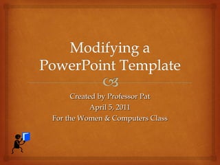
Powerpoint: Modify default Microsoft Templates
•Download as PPT, PDF•
1 like•3,822 views

How to change colors of default Microsoft "Themes" or templates in PowerPoint. How to add clipart to appear on each slide; modify Slide Master
Report
Share
Report
Share

Recommended
Draft #3 - step by step
The document summarizes the steps taken to design a magazine cover in Photoshop. The designer selected an image of a model and used selection and eraser tools to isolate the model on a plain black background. They adjusted the brightness to darken the model for better contrast. Bold green text was added as the headline along with additional white text. Blue and white text was used for selling lines. A resized barcode image and additional text for issue details and price were also added.
draft #1 - step by step
The document describes the process of designing a magazine cover in Photoshop. Key steps include:
1. Selecting an image for the cover and removing the background using selection and eraser tools.
2. Editing the cover image by changing colors and fixing hair to make it look more professional.
3. Realizing the chosen fonts did not work and selecting new fonts from an online library for elements like the masthead and headlines.
4. Adding elements like a barcode, issue details, and pricing information to complete the design.
Draft #2 - Step by step
The document describes the process of editing a photo in Photoshop. Key steps include:
1. Using selection and eraser tools to remove the background and unwanted parts of a model.
2. Adding a mist-like background image and adjusting brightness, colors, and contrasts of the model and jacket.
3. Adding text elements like headlines, mastheads, and sell lines in different fonts and colors around the model.
4. Including additional elements like a barcode and publication details.
Print screens of double page spread2
The document describes the process of designing a double page magazine spread in QuarkXPress. It includes screenshots showing adjustments made such as changing images, fonts, sizes, colors and layout. The masthead, quotes and text are refined over multiple iterations. Tools used include the image, text, move and font tools. The final design features a bold masthead in Elephant font with a shadowed background and larger drop capital.
Process Gap Analysis With Recommendations
“You can download this product from SlideTeam.net”
Presenting this set of slides with name Process Gap Analysis With Recommendations. This is a three stage process. The stages in this process are Comparison, Risk Identification And Implications, Recommendations, Gap Analysis Process. This is a completely editable PowerPoint presentation and is available for immediate download. Download now and impress your audience. https://bit.ly/3dscM6D
Print screens of double page spread
The document describes screenshots from the creation of a double page magazine spread. It details changes made between each screenshot, including importing and resizing images, adding and formatting text, adjusting font sizes and styles, and changing colors. The goal was to refine the layout and design to make elements like the masthead and quotes more prominent. Tools used included text, image, move, and formatting tools. The last section reflects on skills learned like making drop caps, importing images, and using text boxes and shapes.
Before Versus After Comparison 4 Text Boxes Powerpoint Graphics
Presenting before versus after comparison 4 text boxes powerpoint graphics. This is a before versus after comparison 4 text boxes powerpoint graphics. This is a two stage process. The stages in this process are problem solution, current state future state, before after, challenges solutions, compare, comparison. https://bit.ly/3kcBF9l
COVID 19 Icon Showing Crown Shaped Virus
"You can download this product from SlideTeam.net"
Presenting this set of slides with name COVID 19 Icon Showing Crown Shaped Virus. This is a three stage process. The stages in this process are COVID 19 Icon Showing Crown Shaped Virus. This is a completely editable PowerPoint presentation and is available for immediate download. Download now and impress your audience. https://bit.ly/31JuLCI
Task Matrix Presentation Visuals
This document contains a task matrix that outlines the main tasks, responsibilities, and stakeholders for a project. It lists the following main responsibilities:
- Companies are responsible for contributing to company development, reviewing projects, ensuring compatibility with company strategy, assigning and planning projects, evaluating results, and providing funding and deadlines.
- The Project Manager is responsible for planning and organizing project resources, coordinating tasks, setting schedule, cost, and quality objectives, and managing interfaces.
- Project Employees are responsible for supporting planning, demonstrating task-related competence and expertise, and contributing professionalism.
- The Project Committee is responsible for making recommendations, decisions, guidelines, and resolving conflicts and problems.
The matrix helps
Progressions
The document describes progressions made for the final product, double page spread, and front cover mock up of an indie-country magazine. For the final product, a bolder, clearer font was used for the masthead to make it stand out against the dark background. For the double page spread, the background was changed to black to match the models' outfits and red font was used to tie the colors together. The font was also switched to make the text easier to read. Different fonts were tested for the front cover before deciding not to include the treble clef logo for cohesion.
Search project
This document discusses electronics and provides tips for using PowerPoint. It mentions some classic electronic devices like the telegraph, phone, and computer. It then describes PowerPoint features for adding graphics, applying themes for branding, customizing styles, using new slide layouts, and arranging content with SmartArt graphics.
Double Page Spread process
The document describes editing an image for a magazine cover. The editor adjusted brightness and contrast, used selection tools to isolate the model from the background, added a faded black and white layer behind the model, removed imperfections, softened edges, and made minor text and formatting changes to make the image and layout look more polished and professional.
Making the logo
The document describes the process of creating a logo using 2D Design software for layout, copying the layout into Paint to add color using spray cans and selecting the same color, and using WordArt to add reflective text without water for difficulty. Snow was added to the logo to resemble stars.
Anaylsis inside
The document discusses choosing a green font color to match the title and selecting an image that was easy to place on a black background due to its similarity to the cover image. It also notes that the interview was formatted across even columns to provide a professional appearance when lined up.
Detailed Description Of Scrum Team Roles And Structure
"You can download this product from SlideTeam.net"
Presenting this set of slides with name Detailed Description Of Scrum Team Roles And Structure. This is a eleven stage process. The stages in this process are Business, Influence, Development. This is a completely editable PowerPoint presentation and is available for immediate download. Download now and impress your audience. https://bit.ly/3dwSN6M
Presentation1
This document introduces new features in PowerPoint 2011 for authoring presentations, enriching presentations with media, and sharing presentations. It describes tools for using templates to start presentations, organizing slides into sections, customizing images with effects, embedding and editing movies, using exciting new transitions, enabling simultaneous collaboration on documents, and accessing slides from any web browser.
Project Prioritization Process List Ranked Ppt Powerpoint Presentation Outlin...
This document outlines a three-step project prioritization process: 1) Rank and prioritize projects based on weighted criteria, 2) Analyze the portfolio of projects based on available resources and strategic initiatives, and 3) Obtain executive approval for the recommended project portfolio. The process starts with scoring and ranking projects, then assessing the portfolio against constraints to develop recommendations, and finally gaining formal sign-off on the approved project list.
6 Step Client Onboarding Process With Launch Project
“You can download this product from SlideTeam.net”
Presenting this set of slides with name 6 Step Client Onboarding Process With Launch Project. This is a six process. The stages in this process are stages Client Onboarding, Business, Marketing. This is a completely editable PowerPoint presentation and is available for immediate download. Download now and impress your audience. https://bit.ly/3qKPvEH
3. production experiments
The document describes experiments with designing magazine covers and double page spreads. For the front cover, the author used a band image from Google and sampled colors from it to use throughout. Smaller images and angled text were also added. For the double page spread, a 60% text to 40% image ratio was used along with a main story and smaller secondary story. Elements to be included in the final product are using a central image, color scheme based on the image, sampled fonts, and maintaining a 60% text to 40% image ratio.
Weekly Status Showing Management Team
"You can download this product from SlideTeam.net"
Presenting this set of slides with name - Weekly Status Showing Management Team. The topics discussed in this diagram are Weekly Progress Reports, Weekly Performance Reports, Weekly Progress Tracking. This is a completely editable PowerPoint presentation and is available for immediate download. https://bit.ly/3EvmBfM
Project Management Metrics Dashboard Including Budget
“You can download this product from SlideTeam.net”
Presenting this set of slides with name Project Management Metrics Dashboard Including Budget. The topics discussed in these slides are Budget, Target, Campaign. This is a completely editable PowerPoint presentation and is available for immediate download. Download now and impress your audience. https://bit.ly/3olYj0S
Survey Results Showing Customer Engagement
"You can download this product from SlideTeam.net"
Presenting this set of slides with name Survey Results Showing Customer Engagement. The topics discussed in these slides are Operations Manager, Marketing Manager, Customer Support, Data Analyst. This is a completely editable PowerPoint presentation and is available for immediate download. Download now and impress your audience. https://bit.ly/3EFbQb0
Editing images
The document describes the editing process of a photo for an Oxfam advertisement. It involves adjusting brightness, contrast, color balance, vibrance, adding text with effects, and placing the Oxfam logo. The edits are aimed at making the model, clothing details, and Oxfam label stand out against the background. This includes adjustments to levels, hue and saturation, posterizing, adding bevel, emboss and stroke to the text. The final edited image meets the creator's vision for the Oxfam advert.
Cross Functional Org Chart With Functional Manager
Presenting this set of slides with name Cross Functional Org Chart With Functional Manager. This is a four stage process. The stages in this process are Functional Management, Staff, Executive. This is a completely editable PowerPoint presentation and is available for immediate download. Download now and impress your audience. https://bit.ly/3hQFe5a
Data Table Having Rainbow Colored Columns
This document contains repetitive text blocks that do not provide much meaningful information on their own. It appears to be placeholder or sample text intended for editing. The document demonstrates how text can be edited and customized in a presentation by modifying colors, shapes, icons and other design elements. Key instructions are provided on how to edit and adapt the slide content.
How to create a presentation color theme from a photo
Colors are all around us. A picture is worth more than a thousand words. Sometimes it’s the colors of a picture that speaks to us and resonates and tell a story. Maybe you want to capture that color story and use it in your next presentation. This is a guide in 5 steps on how to create a presentation color theme from a photo.
Technology
The document discusses using various image editing and design software tools to create a magazine. Pixlr Editor was used to edit close-up images by adding or removing elements like eyeliner or lines on faces. Pixlr-o-matic allowed browsing effects to apply stylized filters to images across pages. Adobe Fireworks was used to remove backgrounds from images of groups by using selection tools. Font space was utilized to search fonts, customize colors and sizes, and save font images. Microsoft Word facilitated bringing elements forward or backward to carefully position multiple features like images, borders, and captions on the intricate magazine cover page.
Title cards updated
We updated the title card background from a solid color to a photoshopped gradient effect using two similar colors and linear burn. This background will be used consistently across title cards but with varying colors. Additional effects like zoom and handheld were also added to reduce awkwardness between footage and titles and create subtle movement fitting our intended style.
HTAVC14 Creating content with iBook Author
This is the workshop presentation given by Clare Rafferty and Lucy Moore at the HTAV annual 2014 conference. The workshop was on creating content with IBookAuthor
Get the Look and Feel You Want in Oracle APEX
You just received an image or layered file from marketing with the design for an application you need to build. You're wondering what to do. How do I translate this into a usable APEX template? APEX provides great flexibility that allows your applications to fit within your corporate visual theme, but many people don't realize that the APEX built-in themes are not static or your only option. HTML and CSS can be daunting when your expertise lies within the database realm. This session will show you that a little understanding goes a long way.
More Related Content
What's hot
Task Matrix Presentation Visuals
This document contains a task matrix that outlines the main tasks, responsibilities, and stakeholders for a project. It lists the following main responsibilities:
- Companies are responsible for contributing to company development, reviewing projects, ensuring compatibility with company strategy, assigning and planning projects, evaluating results, and providing funding and deadlines.
- The Project Manager is responsible for planning and organizing project resources, coordinating tasks, setting schedule, cost, and quality objectives, and managing interfaces.
- Project Employees are responsible for supporting planning, demonstrating task-related competence and expertise, and contributing professionalism.
- The Project Committee is responsible for making recommendations, decisions, guidelines, and resolving conflicts and problems.
The matrix helps
Progressions
The document describes progressions made for the final product, double page spread, and front cover mock up of an indie-country magazine. For the final product, a bolder, clearer font was used for the masthead to make it stand out against the dark background. For the double page spread, the background was changed to black to match the models' outfits and red font was used to tie the colors together. The font was also switched to make the text easier to read. Different fonts were tested for the front cover before deciding not to include the treble clef logo for cohesion.
Search project
This document discusses electronics and provides tips for using PowerPoint. It mentions some classic electronic devices like the telegraph, phone, and computer. It then describes PowerPoint features for adding graphics, applying themes for branding, customizing styles, using new slide layouts, and arranging content with SmartArt graphics.
Double Page Spread process
The document describes editing an image for a magazine cover. The editor adjusted brightness and contrast, used selection tools to isolate the model from the background, added a faded black and white layer behind the model, removed imperfections, softened edges, and made minor text and formatting changes to make the image and layout look more polished and professional.
Making the logo
The document describes the process of creating a logo using 2D Design software for layout, copying the layout into Paint to add color using spray cans and selecting the same color, and using WordArt to add reflective text without water for difficulty. Snow was added to the logo to resemble stars.
Anaylsis inside
The document discusses choosing a green font color to match the title and selecting an image that was easy to place on a black background due to its similarity to the cover image. It also notes that the interview was formatted across even columns to provide a professional appearance when lined up.
Detailed Description Of Scrum Team Roles And Structure
"You can download this product from SlideTeam.net"
Presenting this set of slides with name Detailed Description Of Scrum Team Roles And Structure. This is a eleven stage process. The stages in this process are Business, Influence, Development. This is a completely editable PowerPoint presentation and is available for immediate download. Download now and impress your audience. https://bit.ly/3dwSN6M
Presentation1
This document introduces new features in PowerPoint 2011 for authoring presentations, enriching presentations with media, and sharing presentations. It describes tools for using templates to start presentations, organizing slides into sections, customizing images with effects, embedding and editing movies, using exciting new transitions, enabling simultaneous collaboration on documents, and accessing slides from any web browser.
Project Prioritization Process List Ranked Ppt Powerpoint Presentation Outlin...
This document outlines a three-step project prioritization process: 1) Rank and prioritize projects based on weighted criteria, 2) Analyze the portfolio of projects based on available resources and strategic initiatives, and 3) Obtain executive approval for the recommended project portfolio. The process starts with scoring and ranking projects, then assessing the portfolio against constraints to develop recommendations, and finally gaining formal sign-off on the approved project list.
6 Step Client Onboarding Process With Launch Project
“You can download this product from SlideTeam.net”
Presenting this set of slides with name 6 Step Client Onboarding Process With Launch Project. This is a six process. The stages in this process are stages Client Onboarding, Business, Marketing. This is a completely editable PowerPoint presentation and is available for immediate download. Download now and impress your audience. https://bit.ly/3qKPvEH
3. production experiments
The document describes experiments with designing magazine covers and double page spreads. For the front cover, the author used a band image from Google and sampled colors from it to use throughout. Smaller images and angled text were also added. For the double page spread, a 60% text to 40% image ratio was used along with a main story and smaller secondary story. Elements to be included in the final product are using a central image, color scheme based on the image, sampled fonts, and maintaining a 60% text to 40% image ratio.
Weekly Status Showing Management Team
"You can download this product from SlideTeam.net"
Presenting this set of slides with name - Weekly Status Showing Management Team. The topics discussed in this diagram are Weekly Progress Reports, Weekly Performance Reports, Weekly Progress Tracking. This is a completely editable PowerPoint presentation and is available for immediate download. https://bit.ly/3EvmBfM
Project Management Metrics Dashboard Including Budget
“You can download this product from SlideTeam.net”
Presenting this set of slides with name Project Management Metrics Dashboard Including Budget. The topics discussed in these slides are Budget, Target, Campaign. This is a completely editable PowerPoint presentation and is available for immediate download. Download now and impress your audience. https://bit.ly/3olYj0S
Survey Results Showing Customer Engagement
"You can download this product from SlideTeam.net"
Presenting this set of slides with name Survey Results Showing Customer Engagement. The topics discussed in these slides are Operations Manager, Marketing Manager, Customer Support, Data Analyst. This is a completely editable PowerPoint presentation and is available for immediate download. Download now and impress your audience. https://bit.ly/3EFbQb0
Editing images
The document describes the editing process of a photo for an Oxfam advertisement. It involves adjusting brightness, contrast, color balance, vibrance, adding text with effects, and placing the Oxfam logo. The edits are aimed at making the model, clothing details, and Oxfam label stand out against the background. This includes adjustments to levels, hue and saturation, posterizing, adding bevel, emboss and stroke to the text. The final edited image meets the creator's vision for the Oxfam advert.
Cross Functional Org Chart With Functional Manager
Presenting this set of slides with name Cross Functional Org Chart With Functional Manager. This is a four stage process. The stages in this process are Functional Management, Staff, Executive. This is a completely editable PowerPoint presentation and is available for immediate download. Download now and impress your audience. https://bit.ly/3hQFe5a
Data Table Having Rainbow Colored Columns
This document contains repetitive text blocks that do not provide much meaningful information on their own. It appears to be placeholder or sample text intended for editing. The document demonstrates how text can be edited and customized in a presentation by modifying colors, shapes, icons and other design elements. Key instructions are provided on how to edit and adapt the slide content.
How to create a presentation color theme from a photo
Colors are all around us. A picture is worth more than a thousand words. Sometimes it’s the colors of a picture that speaks to us and resonates and tell a story. Maybe you want to capture that color story and use it in your next presentation. This is a guide in 5 steps on how to create a presentation color theme from a photo.
Technology
The document discusses using various image editing and design software tools to create a magazine. Pixlr Editor was used to edit close-up images by adding or removing elements like eyeliner or lines on faces. Pixlr-o-matic allowed browsing effects to apply stylized filters to images across pages. Adobe Fireworks was used to remove backgrounds from images of groups by using selection tools. Font space was utilized to search fonts, customize colors and sizes, and save font images. Microsoft Word facilitated bringing elements forward or backward to carefully position multiple features like images, borders, and captions on the intricate magazine cover page.
Title cards updated
We updated the title card background from a solid color to a photoshopped gradient effect using two similar colors and linear burn. This background will be used consistently across title cards but with varying colors. Additional effects like zoom and handheld were also added to reduce awkwardness between footage and titles and create subtle movement fitting our intended style.
What's hot (20)
Detailed Description Of Scrum Team Roles And Structure
Detailed Description Of Scrum Team Roles And Structure
Project Prioritization Process List Ranked Ppt Powerpoint Presentation Outlin...
Project Prioritization Process List Ranked Ppt Powerpoint Presentation Outlin...
6 Step Client Onboarding Process With Launch Project
6 Step Client Onboarding Process With Launch Project
Project Management Metrics Dashboard Including Budget
Project Management Metrics Dashboard Including Budget
Cross Functional Org Chart With Functional Manager
Cross Functional Org Chart With Functional Manager
How to create a presentation color theme from a photo
How to create a presentation color theme from a photo
Viewers also liked
HTAVC14 Creating content with iBook Author
This is the workshop presentation given by Clare Rafferty and Lucy Moore at the HTAV annual 2014 conference. The workshop was on creating content with IBookAuthor
Get the Look and Feel You Want in Oracle APEX
You just received an image or layered file from marketing with the design for an application you need to build. You're wondering what to do. How do I translate this into a usable APEX template? APEX provides great flexibility that allows your applications to fit within your corporate visual theme, but many people don't realize that the APEX built-in themes are not static or your only option. HTML and CSS can be daunting when your expertise lies within the database realm. This session will show you that a little understanding goes a long way.
GREEN RECYCLED AGGREGATE CONCRETE (GRAC)
*Green Recycled Aggregate Concrete (GRAC)
*Effect of mineral addition on the performance of GRAC
*Silica fume,Metakaolin,Fly Ash,GGBFS
Recycled aggregate concrete
Recycled concrete is made from demolished or renovated concrete structures. The concrete is crushed and any rebar or other materials are removed. Crushed recycled concrete can be used as gravel for construction projects or as the aggregate in new concrete mixtures, providing it is free of contaminants. Using recycled concrete reduces costs and pollution compared to using newly quarried materials, and keeps concrete debris out of landfills. However, recycled concrete has reduced strength and density compared to natural aggregates.
Recyled aggregates (Concrete Technology and Building Materials)
Recycled aggregates can be used as a substitute for natural aggregates in construction. They are produced from construction and demolition waste and have lower strength but also lower density than natural aggregates. While recycled aggregates provide environmental benefits and reduce costs, their use also faces challenges from a lack of standards and potential for water pollution. Effective recycling techniques include two-stage mixing, mechanical scrubbing, and heated scrubbing to remove adhered cement paste from recycled concrete pieces.
C and d waste ppt
This document discusses the use of construction and demolition waste in building projects. It notes that demolition sites generate large amounts of solid waste that is often dumped, but that recycling building materials is possible. It then outlines what construction and demolition waste consists of, including concrete, brick, timber, sanitary ware, glass, steel and plastics. For each material, it describes how they can be recycled and reused in building applications to reduce costs and environmental impacts. The document concludes by emphasizing the benefits of recycling construction waste and provides initiatives to promote greater reuse.
Recycled Aggregate Concrete
This document is a study on recycled aggregate concrete conducted by Neelanjan Sarkar from Murshidabad College of Engineering & Technology. It discusses what recycled aggregate concrete is, its characteristics, classification, production process, uses, applications, and benefits. Recycled aggregate concrete is produced using crushed waste concrete as a substitute for natural aggregates. It has properties like lower strength, density and higher water absorption compared to normal concrete. However, using recycled materials reduces waste and saves on costs and natural resource usage, making it a more sustainable construction material.
FORENSIC CIVIL ENGINEERING
FORENSIC CIVIL ENGINEERING
A new technology for the CIVIL ENGINEERING .
The investigation of materials, products, structures or components that fail or do not operate or function as intended, causing personal injury or damage to property’’.
Tips, Tools and Templates To Build Your Content Marketing Strategy
Are you looking for help to develop your content marketing strategy? In this presentation delivered at Content Marketing World, I'm offering all the tips, tools and templates you need to go from wherever you are in your content marketing journey to being a world class content brand.
Spectralis oct normal anatomy & systematic interpretation.
This document provides guidance on interpreting optical coherence tomography (OCT) scans of the retina. It begins by outlining key principles, such as utilizing fundus images and understanding the significance of OCT findings. It then details a 5-step process for evaluating scans: 1) assessing scan quality, 2) rating the overall retinal profile, 3) evaluating the foveal profile, 4) identifying any foveal cut, and 5) carrying out a structural assessment. This includes observing layer alterations, identifying additional structures, and using standardized terminology to describe pathological features. Key pathological structures and findings are defined, including changes affecting the retinal pigment epithelium, sub-RPE space, and intraretinal and subretinal spaces.
Viewers also liked (10)
Recyled aggregates (Concrete Technology and Building Materials)
Recyled aggregates (Concrete Technology and Building Materials)
Tips, Tools and Templates To Build Your Content Marketing Strategy
Tips, Tools and Templates To Build Your Content Marketing Strategy
Spectralis oct normal anatomy & systematic interpretation.
Spectralis oct normal anatomy & systematic interpretation.
Similar to Powerpoint: Modify default Microsoft Templates
Ashlee Foster_CSE 615_Assignment 9-4
This presentation was created for the graduate course Designing Information at Western Oregon University. The process was iterative and continually revised weekly based on new concepts conveyed in the course (e.g. alignment, contrast, font style, message, proximity).
Triad 2010 power_point_chapter_3
This document discusses formatting options in PowerPoint 2010 presentations. It covers how to change themes, color themes, theme effects, slide backgrounds, fonts, and the look of text boxes. It also discusses applying quick styles to text boxes and tables. The document provides step-by-step instructions for tasks like changing themes, backgrounds, fonts, and applying quick styles. It explains concepts like what themes, color themes, and theme effects are in PowerPoint.
Amine-AGT-Dubai
This document provides graphic design tips for PowerPoint presentations and online courses. It discusses using meaningful titles, legible text through proper formatting and color contrast, relevant and labeled images and charts, limited special effects, and a consistent overall format. Key tips include limiting text per slide, aligning bulleted lists, avoiding awkward line breaks, proper font styles and sizes, high contrast background and text colors, and thoroughly proofreading the presentation.
Tutorial how to use a picture as a presentation slide background
http://www.carlkwan.com As promised, here's the tutorial on using a picture as a PowerPoint background. This also works for anyone like me who uses Apple's Keynote.
Why should you do this?
Well, if your slides stand out from normal presentation slides, your presentation will stick better in the audience's mind.
In the slides, you'll see the following...
1. Slides from a real presentation that I fixed and added pictures for the backgrounds.
2. You'll see the Before, then I’ll show you how to get from the Before to the After.
The steps I took can be done in PowerPoint or Keynote. The slides in the example presentation were all made in PowerPoint for Mac. Don't worry, as pretty much everything in the PC version of PowerPoint does the same thing.
So here are the six steps I took:
1. Alignment is a fast way to make a presentation more professional looking; use a left-align as your default to avoid design faults.
2. Use pictures that are relevant to your topic; make sure the picture size is the same or bigger than your slide size.
3. If a picture doesn’t have good colours, change it to black and white.
4. Make your titles bigger to create contrast and to help the audience see better.
5. Don't trap text in a bordered text box... Set it free!
6. Use a black box set at 75% transparency to use as a background for your text.
Digital graphics pro forma
The document provides information on different types of digital graphics, including raster and vector graphics. Raster graphics use pixels and have a fixed resolution, so resizing can cause distortion. Vector graphics use vectors and paths, allowing them to be scaled without losing definition. Common file formats are described, such as JPEG, TIFF, PSD, AI, and 3DS. JPEG is commonly used for photographs on the web due to its small file size from compression, though it loses quality during compression. TIFF preserves quality during compression but results in large file sizes. PSD allows for layers but results in large files limited to Photoshop. AI is used for logos and scales well but is limited to Illustrator. 3DS is used for
Make Visually Stunning PowerPoints - Training Handout
Written summary of the Make Visually Stunning PowerPoints workshop that I teach. Provides most of the detail from the live lecture and includes links to additional resources.
Question 7 media evaluation
The document summarizes the improvements made from the preliminary task to the final product. For the masthead, the preliminary version used a simple three-word layout while the final used a single distinguishing word in a more planned out location. The front cover image was improved by better lighting, positioning, and cropping to make the model the clear focus. Font choices were also improved, using varied fonts from a website rather than PowerPoint defaults and establishing a color theme to make the final product more professional, organized and interesting.
Digital graphics pro forma
The document discusses different types of digital graphics file formats. Raster graphics, like JPEG and TIFF, use pixels and have a fixed resolution, so they can lose quality when resized. Vector graphics use vectors and maintain quality when resized. Specific file formats are also outlined, including their uses, advantages, and disadvantages. JPEG is commonly used for web images due to its small file size from compression, though quality is lost during compression. TIFF preserves quality during compression but results in large file sizes. PSD and AI contain layers and are best suited for image editing software. 3DS is used for 3D modeling and animation.
Olivia Bolt Digital graphics pro forma
The document discusses different types of digital graphics file formats. Raster graphics like JPEG and TIFF store images as a grid of pixels and can lose quality when resized, while vector graphics like AI use mathematical formulas to describe shapes and can be resized without quality loss. Common file formats are described along with their uses, advantages, and disadvantages. JPEG is best for photos due to small file sizes but can lose quality during compression. TIFF preserves quality but has large file sizes. PSD and AI are used for image editing but only work with certain programs. 3DS is for 3D modeling and animation but has large, complex files.
On target Demo
This document contains a template for a presentation with various layouts and placeholders for content. The template includes layouts for agenda slides, main content slides, section headers, photos, tables, graphs, comparisons, and SmartArt diagrams. Each layout contains placeholders for descriptive text, graphics, or other content. The template is designed to be customizable for any presentation needs.
Jessica's School magazine evaluation powerpoint
The document provides an evaluation of a school magazine cover design. It describes the design elements used on the front cover including a posed feature photograph with overlaid text, a vintage-style filter, and script fonts for the masthead and cover lines. Issues noted include the poor quality of the amateur feature photograph, an outdated design that may not appeal to students, and difficult to read fonts. The contents page continues the script style but uses a student photo and keeps the background plain white. Overall, the cover is criticized for mixing contradictory design elements and lacking a cohesive theme between the cover and contents page.
A Power Point Tutorial
This document provides an overview of key features and functions in Microsoft PowerPoint, including slide layouts, designs, and views. It discusses how to organize content using the outline pane, import Word outlines, format text and slides, use slide and title masters, add special items like charts and tables, and insert animations, transitions, sounds, music, and movies. The document also covers printing options and exporting PowerPoints to Word.
5. pre production (js)
The document outlines plans for creating a magazine cover and spreadsheet layout in Photoshop. Brighter colors will be used for the main title over a dark background to make it stand out, and images will also use these colors. Darker colors will be used for text as it may appear over lighter backgrounds. Times New Roman and Arial Black fonts were selected as appropriate choices. A schedule is provided, allocating days for tasks like finding images, creating layouts, and adding backgrounds and text. Potential issues and solutions are also addressed, such as backing up work in case of technical problems or memory stick failure.
Introducing power point 2007
PowerPoint 2007 introduces several new features including improved text formatting options, enhanced graphics capabilities, SmartArt for automatically converting bullet points into diagrams, themes for coordinated formatting across slides and Office documents, quick styles for one-click formatting of objects, and new layouts for presenting content. The presentation provides examples of these new features to inspire how users can create presentations.
Faking It: PowerPoint Layout and Design When You Have No Skills
Easy to make powerpoint title slides and background slides that add a bit of design style to a plain presentation.
Music based magazine - contents page photoshop skills
The document describes how a Photoshop user customized the text and background of a magazine mock-up. They added layer styles like drop shadows and embossing to the text for visual interest. They also changed font styles and colors. For the background, they applied a soft pink color and lighting effects filter to give it a blended look. Images were edited using the magic wand tool to remove blue backgrounds so the text and images would stand out on the page.
6. presentation making-guidelines
This document provides guidelines for creating effective presentations. It discusses clearing the presentation idea by creating a mind map or table of contents. Information should then be collected through online research. The content should be formatted into short bullet points with clear slides. Styling guidelines recommend a dark background, light fonts sized 18-36pt, and consistent colors. Templates can be used to apply predefined styles. Sample slides like the title slide and content slides are demonstrated.
6. presentation making-guidelines
This document provides guidelines for creating effective presentations. It discusses clearing the presentation idea by creating a mind map or table of contents. Information should then be collected through online research. The content should be formatted into short bullet points with clear slides. Styling guidelines recommend a dark background, light fonts sized 18-36pt, and consistent colors. Templates can be used to standardize formatting. Sample slides like titles, contents, and demos are outlined.
Digital Graphics Pro Forma
The document discusses various digital file formats for graphics, including raster graphics, vector graphics, JPEG, TIFF, PSD, AI, and 3DS.
It provides information on each file format such as what it stands for, typical uses, advantages, and disadvantages. JPEG is noted as the most common format for images used on websites due to its small file size, though it can cause loss of quality upon recompression. TIFF is described as useful for graphic design work due to its lossless compression preventing quality loss. PSD is only compatible with Photoshop but allows for layers. AI uses vector graphics making it suitable for scaling without quality loss. 3DS is an industry standard for 3D modeling.
Crazy Science Experiments Template
A PowerPoint template from PresenterMedia.com.
A template for a school chemistry class, or for any technical topic where humor is appropriate. A mad scientist performs several science experiments in this template complete with 19 pages of layouts and customized graphics.
Similar to Powerpoint: Modify default Microsoft Templates (20)
Tutorial how to use a picture as a presentation slide background
Tutorial how to use a picture as a presentation slide background
Make Visually Stunning PowerPoints - Training Handout
Make Visually Stunning PowerPoints - Training Handout
Faking It: PowerPoint Layout and Design When You Have No Skills
Faking It: PowerPoint Layout and Design When You Have No Skills
Music based magazine - contents page photoshop skills
Music based magazine - contents page photoshop skills
More from cronegeek
Making Charts in Excel
This document provides instructions for creating charts in Excel. It explains how to select data, insert a chart, choose a chart type like bar or pie, format chart elements, and change colors. Examples are given for making a simple bar chart with two bars and formatting the legend, plot area, axes, and chart area. The data used in the chart comes from the National Center for Education Statistics in 2006 and is cited at the end.
Carol Bartz: Leader in Computer & Web Development
Slide show about Carol Bartz, former CEO of Autodesk and Yahoo. Part of series by students in SCSU Women and Computers class about women's contributions to the development of computers and the web.
Draft Ada Lovelace Picture Book
1) The document is a draft PowerPoint presentation about Ada Lovelace, the first computer programmer, created for a women and computing class.
2) It provides biographical details of Lovelace's life and education, and describes how she wrote the first computer program for Charles Babbage's Analytical Engine, a precursor to the modern computer.
3) The presentation uses maps and images to illustrate Lovelace's time and accomplishments, and the last slides warn against enlarging images too much which can distort them.
Androcentric Bias Computers
How androcentric norms (based on male interests & behavior) may deter women from the computer science major. Also androcentric norms in arithmetic software
Graphics In Power Point2007
Graphics in PowerPoint 2007 allows you to add callouts and graphics to slides. When using callouts, you must insert a textbox over the callout to type text, unlike in Word where you can type directly into a callout. You can insert clipart and then crop it to only show certain parts, or increase the size of clipart. You can also draw your own graphics using different shapes like rectangles, circles, and triangles to create original drawings.
Graphics In Power Point2003
How to use the Drawing Toolbar to add Callouts, create and recolor outline boxes, etc. in PowerPoint 2003. Includes screen shots.
About Women and Computers Course-WS445
Overview & selected highlights of Women and Computers course at St. Cloud State University. Gender, Race & Class Perspectives. How Social Justice Activists use the Web. Computer skills, free software & online Web tools.
Windows Movie Maker
How to import videos, trim/make clips (excerpts) from long videos, use the storyboard, difference between project files (MWSMM files) and actual movie (WMV files)
Liven up your Photos with Special Effects
How to transform your photos using Negative Image, false Infrared and Channel Swapping commands. Make your photos really different.
Digital Divide
The document discusses the digital divide, defined as unequal access to computers and the internet. It presents data showing gaps between demographic groups in areas like home computer ownership, internet use, and access in schools. Specifically, people of color and those from low-income backgrounds often have less access. The document also examines how educational software and teaching styles can unintentionally favor boys over girls. This can contribute to the underrepresentation of women in computer science fields. Addressing these inequities could help reduce gaps in the digital divide.
Document Map View In Word
The document provides tips for organizing notes in Microsoft Word using heading styles and the document map view. It recommends using heading styles to title each note and the document map view to display note titles in the left pane. Notes can then be grouped by similar topics using heading styles, with style 2 for main categories and style 3 for sub-categories. This allows easy searching and viewing of collected information by topic.
More from cronegeek (11)
Recently uploaded
一比一原版布兰登大学毕业证(BU毕业证书)如何办理
学校原件一模一样【微信:6496090】【布兰登大学毕业证(BU毕业证书)成绩单学位证】【微信:6496090】(留信学历认证永久存档查询)采用学校原版纸张、特殊工艺完全按照原版一比一制作(包括:隐形水印,阴影底纹,钢印LOGO烫金烫银,LOGO烫金烫银复合重叠,文字图案浮雕,激光镭射,紫外荧光,温感,复印防伪)行业标杆!精益求精,诚心合作,真诚制作!多年品质 ,按需精细制作,24小时接单,全套进口原装设备,十五年致力于帮助留学生解决难题,业务范围有加拿大、英国、澳洲、韩国、美国、新加坡,新西兰等学历材料,包您满意。
【业务选择办理准则】
一、工作未确定,回国需先给父母、亲戚朋友看下文凭的情况,办理一份就读学校的毕业证【微信:6496090】文凭即可
二、回国进私企、外企、自己做生意的情况,这些单位是不查询毕业证真伪的,而且国内没有渠道去查询国外文凭的真假,也不需要提供真实教育部认证。鉴于此,办理一份毕业证【微信:6496090】即可
三、进国企,银行,事业单位,考公务员等等,这些单位是必需要提供真实教育部认证的,办理教育部认证所需资料众多且烦琐,所有材料您都必须提供原件,我们凭借丰富的经验,快捷的绿色通道帮您快速整合材料,让您少走弯路。
留信网认证的作用:
1:该专业认证可证明留学生真实身份【微信:6496090】
2:同时对留学生所学专业登记给予评定
3:国家专业人才认证中心颁发入库证书
4:这个认证书并且可以归档倒地方
5:凡事获得留信网入网的信息将会逐步更新到个人身份内,将在公安局网内查询个人身份证信息后,同步读取人才网入库信息
6:个人职称评审加20分
7:个人信誉贷款加10分
8:在国家人才网主办的国家网络招聘大会中纳入资料,供国家高端企业选择人才
→ 【关于价格问题(保证一手价格)
我们所定的价格是非常合理的,而且我们现在做得单子大多数都是代理和回头客户介绍的所以一般现在有新的单子 我给客户的都是第一手的代理价格,因为我想坦诚对待大家 不想跟大家在价格方面浪费时间
对于老客户或者被老客户介绍过来的朋友,我们都会适当给一些优惠。
选择实体注册公司办理,更放心,更安全!我们的承诺:可来公司面谈,可签订合同,会陪同客户一起到教育部认证窗口递交认证材料,客户在教育部官方认证查询网站查询到认证通过结果后付款,不成功不收费!
办理布兰登大学毕业证(BU毕业证书)【微信:6496090 】外观非常简单,由纸质材料制成,上面印有校徽、校名、毕业生姓名、专业等信息。
办理布兰登大学毕业证(BU毕业证书)【微信:6496090 】格式相对统一,各专业都有相应的模板。通常包括以下部分:
校徽:象征着学校的荣誉和传承。
校名:学校英文全称
授予学位:本部分将注明获得的具体学位名称。
毕业生姓名:这是最重要的信息之一,标志着该证书是由特定人员获得的。
颁发日期:这是毕业正式生效的时间,也代表着毕业生学业的结束。
其他信息:根据不同的专业和学位,可能会有一些特定的信息或章节。
办理布兰登大学毕业证(BU毕业证书)【微信:6496090 】价值很高,需要妥善保管。一般来说,应放置在安全、干燥、防潮的地方,避免长时间暴露在阳光下。如需使用,最好使用复印件而不是原件,以免丢失。
综上所述,办理布兰登大学毕业证(BU毕业证书)【微信:6496090 】是证明身份和学历的高价值文件。外观简单庄重,格式统一,包括重要的个人信息和发布日期。对持有人来说,妥善保管是非常重要的。
一比一原版(soton毕业证书)英国南安普顿大学毕业证在读证明如何办理
原版定制【微信:741003700】《(soton毕业证书)英国南安普顿大学毕业证学位证成绩单》【微信:741003700】成绩单 、雅思、外壳、留信学历认证永久存档查询,采用学校原版纸张、特殊工艺完全按照原版一比一制作(包括:隐形水印,阴影底纹,钢印LOGO烫金烫银,LOGO烫金烫银复合重叠,文字图案浮雕,激光镭射,紫外荧光,温感,复印防伪)行业标杆!精益求精,诚心合作,真诚制作!多年品质 ,按需精细制作,24小时接单,全套进口原装设备,十五年致力于帮助留学生解决难题,业务范围有加拿大、英国、澳洲、韩国、美国、新加坡,新西兰等学历材料,包您满意。
【业务选择办理准则】
一、工作未确定,回国需先给父母、亲戚朋友看下文凭的情况,办理一份毕业证【Q微信741003700】文凭即可
二、回国进私企、外企、自己做生意的情况,这些单位是不查询毕业证真伪的,而且国内没有渠道去查询国外文凭的真假,也不需要提供真实教育部认证。鉴于此,办理一份毕业证【Q微信741003700】即可
三、进国企,银行,事业单位,考公务员等等,这些单位是必需要提供真实教育部认证的,办理教育部认证所需资料众多且烦琐,所有材料您都必须提供原件,我们凭借丰富的经验,快捷的绿色通道帮您快速整合材料,让您少走弯路。
留信网认证的作用:
1:该专业认证可证明留学生真实身份
2:同时对留学生所学专业登记给予评定
3:国家专业人才认证中心颁发入库证书
4:这个认证书并且可以归档倒地方
5:凡事获得留信网入网的信息将会逐步更新到个人身份内,将在公安局网内查询个人身份证信息后,同步读取人才网入库信息
6:个人职称评审加20分
7:个人信誉贷款加10分
8:在国家人才网主办的国家网络招聘大会中纳入资料,供国家高端企业选择人才
【关于价格问题(保证一手价格)】
我们所定的价格是非常合理的,而且我们现在做得单子大多数都是代理和回头客户介绍的所以一般现在有新的单子 我给客户的都是第一手的代理价格,因为我想坦诚对待大家 不想跟大家在价格方面浪费时间
对于老客户或者被老客户介绍过来的朋友,我们都会适当给一些优惠。
原版制作(MDIS毕业证书)新加坡管理发展学院毕业证学位证一模一样
学校原件一模一样【微信:741003700 】《(MDIS毕业证书)新加坡管理发展学院毕业证学位证》【微信:741003700 】学位证,留信认证(真实可查,永久存档)原件一模一样纸张工艺/offer、雅思、外壳等材料/诚信可靠,可直接看成品样本,帮您解决无法毕业带来的各种难题!外壳,原版制作,诚信可靠,可直接看成品样本。行业标杆!精益求精,诚心合作,真诚制作!多年品质 ,按需精细制作,24小时接单,全套进口原装设备。十五年致力于帮助留学生解决难题,包您满意。
本公司拥有海外各大学样板无数,能完美还原。
1:1完美还原海外各大学毕业材料上的工艺:水印,阴影底纹,钢印LOGO烫金烫银,LOGO烫金烫银复合重叠。文字图案浮雕、激光镭射、紫外荧光、温感、复印防伪等防伪工艺。材料咨询办理、认证咨询办理请加学历顾问Q/微741003700
【主营项目】
一.毕业证【q微741003700】成绩单、使馆认证、教育部认证、雅思托福成绩单、学生卡等!
二.真实使馆公证(即留学回国人员证明,不成功不收费)
三.真实教育部学历学位认证(教育部存档!教育部留服网站永久可查)
四.办理各国各大学文凭(一对一专业服务,可全程监控跟踪进度)
如果您处于以下几种情况:
◇在校期间,因各种原因未能顺利毕业……拿不到官方毕业证【q/微741003700】
◇面对父母的压力,希望尽快拿到;
◇不清楚认证流程以及材料该如何准备;
◇回国时间很长,忘记办理;
◇回国马上就要找工作,办给用人单位看;
◇企事业单位必须要求办理的
◇需要报考公务员、购买免税车、落转户口
◇申请留学生创业基金
留信网认证的作用:
1:该专业认证可证明留学生真实身份
2:同时对留学生所学专业登记给予评定
3:国家专业人才认证中心颁发入库证书
4:这个认证书并且可以归档倒地方
5:凡事获得留信网入网的信息将会逐步更新到个人身份内,将在公安局网内查询个人身份证信息后,同步读取人才网入库信息
6:个人职称评审加20分
7:个人信誉贷款加10分
8:在国家人才网主办的国家网络招聘大会中纳入资料,供国家高端企业选择人才
一比一原版美国哥伦比亚大学毕业证Columbia成绩单一模一样
原件一模一样【微信:6496090】【美国哥伦比亚大学毕业证Columbia学位证成绩单】【微信:6496090】(留信学历认证永久存档查询)采用学校原版纸张、特殊工艺完全按照原版一比一制作(包括:隐形水印,阴影底纹,钢印LOGO烫金烫银,LOGO烫金烫银复合重叠,文字图案浮雕,激光镭射,紫外荧光,温感,复印防伪)行业标杆!精益求精,诚心合作,真诚制作!多年品质 ,按需精细制作,24小时接单,全套进口原装设备,十五年致力于帮助留学生解决难题,业务范围有加拿大、英国、澳洲、韩国、美国、新加坡,新西兰等学历材料,包您满意。
【业务选择办理准则】
一、工作未确定,回国需先给父母、亲戚朋友看下文凭的情况,办理一份就读学校的毕业证【微信:6496090】文凭即可
二、回国进私企、外企、自己做生意的情况,这些单位是不查询毕业证真伪的,而且国内没有渠道去查询国外文凭的真假,也不需要提供真实教育部认证。鉴于此,办理一份毕业证【微信:6496090】即可
三、进国企,银行,事业单位,考公务员等等,这些单位是必需要提供真实教育部认证的,办理教育部认证所需资料众多且烦琐,所有材料您都必须提供原件,我们凭借丰富的经验,快捷的绿色通道帮您快速整合材料,让您少走弯路。
留信网认证的作用:
1:该专业认证可证明留学生真实身份【微信:6496090】
2:同时对留学生所学专业登记给予评定
3:国家专业人才认证中心颁发入库证书
4:这个认证书并且可以归档倒地方
5:凡事获得留信网入网的信息将会逐步更新到个人身份内,将在公安局网内查询个人身份证信息后,同步读取人才网入库信息
6:个人职称评审加20分
7:个人信誉贷款加10分
8:在国家人才网主办的国家网络招聘大会中纳入资料,供国家高端企业选择人才
→ 【关于价格问题(保证一手价格)
我们所定的价格是非常合理的,而且我们现在做得单子大多数都是代理和回头客户介绍的所以一般现在有新的单子 我给客户的都是第一手的代理价格,因为我想坦诚对待大家 不想跟大家在价格方面浪费时间
对于老客户或者被老客户介绍过来的朋友,我们都会适当给一些优惠。
选择实体注册公司办理,更放心,更安全!我们的承诺:可来公司面谈,可签订合同,会陪同客户一起到教育部认证窗口递交认证材料,客户在教育部官方认证查询网站查询到认证通过结果后付款,不成功不收费!
办理美国哥伦比亚大学毕业证Columbia学位证【微信:6496090 】外观非常精致,由特殊纸质材料制成,上面印有校徽、校名、毕业生姓名、专业等信息。
办理美国哥伦比亚大学毕业证Columbia学位证【微信:6496090 】格式相对统一,各专业都有相应的模板。通常包括以下部分:
校徽:象征着学校的荣誉和传承。
校名:学校英文全称
授予学位:本部分将注明获得的具体学位名称。
毕业生姓名:这是最重要的信息之一,标志着该证书是由特定人员获得的。
颁发日期:这是毕业正式生效的时间,也代表着毕业生学业的结束。
其他信息:根据不同的专业和学位,可能会有一些特定的信息或章节。
办理美国哥伦比亚大学毕业证Columbia学位证【微信:6496090 】价值很高,需要妥善保管。一般来说,应放置在安全、干燥、防潮的地方,避免长时间暴露在阳光下。如需使用,最好使用复印件而不是原件,以免丢失。
综上所述,办理美国哥伦比亚大学毕业证Columbia学位证【微信:6496090 】是证明身份和学历的高价值文件。外观简单庄重,格式统一,包括重要的个人信息和发布日期。对持有人来说,妥善保管是非常重要的。
Discovering the Best Indian Architects A Spotlight on Design Forum Internatio...
Discovering the Best Indian Architects A Spotlight on Design Forum Internatio...Designforuminternational
India’s architectural landscape is a vibrant tapestry that weaves together the country's rich cultural heritage and its modern aspirations. From majestic historical structures to cutting-edge contemporary designs, the work of Indian architects is celebrated worldwide. Among the many firms shaping this dynamic field, Design Forum International stands out as a leader in innovative and sustainable architecture. This blog explores some of the best Indian architects, highlighting their contributions and showcasing the most famous architects in India.Practical eLearning Makeovers for Everyone
Welcome to Practical eLearning Makeovers for Everyone. In this presentation, we’ll take a look at a bunch of easy-to-use visual design tips and tricks. And we’ll do this by using them to spruce up some eLearning screens that are in dire need of a new look.
定制美国西雅图城市大学毕业证学历证书原版一模一样
原版一模一样【微信:741003700 】【美国西雅图城市大学毕业证学历证书】【微信:741003700 】学位证,留信认证(真实可查,永久存档)offer、雅思、外壳等材料/诚信可靠,可直接看成品样本,帮您解决无法毕业带来的各种难题!外壳,原版制作,诚信可靠,可直接看成品样本。行业标杆!精益求精,诚心合作,真诚制作!多年品质 ,按需精细制作,24小时接单,全套进口原装设备。十五年致力于帮助留学生解决难题,包您满意。
本公司拥有海外各大学样板无数,能完美还原海外各大学 Bachelor Diploma degree, Master Degree Diploma
1:1完美还原海外各大学毕业材料上的工艺:水印,阴影底纹,钢印LOGO烫金烫银,LOGO烫金烫银复合重叠。文字图案浮雕、激光镭射、紫外荧光、温感、复印防伪等防伪工艺。材料咨询办理、认证咨询办理请加学历顾问Q/微741003700
留信网认证的作用:
1:该专业认证可证明留学生真实身份
2:同时对留学生所学专业登记给予评定
3:国家专业人才认证中心颁发入库证书
4:这个认证书并且可以归档倒地方
5:凡事获得留信网入网的信息将会逐步更新到个人身份内,将在公安局网内查询个人身份证信息后,同步读取人才网入库信息
6:个人职称评审加20分
7:个人信誉贷款加10分
8:在国家人才网主办的国家网络招聘大会中纳入资料,供国家高端企业选择人才
一比一原版马里兰大学毕业证(UMD毕业证书)如何办理
学校原件一模一样【微信:6496090】【马里兰大学毕业证(UMD毕业证书)成绩单学位证】【微信:6496090】(留信学历认证永久存档查询)采用学校原版纸张、特殊工艺完全按照原版一比一制作(包括:隐形水印,阴影底纹,钢印LOGO烫金烫银,LOGO烫金烫银复合重叠,文字图案浮雕,激光镭射,紫外荧光,温感,复印防伪)行业标杆!精益求精,诚心合作,真诚制作!多年品质 ,按需精细制作,24小时接单,全套进口原装设备,十五年致力于帮助留学生解决难题,业务范围有加拿大、英国、澳洲、韩国、美国、新加坡,新西兰等学历材料,包您满意。
【业务选择办理准则】
一、工作未确定,回国需先给父母、亲戚朋友看下文凭的情况,办理一份就读学校的毕业证【微信:6496090】文凭即可
二、回国进私企、外企、自己做生意的情况,这些单位是不查询毕业证真伪的,而且国内没有渠道去查询国外文凭的真假,也不需要提供真实教育部认证。鉴于此,办理一份毕业证【微信:6496090】即可
三、进国企,银行,事业单位,考公务员等等,这些单位是必需要提供真实教育部认证的,办理教育部认证所需资料众多且烦琐,所有材料您都必须提供原件,我们凭借丰富的经验,快捷的绿色通道帮您快速整合材料,让您少走弯路。
留信网认证的作用:
1:该专业认证可证明留学生真实身份【微信:6496090】
2:同时对留学生所学专业登记给予评定
3:国家专业人才认证中心颁发入库证书
4:这个认证书并且可以归档倒地方
5:凡事获得留信网入网的信息将会逐步更新到个人身份内,将在公安局网内查询个人身份证信息后,同步读取人才网入库信息
6:个人职称评审加20分
7:个人信誉贷款加10分
8:在国家人才网主办的国家网络招聘大会中纳入资料,供国家高端企业选择人才
→ 【关于价格问题(保证一手价格)
我们所定的价格是非常合理的,而且我们现在做得单子大多数都是代理和回头客户介绍的所以一般现在有新的单子 我给客户的都是第一手的代理价格,因为我想坦诚对待大家 不想跟大家在价格方面浪费时间
对于老客户或者被老客户介绍过来的朋友,我们都会适当给一些优惠。
选择实体注册公司办理,更放心,更安全!我们的承诺:可来公司面谈,可签订合同,会陪同客户一起到教育部认证窗口递交认证材料,客户在教育部官方认证查询网站查询到认证通过结果后付款,不成功不收费!
办理马里兰大学毕业证(UMD毕业证书)【微信:6496090 】外观非常简单,由纸质材料制成,上面印有校徽、校名、毕业生姓名、专业等信息。
办理马里兰大学毕业证(UMD毕业证书)【微信:6496090 】格式相对统一,各专业都有相应的模板。通常包括以下部分:
校徽:象征着学校的荣誉和传承。
校名:学校英文全称
授予学位:本部分将注明获得的具体学位名称。
毕业生姓名:这是最重要的信息之一,标志着该证书是由特定人员获得的。
颁发日期:这是毕业正式生效的时间,也代表着毕业生学业的结束。
其他信息:根据不同的专业和学位,可能会有一些特定的信息或章节。
办理马里兰大学毕业证(UMD毕业证书)【微信:6496090 】价值很高,需要妥善保管。一般来说,应放置在安全、干燥、防潮的地方,避免长时间暴露在阳光下。如需使用,最好使用复印件而不是原件,以免丢失。
综上所述,办理马里兰大学毕业证(UMD毕业证书)【微信:6496090 】是证明身份和学历的高价值文件。外观简单庄重,格式统一,包括重要的个人信息和发布日期。对持有人来说,妥善保管是非常重要的。
Graphic Design Tools and Software .pptx
Explore the essential graphic design tools and software that can elevate your creative projects. Discover industry favorites and innovative solutions for stunning design results.
一比一原版南安普顿索伦特大学毕业证Southampton成绩单一模一样
原件一模一样【微信:6496090】【南安普顿索伦特大学毕业证Southampton学位证成绩单】【微信:6496090】(留信学历认证永久存档查询)采用学校原版纸张、特殊工艺完全按照原版一比一制作(包括:隐形水印,阴影底纹,钢印LOGO烫金烫银,LOGO烫金烫银复合重叠,文字图案浮雕,激光镭射,紫外荧光,温感,复印防伪)行业标杆!精益求精,诚心合作,真诚制作!多年品质 ,按需精细制作,24小时接单,全套进口原装设备,十五年致力于帮助留学生解决难题,业务范围有加拿大、英国、澳洲、韩国、美国、新加坡,新西兰等学历材料,包您满意。
【业务选择办理准则】
一、工作未确定,回国需先给父母、亲戚朋友看下文凭的情况,办理一份就读学校的毕业证【微信:6496090】文凭即可
二、回国进私企、外企、自己做生意的情况,这些单位是不查询毕业证真伪的,而且国内没有渠道去查询国外文凭的真假,也不需要提供真实教育部认证。鉴于此,办理一份毕业证【微信:6496090】即可
三、进国企,银行,事业单位,考公务员等等,这些单位是必需要提供真实教育部认证的,办理教育部认证所需资料众多且烦琐,所有材料您都必须提供原件,我们凭借丰富的经验,快捷的绿色通道帮您快速整合材料,让您少走弯路。
留信网认证的作用:
1:该专业认证可证明留学生真实身份【微信:6496090】
2:同时对留学生所学专业登记给予评定
3:国家专业人才认证中心颁发入库证书
4:这个认证书并且可以归档倒地方
5:凡事获得留信网入网的信息将会逐步更新到个人身份内,将在公安局网内查询个人身份证信息后,同步读取人才网入库信息
6:个人职称评审加20分
7:个人信誉贷款加10分
8:在国家人才网主办的国家网络招聘大会中纳入资料,供国家高端企业选择人才
→ 【关于价格问题(保证一手价格)
我们所定的价格是非常合理的,而且我们现在做得单子大多数都是代理和回头客户介绍的所以一般现在有新的单子 我给客户的都是第一手的代理价格,因为我想坦诚对待大家 不想跟大家在价格方面浪费时间
对于老客户或者被老客户介绍过来的朋友,我们都会适当给一些优惠。
选择实体注册公司办理,更放心,更安全!我们的承诺:可来公司面谈,可签订合同,会陪同客户一起到教育部认证窗口递交认证材料,客户在教育部官方认证查询网站查询到认证通过结果后付款,不成功不收费!
办理南安普顿索伦特大学毕业证Southampton学位证【微信:6496090 】外观非常精致,由特殊纸质材料制成,上面印有校徽、校名、毕业生姓名、专业等信息。
办理南安普顿索伦特大学毕业证Southampton学位证【微信:6496090 】格式相对统一,各专业都有相应的模板。通常包括以下部分:
校徽:象征着学校的荣誉和传承。
校名:学校英文全称
授予学位:本部分将注明获得的具体学位名称。
毕业生姓名:这是最重要的信息之一,标志着该证书是由特定人员获得的。
颁发日期:这是毕业正式生效的时间,也代表着毕业生学业的结束。
其他信息:根据不同的专业和学位,可能会有一些特定的信息或章节。
办理南安普顿索伦特大学毕业证Southampton学位证【微信:6496090 】价值很高,需要妥善保管。一般来说,应放置在安全、干燥、防潮的地方,避免长时间暴露在阳光下。如需使用,最好使用复印件而不是原件,以免丢失。
综上所述,办理南安普顿索伦特大学毕业证Southampton学位证【微信:6496090 】是证明身份和学历的高价值文件。外观简单庄重,格式统一,包括重要的个人信息和发布日期。对持有人来说,妥善保管是非常重要的。
Getting Data Ready for Culture Hack by Neontribe
Sometime in the 2010s, this is how explained how to make data "hackday ready"
欧洲杯买球-欧洲杯买球买球网好的网站-欧洲杯买球哪里有正规的买球网站|【网址🎉ac123.net🎉】
【网址🎉ac123.net🎉】欧洲杯买球是独立的博彩公司。该公司最初专门从事在线体育博彩,现在合并了在线娱乐场。该公司最初成立时以其前董事长Victor Chandler的名字命名,之后更名为欧洲杯买球。欧洲杯买球现由商人和赛马主,迈克尔·塔博尔拥有,运营总部设在直布罗陀。平台拥有体育博彩(沙巴)、真人娱乐场、电子游戏、金融投注等游戏项目,支持手机投注,优惠活动很丰富。
Best Digital Marketing Strategy Build Your Online Presence 2024.pptx
This presentation provides a comprehensive guide to the best digital marketing strategies for 2024, focusing on enhancing your online presence. Key topics include understanding and targeting your audience, building a user-friendly and mobile-responsive website, leveraging the power of social media platforms, optimizing content for search engines, and using email marketing to foster direct engagement. By adopting these strategies, you can increase brand visibility, drive traffic, generate leads, and ultimately boost sales, ensuring your business thrives in the competitive digital landscape.
一比一原版肯特大学毕业证UKC成绩单一模一样
原件一模一样【微信:6496090】【肯特大学毕业证UKC学位证成绩单】【微信:6496090】(留信学历认证永久存档查询)采用学校原版纸张、特殊工艺完全按照原版一比一制作(包括:隐形水印,阴影底纹,钢印LOGO烫金烫银,LOGO烫金烫银复合重叠,文字图案浮雕,激光镭射,紫外荧光,温感,复印防伪)行业标杆!精益求精,诚心合作,真诚制作!多年品质 ,按需精细制作,24小时接单,全套进口原装设备,十五年致力于帮助留学生解决难题,业务范围有加拿大、英国、澳洲、韩国、美国、新加坡,新西兰等学历材料,包您满意。
【业务选择办理准则】
一、工作未确定,回国需先给父母、亲戚朋友看下文凭的情况,办理一份就读学校的毕业证【微信:6496090】文凭即可
二、回国进私企、外企、自己做生意的情况,这些单位是不查询毕业证真伪的,而且国内没有渠道去查询国外文凭的真假,也不需要提供真实教育部认证。鉴于此,办理一份毕业证【微信:6496090】即可
三、进国企,银行,事业单位,考公务员等等,这些单位是必需要提供真实教育部认证的,办理教育部认证所需资料众多且烦琐,所有材料您都必须提供原件,我们凭借丰富的经验,快捷的绿色通道帮您快速整合材料,让您少走弯路。
留信网认证的作用:
1:该专业认证可证明留学生真实身份【微信:6496090】
2:同时对留学生所学专业登记给予评定
3:国家专业人才认证中心颁发入库证书
4:这个认证书并且可以归档倒地方
5:凡事获得留信网入网的信息将会逐步更新到个人身份内,将在公安局网内查询个人身份证信息后,同步读取人才网入库信息
6:个人职称评审加20分
7:个人信誉贷款加10分
8:在国家人才网主办的国家网络招聘大会中纳入资料,供国家高端企业选择人才
→ 【关于价格问题(保证一手价格)
我们所定的价格是非常合理的,而且我们现在做得单子大多数都是代理和回头客户介绍的所以一般现在有新的单子 我给客户的都是第一手的代理价格,因为我想坦诚对待大家 不想跟大家在价格方面浪费时间
对于老客户或者被老客户介绍过来的朋友,我们都会适当给一些优惠。
选择实体注册公司办理,更放心,更安全!我们的承诺:可来公司面谈,可签订合同,会陪同客户一起到教育部认证窗口递交认证材料,客户在教育部官方认证查询网站查询到认证通过结果后付款,不成功不收费!
办理肯特大学毕业证UKC学位证【微信:6496090 】外观非常精致,由特殊纸质材料制成,上面印有校徽、校名、毕业生姓名、专业等信息。
办理肯特大学毕业证UKC学位证【微信:6496090 】格式相对统一,各专业都有相应的模板。通常包括以下部分:
校徽:象征着学校的荣誉和传承。
校名:学校英文全称
授予学位:本部分将注明获得的具体学位名称。
毕业生姓名:这是最重要的信息之一,标志着该证书是由特定人员获得的。
颁发日期:这是毕业正式生效的时间,也代表着毕业生学业的结束。
其他信息:根据不同的专业和学位,可能会有一些特定的信息或章节。
办理肯特大学毕业证UKC学位证【微信:6496090 】价值很高,需要妥善保管。一般来说,应放置在安全、干燥、防潮的地方,避免长时间暴露在阳光下。如需使用,最好使用复印件而不是原件,以免丢失。
综上所述,办理肯特大学毕业证UKC学位证【微信:6496090 】是证明身份和学历的高价值文件。外观简单庄重,格式统一,包括重要的个人信息和发布日期。对持有人来说,妥善保管是非常重要的。
按照学校原版(UIUC文凭证书)伊利诺伊大学|厄巴纳-香槟分校毕业证快速办理
出售【(UIUC毕业证书)伊利诺伊大学|厄巴纳-香槟分校毕业证】【176555708微信号】海外认证成绩单、外壳、offer、留信学历认证(永久存档真实可查)采用学校原版纸张、特殊工艺完全按照原版一比一制作(包括:隐形水印,阴影底纹,钢印LOGO烫金烫银,LOGO烫金烫银复合重叠,文字图案浮雕,激光镭射,紫外荧光,温感,复印防伪)行业标杆!精益求精,诚心合作,真诚制作!多年品质 ,按需精细制作,24小时接单,全套进口原装设备,十五年致力于帮助留学生解决难题,业务范围有加拿大、英国、澳洲、韩国、美国、新加坡,新西兰等学历材料,包您满意。
【我们承诺采用的是学校原版纸张(纸质、底色、纹路),我们拥有全套进口原装设备,特殊工艺都是采用不同机器制作,仿真度基本可以达到100%,所有工艺效果都可提前给客户展示,不满意可以根据客户要求进行调整,直到满意为止!】
【业务选择办理准则】
一、工作未确定,回国需先给父母、亲戚朋友看下文凭的情况,办理一份就读学校的毕业证【微信176555708】文凭即可
二、回国进私企、外企、自己做生意的情况,这些单位是不查询毕业证真伪的,而且国内没有渠道去查询国外文凭的真假,也不需要提供真实教育部认证。鉴于此,办理一份毕业证【微信176555708】即可
三、进国企,银行,事业单位,考公务员等等,这些单位是必需要提供真实教育部认证的,办理教育部认证所需资料众多且烦琐,所有材料您都必须提供原件,我们凭借丰富的经验,快捷的绿色通道帮您快速整合材料,让您少走弯路。
留信网认证的作用:
1:该专业认证可证明留学生真实身份
2:同时对留学生所学专业登记给予评定
3:国家专业人才认证中心颁发入库证书
4:这个认证书并且可以归档倒地方
5:凡事获得留信网入网的信息将会逐步更新到个人身份内,将在公安局网内查询个人身份证信息后,同步读取人才网入库信息
6:个人职称评审加20分
7:个人信誉贷款加10分
8:在国家人才网主办的国家网络招聘大会中纳入资料,供国家高端企业选择人才
留信网服务项目:
1、留学生专业人才库服务(留信分析)
2、国(境)学习人员提供就业推荐信服务
3、留学人员区块链存储服务
→ 【关于价格问题(保证一手价格)】
我们所定的价格是非常合理的,而且我们现在做得单子大多数都是代理和回头客户介绍的所以一般现在有新的单子 我给客户的都是第一手的代理价格,因为我想坦诚对待大家 不想跟大家在价格方面浪费时间
对于老客户或者被老客户介绍过来的朋友,我们都会适当给一些优惠。
选择实体注册公司办理,更放心,更安全!我们的承诺:客户在留信官方认证查询网站查询到认证通过结果后付款,不成功不收费!
一比一原版(LaTrobe毕业证书)拉筹伯大学毕业证如何办理
原件一模一样【微信:WP101A】【(LaTrobe毕业证书)拉筹伯大学毕业证学位证成绩单】【微信:WP101A】(留信学历认证永久存档查询)采用学校原版纸张、特殊工艺完全按照原版一比一制作(包括:隐形水印,阴影底纹,钢印LOGO烫金烫银,LOGO烫金烫银复合重叠,文字图案浮雕,激光镭射,紫外荧光,温感,复印防伪)行业标杆!精益求精,诚心合作,真诚制作!多年品质 ,按需精细制作,24小时接单,全套进口原装设备,十五年致力于帮助留学生解决难题,业务范围有加拿大、英国、澳洲、韩国、美国、新加坡,新西兰等学历材料,包您满意。
【业务选择办理准则】
一、工作未确定,回国需先给父母、亲戚朋友看下文凭的情况,办理一份就读学校的毕业证【微信:WP101A】文凭即可
二、回国进私企、外企、自己做生意的情况,这些单位是不查询毕业证真伪的,而且国内没有渠道去查询国外文凭的真假,也不需要提供真实教育部认证。鉴于此,办理一份毕业证【微信:WP101A】即可
三、进国企,银行,事业单位,考公务员等等,这些单位是必需要提供真实教育部认证的,办理教育部认证所需资料众多且烦琐,所有材料您都必须提供原件,我们凭借丰富的经验,快捷的绿色通道帮您快速整合材料,让您少走弯路。
留信网认证的作用:
1:该专业认证可证明留学生真实身份【微信:WP101A】
2:同时对留学生所学专业登记给予评定
3:国家专业人才认证中心颁发入库证书
4:这个认证书并且可以归档倒地方
5:凡事获得留信网入网的信息将会逐步更新到个人身份内,将在公安局网内查询个人身份证信息后,同步读取人才网入库信息
6:个人职称评审加20分
7:个人信誉贷款加10分
8:在国家人才网主办的国家网络招聘大会中纳入资料,供国家高端企业选择人才
→ 【关于价格问题(保证一手价格)
我们所定的价格是非常合理的,而且我们现在做得单子大多数都是代理和回头客户介绍的所以一般现在有新的单子 我给客户的都是第一手的代理价格,因为我想坦诚对待大家 不想跟大家在价格方面浪费时间
对于老客户或者被老客户介绍过来的朋友,我们都会适当给一些优惠。
选择实体注册公司办理,更放心,更安全!我们的承诺:可来公司面谈,可签订合同,会陪同客户一起到教育部认证窗口递交认证材料,客户在教育部官方认证查询网站查询到认证通过结果后付款,不成功不收费!
办理(LaTrobe毕业证书)拉筹伯大学毕业证学位证【微信:WP101A 】外观非常精致,由特殊纸质材料制成,上面印有校徽、校名、毕业生姓名、专业等信息。
办理(LaTrobe毕业证书)拉筹伯大学毕业证学位证【微信:WP101A 】格式相对统一,各专业都有相应的模板。通常包括以下部分:
校徽:象征着学校的荣誉和传承。
校名:学校英文全称
授予学位:本部分将注明获得的具体学位名称。
毕业生姓名:这是最重要的信息之一,标志着该证书是由特定人员获得的。
颁发日期:这是毕业正式生效的时间,也代表着毕业生学业的结束。
其他信息:根据不同的专业和学位,可能会有一些特定的信息或章节。
办理(LaTrobe毕业证书)拉筹伯大学毕业证学位证【微信:WP101A 】价值很高,需要妥善保管。一般来说,应放置在安全、干燥、防潮的地方,避免长时间暴露在阳光下。如需使用,最好使用复印件而不是原件,以免丢失。
综上所述,办理(LaTrobe毕业证书)拉筹伯大学毕业证学位证【微信:WP101A 】是证明身份和学历的高价值文件。外观简单庄重,格式统一,包括重要的个人信息和发布日期。对持有人来说,妥善保管是非常重要的。
Recently uploaded (20)
Discovering the Best Indian Architects A Spotlight on Design Forum Internatio...
Discovering the Best Indian Architects A Spotlight on Design Forum Internatio...
Introduction to User experience design for beginner
Introduction to User experience design for beginner
欧洲杯买球-欧洲杯买球买球网好的网站-欧洲杯买球哪里有正规的买球网站|【网址🎉ac123.net🎉】
欧洲杯买球-欧洲杯买球买球网好的网站-欧洲杯买球哪里有正规的买球网站|【网址🎉ac123.net🎉】
Best Digital Marketing Strategy Build Your Online Presence 2024.pptx
Best Digital Marketing Strategy Build Your Online Presence 2024.pptx
Powerpoint: Modify default Microsoft Templates
- 1. Created by Professor Pat April 5, 2011 For the Women & Computers Class
- 2. To change Colors of a Microsoft Theme: Click Design > Colors
- 3. Different Color Choices for each “Theme” Microsoft’s ‘Hardcover’ default color scheme for the Office ‘Theme’ I changed to ‘Essential’ color scheme Other Options ‘ Pushpin ’ (blue) ‘ Opulent ’ (Cranberry) ‘ Aspect ’ (Dark Gray almost Black)
Editor's Notes
- Here I started with the Office theme (a dark brown background) as provided by Microsoft when one clicks Design > Theme. I then clicked Colors in the Design Tab and chose the Essential scheme just to illustrate changing color to a lighter brown. To add the graphic to all of the slides, I had to work with the Slide Master. Go to View Tab, & click Slide master. There are several different Masters. This is the one for the Title Slide. I went to Insert > Clip Art and chose this graphic which I added in lower right hand corner. NOTE: must separately change the Master for the typical Bullet/Content style slide – Adding graphic here will NOT carry over to other slides.
- To change background color of slides, go to Design Tab, and click Down-Arrow beside colors to get many choices. The Left most square indicates background color of slide, other squares indicate color of text, clickable URLs, etc. See next slide for examples of how changes.
- Blue is Pushpin Cranberry is Opulent Dark Gray, almost Black is Aspect
- I had to change the Master for this type of slide. (Even tho the Title Slide to open a presentation was brown, Microsoft’s defaults provided an off-white for all the other types of slides). Go to View > Slide Master and click on the third one in the sidebar (says Content & Layout if hover mouse over it) I chose this brownish background – not quite the same as what appears on Title slide, but closest I could come from the choices given. Then I changed the color of the Text to this yellow. I also changed the font used for Bullet entries to Calibri (instead of the Serif style Book Antiqua that Microsoft had used). I also had to change the style of the bullets and their color. Also removed the divider line between title and bullet area because the curlicue did not seem to fit with rest of slide. I searched for dividers in Clip Art to find this rather plain brown divider which I then used Picture Tools > Color to change to this more reddish version.
- After writing these bullet entries, I highlighted entire bullet text, clicked Down facing arrow in lower right hand corner of Paragraph section of Home toolbar. Went to Spacing section of dialog box (near bottom) and changed the “space after” to 12 points. Moved the Text box downward and narrowed it to give more pleasing layout.