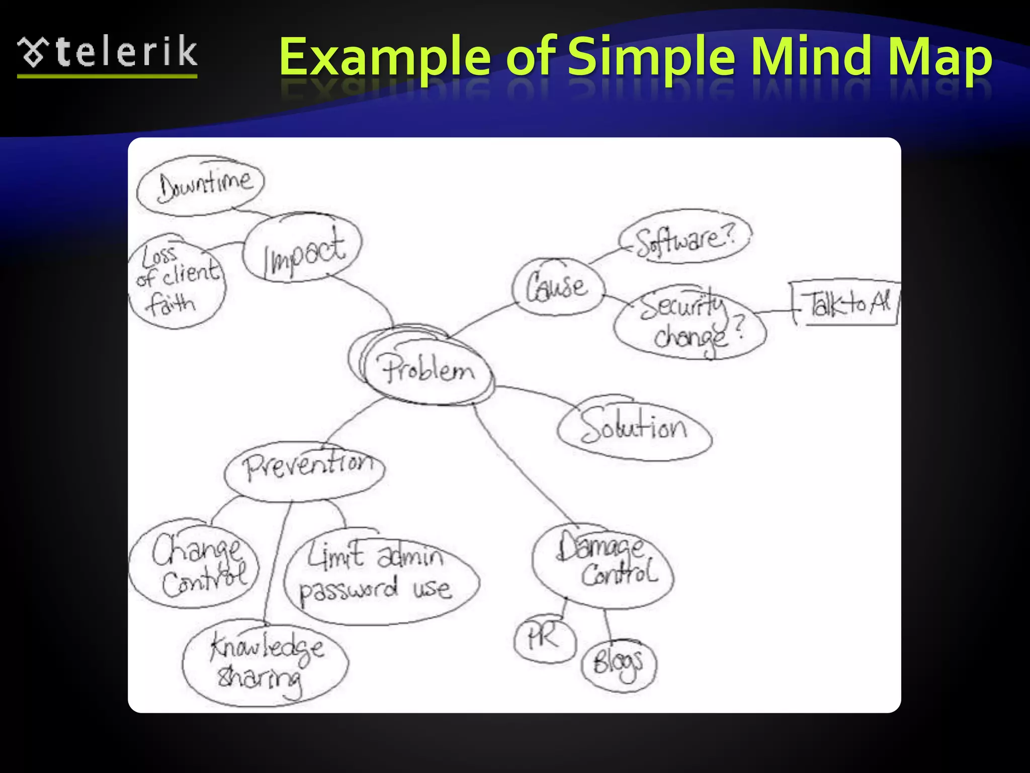
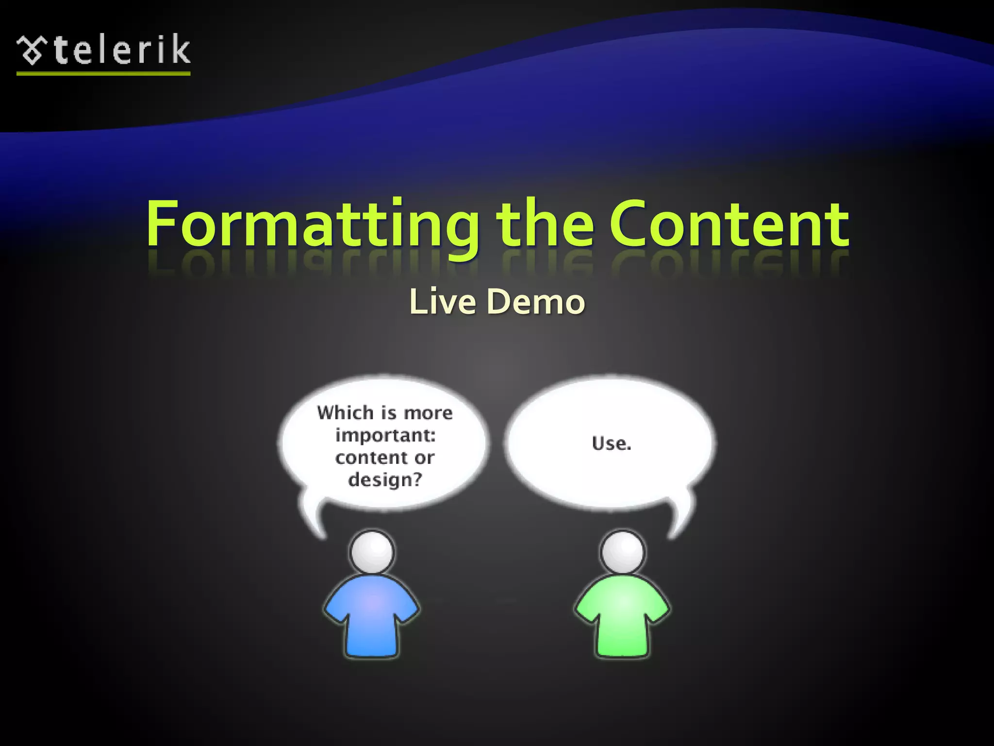
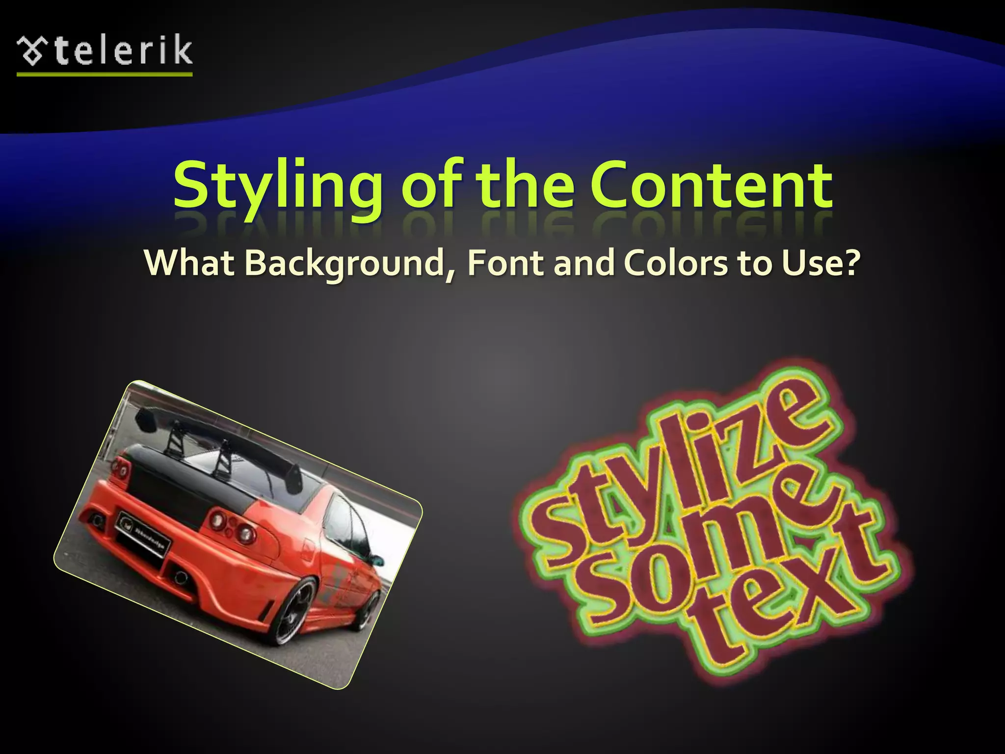
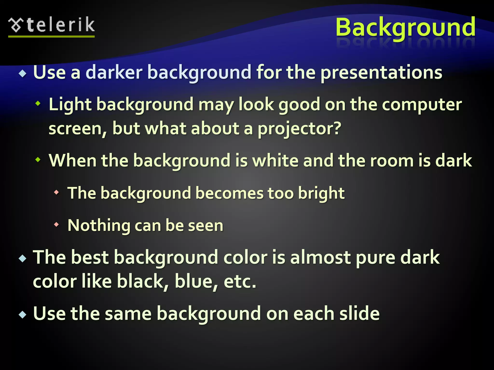
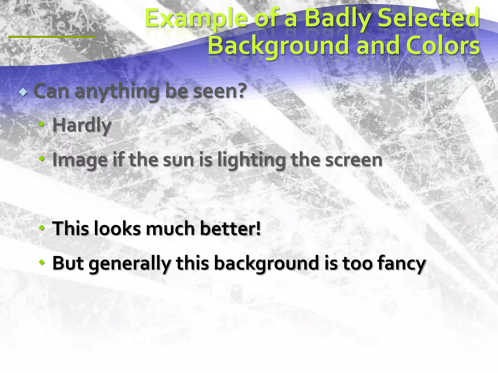
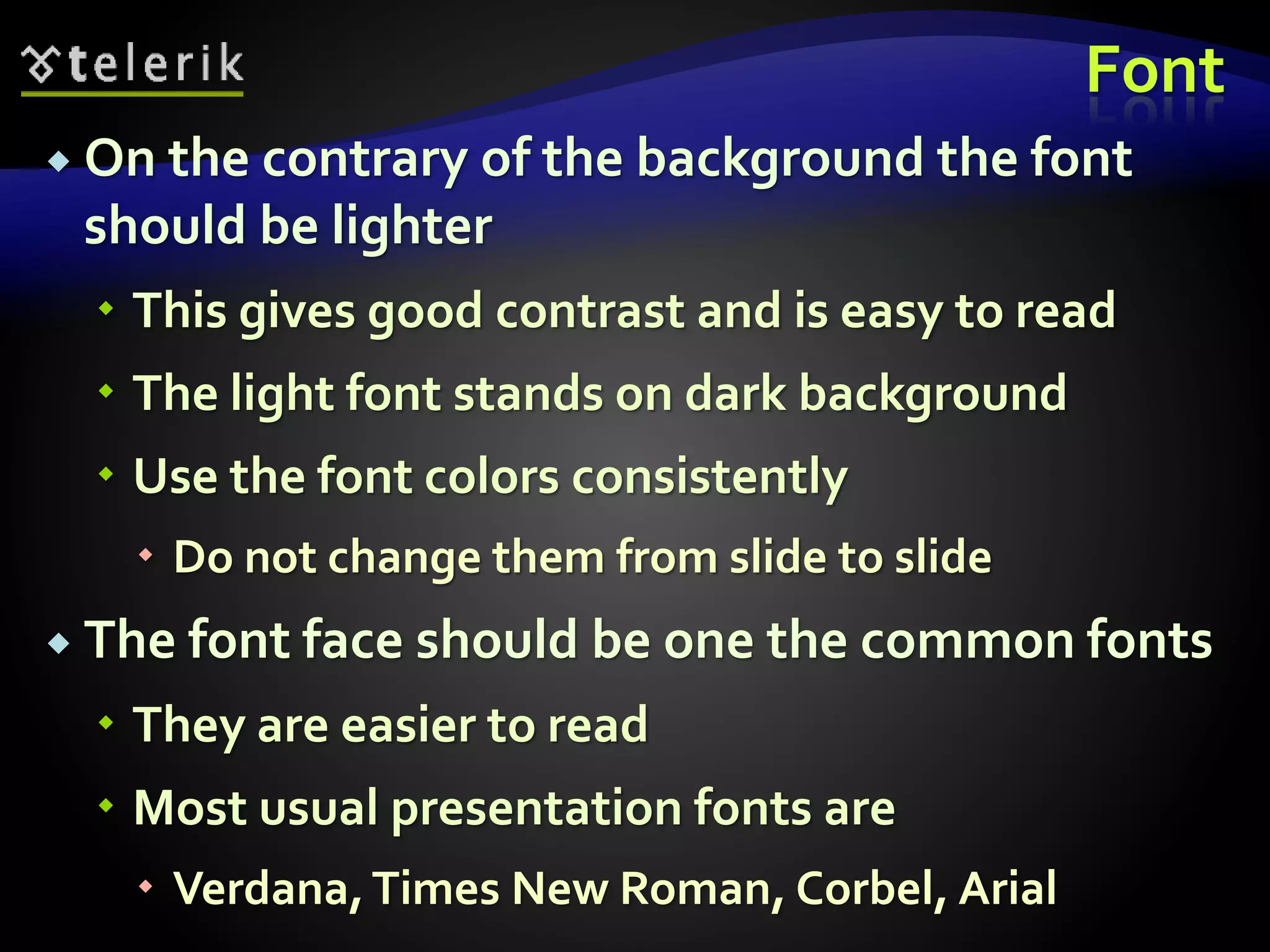
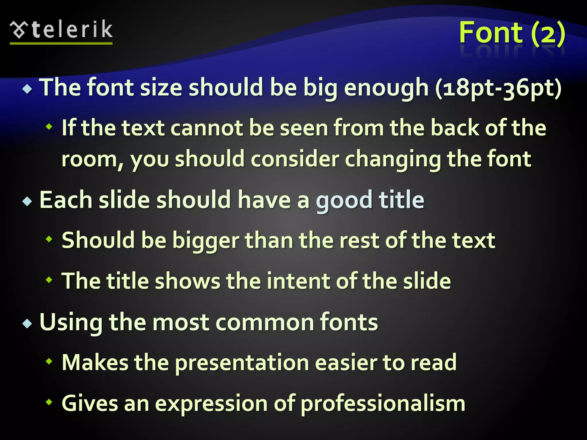
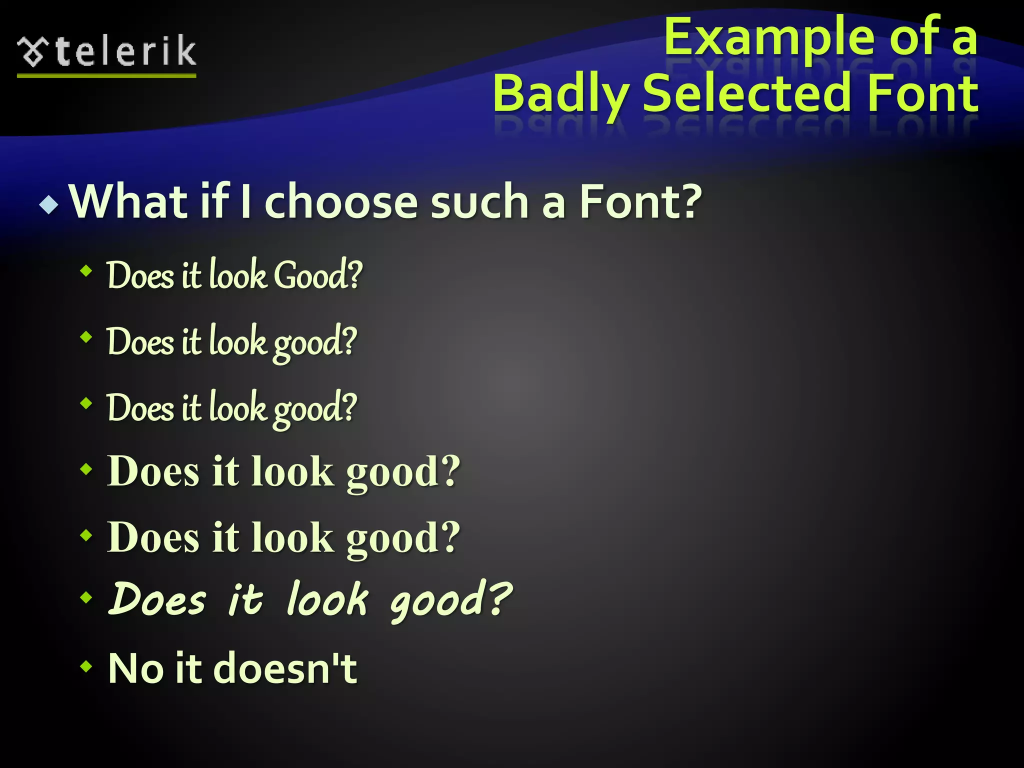
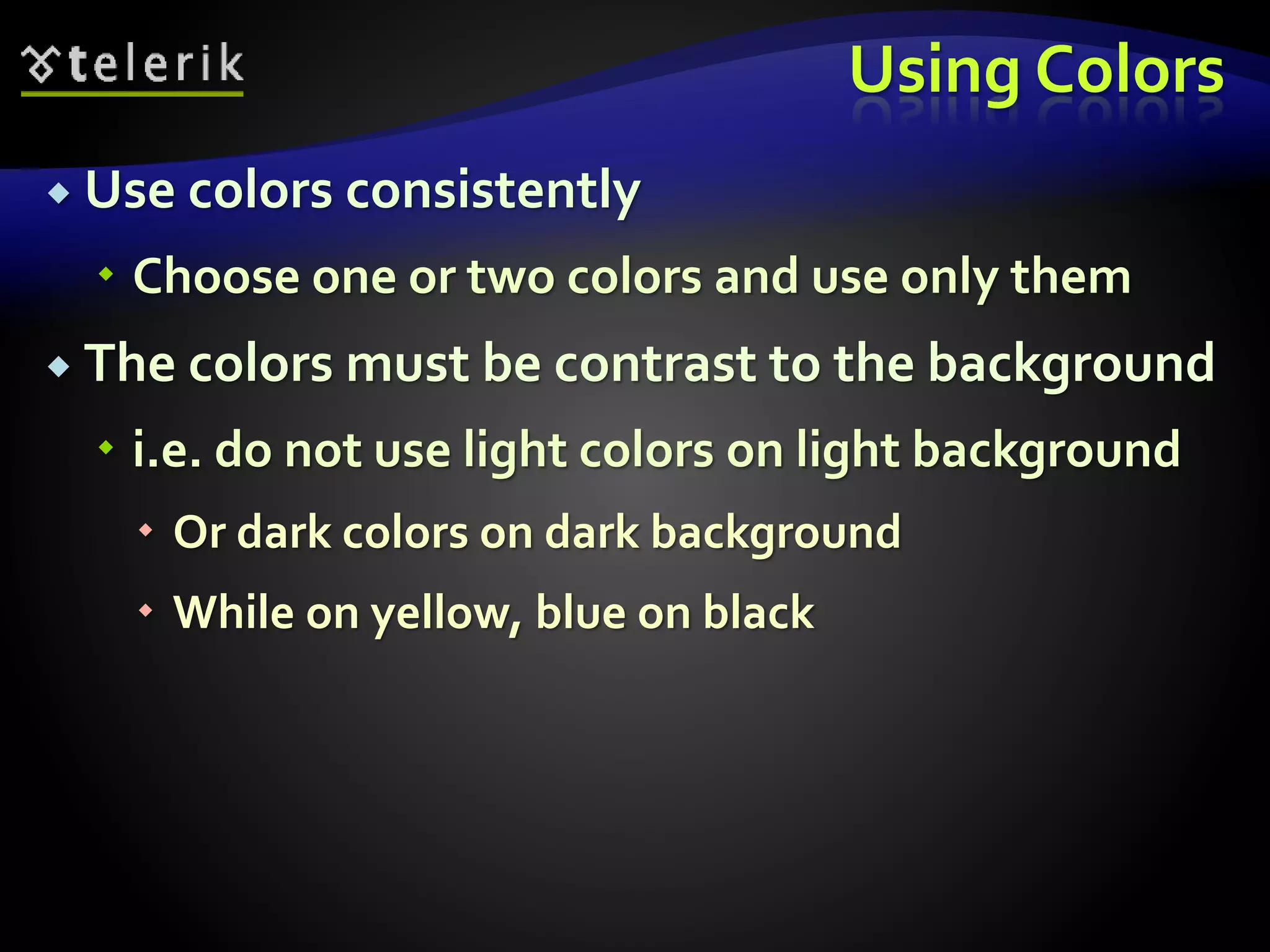
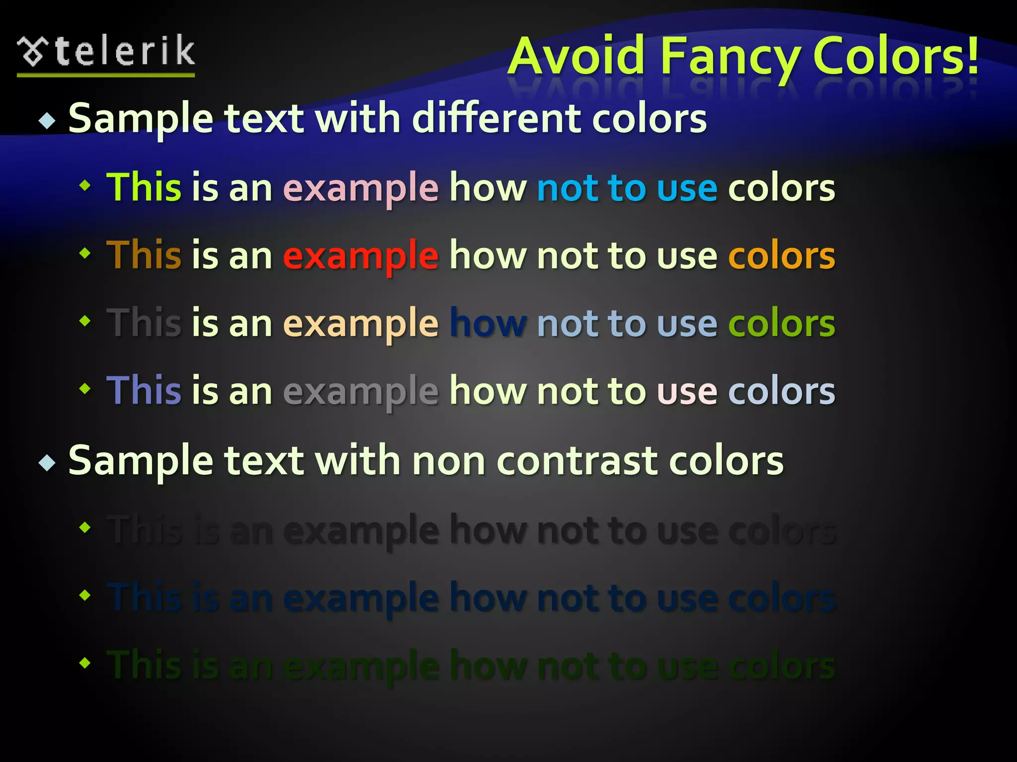
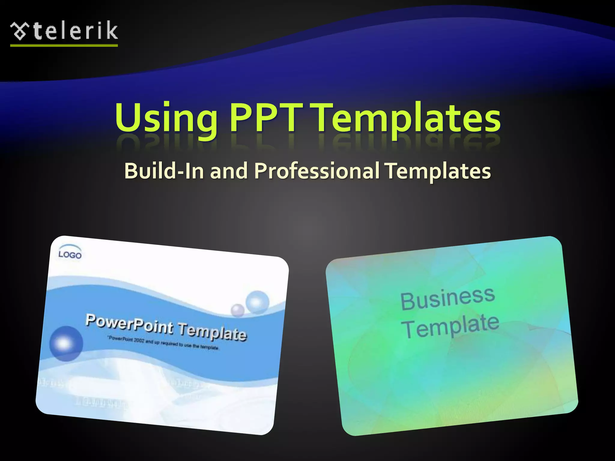
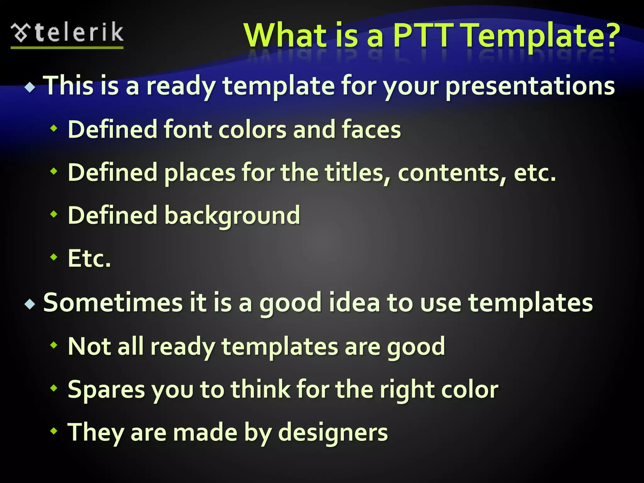
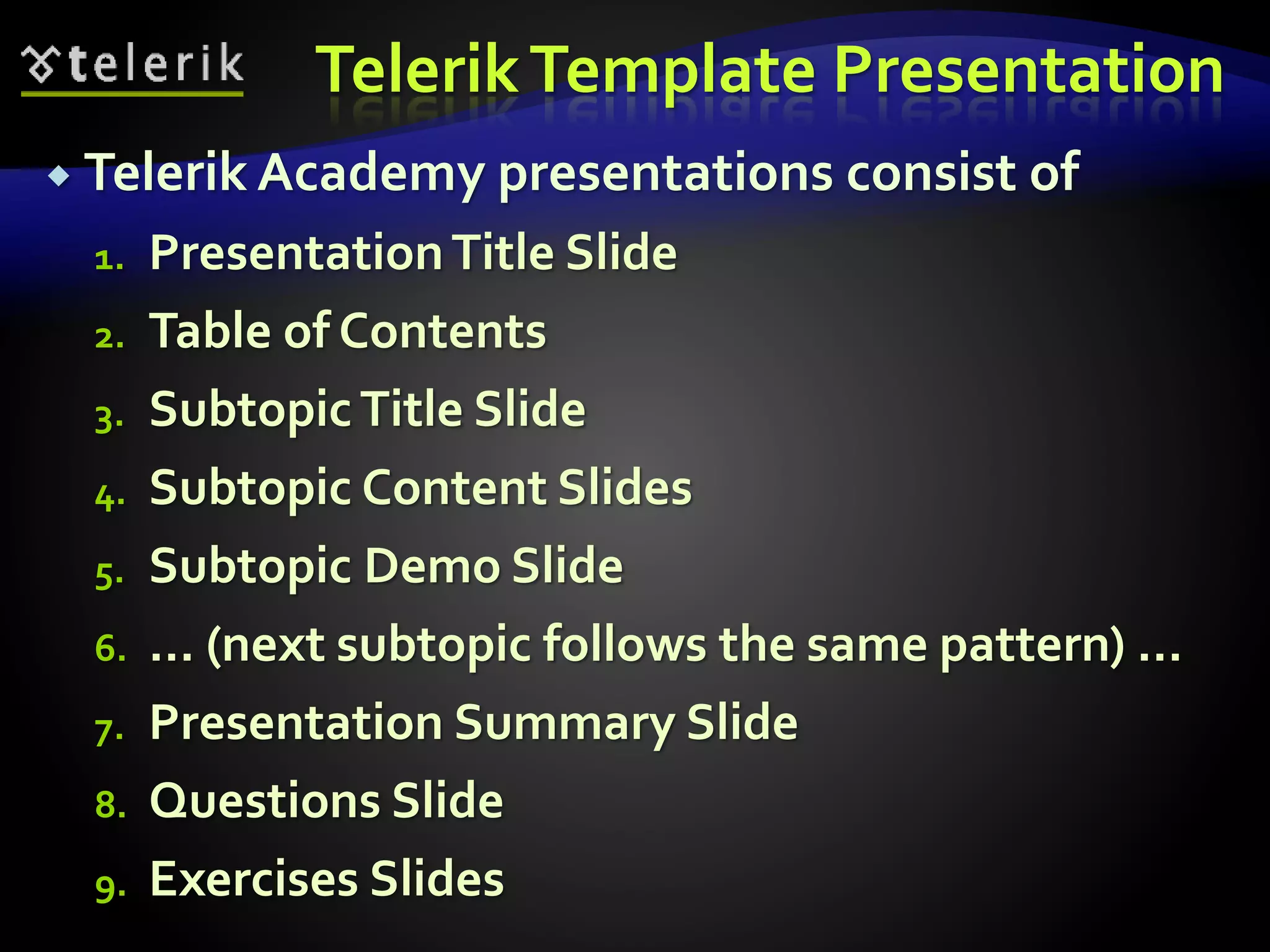
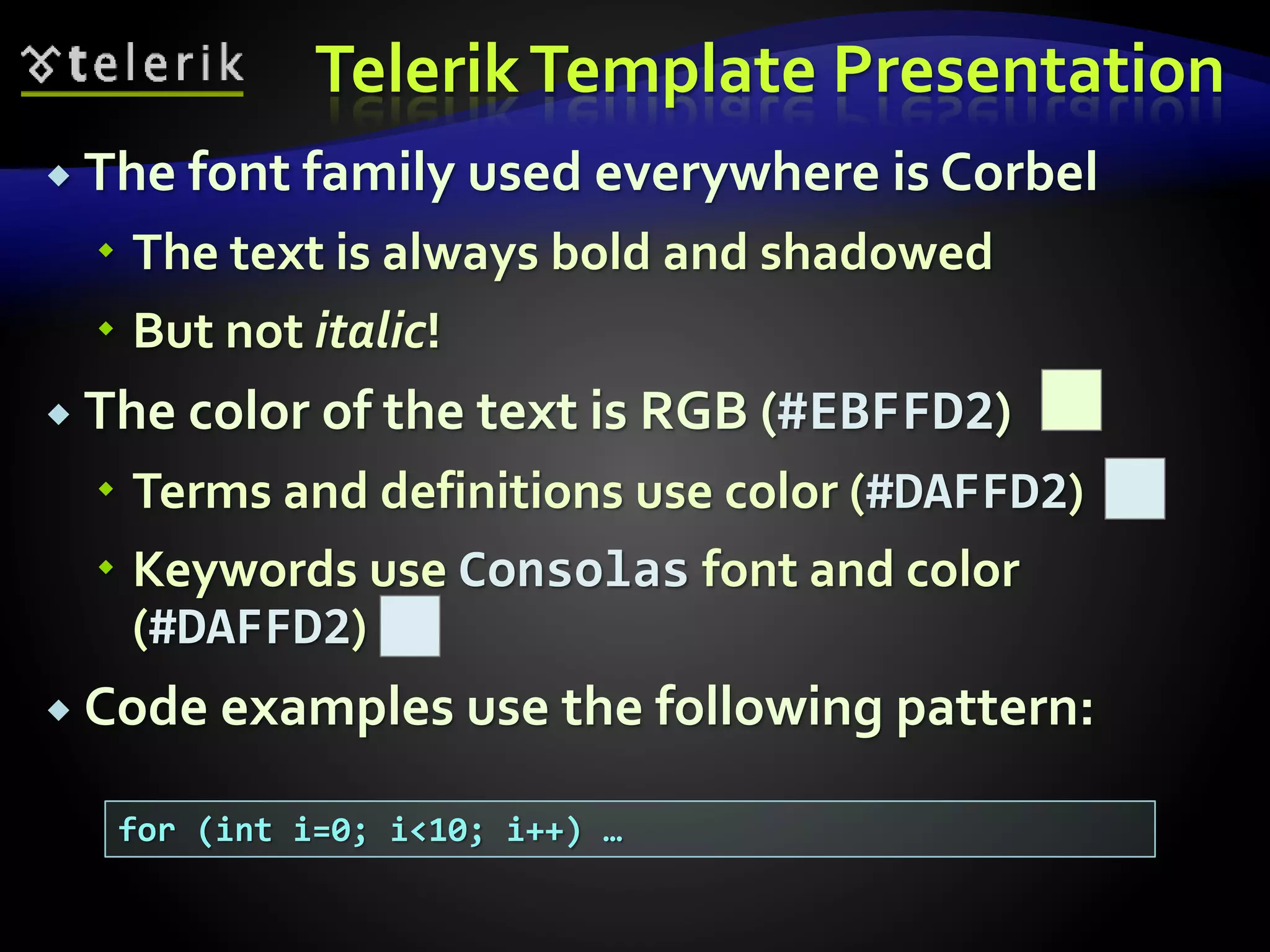
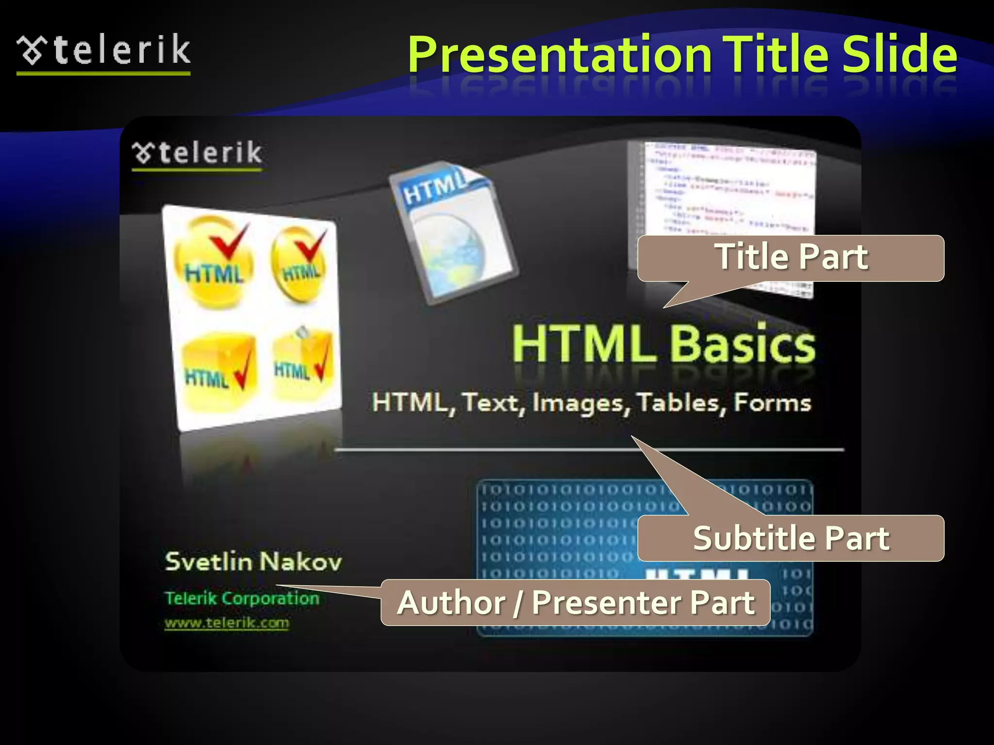
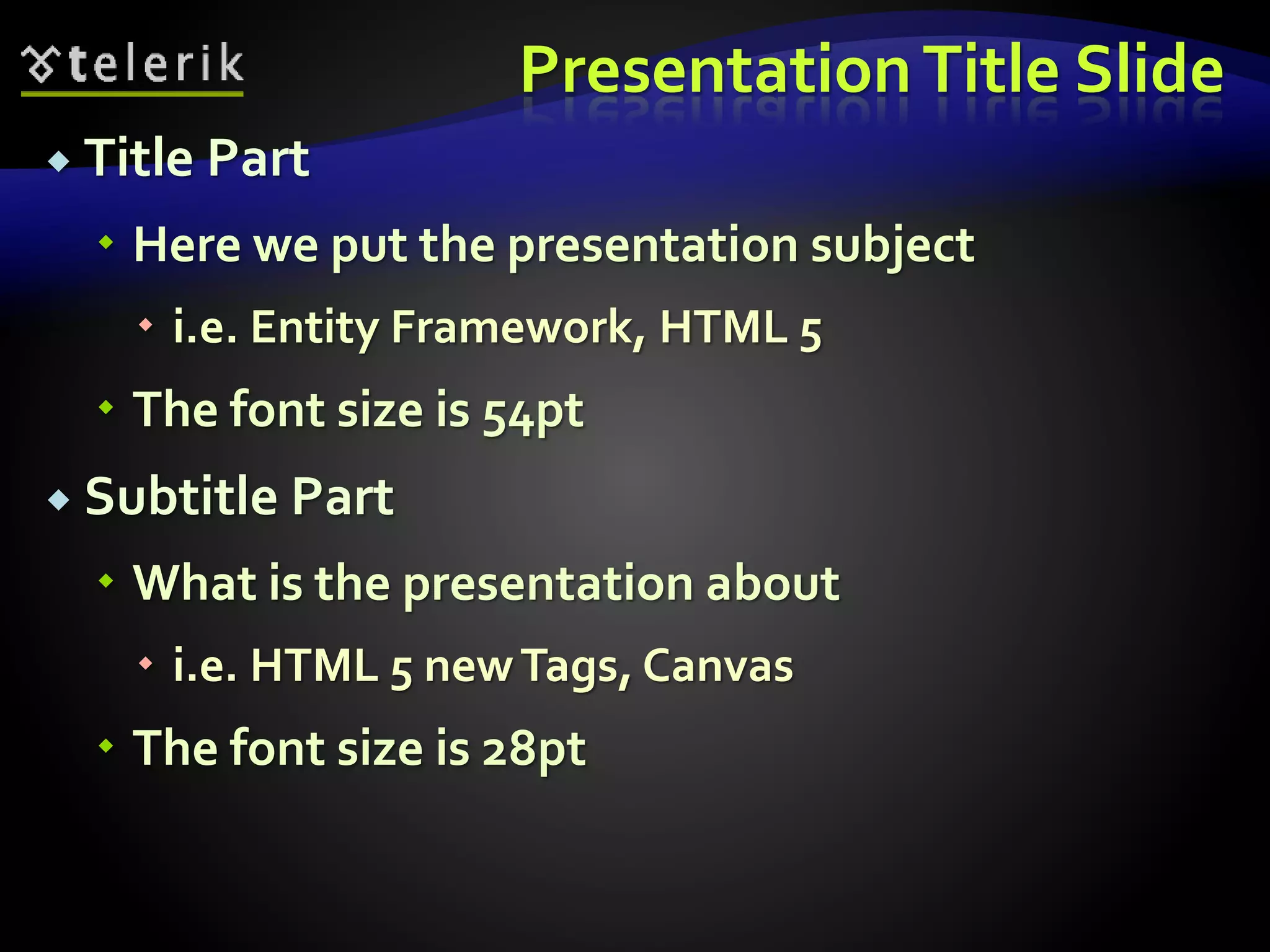
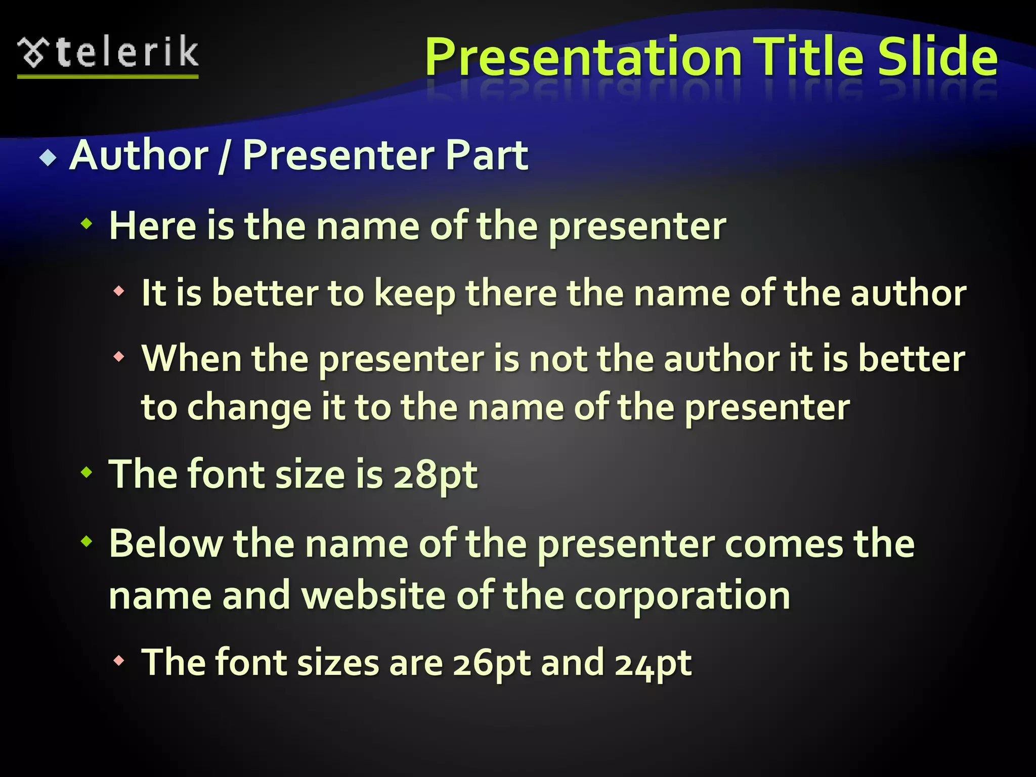
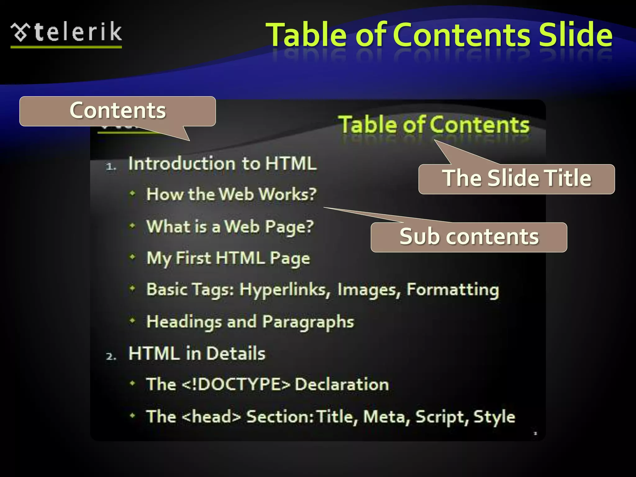
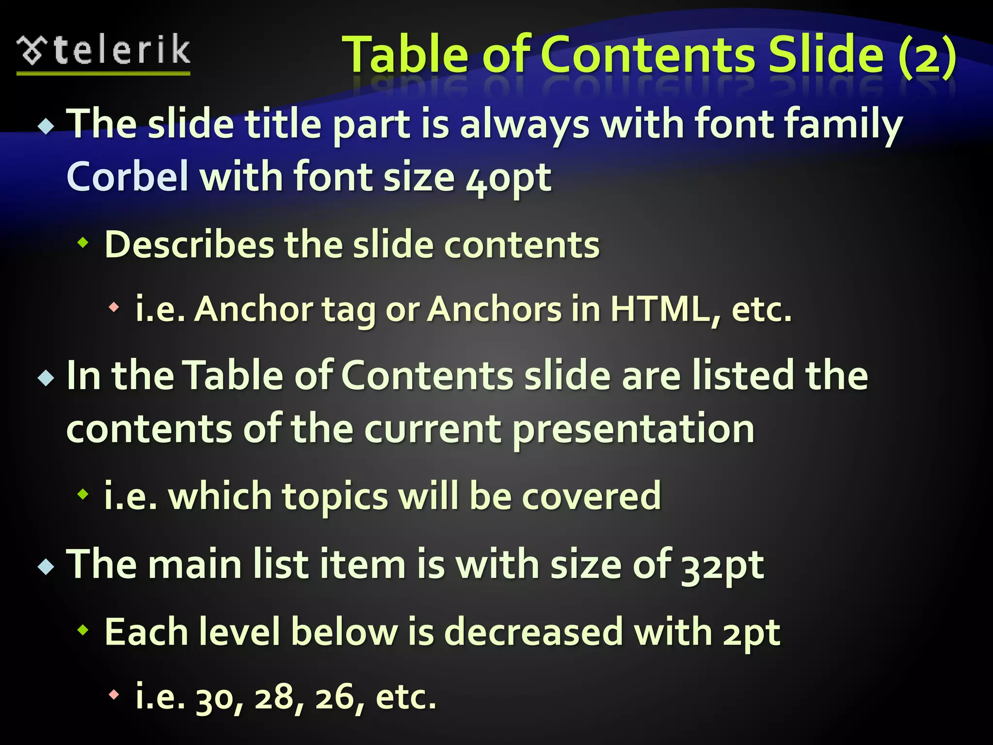
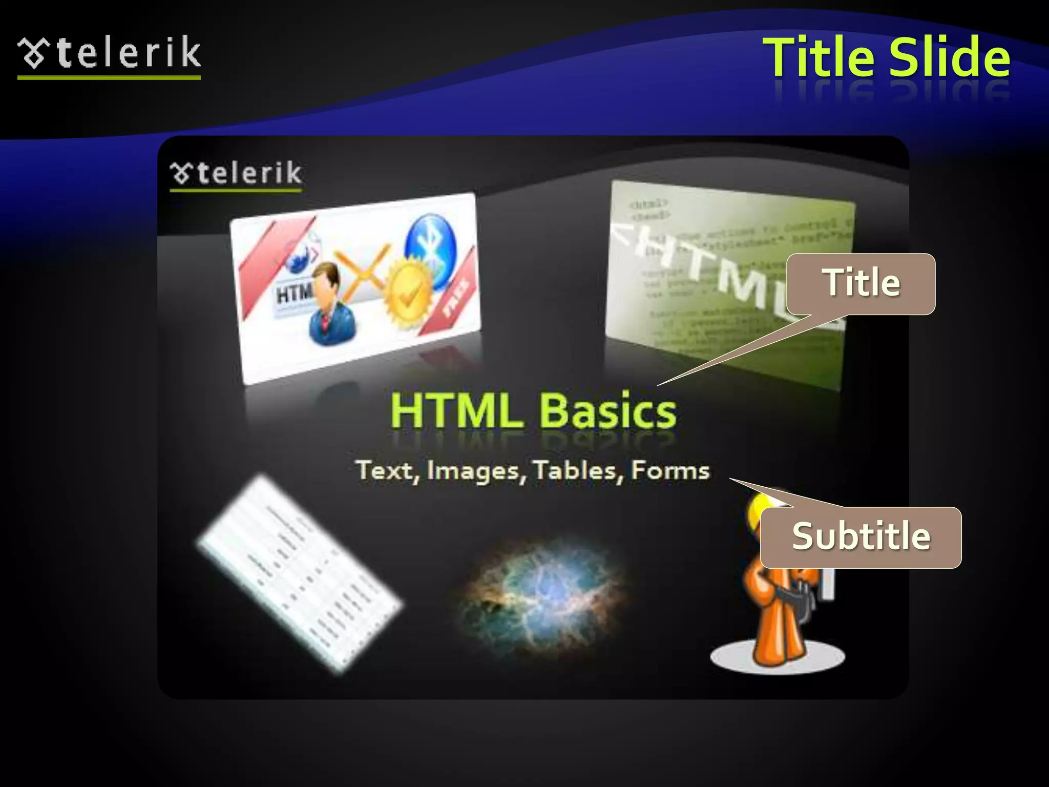
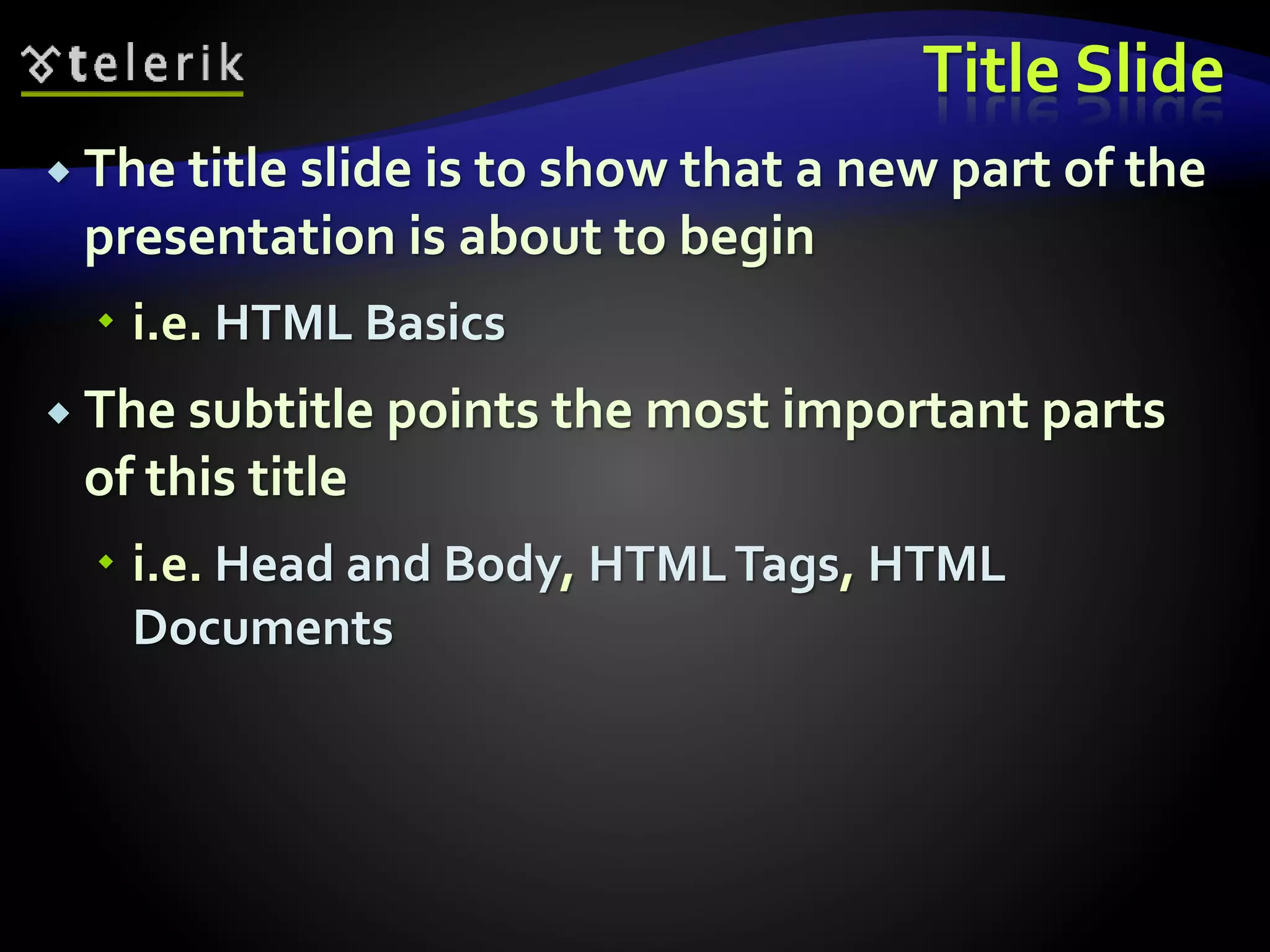
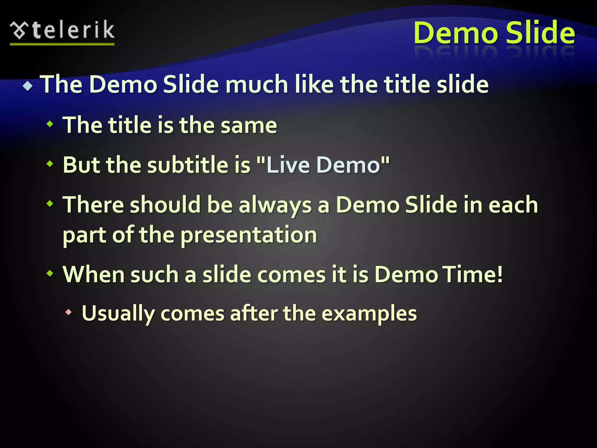
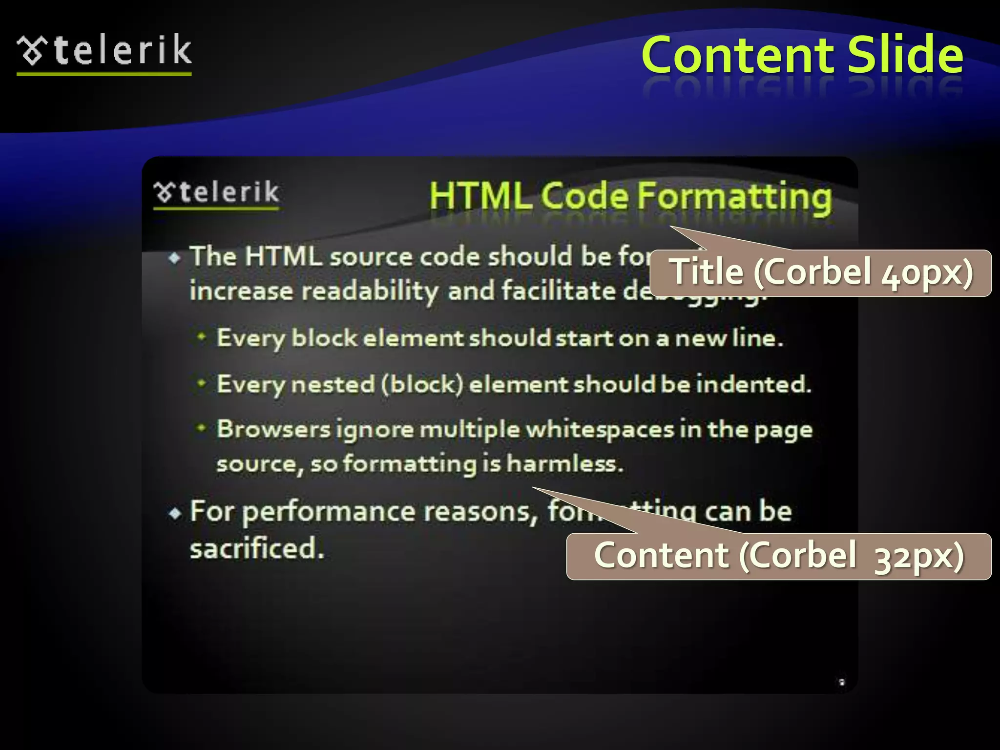
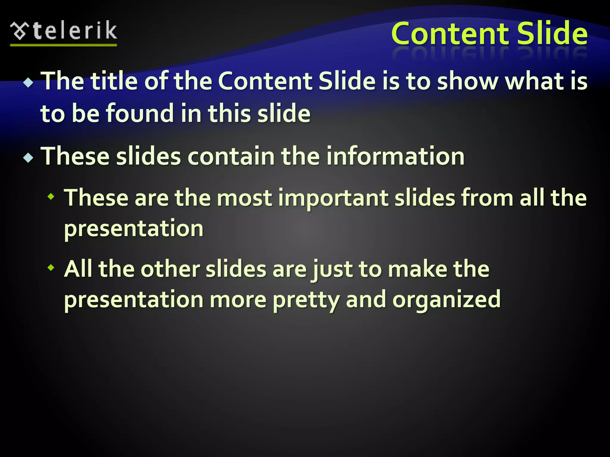
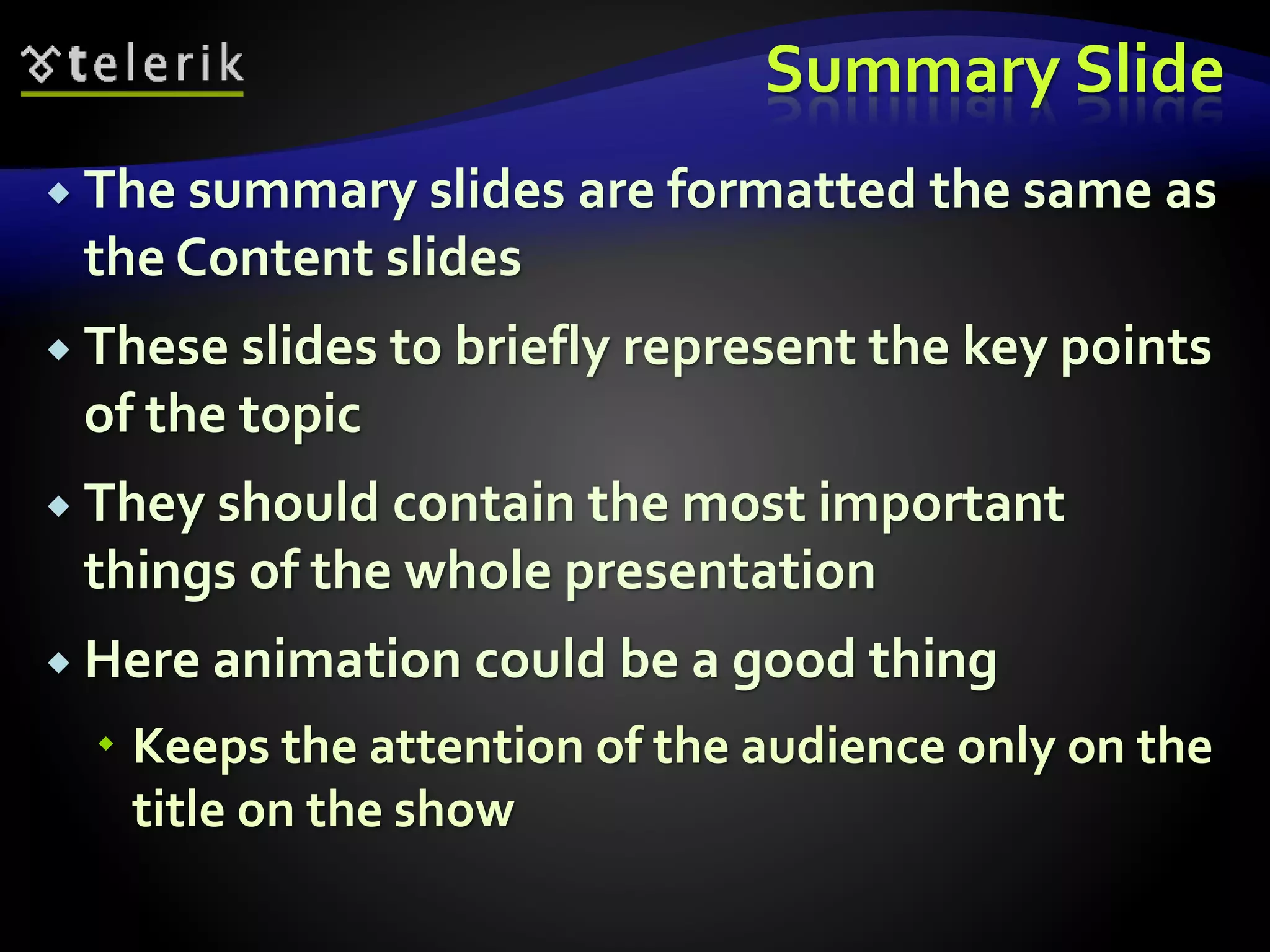
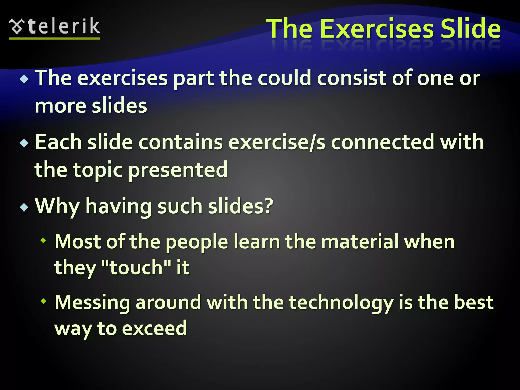
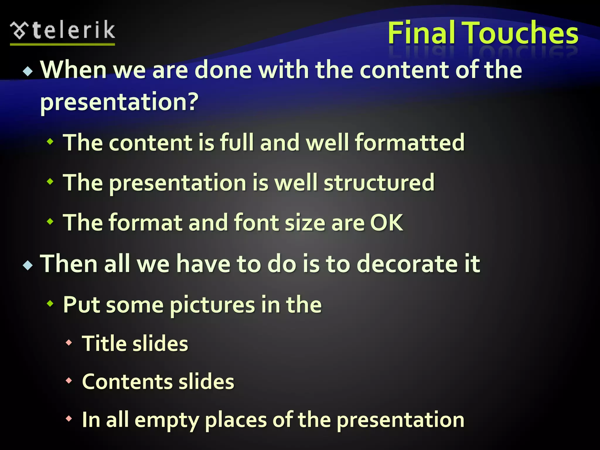
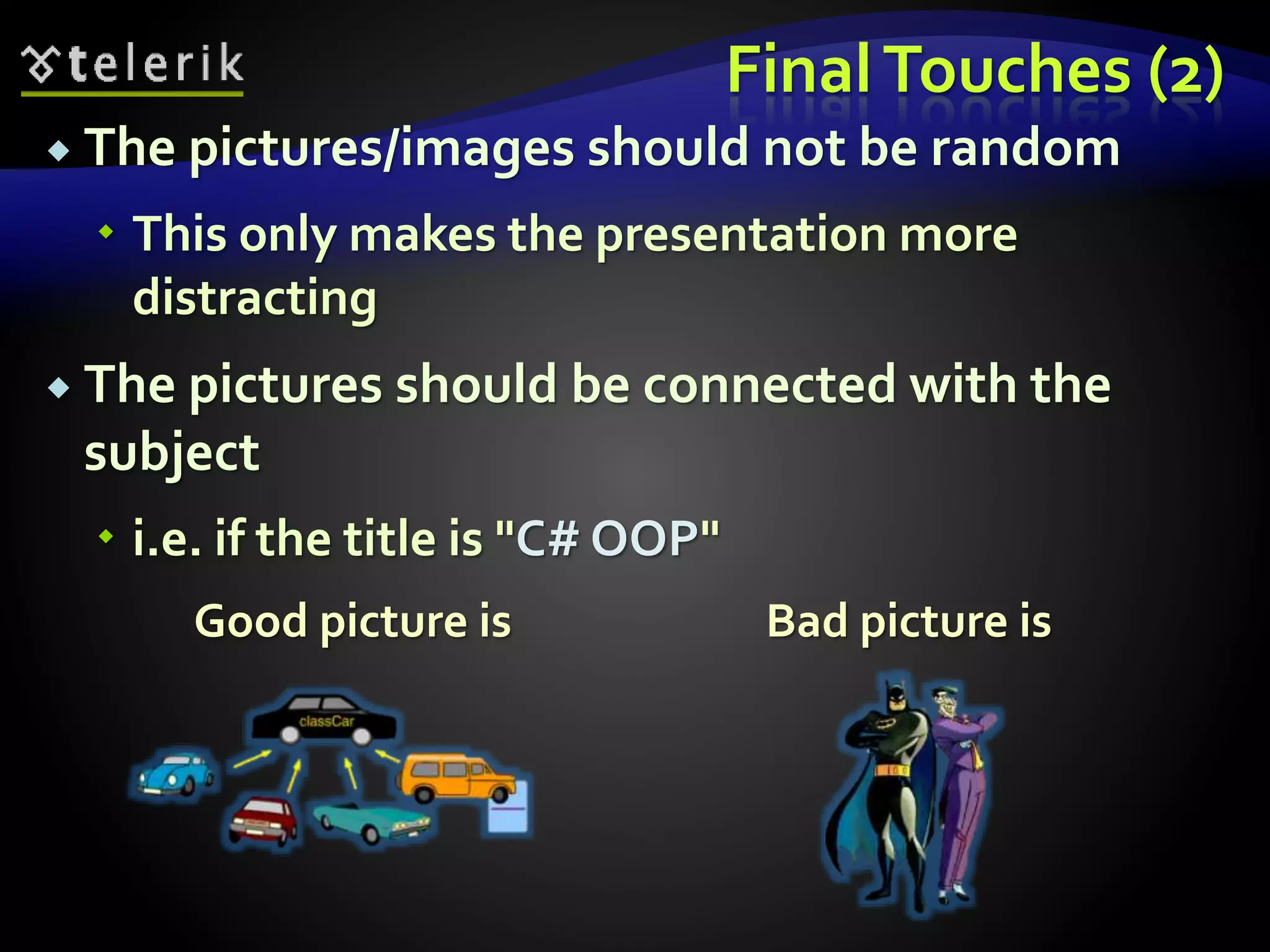
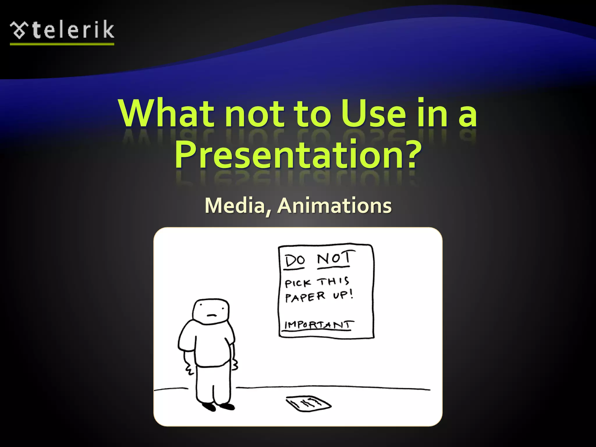
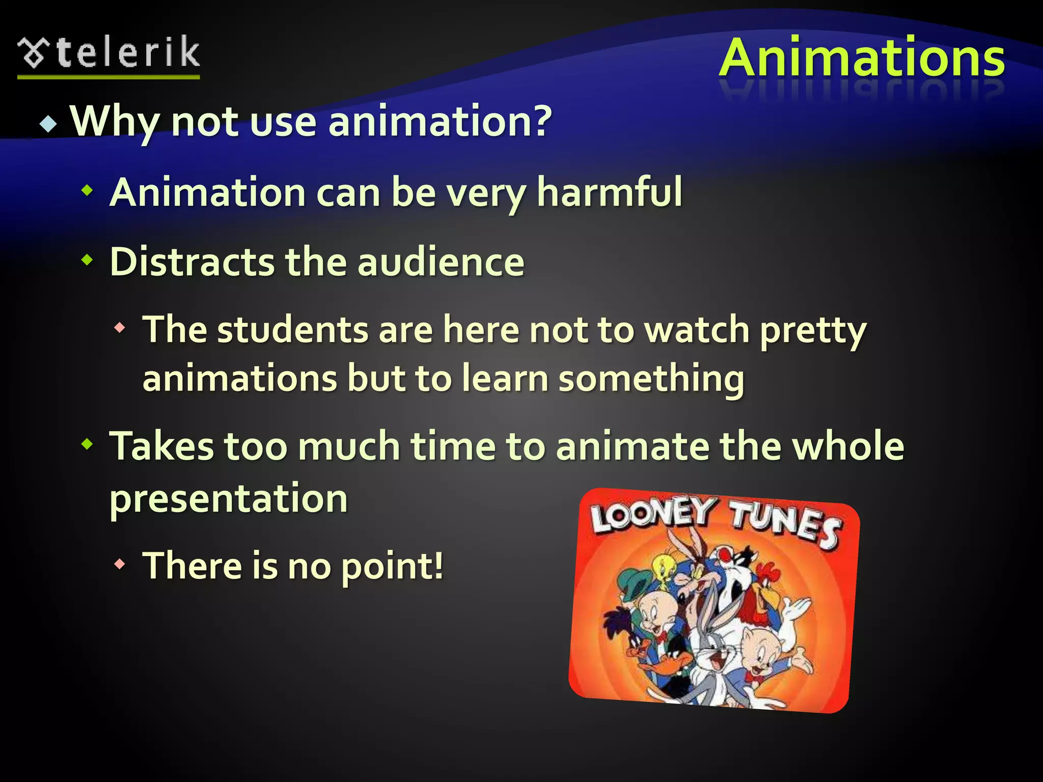
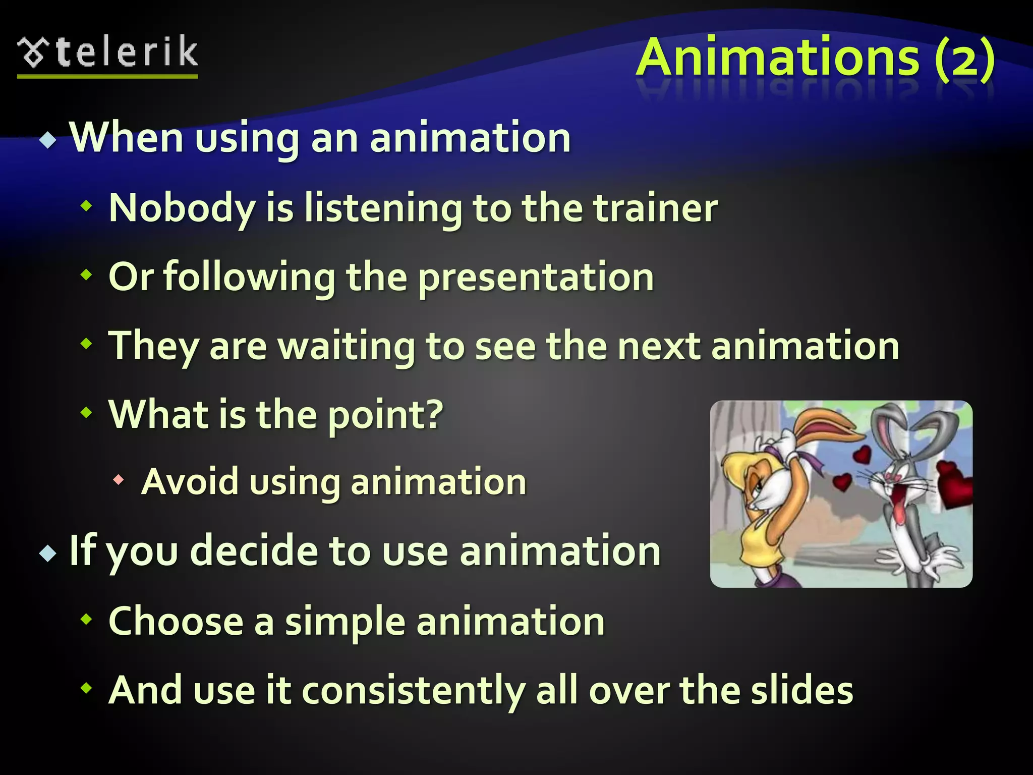
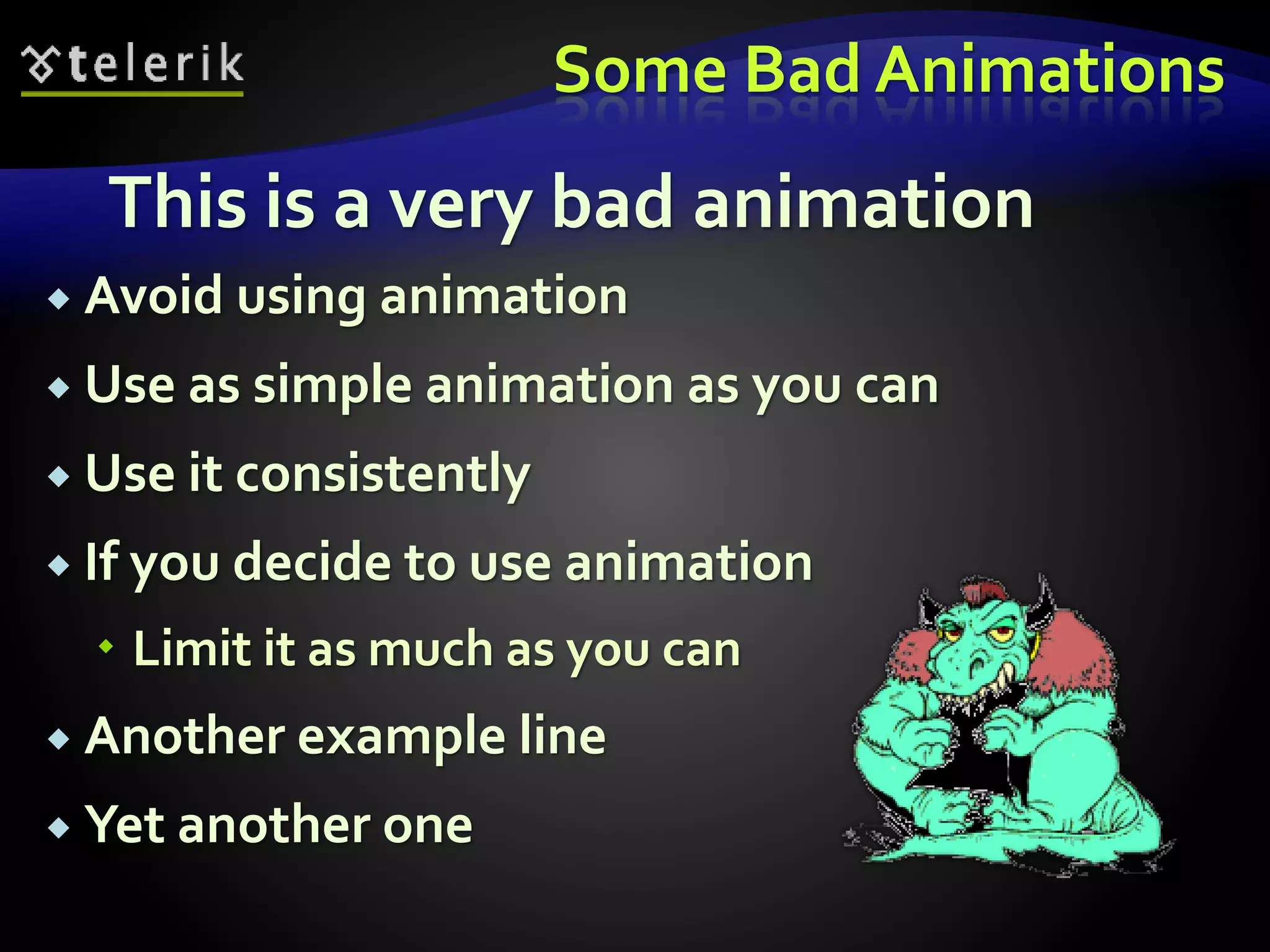
This document provides guidelines for creating effective presentations. It discusses clearing the presentation idea by creating a mind map or table of contents. Information should then be collected through online research. The content should be formatted into short bullet points with clear slides. Styling guidelines recommend a dark background, light fonts sized 18-36pt, and consistent colors. Templates can be used to apply predefined styles. Sample slides like the title slide and content slides are demonstrated.
in this presentation we saw the how to prepare the effective presentation for useful purpose. which guidelines is made the presentation is better and effective.
I am currently working at AGT Graphics as their senior Graphics Designer. My job responsibilities include designing different graphics for AGT's clients and helping them with day to day tasks. I have worked with clients all over the world including North America, Dubai, Australia.
Slide guide for consulting-style presentationsreallygoodppts
This document presents the guidelines used by top-tier consulting firms to craft effective presentations.
All the top-tier management consulting firms have templates and ‘style-guides’ to ensure consistent quality. Until now, these guides have been locked up inside corporate firewalls. For the first time, ReallyGoodPowerPoints has made these building blocks for consulting-style presentations available to the public
Making PowerPoint SlidesBest PracticesAdapted from.docxsmile790243
Making PowerPoint Slides
Best Practices
Adapted from: www.iasted.org/conferences/formatting/Presentations-Tips.ppt
*
Tips to be CoveredTitle slide and outlinesSlide StructureFontsColorBackgroundGraphsSpelling and GrammarConclusionsQuestionsReferences
Title and Outline Include a title slide with the title of your presentation, your full name and affiliation.Make your second slide an outline of your presentation
Ex: previous slideFollow the order of your outline for the rest of the presentationOnly place main points on the outline slide
Ex: Use the titles of each slide as main points
*
Slide Structure Use 1-2 slides per minute of your presentationWrite in point form, not complete sentencesInclude 4-5 points per slideAvoid wordiness: use key words and phrases only
Slide StructureThis page contains too many words for a presentation slide. It is not written in point form, making it difficult both for your audience to read and for you to present each point. Although there are exactly the same number of points on this slide as the previous slide, it looks much more complicated. In short, your audience will spend too much time trying to read this paragraph instead of listening to you.
Slide StructureShow one point at a time:
Will help audience concentrate on what you are saying
Will prevent audience from reading ahead
Will help you keep your presentation focused
Slide StructureDo not use distracting animation
Do not go overboard with the animation, if you decide to use any
Be consistent with the animation that you use
FontsUse at least an 18-point fontUse different size fonts for main points and secondary points
this font is 24-point, the main point font is 28-point, and the title font is 36-pointUse a standard font like Times New Roman or Arial
FontsIf you use a small font, your audience won’t be able to read what you have written
CAPITALIZE ONLY WHEN NECESSARY. IT IS DIFFICULT TO READ
Don’t use a complicated font
ColorUse a color of font that contrasts sharply with the background
Ex: blue font on white backgroundUse color to reinforce the logic of your structure
Ex: light blue title and dark blue textUse color to emphasize a point
But only use this occasionally
ColorUsing a font color that does not contrast with the background color is hard to read Using color for decoration is distracting and unprofessional.So is using color to creative.Using a different color for each point is unnecessary
Using a different color for secondary points is also unnecessary
BackgroundUse backgrounds such as this one that are attractive but simple
Use backgrounds which are light, with dark text
Use the same background consistently throughout your presentation
BackgroundAvoid backgrounds that are distracting or difficult to read fromAlways be consistent with the background that you use
GraphsUse graphs rather than just charts and words
Data in graphs is easier to comprehend & retain than is raw data
Trends are easi ...
Creating Effective PowerPoint® Presentations
Microsoft® PowerPoint® is a tool for creating dynamic oral presentations. An effective PowerPoint® presentation has maximum impact on an audience in minimal time. If you have been assigned a PowerPoint® in addition to an essay or instead of an essay, here are the key similarities [+] and differences [x] between these two forms:
Table 1
Elements of an Essay and a PowerPoint Presentation
Elements
Essay
PowerPoint®
Design
x Text-based, regular black font, one inch margins, double spacing
+ Visual design: color, theme, and layout options; art and multimedia options
Title
+ Title page
+ Title slide
Introduction
+ Topic, issue, thesis statement
+ Slide title (topic); key points
Body
+ Paragraphs featuring one point each
+ Slides featuring one point each
Conclusion
+ Recap of main point, final thoughts
+ Slide listing recap of main points
Paragraphs
+ Unified and cohesive paragraphs with topic and concluding sentences
x Unordered (bulleted) lists or a captioned image to convey key points
Sentences
Complete sentences
x One-line fragments; unordered list (bullet points).
Lists
x Occasionally used to separate elements in a sentence.
+Lists are the building blocks of a PowerPoint®.
Visuals/art
+ Tables, charts, and graphs display data and research results and make a paper visually appealing.
+ Images, art, tables, charts, and graphs increase the impact and visual appeal of a presentation.
In-text citations
+ Quotes, paraphrases, summaries, and visuals require in-text citations.
+ Quotes, paraphrases, and summaries, and visuals require in-text citations.
Reference list
+ Last page lists full-citation references.
+ Last slide lists full-citation references
GETTING STARTED WITH SLIDES
Similar to drafting an essay, when creating a PowerPoint®, you need to define your topic and focus, determine your audience, and know your purpose--whether you are informing, educating, entertaining, or persuading.
Another essential step that takes as much time when creating a PowerPoint® as it does when writing an essay is to research your subject matter and prewrite your ideas. A next step is to make an informal outline to organize your ideas and establish a clear beginning middle and end. With the groundwork complete and content prepared, you are ready to create Slide 1.
Slide 1
1. New presentations begin with a title slide. Follow the directions given in the text placeholders beginning with “click to add title” (Figure 2).
2. Then, in the next box, add your subtitle. You may also use this area to provide your name and the university name per APA guidelines or any other information required on your title slide.
3. Since a PowerPoint® accompanies an oral presentation, you may want to add speaker notes in the notes pane to elaborate on the points on each slide.
Figure 1
PowerPoint® Side 1. Click to Add Title
Important: PowerPoint® has older versions and newer, PC and Mac. Shown in Figure 1 is Microsoft® PowerPoint® 2013 for Win ...
buy old yahoo accounts buy yahoo accountsSusan Laney
As a business owner, I understand the importance of having a strong online presence and leveraging various digital platforms to reach and engage with your target audience. One often overlooked yet highly valuable asset in this regard is the humble Yahoo account. While many may perceive Yahoo as a relic of the past, the truth is that these accounts still hold immense potential for businesses of all sizes.
An introduction to the cryptocurrency investment platform Binance Savings.Any kyc Account
Learn how to use Binance Savings to expand your bitcoin holdings. Discover how to maximize your earnings on one of the most reliable cryptocurrency exchange platforms, as well as how to earn interest on your cryptocurrency holdings and the various savings choices available.
B2B payments are rapidly changing. Find out the 5 key questions you need to be asking yourself to be sure you are mastering B2B payments today. Learn more at www.BlueSnap.com.
Tata Group Dials Taiwan for Its Chipmaking Ambition in Gujarat’s DholeraAvirahi City Dholera
The Tata Group, a titan of Indian industry, is making waves with its advanced talks with Taiwanese chipmakers Powerchip Semiconductor Manufacturing Corporation (PSMC) and UMC Group. The goal? Establishing a cutting-edge semiconductor fabrication unit (fab) in Dholera, Gujarat. This isn’t just any project; it’s a potential game changer for India’s chipmaking aspirations and a boon for investors seeking promising residential projects in dholera sir.
Visit : https://www.avirahi.com/blog/tata-group-dials-taiwan-for-its-chipmaking-ambition-in-gujarats-dholera/
At Techbox Square, in Singapore, we're not just creative web designers and developers, we're the driving force behind your brand identity. Contact us today.
Anny Serafina Love - Letter of Recommendation by Kellen Harkins, MS.AnnySerafinaLove
This letter, written by Kellen Harkins, Course Director at Full Sail University, commends Anny Love's exemplary performance in the Video Sharing Platforms class. It highlights her dedication, willingness to challenge herself, and exceptional skills in production, editing, and marketing across various video platforms like YouTube, TikTok, and Instagram.
Digital Transformation and IT Strategy Toolkit and TemplatesAurelien Domont, MBA
This Digital Transformation and IT Strategy Toolkit was created by ex-McKinsey, Deloitte and BCG Management Consultants, after more than 5,000 hours of work. It is considered the world's best & most comprehensive Digital Transformation and IT Strategy Toolkit. It includes all the Frameworks, Best Practices & Templates required to successfully undertake the Digital Transformation of your organization and define a robust IT Strategy.
Editable Toolkit to help you reuse our content: 700 Powerpoint slides | 35 Excel sheets | 84 minutes of Video training
This PowerPoint presentation is only a small preview of our Toolkits. For more details, visit www.domontconsulting.com
Company Valuation webinar series - Tuesday, 4 June 2024FelixPerez547899
This session provided an update as to the latest valuation data in the UK and then delved into a discussion on the upcoming election and the impacts on valuation. We finished, as always with a Q&A
LA HUG - Video Testimonials with Chynna Morgan - June 2024Lital Barkan
Have you ever heard that user-generated content or video testimonials can take your brand to the next level? We will explore how you can effectively use video testimonials to leverage and boost your sales, content strategy, and increase your CRM data.🤯
We will dig deeper into:
1. How to capture video testimonials that convert from your audience 🎥
2. How to leverage your testimonials to boost your sales 💲
3. How you can capture more CRM data to understand your audience better through video testimonials. 📊
Premium MEAN Stack Development Solutions for Modern BusinessesSynapseIndia
Stay ahead of the curve with our premium MEAN Stack Development Solutions. Our expert developers utilize MongoDB, Express.js, AngularJS, and Node.js to create modern and responsive web applications. Trust us for cutting-edge solutions that drive your business growth and success.
Know more: https://www.synapseindia.com/technology/mean-stack-development-company.html
Discover the innovative and creative projects that highlight my journey throu...dylandmeas
Discover the innovative and creative projects that highlight my journey through Full Sail University. Below, you’ll find a collection of my work showcasing my skills and expertise in digital marketing, event planning, and media production.
2. Table of Contents
Clearing the Idea
Collect the Information
Getting Started
Formatting the Content
Styling the Content
Telerik Template Presentation
Final Touches
What to Avoid in a Presentation?
4. Clearing the Idea
The first thing to do when starting to build a
presentation is to clear the idea
Might be done using mind mappings
I.e. draw a circle and write inside the name of
the presentation
Then start drawing around the main circle
everything that comes to your mind and is
somehow connected to the subject
After finishing with that get the most important
things and do the same with them, etc.
5. Clearing the Idea
At the end you should have something like a
Table of Contents
Or at least a blueprint, something to begin with
It is important to have in mind the level of
complexity of the subject
I.e. if the name of the presentation is "Basics of
OOP in C#" you should not include
Polymorphism and multiple inheritance
You should decide how detailed the
presentation should be
9. Collecting the Information
Once you have a sample Table of Contents you
should start to collect the information
How to do that?
The answer is simple: googling
Google is the perfect way to collect materials
Google is full of tutorials and already done
presentations
Do not copy the presentations, just use them as
source
Just type the name of the presentation and
filetype:ppt or filetype:pptx
12. Getting Started
Now you have some materials on hand
But sometimes it is not enough
It is better to start making the presentation on
your own and later on seek for help
You should make sure that your presentations
are well structured and organized
Not a random list of bullet points with no
logical order
14. Key Principles
Key principles of presentation creation
Keep the sentences as short as possible
Keep the content of a slide as small as possible
Use dark backgrounds with light foregrounds
The opposite is also acceptable (high contrast)
Use as large fonts as possible
15. What to Include in the
Presentation?
Keep the content in the presentation small
The presentation serves to point the most
important aspects of the topic
There will be a trainer to explain the details
If all the information is on the slides what is
the point of having a trainer?
Or the point of having this presentation?
Better email the presentation
16. Example of Bad Presentation
Hello! My name is Doncho Minkov and today we
will talk about HTML Fundamentals. We will see
the basics of the Hyper-Text-Markup Language
and will explain what is a tag in HTML, the parts
of a HTML document, and some of the tags….
<a> this is the tag 'a'. 'a' comes from anchor and
this tag is used for redirecting from one HTML
document to another…
bla bla bla
17. Content Formatting
Avoid "all words slides" (like a journal article)
Keep the lines in a slide to 7 (+/-2) lines
Limit the bullet points to 4-8
Try to make each bullet one or two lines long
If you have a text
Make it in bullet points
It may take 2-3 slides
So what?
Each sentence can be transformed into one bullet
18. Content Formatting (2)
When there is too much text on one slide the
audience
Starts reading and does not listen to the trainer
Could fall asleep
It is easier for the trainer when there is less
information on each slide
Less topics to cover on this slide
More concentrated in the slide
19. Arranging the Content
Example of a bad slide
This could be split into at least four bullet
points (4 sentences)
The title is not fully
corresponding with the content
22. Styling of the Content
What Background, Font and Colors to Use?
23. Background
Use a darker background for the presentations
Light background may look good on the computer
screen, but what about a projector?
When the background is white and the room is dark
The background becomes too bright
Nothing can be seen
The best background color is almost pure dark
color like black, blue, etc.
Use the same background on each slide
24. Example of a Badly Selected
Background and Colors
Can anything be seen?
Hardly
Image if the sun is lighting the screen
This looks much better!
But generally this background is too fancy
25. Font
On the contrary of the background the font
should be lighter
This gives good contrast and is easy to read
The light font stands on dark background
Use the font colors consistently
Do not change them from slide to slide
The font face should be one the common fonts
They are easier to read
Most usual presentation fonts are
Verdana, Times New Roman, Corbel, Arial
26. Font (2)
The font size should be big enough (18pt-36pt)
If the text cannot be seen from the back of the
room, you should consider changing the font
Each slide should have a good title
Should be bigger than the rest of the text
The title shows the intent of the slide
Using the most common fonts
Makes the presentation easier to read
Gives an expression of professionalism
27. Example of a
Badly Selected Font
What if I choose such a Font?
Does it look Good?
Does it look good?
Does it look good?
Does it look good?
Does it look good?
Does it look good?
No it doesn't
28. Using Colors
Use colors consistently
Choose one or two colors and use only them
The colors must be contrast to the background
i.e. do not use light colors on light background
Or dark colors on dark background
While on yellow, blue on black
29. Avoid Fancy Colors!
Sample text with different colors
This is an example how not to use colors
Sample text with non contrast colors
This is an example how not to use colors
31. What is a PTT Template?
This is a ready template for your presentations
Defined font colors and faces
Defined places for the titles, contents, etc.
Defined background
Etc.
Sometimes it is a good idea to use templates
Not all ready templates are good
Spares you to think for the right color
They are made by designers
32. There are some built-in templates
But can also be downloaded from the web
Examples of free PPT templates:
http://www.presentationpoint.com/powerpoint-templates/
http://www.templateswise.com/
34. Telerik Academy
Template Presentation
How to execute the rules upon
Telerik Academy Presentations
35. Telerik Template Presentation
Telerik Academy presentations consist of
1. Presentation Title Slide
2. Table of Contents
3. Subtopic Title Slide
4. Subtopic Content Slides
5. Subtopic Demo Slide
6. … (next subtopic follows the same pattern) …
7. Presentation Summary Slide
8. Questions Slide
9. Exercises Slides
36. Telerik Template Presentation
The font family used everywhere is Corbel
The text is always bold and shadowed
But not italic!
The color of the text is RGB (#EBFFD2)
Terms and definitions use color (#DAFFD2)
Keywords use Consolas font and color
(#DAFFD2)
Code examples use the following pattern:
for (int i=0; i<10; i++) …
38. Presentation Title Slide
Title Part
Here we put the presentation subject
i.e. Entity Framework, HTML 5
The font size is 54pt
Subtitle Part
What is the presentation about
i.e. HTML 5 new Tags, Canvas
The font size is 28pt
39. Presentation Title Slide
Author / Presenter Part
Here is the name of the presenter
It is better to keep there the name of the author
When the presenter is not the author it is better
to change it to the name of the presenter
The font size is 28pt
Below the name of the presenter comes the
name and website of the corporation
The font sizes are 26pt and 24pt
41. Table of Contents Slide (2)
The slide title part is always with font family
Corbel with font size 40pt
Describes the slide contents
i.e. Anchor tag or Anchors in HTML, etc.
In the Table of Contents slide are listed the
contents of the current presentation
i.e. which topics will be covered
The main list item is with size of 32pt
Each level below is decreased with 2pt
i.e. 30, 28, 26, etc.
43. Title Slide
The title slide is to show that a new part of the
presentation is about to begin
i.e. HTML Basics
The subtitle points the most important parts
of this title
i.e. Head and Body, HTML Tags, HTML
Documents
44. Demo Slide
The Demo Slide much like the title slide
The title is the same
But the subtitle is "Live Demo"
There should be always a Demo Slide in each
part of the presentation
When such a slide comes it is Demo Time!
Usually comes after the examples
46. Content Slide
The title of the Content Slide is to show what is
to be found in this slide
These slides contain the information
These are the most important slides from all the
presentation
All the other slides are just to make the
presentation more pretty and organized
47. Summary Slide
The summary slides are formatted the same as
the Content slides
These slides to briefly represent the key points
of the topic
They should contain the most important
things of the whole presentation
Here animation could be a good thing
Keeps the attention of the audience only on the
title on the show
48. The Exercises Slide
The exercises part the could consist of one or
more slides
Each slide contains exercise/s connected with
the topic presented
Why having such slides?
Most of the people learn the material when
they "touch" it
Messing around with the technology is the best
way to exceed
51. Final Touches
When we are done with the content of the
presentation?
The content is full and well formatted
The presentation is well structured
The format and font size are OK
Then all we have to do is to decorate it
Put some pictures in the
Title slides
Contents slides
In all empty places of the presentation
52. Final Touches (2)
The pictures/images should not be random
This only makes the presentation more
distracting
The pictures should be connected with the
subject
i.e. if the title is "C# OOP"
Good picture is Bad picture is
54. What not to Use in a
Presentation?
Media, Animations
55. Animations
Why not use animation?
Animation can be very harmful
Distracts the audience
The students are here not to watch pretty
animations but to learn something
Takes too much time to animate the whole
presentation
There is no point!
56. Animations (2)
When using an animation
Nobody is listening to the trainer
Or following the presentation
They are waiting to see the next animation
What is the point?
Avoid using animation
If you decide to use animation
Choose a simple animation
And use it consistently all over the slides
57. Some Bad Animations
This is a very bad animation
Avoid using animation
Use as simple animation as you can
Use it consistently
If you decide to use animation
Limit it as much as you can
Another example line
Yet another one
58. Some Very Bad Animations
This is a very bad animation
Avoid using animation
Use as simple animation as you can
Use it consistently
If you decide to use animation
Limit it as much as you can
Another example line
Yet another one
59. Media
Avoid media inside you presentations
Better put an external link and show it as demo
Why?
The audience is here to see the presenter and
his / her talk
They can watch the video / listen audio at home
It will be more comfortable for them too
60. Summary
Clearing the Idea
Mind mapping
Collect the Information
Using Google
Getting Started
How to format the presentation?
Telerik Template Presentation
Decorating with pictures
Avoid using media and / or animations