This document provides guidelines for designing documents, slides, and screens. It discusses:
1. Using design principles at each step of writing and revising, such as using headings, lists, and getting feedback to create inviting and easy to read pages.
2. Why design matters, as good design saves time and money, reduces legal problems, and helps ensure information is read and understood by grouping ideas visually.
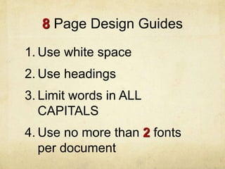
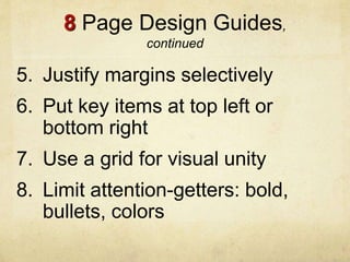
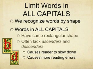
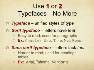
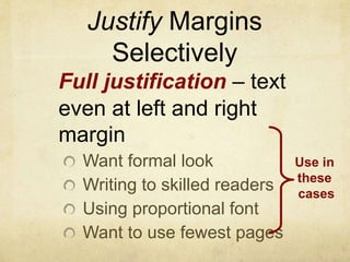
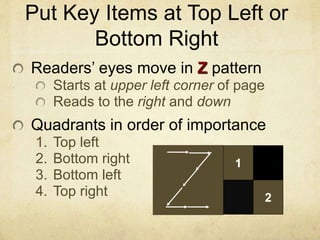
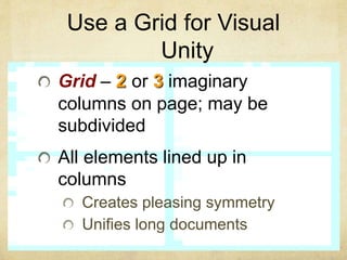
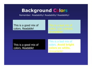
3. Eight design guides including using white space, headings, limiting all caps words, using one or two fonts, justifying margins selectively, putting key items in top/bottom areas, using a grid for unity, and limiting attention-getters.