
Recommended
More Related Content
What's hot
What's hot (20)
Similar to Thriller Film titles analysis
Similar to Thriller Film titles analysis (20)
Recently uploaded
Recently uploaded (20)
Thriller Film titles analysis
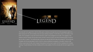
- 1. The movie title ‘I am Legend’ fits in with the thriller genre. It stands out through the use of white typography against the black background, this will immediately draw the viewers attention towards it. The film title is shown in the bottom of the frame, and is arranged in a way that it almost looks like a ‘path’ for the protagonist as he walks. This suggests to the audience that this character will say those words in the film or that he is heroic and will do something great in the film to earn the title of ‘Legend’. This positioning also reinforces the idea that Will Smith plays the protagonist. The film title also correlates with the post-apocalyptic theme of the film, acting as additional iconography to the genre. However, little context is given about the title, which intrigues that audience as they have to watch the film to understand the complete meaning. The gold lettering of the title correlates with the colour palette of the film, and also with the word ‘Legend’ in the title.
- 2. The Purge is a thriller movie. ‘The Purge’ contrasts against the dark background which shows the binary opposition in the narrative – good v bad, god/belief vs the government. The text is in white which allows us to see the title clearer against the face. This also follows the stereotypical colour scheme for thriller movies, black and white. The title is smaller than the face so that it can be the main focus and attention. https://www.slideshare.net/dragonkiller300/analysis-of-thriller-film-posters
- 3. The title is written in a font that gives a chilling feel and that is a conventional font for the genre of horror. It is coloured white to reflect the aspects of ghosts as well as to stand out against the dark black background, and is also presented in a large font for the same purposes. This is the most important piece of text on the poster so it must be seen clearly.
- 4. Largest font dedicated to the image has a frame name of the film as this is the of an old fashioned most important piece of printed picture. This information on the poster. The suggests to the font it is written in suggests audience that the man that it is an action film as it in the picture is either appears to have been quickly being spied on or is written down, and also some wanted by the police psychological aspects could because of his actions be involved as the font is all during the film at some over the place and point. inconsistent.
- 5. The title, ‘Shutter Island,’ obviously relates to the island in the film, revealing the name of the location/setting and suggesting that it is main part/feature of the story. Stands out as it is in bold and red font, making it the only colourful image on the poster. This is done to stick into people’s heads the name of the film. The bold red writing definitely fits in with the thriller genre.
- 6. The posters title 'Black Swan’ is fairly simple and is black to contrast against her pale skin, which makes it effectively stand out to the audience from the disturbing main image above it. It is small, minimalistic and classical- signifying the nature of ballet. However, it connotes that it has a dark, evil meaning behind it which links with the genre psychological horror; this is because of the sharp, thin typography chosen for the title.
- 7. The films title connotes the beginning of something, either an organisation or an operation which involves all the six characters shown in the poster. The title is in colour red, the colour red denotes danger and something bad about to happen. It also makes it stand out from the rest of the poster, as apart from the title only calm and basic colours are used which count in favour of the thriller genre.
- 8. There’s no character in this film that isn’t in danger or who may come into harms way and that is partly what makes the title of the film fitting as called ‘Collateral’ because everybody in this movie feels the damage caused by Vincent in some way. Max has feelings for Annie so he wants to do the most he can to protect her before she become apart of the ‘collateral’ damage that is being inflicted by Vincent.
- 9. A large font is used for the film title. The use of red, dominates the film poster as it draws the viewers attention to that section. The reason for it being bold is because it indicates where the movie will be set. Red also indicates death and danger which gives the audience an insight as to what will occur. The film name itself is in a much larger font size to make it stand out. There is also a comic book like description in the corner of who the actress is and who she is playing
- 10. Secondly, the red of the title suggests danger and warning, as well as blood and malice. This could be seen as challenging to the typical thriller genre. Just like ‘Black Swan’, the colour of red used in the font. Placed in the middle of the poster is the title of ‘The Town’ which is in red and also larger font than the surrounding texts, the connotations that is raised from the title is that having the colour in red may resemble power and dominance. Furthermore, it could also show a sense of bloodshed that may happen in the film, the reason for why it may be blood is because of blood being red itself.