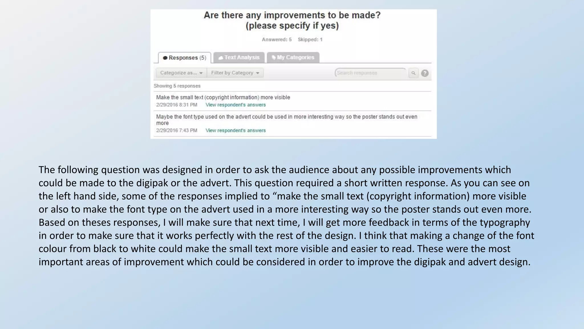
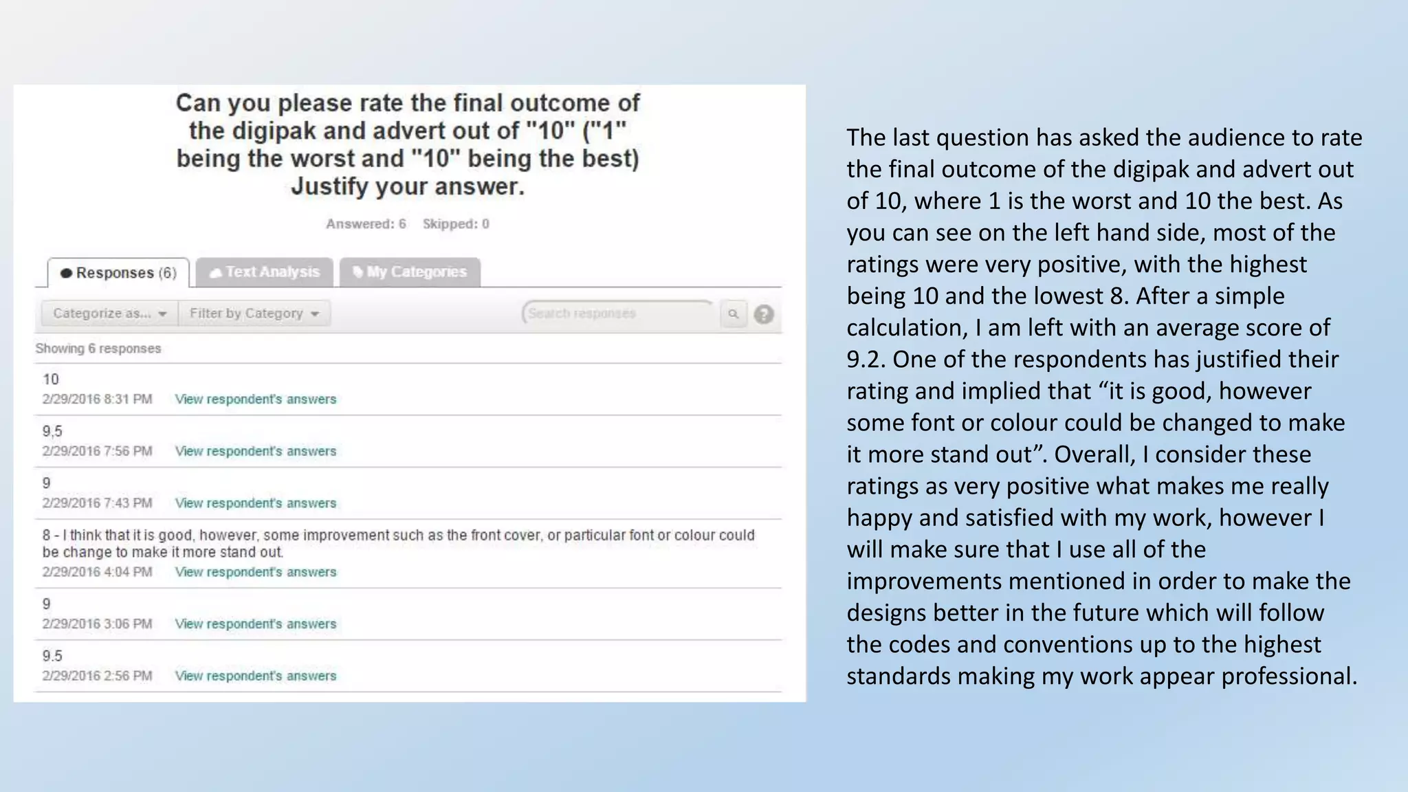
The document summarizes the results of a post-production questionnaire given to respondents about a digipak and advertisement for progressive house music. Key findings include:
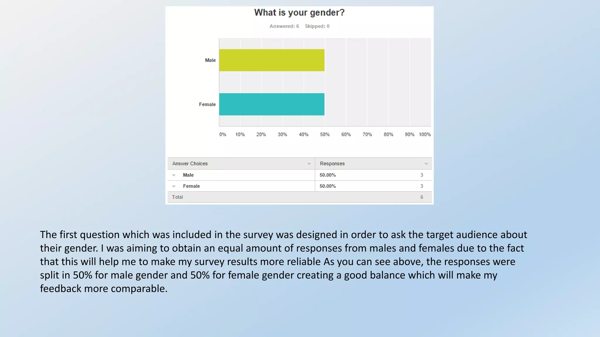
- Respondents were split evenly between male and female.
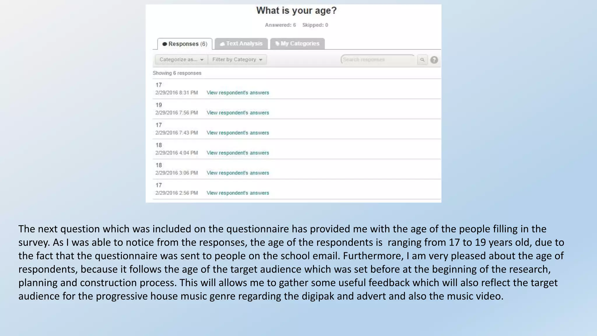
- Ages ranged from 17-19, as the questionnaire was distributed through a school email.
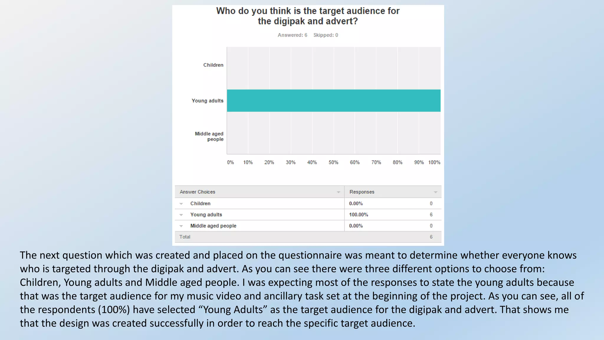
- All respondents correctly identified the target audience as young adults.
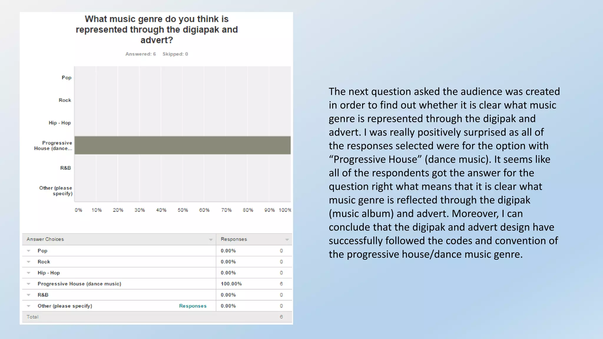
- All respondents correctly identified the music genre as progressive house.
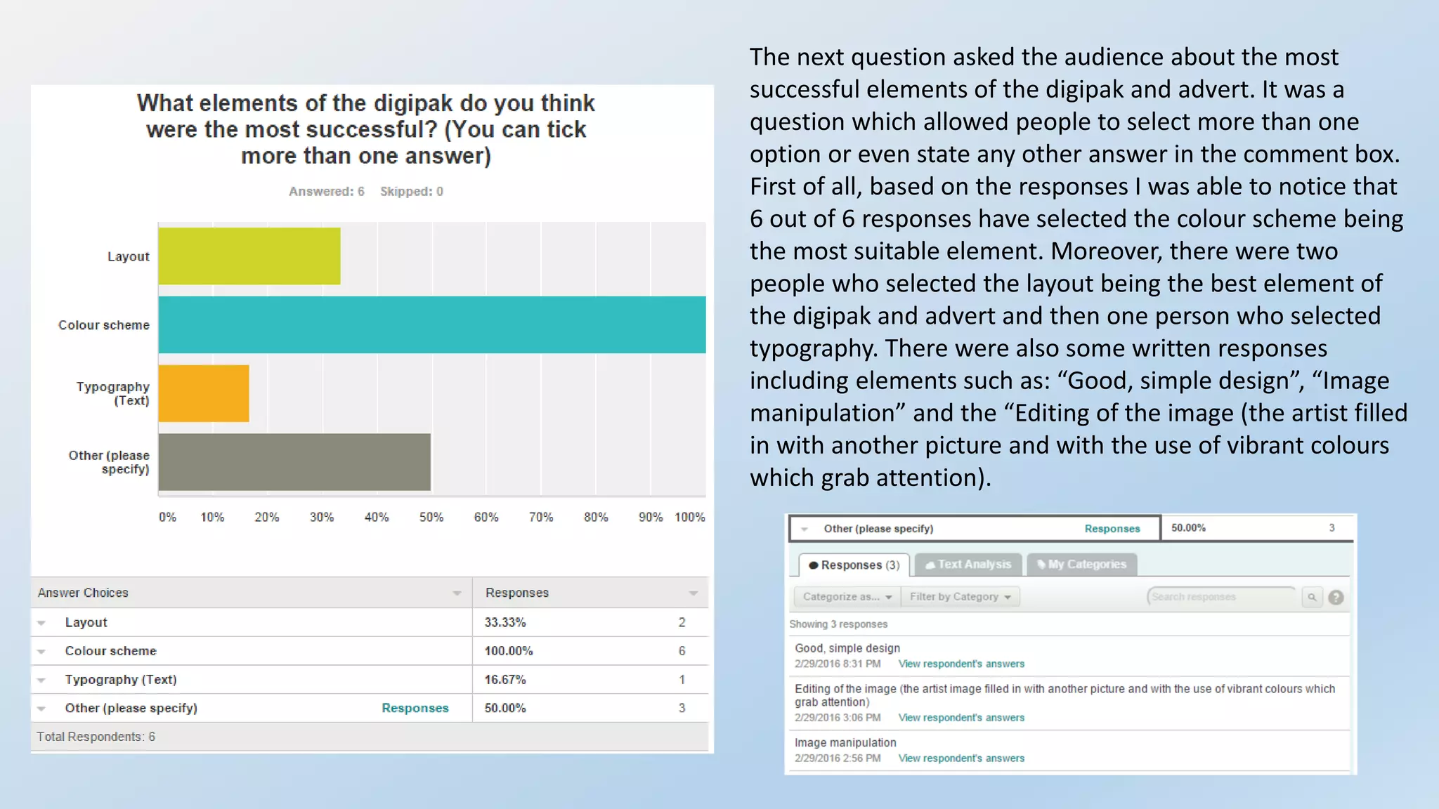
- Color scheme, layout, and typography were most successful design elements.
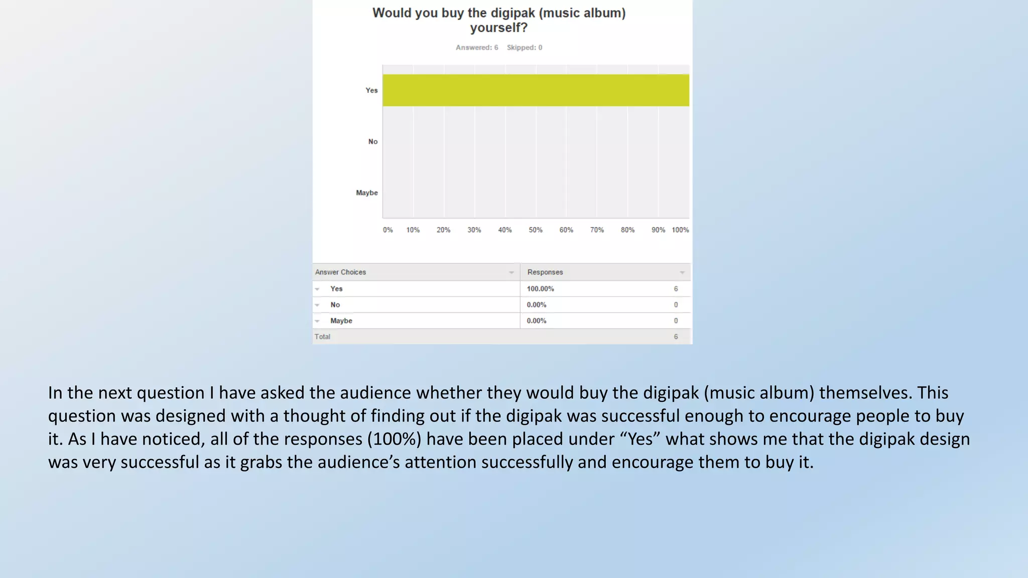
- All respondents said they would buy the digipak.
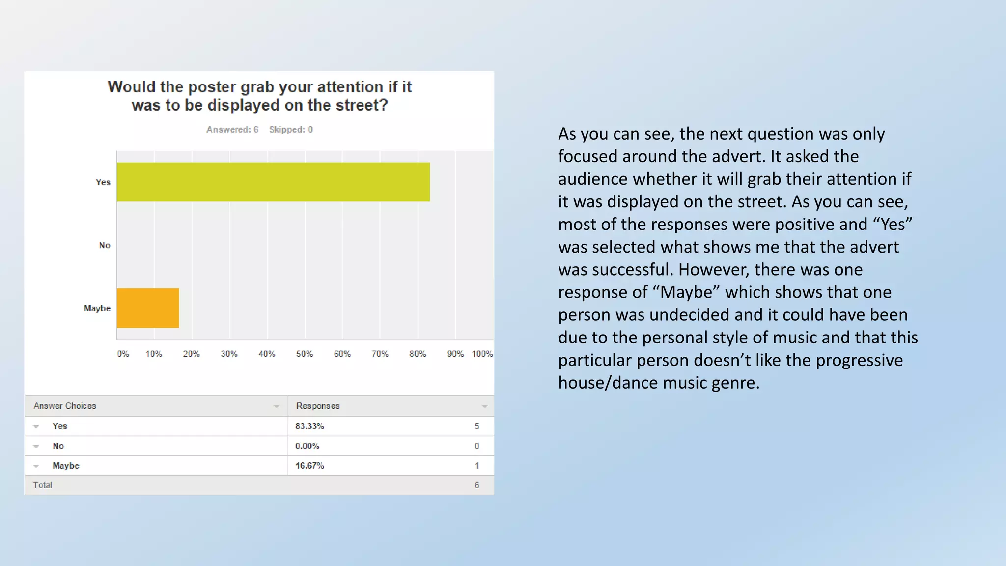
- Most said the ad would grab their attention.
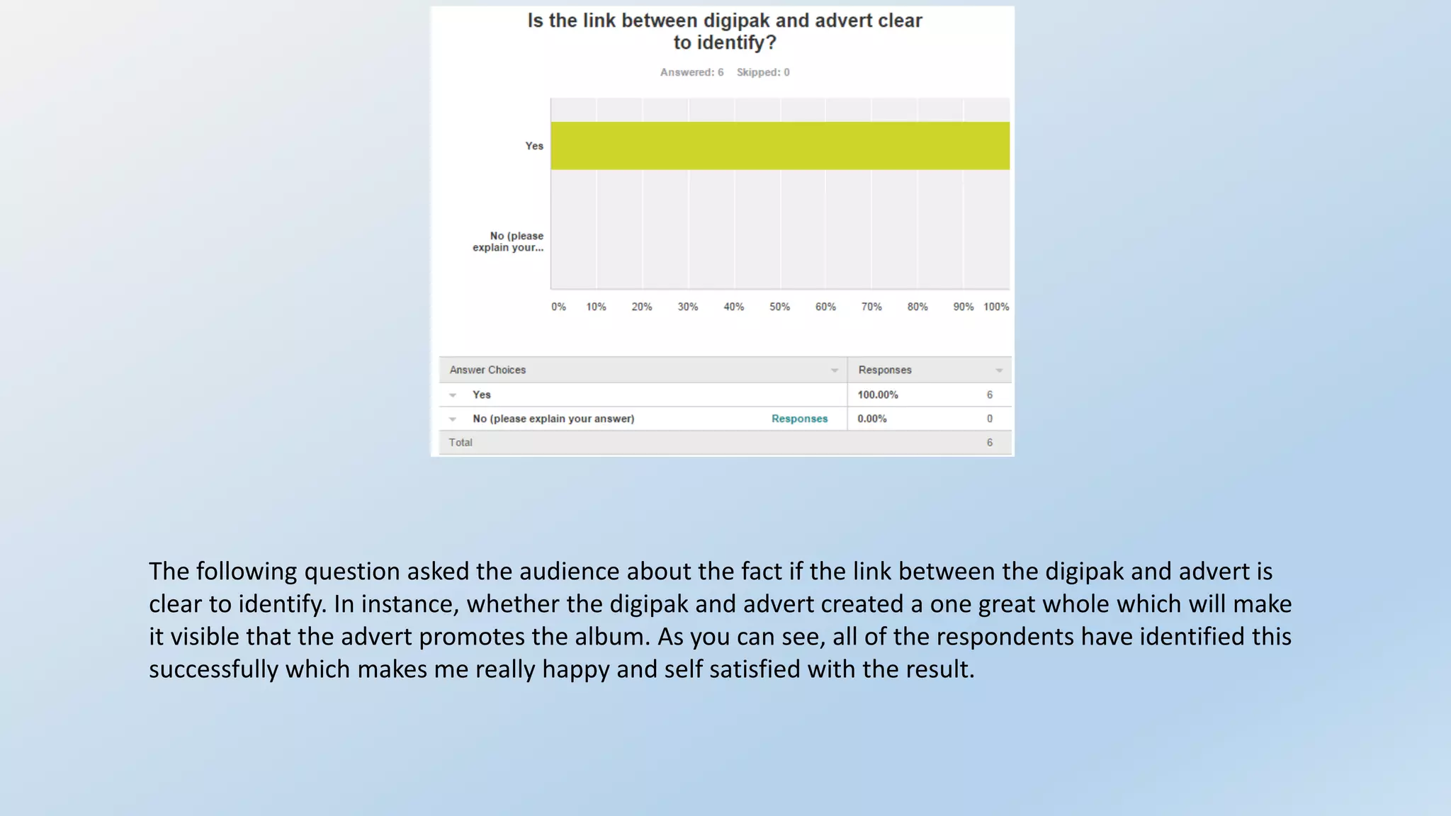
- All saw a clear link between the digipak and ad.