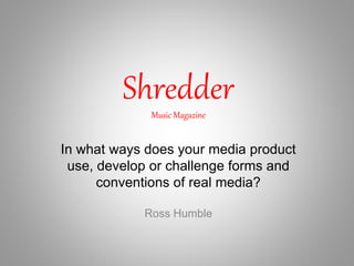
2. Music Magazine Conventions
• Left Third(the way magazines are displayed means if lettering is placed
on the right hand side of the cover it will get seen)
• Plug (advertises something which comes with the issue for example a
free toy in a kids magazine)
• Masthead/Logo (name of the magazine for recognition)
• Top Strip (advertises the contents of the issue)
• Puff (small image or textbox to advertise)
• Main Cover Line (to advertise the main article in the issue)
• Strap Line (quote or short description of the main article)
• Cover Lines (shows the bigger articles included in the issue)
3. Double Page Spread Conventions
Main Image
The main image
is used to both
show the reader
who the article
focuses on and to
show a
recognizable
person which will
attract people to
read on
Pull Quote
The pull quote is a quote taken from the
text and used to entice the reader in to
reading the article
Column
The columns are used to give the text
a clear and streamlined form which is
easy to read
Headline
To show the reader
what the following
page/pages are
featuring
Stand First
To point to the
reader the starting
point of the text
4. Double Page Spread Overview
To make my double page spread look as professional as
Possible I incorporated a few design elements to give the pages
A sleek and simplistic look.
I used black, red and white as my colour scheme because of how
They contrast one another making everything stand out and be
Visible, I also incorporated the black and white style with the
Images which adds a very dramatic and contrasting look, this
Paired with the high key lighting which creates harsh shadows
Adds very much to the feel of the page and fits with the Rock
Genre of music magazine.
The fonts used were done to appear professional so they are mostly easy to read, simplistic, thin and clean looking.
The only exception to this is the red “Stendarr” written at the top of the page as this was an attempt to create a
Rock/Metal band’s logo it had to fit with others of the genre, I researched and took inspiration from logos of bands such
as Metallic, Motorhead, Black Sabbath, Pantera and Iron Maiden and tried to incorporate their bold and thick nature as
well as their edgy and sharp pieces to create that slightly menacing and rough appearance commonplace in the genre.
I decided to give the page a little personality so I added Nordic knots to three corners of the text border and found it
really made the page look unique and interesting, it fits with the band’s Folk/Viking metal style also and just makes the
page stand out and look different without going overboard and cluttering the page.
5. Front Cover Conventions
Masthead/Logo
To create familiarity with
customers and create a logo for
the brand whilst also showing
new audiences the genre of
magazine and house style
Main Image
Used to show the focus of
the issue whilst also using
the fame of the artist on
the cover to encourage
sales
Plug
Used to advertise
something that comes
with the issue in this
case a free CD
Main Cover Line
Advertises the issues
main focus and is
usually paired with
the main image
Cover Lines
Lists off the other
articles within the
issue witch are
noteworthy
Top/Bottom Strip
Used to further advertise the contents of the issue and the other articles featured
Left Third
Where the majority of selling
points should be placed to make
sure they are seen when being
displayed at a retailer
Strap Line
Gives further information for
the main cover line
6. Front Cover Overview
To make my front cover look both professional and fitting of the
rock and metal genre I used certain techniques.
First of all I continued on with the black, white and red motif from
the double page spread to give Shredder a recognizable house
style and to make sure all pages of the issue look connected and
flow together. I did however make the addition of some light grey
fonts to give the page a bit more variety whilst still sticking with
the greyscale motif. I used a border for my magazine to emulate
Metal Hammer magazine and give the cover a bit more of a
professional look. I also used the border to advertise a few
selling points of the issue with big bands listed at the bottom of
the page and a top 100 list along with a free CD featuring the top
15 of that list.
When setting out the page I made sure to show the most
important articles and selling points on the left third of the page
as depending on how the magazine was displayed could be the
only part of the page visible to possible buyers.
7. Contents Page Conventions
Main Image
Shows the magazines main
article (usually linked to the
main image on the cover)
Image of Cover
Shows a scaled down version
of the cover art of the
magazine
Smaller Images
Images not related to the main image or
main selling point of the issue and relate
to something else featured in the issue,
in this case an album cover
Top/Bottom Strip
Just like the ones featured on
magazine covers they
advertise something within
the issue
Contents Numbers
A list of numbered articles or
other content so the reader
can find the page they want
to read quickly
Magazine Logo
To create familiarity with the readers
and the brand
Contents Title
So the reader is aware that they are on the
contents page if it wasn’t already clear to them
8. Contents Page Overview
For the contents page I wanted to make sure that I changed it up a bit
whilst still sticking with the same colour scheme so I decided to use
red as the main colour of the page as it has been used only to
highlight the main black or white in previous pages. This gives the
page familiarity and the same house style whilst also giving it it’s own
personality and unique appearance.
I decided to use a colour image unrelated to the black and white
images used thus far and thought to create an album cover that links
to the “New Band Spotlight” right beside it. I tried to make it stick out
and not be too similar to the house style so I used a bolder and
chunkier font and a vibrant and bright colour palette. This gives the
page and magazine as a whole more variety and gives a stark
contrast from the greyscale images featured already.
I used the same main fonts as used on the cover art to give the two a
connection whilst choosing not to use the fonts from the double page
article to make sure it keeps it’s unique look (like with most double
page articles in magazines).
10. Conclusion
In conclusion I did put my extensive research into the codes and conventions of
music magazines to good use by incorporating the more important (in my
opinion) such as the Left Third, but also using my own skill and experience with
InDesign to create something unique and personally appealing. I attempted to
adhere to the conventions whilst also creating something new, changing things
from the current rock and metal magazines I believe either don’t work or could
be done better.
The use of contrasting but complementing black, white and red colour scheme
may not be used to such the extent as I have but for Shredder I believe it fits
the style and house design, just as the 1950’s looking font on the logo
complements the focus on older and more classic bands and the sharper and
more edgy appearing font gives that tougher exterior metal fans are used to.
Everything was well thought out and picked out to adhere to the codes and
conventions of the music magazine whilst also appealing to the genre of rock
and metal.