Download to read offline


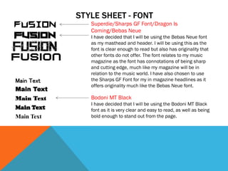
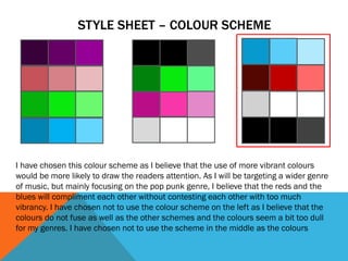
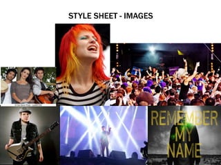
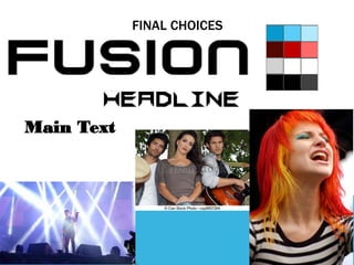

The document discusses font and design choices for a music magazine. It selects the Bebas Neue font for headers due to its clarity and originality. The Sharps GF Font is chosen for in-magazine headlines for similar reasons. Bodoni MT Black is selected for the main text due to its clarity, boldness, and ability to stand out from the page. The color scheme uses reds and blues that complement each other without being too vibrant, as this magazine will feature pop punk and other genres of music. Images are chosen that represent different music scenes and genres through bands, artists, concerts, and TV shows to appeal to the intended audience.


