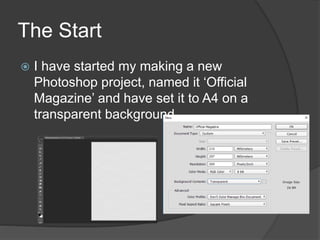
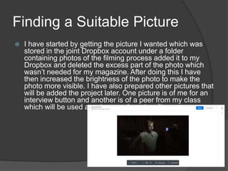
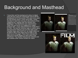
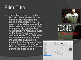
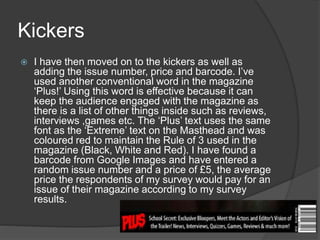
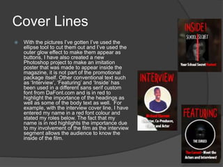
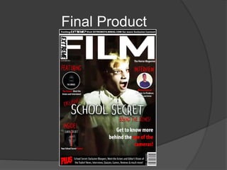
Michael Ekanem
The Start
 I have started my making a new
Photoshop project, named it ‘Official
Magazine’ and have set it to A4 on a
transparent background.
Finding a Suitable Picture
 I have started by getting the picture I wanted which was
stored in the joint Dropbox account under a folder
containing photos of the filming process added it to my
Dropbox and deleted the excess part of the photo which
wasn’t needed for my magazine. After doing this I have
then increased the brightness of the photo to make the
photo more visible. I have also prepared other pictures that
will be added the project later. One picture is of me for an
interview button and another is of a peer from my class
which will be used as a button of another film.
Background and Masthead
 I have then set the background colour to black
using fill and used the rectangular tool to fill the
transparent bit of the screen, this was to be used
for the kickers which I have done later. I have
decided to start from the top to the bottom of the
magazine so I started with the Skyline and
Masthead. The Masthead was inspired from
Total Film and since my magazine is called
Extreme film, I have placed Extreme inside the F
for Film. The font for extreme was a custom sans
serif font from DaFont.com as Film was a pre-
installed Sans serif bold font, its height takes up
at least a fifth of the page and its width is the
same as an A4 page. I have then entered the
date and a small slogan on each side of the
masthead. The skyline features the website and
also teases other online content for users
Before
After
Film Title
 I have then moved on to the
film title, I have placed it in the
middle of the magazine and
added a drop shadow filter to
make it more visible against the
white clothing in the image. We
also added the conventional
words used in a magazine such
as ‘Exclusive!’ and placed it
besides the title. The ‘Exclusive’
text has been coloured in red
and was also given a drop
shadow to make it more visible
against the white clothing as
well, the same was done for the
‘Behind the Scenes’ text.
Kickers
 I have then moved on to the kickers as well as
adding the issue number, price and barcode. I’ve
used another conventional word in the magazine
‘Plus!’ Using this word is effective because it can
keep the audience engaged with the magazine as
there is a list of other things inside such as reviews,
interviews ,games etc. The ‘Plus’ text uses the same
font as the ‘Extreme’ text on the Masthead and was
coloured red to maintain the Rule of 3 used in the
magazine (Black, White and Red). I have found a
barcode from Google Images and have entered a
random issue number and a price of £5, the average
price the respondents of my survey would pay for an
issue of their magazine according to my survey
results.
Cover Lines
 With the pictures I’ve gotten I’ve used the
ellipse tool to cut them out and I’ve used the
outer glow effect to make them appear as
buttons, I have also created a new
Photoshop project to make an imitation
poster that was made to appear inside the
magazine, it is not part of the promotional
package itself. Other conventional text such
as ‘Interview’, ‘Featuring’ and ‘Inside’ has
been used in a different sans serif custom
font from DaFont.com and is in red to
highlight the importance of the headings as
well as some of the body text as well. For
example, with the interview cover line, I have
entered my name in a red font colour and
stated my roles below. The fact that my
name is in red highlights the importance due
to my involvement of the film as the interview
segment allows the audience to know the
inside of the film.
Final Product

Photoshop construction process

  • 1.
  • 2.
    The Start  Ihave started my making a new Photoshop project, named it ‘Official Magazine’ and have set it to A4 on a transparent background.
  • 3.
    Finding a SuitablePicture  I have started by getting the picture I wanted which was stored in the joint Dropbox account under a folder containing photos of the filming process added it to my Dropbox and deleted the excess part of the photo which wasn’t needed for my magazine. After doing this I have then increased the brightness of the photo to make the photo more visible. I have also prepared other pictures that will be added the project later. One picture is of me for an interview button and another is of a peer from my class which will be used as a button of another film.
  • 4.
    Background and Masthead I have then set the background colour to black using fill and used the rectangular tool to fill the transparent bit of the screen, this was to be used for the kickers which I have done later. I have decided to start from the top to the bottom of the magazine so I started with the Skyline and Masthead. The Masthead was inspired from Total Film and since my magazine is called Extreme film, I have placed Extreme inside the F for Film. The font for extreme was a custom sans serif font from DaFont.com as Film was a pre- installed Sans serif bold font, its height takes up at least a fifth of the page and its width is the same as an A4 page. I have then entered the date and a small slogan on each side of the masthead. The skyline features the website and also teases other online content for users Before After
  • 5.
    Film Title  Ihave then moved on to the film title, I have placed it in the middle of the magazine and added a drop shadow filter to make it more visible against the white clothing in the image. We also added the conventional words used in a magazine such as ‘Exclusive!’ and placed it besides the title. The ‘Exclusive’ text has been coloured in red and was also given a drop shadow to make it more visible against the white clothing as well, the same was done for the ‘Behind the Scenes’ text.
  • 6.
    Kickers  I havethen moved on to the kickers as well as adding the issue number, price and barcode. I’ve used another conventional word in the magazine ‘Plus!’ Using this word is effective because it can keep the audience engaged with the magazine as there is a list of other things inside such as reviews, interviews ,games etc. The ‘Plus’ text uses the same font as the ‘Extreme’ text on the Masthead and was coloured red to maintain the Rule of 3 used in the magazine (Black, White and Red). I have found a barcode from Google Images and have entered a random issue number and a price of £5, the average price the respondents of my survey would pay for an issue of their magazine according to my survey results.
  • 7.
    Cover Lines  Withthe pictures I’ve gotten I’ve used the ellipse tool to cut them out and I’ve used the outer glow effect to make them appear as buttons, I have also created a new Photoshop project to make an imitation poster that was made to appear inside the magazine, it is not part of the promotional package itself. Other conventional text such as ‘Interview’, ‘Featuring’ and ‘Inside’ has been used in a different sans serif custom font from DaFont.com and is in red to highlight the importance of the headings as well as some of the body text as well. For example, with the interview cover line, I have entered my name in a red font colour and stated my roles below. The fact that my name is in red highlights the importance due to my involvement of the film as the interview segment allows the audience to know the inside of the film.
  • 8.