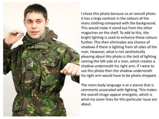
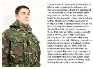
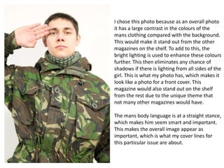
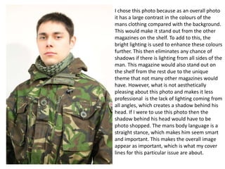
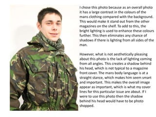
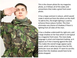
Cover 1 selection
Danny Sutch
I chose this photo because as an overall photo
it has a large contrast in the colours of the
mans clothing compared with the background.
This would make it stand out from the other
magazines on the shelf. To add to this, the
bright lighting is used to enhance these colours
further. This then eliminates any chance of
shadows if there is lighting from all sides of the
man. However, what is not aesthetically
pleasing about this photo is the lack of lighting
coming the left side of a man, which creates a
shadow underneath his right arm. If I were to
use this photo then the shadow underneath
his right arm would have to be photo shopped.
The mans body language is at a stance that is
commonly associated with fighting. This makes
the overall image appear energetic, which is
what my cover lines for this particular issue are
about.
I chose this photo because as an overall photo
it has a large contrast in the colours of the
mans clothing compared with the background.
This would make it stand out from the other
magazines on the shelf. To add to this, the
bright lighting is used to enhance these colours
further. This then eliminates any chance of
shadows if there is lighting from all sides of the
man. This magazine would also stand out on
the shelf from the rest due to the unique
theme that not many other magazines would
have. However, what is not aesthetically
pleasing about this photo and makes it less
professional is the lack of lighting coming from
all angles, which creates a shadow behind his
head. If I were to use this photo then the
shadow behind his head would have to be
photo shopped. The mans body language is a
straight stance, which makes him seem smart
and important. This makes the overall image
appear as important, which is what my cover
lines for this particular issue are about.
I chose this photo because as an overall photo
it has a large contrast in the colours of the
mans clothing compared with the background.
This would make it stand out from the other
magazines on the shelf. To add to this, the
bright lighting is used to enhance these colours
further. This then eliminates any chance of
shadows if there is lighting from all sides of the
girl. This is what my photo has, which makes it
look like a photo for a front cover. This
magazine would also stand out on the shelf
from the rest due to the unique theme that
not many other magazines would have.
The mans body language is at a straight stance,
which makes him seem smart and important.
This makes the overall image appear as
important, which is what my cover lines for
this particular issue are about.
I chose this photo because as an overall photo
it has a large contrast in the colours of the
mans clothing compared with the background.
This would make it stand out from the other
magazines on the shelf. To add to this, the
bright lighting is used to enhance these colours
further. This then eliminates any chance of
shadows if there is lighting from all sides of the
man. This magazine would also stand out on
the shelf from the rest due to the unique
theme that not many other magazines would
have. However, what is not aesthetically
pleasing about this photo and makes it less
professional is the lack of lighting coming from
all angles, which creates a shadow behind his
head. If I were to use this photo then the
shadow behind his head would have to be
photo shopped. The mans body language is a
straight stance, which makes him seem smart
and important. This makes the overall image
appear as important, which is what my cover
lines for this particular issue are about.
I chose this photo because as an overall photo
it has a large contrast in the colours of the
mans clothing compared with the background.
This would make it stand out from the other
magazines on the shelf. To add to this, the
bright lighting is used to enhance these colours
further. This then eliminates any chance of
shadows if there is lighting from all sides of the
man.
However, what is not aesthetically pleasing
about this photo is the lack of lighting coming
from all angles. This creates a shadow behind
his head, which is not typical to a magazine
front cover. The mans body language is at a
straight stance, which makes him seem smart
and important. This makes the overall image
appear as important, which is what my cover
lines for this particular issue are about. If I
were to use this photo then the shadow
behind his head would have to be photo
shopped.
This is the chosen photo for my magazine
photo, as it follows all of the codes and
conventions that make a great front cover
photo.
It has a large contrast in colours, which would
make it stand out from the others on the shelf.
To add to this, the bright lighting is used to
enhance these colours further. This then
eliminates any chance of shadows if there is
lighting from all sides of the man.
It has a shadow underneath his right arm, and
a large shadow on her face which is not typical
to a magazine front cover. The mans body
language is smart and important looking, as it
appears as if she is leaning against the wall.
This makes the overall image appear quite
smart, which is what my cover lines for this
particular issue are about. If I were to use this
photo then the shadows would have to be
photo shopped.

Cover 1 selection

  • 1.
  • 2.
    I chose thisphoto because as an overall photo it has a large contrast in the colours of the mans clothing compared with the background. This would make it stand out from the other magazines on the shelf. To add to this, the bright lighting is used to enhance these colours further. This then eliminates any chance of shadows if there is lighting from all sides of the man. However, what is not aesthetically pleasing about this photo is the lack of lighting coming the left side of a man, which creates a shadow underneath his right arm. If I were to use this photo then the shadow underneath his right arm would have to be photo shopped. The mans body language is at a stance that is commonly associated with fighting. This makes the overall image appear energetic, which is what my cover lines for this particular issue are about.
  • 3.
    I chose thisphoto because as an overall photo it has a large contrast in the colours of the mans clothing compared with the background. This would make it stand out from the other magazines on the shelf. To add to this, the bright lighting is used to enhance these colours further. This then eliminates any chance of shadows if there is lighting from all sides of the man. This magazine would also stand out on the shelf from the rest due to the unique theme that not many other magazines would have. However, what is not aesthetically pleasing about this photo and makes it less professional is the lack of lighting coming from all angles, which creates a shadow behind his head. If I were to use this photo then the shadow behind his head would have to be photo shopped. The mans body language is a straight stance, which makes him seem smart and important. This makes the overall image appear as important, which is what my cover lines for this particular issue are about.
  • 4.
    I chose thisphoto because as an overall photo it has a large contrast in the colours of the mans clothing compared with the background. This would make it stand out from the other magazines on the shelf. To add to this, the bright lighting is used to enhance these colours further. This then eliminates any chance of shadows if there is lighting from all sides of the girl. This is what my photo has, which makes it look like a photo for a front cover. This magazine would also stand out on the shelf from the rest due to the unique theme that not many other magazines would have. The mans body language is at a straight stance, which makes him seem smart and important. This makes the overall image appear as important, which is what my cover lines for this particular issue are about.
  • 5.
    I chose thisphoto because as an overall photo it has a large contrast in the colours of the mans clothing compared with the background. This would make it stand out from the other magazines on the shelf. To add to this, the bright lighting is used to enhance these colours further. This then eliminates any chance of shadows if there is lighting from all sides of the man. This magazine would also stand out on the shelf from the rest due to the unique theme that not many other magazines would have. However, what is not aesthetically pleasing about this photo and makes it less professional is the lack of lighting coming from all angles, which creates a shadow behind his head. If I were to use this photo then the shadow behind his head would have to be photo shopped. The mans body language is a straight stance, which makes him seem smart and important. This makes the overall image appear as important, which is what my cover lines for this particular issue are about.
  • 6.
    I chose thisphoto because as an overall photo it has a large contrast in the colours of the mans clothing compared with the background. This would make it stand out from the other magazines on the shelf. To add to this, the bright lighting is used to enhance these colours further. This then eliminates any chance of shadows if there is lighting from all sides of the man. However, what is not aesthetically pleasing about this photo is the lack of lighting coming from all angles. This creates a shadow behind his head, which is not typical to a magazine front cover. The mans body language is at a straight stance, which makes him seem smart and important. This makes the overall image appear as important, which is what my cover lines for this particular issue are about. If I were to use this photo then the shadow behind his head would have to be photo shopped.
  • 7.
    This is thechosen photo for my magazine photo, as it follows all of the codes and conventions that make a great front cover photo. It has a large contrast in colours, which would make it stand out from the others on the shelf. To add to this, the bright lighting is used to enhance these colours further. This then eliminates any chance of shadows if there is lighting from all sides of the man. It has a shadow underneath his right arm, and a large shadow on her face which is not typical to a magazine front cover. The mans body language is smart and important looking, as it appears as if she is leaning against the wall. This makes the overall image appear quite smart, which is what my cover lines for this particular issue are about. If I were to use this photo then the shadows would have to be photo shopped.