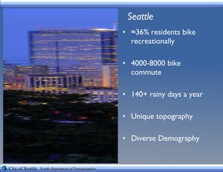
- Seattle has a high rate of biking with 36% of residents biking recreationally and 4000-8000 commuting by bike each year despite 140+ rainy days.
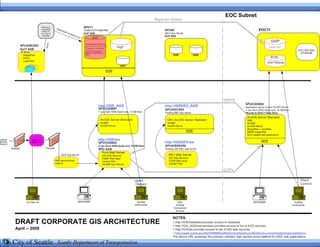
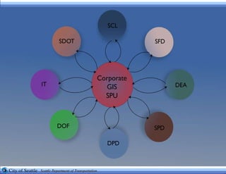
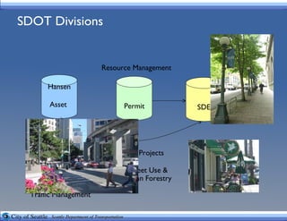
- Seattle DOT has been using GIS for 18 years to manage infrastructure and plan bike and pedestrian improvements.
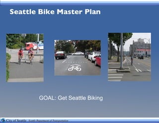
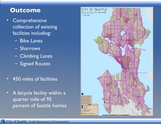
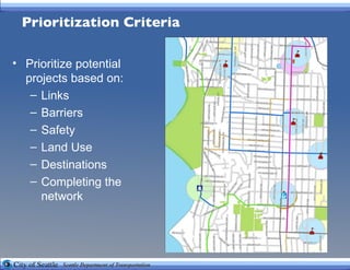
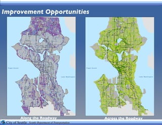
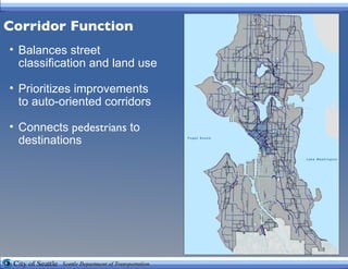
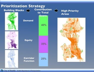
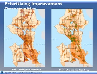
- The Bike Master Plan aims to get more people biking through developing a network of bike lanes, sharrows, and routes covering 450 miles and within 0.25 miles of 95% of homes.
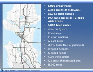
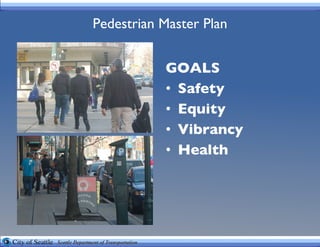
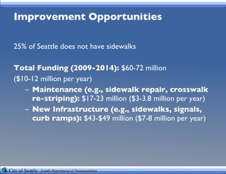
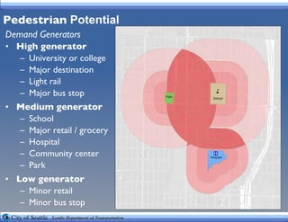
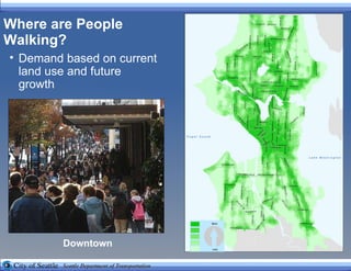
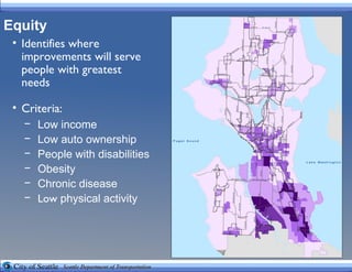
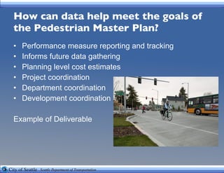
- The Pedestrian Master Plan aims for safety, equity, vibrancy and health through improving sidewalk coverage, crosswalks, and prioritizing high pedestrian areas and those serving low-income communities.


![Questions? Chad Lynch Seattle Department of Transportation Policy and Planning [email_address] Amalia Leighton SvR Design Company Civil Engineer [email_address]](https://image.slidesharecdn.com/peerexchange-100701193222-phpapp02/85/Peer-exchange-23-320.jpg)


![[Urban transportation policy program]city paper presentation shiraz](https://cdn.slidesharecdn.com/ss_thumbnails/urbantransportationpolicyprogramcitypaperpresentationshiraz-160407024255-thumbnail.jpg?width=640&height=640&fit=bounds)


