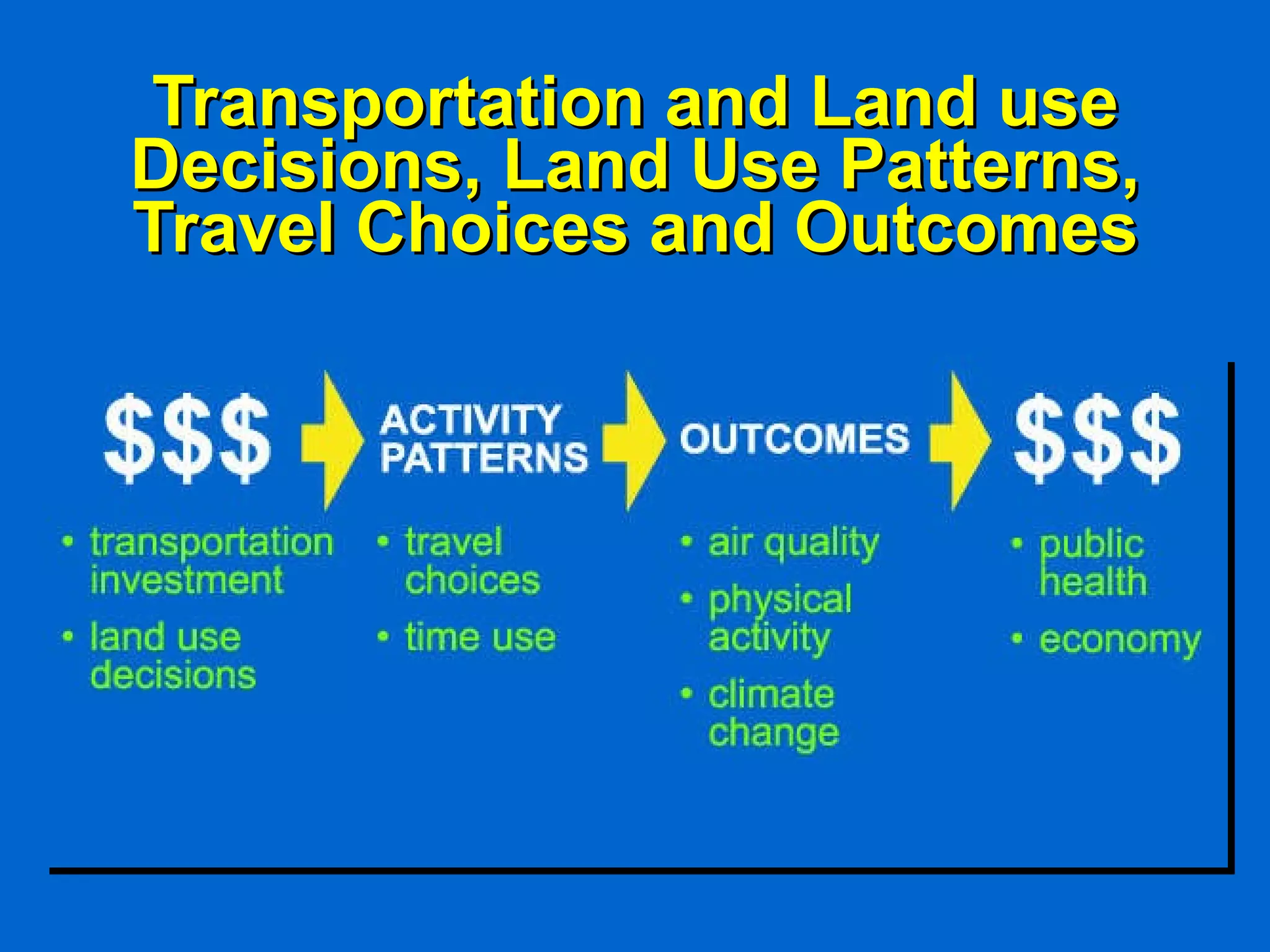
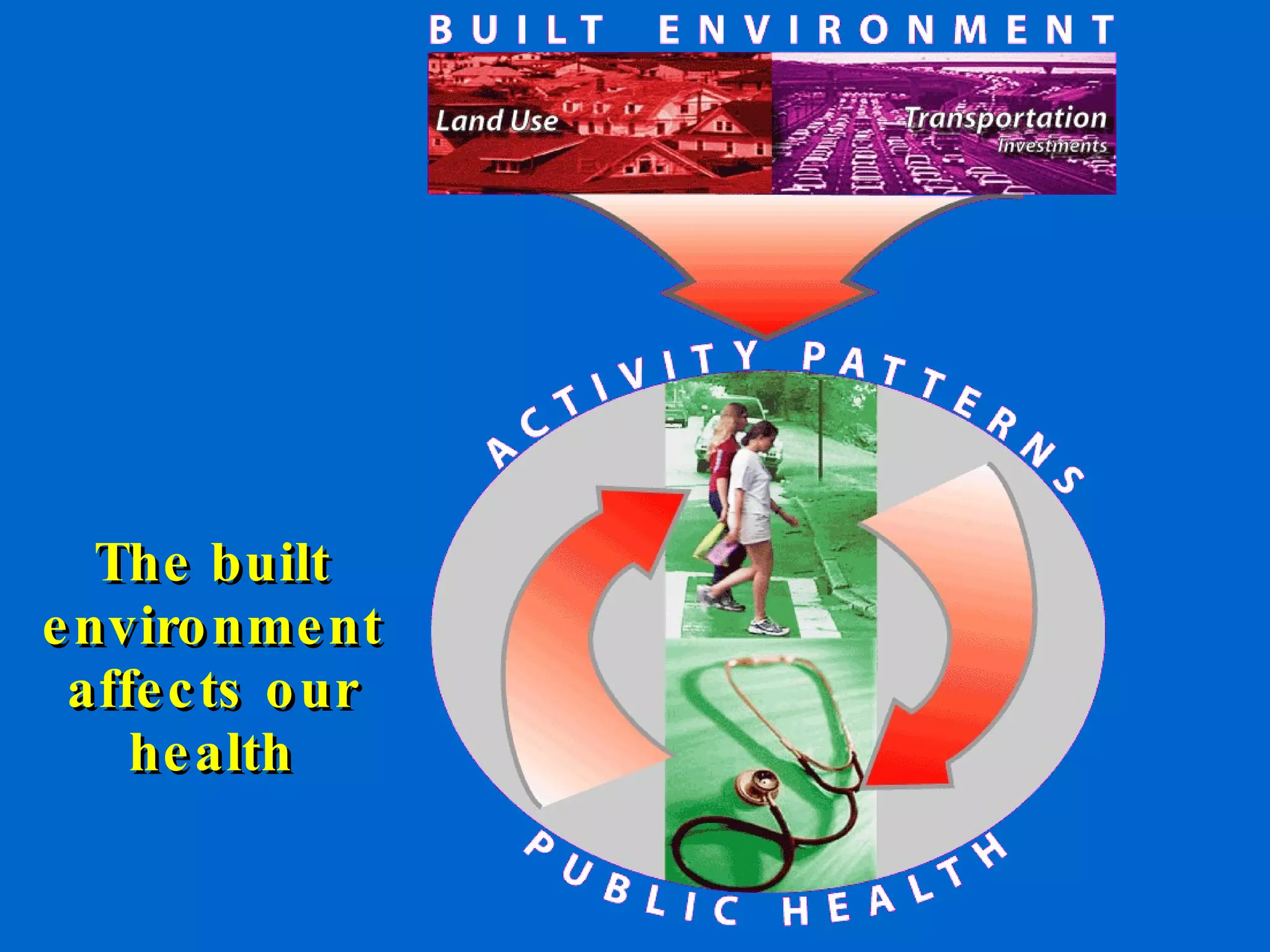
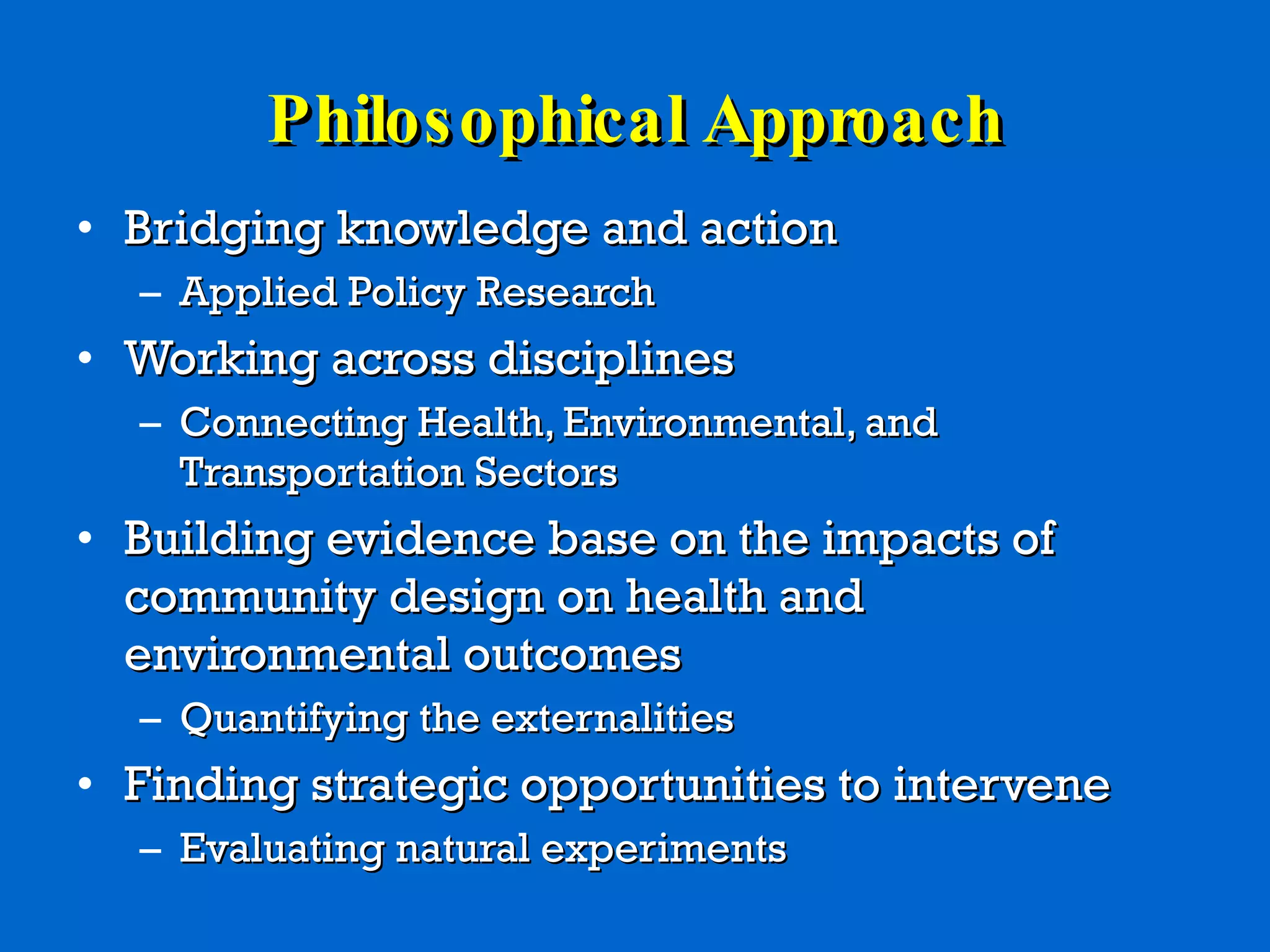
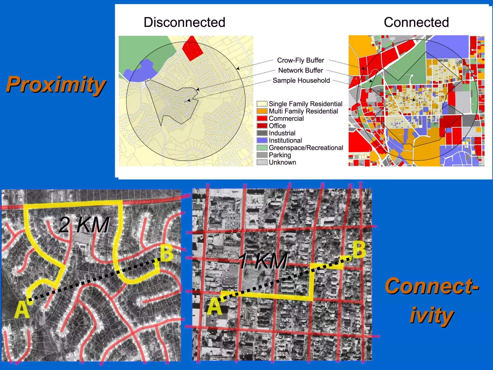
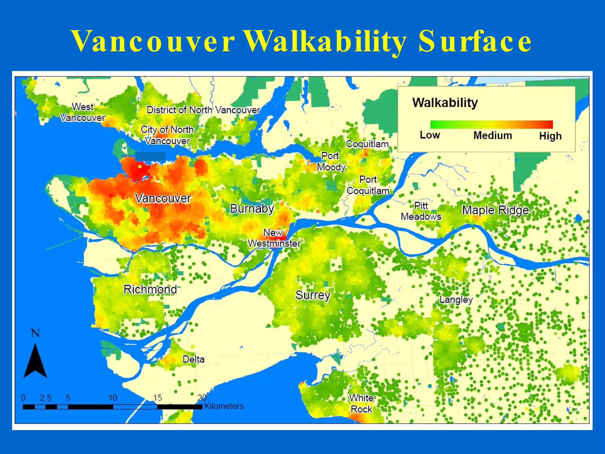
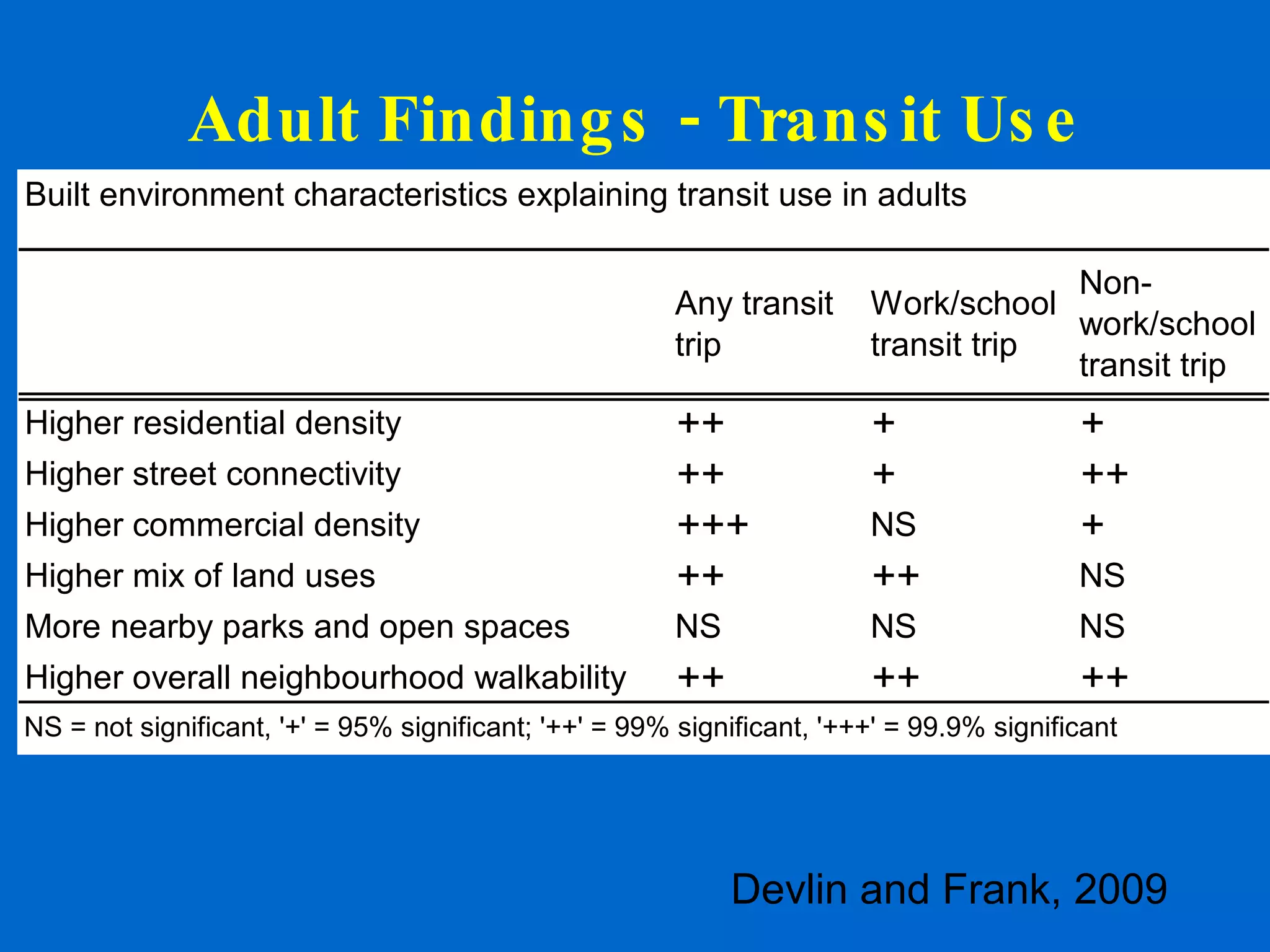
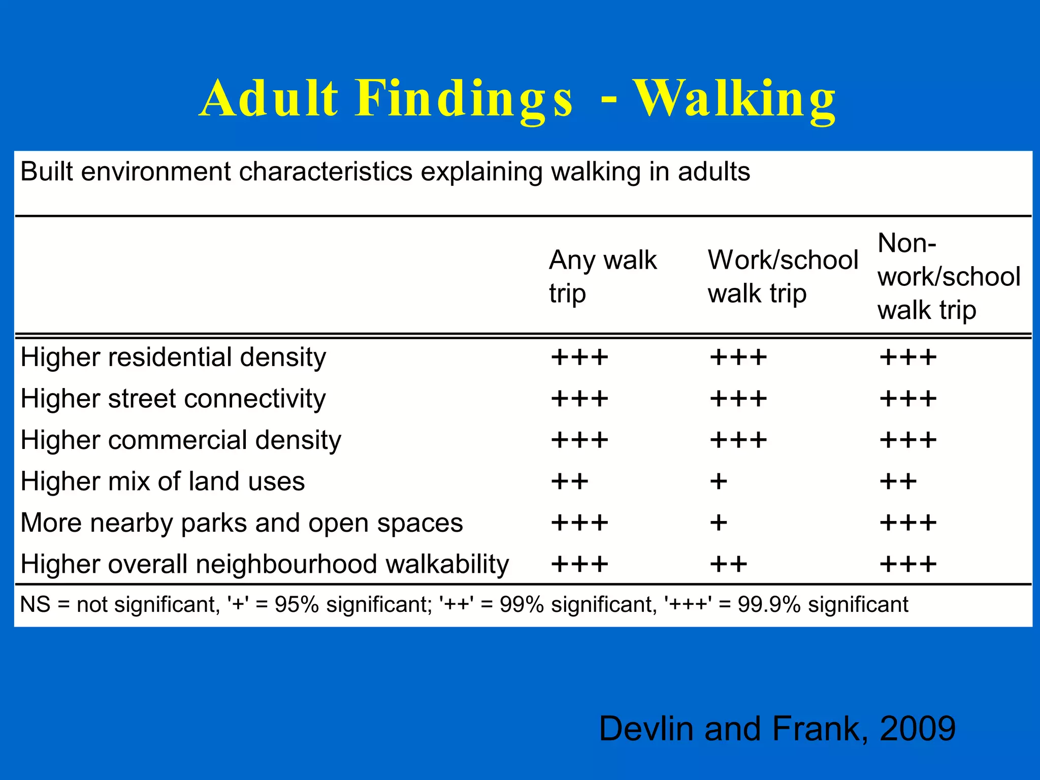
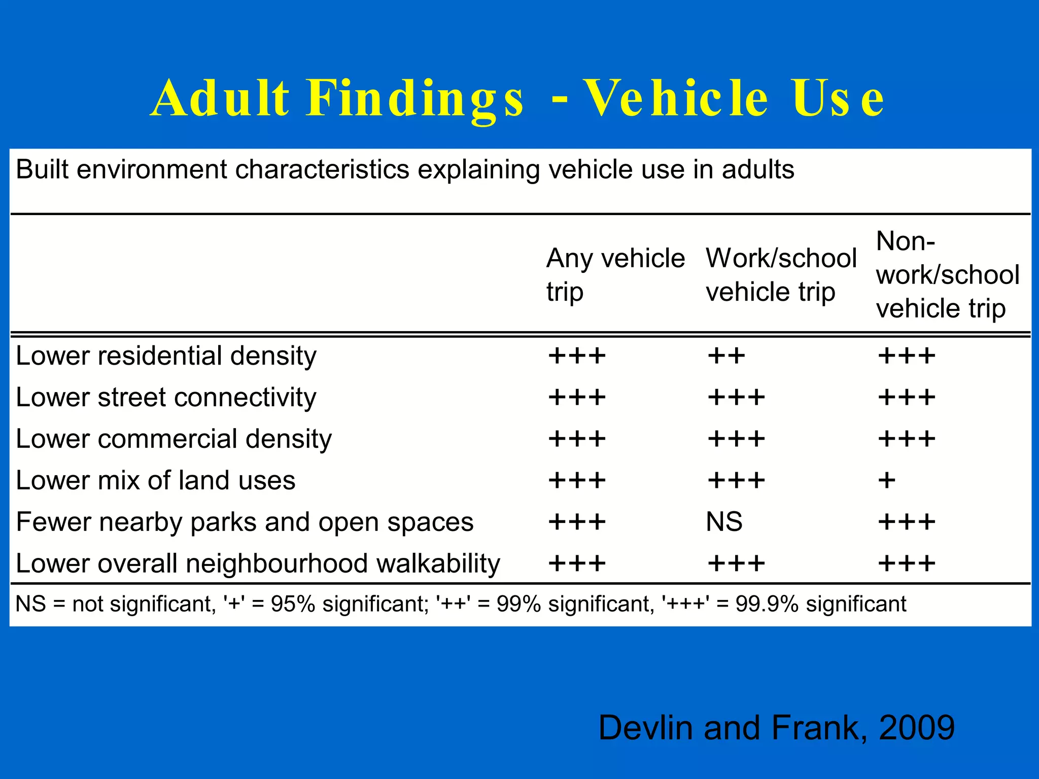
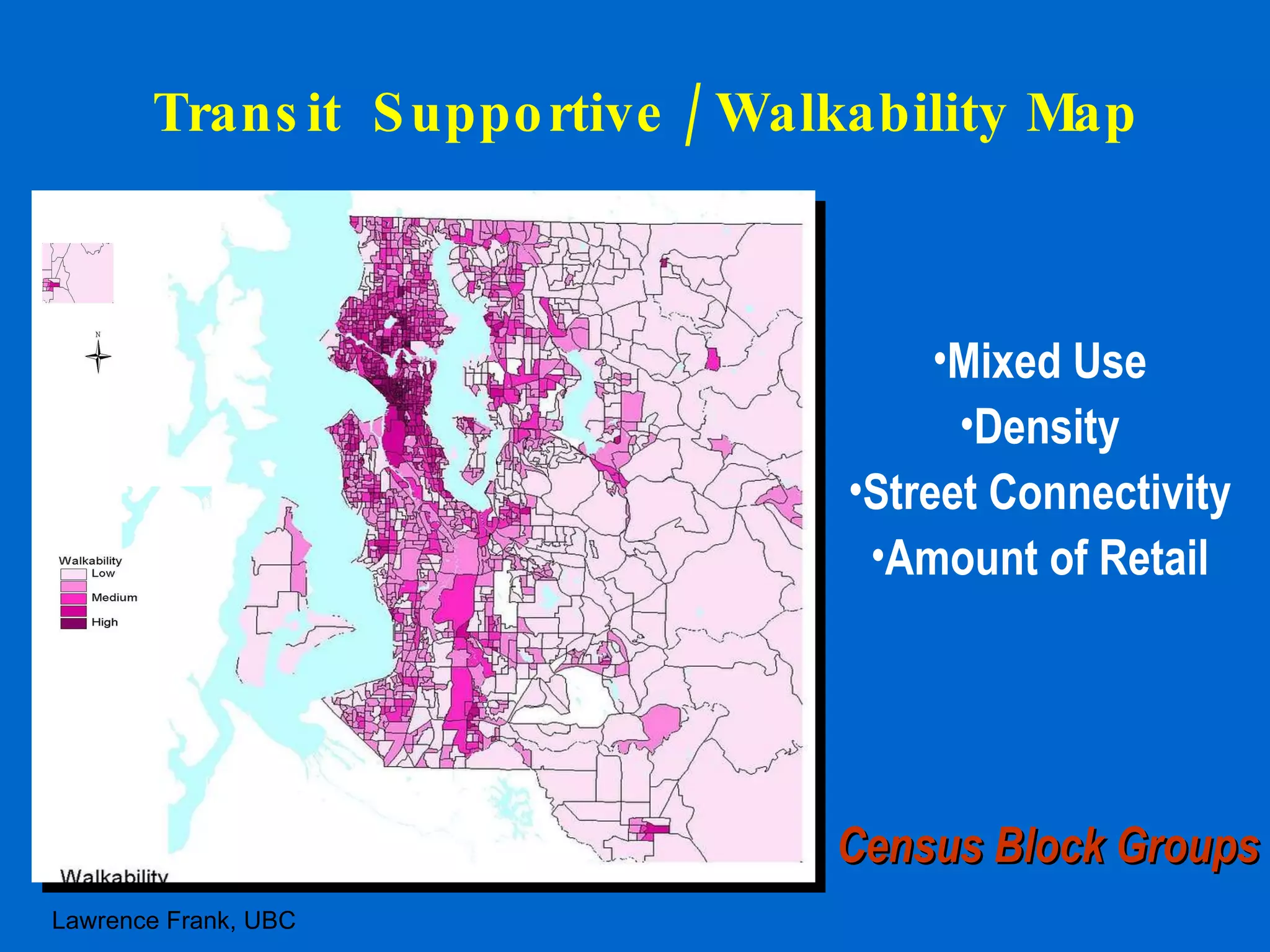
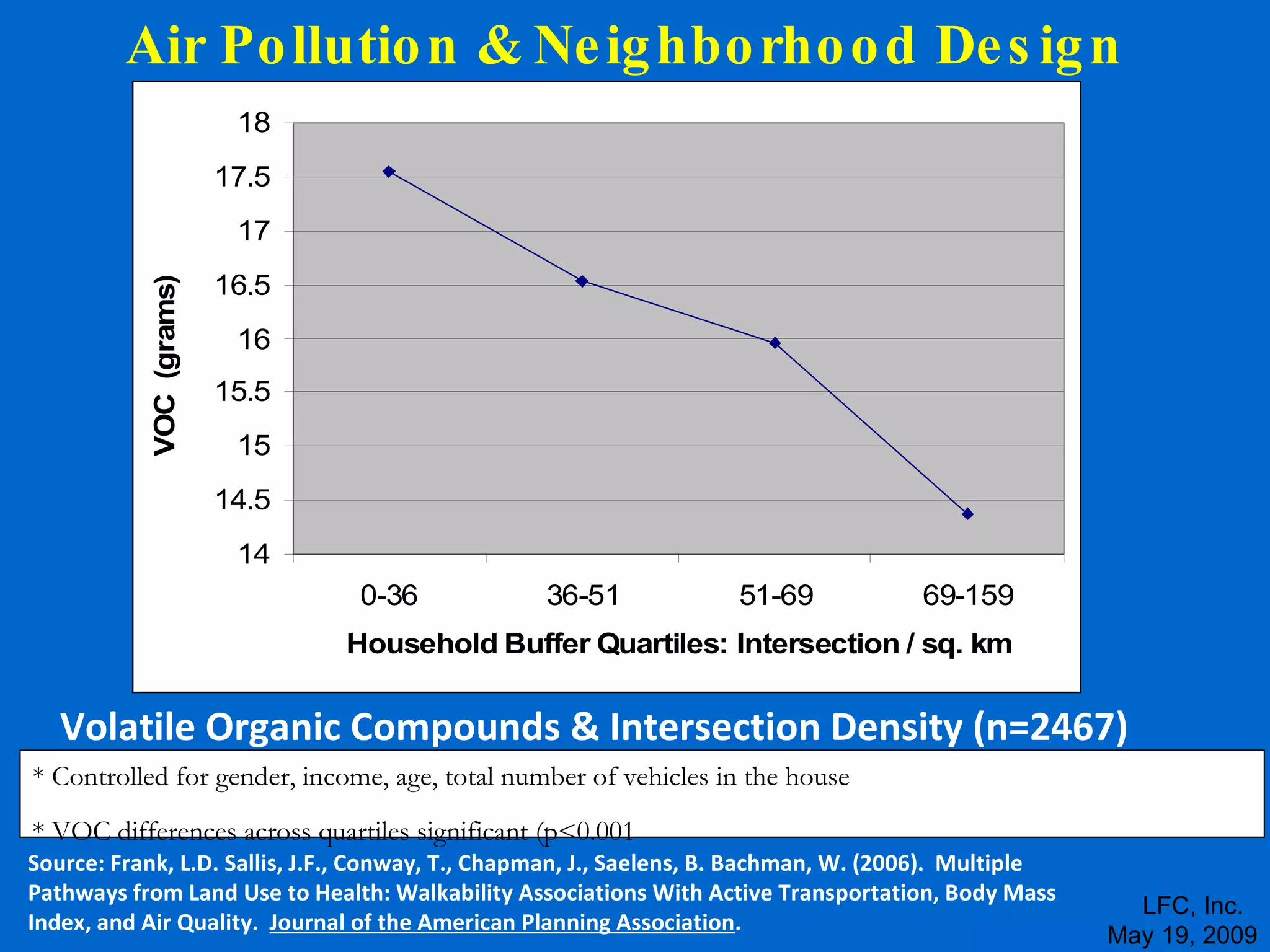
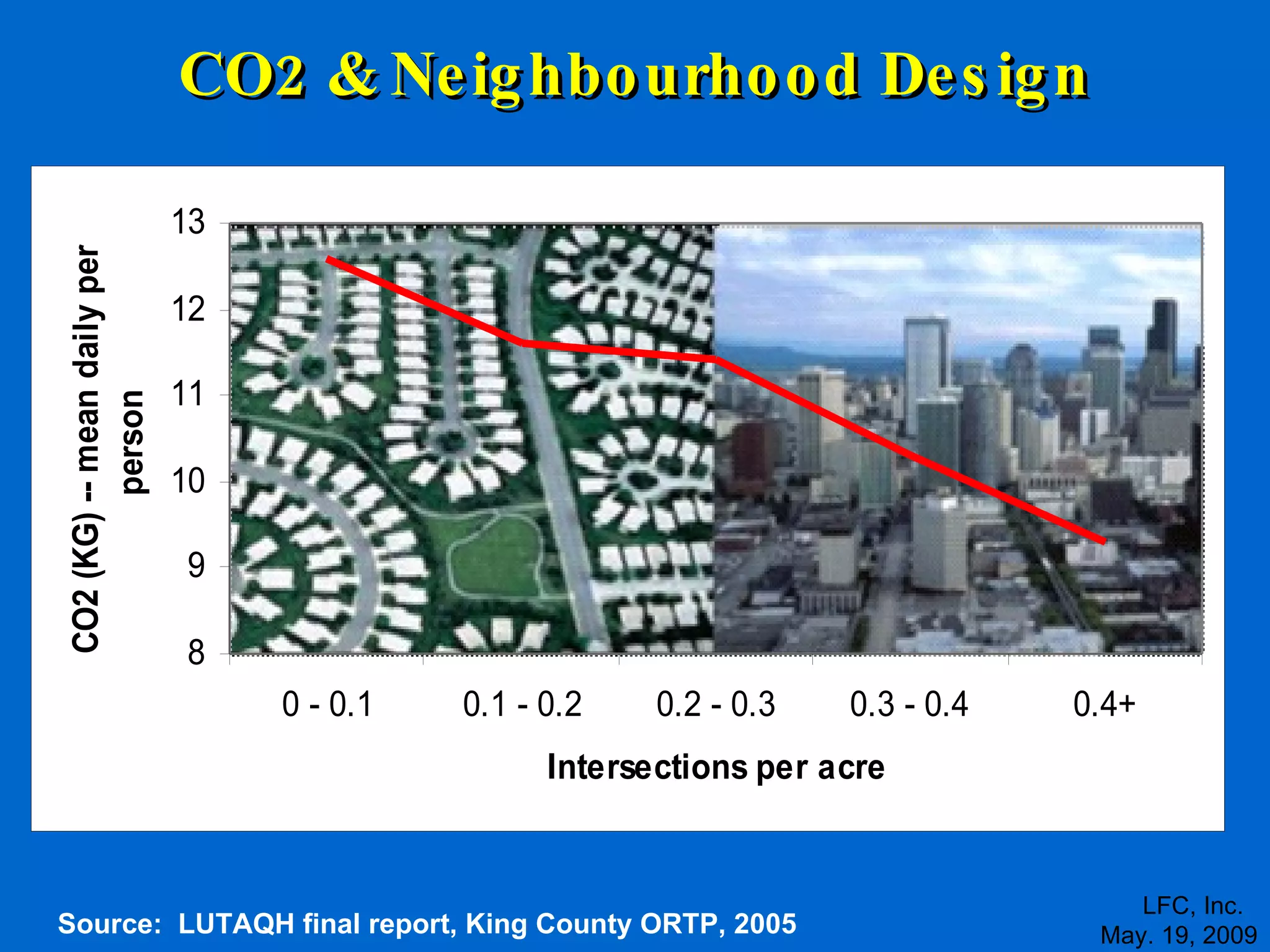
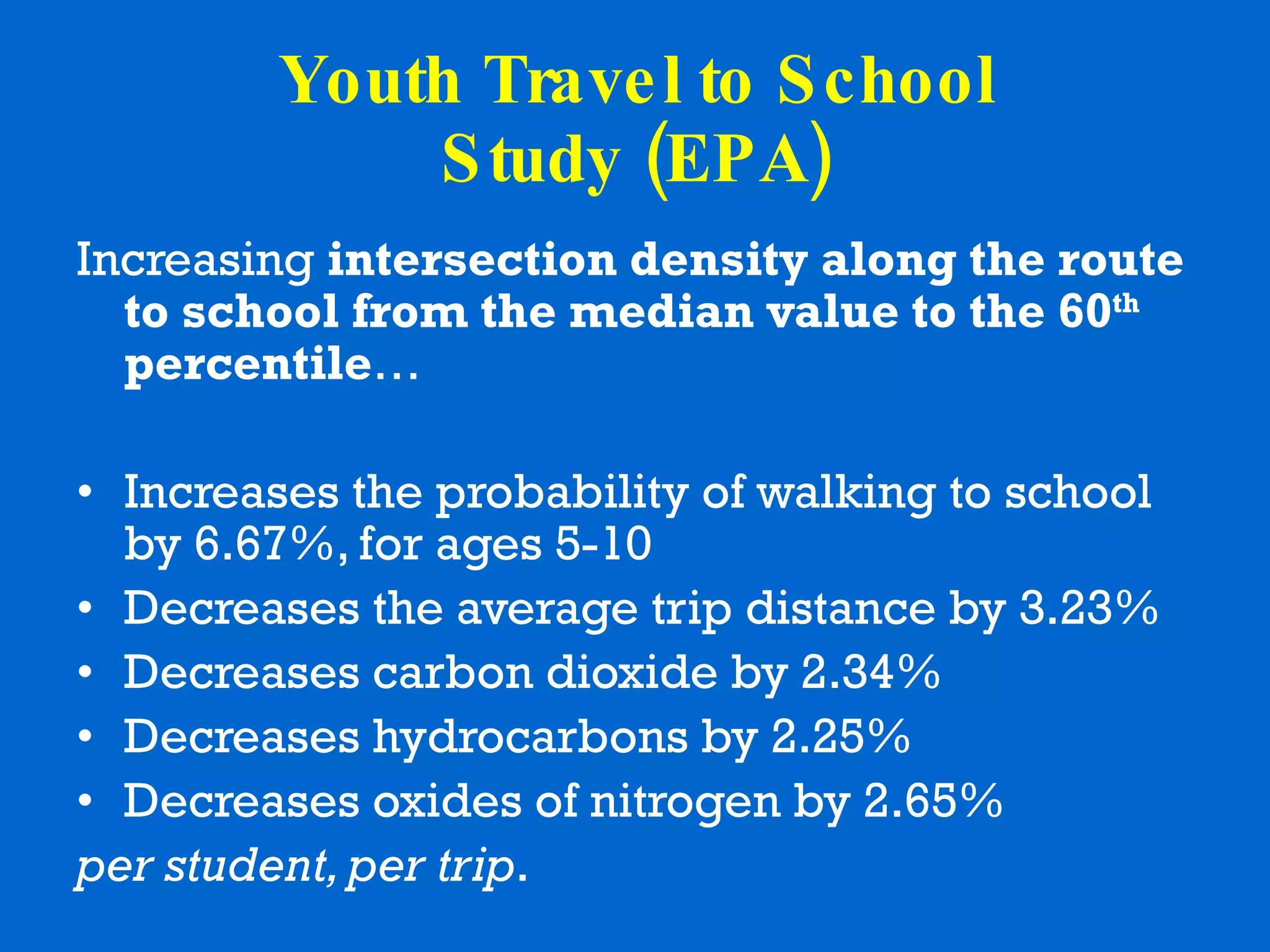
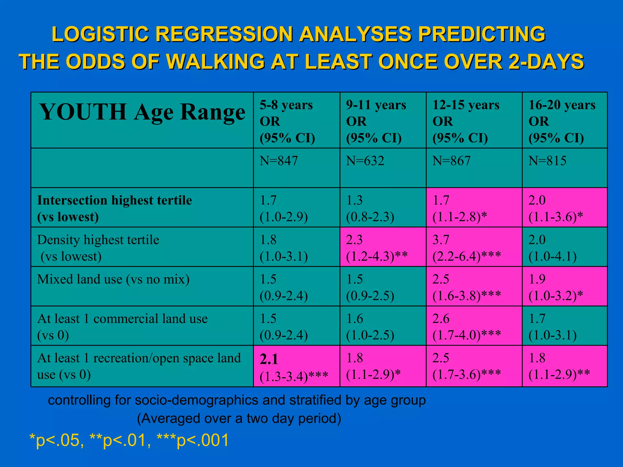
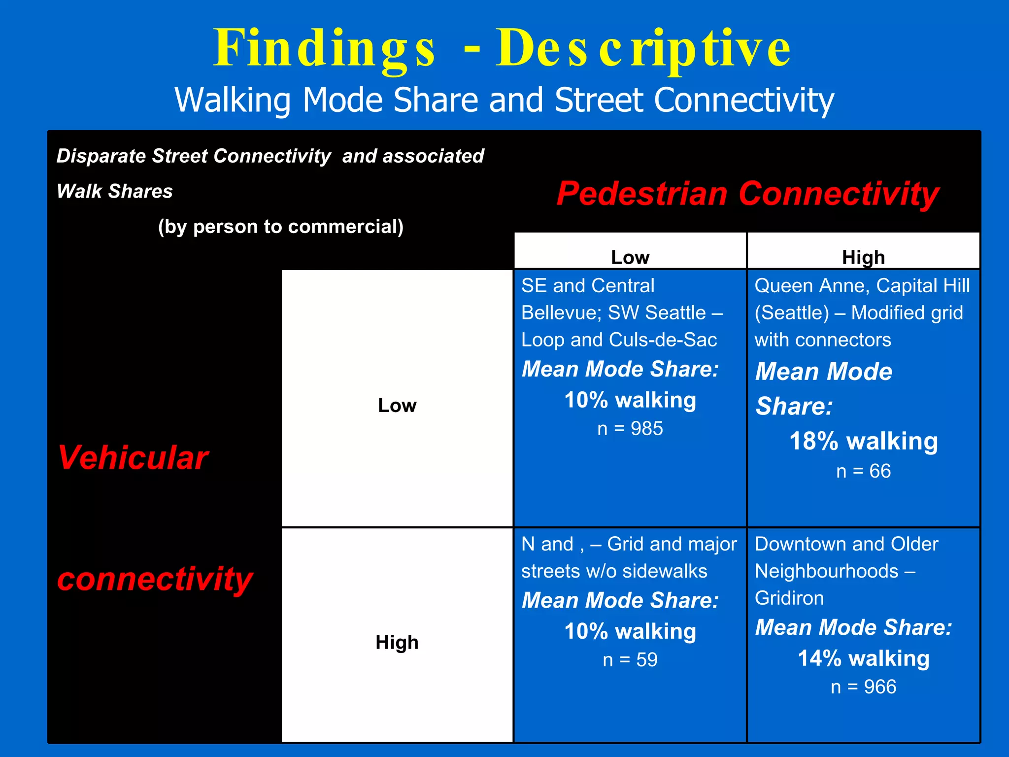
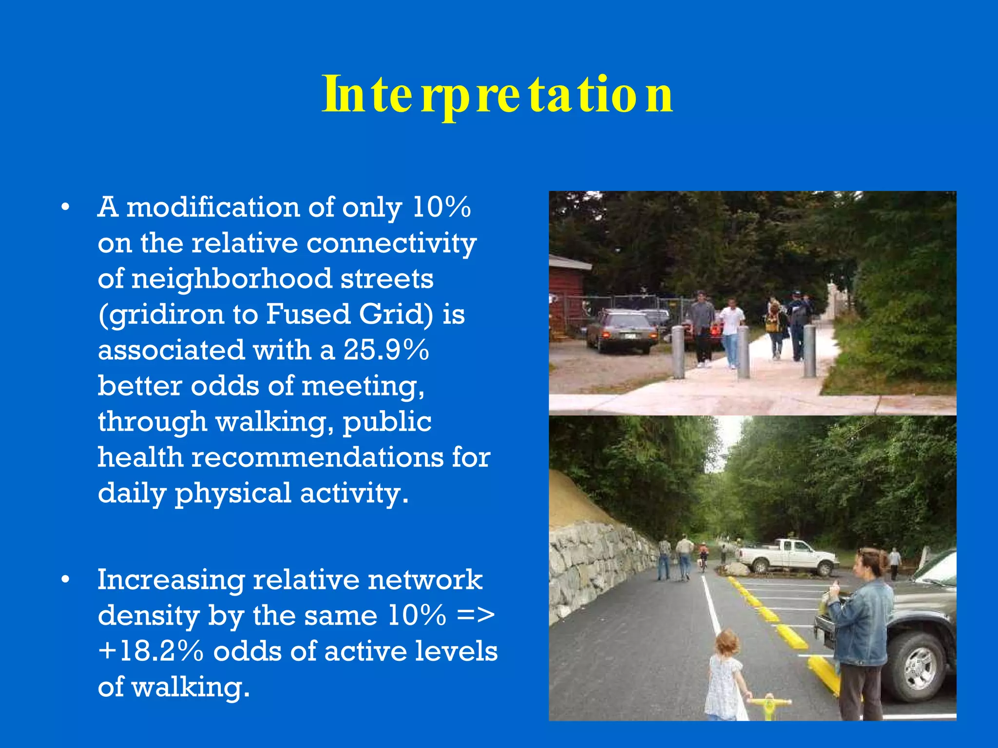
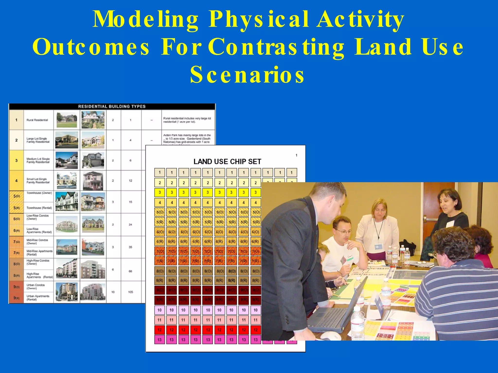
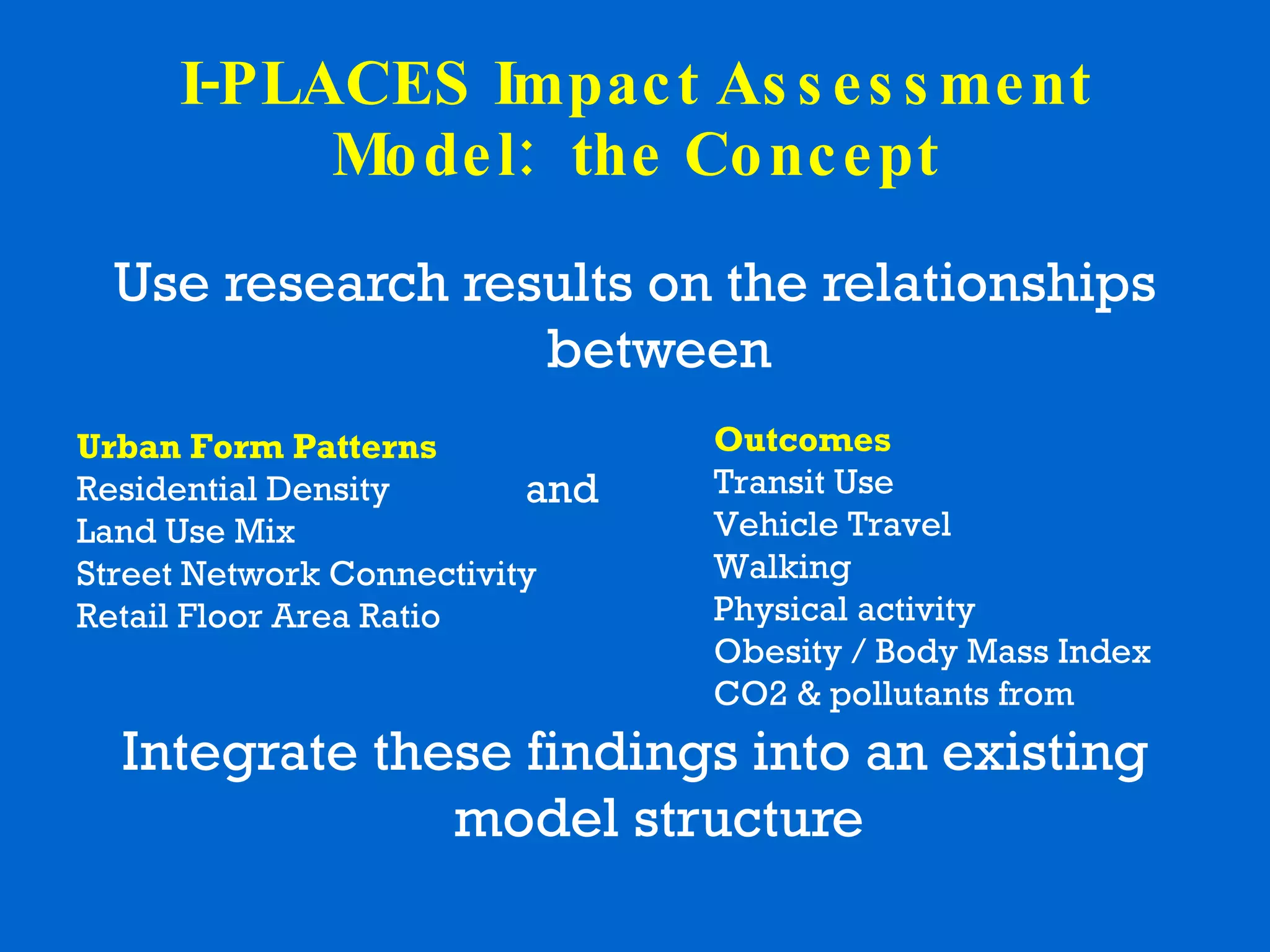
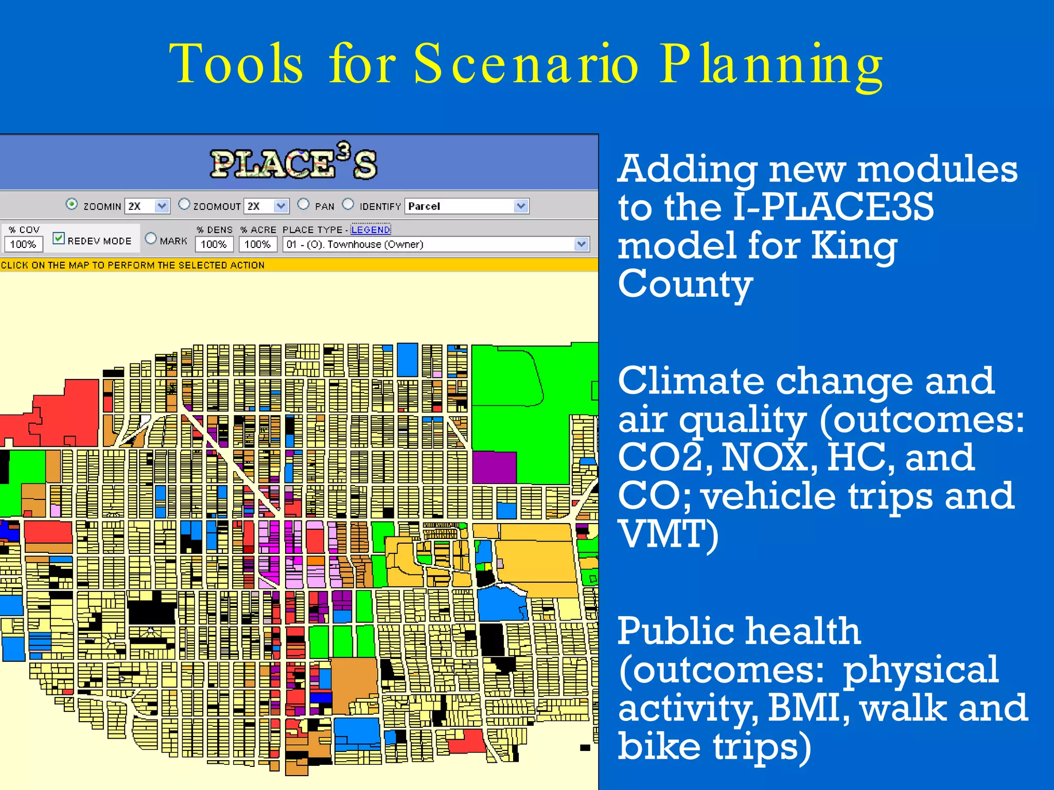
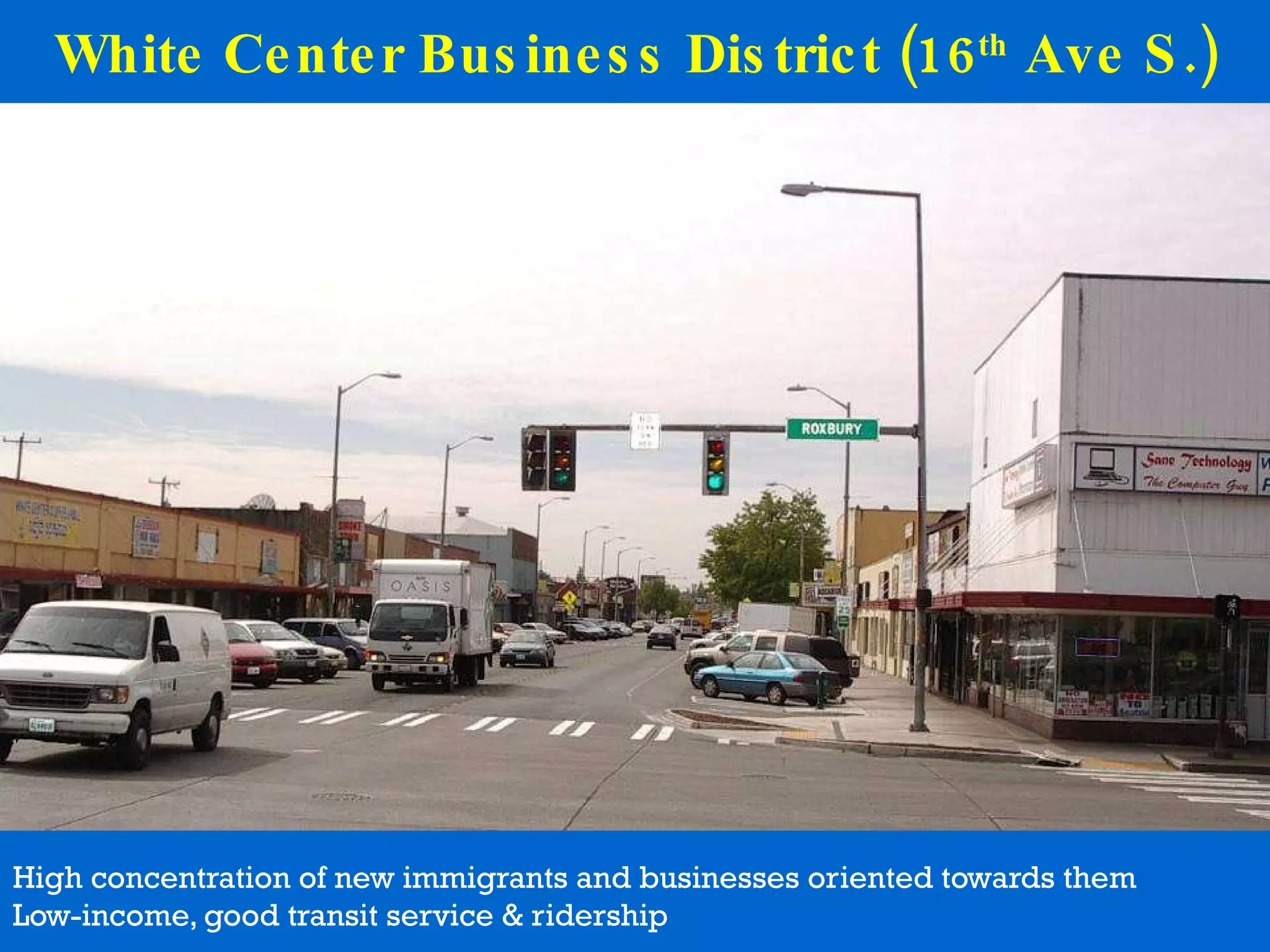
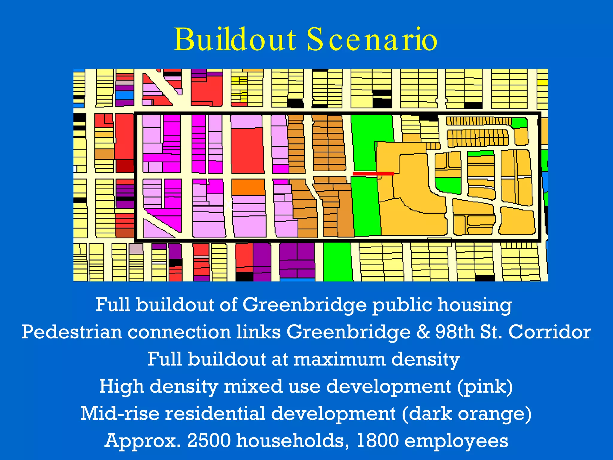
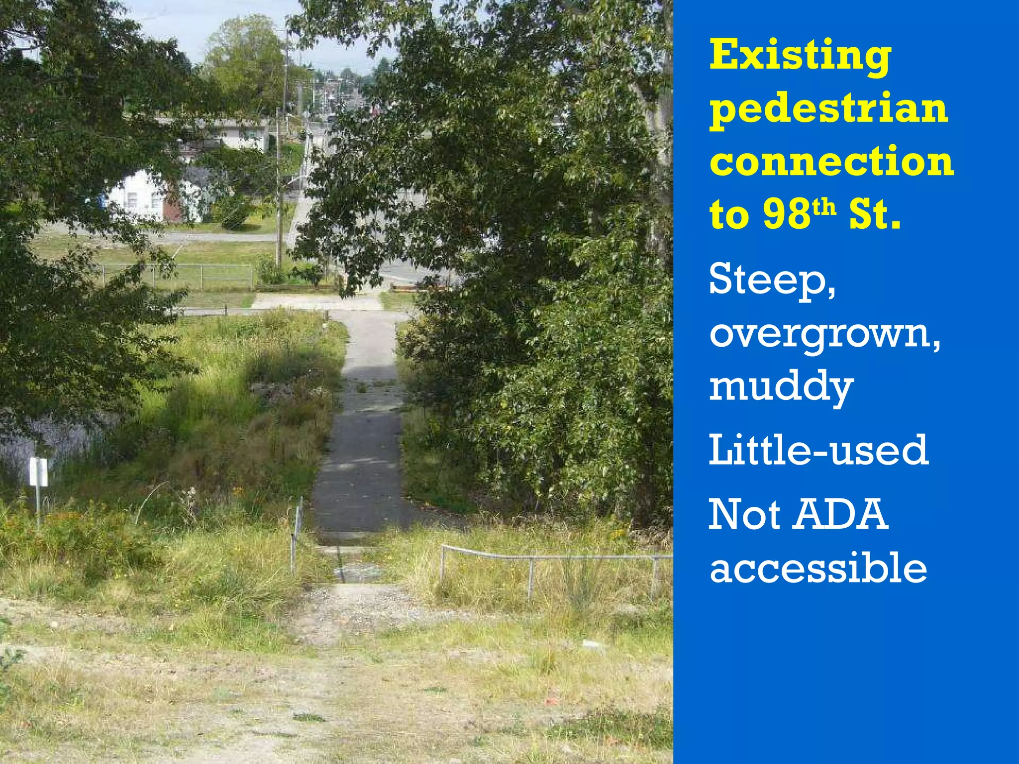
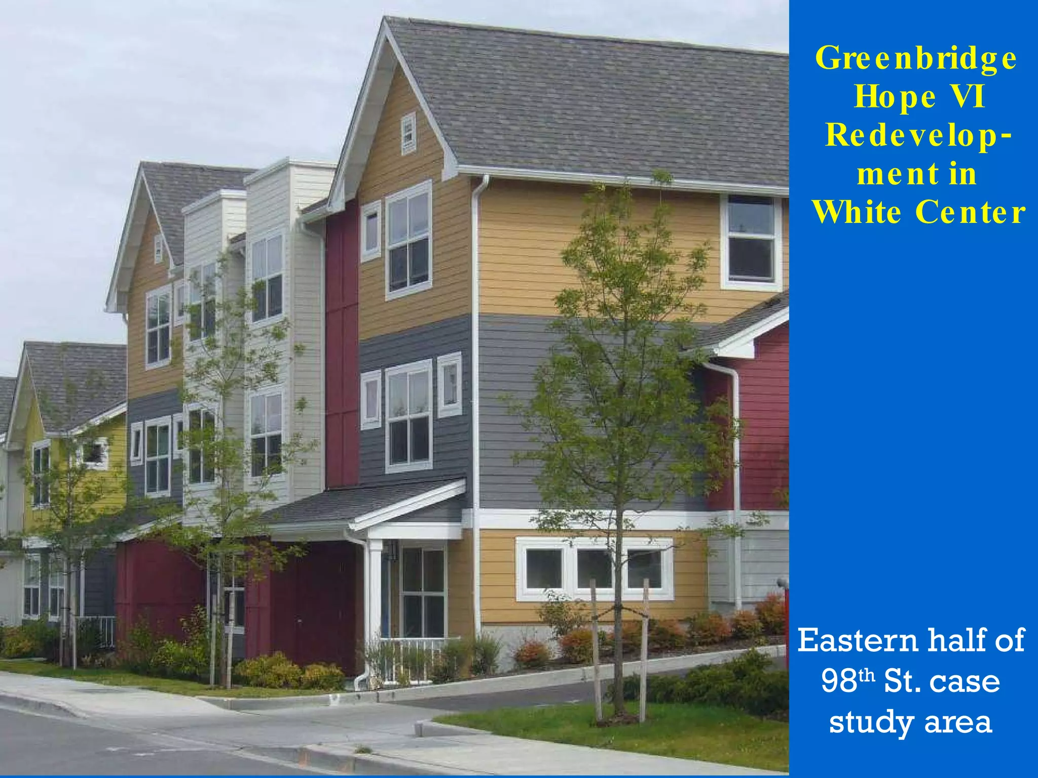
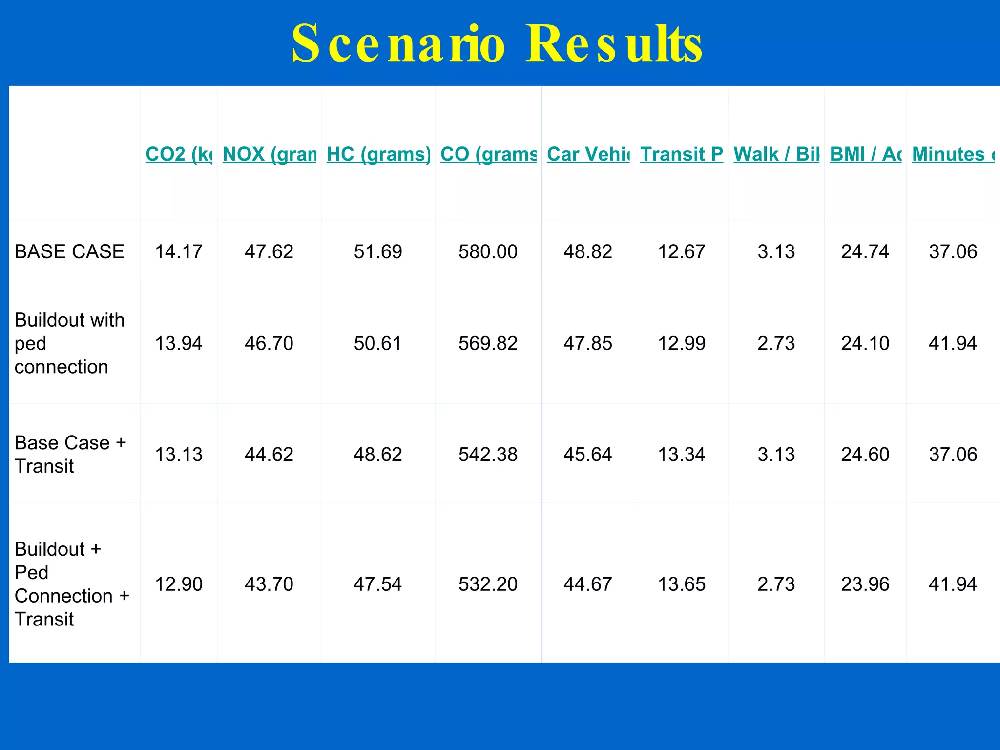
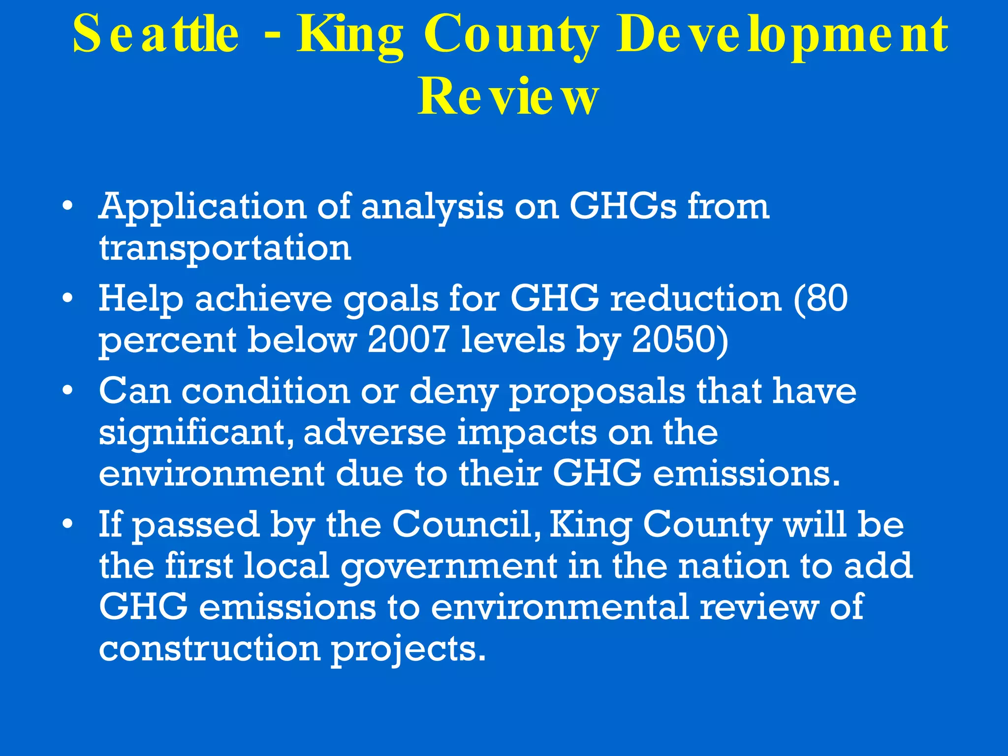
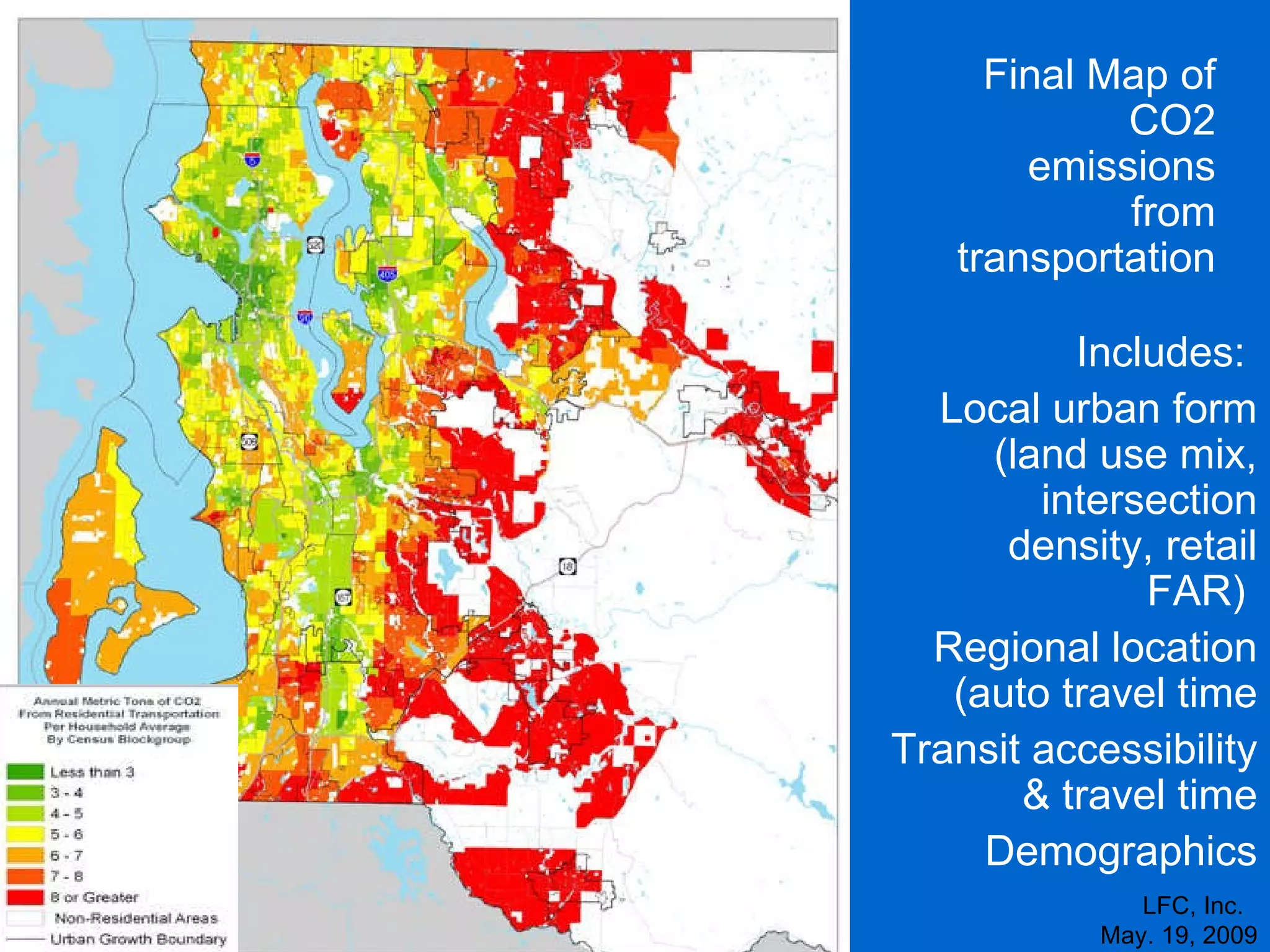
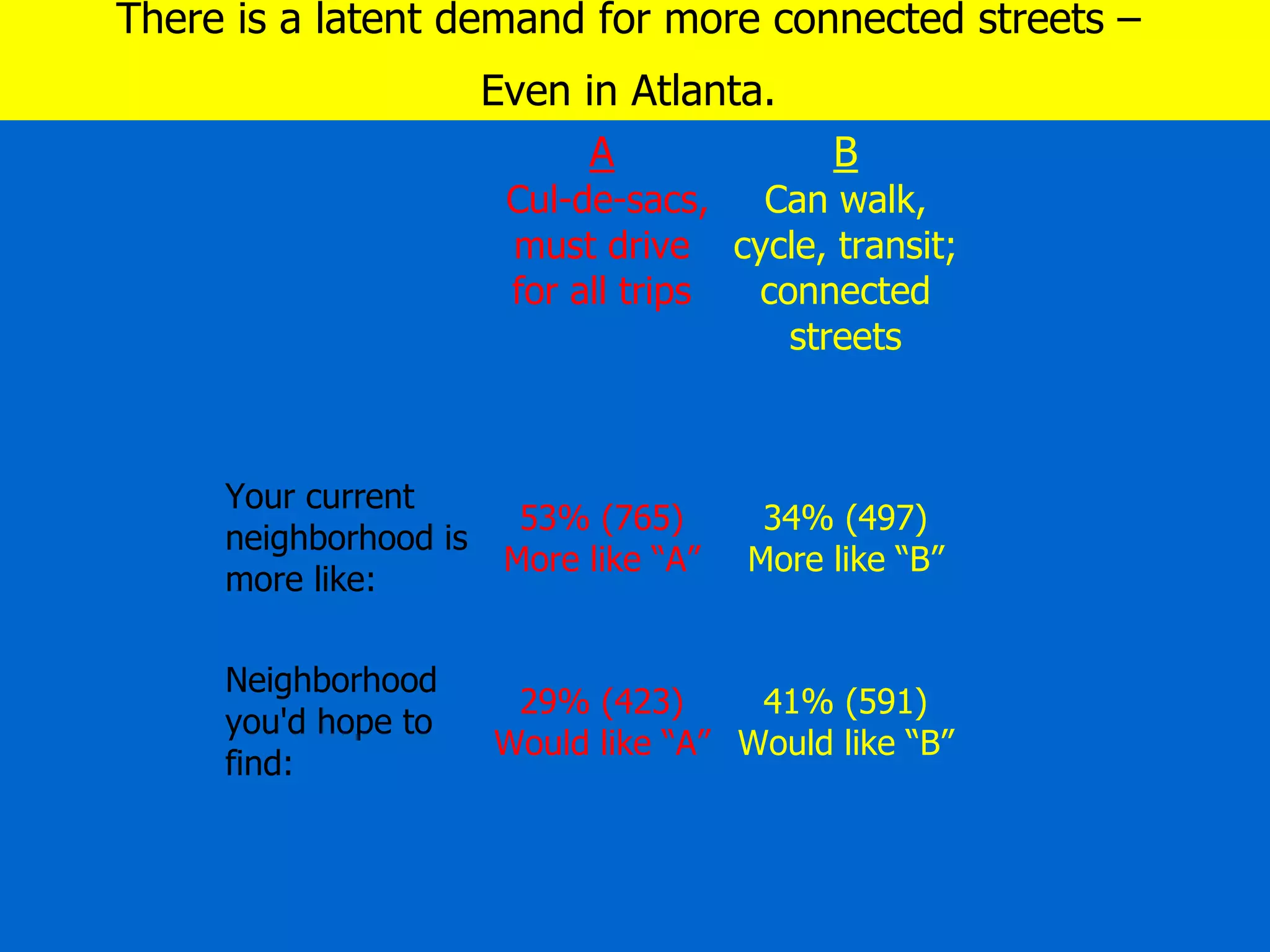
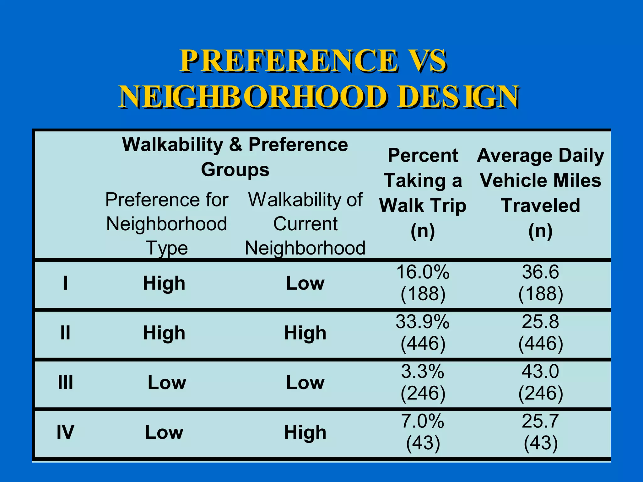
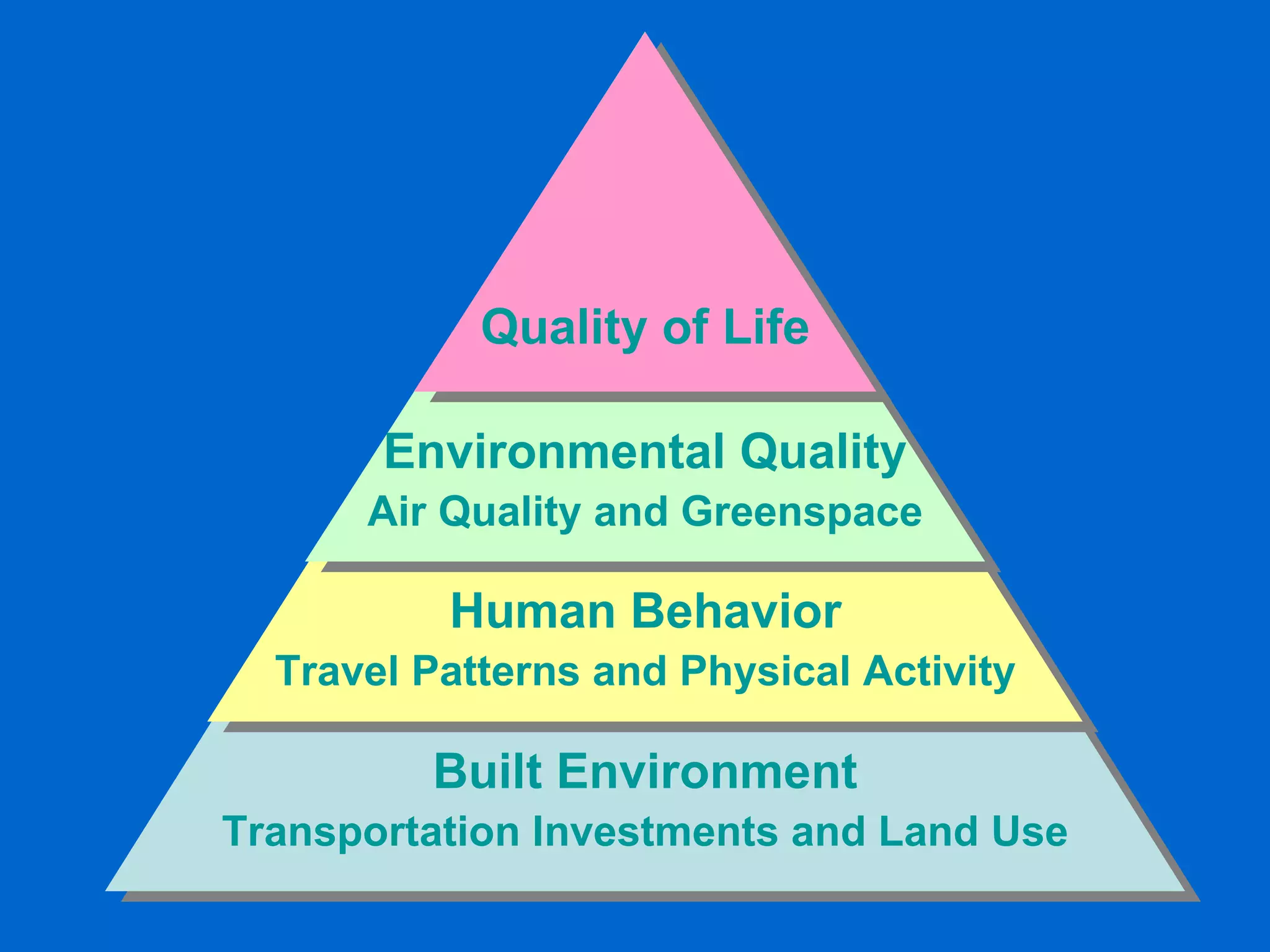
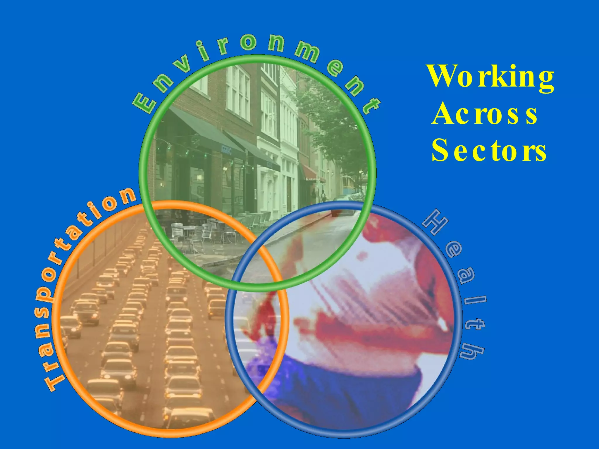
Climate Change and Health Impacts of Transportation Network Design Dr. Lawrence Frank Bombardier Chair in Sustainable Transportation University of British Columbia
Transportation and Land use Decisions, Land Use Patterns, Travel Choices and Outcomes
 
The built environment affects our health
Philosophical Approach Bridging knowledge and action Applied Policy Research Working across disciplines Connecting Health, Environmental, and Transportation Sectors  Building evidence base on the impacts of community design on health and environmental outcomes Quantifying the externalities Finding strategic opportunities to intervene Evaluating natural experiments
. Proximity Connect- ivity 2 KM 1 KM
Vancouver Walkability Surface
Adult Findings - Transit Use Devlin and Frank, 2009
Adult Findings - Walking Devlin and Frank, 2009
Adult Findings - Vehicle Use Devlin and Frank, 2009
Transit  Supportive / Walkability Map Mixed Use Density Street Connectivity Amount of Retail Census Block Groups Lawrence Frank, UBC
LFC, Inc.  May 19, 2009 * Controlled for gender, income, age, total number of vehicles in the house * VOC differences across quartiles significant (p<0.001 Volatile Organic Compounds &  Intersection Density (n=2467)   Air Pollution & Neighborhood Design Source: Frank, L.D. Sallis, J.F., Conway, T., Chapman, J., Saelens, B. Bachman, W. (2006).  Multiple Pathways from Land Use to Health: Walkability Associations With Active Transportation, Body Mass Index, and Air Quality.  Journal of the American Planning Association .
CO2 & Neighbourhood Design LFC, Inc.  May. 19, 2009 Source:  LUTAQH final report, King County ORTP, 2005
Puget Sound Mode  Choice Study 2007 for non-work (home-based other) tours… Increasing home and destination intersection densities by 10% were associated with a 2.4% and 2.3% respective increase in transit demand. Increasing street network connectivity at the home location by 10% was associated with a 2.8% increase in walking, and increasing street network connectivity by 10% at the destination was associated with an additional 2.7% increase in walking. Study Published in  Transportation
Seattle / King County LUTAQH study Travel survey household average = 68 intersections / sq km  Out of all urban form variables, the greatest differences in VMT were observed across levels of intersection density.  Residents in the most interconnected areas of the county travel  26 percent fewer vehicle miles per day  than those in the most disconnected areas. Each quartile of increase in intersection density corresponded with a 14 percent increase in the odds of walking for non-work travel.
Youth Travel to School Study (EPA) Increasing  intersection density   along the route to school from the median value to the 60 th  percentile … Increases the probability of walking to school by 6.67%, for ages 5-10 Decreases the average trip distance by 3.23% Decreases carbon dioxide by 2.34% Decreases hydrocarbons by 2.25% Decreases oxides of nitrogen by 2.65% per student, per trip .
*p<.05, **p<.01, ***p<.001 *p<.05, **p<.01, ***p<.001 controlling for socio-demographics and stratified by age group  (Averaged over a two day period) LOGISTIC REGRESSION ANALYSES PREDICTING  THE ODDS OF WALKING AT LEAST ONCE OVER 2-DAYS YOUTH Age Range  5-8 years OR  (95% CI) 9-11 years OR  (95% CI) 12-15 years OR  (95% CI) 16-20 years OR  (95% CI) N=847 N=632 N=867 N=815 Intersection highest tertile  (vs lowest) 1.7  (1.0-2.9) 1.3  (0.8-2.3) 1.7  (1.1-2.8)* 2.0  (1.1-3.6)* Density highest tertile (vs lowest) 1.8  (1.0-3.1) 2.3  (1.2-4.3)** 3.7  (2.2-6.4)*** 2.0  (1.0-4.1) Mixed land use (vs no mix) 1.5  (0.9-2.4) 1.5  (0.9-2.5) 2.5  (1.6-3.8)*** 1.9 (1.0-3.2)* At least 1 commercial land use  (vs 0) 1.5  (0.9-2.4) 1.6  (1.0-2.5) 2.6  (1.7-4.0)*** 1.7  (1.0-3.1) At least 1 recreation/open space land use (vs 0) 2.1  (1.3-3.4)*** 1.8  (1.1-2.9)* 2.5  (1.7-3.6)*** 1.8  (1.1-2.9)**
Analyzing the Fused Grid Fused Grid Residential Quadrant Resulting Pedestrian Network Resulting Vehicular Network
Non-Motorized V Motorized Connectivity Disparities in network connectivity encourage more travel in the favored mode, other factors being equal. Tested route directness for Drivers Vs Pedestrians From home to nearest commercial destination From home to nearest recreational destination Assessed relative degree of route directness between driving and walking Relationship with mode choice  Established four types of communities  Nexus of high and low levels of pedestrian and vehicle connectivity
Typology of Connectivity Patterns
Variable Development Connectivity and continuity were measured on distinct modal networks – walking and driving
Residential Street Patterns in Study Area    Seattle (Queen Anne)   Bellevue (East)   Redmond (South)  King County, WA – Gridirons to Loop & Culs-de-sac
Findings - Descriptive Walking Mode Share and Street Connectivity Disparate Street Connectivity  and associated Walk Shares (by person to commercial) Pedestrian Connectivity Low High Vehicular connectivity Low SE and Central Bellevue; SW Seattle – Loop and Culs-de-Sac Mean Mode Share: 10% walking n = 985 Queen Anne, Capital Hill (Seattle) – Modified grid with connectors  Mean Mode Share: 18% walking n = 66 High N and , – Grid and major streets w/o sidewalks Mean Mode Share: 10% walking n = 59 Downtown and Older Neighbourhoods – Gridiron Mean Mode Share: 14% walking n = 966
Interpretation A modification of only 10% on the relative connectivity of neighborhood streets (gridiron to Fused Grid) is associated with a 25.9% better odds of meeting, through walking, public health recommendations for daily physical activity. Increasing relative network density by the same 10% => +18.2% odds of active levels of walking.
Modeling Physical Activity Outcomes For Contrasting Land Use Scenarios
I-PLACES Impact Assessment Model:  the Concept Use research results on the relationships between Integrate these findings into an existing model structure Urban Form Patterns   Residential Density Land Use Mix Street Network Connectivity Retail Floor Area Ratio Outcomes Transit Use Vehicle Travel Walking Physical activity Obesity / Body Mass Index CO2 & pollutants from and
The White Center / SW 98 th  St. Case Study White Center  Neighborhood SW 98 th  St.  Corridor
Adding new modules to the I - PLACE3S model   for King County Climate change and air quality (outcomes:  CO2, NOX, HC, and CO; vehicle trips and VMT) Public health (outcomes:  physical activity, BMI, walk and bike trips) Tools for Scenario Planning
White Center Business District (16 th  Ave S.) High concentration of new immigrants and businesses oriented towards them Low-income, good transit service & ridership
Buildout Scenario Full buildout of Greenbridge public housing  Pedestrian connection links Greenbridge & 98th St. Corridor Full buildout at maximum density  High density mixed use development (pink) Mid-rise residential development (dark orange) Approx. 2500 households, 1800 employees x
Existing pedestrian connection to 98 th  St. Steep, overgrown, muddy  Little-used Not ADA accessible
Greenbridge Hope VI Redevelop-ment in White Center Eastern half of 98 th  St. case study area
Scenario Results CO2 (kg) / DU NOX (grams) / DU HC (grams) / DU CO (grams) / DU Car Vehicle Miles / DU Transit Person Miles / DU Walk / Bike Miles / DU BMI / Adult Minutes of Physical Activity / Adult BASE CASE 14.17 47.62 51.69 580.00 48.82 12.67 3.13 24.74 37.06 Buildout with ped connection 13.94 46.70 50.61 569.82 47.85 12.99 2.73 24.10 41.94 Base Case + Transit 13.13 44.62 48.62 542.38 45.64 13.34 3.13 24.60 37.06 Buildout + Ped Connection + Transit 12.90 43.70 47.54 532.20 44.67 13.65 2.73 23.96 41.94
Seattle - King County Development Review Application of analysis on GHGs from transportation Help achieve goals for GHG reduction (80 percent below 2007 levels by 2050) Can condition or deny proposals that have significant, adverse impacts on the environment due to their GHG emissions.  If passed by the Council, King County will be the first local government in the nation to add GHG emissions to environmental review of construction projects.
LFC, Inc.  May. 19, 2009 Final Map of CO2 emissions from transportation Includes:  Local urban form (land use mix, intersection density, retail FAR)  Regional location (auto travel time Transit accessibility & travel time Demographics
The Essential Role of Demand LFC, Inc.  May. 9, 2009
Results – Urban Form + Major Progress All else equal, households living in the most walkable King County neighborhoods were 54 percent more likely to meet the 8.4 daily mile threshold.  Each ten-minute decrease in regional transit travel time increased the odds of meeting the VMT target by 11 percent.
High Walkability Low Walkability Prefers  a Walkable  Community Design Prefers  Auto - Based  Community Design 1 2 4 3 Neighborhood  Preferences Built   Environment Maximum Minimum
Stated Preference (Q8a, Q8b, Q8c) Street Design and Travel Options
There is a latent demand for more connected streets –  Even in Atlanta.
 
PREFERENCE VS  NEIGHBORHOOD DESIGN
Built Environment Transportation Investments and Land Use Human Behavior Travel Patterns and Physical Activity Environmental Quality Air Quality and Greenspace Quality of Life
Working Across  Sectors
The End

Climate Change and Health Impacts of Transportation Network Design

  • 1.
    Climate Change andHealth Impacts of Transportation Network Design Dr. Lawrence Frank Bombardier Chair in Sustainable Transportation University of British Columbia
  • 2.
    Transportation and Landuse Decisions, Land Use Patterns, Travel Choices and Outcomes
  • 3.
  • 4.
    The built environmentaffects our health
  • 5.
    Philosophical Approach Bridgingknowledge and action Applied Policy Research Working across disciplines Connecting Health, Environmental, and Transportation Sectors Building evidence base on the impacts of community design on health and environmental outcomes Quantifying the externalities Finding strategic opportunities to intervene Evaluating natural experiments
  • 6.
    . Proximity Connect-ivity 2 KM 1 KM
  • 7.
  • 8.
    Adult Findings -Transit Use Devlin and Frank, 2009
  • 9.
    Adult Findings -Walking Devlin and Frank, 2009
  • 10.
    Adult Findings -Vehicle Use Devlin and Frank, 2009
  • 11.
    Transit Supportive/ Walkability Map Mixed Use Density Street Connectivity Amount of Retail Census Block Groups Lawrence Frank, UBC
  • 12.
    LFC, Inc. May 19, 2009 * Controlled for gender, income, age, total number of vehicles in the house * VOC differences across quartiles significant (p<0.001 Volatile Organic Compounds & Intersection Density (n=2467) Air Pollution & Neighborhood Design Source: Frank, L.D. Sallis, J.F., Conway, T., Chapman, J., Saelens, B. Bachman, W. (2006). Multiple Pathways from Land Use to Health: Walkability Associations With Active Transportation, Body Mass Index, and Air Quality. Journal of the American Planning Association .
  • 13.
    CO2 & NeighbourhoodDesign LFC, Inc. May. 19, 2009 Source: LUTAQH final report, King County ORTP, 2005
  • 14.
    Puget Sound Mode Choice Study 2007 for non-work (home-based other) tours… Increasing home and destination intersection densities by 10% were associated with a 2.4% and 2.3% respective increase in transit demand. Increasing street network connectivity at the home location by 10% was associated with a 2.8% increase in walking, and increasing street network connectivity by 10% at the destination was associated with an additional 2.7% increase in walking. Study Published in Transportation
  • 15.
    Seattle / KingCounty LUTAQH study Travel survey household average = 68 intersections / sq km Out of all urban form variables, the greatest differences in VMT were observed across levels of intersection density. Residents in the most interconnected areas of the county travel 26 percent fewer vehicle miles per day than those in the most disconnected areas. Each quartile of increase in intersection density corresponded with a 14 percent increase in the odds of walking for non-work travel.
  • 16.
    Youth Travel toSchool Study (EPA) Increasing intersection density along the route to school from the median value to the 60 th percentile … Increases the probability of walking to school by 6.67%, for ages 5-10 Decreases the average trip distance by 3.23% Decreases carbon dioxide by 2.34% Decreases hydrocarbons by 2.25% Decreases oxides of nitrogen by 2.65% per student, per trip .
  • 17.
    *p<.05, **p<.01, ***p<.001*p<.05, **p<.01, ***p<.001 controlling for socio-demographics and stratified by age group (Averaged over a two day period) LOGISTIC REGRESSION ANALYSES PREDICTING THE ODDS OF WALKING AT LEAST ONCE OVER 2-DAYS YOUTH Age Range 5-8 years OR (95% CI) 9-11 years OR (95% CI) 12-15 years OR (95% CI) 16-20 years OR (95% CI) N=847 N=632 N=867 N=815 Intersection highest tertile (vs lowest) 1.7 (1.0-2.9) 1.3 (0.8-2.3) 1.7 (1.1-2.8)* 2.0 (1.1-3.6)* Density highest tertile (vs lowest) 1.8 (1.0-3.1) 2.3 (1.2-4.3)** 3.7 (2.2-6.4)*** 2.0 (1.0-4.1) Mixed land use (vs no mix) 1.5 (0.9-2.4) 1.5 (0.9-2.5) 2.5 (1.6-3.8)*** 1.9 (1.0-3.2)* At least 1 commercial land use (vs 0) 1.5 (0.9-2.4) 1.6 (1.0-2.5) 2.6 (1.7-4.0)*** 1.7 (1.0-3.1) At least 1 recreation/open space land use (vs 0) 2.1 (1.3-3.4)*** 1.8 (1.1-2.9)* 2.5 (1.7-3.6)*** 1.8 (1.1-2.9)**
  • 18.
    Analyzing the FusedGrid Fused Grid Residential Quadrant Resulting Pedestrian Network Resulting Vehicular Network
  • 19.
    Non-Motorized V MotorizedConnectivity Disparities in network connectivity encourage more travel in the favored mode, other factors being equal. Tested route directness for Drivers Vs Pedestrians From home to nearest commercial destination From home to nearest recreational destination Assessed relative degree of route directness between driving and walking Relationship with mode choice Established four types of communities Nexus of high and low levels of pedestrian and vehicle connectivity
  • 20.
  • 21.
    Variable Development Connectivityand continuity were measured on distinct modal networks – walking and driving
  • 22.
    Residential Street Patternsin Study Area Seattle (Queen Anne) Bellevue (East) Redmond (South) King County, WA – Gridirons to Loop & Culs-de-sac
  • 23.
    Findings - DescriptiveWalking Mode Share and Street Connectivity Disparate Street Connectivity and associated Walk Shares (by person to commercial) Pedestrian Connectivity Low High Vehicular connectivity Low SE and Central Bellevue; SW Seattle – Loop and Culs-de-Sac Mean Mode Share: 10% walking n = 985 Queen Anne, Capital Hill (Seattle) – Modified grid with connectors Mean Mode Share: 18% walking n = 66 High N and , – Grid and major streets w/o sidewalks Mean Mode Share: 10% walking n = 59 Downtown and Older Neighbourhoods – Gridiron Mean Mode Share: 14% walking n = 966
  • 24.
    Interpretation A modificationof only 10% on the relative connectivity of neighborhood streets (gridiron to Fused Grid) is associated with a 25.9% better odds of meeting, through walking, public health recommendations for daily physical activity. Increasing relative network density by the same 10% => +18.2% odds of active levels of walking.
  • 25.
    Modeling Physical ActivityOutcomes For Contrasting Land Use Scenarios
  • 26.
    I-PLACES Impact AssessmentModel: the Concept Use research results on the relationships between Integrate these findings into an existing model structure Urban Form Patterns Residential Density Land Use Mix Street Network Connectivity Retail Floor Area Ratio Outcomes Transit Use Vehicle Travel Walking Physical activity Obesity / Body Mass Index CO2 & pollutants from and
  • 27.
    The White Center/ SW 98 th St. Case Study White Center Neighborhood SW 98 th St. Corridor
  • 28.
    Adding new modulesto the I - PLACE3S model for King County Climate change and air quality (outcomes: CO2, NOX, HC, and CO; vehicle trips and VMT) Public health (outcomes: physical activity, BMI, walk and bike trips) Tools for Scenario Planning
  • 29.
    White Center BusinessDistrict (16 th Ave S.) High concentration of new immigrants and businesses oriented towards them Low-income, good transit service & ridership
  • 30.
    Buildout Scenario Fullbuildout of Greenbridge public housing Pedestrian connection links Greenbridge & 98th St. Corridor Full buildout at maximum density High density mixed use development (pink) Mid-rise residential development (dark orange) Approx. 2500 households, 1800 employees x
  • 31.
    Existing pedestrian connectionto 98 th St. Steep, overgrown, muddy Little-used Not ADA accessible
  • 32.
    Greenbridge Hope VIRedevelop-ment in White Center Eastern half of 98 th St. case study area
  • 33.
    Scenario Results CO2(kg) / DU NOX (grams) / DU HC (grams) / DU CO (grams) / DU Car Vehicle Miles / DU Transit Person Miles / DU Walk / Bike Miles / DU BMI / Adult Minutes of Physical Activity / Adult BASE CASE 14.17 47.62 51.69 580.00 48.82 12.67 3.13 24.74 37.06 Buildout with ped connection 13.94 46.70 50.61 569.82 47.85 12.99 2.73 24.10 41.94 Base Case + Transit 13.13 44.62 48.62 542.38 45.64 13.34 3.13 24.60 37.06 Buildout + Ped Connection + Transit 12.90 43.70 47.54 532.20 44.67 13.65 2.73 23.96 41.94
  • 34.
    Seattle - KingCounty Development Review Application of analysis on GHGs from transportation Help achieve goals for GHG reduction (80 percent below 2007 levels by 2050) Can condition or deny proposals that have significant, adverse impacts on the environment due to their GHG emissions. If passed by the Council, King County will be the first local government in the nation to add GHG emissions to environmental review of construction projects.
  • 35.
    LFC, Inc. May. 19, 2009 Final Map of CO2 emissions from transportation Includes: Local urban form (land use mix, intersection density, retail FAR) Regional location (auto travel time Transit accessibility & travel time Demographics
  • 36.
    The Essential Roleof Demand LFC, Inc. May. 9, 2009
  • 37.
    Results – UrbanForm + Major Progress All else equal, households living in the most walkable King County neighborhoods were 54 percent more likely to meet the 8.4 daily mile threshold. Each ten-minute decrease in regional transit travel time increased the odds of meeting the VMT target by 11 percent.
  • 38.
    High Walkability LowWalkability Prefers a Walkable Community Design Prefers Auto - Based Community Design 1 2 4 3 Neighborhood Preferences Built Environment Maximum Minimum
  • 39.
    Stated Preference (Q8a,Q8b, Q8c) Street Design and Travel Options
  • 40.
    There is alatent demand for more connected streets – Even in Atlanta.
  • 41.
  • 42.
    PREFERENCE VS NEIGHBORHOOD DESIGN
  • 43.
    Built Environment TransportationInvestments and Land Use Human Behavior Travel Patterns and Physical Activity Environmental Quality Air Quality and Greenspace Quality of Life
  • 44.
  • 45.

Editor's Notes

  • #8 This is the Walkability Surface. It shows us how walkable each postal code is in the region based on measured densities, land use mix and street patterns. Note the inter and intra municipal variation in measured walkability in the image; generally neighbourhood walkability in the region decreases the further out one gets from the regional core. Vancouver, New Westminster and parts of North Vancouver and West Vancouver are all characterized as being highly walkable. Many neighbourhoods in these municipalities have high densities, a variety of shops and services nearby and a well-connected street network.
  • #29 Just based on KC data now, but has a lot of potential to expand – pull in data from other regions for broader geographic applicability.
  • #36 Final model explains about 41% of HH behavior.
  • #37 Reducing demand is essential to meeting the target in 2050. Either of these scenarios will meet the target – where technology can do more, there is less need to reduce demand, but all scenarios will need to address demand in some way.