👉Chandigarh Call Girls 👉9878799926👉Just Call👉Chandigarh Call Girl In Chandiga...
Evaluation
1. In what ways does your media product use, develop or challenge
forms and conventions of real media products?
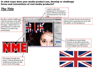
The Title I used a union jack
background in my text as it
links in with the mod fashion
and links with the ‘Uk’ in the
title.
My title is similar to NME as it It is in a similar font but not as bold as I
uses the structure of the text believe that it would look too much with
and is in the same position on the pattern on the background.
the page. I believe that it is
good because it is plain and
simple so it is easy to be
remembered.
It is different to usual media
products as the title matches the
background of the magazine but it
is a lot brighter than the picture.
The shape is simple and
sharp. It will be attracted to all
audiences and does not take
up too much of the page.
2. In what ways does your media product use, develop or challenge forms and
conventions of real media products?
Mise-en-scene of images
In every image the model for my magazine is making complete eye contact, this drawing the
reader in and the camera is acting as just an observer therefore the audience will not feel
connected.
This is using the general ideas of a This is challenging the average
magazine cover as the face is magazine image as it is casual This generally develops the
straight on and she fits in to the and looks like it could be taken normal double page spread as it
size perfectly. The colours are not by a friend and not to posed is face on but you get a lot of
too bold around her so the models for. It gives a lay backed feel detail in the background.
face is the main focus. and puts the audience at ease.
3. In what ways does your media product use, develop or challenge forms and
conventions of real media products?
Costume and props
I used union jack flags as it
links in with the magazine
and the whole style. I
wanted them to link with the
title as well to go against of
the norms.
Her Denim shirt and cross
necklace being a causal
and average outfit that
would be seen on a
musician and going along
with the norms within
media.
The union jack sign has been used a lot with
musicians and in the media and is a very
popular pattern. It’s used to represent a type
of music and fits in with my ‘Mod’ magazine
image.
Her hair and make up are
plain and simple as I did not Her lipstick being a similar
want to draw the attention colour to the detail on the
away from the detailed title. title
4. In what ways does your media product use, develop or challenge
forms and conventions of real media products?
People
The people I chose obviously had to
be photogenic but also had to fit in
with the theme of my magazine.
They had too fit in with the musical
theme and look like they could
feature in a popular magazine. Also
relating to fans was a big reason for
me picking the people I did, a lot of
people like them therefore they can’t
look to out there and need to look
approachable.
The only way my choices will challenge the conventions of media products is the
fact that is featuring only girls. The Mod image is not shown with the ‘lad culture’
or the ‘rebel culture’. It’s un unusual for a music magazine to feature mainly girls
and it is going against the norms.
5. In what ways does your media product use, develop or challenge
forms and conventions of real media products?
Title, font,style
The other main features are in a The font on the title is very simple
different font to spilt up the The pull out text is a but has a bold pattern which is not
stories. This is a tactic I took conventional part on a average for magazine. It is not
from NME. interview. conventional for the pattern to be
the same on the title as the picture
background.
It’s not very conventional for the
magazine to have a text that is all
capitals, it could be seen as not to
easy to read but I think it looks
bold and effective.
6. In what ways does your media product use, develop or challenge
forms and conventions of real media products?
The text is the
Written content same as most
magazines as it is a
simple question
and response
format. The
I went for a questions in bold
basic to split up the text.
interview to
be paired
with a bold
picture.
I used an idea
from another
magazine to
enlarge the letter The written
behind the text. content uses the
This splitting up same system
the standard with pulling out
interview. quotes from the
text and making
them bold.
I used the colours that match
my magazine and it’s name so
that the same theme is
running all the way through.
7. In what ways does your media product use, develop or challenge
forms and conventions of real media products?
Music genre and how your magazine suggests it
My magazine is ‘Mod’ inspired.
I liked the idea of having the Nme themed set out for
my magazine but I wanted the music to be more
specific. I liked the whole ‘ mod culture’ idea.
My magazine shows off that image with the title it’s self. It is a
union jack pattern and that was a feature of Mod fashion, it is
strongly linked with the theme. Also at the back of my picture
I have more union jacks and the props link in. The colour
theme on the text also links in with the genre of music.
In the magazine there is references to specific bands that show off the Mod image, people like Paul Weller are mentioned and he
was a key feature in the comeback of the ‘Mod culture’. Most of the bands I involve have a mod influence or style. The set out is
not too much and cluttered so it does not have a pop image and is not to laid back. The swearing within the text is not something
you would see in a pop magazine it is more risky and would be more of a rock or Mod representation. The Mod music shows a
working class feel as that would of been the audience it attracted at it’s time so the style of the artists have to relate with the
audience.
My magazine challenges the convention of normal media products as it is a more specific than Nme as that ranges from a few
genres of music.