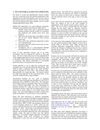
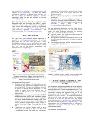
This document summarizes an interactive online mapping application created for the Long Island Index community indicators project. The application uses open source frameworks like OpenLayers and AJAX techniques to allow users to simultaneously visualize multiple data layers within a single map frame. It integrates proprietary GIS data with open data sources and tools to provide detailed property-level maps, census data, transportation features, and more. Key techniques like dynamic transparencies allow overlaying different data layers while maintaining readability.
The Penn State University campus map team is redesigning the interactive online campus map. The original map from 1997 is outdated for today's internet capabilities. The redesign includes simplifying and generalizing the map for online use, implementing user interactivity features like search and zooming, and emphasizing Penn State's brand colors in the new design. Building footprints will be clickable for information rather than using 3D renderings. The goal is to release a prototype of the new interactive map design by 2010 that takes advantage of the online medium's capabilities.
Talk about what relation between web and mapping. Also the process to create and collaborate on-line map using free source like mapserver, geoserver, postgis, openlayer.
Web mapping involves designing and delivering maps on the World Wide Web. It has become more accessible due to free and open source software and data. There are several types of web maps, including analytic maps that allow online analysis, animated maps that show changes over time, and collaborative maps that allow multiple users to edit maps simultaneously. Popular technologies used for web mapping include spatial databases for storing and querying geographic data, and WMS servers for generating map images on demand from layered geographic datasets.
Len Bundra, the IT and GIS director for Toms River Municipal Utilities Authority, built a free public web map in 2004 that included layers of infrastructure, imagery, and other data. This map proved invaluable for emergency response during and after Hurricane Sandy in 2012, when Bundra updated it with post-storm imagery and flood data. It became a one-stop resource for many agencies and helped with tasks like utility restoration and demolition planning. Bundra's creation of the map showed that "if you build it, they will become aware" of its usefulness.
3D GIS has several strengths for public engagement in development proposals. It allows non-experts to better understand proposals through interactive 3D visualization of projects. Web-based 3D GIS makes information easily accessible to the public online instead of just at meetings. The realism of 3D models through techniques like photorealistic texturing helps users visualize how projects will look from different angles and heights. 3D GIS can also collect public feedback through integrating communication platforms like emails and forums. However, 3D GIS also has limitations such as high hardware and software requirements.
The document discusses the development of an interactive mapping application for the Long Island Index project using a hybrid "geo stack" approach. It combines proprietary ESRI ArcGIS software to manage spatial data with open source mapping libraries like OpenLayers to display interactive maps in the browser. The result is a website that allows users to visualize and explore socioeconomic and environmental indicators for communities on Long Island. It leverages different technologies to provide an easy-to-use and intuitive mapping experience while maintaining control over spatial data and cartography.
CartoService: A Web Service Framework for Quality On-Demand GeovisualisationBeniamino Murgante
CartoService: A Web Service Framework for Quality On-Demand Geovisualisation
Rita Engemaier, Hartmut Asche - Department of Geography, University of Potsdam
GeoWeb: overview of services and functions, 2010Moullet
The document discusses the history and definition of the GeoWeb. It describes the GeoWeb as being composed of "bricks" like maps, geoRSS, geotags, and KML/GML that can be used together. Examples are given like Swissgeocache using geoRSS and Panoramio using maps, geotags, and KML. Formats for the GeoWeb include GML, KML, GeoJSON, and GeoRSS. Access to resources is described through WMTS, geocoding, APIs, and KML features. Trends mentioned include mobile, crowdsourcing, 3D/4D, location-based services, augmented reality, and GeoAPIs. The document outlines
Crowd-Sourcing Approach of Building Ground Truth Database for Global Urban Ar...Hiroyuki Miyazaki
This document proposes a crowd-sourcing approach to build a ground truth database for global urban area mapping. It describes existing ground truth data sources as being too scarce. It then outlines the design and implementation of a web-based crowd-sourcing system using free and open source software like MapServer, TinyOWS, and PostgreSQL to allow trained and untrained users to interpret satellite imagery and delineate urban boundaries from anywhere in the world. The system is intended to efficiently create a large ground truth dataset in a secure and organized manner.
3D Digital Modeling for Urban Design + PlanningManny Velazco
This document provides an overview of a senior project that created a 3D digital model of downtown Pismo Beach, California using Google SketchUp software. The project aimed to demonstrate how such a model could assist a city's planning commission in evaluating proposed development projects. Specifically, the model was used to analyze the impacts of three large beachfront development projects on the city. The document discusses the scope of the project, how SketchUp works, examples of other cities experimenting with 3D modeling, potential funding sources, and concludes that 3D digital models can engage stakeholders and lead to more informed decision-making.
HSLayers (Help Service + OpenLayers) combines capabilities of ExtJS and OpenLayers and several helping scripts to establish truly Web GIS applications. Development started in 2007. In 2009, after 2 years of development, it was released under conditions of GNU General Public License 3.
The document provides an overview of how geographic information systems (GIS) can be used in civil engineering applications. It discusses how GIS allows civil engineers to manage and analyze spatial data to support infrastructure planning, design, construction, and maintenance. It also summarizes several specific ways GIS is used, including infrastructure management, transportation, land use planning, watershed management, and environmental analysis. GIS provides a centralized way to store and visualize spatial data, analyze relationships, and share information across teams and organizations.
3D GIS brings enhanced depth into data collection and analysis by incorporating a z-value into mapping. Most commonly, that means including elevation data, but users have many options for adding layers of information.
While 3D models are more difficult to create and maintain than 2D ones, there are myriad 3D GIS applications where this technology is greatly beneficial.
The 3D-GIS in the Cloud main purpose is to evaluate the use-efficiency of both existing and planned spatial space.
Kevin Ma - CASM Interface Technical PosterKevin Ma
CASM is a software program that allows agencies to share information about communication equipment to prevent interference. It previously created coverage plot files using Google Earth, but the files were too large to display. To address this, an alternative mapping library called Leaflet was chosen. Leaflet allows larger files and local loading of maps. It also provides easier printing and coloring of plots. The changes included creating temporary session folders to store user files that delete when the session ends.
The web offers many free tools for basic GIS analysis and visualization. Steve Schild, GIS Manager at the Rutland Regional Planning Commission, highlights the best in this slideshow.
This is the fourth project in a series on Quantum Architecture developed in 2005. This project builds on teh concepts developed in 01 Degridding Chamdigarh and 02 Recombinant Dumbo, and adds significant tools and processes in the design phase. Urban Weaving is mostly conserned with the Tabula rasa and confronts a real world case based in Bahrain
The web offers many free tools for basic geographic analysis and visualization. Steve Schild, GIS Manager at the Rutland Regional Planning Commission, highlights the best in this slideshow.
Globe-based earth browsers like GoogleEarth have turned web-based cartography into a widely accepted
commodity. This success is based on the three components: The browser software itself, remote sensing
data as a backdrop maps and thematic content layers.
From a GRASS GIS perspective, the ability to communicate thematic content via earth browsers is a
strategic means to quickly communicate findings to very large communities.
This poster describes the current options to compose such thematic content layers by using GRASS GIS:
Loosely coupled Keyhole Markup Language (KML) export functionalities provide the „glue“ for the seamless
integration between the GIS and the earth browser.
This document provides a citizen's guide to understanding density in Arlington County, Virginia. It defines density in terms of units per acre and floor area ratio (FAR), and explains Arlington's development process. The guide contains images and data on various residential, commercial and mixed-use developments in Arlington organized by density level to illustrate the range of densities and provide visual examples. It aims to help residents effectively participate in public planning processes by understanding density measurements.
THE OGC STANDARDS AND GEO-PLATFORM BASED WEB APPLICATION FOR SEISMIC EVENTS M...Lorenzo Amato
SUSTAINABILITY & SECURITY APPLICATIONS FOR GEO-RISK-PREVENTION & ENVIRO-DISASTER-PROTECTION
GRENZÜBERSCHREITENDES SÄCHSISCHES GI/GIS/GDI-FORUM AM 29./30. APRIL 2013 IN DRESDEN
This document provides a summary of Maurice C. Johnson III's work as a Software Application Developer for Heritage Interactive Services from April 2015 to August 2016. It describes his responsibilities developing and supporting web applications using technologies like Leaflet, OpenStreetMaps, JSON, and AJAX. It then provides an example work project where he enhanced an existing web application to allow mapping and searching supplier, customer, and service site data on an interactive map using open source mapping tools. The project aimed to help users better visualize their data and identify sales opportunities.
Gis technology Application in Urban Planning in Kenya - Mathenge MweheMathenge Mwehe
GIS technology is an indispensable tool that can transform the way urban planning is done in Kenya. However, Kenya urban planning system is still tied up in the outdated manual planning systems with disastrous results in return. If Kenya Is to achieve vision 2030 goal of spatial prosperity and well planned urban land uses, it’s imperative that it incorporate and integrate the GIS technology in its devolved planning offices.
The document describes how seismic event data from the Italian Seismic Network (ISIDe) can be integrated into the Italian Civil Protection's Geo-Platform based web application for emergency management. A server collects ISIDe's near real-time earthquake data and imports it into a PostGIS database. A GeoServer then serves the data via OGC standards. The web application uses widgets to filter, refresh, and map the seismic data alongside other interoperable layers for emergency response and damage assessment. Mobile apps also allow early collection of ground observations that further enhance the common operating picture.
This document summarizes the design process for visualizing data about LEGO theme colors. It begins with exploring bar charts to show the number of colors in each theme. Representative LEGO minifigures are added to labels to make the graph more attractive and convey relevant information. The colors are directly visualized on the bars to provide extra detail. Tooltips are included to show color names and applications when hovering over colors. In later iterations, the minifigures are moved above the bars to reduce visual search time. The final visualization could be implemented on the LEGO website and other channels to engage fans.
The document provides information on how to build 3D visualizations of places using geographic information systems (GIS) and other software tools. It discusses obtaining digital elevation data, creating 3D terrain models and draping historical maps on them using ArcGIS. It also introduces VRML for authoring 3D scenes and lists software for viewing, editing and optimizing 3D models for real-time rendering. The goal is to virtually reconstruct places and landscapes over time through interactive 3D visualization.
El aprendizaje invertido es una técnica didáctica en la que los estudiantes consultan videos y materiales en línea por su cuenta, mientras que las clases se dedican a discusiones, resolución de problemas y actividades prácticas con el apoyo del profesor. En biología, los estudiantes realizan investigaciones independientes sobre los temas utilizando tecnología para reforzar los conceptos aprendidos en clase. El profesor presenta el tema y sus aspectos clave al inicio para guiar la investigación de los estudiantes, quienes
El taller tiene como objetivo ayudar a los docentes a identificar cambios necesarios para incorporar las TIC en el aula y currículo escolar. A través de 10 pasos, el taller busca que los docentes desarrollen habilidades innovadoras y estrategias para fomentar la creatividad de los estudiantes. La metodología incluye trabajo individual y colaborativo, así como enfoques pedagógicos basados en experiencias y aprendizaje flexible e invertido utilizando recursos digitales.
Some slides I presented at MWC 2010 in the Innovation and Fragmentation stream, on behalf of O2 Litmus, although this is my own interpretation, not the official O2 line per se.
This presentation is aimed at operator folk generally, not just the API/dev-community folks, so it's a bit basic.
NOUVEAUTES Dpulse 2010 hifi-car chez autoprestige-tuningautoprestige
NOUVEAUTES Dpulse 2010 hifi-car chez autoprestige-tuning
http://www.autoprestige-tuning.fr/catalog.php
http://www.digitaldynamic.it/index.php?option=com_virtuemart&Itemid=2
Digitaldynamic produits audio sont conçus pour des applications de voiture Salut Fi Surround, Car.
La puissance maximale combinée à la dynamique maximale de créer un sentiment d'espace et incroyable de mettre en évidence l'impact des effets audio-visuels en plus sophistiquées.
The author felt suffocated by concepts of God that demanded unquestioning surrender and challenged individual freedom. However, through practicing Namasmaran - remembering divine names - the author realized there is no need to believe or disbelieve in God. Namasmaran can be practiced like daily habits and leads to objective changes in individuals and the universe becoming self-evident. Prejudices about theists and atheists also disappear through Namasmaran.
R E F E L C T I O N S A N D C R E A T I O N S Drbanothkishan
The document discusses reflections and creations, and how they can provide both pleasure and horror. It notes that people commonly enjoy watching their mirror image and receiving compliments, and performers enjoy audiences' applause. Creations like successful surgeries or films can also boost those who made them. However, sometimes reflections and creations show horrifying failures, which an abstract thinker working to help the world may face in lack of or distorted reflections and creations. The document poses whether namasmāran, or remembrance of the divine name, could help such people, suggesting it is worth trying.
Family Deity (Kuladevata) Dr Shriniwas Kashalikarbanothkishan
This document discusses the author's childhood experiences visiting the Laxmi-Narayan temple in Walaval, India. As a child, the author found the temple and surrounding area pleasant, with its red brick roads, tea shops, and the temple itself overseeing a lake. However, later in life the author was drawn to Marxist analysis and felt the family deity seemed redundant. But now the author believes the family deity concept helps introduce individuals to cosmic consciousness and plays an important role in individual and social development. The author feels their family deity in Walaval can remind visitors of cosmic consciousness through its beautiful setting.
Fame can give a temporary sense of pride but also leads to depression when it fades. True happiness comes from within through practices like NAMASMARAN, which is very personal but causes one's personality to blossom and spread positive energy to the universe. NAMASMARAN keeps one invigorated and rejuvenated for millennia by making happiness independent of outside inputs.
G R O W T H & S U P E R L I V I N G D Rbanothkishan
The document discusses two main points. First, people tend to see problems everywhere and come up with solutions, believing their solutions will create lasting change and harmony, but they fail to address the root issues. Second, people tend to exclude themselves and demand change from others while ignoring their own flaws. However, the author argues that transcending the subjective desire for perfection through meditation and focusing on our shared humanity can help us realize and manifest the potential for freedom that already exists. Practicing meditation collectively could help realize this freedom for all.
Holistic Education, Economy And Health Drbanothkishan
The document discusses holistic education and its benefits for the economy, health, and reducing stress. It argues that mainstream education focuses too much on superficial goals and neglects students' spiritual and productive development. A more holistic approach integrating a productive domain like crafts, skills, or agriculture into 25% of school time could help make education more accessible, empower students, and reduce stress, crime, and unemployment. Warnings note the changes need expertise and care not to overburden students physically or without the aim of all-round development.
This document discusses web-based GIS and virtual globes. It begins by defining web-based GIS as using the web to disseminate and process geographic information and present results. Virtual globes are 3D software models of the earth that allow users to freely navigate. The history of web-based GIS is then outlined, along with examples like Google Earth. The document notes that web-based GIS and virtual globes can advance science by allowing overlay of data and custom applications. Examples of how these tools may impact daily life are finding hotels and viewing real-time weather. The document concludes by speculating on further potential benefits in areas like home shopping, data exploration, and comparing human behavior patterns.
GeoWeb2009 presentation: Long Island Index & OASISsromalewski
The document discusses leveraging interactive AJAX web tools for online map presentations. It describes challenges in displaying multivariate data and spatial patterns on maps. It then summarizes using a hybrid "geo stack" approach combining open source and proprietary technologies like ArcGIS and OpenLayers to build interactive online maps for projects in New York that allow users to visualize and explore community data.
Lecture delivered for Prof. Terry Slocum's Geography Seminar (Geog 911) on Neogeography at the University of Kansas (23Feb2010) . Reviews my research on GIS 2.0, its impact on humanitarian information management, and discusses a class project.
This document discusses heads-up digitization, which involves manually tracing features on a computer screen using raster data as a backdrop. It describes different types of digitization including heads-down and heads-up methods. Heads-up digitization allows an operator to use a scanned image on screen to trace and digitize geographical features into GIS layers. The document also discusses on-the-fly projection in GIS software, which automatically projects additional data layers to match the coordinate system of the base map. On-the-fly generalization is useful for applications requiring real-time map display at multiple scales, such as web mapping, mobile mapping, and decision support systems.
The document discusses how Honolulu, Hawaii is using 3D modeling and GIS to plan for an elevated rail system and transit-oriented development (TOD). Three core models were created - walkability, urban growth, and densification. Esri CityEngine was used to develop 3D geometry and textures of the proposed rail corridor and TOD. Holograms were also created from the 3D models to provide unique views for stakeholders and the public to communicate how the changes could positively impact the community by controlling urban sprawl and reducing traffic. The goal was to build support for the rail project and TOD approach through collaborative planning and visualization tools.
"If I make the changes they asked for, it'll become ugly and ineffective:" Ne...Amber Bosse
This document discusses several research papers and articles about factors that influence the effectiveness of map design. It covers topics like map design for mobile devices, user satisfaction with indoor navigation maps, integrating rational and intuitive approaches to map design education, using communication models to make map messages clear to the intended audience, best practices for animated map design, principles for effective flow map design, assessing design of online solar energy maps, how aesthetics impact sense of place in maps, challenges of effective map design in the digital age, reexamining boundaries of acceptable map distortions, analyzing how different stakeholders read evacuation maps, factors that influence design of topographic maps in Nigeria, constraints on design of journalistic maps, how map viewers process and react to design elements,
Geographic Information Systems PowerPoint Summer 2014 SemesterNicholas Tancredi
A geographic information system (GIS) is a computer system for managing geographic data and attribute data. GIS uses two types of data: raster data which uses cells to create images like satellite photos, and vector data which uses points, lines, and polygons to create maps of things like roads and city boundaries. While creating spatial data for GIS can be expensive, organizations make some data freely available online. GIS allows examination of data at different geographic areas and is useful for tasks like property analysis and program planning and evaluation.
This interim report summarizes testing of a geo-addressing location system developed for GeoRIST. The system allows users to locate particular houses or collections of urban units on a map with associated road networks. It is designed to locate houses even for users unfamiliar with the city. The system provides information on facilities in each colony. It was developed using GIS software and can load any map file. The report describes the system configuration, analysis of the current and proposed systems, and system testing.
This document provides information about Geographic Information Systems (GIS) including what GIS is, its applications, data types used, and importance in architecture. GIS refers to interconnected hardware, software, users, data, and procedures that together enable geospatial analysis. It is used for tasks like mapping locations and quantities, finding distances, and monitoring change over time. GIS uses vector data represented as points, lines, and polygons with coordinate pairs. It has various applications in fields like urban planning, utilities management, and transportation planning. The document also outlines how GIS can be used in architecture for tasks such as line of sight planning, noise exposure modeling, and solar exposure analysis.
A Study on Data Visualization Techniques of Spatio Temporal DataIJMTST Journal
Data visualization is an important tool to analyze complex Spatio Temporal data. The spatio-temporal data
can be visualized using 2D, 3D or any other type of maps. Cartography is the major technique used in
mapping. The data can also be visualized by placing different layers of maps one on other, which is done by
using GIS. Many data visualization techniques are in trend but the usage of the techniques must be decided
by considering the application requirements.
Geohistory-Géohistoire Canada: Developing a partnership for historical GIS an...nacis_slides
NACIS 2016 Presentation
Byron Moldofsky, GIS and Cartography Office, Department of Geography and Planning, University of Toronto
Marcel Fortin, Map and Data Library, University of Toronto
The Canadian Historical Geographic Information Systems (HGIS) Partnership Development Project is a diverse group of geographers, historians, librarians, research NGOs, GIS companies, and members of the public. We are working to improve our collective ability to research historical subjects using GIS, and map them, primarily on the web. We are reaching out to the larger HGIS community to consolidate knowledge about what kinds of resources are currently available, and what will be needed in the future - not only to build historical GIS data and tools, but also to facilitate collaboration and data-sharing. In the first year of this two-year project we are laying the groundwork by reviewing current capabilities and needs, including doing a user needs survey for HGIS web-mapping. This presentation will present preliminary results from this study, and will discuss plans for pilot projects in the coming year.
WebGIS is a technology that allows spatial information to be presented in a user friendly format on the internet, allowing for data creation, editing, analysis, and querying. It also enables dissemination of data over the internet for a wider audience and includes capabilities like spatial analysis, 3D data viewing, and interactivity.
WebGIS is a technology that allows spatial information to be presented in a user friendly format on the internet, allowing for data creation, editing, analysis, and querying. It is more than just static maps and can disseminate data widely over the internet while also allowing for interactivity, spatial analysis, and visualization of 3D data. Popular platforms include Google Earth, Google Maps, Bing Maps, and OpenStreetMap.
This project involves updating the geographic information system (GIS) database and maps for the existing electricity distribution network in Muzaffarabad, Pakistan. The network was originally developed in 2006 but has not been updated since 2010. The project will update the digital database and maps to reflect current infrastructure by collecting data on transformers, poles, conductors, and consumers. This updated GIS database will help improve planning, implementation, and operation of the electricity network by providing accurate spatial and non-spatial utility data to support decision making. The specific area of focus will be the 11kV City-4 feeder network within the 132kV Muzaffarabad grid.
This presentation uses the spatial analysis completed over the past year on 20 villages in Andhra Paradesh to demonstrate the effectiveness of mapping as a way of analysing and understanding factors that influence life-cycle costs and WASH service levels.
This document proposes a data model for managing large point cloud data while integrating semantics. It presents a conceptual model composed of three interconnected meta-models to efficiently store and manage point cloud data, and allow the injection of semantics. A prototype is implemented using Python and PostgreSQL to combine semantic and spatial concepts for queries on indoor point cloud data captured with a terrestrial laser scanner.
Artículo GEOStore: “New web marketing and distribution
techniques for geolocated digital content”
Autores: V. Sanjaime, A. del Rey, L. Vicens, R. Olivella, A. Hernández, G. Beltrán
Publicado en Directions Magacine
Fecha: 15 de mayo de 2013
Fuente: http://www.directionsmag.com/articles/geostore-new-web-marketing-and-distribution-techniques-for-geolocated-/328886
This document summarizes a study that used remote sensing and GIS techniques to produce a digital land use map of the Technical Institute of Anbar in Iraq. Satellite imagery and attribute data were collected and digitized in ArcGIS to create vector data layers representing land use classes. The final digital map identified destroyed buildings, service buildings, green areas, sports facilities, and unused land. It found that 20% of the institute's area contained structures while 80% was unused land. The digital map and geographic database produced can serve as a basis for future studies of the Technical Institute of Anbar.
This document provides a help and tutorial for TopStyle Pro version 3.11. It covers getting started with TopStyle, editing style sheets and HTML/XHTML, working with colors, previews, validation, site management, reports, mappings, customization, and third-party integration. It also includes appendices on CSS basics and tips, TopStyle tips and tricks, style sheet resources, keyboard shortcuts, and regular expressions.
TopStyle Help & <b>Tutorial</b>tutorialsruby
This document provides a table of contents for the TopStyle Pro Help & Tutorial, which teaches how to use the TopStyle software for editing style sheets and HTML/XHTML documents. It lists over 50 sections that provide explanations and instructions for features like creating and opening files, editing styles, working with colors, previews, validation, site management, reports and customizing the software. The document was created by Giampaolo Bellavite from the online help provided with TopStyle version 3.11.
The Art Institute of Atlanta IMD 210 Fundamentals of Scripting <b>...</b>tutorialsruby
This document provides the course outline for IMD 210 Fundamentals of Scripting Languages at The Art Institute of Atlanta during the Spring 2005 quarter. The course focuses on integrating programming concepts with interface design using scripting languages like JavaScript and CSS. It will cover topics like DOM, CSS layout, JavaScript variables, conditionals, and events. Students will complete 4 assignments including redesigning existing websites, and there will be weekly quizzes, a midterm, and final exam. The course is worth 4 credits and meets once a week for class and lab.
The group aims to bridge gaps between peer-to-peer database architectures and scaling multimedia information retrieval. They develop a probabilistic multimedia database system with abstraction layers for applications and researchers. They also research challenges of peer-to-peer networks for distributed data management. Both lines are supported by the MonetDB platform to exploit custom hardware and adaptive query optimization. The goal is a modular solution linking theoretical optimal solutions to application demands under resource limitations.
Standardization and Knowledge Transfer – INS0tutorialsruby
The group aims to bridge gaps between peer-to-peer database architectures and scaling multimedia information retrieval. They develop a probabilistic multimedia database system with abstraction layers and a flexible model. They also research challenges of peer-to-peer networks for distributed data management. Both lines are supported by the MonetDB platform to exploit custom hardware and adaptive query optimization. The goal is a modular solution linking theoretical optimal solutions to application demands under resource limitations.
This document provides an introduction to converting HTML documents to XHTML, including the basic syntax changes needed like making all tags lowercase and closing all tags. It provides examples of correct XHTML markup for different tags. It also explains the new DOCTYPE declaration and shows a sample well-formed XHTML document incorporating all the discussed changes. Resources for learning more about XHTML are listed at the end.
XHTML is a markup language that provides structure and semantics to web pages. It is based on XML and is more strict than HTML. XHTML pages must have a document type definition, html and head tags, and a body where the visible content goes. Common XHTML tags include paragraphs, lists, links, images, and divisions to logically separate content. While XHTML provides structure, CSS is used to style pages and control visual presentation by defining rules for tags. CSS rules are defined in external style sheets to keep presentation separate from structure and content.
XHTML is a markup language that provides structure and semantics to web pages. It is based on XML and is more strict than HTML. XHTML pages must have a document type definition, html and head tags, and a body where the visible content goes. Common XHTML tags include paragraphs, lists, links, images, and divisions to logically separate content. While XHTML provides structure, CSS is used to style pages and control visual presentation through rules that target specific XHTML elements.
This document discusses how to create and use external cascading style sheets (CSS) in Dreamweaver. It provides steps to:
1. Open the CSS Styles tab in Dreamweaver and create a new external CSS stylesheet using a sample text style.
2. Save the stylesheet and link it to a new HTML page to style elements like headings, text sizes, and boxes.
3. Edit existing styles by selecting a tag in the CSS Styles panel and modifying properties directly, or by clicking the tag and using the pencil icon to edit in a window. This allows customizing styles globally across all linked pages.
This document provides an overview of how to create and use cascading style sheets (CSS) in Dreamweaver. It describes the different types of style sheets, including external and internal style sheets. It outlines the steps to create an external style sheet in Dreamweaver using the CSS Styles panel and provides instructions for linking the external style sheet to an HTML page. The document demonstrates how to experiment with predefined styles and how to edit, add, and delete styles in the CSS stylesheet.
This document appears to be a weekly update from an intro to computer science course. It includes summaries of classmates' demographics, comfort levels, and prior experience. It also discusses time spent on problem sets and recommends upcoming courses in CS51 and CS61. Finally, it recommends reading on TCP/IP, HTTP, XHTML, CSS, PHP, SQL and using the bulletin board for questions.
This document appears to be a weekly update from an intro to computer science course. It includes summaries of classmates' demographics, comfort levels, and prior experience. It also discusses time spent on problem sets and recommends upcoming courses in CS51 and CS61. Finally, it recommends reading on topics like TCP/IP, HTTP, XHTML, CSS, PHP, SQL and using bulletin boards, and includes images related to these topics.
The document discusses how to use Cascading Style Sheets (CSS) with Corvid Servlet Runtime templates to control formatting and layout. CSS allows separating design from content, making templates simpler and easier to maintain. It also enables adapting appearance for different devices. The document provides examples of using CSS classes to style template elements and explains how to set up a demo system using the included CSS and templates.
The document discusses how to use Cascading Style Sheets (CSS) with Corvid Servlet Runtime templates to control formatting and layout. CSS allows separating design from content, making templates simpler and easier to maintain. It also enables customization of appearance for different devices. The document provides examples of how to apply CSS classes and rules to Corvid template elements to control fonts, colors, positioning and more.
The document provides an introduction to CSS and how it works with HTML to control the presentation and styling of web page content. It explains basic CSS concepts like selectors, properties and values, and how CSS rules are used to target specific HTML elements and style them. Examples are given of common CSS properties and selectors and how they can be used to style elements and format the layout of web pages.
The document introduces CSS and how it works with HTML to separate content from presentation, allowing the styling of web pages through rules that target HTML elements. It explains CSS syntax and various selectors like type, class, ID, and descendant selectors. Examples are provided of how CSS can be used to style properties like color, font, padding, and layout of elements on a page.
Cascading Style Sheets (CSS) allow users to define how HTML elements are presented on a page. CSS enables changing the appearance and layout of an entire website by editing just one CSS file. CSS uses selectors to apply styles to HTML elements via properties and values. Styles can be defined internally in HTML or externally in CSS files. CSS can control text formatting, colors, spacing, positioning and more to achieve visual consistency across web pages.
Full-RAG: A modern architecture for hyper-personalizationZilliz
Mike Del Balso, CEO & Co-Founder at Tecton, presents "Full RAG," a novel approach to AI recommendation systems, aiming to push beyond the limitations of traditional models through a deep integration of contextual insights and real-time data, leveraging the Retrieval-Augmented Generation architecture. This talk will outline Full RAG's potential to significantly enhance personalization, address engineering challenges such as data management and model training, and introduce data enrichment with reranking as a key solution. Attendees will gain crucial insights into the importance of hyperpersonalization in AI, the capabilities of Full RAG for advanced personalization, and strategies for managing complex data integrations for deploying cutting-edge AI solutions.
UiPath Test Automation using UiPath Test Suite series, part 5DianaGray10
Welcome to UiPath Test Automation using UiPath Test Suite series part 5. In this session, we will cover CI/CD with devops.
Topics covered:
CI/CD with in UiPath
End-to-end overview of CI/CD pipeline with Azure devops
Speaker:
Lyndsey Byblow, Test Suite Sales Engineer @ UiPath, Inc.
GraphSummit Singapore | The Art of the Possible with Graph - Q2 2024Neo4j
Neha Bajwa, Vice President of Product Marketing, Neo4j
Join us as we explore breakthrough innovations enabled by interconnected data and AI. Discover firsthand how organizations use relationships in data to uncover contextual insights and solve our most pressing challenges – from optimizing supply chains, detecting fraud, and improving customer experiences to accelerating drug discoveries.
Maruthi Prithivirajan, Head of ASEAN & IN Solution Architecture, Neo4j
Get an inside look at the latest Neo4j innovations that enable relationship-driven intelligence at scale. Learn more about the newest cloud integrations and product enhancements that make Neo4j an essential choice for developers building apps with interconnected data and generative AI.
Observability Concepts EVERY Developer Should Know -- DeveloperWeek Europe.pdfPaige Cruz
Monitoring and observability aren’t traditionally found in software curriculums and many of us cobble this knowledge together from whatever vendor or ecosystem we were first introduced to and whatever is a part of your current company’s observability stack.
While the dev and ops silo continues to crumble….many organizations still relegate monitoring & observability as the purview of ops, infra and SRE teams. This is a mistake - achieving a highly observable system requires collaboration up and down the stack.
I, a former op, would like to extend an invitation to all application developers to join the observability party will share these foundational concepts to build on:
Goodbye Windows 11: Make Way for Nitrux Linux 3.5.0!SOFTTECHHUB
As the digital landscape continually evolves, operating systems play a critical role in shaping user experiences and productivity. The launch of Nitrux Linux 3.5.0 marks a significant milestone, offering a robust alternative to traditional systems such as Windows 11. This article delves into the essence of Nitrux Linux 3.5.0, exploring its unique features, advantages, and how it stands as a compelling choice for both casual users and tech enthusiasts.
HCL Notes and Domino License Cost Reduction in the World of DLAUpanagenda
Webinar Recording: https://www.panagenda.com/webinars/hcl-notes-and-domino-license-cost-reduction-in-the-world-of-dlau/
The introduction of DLAU and the CCB & CCX licensing model caused quite a stir in the HCL community. As a Notes and Domino customer, you may have faced challenges with unexpected user counts and license costs. You probably have questions on how this new licensing approach works and how to benefit from it. Most importantly, you likely have budget constraints and want to save money where possible. Don’t worry, we can help with all of this!
We’ll show you how to fix common misconfigurations that cause higher-than-expected user counts, and how to identify accounts which you can deactivate to save money. There are also frequent patterns that can cause unnecessary cost, like using a person document instead of a mail-in for shared mailboxes. We’ll provide examples and solutions for those as well. And naturally we’ll explain the new licensing model.
Join HCL Ambassador Marc Thomas in this webinar with a special guest appearance from Franz Walder. It will give you the tools and know-how to stay on top of what is going on with Domino licensing. You will be able lower your cost through an optimized configuration and keep it low going forward.
These topics will be covered
- Reducing license cost by finding and fixing misconfigurations and superfluous accounts
- How do CCB and CCX licenses really work?
- Understanding the DLAU tool and how to best utilize it
- Tips for common problem areas, like team mailboxes, functional/test users, etc
- Practical examples and best practices to implement right away
Unlock the Future of Search with MongoDB Atlas_ Vector Search Unleashed.pdfMalak Abu Hammad
Discover how MongoDB Atlas and vector search technology can revolutionize your application's search capabilities. This comprehensive presentation covers:
* What is Vector Search?
* Importance and benefits of vector search
* Practical use cases across various industries
* Step-by-step implementation guide
* Live demos with code snippets
* Enhancing LLM capabilities with vector search
* Best practices and optimization strategies
Perfect for developers, AI enthusiasts, and tech leaders. Learn how to leverage MongoDB Atlas to deliver highly relevant, context-aware search results, transforming your data retrieval process. Stay ahead in tech innovation and maximize the potential of your applications.
#MongoDB #VectorSearch #AI #SemanticSearch #TechInnovation #DataScience #LLM #MachineLearning #SearchTechnology
Communications Mining Series - Zero to Hero - Session 1DianaGray10
This session provides introduction to UiPath Communication Mining, importance and platform overview. You will acquire a good understand of the phases in Communication Mining as we go over the platform with you. Topics covered:
• Communication Mining Overview
• Why is it important?
• How can it help today’s business and the benefits
• Phases in Communication Mining
• Demo on Platform overview
• Q/A
Dr. Sean Tan, Head of Data Science, Changi Airport Group
Discover how Changi Airport Group (CAG) leverages graph technologies and generative AI to revolutionize their search capabilities. This session delves into the unique search needs of CAG’s diverse passengers and customers, showcasing how graph data structures enhance the accuracy and relevance of AI-generated search results, mitigating the risk of “hallucinations” and improving the overall customer journey.
Threats to mobile devices are more prevalent and increasing in scope and complexity. Users of mobile devices desire to take full advantage of the features
available on those devices, but many of the features provide convenience and capability but sacrifice security. This best practices guide outlines steps the users can take to better protect personal devices and information.
Climate Impact of Software Testing at Nordic Testing DaysKari Kakkonen
My slides at Nordic Testing Days 6.6.2024
Climate impact / sustainability of software testing discussed on the talk. ICT and testing must carry their part of global responsibility to help with the climat warming. We can minimize the carbon footprint but we can also have a carbon handprint, a positive impact on the climate. Quality characteristics can be added with sustainability, and then measured continuously. Test environments can be used less, and in smaller scale and on demand. Test techniques can be used in optimizing or minimizing number of tests. Test automation can be used to speed up testing.
For the full video of this presentation, please visit: https://www.edge-ai-vision.com/2024/06/building-and-scaling-ai-applications-with-the-nx-ai-manager-a-presentation-from-network-optix/
Robin van Emden, Senior Director of Data Science at Network Optix, presents the “Building and Scaling AI Applications with the Nx AI Manager,” tutorial at the May 2024 Embedded Vision Summit.
In this presentation, van Emden covers the basics of scaling edge AI solutions using the Nx tool kit. He emphasizes the process of developing AI models and deploying them globally. He also showcases the conversion of AI models and the creation of effective edge AI pipelines, with a focus on pre-processing, model conversion, selecting the appropriate inference engine for the target hardware and post-processing.
van Emden shows how Nx can simplify the developer’s life and facilitate a rapid transition from concept to production-ready applications.He provides valuable insights into developing scalable and efficient edge AI solutions, with a strong focus on practical implementation.
AI 101: An Introduction to the Basics and Impact of Artificial IntelligenceIndexBug
Imagine a world where machines not only perform tasks but also learn, adapt, and make decisions. This is the promise of Artificial Intelligence (AI), a technology that's not just enhancing our lives but revolutionizing entire industries.
Infrastructure Challenges in Scaling RAG with Custom AI modelsZilliz
Building Retrieval-Augmented Generation (RAG) systems with open-source and custom AI models is a complex task. This talk explores the challenges in productionizing RAG systems, including retrieval performance, response synthesis, and evaluation. We’ll discuss how to leverage open-source models like text embeddings, language models, and custom fine-tuned models to enhance RAG performance. Additionally, we’ll cover how BentoML can help orchestrate and scale these AI components efficiently, ensuring seamless deployment and management of RAG systems in the cloud.
Infrastructure Challenges in Scaling RAG with Custom AI models
paper24_SRomalewski
1. RICH INTERACTIVE MAPPING EXPERIENCE THROUGH
OPEN SOURCE FRAMEWORKS AND AJAX DATA VISUALIZATION TECHNIQUES
Steven A. Romalewski
Center for Urban Research at the Graduate Center of the City University of New York (CUNY)
365 Fifth Avenue, New York, NY 10016
sromalewski@gc.cuny.edu
KEY WORDS: Online mapping, data visualization, regional urban indicators, data integration, multi-scale representations, open
source, interoperability, geographic information systems
ABSTRACT:
Community indicator projects across America seek to understand and analyze the inter-relationships of multiple issues over a given
geographic area, typically within an urban region or city. While maps can be well-suited to portraying urban development patterns,
geographic information systems (GIS) typically are limited to displaying single or bivariate spatial relationships; additional spatial
statistical tools are generally needed to analyze multivariate relationships. Online interactive GIS applications using a single map
frame present an even more difficult challenge when attempting to visualize multiple variables at once, especially at multiple scales.
New open source web frameworks and AJAX-style data display tools, though not designed specifically for GIS purposes, offer
innovative ways of overcoming this challenge. A new online mapping application covering the Long Island region in New York
provides an example of how to implement these frameworks and tools. It represents a compelling example of a production-level,
customized application (rather than a mashup relying on Google-Yahoo-Microsoft basemaps) that nonetheless is replicable and
extensible.
1. INTRODUCTION understand how these impacts will affect them. Maps are
effective tools for visualizing these local impacts.
This paper describes an application of new AJAX-style* data
visualization tools as part of an interactive mapping website in The Long Island Index is a community indicators project
the New York metropolitan region. This example demonstrates focused on the two suburban counties located just east of New
the repurposing of tools such as dynamic transparencies to York City (Long Island Index, 2009). A central goal of the
facilitate the effect of portraying spatial relationships of Index is to make information about regional indicators easily
multiple data sets simultaneously for a given geographic area and broadly accessible. The project also tries to localize the
across a range of geographic scales. information as much as possible to make it especially relevant
to people interested in their communities, as well as the island
The mapping website was developed for a regional community as a whole.
indicators project. Indicator projects in the United States
compile and analyze a wide array of demographic and The original Index website (www.longislandindex.org) had
socioeconomic data to understand and monitor progress related provided “Community Profiles” consisting of static maps and
to the vitality and resilience of urban regions. These projects tables highlighting Census data for each village, town, and city
seek to understand and analyze the inter-relationships among on Long Island. The Index had removed those profiles when its
multiple issue domains to identify trends and map local and website was redesigned two years ago, but Index staff and its
regional patterns (Kingsley, 1998). These domains can include steering committee knew they needed to provide better access to
housing, commercial development, population trends, this data – the Index regularly receives requests from public
transportation networks, environmental concerns, and more. officials, the media, and community groups for information
Policies that facilitate housing growth, for example, can about what the Index’s indicators mean for local neighborhoods.
subsequently influence commercial development (and vice The Index also knew that it needed an easier way of helping
versa), which will help determine transportation access to and people make connections among multiple issues such as
from workplaces, all of which will have environmental impacts. housing, transportation, and jobs.
While these policies can be evaluated at the regional and The Index contracted with the Center for Urban Research’s
national scales, their impacts are felt at the local (Maantay J & Mapping Service at the Graduate Center of the City University
Ziegler J, 2006) and even “hyperlocal” level (Kelly T, 2009). of New York (CUNY) to apply GIS technology in an
Housing might be built according to a suburban sprawl pattern, interactive, online environment to enable website visitors to mix
for example, or it could be concentrated in local downtown and match data to suit their individual needs and reveal complex
areas with commensurate commercial land use activities relationships in easily understood ways. Index staff wanted
coupled with new public transit hubs and routes. Individuals visualization tools that would allow users to quickly find a
living or working in or near these downtowns or along transit wealth of richly layered information without having to search
routes, as well as local planning agencies, advocacy groups, multiple sites and resources.
reporters and editors, and local elected officials want to
*
AJAX refers to “Asynchronous JavaScript and XML”. AJAX
techniques are discussed more fully in Section 2.
2. 2. RELATED WORK & ALTERNATIVE APPROACHES different sources. This makes the user experience less jarring,
because the entire web page does not “refresh” or reload each
The ability to overlay and simultaneously visualize multiple time a user initiates an action (such as clicking a hyperlink),
data sets, in particular those that represent administrative data only that particular section of the page or layer on the page
aggregated across statistical boundaries such as Census areas or changes.
administrative districts, using GIS is not new. But only recently
have web development tools made it feasible to do so in online In the article that first described the AJAX approach, Google
mapping applications (Dykes, 2005). Maps was credited as one of the main examples of
implementing AJAX beyond research projects (Garrett, J.J.,
Desktop GIS applications have used traditional cartographic 2005). The use of AJAX in Google Maps has since helped
techniques to accomplish this goal (Slocum, 2009) such as: changed the way people expect to experience interactive
1. Multiple symbol types such as graduated symbols mapping. The now-common technique of dragging a map and
located at polygon centroids overlain on a choropleth panning without first having to click on a special icon to enable
map displaying color patterns across those same panning is a result of AJAX, and clicking on the map and
polygons. retrieving information about that specific location without the
2. Multivariate dot density maps, using different colored entire map reloading (or more severely, the entire web page
dots for each variable displayed within common reloading) is another.
spatial units.
3. Points and/or lines symbolized categorically overlain At the same time, online mapping software has become easier to
over a choropleth map. use, and consumer-oriented online mapping services such as
4. Choropleth maps that combine texture (such as cross- Google Maps or Microsoft “Bing” Maps provide freely
hatching) with hue. accessible application programming interfaces (APIs) to
5. Transparency such as a semi-transparent hillshade facilitate the integration of different data sets onto a common
choropleth draped over a digital elevation model. basemap (Plewe, 2007; Smith, 2008). One benefit to both of
these approaches is that they are relatively easy to implement in
Some of these approaches translate well in an online a short amount of time.
environment, such as overlaying line symbols on other map
layers. But most of them either have not been implemented in However, they are not necessarily well-suited for projects such
online mapping applications or (in the case of dot density maps as the Long Island Index that require highly customized
or choropleth+texture maps) lose their visual power when used cartography and functionality (Smith, 2008). With the
in conjunction with satellite orthoimagery or color-shaded exception of the aerial orthoimagery, for example, the map
spatial units that are fine-grained such as tax parcels. layers for this project are all hosted at the CUNY Graduate
Center. There was too much data to simply mash it up with a
Another approach is a set of maps each covering the same commercially available web map service, and we needed a
geographic area, with each map displaying different data. This greater degree of control over the cartography.
could be either a traditional atlas or the “small multiples”
approach described by Tufte (1983). But interactive online So-called first- and second-generation online mapping systems
maps generally use a single map frame. We wanted to follow such as ArcIMS are GIS-centric but not as interactive as this
the single frame approach for the Long Island Index, so this project called for (Plewe, 2007). We wanted to develop the
ruled out a traditional atlas or small multiples. application using tools that would provide the kind of user
experience that is now generally expected of online maps
Geo-statistical packages are very good at displaying intended for a wide audience. For example, it would have been
multivariate data using graphs and scatterplots (cf. GeoVISTA’s too onerous to require our users to first click a “hand” tool in
applications such as HealthVis; Edsall, 2001). But scatterplots order to pan around the map, or to click an “information” tool
do not display patterns in geographic space; they use Euclidian in order to access information from the map. We evaluated
space to illustrate relationships. Also, these relationships are several open source alternatives to ESRI’s Web ADF and
generally described for a large area (such as countywide or concluded that OpenLayers was best suited to our needs. (Going
metropolitan statistics), rather than the spatial patterns in small forward, ESRI’s new JavaScript and/or Flex APIs may be worth
areas such as within villages or even within Census block considering for new applications.)
groups. The Long Island application needed to display these
spatial relationships in very small areas as well as regionally. The Mapping Service did explore open source options such as
MapServer and GeoServer. But using those tools would have
Online GIS adds interactivity to traditional cartographic required learning new markup syntax for map styling and online
techniques, such as turning on/off different choropleth layers or cartography (such as GeoServer’s SLD files).
clicking on the map to access each layer’s attributes. But until
recently, online mapping did not offer much more functionality Other applications that are widely used such as Google Earth
than that (Plewe, 2007). In 2005, web developers started to use (http://earth.google.com/) and NASA’s World Wind system
a set of techniques referred to as “AJAX”, which was well- (http://worldwind.arc.nasa.gov/) also employ similar
suited to enhanced interactivity for online mapping applications techniques, but these are desktop applications rather than
(Garrett, J.J., 2005). AJAX refers to Asynchronous JavaScript websites.
and XML. It was coined at that time to refer to a mix of
different web development approaches that, when implemented By 2008, other online mapping applications had begun to
together, enable web pages to behave more like desktop integrate AJAX-style tools to facilitate the simultaneous display
applications. For example, multiple components of single web of multiple data layers. At the time, however, we identified
pages designed using AJAX techniques can operate only a few sites with a focus on community indicators that were
independently of each other and can each display data from employing tools to overlay multiple data layers within the same
3. map frame (such as PolicyMap at www.policymap.com and boundaries of incorporated and unincorporated villages,
DataPlace at www.dataplace.org). Even fewer sites enabled special districts (such as fire, police, and sewer), and
simultaneous visualization of multiple layers. MapTube was legislative districts.
the main example we identified, employing a dynamic • Dynamic bar charts comparing Census statistics from 1990
transparency “slider” for each layer displayed on the map through 2007.
(www.maptube.org). • Microsoft’s “bird’s eye view” oblique aerial imagery of
any location on the map, embedded dynamically within the
Since deploying the Long Island Index application, other map frame. (The bird’s eye view photos are accessed via
applications have been developed that employ a similar Microsoft’s “Bing” Maps API at
combination of technologies and techniques (cf. OpenGeo, www.microsoft.com/maps/isdk/ajax/.)
2009). Several open source projects now use Ext JS’s tools for
online maps such as OpenGeo’s GeoExt framework The map application supplements the Long Island Index’s
(www.geoext.org), MapFish (www.mapfish.org), and annual reports and ongoing surveys. In conjunction with the
GeoCommons Maker! (http://maker.geocommons.com/). January 2009 release of the Long Island Index 2009 indicators
report, new data was added to the map including:
• Education statistics such as district size and statistics on
3. APPLICATION OVERVIEW affluence, finances and obstacles.
• Brownfield site information, showing the locations of 278
The Long Island Index interactive mapping application is brownfield sites plus information for each on clean-up
accessible at www.longislandindexmaps.org. It combines expenditures.
parcel-based land use data across the region, Census
• Early childhood education program locations, plus child
demographics, downtown surveys, aerial photos, and much
care capacity by school district.
more to create detailed neighborhood maps and give users a
bird’s eye view on key housing, transportation, and
development issues facing the region.
Figure 1. Screen shot of Long Island Index interactive map, Figure 2. Local data sets such as pre-K, school, and brownfield
zoomed in on the location of a new housing development, locations and regional transit routes are featured
highlighting land use patterns and Microsoft’s “bird’s eye view”
imagery integrated into the map frame
4. A HYBRID “GEO STACK”: OPEN SOURCE AND
The mapping application features: AJAX TOOLS ATOP PROPRIETARY BACKEND
• Detailed property-level patterns of residential, commercial, SYSTEMS
industrial, and other land use types within each village and
The development of open source software as well as standards-
across Long Island. This data – provided under license by
based application development have made it easier to integrate
the Nassau and Suffolk planning departments – is not
disparate technologies to create online mapping services. It is
available in mapped format online anywhere else. It
now feasible to use software for database management,
provides a rich picture of each of Long Island’s
cartographic rendering, map navigation tools, and a user
neighborhoods.
interface framework all from different – including a mix of
• Key population and housing characteristics from the 2000
proprietary and open – sources. The Long Island application
decennial census plus statistics listed dynamically as users
was developed using proprietary mapping and database
zoom in to each community. Census data is mapped by
technology on the back end, the open source map viewing
block group rather than the more common Census tracts
library OpenLayers (www.openlayers.org), and the JavaScript
because in many cases tracts were as big if not larger than
web framework Ext JS (http://extjs.com/products/extjs/). This
villages. This meant that we could not display variation or
combination of tools and frameworks enables the integration of
patterns within many villages if we used tracts for the
sophisticated cartography, robust map services, and new
maps.
visualization techniques.
• Transportation and reference features such as aerial
orthoimagery (provided by the New York State GIS The technology platforms include:
Clearinghouse), bus and Long Island Rail Road routes,
4. • ArcGIS Desktop from Environmental Systems Research less transparent in relation to the map layer beneath it
Institute, Inc. (ESRI) to create map document (“MXD”) dynamically.
files for transportation and reference layers, land use maps,
demographics and regional views and ArcSDE/SQL Server
to manage the data sources (see
www.esri.com/products/index.html for details about ESRI
software).
• ESRI’s ArcGIS Server to generate web map service
(“WMS”) resources from the MXD files. The application
also uses ArcGIS Server to generate cached tiles for the
parcel-level land use map layer.
• OpenLayers consumes the WMS resources, manages and
displays the map layers, and provides map navigation
tools. The WMS resources consumed by OpenLayers
include local resources created by the CUNY Mapping
Service as well as remote resources such as the
orthoimagery available from New York State’s GIS
Clearinghouse; see
www.nysgis.state.ny.us/gateway/mg/webserv/).
• Dynamic data feeds are also provided via REST web
services (such as village-specific statistics and comparison Figure 4. Excerpt from Long Island Index interactive map
statistics). tutorial, explaining the use of the dynamic transparency tool
• Ext JS provides the overall framework for the website itself
and enables us to relatively easily integrate visualization However, the transparency tool coupled with OpenLayers’
and navigation tools such as dynamic transparencies, ability to instantly (and – through AJAX – without refreshing
collapsible panels, and floating windows populated with the rest of the web page or even the map itself) swap in and out
dynamic data and charts. different map layers creates the effect of viewing multiple map
layers at once. One can set the transparency level of the land
The maps use ESRI’s platform on the back end because the use layer at 20% with satellite imagery displayed beneath it,
CUNY Mapping Service has extensive experience using ESRI display a choropleth Census block group map of low income
products to generate maps (online and offline). Though we housing concentration at 40% transparent above the land use
have historically used ArcIMS (another ESRI product) to layer, and switch to a choropleth Census block group map
manage and serve online applications, the learning curve was showing patterns of multi-family housing at 100% opacity.
minimal to install and use ArcGIS Server’s tools. Switching back and forth between the Census layers enables
you to visualize the overlap between Census variables along
The Ext JS dynamic transparency tool is central to enabling the with the land use patterns (three variables).
visual analysis of multiple layers at once (see
http://extjs.com/deploy/dev/examples/slider/slider.html for a If you are zoomed in close enough on the map to discern
generic online demonstration of this tool). Although the Ext JS building-level differences based on the satellite imagery
toolkit was not intended for GIS layers, we quickly realized it (showing through the semi-transparent land use layer), you can
would meet this need. use the same approach to also reveal how the actual land use
patterns (a 4th variable) are related to the aggregated
The dynamic transparency operates on one map layer at a time, administrative data sets.
but it can be used to create the impression of visualizing a
multivariate analysis. For example, a choropleth layer showing The Census Bureau cross-tabulates some variables such as
population density by Census block group is overlain on the poverty by income or race/ethnicity by sex and/or age. But
land use layer that displays property-by-property land use Census variables such as the ones included in the Long Island
patterns using a categorical color scheme, and the transparency Index application have not been cross-tabulated already, and
of the choropleth is controlled by the map user from fully none of them are cross-tabulated with variables such as land use
opaque (0% transparent) to fully invisible (100% transparent) (administered by a completely separate set of local government
by dragging a slider tool that automatically changes the agencies) nor with transit routes or education data. Therefore,
transparency in 10% increments – see figure below. the Long Island application provides a unique way of visually
analyzing the spatial relationships among these different
socioeconomic characteristics.
Figure 3. Screen shot of transparency slider tool
The AJAX approach controlled through Ext JS enables the
choropleth Census map layer to change transparency without
the rest of the page (or the other map layers) refreshing, so the
transparency fades from one level to the next, becoming more or
5. community shown in the resulting data list will display that
community’s detailed profile and highlight it on the map.
Double-clicking on the community will cause the map to
zoom to the community’s boundaries. Clicking the “zoom
out” option in the panel will cause the map to zoom to the
full extent of Long Island, showing the regional patterns of
the selected data item.
Figure 5. Excerpt from Long Island Index interactive map
tutorial, highlighting how the dynamic transparency tool reveals
aerial orthoimagery layered underneath a layer of tax parcel
boundaries shaded categorically by land use
It is also important to consider the power of the transparency
tool in the context of the transition from one transparency level
to the next. Setting the transparency of a layer at a particular
percentage using the transparency slider reveals the map Figure 6. Excerpt from Long Island Index interactive map
patterns of the underlying layer. But watching the transition tutorial, demonstrating how AJAX-style drop down lists are
from 0% to 50% transparent, for example, makes the linked with map navigation
transparency “come alive”. As a recent web design handbook
notes,
Things move smoothly in the real world. They 5. REPLICABLE AND EXTENSIBLE
do not “pop up”. Transitions smooth out the
jarring world of the Web, making changes appear The Long Island Index interactive map application is replicable
more natural. (Scott, 2009) and extensible. With modest effort it can be modified to focus
on other urban regions, and can be extended to include other
This also overcomes a potential concern with map visualization tools such dynamic charts and timeline controls.
transparencies. Once a map layer becomes partly transparent,
the semi-transparent map colors no longer match the legend; Though it relies in part on proprietary software, other
they are influenced by the underlying map layer(s). We organizations without access to proprietary backend database
understood this concern when we developed the Long Island and map development systems can substitute open source
Index application, but hoped that application users would applications making the overall environment 100%-reliant on
realize this limitation once they used the tool and modify their open source technologies.
expectations accordingly (for example, another map developer
using transparency controls notes that “The transparency Similarly, although the choice of variables and issue domains is
control lets mapmakers decide what works and what doesn’t” – pre-selected, with slight modification the platform can be
Axismaps.com, 2008). We have also created video tutorials and designed to accommodate user-generated data, web services,
“frequently asked questions” (FAQ) web pages that address this and other dynamic content.
issue.
Other AJAX tools included in the Ext JS framework that we 6. CONCLUSIONS
applied to the Long Island Index application include:
- Interactive legend items that control the display of map The interactive map was launched in December 2008. Since
elements without having to check a legend box and then then several thousand individuals, local officials, community
separately click a “redraw map” button (cf. “smart leaders, and industry representatives worldwide have used it.
legends” in Cron, 2008); and Access is free, and people can sign up for updates as the feature
- Data panels that operate independently of the map, but also is expanded. Tutorials are available online for quick reference
control the map display. In particular, the Long Island on how to navigate the maps and access the data.
Index includes an option to display “regional views” of
pre-selected data elements. The Regional Views tool The application is its own comprehensive but strategically-
opens a panel that floats on the map (it can be moved or designed mashup, with a focused goal of illuminating regional
collapsed by the user). This panel includes a pull-down and local planning issues across Long Island by visualizing
list that will change the map display by highlighting statistics in new ways. It represents a novel implementation of
communities that meet certain criteria, such as all the multiple online mapping and web navigation technologies and
villages across Long Island with more than 10% techniques, customized specifically for displaying aggregated
population growth from 1990 to 2000. Clicking a administrative data such as Census statistics at the block group
level and education data at the school district level plus
6. transportation networks and site-specific environmental http://maplewood.blogs.nytimes.com/2009/03/02/why-were-
activities, all overlain spatially with parcel-level land use data here (accessed March 10, 2009).
and contemporary aerial imagery.
Kingsley, G. T., 1998. Neighborhood Indicators: Taking
Lay audiences and industry experts alike have been impressed Advantage of the New Potential. National Neighborhood
with the integration of AJAX tools in the Long Island Indicators Partnership, The Urban Institute, Washington DC,
application. The mapping feature already has been described as USA.
“an incredible resource” and a “data gold mine” by users who
have ranged from high school students to industry experts to Long Island Index, 2009. 2009 Long Island Index, Garden
local newspapers to government officials across both counties City, NY, USA.
as well as in New York City, San Francisco, Washington State,
Maantay, J. and Ziegler, Z., 2006. GIS for the Urban
Oregon, Maryland, and Michigan. The maps have also attracted
Environment. ESRI Press, USA, pp. 9-11.
international attention. They have been accessed by mapping
consultants and government representatives from Australia, OpenGeo, 2009. “White Paper: The OpenGeo Architecture”,
France, Germany and Japan, as well as the geographic OpenGeo.org, New York, USA.
information officer for the United Nations. http://opengeo.org/publications/opengeo-architecture/ (accessed
May 7, 2009).
As the Index continues to monitor and report on indicators of
interest, the interactive map will be kept up to date as well. In Plewe, B., 2007. Web cartography in the United States.
addition to new data, the map will incorporate updates to data Cartography and Geographic Information Science, 34(2).
as public agencies and others make this information available.
Updates from the Census Bureau will be incorporated, as well Scott, B. and Neil, T., 2009. Designing Web Interfaces.
as annual land use updates from Nassau and Suffolk counties. O’Reilly Media, Sebastopol, CA, USA. p. 233.
Above all, the Index wants to avoid adding data to the maps just Slocum, T., et al., 2009. Thematic Cartography and
for the sake of adding data. It is important that the maps Geovisualization, 3rd Ed. Pearson Prentice Hall, Upper Saddle
continue to help reveal relationships of interest to the Index. River, NJ, USA, pp. 327-354.
For example, the wealth of education statistics compiled by
local districts as mandated by state and federal agencies can be Smith, P., 2008. “Take Control of Your Maps”, A List Apart,
overwhelming. Simply tossing all that data into the mix would USA.
be counter-productive, helping to obscure rather than enlighten http://www.alistapart.com/articles/takecontrolofyourmaps/
the public’s understanding of what lies at the heart of (accessed April 9, 2008).
educational challenges and how to overcome them. The Index
will strive to be strategic in how it further develops the maps, Tufte, E., 1983. The Visual Display of Quantitative
while also responding to feedback and requests from the public. Information, Graphics Press, Cheshire, CT, USA.
REFERENCES
ACKNOWLEDGMENTS
Axismaps.com, 2008. “The Best of Both Worlds: Semi-
Funding for the Long Island Index interactive map was
transparent choropleth maps in GeoCommons Maker!” blog
provided by the Rauch Foundation, convener of the Index’s
entry. http://www.axismaps.com/blog/2008/12/semi-
Advisory Committee and the financial underwriter of the Long
transparent-choropleth-maps-in-geocommons-maker-what-
Island Index project itself. Special thanks to Nancy Rauch
gives/ (accessed December 15, 2008).
Douzinas, president of the Rauch Foundation, and Ann Golob,
Cron, J., et al., 2008. Facilitating the Handling of Interactive director of the Long Island Index.
Atlases by Dynamic Grouping of Functions – The Example of
“Smart Legend”. In: Geospatial Vision: New Dimensions in The interactive map involved the integration of many data
Cartography. Springer Berlin Heidelberg. pp. 1-18. layers from numerous sources. Two sources require special
thanks: 1) Nassau and Suffolk county governments provided
Dykes, J., 2005. Exploring Geovisualization. Elsevier, 2005. access to land use information developed by each county’s
planning department and tax assessor’s offices; and 2) the New
Edsall, R.M., et al., 2001. Case Study: Design and Assessment York State GIS Clearinghouse which provided access to its web
of an Enhanced Geographic Information System for Exploration service that displays high resolution aerial photo imagery
of Multivariate Health Statistics. In: K. Andrews, S. Roth and through a partnership with the US Geological Survey.
P.C. Wong, Proceedings of the IEEE Symposium on
Information Visualization 2001, San Diego, CA, October 22-
25, 2001.
Garrett, J. J., 2005. “Ajax: A New Approach to Web
Applications”, San Francisco, CA, USA.
http://www.adaptivepath.com/ideas/essays/archives/000385.php
(accessed January 9, 2009).
Kelly, T., 2009. “Why We’re Here”, The Local Blog, The New
York Times, New York, NY, USA.