Music magazine front covers
•Download as PPT, PDF•
0 likes•203 views
The document provides an analysis of the layout, design elements, and visuals used in two different magazine covers from different eras. For the first magazine, it notes the messy yet neat text layout, bold colored masthead, and use of primary colors that make the cover stand out. For the second 1960s-style magazine, it describes the fonts, black and white photo of The Beatles reflecting 1960s fashion, and how individual band members are distinguished with different colors. Overall, the summaries effectively highlight the key points about the visual design and stylistic elements of the two magazine covers.
Report
Share
Report
Share

Recommended
Analysing Music Magazines
The document analyzes and compares the design elements of four different music magazines to understand how they appeal to different target audiences. Key differences include use of color in the house style (vibrant for youth audiences vs sophisticated tones for mature audiences), amount of text (less for youth, more for mature readers), cover lines (none for youth who don't want to read much vs emphasizing prestigious artists for mature audiences), and imagery (many bright pictures for youth vs few less vibrant for mature audiences). Design elements are tailored to match the sophistication level and reading preferences of the intended readership.
Front Covers
The cover has an indie/scrapbook feel with a black and white image of the band. The bright pink text for the lead article stands out against this backdrop. The typefaces used for the magazine name and additional text were designed to look handwritten, adding to the scrapbook aesthetic. While the overall color scheme is dark, using blacks, whites and reds, the pink text and white text in the skyline help draw the eye to the key information. The simple and recognizable masthead in white on red makes it easily visible among the other elements on the cover.
Hot press cover analysis
Hot Press is an Irish music magazine founded in 1977 that is published biweekly. It covers music and politics and is based in Dublin. The magazine title refers to an Irish airing cupboard, suggesting it contains information about music. The magazine has a circulation of around 17,000 and targets adults aged 18-35. It is distributed across Ireland and has a roughly equal readership of males and females. The magazine has a rock style reflected in its dark color scheme and typically features rock and roll artists like U2 and Arctic Monkeys.
Rolling Stone Magazine Analysis
Rolling Stone Magazine targets a young mainstream audience aged 15-24 with content focusing on popular culture such as music, films, television and celebrities. It was first published in 1967 and is now on its 1118th issue. The magazine is published bi-weekly in the United States by Wenyer Media and reaches an audience of 1.4 million. It covers topics in popular music, politics and culture while maintaining a classic quality.
Magazine cover analysis rolling stones
The document provides an analysis of the design elements of a magazine cover featuring Bruno Mars. Key elements analyzed include the masthead in bold red writing at the top, the central dominant image of Bruno Mars holding a cigarette, and use of contrasting colors like red, black, and yellow to signify the rock genre. Typefaces use bold sans serif fonts to look less formal. The main cover line "Best Rock of 2013" stands out in bold black against the white background. Elements are analyzed in terms of attracting the target audience and adhering to principles of magazine design.
Front cover analysis, kerrang!, mojo, q
The Kerrang! magazine cover uses bold fonts, edgy text styles, and gender-neutral colors to attract readers interested in loud, edgy rock music. Sell lines and free poster offers are used to further engage the target demographic. A variety of fonts, styles and sizes are implemented to appeal to different audiences within the demographic. Interviews and competitions are prominently featured using colors, fonts and graphics that stand out against the background. Images of artists are placed in the center of the cover to emphasize their importance, while other design elements are positioned to avoid obstructing key visuals and text.
Front cover research
The front cover uses a photo of famous musician Jared Leto to draw attention and grab readers' interest. It also features the bold masthead in red to make the magazine title stand out. The main story is advertised using exciting imagery and a quote to entice readers to learn more. The color scheme matches the magazine's brand and helps the most important text pop visually.
Rolling Stone
The document analyzes design elements of Rolling Stone magazine's cover and contents pages. It notes that the red masthead against a white background creates a professional, recognizable brand identity. The cover typically features a provocative full-body photo of a female musician wearing minimal clothing, in contrast to male-focused magazines. The contents pages include photos related to music and politics to appeal to an older demographic, along with page numbers, headings, and questions to guide readers through the magazine's articles and sections.
Magazine covers
The document discusses several music magazines including NME, Kerrang, and Rolling Stone. It analyzes aspects of their covers like logos, color schemes, featured artists, and techniques used to attract readers. NME stands for "new musical express" and features younger indie bands. Kerrang features Black Sabbath and offers a free poster. Rolling Stone focuses on rock artists like Slash and uses large images and headlines in capital letters to draw attention. The magazines aim to appeal to fans of different genres through their cover designs.
Kerrang! magazine cover analysis
The target audience of this rock magazine is males and females aged 12-20. This is evident through the chaotic design and bright colors meant to attract teenagers. The magazine focuses on rock music, as seen in the cracked masthead and general chaos of the layout. The main image takes up most of the page and features Ozzy Osbourne, a prominent rock artist, looking threatening to draw in readers. Band names in the credits and coverlines are in large, bright fonts to grab the attention of audiences familiar with those bands. Overall, the magazine's design is loud and chaotic to appeal to its target teenage rock audience.
Mojo’ magazine analysis
This document analyzes the design elements of a music magazine cover and contents page. It discusses the masthead, images, puffs, slogans, cover lines, colors, and layout. Key elements include the masthead placed at the top in white contrasting the dark background. The main image is a singer linked to the coverline and placed in the center. Puffs advertise extras like a free CD. The contents page also follows magazine conventions with the masthead, date, images, and grab quotes to entice readers. A double page spread similarly analyzes the heading, images, puffs, and article elements used.
Double Page Spread Analysis
The page uses black and red colors which link to the magazine's style and the genre of rock music. A large main image takes up much of the page along with informal text. The headline aims to make readers curious to learn more from the article. While the layout is informal with the large image, the content and language around music suggests discussing a notable figure within the industry.
Rock magazine covers
This double page magazine spread uses a typical rock layout with black, white, and pink colors. The large retro-style headline introduces an article that looks back on 1970s music. A pull quote in the headline attracts readers, while photos provide context without reading. Background information is included in a sidebar column. The overall retro design and references to drugs appeal to a young male audience interested in classic rock.
Kerrang front cover analysis
This document summarizes the key design elements of the cover of Kerrang magazine's Halloween edition. The cover uses a variety of colors, fonts, images and text placements to attract the target audience of 15-24 year old male rock music fans. The large masthead and bold coverlines draw attention, while images of tattooed rock artists and previews of posters provide incentives to buy. Color schemes emphasize Halloween tones of green and yellow while maintaining associations with black and white. The overall busy, angled layout creates an impressionistic feel to appeal to the rebellious sensibilities of the target readership.
Contents Page Analysis
1) The document analyzes the contents page of two music magazines - NME and Mixmag. It examines the design elements, color schemes, layouts, and target audiences of each magazine.
2) NME uses red, white, and black colors which fits its general color scheme. Its contents page has a more organized layout with many small artist images. Its target audience is males aged 18-30 who like rock music.
3) Mixmag has a mainly black and white color scheme with one large central image bringing color. Its layout is simpler with less information. Its target audience is males aged 18-30 who like clubbing and festivals.
4) Both magazines target young men but have different styles reflecting
Rolling stone analysis
Rolling Stone magazine was founded in 1967 and quickly became recognized as the best magazine of its type. It featured influential writers and covered major musicians and actors on its covers. Throughout its history, Rolling Stone has led the way in magazine practices and continues to be one of the top-selling magazines, averaging over 1 million copies sold per month. The magazine helped launch the careers of many famous writers and established itself as an iconic brand in music journalism and pop culture coverage.
Cover Analysis of Rolling Stone
The cover features a close-up photo of Steve Jobs looking directly at the viewer, with the main headlines about his story and the 2011 music playlists. The simple black, white, and red color scheme and classic font create a sophisticated but eye-catching design. Additional lines advertise a story on current events protests and establish the magazine's focus on both music and broader cultural topics.
Magazine analysis
This document analyzes several magazine covers and content pages. It discusses design elements like layout, colors, images, and text used on the covers and pages. Across the magazines, different elements appeal to different audiences - younger audiences prefer bold colors, prominent band names and images, while older audiences prefer simpler designs with more mature language and layouts. Placement of certain elements, like price or free offers, also aims to make the magazines more appealing to purchase.
Conventions of a Music Magazine
The document discusses various elements of magazine covers. It describes the masthead, which displays the magazine's name and logo. It also discusses the lead cover line, which introduces the main article in bold or capital letters. Additionally, it mentions other elements like the barcode, cover lines, strapline, house style, images, pull quotes, and white space. These elements are used to identify the magazine, draw attention to articles, match a distinctive design, feature celebrities, engage readers with questions, and provide clarity.
Music magazine front cover analysis
The Kerrang magazine cover uses distinctive design elements to attract rock music fans. The smashed glass font of the masthead is instantly recognizable and represents the wild image of rock music. The cover photo features a band giving direct address with diverse emotional expressions to seem relatable to different fans. As popular figures in rock, the band members cover part of the masthead and are the main attraction of the issue. The large centered headline promotes the featured band in contrasting color to stand out. Minimal cover lines employ images to seem less text-heavy while still promoting content.
Magazine 1
The document summarizes the key design elements of a magazine cover featuring David Bowie. The main cover line introduces Bowie as being "More Influential Than He's Ever Been". Additional cover lines provide quotes and details about the magazine's contents. The masthead "NME" is prominently displayed in the top left corner. Photography of Bowie uses bright lighting and colors to make him the clear focal point. Overall, the design aims to attract fans of Bowie and other artists featured through its unique visual style and intriguing promotional text.
Magazine Research for A2 Media
Sally Paskins has researched magazine covers of Q Magazine and Mojo Magazine. She found that Q Magazine appeals to an older audience based on its plain color schemes and mature photographs. Special editions of both Q and Mojo use slightly different designs than the standard issues. Some 2006/2007 Mojo covers caught her attention with their bright colors and comic book style. For her new magazine covering 1980s-inspired music, Sally plans to create a special edition with a bright, colorful retro design to match the 1980s theme and appeal to her target audience.
A2 media mag research
Sally Paskins has researched magazine covers of Q Magazine and Mojo Magazine. She analyzed their covers and found that Q Magazine appeals to an older audience, shown through its plain color schemes and mature photographs. Mojo Magazine also targets an older demographic, using dark colors and sometimes black and white on covers. However, some special editions of both magazines featured brighter colors and different designs. Sally plans to create a special edition magazine cover promoting an 80s-style artist, so she will use bright colors inspired by those special editions to tie her products together and appeal to her target audience.
Q magazine cover analysis
This magazine targets men aged mid-20s and older, focusing on classic rock and soft rock genres. The main image features the popular American band Foo Fighters dressed formally. A lead article about the band is displayed prominently in large font on a grey background to draw attention. The masthead, colors, fonts and layout are consistent with the magazine's established house style.
magazine cover, analysis 1
The magazine cover uses bright colors and images to attract attention. The band The Wombats are the featured artists with their photo as the background. They are described as "lords of the indie dancefloor" to appeal to fans of indie music. The band poses unconventionally to seem unique, with casual facial expressions to portray a rock star persona. The cover aims to attract students aged 16-21 with its uncoordinated layout and neutral colors, representing both male and female audiences. However, only male bands are depicted, suggesting this genre is meant for males.
Kerrang contents
The document discusses the design elements of a magazine cover and contents page. It analyzes the use of color, images, and layout to attract the target audience of young rock music fans. Red is used prominently and consistently to link different advertising sections. Large images of recognizable bands are featured to draw readers in. Icons and symbols associated with rock music like skulls and beer bottles are incorporated into the typography and graphics. The overall design portrays a lifestyle of danger and rebellion through its stylistic choices to appeal to readers.
Music magazine analysis
The document analyzes the design elements of the music magazine "Uncut", including its cover page, contents page, and double page spreads. It finds that the magazine has consistent color schemes throughout and uses a variety of fonts to represent different artists. The target audience is identified as older men, typically ages 40-50, based on the classic rock bands and artists featured from the 1970s onward and the more mature language used. The magazine aims to keep rock music alive for this audience.
Colour schemes
The document discusses choosing colors for a magazine, having narrowed it down to two color schemes from several options collected. A decision on which colors to use for the magazine has not yet been made.
What You Can Say: The State of Play
The presentation addresses the current application of two important securities regulations impacting companies’ communications with shareholders, securities professionals, and the public. Regulation FD has received significant attention from the SEC in recent years, and the discussion will cover the current understanding of the rules on disclosure of material non-public information as well as best practices for protecting your company.
Shannon VanVleet Patterson is an associate in the Securities and Corporate Governance practice group in the Richmond office of Troutman Sanders LLP.
More Related Content
What's hot
Magazine covers
The document discusses several music magazines including NME, Kerrang, and Rolling Stone. It analyzes aspects of their covers like logos, color schemes, featured artists, and techniques used to attract readers. NME stands for "new musical express" and features younger indie bands. Kerrang features Black Sabbath and offers a free poster. Rolling Stone focuses on rock artists like Slash and uses large images and headlines in capital letters to draw attention. The magazines aim to appeal to fans of different genres through their cover designs.
Kerrang! magazine cover analysis
The target audience of this rock magazine is males and females aged 12-20. This is evident through the chaotic design and bright colors meant to attract teenagers. The magazine focuses on rock music, as seen in the cracked masthead and general chaos of the layout. The main image takes up most of the page and features Ozzy Osbourne, a prominent rock artist, looking threatening to draw in readers. Band names in the credits and coverlines are in large, bright fonts to grab the attention of audiences familiar with those bands. Overall, the magazine's design is loud and chaotic to appeal to its target teenage rock audience.
Mojo’ magazine analysis
This document analyzes the design elements of a music magazine cover and contents page. It discusses the masthead, images, puffs, slogans, cover lines, colors, and layout. Key elements include the masthead placed at the top in white contrasting the dark background. The main image is a singer linked to the coverline and placed in the center. Puffs advertise extras like a free CD. The contents page also follows magazine conventions with the masthead, date, images, and grab quotes to entice readers. A double page spread similarly analyzes the heading, images, puffs, and article elements used.
Double Page Spread Analysis
The page uses black and red colors which link to the magazine's style and the genre of rock music. A large main image takes up much of the page along with informal text. The headline aims to make readers curious to learn more from the article. While the layout is informal with the large image, the content and language around music suggests discussing a notable figure within the industry.
Rock magazine covers
This double page magazine spread uses a typical rock layout with black, white, and pink colors. The large retro-style headline introduces an article that looks back on 1970s music. A pull quote in the headline attracts readers, while photos provide context without reading. Background information is included in a sidebar column. The overall retro design and references to drugs appeal to a young male audience interested in classic rock.
Kerrang front cover analysis
This document summarizes the key design elements of the cover of Kerrang magazine's Halloween edition. The cover uses a variety of colors, fonts, images and text placements to attract the target audience of 15-24 year old male rock music fans. The large masthead and bold coverlines draw attention, while images of tattooed rock artists and previews of posters provide incentives to buy. Color schemes emphasize Halloween tones of green and yellow while maintaining associations with black and white. The overall busy, angled layout creates an impressionistic feel to appeal to the rebellious sensibilities of the target readership.
Contents Page Analysis
1) The document analyzes the contents page of two music magazines - NME and Mixmag. It examines the design elements, color schemes, layouts, and target audiences of each magazine.
2) NME uses red, white, and black colors which fits its general color scheme. Its contents page has a more organized layout with many small artist images. Its target audience is males aged 18-30 who like rock music.
3) Mixmag has a mainly black and white color scheme with one large central image bringing color. Its layout is simpler with less information. Its target audience is males aged 18-30 who like clubbing and festivals.
4) Both magazines target young men but have different styles reflecting
Rolling stone analysis
Rolling Stone magazine was founded in 1967 and quickly became recognized as the best magazine of its type. It featured influential writers and covered major musicians and actors on its covers. Throughout its history, Rolling Stone has led the way in magazine practices and continues to be one of the top-selling magazines, averaging over 1 million copies sold per month. The magazine helped launch the careers of many famous writers and established itself as an iconic brand in music journalism and pop culture coverage.
Cover Analysis of Rolling Stone
The cover features a close-up photo of Steve Jobs looking directly at the viewer, with the main headlines about his story and the 2011 music playlists. The simple black, white, and red color scheme and classic font create a sophisticated but eye-catching design. Additional lines advertise a story on current events protests and establish the magazine's focus on both music and broader cultural topics.
Magazine analysis
This document analyzes several magazine covers and content pages. It discusses design elements like layout, colors, images, and text used on the covers and pages. Across the magazines, different elements appeal to different audiences - younger audiences prefer bold colors, prominent band names and images, while older audiences prefer simpler designs with more mature language and layouts. Placement of certain elements, like price or free offers, also aims to make the magazines more appealing to purchase.
Conventions of a Music Magazine
The document discusses various elements of magazine covers. It describes the masthead, which displays the magazine's name and logo. It also discusses the lead cover line, which introduces the main article in bold or capital letters. Additionally, it mentions other elements like the barcode, cover lines, strapline, house style, images, pull quotes, and white space. These elements are used to identify the magazine, draw attention to articles, match a distinctive design, feature celebrities, engage readers with questions, and provide clarity.
Music magazine front cover analysis
The Kerrang magazine cover uses distinctive design elements to attract rock music fans. The smashed glass font of the masthead is instantly recognizable and represents the wild image of rock music. The cover photo features a band giving direct address with diverse emotional expressions to seem relatable to different fans. As popular figures in rock, the band members cover part of the masthead and are the main attraction of the issue. The large centered headline promotes the featured band in contrasting color to stand out. Minimal cover lines employ images to seem less text-heavy while still promoting content.
Magazine 1
The document summarizes the key design elements of a magazine cover featuring David Bowie. The main cover line introduces Bowie as being "More Influential Than He's Ever Been". Additional cover lines provide quotes and details about the magazine's contents. The masthead "NME" is prominently displayed in the top left corner. Photography of Bowie uses bright lighting and colors to make him the clear focal point. Overall, the design aims to attract fans of Bowie and other artists featured through its unique visual style and intriguing promotional text.
Magazine Research for A2 Media
Sally Paskins has researched magazine covers of Q Magazine and Mojo Magazine. She found that Q Magazine appeals to an older audience based on its plain color schemes and mature photographs. Special editions of both Q and Mojo use slightly different designs than the standard issues. Some 2006/2007 Mojo covers caught her attention with their bright colors and comic book style. For her new magazine covering 1980s-inspired music, Sally plans to create a special edition with a bright, colorful retro design to match the 1980s theme and appeal to her target audience.
A2 media mag research
Sally Paskins has researched magazine covers of Q Magazine and Mojo Magazine. She analyzed their covers and found that Q Magazine appeals to an older audience, shown through its plain color schemes and mature photographs. Mojo Magazine also targets an older demographic, using dark colors and sometimes black and white on covers. However, some special editions of both magazines featured brighter colors and different designs. Sally plans to create a special edition magazine cover promoting an 80s-style artist, so she will use bright colors inspired by those special editions to tie her products together and appeal to her target audience.
Q magazine cover analysis
This magazine targets men aged mid-20s and older, focusing on classic rock and soft rock genres. The main image features the popular American band Foo Fighters dressed formally. A lead article about the band is displayed prominently in large font on a grey background to draw attention. The masthead, colors, fonts and layout are consistent with the magazine's established house style.
magazine cover, analysis 1
The magazine cover uses bright colors and images to attract attention. The band The Wombats are the featured artists with their photo as the background. They are described as "lords of the indie dancefloor" to appeal to fans of indie music. The band poses unconventionally to seem unique, with casual facial expressions to portray a rock star persona. The cover aims to attract students aged 16-21 with its uncoordinated layout and neutral colors, representing both male and female audiences. However, only male bands are depicted, suggesting this genre is meant for males.
Kerrang contents
The document discusses the design elements of a magazine cover and contents page. It analyzes the use of color, images, and layout to attract the target audience of young rock music fans. Red is used prominently and consistently to link different advertising sections. Large images of recognizable bands are featured to draw readers in. Icons and symbols associated with rock music like skulls and beer bottles are incorporated into the typography and graphics. The overall design portrays a lifestyle of danger and rebellion through its stylistic choices to appeal to readers.
Music magazine analysis
The document analyzes the design elements of the music magazine "Uncut", including its cover page, contents page, and double page spreads. It finds that the magazine has consistent color schemes throughout and uses a variety of fonts to represent different artists. The target audience is identified as older men, typically ages 40-50, based on the classic rock bands and artists featured from the 1970s onward and the more mature language used. The magazine aims to keep rock music alive for this audience.
What's hot (19)
Viewers also liked
Colour schemes
The document discusses choosing colors for a magazine, having narrowed it down to two color schemes from several options collected. A decision on which colors to use for the magazine has not yet been made.
What You Can Say: The State of Play
The presentation addresses the current application of two important securities regulations impacting companies’ communications with shareholders, securities professionals, and the public. Regulation FD has received significant attention from the SEC in recent years, and the discussion will cover the current understanding of the rules on disclosure of material non-public information as well as best practices for protecting your company.
Shannon VanVleet Patterson is an associate in the Securities and Corporate Governance practice group in the Richmond office of Troutman Sanders LLP.
Viaggio nel mondo femminile
Una serie di immagini evocative per mostrare i tanti "volti" della femminilità... Il video è stato usato all'inizio di un Seminario di studi su "Tradizione e tenerezza: viaggio nel mondo femminile". Info: www.giustiziaepace.org
Medialive! 2011 Government Summit
This document provides an overview of the conference timetable for the medialive! conference taking place on October 18th and 19th. On the first day, the conference features sessions in the Media Business Conference and Government Summit tracks in the morning, focusing on topics like monetizing new media platforms and using social media and mobile for government. It also lists master classes on video editing and production software in the afternoon. The second day continues with sessions on branded content and 3D TV alongside additional master classes, culminating in a tour of a 3D lab. Various sessions are also flagged as spotlight sessions or as being free to attend.
Niri prez final
The document discusses crisis communications strategies for companies. It notes that companies seen as unprepared for crises are punished in the stock market. While 66% of companies report having crisis plans, only 50% conduct drills and 53% of investor relations teams do not participate in planning. Damage to brand and reputation from crises was ranked highly as a business risk. The document provides examples of how crises can significantly impact share prices and discusses best practices for crisis response, including establishing a rapid response plan, social media monitoring, and regular crisis training.
Music magazine double page spread analysis
This document summarizes a double page magazine spread about a band. The spread uses large, impactful images including a low-angle shot of the band performing that captures the energy of a live show. The lighting and colors in the images reflect the band's Arctic theme and name. The spread features a close-up of the lead singer as the focus, while smaller, blurred images of other band members provide context. Colorful graphic elements and the band's photo split up the page in an eye-catching way, giving the spread visual appeal and representing the band's style of music.
MediaLive! 2011 Complete information Doc
Shaping the future of media content in the Middle East
Across the Arab world, a young and wealthy population base with a healthy appetite for new technology and entertainment is demanding communication and content catering to regional, cultural and language differences.
The pan-Arab media industry is expanding faster than that of any other region. There is a clear business opportunity out there, but the industry needs a clearer understanding of consumer trends and how to monetise content across new platforms.
medialive! will be a two day showcase for the Middle East’s media community and a forum to further industry thinking across the entire media lifecyle.
Colour schemes
This document discusses a potential color scheme that the author has not yet decided to use for a project. They plan to create some mock-ups using this color scheme and will later choose which color scheme to go with.
Presentation
Dawn Rolland faced a formidable foe on September 17th, 2011 that threatened her life but inflicted only a flesh wound, as she was able to withstand everything thrown at her by the Stay Puft Man and laugh in the face of certain death. However, her family watching their champion face a sticky demise were terrified by the prospect.
The 2012 Elections & The Impact on the US Economy
The 2012 elections will have significant economic impacts. Polls show a close presidential race between Obama and Romney. Key factors are the state of the economy, presidential approval ratings, and incumbency. Campaign issues include taxes, spending, and jobs. Several battleground states have high unemployment rates. Control of Congress is also in play, with projections of small Democratic losses.
Enfermedades micoticas
Este documento resume varias enfermedades fúngicas superficiales de la piel, incluyendo tiña capitis, tiña corporis, tiña cruris, tiña pedis, pitiriasis versicolor, intertrigo candidiásico, esporotricosis, cromomicosis y micetoma. Describe los agentes causales, características clínicas, manifestaciones y clasificaciones de cada enfermedad. El documento fue realizado por 6 estudiantes de medicina de la UNAN-León como parte de un módulo sobre piel y tejidos blandos
Oxy acetylene
The document discusses oxyacetylene welding (OAW). OAW uses oxygen and acetylene gases to produce a high-temperature flame. It requires manually controlling the torch. Equipment includes cylinders storing oxygen and acetylene at high pressures, regulators to reduce pressure, and hoses. Safety devices like flashback arrestors are used. The document also covers cylinder transportation, flame types, welding procedures, and quiz questions/answers on OAW topics.
Rapid prototyping
Rapid prototyping is a process that builds 3D objects from a digital CAD file layer by layer. It allows designers to quickly test designs by creating physical prototypes. Various techniques were developed in the 1960s-1980s including selective laser sintering which uses a laser to fuse powdered material. Rapid prototyping is now commonly used to build prototypes from 3D CAD models in hours rather than weeks. It offers advantages over traditional modeling like faster production and ability to modify designs easily.
Viewers also liked (15)
Similar to Music magazine front covers
Magazine anaylisis
The document provides details about various magazine covers, including their layout, color schemes, featured artists, and target audiences. Key elements that are highlighted include the use of prominent images and text to attract readers' attention, consistency in branding and house styles, and inclusion of previews of article topics to entice reading. The magazines profile various music genres including rock, indie, and pop artists in order to appeal to a range of teenage listeners.
Music mag analysed
The student created a music magazine targeted at 16-year-old girls who enjoy indie music. For the front cover, they used a single image of an indie artist and included a competition notice and slogan to draw in readers. The contents page was inspired by Kerrang! magazine but with some customized design elements. The double-page story spread followed conventions from Q magazine and included photos, pull quotes, and short chunks of text for readability. In constructing the magazine, the student learned Photoshop skills like cutting out images and adding effects to create a polished, multi-page digital magazine.
Music mag analysed
The document provides an evaluation of a music magazine. Key points discussed include:
- The use of words like "massive" and highlighting "download" are used to draw attention and excite readers about a rock event being advertised.
- Free incentives are good for getting people to buy magazines as it adds perceived value.
- Images and layout are discussed in terms of drawing attention to important stories and standing out from other design elements.
- Techniques like using bold colors and fonts are evaluated for how well they draw attention to important mastheads and headings.
Research task
This document provides an analysis of various magazine covers and contents pages from music magazines including MOJO, NME, and Q Magazine. Some key points summarized:
- The MOJO cover analyzed features Brian Jones from The Rolling Stones as the main image and uses bold fonts and artist/band names to grab attention.
- The NME contents page analyzed packs in more information than MOJO in a more cramped layout, with sections for reviews, news, and features.
- A two-page article spread in Q Magazine on The Gorillaz uses most of the double pages for large images in a creative layout with text on one page.
Similar music magazine analysis
Music magazine analysis of three front covers, contents pages and double page spreads of music magazines similar to my own that i will create.
Magazine Analysis
Analysis of existing music magazine covers, contents pages and double page spreads for Media Studies Coursework
Researching music magazines
NME magazine targets a younger audience aged 16-24, with most readers being male. It uses a bold red masthead and images of indie artists to attract this demographic. Articles use informal language in a clear layout with equal images and text. The magazine covers various music genres and focuses on entertaining readers while informing them about new artists.
Textual Analysis
- NME (New Musical Express) is a UK-based music magazine first published in 1952 that became associated with punk rock in the 1970s and indie music more recently.
- The magazine started as a newspaper and transitioned to its current format in the 1980s. Circulation has declined in recent years to under 30,000 weekly.
- The magazine employs a consistent color scheme of red, black, and white in its masthead and advertisements to create a recognizable style. Images and text are arranged to emphasize important artists and stories.
Format research of music magazines
This magazine cover targets an older, more educated audience interested in classical music. The masthead at the top is formal and elegant. The main image takes up the whole cover and shows a classical musician in a calm, sophisticated pose. The main cover line introduces the musician and the story in simple, understated text. Fonts and colors across the page are mellow and spread out for readability. The overall presentation is simple and professional to match the classical music genre and appeal to its audience.
Radial analysis
The document provides an analysis of a magazine cover and article about John Lennon. It notes that the large image of Lennon combined with the dramatic title and minimal text makes for an eye-catching cover. The use of red text and black and white imagery creates a somber mood fitting for the 30th anniversary of Lennon's death. Within the article, close-up images of Lennon in black and white further connect him to the past and the magazine's tone.
Mojo magazine analysis
The document provides an analysis of the cover and contents of a magazine called "MOJO". It examines various design elements including the use of color, images, text formatting and layout. Key points analyzed include the obscured but recognizable magazine title, artist quotes in contrasting colors, placement of advertisements, minimalist and clean design aesthetic compared to metal magazines, and use of red accent colors to draw attention to important details. Photographs on pages are examined for historical and mysterious qualities. The overall analysis focuses on how various visual elements are used to engage readers and convey information.
Magazine Front Cover Analysis.
The masthead is large and positioned to the left to draw attention in line with the magazine's house style which features consistent use of fonts and sectioning of information. The main image takes up most of the cover showing the band is popular and will attract regular and new readers. The cover lines are all in the same font but vary in color and size to highlight popular or important articles while maintaining the professional presentation and house style. The issue information is near the barcode for easy finding by those interested in the publication date or issue number.
Front Covers - Research Task
This front cover features rapper Lil Wayne. The masthead stands out due to bold red and black colors. Lil Wayne's name is in bold red capital letters overlapping the main image, showing its importance. The bold black and red headings and subheadings continue the theme and make the magazine's contents easy to see. The main image is of Lil Wayne and draws attention to the likely main story.
Analysis of graphic elements
The document discusses magazine cover design and how various design elements attract readers' attention. It analyzes several magazine covers, noting how the placement and colors of the masthead, main image, cover lines, and other elements influence what stands out. For example, a brightly-colored masthead behind the main image helps attract attention, as does using colors and fonts that suit the magazine's topic or intended audience. The goal is to use the cover design to quickly convey what the magazine is about and draw in potential buyers through visual elements.
Front cover analysis.
The front cover of the magazine features a close-up photo of Florence Welch with vibrant makeup drawing attention to her eyes. The simple layout and structured typography aim to appear mature. Secondary images and sell lines about artists like Skrillex are used to entice buyers. The main photo of Welch has been heavily airbrushed to look flawless and portray purity, in line with the magazine's image.
Magazine analysis
The document provides an analysis of the design elements of the front cover and opening contents page of a music magazine called 'Q'.
The cover uses bold red and white colors that contrast strongly and draw attention. It features an image of Dave Grohl in a field to create a comedic pun. Other elements like the price, barcode and coverlines are conventionally placed. The contents page continues the color scheme and features an image of Nick Cave to provide information on an article. It is laid out in columns and sections to organize the contents clearly.
Overall, the document analyzes how the design choices on the cover and opening page aim to attract the target audience of older music fans through bold colors, familiar artists, pun
Analysis of three magazines (3)
The document provides an analysis of 3 different music magazines: Kerrang, Status, and Vibe. For Kerrang, it notes the bold masthead font suits the rock audience and text overlapping the image screams out to readers. Status has a unique masthead and covers various artist genres. Vibe has few cover lines but the main one introduces new pop music, and its images project a tough image of the pop artists.
magazine cover analysis 1
The magazine cover uses bright colors and images to attract attention. The band The Wombats are the main feature, shown in an unconventional pose. Their indie style of dress and relaxed facial expressions portray them as modern rock stars. The messy layout and neutral colors are meant to appeal to both male and female students aged 16-21, representing the masculine culture of indie music.
magazine cover analysis 1
The magazine cover uses bright colors and images to attract attention. The band The Wombats are the featured artists with their photo as the background. They are described as "lords of the indie dancefloor" to appeal to fans of indie music. The band poses unconventionally to seem unique, with casual expressions to portray a rock star persona. The cover aims to attract students aged 16-21 with its uncoordinated layout resembling a stereotypical student. It represents indie music culture as male-dominated but also targets female readers, suggesting women can engage with male cultures.
Similar to Music magazine front covers (20)
More from wilson101
Masthead ideas
This document contains a tally chart showing which masthead font people preferred. The chart had three options on the left hand side. The author decided to use the font listed as the first option on the left hand side.
Font styles
This document contains a tally chart showing which masthead font people preferred. The chart had three options on the left hand side. The author decided to use the font listed as the first option on the left hand side.
More from wilson101 (6)
Front cover and contents page final product for preliminary
Front cover and contents page final product for preliminary
Recently uploaded
Azure Interview Questions and Answers PDF By ScholarHat
Azure Interview Questions and Answers PDF By ScholarHat
Hindi varnamala | hindi alphabet PPT.pdf
हिंदी वर्णमाला पीपीटी, hindi alphabet PPT presentation, hindi varnamala PPT, Hindi Varnamala pdf, हिंदी स्वर, हिंदी व्यंजन, sikhiye hindi varnmala, dr. mulla adam ali, hindi language and literature, hindi alphabet with drawing, hindi alphabet pdf, hindi varnamala for childrens, hindi language, hindi varnamala practice for kids, https://www.drmullaadamali.com
Advanced Java[Extra Concepts, Not Difficult].docx
This is part 2 of my Java Learning Journey. This contains Hashing, ArrayList, LinkedList, Date and Time Classes, Calendar Class and more.
How to Fix the Import Error in the Odoo 17
An import error occurs when a program fails to import a module or library, disrupting its execution. In languages like Python, this issue arises when the specified module cannot be found or accessed, hindering the program's functionality. Resolving import errors is crucial for maintaining smooth software operation and uninterrupted development processes.
A Strategic Approach: GenAI in Education
Artificial Intelligence (AI) technologies such as Generative AI, Image Generators and Large Language Models have had a dramatic impact on teaching, learning and assessment over the past 18 months. The most immediate threat AI posed was to Academic Integrity with Higher Education Institutes (HEIs) focusing their efforts on combating the use of GenAI in assessment. Guidelines were developed for staff and students, policies put in place too. Innovative educators have forged paths in the use of Generative AI for teaching, learning and assessments leading to pockets of transformation springing up across HEIs, often with little or no top-down guidance, support or direction.
This Gasta posits a strategic approach to integrating AI into HEIs to prepare staff, students and the curriculum for an evolving world and workplace. We will highlight the advantages of working with these technologies beyond the realm of teaching, learning and assessment by considering prompt engineering skills, industry impact, curriculum changes, and the need for staff upskilling. In contrast, not engaging strategically with Generative AI poses risks, including falling behind peers, missed opportunities and failing to ensure our graduates remain employable. The rapid evolution of AI technologies necessitates a proactive and strategic approach if we are to remain relevant.
ISO/IEC 27001, ISO/IEC 42001, and GDPR: Best Practices for Implementation and...
Denis is a dynamic and results-driven Chief Information Officer (CIO) with a distinguished career spanning information systems analysis and technical project management. With a proven track record of spearheading the design and delivery of cutting-edge Information Management solutions, he has consistently elevated business operations, streamlined reporting functions, and maximized process efficiency.
Certified as an ISO/IEC 27001: Information Security Management Systems (ISMS) Lead Implementer, Data Protection Officer, and Cyber Risks Analyst, Denis brings a heightened focus on data security, privacy, and cyber resilience to every endeavor.
His expertise extends across a diverse spectrum of reporting, database, and web development applications, underpinned by an exceptional grasp of data storage and virtualization technologies. His proficiency in application testing, database administration, and data cleansing ensures seamless execution of complex projects.
What sets Denis apart is his comprehensive understanding of Business and Systems Analysis technologies, honed through involvement in all phases of the Software Development Lifecycle (SDLC). From meticulous requirements gathering to precise analysis, innovative design, rigorous development, thorough testing, and successful implementation, he has consistently delivered exceptional results.
Throughout his career, he has taken on multifaceted roles, from leading technical project management teams to owning solutions that drive operational excellence. His conscientious and proactive approach is unwavering, whether he is working independently or collaboratively within a team. His ability to connect with colleagues on a personal level underscores his commitment to fostering a harmonious and productive workplace environment.
Date: May 29, 2024
Tags: Information Security, ISO/IEC 27001, ISO/IEC 42001, Artificial Intelligence, GDPR
-------------------------------------------------------------------------------
Find out more about ISO training and certification services
Training: ISO/IEC 27001 Information Security Management System - EN | PECB
ISO/IEC 42001 Artificial Intelligence Management System - EN | PECB
General Data Protection Regulation (GDPR) - Training Courses - EN | PECB
Webinars: https://pecb.com/webinars
Article: https://pecb.com/article
-------------------------------------------------------------------------------
For more information about PECB:
Website: https://pecb.com/
LinkedIn: https://www.linkedin.com/company/pecb/
Facebook: https://www.facebook.com/PECBInternational/
Slideshare: http://www.slideshare.net/PECBCERTIFICATION
CACJapan - GROUP Presentation 1- Wk 4.pdf
Macroeconomics- Movie Location
This will be used as part of your Personal Professional Portfolio once graded.
Objective:
Prepare a presentation or a paper using research, basic comparative analysis, data organization and application of economic information. You will make an informed assessment of an economic climate outside of the United States to accomplish an entertainment industry objective.
How to Build a Module in Odoo 17 Using the Scaffold Method
Odoo provides an option for creating a module by using a single line command. By using this command the user can make a whole structure of a module. It is very easy for a beginner to make a module. There is no need to make each file manually. This slide will show how to create a module using the scaffold method.
The Diamonds of 2023-2024 in the IGRA collection
A review of the growth of the Israel Genealogy Research Association Database Collection for the last 12 months. Our collection is now passed the 3 million mark and still growing. See which archives have contributed the most. See the different types of records we have, and which years have had records added. You can also see what we have for the future.
Natural birth techniques - Mrs.Akanksha Trivedi Rama University
Natural birth techniques - Mrs.Akanksha Trivedi Rama UniversityAkanksha trivedi rama nursing college kanpur.
Natural birth techniques are various type such as/ water birth , alexender method, hypnosis, bradley method, lamaze method etcAssessment and Planning in Educational technology.pptx
In an education system, it is understood that assessment is only for the students, but on the other hand, the Assessment of teachers is also an important aspect of the education system that ensures teachers are providing high-quality instruction to students. The assessment process can be used to provide feedback and support for professional development, to inform decisions about teacher retention or promotion, or to evaluate teacher effectiveness for accountability purposes.
DRUGS AND ITS classification slide share
Any substance (other than food) that is used to prevent, diagnose, treat, or relieve symptoms of a
disease or abnormal condition
How to Add Chatter in the odoo 17 ERP Module
In Odoo, the chatter is like a chat tool that helps you work together on records. You can leave notes and track things, making it easier to talk with your team and partners. Inside chatter, all communication history, activity, and changes will be displayed.
Introduction to AI for Nonprofits with Tapp Network
Dive into the world of AI! Experts Jon Hill and Tareq Monaur will guide you through AI's role in enhancing nonprofit websites and basic marketing strategies, making it easy to understand and apply.
Recently uploaded (20)
Azure Interview Questions and Answers PDF By ScholarHat
Azure Interview Questions and Answers PDF By ScholarHat
ISO/IEC 27001, ISO/IEC 42001, and GDPR: Best Practices for Implementation and...
ISO/IEC 27001, ISO/IEC 42001, and GDPR: Best Practices for Implementation and...
How to Build a Module in Odoo 17 Using the Scaffold Method
How to Build a Module in Odoo 17 Using the Scaffold Method
Film vocab for eal 3 students: Australia the movie
Film vocab for eal 3 students: Australia the movie
Natural birth techniques - Mrs.Akanksha Trivedi Rama University
Natural birth techniques - Mrs.Akanksha Trivedi Rama University
Assessment and Planning in Educational technology.pptx
Assessment and Planning in Educational technology.pptx
Introduction to AI for Nonprofits with Tapp Network
Introduction to AI for Nonprofits with Tapp Network
Music magazine front covers
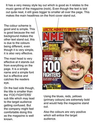
- 1. It has a very messy style lay out which is good as it relates to the music genre of the magazine (rock). Even though the text is laid out quite neat, it still goes bigger to smaller all over the page. This makes the main headlines on the front cover stand out. The colour scheme is good and is simple. This is good because the red background makes the other text stand out, this is due to the colours being different, even though it is very simple, it is also very effective. The mast head is very effective at it stands out from everything on the page. It is a simple name and a simple font but is effective and catches the readers eye. On the bad side though, the title is smaller than the ‘FOO FIGHTERS’ sub title which may lead to the target audience getting confused. But the company might feel comfortable doing this as the magazine is well known. Using the blues, reds, yellows (primary colours) are extremely bold and would help the magazine stand out. Also the colours are very positive which will entice the target audience.
- 2. This is a 60’s style magazine and the fonts and the style is relative to the age of the product with the greys, blacks and whites and the Beatles in blue. These colours represent the fashion and style of the 60’s era. Each individual on the picture looks as though they are equally important with there hair styles and how they dress. But the image also shows the different facial expressions of the Beatles which shows that they are their own individual characters. Each individual person also has a different colour on which may show that they have different personalities. Where it says ‘THE BEATLES’ this is the same text that is on the album cover for this band, this is good as readers will recognise it better. The txt is simple bold colours which would attract the attention of the target audience. The picture blurs out at the bottom which tries to focus the readers attention on the faces. How the title is behind the picture it shows the makers are comfortable knowing that the magazine is well known and people will still know what magazine it is without seeing the full image.
- 3. With the title being behind one f the persons heads, this shows the magazine company is comfortable with there name being slightly covered as they are well known. The image is of two people who are dressed the same and have the same hair styles as john Lennon and Paul McCartney. This would attract people who liked there music and would attract them. The white background allows the rest of the writing to stand out, the white and red go well and the bold red stands out from everything on the page. The page is well laid out and gives the magazine a more formal view. Also there are several sub headings which are in bold text which stand out and show that they are the main story's in the magazine.