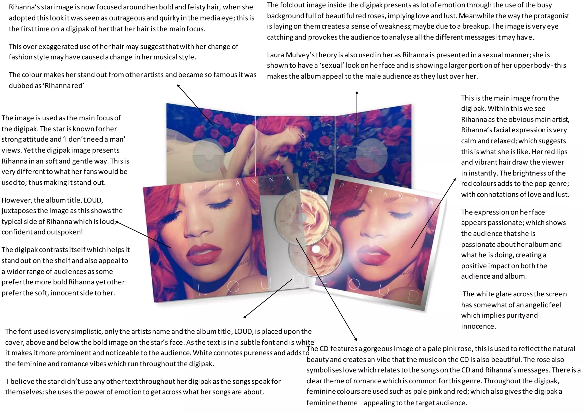
Thisis the mainimage fromthe
digipak.Withinthiswe see
Rihannaas the obviousmainartist,
Rihanna’sfacial expressionisvery
calm andrelaxed;whichsuggests
thisiswhat she islike.Herredlips
and vibranthairdraw the viewer
ininstantly.The brightnessof the
redcoloursadds to the pop genre;
withconnotationsof love andlust.
The expressiononherface
appearspassionate;whichshows
the audience thatshe is
passionate aboutheralbumand
whathe isdoing,creatinga
positive impactonboththe
audience andalbum.
The white glare acrossthe screen
has somewhatof anangelicfeel
whichimpliespurityand
innocence.
The CD featuresagorgeousimage of a pale pinkrose,thisisusedtoreflectthe natural
beautyandcreatesan vibe that the musicon the CD isalso beautiful.The rose also
symboliseslove whichrelatestothe songsonthe CD and Rihanna’smessages.There isa
cleartheme of romance whichiscommon forthisgenre.Throughoutthe digipak,
femininecoloursare used suchas pale pinkandred;whichalsogivesthe digipaka
femininetheme –appealingtothe targetaudience.
The font usedisverysimplistic,onlythe artistsname andthe albumtitle,LOUD,isplaceduponthe
cover,above andbelowthe boldimage on the star’s face.Asthe textis ina subtle fontandis white
it makesitmore prominentandnoticeable tothe audience.White connotespurenessandaddsto
the feminine andromance vibeswhichrunthroughoutthe digipak.
I believe the stardidn’tuse any othertextthroughoutherdigipakasthe songsspeakfor
themselves;she usesthe powerof emotiontogetacrosswhat hersongsare about.
The image is usedasthe mainfocusof
the digipak.The star isknownforher
strongattitude and‘I don’tneeda man’
views.Yetthe digipakimage presents
Rihannainan softand gentle way.Thisis
verydifferenttowhather fanswouldbe
usedto; thusmakingitstand out.
However,the albumtitle, LOUD,
juxtaposesthe image asthisshowsthe
typical side of Rihannawhichisloud,
confidentandoutspoken!
The digipakcontrastsitself whichhelpsit
standout on the shelf andalsoappeal to
a widerrange of audiencesassome
preferthe more boldRihannayetother
preferthe soft,innocentside toher.
The foldout image inside the digipakpresentsaslotof emotionthroughthe use of the busy
backgroundfull of beautifulredroses,implyinglove andlust.Meanwhile the waythe protagonist
islayingon themcreatesa sense of weakness;maybe due toa breakup.The image isveryeye
catchingand provokesthe audience toanalyse all the differentmessagesitmayhave.
Laura Mulvey’stheoryisalsousedinheras Rihannais presentedinasexual manner;she is
shownto have a ‘sexual’lookonherface andis showingalargerportionof her upperbody- this
makesthe albumappeal tothe male audience astheylustover her.
Rihanna’sstarimage isnow focusedaroundherboldandfeistyhair, whenshe
adoptedthislookitwasseenas outrageousandquirkyinthe mediaeye;thisis
the firsttime on a digipakof herthat herhair isthe mainfocus.
Thisoverexaggerateduse of herhairmay suggestthatwithher change of
fashionstyle mayhave causedachange inhermusical style.
The colour makesherstandout fromotherartists andbecame so famousitwas
dubbedas‘Rihannared’

Rihanna digipack

  • 1.
    Thisis the mainimagefromthe digipak.Withinthiswe see Rihannaas the obviousmainartist, Rihanna’sfacial expressionisvery calm andrelaxed;whichsuggests thisiswhat she islike.Herredlips and vibranthairdraw the viewer ininstantly.The brightnessof the redcoloursadds to the pop genre; withconnotationsof love andlust. The expressiononherface appearspassionate;whichshows the audience thatshe is passionate aboutheralbumand whathe isdoing,creatinga positive impactonboththe audience andalbum. The white glare acrossthe screen has somewhatof anangelicfeel whichimpliespurityand innocence. The CD featuresagorgeousimage of a pale pinkrose,thisisusedtoreflectthe natural beautyandcreatesan vibe that the musicon the CD isalso beautiful.The rose also symboliseslove whichrelatestothe songsonthe CD and Rihanna’smessages.There isa cleartheme of romance whichiscommon forthisgenre.Throughoutthe digipak, femininecoloursare used suchas pale pinkandred;whichalsogivesthe digipaka femininetheme –appealingtothe targetaudience. The font usedisverysimplistic,onlythe artistsname andthe albumtitle,LOUD,isplaceduponthe cover,above andbelowthe boldimage on the star’s face.Asthe textis ina subtle fontandis white it makesitmore prominentandnoticeable tothe audience.White connotespurenessandaddsto the feminine andromance vibeswhichrunthroughoutthe digipak. I believe the stardidn’tuse any othertextthroughoutherdigipakasthe songsspeakfor themselves;she usesthe powerof emotiontogetacrosswhat hersongsare about. The image is usedasthe mainfocusof the digipak.The star isknownforher strongattitude and‘I don’tneeda man’ views.Yetthe digipakimage presents Rihannainan softand gentle way.Thisis verydifferenttowhather fanswouldbe usedto; thusmakingitstand out. However,the albumtitle, LOUD, juxtaposesthe image asthisshowsthe typical side of Rihannawhichisloud, confidentandoutspoken! The digipakcontrastsitself whichhelpsit standout on the shelf andalsoappeal to a widerrange of audiencesassome preferthe more boldRihannayetother preferthe soft,innocentside toher. The foldout image inside the digipakpresentsaslotof emotionthroughthe use of the busy backgroundfull of beautifulredroses,implyinglove andlust.Meanwhile the waythe protagonist islayingon themcreatesa sense of weakness;maybe due toa breakup.The image isveryeye catchingand provokesthe audience toanalyse all the differentmessagesitmayhave. Laura Mulvey’stheoryisalsousedinheras Rihannais presentedinasexual manner;she is shownto have a ‘sexual’lookonherface andis showingalargerportionof her upperbody- this makesthe albumappeal tothe male audience astheylustover her. Rihanna’sstarimage isnow focusedaroundherboldandfeistyhair, whenshe adoptedthislookitwasseenas outrageousandquirkyinthe mediaeye;thisis the firsttime on a digipakof herthat herhair isthe mainfocus. Thisoverexaggerateduse of herhairmay suggestthatwithher change of fashionstyle mayhave causedachange inhermusical style. The colour makesherstandout fromotherartists andbecame so famousitwas dubbedas‘Rihannared’