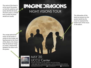
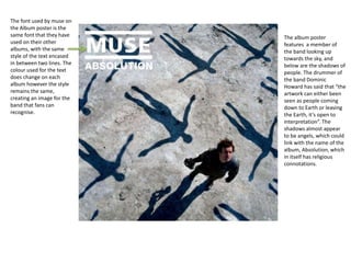
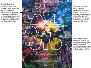
Alternative Rock Poster Analysis
The name of the band is
at the top of the poster
so that the audience can
easily identify the band.
The font used is a similar
font to what the band
would use usually.
The smoke behind the
moon on the poster is
similar to the smoke and
fog featured on the front
of the album, this shows
that the band are trying
to create a relationship
between the album and
the poster.
The silhouettes of the
band are present on the
poster, backlit by the
moon to represent the
darker tone of the music
in the album.
The font used by muse on
the Album poster is the
same font that they have
used on their other
albums, with the same
style of the text encased
in between two lines. The
colour used for the text
does change on each
album however the style
remains the same,
creating an image for the
band that fans can
recognise.
The album poster
features a member of
the band looking up
towards the sky, and
below are the shadows of
people. The drummer of
the band Dominic
Howard has said that “the
artwork can either been
seen as people coming
down to Earth or leaving
the Earth, it’s open to
interpretation”. The
shadows almost appear
to be angels, which could
link with the name of the
album, Absolution, which
in itself has religious
connotations.
The band name is
present on the poster
however is difficult to see
against the graffiti
background, suggesting
that the background is
meant to be the centre of
focus in order to promote
the Coldplay’s image.
The poster seems to
shows a graffiti
background filled with
random colours and
drawings, this shows the
creativity of the band
through the variety of
colours on the poster.
The title of Coldplay’s
new single ‘Paradise’ is
displayed on the poster,
which follows the
convention of alternative
rock magazine adverts.

Alternative Rock Poster Analysis

  • 1.
  • 2.
    The name ofthe band is at the top of the poster so that the audience can easily identify the band. The font used is a similar font to what the band would use usually. The smoke behind the moon on the poster is similar to the smoke and fog featured on the front of the album, this shows that the band are trying to create a relationship between the album and the poster. The silhouettes of the band are present on the poster, backlit by the moon to represent the darker tone of the music in the album.
  • 3.
    The font usedby muse on the Album poster is the same font that they have used on their other albums, with the same style of the text encased in between two lines. The colour used for the text does change on each album however the style remains the same, creating an image for the band that fans can recognise. The album poster features a member of the band looking up towards the sky, and below are the shadows of people. The drummer of the band Dominic Howard has said that “the artwork can either been seen as people coming down to Earth or leaving the Earth, it’s open to interpretation”. The shadows almost appear to be angels, which could link with the name of the album, Absolution, which in itself has religious connotations.
  • 4.
    The band nameis present on the poster however is difficult to see against the graffiti background, suggesting that the background is meant to be the centre of focus in order to promote the Coldplay’s image. The poster seems to shows a graffiti background filled with random colours and drawings, this shows the creativity of the band through the variety of colours on the poster. The title of Coldplay’s new single ‘Paradise’ is displayed on the poster, which follows the convention of alternative rock magazine adverts.