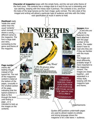
1. Character of magazine keeps with the simple fonts, and the red and white theme of
the front cover. The contents has a vintage style to it and it’s lay out is interesting and
eye catching, keeping with the messy style it portrays. The contents is fun, and from
the looks of the large banana as the main image; quite comical. The retro style of the
imaged and writing will attract a particular type of audience and links with the Indie/
rock specification of music it seems to hold.
Masthead reads
‘inside this week’
rather than the
usual ‘contents’
which immediately
shows a young,
different sense to
the magazine. The
font is large bold
and retro,
connecting to the
genre and theme of
the magazine.
Images show
what and who are
going to be
featured in the
band attached
with the page
number of the
article. The reader
doesn’t have to
read who they are
if they are familiar
with the music
sort.
The images are
sized differently,
probably larger if
more important to
the magazines
content. The
images are closes
together , and
separated in a
messy style,
keeping with the
magazine type
and theme.
Page numbers Are
mainly attached to
leading images
instead of the
typical list. The rest
of the magazines
content is listed at
the bottom of the
pages, unusually in
the smallest section
of the page,
indicating that the
typical audience is
likely to flick
through the book
until finding a
page , or is
intended to look up
the images on the
contents.
Advertisements
Quotes and questions underneath pages
are used to attract readers to articles
and strong language shows the
magazine is for a late teens + audience.