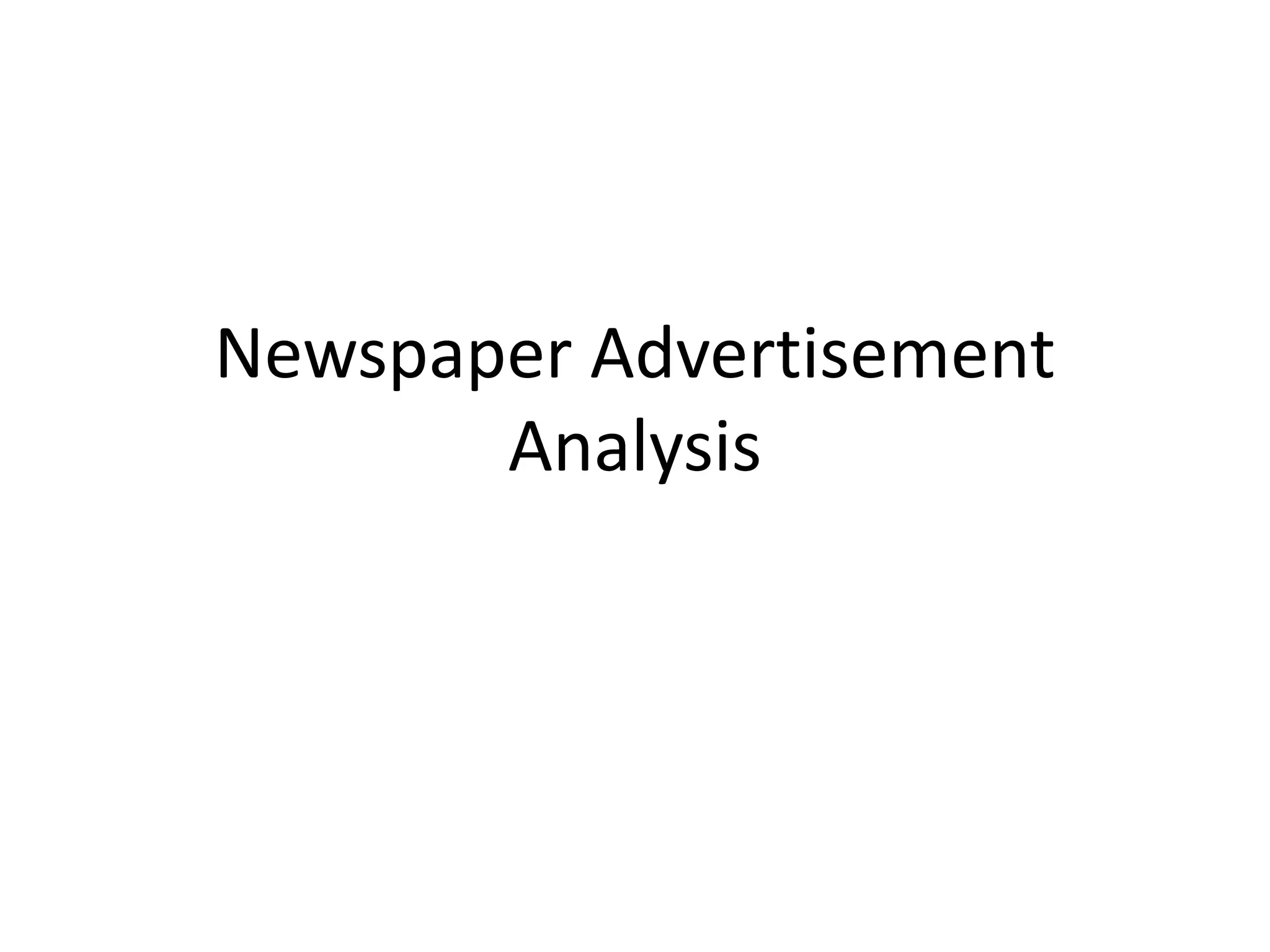
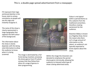
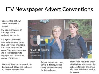
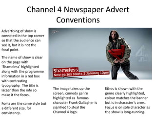
This newspaper advertisement uses conventions common to ITV and Channel 4 ads. For ITV, the logo is prominently displayed and the name of the show is in large, contrasting typography to stand out. Key information like date, time and channel are clearly listed. For Channel 4, the iconic logo is used and the image takes up most of the space, focusing on characters to depict the genre. Both follow conventions of clear branding, focal images, and vital show information to effectively promote programs.
Bloggers, Vloggers & More: How Influencers Matter for Beauty and Fashion BrandsWomen's Marketing, Inc.
Learn how to use the power of influencers to ignite your brand. Discover the latest trends, how to find the right bloggers for your brand, and the best practices for engaging with influencers.
Introduction to Storyboarding for User Experience DesignDeb Aoki
An introduction to storyboarding for user experience (UX) design, with tips and examples from eBay and Citrix. A presentation for World Innovation Lab in Palo Alto in June 2015.
OTT Video Trends and Opportunity (2018)MC[CO] Labs
This upload features a summary of MC[CO] Labs' work in video streaming and our general perspective on OTT video trends from our more recent work, sanitized to protect the confidentiality of our clients.
PDF, audio, and voiceover will be available on designintechreport.wordpress.com
Today’s most beloved technology products and services balance design and engineering in a way that perfectly blends form and function. Businesses started by designers have created billions of dollars of value, are raising billions in capital, and VC firms increasingly see the importance of design. The third annual Design in Tech Report examines how design trends are revolutionizing the entrepreneurial and corporate ecosystems in tech. This report covers related M&A activity, new patterns in creativity × business, and the rise of computational design.
Telecom Service/Media: AT&T to acquire Time Warner
- US-based telco AT&T’s acquisition of Time Warner will be an industry game changer
- Note growing investment in premium content (a growth driver for ICT ecosystem)
- Focus on CJ E&M’s efforts to improve original content and telcos’ media expansion
Tom Roach, BBH London’s Head of Effectiveness, discusses the importance of difference in business, marketing and creativity, and shares some key data to help you avoid drowning in the ‘sea of sameness’.
We are all born storytellers. But not many of us know how to create and tell stories in the right way. Especially, in presentations and public speaking. Learn about the art of storytelling in our short slide deck covering valuable tips and tricks about it.
Check out our training: http://yanyhbash.ru/training-courses/let-me-speak-from-my-heart-storitelling-v-prezentatsiyakh/
BRANDING UNLIMITED. How will AI break the boundaries?Daniel Alencar
By analyzing consumer behavior and trends and creating stunning brand expression and personalized campaigns, AI has become an essential tool in crafting successful branding stories.
Takeaways
AI's rise challenges concepts and inspires new social narratives. Grasping these shifts is key to create powerful brand-audience connections.
AI provokes a new mindset for professionals and reshapes the creative journey. Three trends will unveil opportunities to stay tuned and relevant.
Inspiring examples on how AI can assist brands in engaging ever-demanding audiences, swamped with content and facing limited attention spans.
How to create a good story? What are the rules for effective storytelling? Which elements each story has to contain? Which structure? How to use storytelling in advertising business? Here it is all...
Why are stories so important to us? What makes a good story? In this presentation learn why stories are the best way we have to get ideas out into the world and how to create an effective story.
This year, the team at Activate has defined the 11 most important insights for tech and media in 2017. Key points:
*$300 Billion in Tech and Media Growth Dollars
*There are 31 Hours in a Day
*Super Users: A Lot More Time, a Lot More Money
*Smart Speaker Battles are about the Great Digital Assistant Wars
*Reality Computing: VR/AR Move from Entertainment to the Next Big Computing Platform
*Big Influencers and Media Brands will Rule Web Video
*Premium Video: The Chase for Television Viewers and Television Dollars
*Sports is the Ultimate Moat
*News Brands will Beat Fake News (Spread by Fake Friends)
*eCommerce: More than Two Trillion Dollars To Go
*In an Era of Voice Control, Look to Podcasting to Engage Users
A Experiência do Usuário tem uma longa história como fator determinante sobre o sucesso de negócios, mas como podemos explicar isso de forma clara para aqueles que precisam justificar as mudanças e soluções propostas para a diretoria de uma empresa não-digital?
A proposta dessa palestra é apontar diversos casos e estatísticas comprovadas onde a UX trouxe até 4x mais retorno do que o esperado, apenas por seguir processos e otimizar negócios partindo das pessoas.
Advertisement analysis and breakdown of :-
Fevicol’s ‘kissa kursi ka’ - crazy chairs
Olx – daastaan - timeless stories
Thumbs up - real heroes
Nescafe
Pepsi oh yes abhi!
Maybelline – the girl with the big eyes.
A free version of McDonald's Corporation SWOT analysis 2017. To get the full presentation buy the SWOT here: https://www.strategicmanagementinsight.com/swot-analyses/mcdonalds-swot-analysis.html
2. I found this newspaper advertisement on the internet but later discovered that it was
scanned in, therefore meaning that originally the colours were not black and white.
The name of the show is
connoted in the largest
typography to signify its
importance and to make it
stand out.
Ant & Dec have branding
familiarity with ITV,
therefore the channel uses
them regularly to promote
shows as they are popular
icons.
Ant is highlighted to be
a button essentially,
with the image
semantically relating to
the name of the show to
therefore emphasise the
point of the game show.
The image also looks
exciting, which draws
the audience towards it.
The information about the
show is clearly depicted,
with this being vital
information to allow the
audience to know when it
is being screened.
The ITV logo is denoted
here as black and white,
but it is infact the typical
colour of yellow and white
(though this has changed
now), but branding
consistency is connoted
with the advert.
There is a small website
link next to the logo, this
implies the importance of
web 2.0 and uses cross
media convergence to
highlight the range of
products that ITV has.
3. More Analysis
Ant and Dec are represented as both wearing suits which therefore gives them
a sense of credibility and also makes them appear to look extremely smart.
Their representation highlights ITV to be a professional channel as they look
smart, as well as the way that the famous duo are synonymous with the ITV
brand with other flagship shows.
Dec is represented with a huge grin on his face whilst having his tongue out
therefore signifying his personality to be exuberant which the audience will
enjoy, with the purpose of this advert to be entertaining because this is what
Ant & Dec are known for. The positioning itself is used for humorous effect
because both celebrities constantly play on their small heights for comedy,
with Dec purposely looking directly at the reader in order to allow the
audience to interpret this in a funny manner so that they will watch the show.
Ant stares back up at Dec to give the impression that he is annoyed at being
used as a button, with his facial expression connoting him to look up at Dec in
disgust, but yet again this is to make the audience engage with them to make
them laugh.
4. Further Analysis
The typography is curved and slanted around both Ant & Dec on the page, with
instantly demonstrates that the show is dynamic and wacky along with the persona of
the presenters. This gives the audience information about what the show is like before
they see it, which is a positive because it signifies the comedy genre of ITV.
This show was sponsored by Maltesers, with the actual background of the advert
being a red colour to relate to them through the same branding colours. This is used
with two different shades of red to highlight sound waves from using Ant as a button
(or a buzzer), this not only is intended to make the audience laugh – but the colours
make sure that the Maltesers brand is shown thoroughly. The ITV logo is still able to
stand out against the red colour due to it being yellow, with the purpose being for the
audience to know that the show is on ITV so making the logo entirely visible is a
fundamental aspect of the advertisement.
This connotes Daniel Chandler’s genre theory because of the fact that comedy is
clearly being signified in order to elicit a comedic response from the audience, with
the levels and status of both Ant and Dec being purposely manipulated as this is
conventional slapstick comedy that a comedy audience will be synonymous with.
5. Summary
The advert intends on using two presenters that are
synonymous with the ITV brand and ethos, so by using these
two as a representation for a flagship view, the audience will
instantly be drawn to the advert and this is a very effective
technique. Furthermore, the advert looks humorous and uses
the two in a wacky way due to the image of Ant being used as
a button, but also the curved typography highlights the fun
side of the show and it is intended to make the viewer laugh.
Information is clearly highlighted on the page, so that the
audience can easily see the name of the show, the time and
the channel – as well as giving them opportunities to find
more information through the use of web 2.0, allowing an
active audience to become thoroughly engaged with the show
before it is even aired.
6. This is a double page spread advertisement from a newspaper.
ITV represent their logo
and brand identity in the
house style to convey
consistency as people will
see this logo and
instantly recognise it.
The name of the show is
clearly represented in
large typography that
opposes the dark colour
of the background.
The information about
the show is clearly
depicted, with this being
vital information to allow
the audience to know
when it is being
screened. The image is dominated by a full
frame being smashed, conveying
the drama genre from ITV which
conveys that they follow their
ethos of a range of genres in
their programming.
Colour is not typical
within a period drama so
this subverts from the
traditional convention,
therefore creating
excitement for the
audience.
Downton Abbey is known
as a flagship show, hence
the reason why there
isn’t a huge amount of
information on the
advert, as audience’s are
typically expected to
know aspects about the
show.
Within the image the characters are
denoted to emphasise the period
drama genre intrinsically, allowing the
audience to interpret what type of
show is being advertised easily.
7. More Analysis
The tagline ‘A House Divided’ instantly creates suspense to the audience with the
intention of drawing them in towards the show, as this creates tension. Furthermore,
the tagline relates to the image due to the way in which the photo frame has
smashed, hence emphasising the period drama genre and it creates further
excitement for the audience. Todorov’s narrative theory is suggested through the
combination of image and tagline, as it creates an instant disequilibrium before the
show has even been aired.
All of the characters within the frame (apart from the character on the far left) are
looking directly at the audience with the purpose being to attract them towards the
advert as this signifies their importance within the show. The direct contact from the
advert will appeal to audiences as it will make them want to see why the
disequilibrium has occurred, with this being enhanced further due to the fact that only
one character in the frame isn’t looking directly at the audience – which then creates a
sense of tension and Todorov’s theory again also.
Furthermore, Barthes’ hermeneutic code is connoted due to the fact that the
advertisement is promoted without a denouement because of the fact that ITV want
to create suspense as the frame is cracked which instantly highlights disequilibrium, as
this is essential to the advertisement because of the fact that there is not resolution.
8. The Channel 4 logo is used as more of an icon
in comparison with ITV, these are just two
examples that we sourced from the internet
in order to gain a better interpretation into
the conventions of newspaper
advertisements. ITV is placed upon the
adverts in order to allow the audience to
simply be able to see what channel the
specific programme is on, however the
channel 4 logo appears as more of a stand
out and iconic logo which we as a group
perceive to be effective. This is a positive by
Channel 4 because it gives the channel a
sense of identity, there is more creativity
within the logo and diversity is conveyed
between the two examples – however this
still relates to Channel 4’s ethos of diverse
programming. The image is always the focal
point of the advert, with the text playing little
part on the page but still containing all of the
vital information. A coloured text box is
placed in the corner so that the centre of the
advert is always in place to highlight the
importance of the image. Colour schemes are
consistent throughout adverts which is
effective as it makes them look more
professional and these colours stand out
compared to the image.
9. The Channel 4 logo is
kept on the right side of
the advertisement, this is
kept consistent which is
effective as it creates
brand identity.
There is a simplicity
within Channel 4 and
their adverts, the
conventions of adverts
are still concurrent.
The information of the
programme is stated,
along with details about
the show itself and the
time and date that it
starts to inform the
audience and allow
them to see when the
show is on.
The advert focuses on this key scene between all of the main characters within the show, the
image also appears as natural rather than ITV’s characters looking directly at the audience.
This alternation conveys the positive relationship between the characters. However, this hints
at a sense of disequilibrium within the future, with the fact that all the characters being
shown representing Propp’s character types which therefore highlights that each character in
the frame has a different role that the audience will learn, this entices them towards the
show.
The colour of the logo is in place
to make sure that it stands out
against the dominant image on
the page. The typography of the
information follows this
consistency also.
The emphasis upon the
brand identity allows the
audience to remember the
logo and therefore the
programme being
advertised, which means it is
entirely successful.
The image takes up
the entire frame, with
all the main
characters depicted
during a scene of the
show, this instantly
allows the audience
to seek out the
characters.
This advert involves the plausible realism theory
because of the fact that characters are conveyed as
they would have stereotypically been in the era of
late 80’s. Girls as having short hair, though this is
an aspect of plausible realism in this era, which is
effective because it highlights the characters to be
realistic so that audience can subsequently engage
with them.
10. ITV Newspaper Advert Conventions
ITV logo is prevalent on
the page so the
audience can see it.
ITV logo is coloured to
match the genre of show,
blue and yellow emphasise
the police crime drama
genre. Two main characters
are in the focal point to
highlight that they are the
central characters.
Name of show contrasts with the
background, allows the audience
to see the name of show.
Advert states that a new
series is starting, hence
trying to create interest
for the audience.
Information about the show
is highlighted also, allows the
audience to know the simple
info, date and time is vital on
the advert.
Sponsorship is shown
in the top corner of
advert.
11. Channel 4 Newspaper Advert
Conventions
Advertising of show is
connoted in the top corner
so that the audience can
see it, but it is not the
focal point.
The name of show is clear
on the page with
‘Shameless’ highlighted
along with the programme
information in a red box
with contrasting
typography. The title is
larger than the info so
make it the focus.
Fonts are the same style but
a different size, for
consistency.
The image takes up the
screen, comedy genre
highlighted as famous
character Frank Gallagher is
signified to steal the
Channel 4 logo.
Ethos is shown with the
genre clearly highlighted,
colour matches the banner
but is in character’s arms.
Focus is on sole character as
the show is long-running.