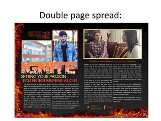
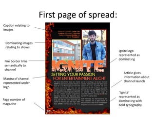
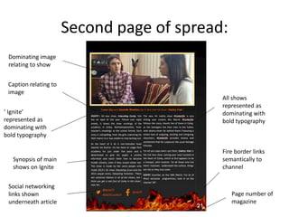
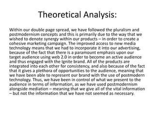
This double page magazine spread promotes the launch of the Ignite TV channel. On the first page, large images from two Ignite shows are overlapped by the colorful Ignite logo. Program details and the channel slogan appear underneath. The second page continues promoting Ignite's lineup of exciting shows in bold text. Fire borders link the two pages and relate to the channel's theme of "setting passion for television alight." The spread aims to attract viewers and make the Ignite brand highly recognizable through its dynamic visual design and emphasis on mobile viewing options.
- The products use consistent branding elements like the bright orange Ignite logo, fire-themed graphics, and bold typeface to clearly show they are part of the same campaign.
- They also share common imagery from the three flagship shows to link the products and familiarize audiences with the channel's content.
- Synergy is created by including the same social media details in the newspaper ad and double page spread to point audiences to additional online content and promotions.
How effective is the combination of my main and ancillary productsLewis Thickpenny
The document discusses how the author created a brand identity for their main documentary product and two ancillary texts (a TV listing and advertisement).
The author paid close attention to elements like color, font, positioning and imagery to link the products together visually. Both ancillaries feature a similar dark image with an EU flag to set the theme. While the font differs, placement of elements like the title and Channel 4 logo are consistent.
The documentary product combines well with the ancillary pieces through use of matching imagery, themes and narrative to present a cohesive representation of the topic across all products. However, the documentary did not fully cover all topics mentioned in the TV listing, breaking that convention.
The document describes the process of designing a movie poster and website. For the poster, the creator used their original film prop image, flipped it horizontally, increased brightness, added a masthead, stars, and adjusted colors. For the website, they chose a black background with white text for contrast. The poster design was used prominently and resized appropriately. Additional pages and graphical elements like social media links were included to offer more content for consumers.
This document provides an overview and analysis of the media products created by the author for their A Level media studies project, including a short film, poster, and website. It discusses how the products utilize conventions of comedy, mockumentary, and film posters/websites. The short film uses slapstick and a handheld camera style to critique modern consumerism. Connections between the products include sharing the production company logo and a box motif representing exploitation. Audience feedback found the strongest elements were comedy and acting, while sound/lighting could be improved when filming on location.
The combination of the main music video product and two ancillary texts (a digipak and advertisement) is effective when they are consistent and match the same theme. It is important that the audience can visually connect all three and understand they are related. The student ensured their music video, digipak, and advertisement used consistent fonts, colors, visual techniques, and featured the same character to clearly link all three together as a cohesive promotional package. Primary market research in the form of a questionnaire was conducted to gauge how effectively the audience could see the connection between all three pieces.
Cake & Socialyse January 2016 Facebook UpdatesCake
The document provides information about two new Facebook features: Audience Optimization and Canvas. Audience Optimization is a tool that helps publishers better understand the interests of their engaged audiences to improve content relevancy and engagement. It includes new audience tags and filters. Canvas is an immersive mobile experience that uses video, images and buttons to tell brand stories. It provides creative flexibility and is compatible with all campaign objectives. Examples of how brands can benefit from each tool are also provided.
The document discusses the effectiveness of combining a documentary with ancillary media products like a double page spread and radio trailer. It notes that constant reference must be made to the documentary's content through things like quotes, pictures, and relevant information. This helps prevent audience confusion and maintains interest. The target audience is identified as young adults aged 17-24 who frequently use mobile phones. Both the double page spread and radio trailer directly reference the documentary title and include images and sound bites from the documentary to clearly link them together. The use of consistent branding, language, and targeting of the same audience across all three media products helps effectively promote the documentary.
The document discusses how the author used new media technologies in the construction, research, planning, and evaluation stages of their media project. During research, the author used websites like YouTube and Google to find examples of commercials and record research findings in a blog. SoundCloud was used to find royalty-free music. Green screen technology and studio lighting were used for the first time during production. Premier Pro was used for editing, with YouTube tutorials to learn skills. Google Docs surveys gathered audience feedback for evaluation. Overall, the author learned new skills with technologies like green screen and survey tools.
This document discusses the branding and marketing strategies used by several energy drink companies. It analyzes the color schemes, imagery, fonts, and contexts used in the advertisements and packaging of IRN-BRU, Relentless, Red Bull, and Monster energy drinks. The document examines how each company uses distinctive colors and graphics to represent their brands and target certain demographics. It also explores some controversial advertisements and how the companies promote an image of energy and excitement through their visual design choices.
The document analyzes a world tour poster design. It identifies strengths like the background image blending well. Weaknesses include empty space below ticket information. Suggested changes are to add more sponsor logos to fill space, and social media links/websites to promote brand loyalty and convergence media. The final design should keep conventions like the ticket area, and add arenas to advertise tour locations and meet profitability goals.
This document provides reasoning for slogans and font choices for potential Irn-Bru packaging designs. It discusses using pun-based slogans to appeal to teenagers. It considers several font styles and colors, including Impact, Tall Dark and Handsome, and Cooper Black, settling on Impact and Tall Dark and Handsome for boldness. Four can packaging designs are proposed: 1) uses Impact font around the can, 2) features one line of text on a blue can, 3) uses rounded text similar to Dr Pepper, 4) reverses Irn-Bru colors with blue text on orange background. The designs aim to stand out and attract teenage customers through bold colors and fonts.
1) The author ensured their main music video and ancillary texts (advert and digipak) were related and seen as a set by using similar aspects like color scheme, fonts, and references to promote synergy between the products.
2) The color purple was used in all products to relate to the power gained by the character and the color of smoke in the climax, establishing continuity.
3) A cartoon version of the character drumming was included in the ancillary texts to provide insight into the music video and attract audiences through familiarity with the narrative.
The combination of the main product and ancillary texts was effective at promoting and marketing the production. Two tasks were created - a double page advertisement poster for a magazine and a radio advertisement. Both were designed using research on effective marketing techniques and elements. A marketing timeline was created to plan the release of various promotional materials like teasers, trailers and posters across different social media platforms and local radio over several months leading up to the production release. Feedback indicated the promotional efforts were successful at generating interest and audience for the main product.
The document discusses draft website designs for the homepage, news page, and shows page of a channel called Indigo TV. Consistent elements are included across all pages like the logo, motto, and navigation buttons to clearly indicate the channel and encourage audience engagement. Pictures and videos are used to promote flagship shows and new programming. Descriptions provide information about the channel's ethos and shows to attract the target audience of young adults. Images of mixed gender groups are also included to represent the target demographic. The goal is to introduce audiences to the channel, its shows, and build interest in the programming.
This document outlines a marketing plan for a cloud storage app called Cloud Wrap. It aims to provide college students, office workers, and businessmen with cloud storage and sharing capabilities. The plan details goals of becoming a popular paid app and increasing Indian users through free initial service. It proposes promoting through social media, seminars, and YouTube ads. Revenue will come from premium storage tiers starting at $9.99/month for 125GB. The app aims to break even with 500 monthly users and profit from premium subscribers.
The document provides an analysis and self-reflection of the student's multi-media marketing campaign for a makeup line. The campaign included a web pop-up, sponsorship video, and two television advertisements. Though largely satisfied, the student notes some areas for improvement, such as consistently showing the actual products and incorporating a wider variety of colors throughout to better represent the "Impact Colour" theme. Overall, the campaign utilized similar visual styles, models, and a red/black color scheme, but could have been strengthened by addressing some missed opportunities in integrating multiple products.
The document discusses the effectiveness of combining a band's main product (their album) with ancillary texts like a digipak, music video, and advert. There are links created between the products through using consistent props, locations, imagery and logos. However, some links could be stronger by adjusting small design details. Overall, the combination of products is deemed effective as they create synergy and recognition between the pieces. But the document suggests there is still room for improvement to make the links and synergy even stronger.
The document analyzes 3 Irn-Bru advertisements and provides details on the font, color, layout, images, and text used in each. Some key points made:
- The fonts used are fun and handwritten to appeal to younger audiences. Bright colors like blue and orange are used to match the brand and catch attention.
- Layouts are simple with little content to look modern. Images include products and jokes/puns to tie to the text.
- Text uses humor and jokes related to the images to engage the target audience. Simplicity and recognizing branding colors/fonts is important.
Both media products use a photoshopped main image to represent the topic - a man holding a phone for the documentary on teenagers' use of phones, and a man in a suit for a mystery documentary. They both use a medium shot and include other smaller images on the page. While the example magazine uses behind-the-scenes images, the student magazine uses clips from the documentary to promote what will be shown and create familiarity. They both include logos and captions to provide context for the images and previews of their documentaries.
The document discusses the evaluation of a research project promoting nightlife in York through a cinemagraph and mobile app. It describes the research conducted, including looking at demographics, existing products, and primary data collection. Planning involved considering fonts, colors, and existing posters and apps. Time management split tasks evenly within the given timeframe. The technical qualities of the app logo are discussed against other examples. Feedback noted the app could better reflect York and include more details and pages. The cinemagraph design aimed to appeal to audiences through imagery, fonts, transitions and prizes through the app.
The document discusses how the author continued the theme of coasts and beaches throughout their website and other materials. Images of beaches and coasts were the first things seen on the website to reinforce this theme. The same masthead was used on the magazine and billboard to help audiences recognize the brand between formats. An advertisement on the billboard also visually linked back to the magazine's front cover to help determine if it was the right type of regional magazine for audiences. Consistent writing style and techniques like hyperlinks helped establish a cohesive brand across all materials.
Sound print platform increases customer interaction with tv(yang sun)Frank Sun
This document discusses how the SoundPrint platform developed by IntoNow increases customer interaction with television. SoundPrint uses audio fingerprinting technology to identify television programs, including specific episodes, allowing users to check-in to and discuss shows with friends. This level of integration has changed marketing approaches, making advertising more implicit and measurable. The platform also has potential applications in other industries like automotive and accessibility for the blind. While growing customer interaction, competition in the social television space remains intense.
Tom Armstrong created various materials for an ocean pollution awareness campaign including logos, posters, merchandise, and other graphics. He refined his logo to be simple and recognizable. His posters ranged from direct messages to more subtle designs and utilized colors, images, and text to raise awareness. For merchandise, Tom found simpler designs worked best, like using just the logo on phone cases. Overall, Tom tailored his pieces to effectively spread awareness of ocean pollution to various audiences through clear, impactful messaging.
This newspaper advertisement promotes the launch of the Ignite TV channel. It uses a dynamic design with the logo in the middle and large images from shows like "#CorbyLife". The advertisement draws viewers in with these vivid images and uses consistent branding elements like white text on a black background across all the shows promoted. It provides the launch date and social media links to encourage engagement. The advertisement aims to present Ignite as an exciting new channel through its unconventional design and use of "hot" colors, while clearly communicating the channel's identity and programming to potential viewers.
The Ignite website effectively promotes the channel's brand and shows. Key features include a navigation bar linking all pages, prominent display of the logo and brand mantra at the top of each page, and large inviting images in slideshows to entice viewers. The home page provides information on the launch date and uses hashtags to encourage social media engagement. Images and descriptions of the top shows are also featured. Consistency in design, colors and features helps create a recognizable brand identity and intuitive user experience across the site. The social media bar allows viewers to easily connect with the channel online. Overall, the website utilizes visuals, content and interactivity well to promote Ignite and attract audiences to its programming.
This document discusses branding conventions for ending advertisements, focusing on the Ignite brand. It recommends including the Ignite logo prominently to represent the channel's identity. Program names should be shown in a smaller font below for differentiation. Date and time should also be included in a smaller font. Social media links and hashtags should be incorporated to encourage audience involvement, as the target demographic of 16-34 year olds is likely to use social media. This aligns with the goal of creating a cohesive branding strategy and synergistic marketing campaign.
The combination of the documentary and two ancillary texts of a radio trailer and magazine article were effective at targeting a similar audience of 16-34 year olds. Similar conventions and features were used across all three products to clearly connect them. While the radio trailer most directly advertised and reinforced the documentary through use of the same music, narration style, and audio clips, the magazine article could have been improved with more attention to layout and visuals to better appeal to the target demographic. Overall, the products established a clear brand identity through a shared color scheme and language to cohesively promote the topic of social networking.
This is my portfolio. It contains a few highlights from my career as a content writer so far. Please do get in contact if you'd like any more information:
nickcolman1@gmail.com
07526728996
The document discusses several case studies of mobile advertising campaigns. It describes the objectives, solutions, and results for campaigns run by companies like John Lewis, The Economist, Mini, BBC Top Gear, Hotel Tonight, Priceline, YPlan, Cut the Rope, Pfizer, and Facebook. The solutions involved strategies like targeted placements, premium inventory, geo-fencing, optimization, and multi-variant testing. The results generally exceeded expectations by increasing traffic, sales, leads, downloads, and subscriptions.
The ancillary texts, including a double page spread and poster, were created to support the main documentary. The double page spread provides dialogue and images from interviews to engage audiences and inform them about the documentary. The poster displays an eye-catching image and details about the documentary to attract viewers. Both ancillary texts are presented in a formal style to match the educational nature of the documentary. Comparisons are made to other double page spreads and posters, noting similarities in layout and information provided, as well as differences in style that would not be appropriate for this documentary.
This document analyzes the genre of soap operas and how they use ancillary products like posters to promote and advertise their shows. It discusses several key elements that are typically included in soap opera posters and why they are important. These key elements include taglines, images of protagonists, use of social media, logos, and colors/themes. The taglines help contribute to the fan base and create interest. Images of protagonists create star appeal to engage consumers. Social media creates synergy across platforms for more advertisement. Logos help with brand identity and identifying the channel. Colors and themes depicted drama and trouble to persuade viewers.
The document discusses how the creator established brand identity across their documentary, radio trailer, and magazine double-page spread which promoted the documentary. Similar fonts, color schemes, music, and imagery were used to create continuity and familiarity between the products. Screenshots and descriptions from the documentary were featured in the magazine spread to link the pieces. Logos and references to the broadcast channel were also included to clearly associate the documentary with Channel 4. The goal was to effectively promote awareness of the documentary and influence audiences to watch through a cohesive branded identity.
This document discusses the codes and conventions of real media listings magazines that were analyzed to inform the design of a student-created listings magazine article. It describes several key elements that were included, such as a byline, page numbers, main image, main heading, pull quotes, subheadings, drop caps, consistent color scheme, use of columns, and inclusion of date/channel/time. The student analyzed examples of real listings magazines and circled similarities between their article and a real one. While most conventions were followed, some aspects like direct address in images and use of symbols were deliberately not included. The analysis demonstrates an understanding of relevant conventions to create an article that resembles professional media listings.
The document discusses the effectiveness of combining a documentary with ancillary texts like a magazine spread and radio trailer to create a consistent brand identity. It details how the same font, color scheme, music, and narrator were used across the documentary, radio trailer, and magazine spread to appeal to the target 11-19 year old audience and make the products recognizable as being related. Screenshots from the documentary were also included in the magazine spread to clearly link the products and influence audiences to watch the documentary.
The document describes a print advertisement the author created to promote a documentary. It follows conventions of real print ads by major channels. These conventions include positioning the logo on one side, using the largest font for the title, and including one high quality main image. The ad features the documentary title, slogan describing its topic, and air time. It uses a banner and logo in matching purple to create a cohesive house style. The image shows a man with chocolate in his mouth to identify the documentary's topic.
Cohesive marketing involves merging different marketing styles together to promote a product through various media channels simultaneously. This creates a unified promotional campaign where the branding is seen everywhere. 360 degree branding further enhances this by promoting the brand through secondary products like clothing and accessories. Multi-platform branding consistently delivers the same branding messages across different channels like websites, social media, television, and print to maximize exposure and create recognition of the brand.
Sophie Bottazzi created a local newspaper, website, and radio advertisement for her media studies advance portfolio to develop new media skills beyond her foundation portfolio. She researched existing local newspapers to identify common forms and conventions like headings, images, articles, and ads. Her newspaper challenged conventions by using colored high-resolution images and modern storylines. Her radio ad developed conventions by recording voices naturally and altering them digitally. Her website challenged conventions by having a modern, easy-to-read design. Audience feedback from surveys helped shape the project to attract different age groups with local news. Technologies like blogs, YouTube, and design software were used in planning, construction, and sharing the portfolio pieces.
Epicurious is overhauling its app to better engage users and solve challenges around discovery, recidivism, loyalty and visibility. The rebuilt app will leverage Apple's tools like push notifications tied to location and seasons, as well as widgets. It aims to keep the app top of mind through non-utility moments. FIG is investing in the overhaul after revenue growth and hopes higher-margin native ads will offset a smaller app audience. Discovery will rely on heavy promotion through social videos as no one has tried to own the food media channel on social before. The business model evolution and publisher learning around apps warrants a second look at the ecosystem.
.How effective is the combination of your main media product and the correspo...tfyeomans13
The combination of the documentary and ancillary texts was effective in creating a consistent brand. Quotes, pictures, and information from the documentary were used in the double page spread and radio trailer to immediately connect them and create consistency. The title "Necessity or Luxury" was also carried over to reinforce the connection between products. While some of the individual channel/publication choices were inconsistent and disconnected the products, overall the texts promoted the documentary and maintained consistency in branding to some extent.
How effective is the combination of your main media product and the correspon...tfyeomans13
The combination of the documentary and ancillary texts was effective in creating a consistent brand. Quotes, pictures, and information from the documentary were used in the double page spread and radio trailer to immediately connect them and create consistency. The title "Necessity or Luxury" was also carried over to reinforce the connection between products. While some of the individual channel/publication choices were inconsistent and disconnected the products, overall the texts promoted the documentary and maintained consistency in branding to some extent.
The document discusses the effective combinations between the author's four media products: a newspaper, inside page, website, and poster. All four products have similar styles, with the same masthead and color scheme. The newspaper front page and inside page share similar images and ads. The poster advertises the newspaper and links to the website. The website features videos, apps, stories and social media to branch out to different audiences. The combinations between the products help them represent and promote each other.
The document discusses the effectiveness of combining a documentary with ancillary texts like a radio trail and double page spread. It describes how questionnaires and focus groups were used to ensure the documentary met student expectations. The documentary looked at the positive and negative effects of social media on students. Feedback indicated most students highly rated it. The radio trail promoted the documentary on BBC Radio 1, reaching millions of 15-29 year old listeners. It used clips and facts from the documentary. Similarly, the double page spread advertised in a magazine format with images and bold headings. Overall, the ancillary texts helped promote the documentary to wider audiences and developed a coherent brand identity.
Similar to Ignite Double Page Spread Analysis (20)
The document outlines the planning process for a TV show, including creating a storyboard with shot lists and script. It describes 17 planned shots, such as panning and close-up shots of different characters. It then provides an example script using the shots, showing dialogue between characters discussing a relationship drama involving cheating and threats of violence. The planning process focused on enticing audiences through compelling shots and dialogue.
The planning for the soap opera did not take as long as previous times because the filmmakers have more experience undertaking this planning stage. They also had a clear idea of the storyline they wanted to follow. As soap operas typically use simple camera shots and angles to allow audiences to relate to the on-screen action, the filmmakers decided to select the most basic, natural types of camera shots for their storyboard. They then created a script to accompany the shot list, repeating the same process as before. The script includes exchanges between characters revealing that Beckie is pregnant.
The document appears to be about drafting a website, as the title simply states "Draft Website". However, without any other context or details provided in the document, it is difficult to determine the specific purpose or content of the draft website. All that can be gleaned is that the document relates in some way to creating a draft or initial version of a website.
The document discusses planning for a documentary about Educating Corby. It involved creating a shot list and script. The shot list includes 20 shots of different scenes that would be filmed at the school. Scenes include establishing shots of the school, shots of students in classrooms and lessons, and close-ups of teachers. After the shot list was completed, a more detailed script was written to correspond with specific shots and include narration. The script provides descriptions and dialogue for 5 of the shots from the list.
This document analyzes 13 shots from various television shows and websites. It summarizes the purpose and meaning behind each shot and how they relate to film theory concepts. Some key points:
1) Shots 1-4 are from documentaries and reality shows, using techniques like long shots and close-ups to depict classroom and character dynamics.
2) Shots 5-8 continue analyzing reality and soap opera shots, focusing on facial expressions, body language, and settings to create intrigue or portray positive and negative characters.
3) Shots 9-13 examine shots from dramas, advertisements, and websites, highlighting techniques like high angles, over-the-shoulder frames, and mediums to
The document profiles the target audience for a television network. It aims to attract 16-34 year olds of both genders. Men in this age range watch 2.5 hours of TV per day, while women watch 3 hours. The network will segment its audience into social, connected, and busy groups and target working class demographics. The key psychographic segments are mainstreamers, aspirers seeking reality TV, explorers valuing difference and web 2.0, and strugglers seeking soap opera escapism.
ITV targets different demographics and psychographics throughout the day with their programming. In the mornings, shows like Good Morning Britain target high income businessmen and women. Mid-day shows appeal to lower demographics like the unemployed or those aged 35-40. Evening programs entertain older generations with soaps and appeal to younger audiences and women with talent shows. ITV uses this segmentation, called "dayparting", to ensure they attract a diverse range of audiences throughout the day to watch various genres of shows and advertisements.
ITV aims to attract diverse audiences through their programming schedule and channel offerings. They target different demographics and psychographics depending on the time of day. In the mornings, ITV shows appeal to high income businessmen and women. Mid-day shows target unemployed or lower income viewers. Evening programs entertain older retired people as well as younger and middle-aged women through soap operas and talent shows. ITV also uses its other channels like ITV2 to focus on specific audiences, such as teenagers for shows featuring celebrities and reality television.
ITV Be is a new channel launched by ITV focused on programming and advertising targeting female audiences. ITV Be's advertising campaign uses stereotypical depictions of attractive women to appeal to aspirational desires of other women rather than heterosexual male desires. The advertising strategy focuses heavily on digital platforms like YouTube, social media, and websites which are commonly used by younger audiences. A consistent pink color scheme and focus on lifestyle programming featuring celebrities are used across all advertising to clearly brand ITV Be as a channel for young women.
This newspaper advertisement uses conventions common to ITV and Channel 4 ads. For ITV, the logo is prominently displayed and the name of the show is in large, contrasting typography to stand out. Key information like date, time and channel are clearly listed. For Channel 4, the iconic logo is used and the image takes up most of the space, focusing on characters to depict the genre. Both follow conventions of clear branding, focal images, and vital show information to effectively promote programs.
ITV conducted extensive audience research called ITV LIVES to better understand their UK viewers. They segmented audiences into 4 groups - Social LIVES, Connected LIVES, Busy LIVES, and Traditional LIVES - based on technology usage, lifestyle, and attitudes. Social LIVES were the youngest, most connected group, while Traditional LIVES were older viewers who did not use new technology. The research helped ITV tailor their advertising and content to each audience segment.
ITV launched a new channel called ITV Be to broadcast programming focused on female audiences. An extensive advertising campaign promoted ITV Be's brand and programming to appeal to young women. Digital advertising through social media and YouTube was emphasized to reach ITV Be's target demographic, who frequently use these platforms. The branding for ITV Be featured a prominent pink color scheme representing its female audience.
The document discusses theories of genre, representation, audience, and realism that will inform the development of a new TV channel and website. It will draw on genre conventions like soap operas and reality TV to attract broad audiences. Representations will follow theories of the male gaze and use stereotypes to seem realistic and appeal to psychographic groups. The website, ads, and listings will work together through consistent branding and the incorporation of social media to create an active audience.
This document discusses different genres of television programming, focusing on drama and reality TV genres. It provides examples of specific TV shows like Hollyoaks, Downton Abbey, and Casualty to illustrate how different drama shows aim their content at different audiences based on factors like the channel and demographic of viewers. Reality TV genres like docusoaps and lifestyle programs are also examined in terms of their conventions and how they portray people and stereotypes.
ITV aims to attract a diverse audience through its programming schedule. In the mornings, shows like Good Morning Britain target high-income businessmen and women seeking news and information. Midday programs such as 60 Minute Makeover and Loose Women appeal to unemployed individuals and housewives. Evening shows like Coronation Street and The X Factor attract both older retired viewers and younger materialistic women. By varying its programming throughout the day, ITV hopes to attract different demographics and psychographics.
ITV launched a new channel called ITV Encore to broadcast previously aired shows. To promote the new channel, ITV used both traditional and digital marketing methods in a cohesive campaign with Sky. ITV advertised on Sky to gain new viewers, while Sky attracted new customers by offering the exclusive ITV Encore channel to existing Sky subscribers at no extra cost. The marketing campaign created brand identity and awareness of ITV Encore through consistent advertising across various channels and media.
This newspaper advertisement analyzes conventions used across multiple advertisements from ITV and Channel 4. Some key conventions highlighted include prominently displaying the channel's logo and branding colors to associate the program with the network. Information like the program name, date, and time are clearly stated. Images take up most of the space and focus on characters to represent the genre and draw viewers in. Color schemes and font styles remain consistent across advertisements to create a recognizable identity. The analysis compares examples to show differences in approaches while still achieving branding and informative goals.
This document analyzes the layout and design of TV listings magazine spreads. It discusses how the spreads use images, text, formatting and color schemes to attract readers and convey information about television shows. Key techniques included are using recognizable celebrity names and photos, descriptive titles, pull quotes, drop caps and columnar text for easy reading. Color schemes and sad or dramatic images are chosen to set certain moods for different stories. The spreads examine soap opera or drama plotlines in an engaging way without revealing full episodes.
The document provides a review and critique of a website created by students for a new television channel targeted at teenagers and young adults. In the summary:
- The homepage receives positive feedback for its use of color, video, and navigation bar, though some images could be better aligned.
- A video introducing the channel's programming is well-received for using an engaging teenage speaker to relate to the target audience.
- The shows page is critiqued as too text-heavy and not having consistent visuals, making it less appealing compared to other pages.
- The about and FAQ pages could also be more engaging for their audience by incorporating visuals rather than blocks of text. Consistent use of
This document analyzes a TV listings magazine double page spread. The first page features the "Pick of the Day" show with a large image and synopsis to entice viewers. Other shows are also featured with descriptions and formatting to highlight key details. The second page similarly features various shows from different genres separated into sections with synopses, images, and formatting to attract different audiences. The spread aims to inform readers about television options on that day and engage a range of viewers through targeted representations of shows.
3. First page of spread:
Dominating images
relating to shows
Caption relating to
images
Fire border links
semantically to
channel
Page number of
magazine
Mantra of channel
represented under
logo
Ignite logo
represented as
dominating
Article gives
information about
channel launch
‘ Ignite’
represented as
dominating with
bold typography
4. Second page of spread:
Dominating image
relating to show
Caption relating to
image
‘ Ignite’
represented as
dominating with
bold typography
All shows
represented as
dominating with
bold typography
Page number of
magazine
Fire border links
semantically to
channel
Social networking
links shown
underneath article
Synopsis of main
shows on Ignite
5. Analysis
This is the double page spread that we have completed for the launch of the Ignite channel. Firstly, we have decided to
use a slightly dynamic design in the sense that directionality is subverting a tradition – due to the way in which the
Ignite logo is not conveyed at the top of the page – alike how we have created the website. The page itself starts with
the two large images that connote two types of programming that the Ignite brand offers, with these being large
dominating images that are used to subsequently entice the audience and stand out prevalently on the page. One
image is of a school, thus denoting the ‘Educating Corby’ programme that the channel has to offer – whereas the
second image is a medium shot of the main character from the reality television show ‘#CorbyLife’. Above the left
image is a caption that includes all of the relevant information about the images – in order to further emphasise the
fact that the audience should watch the programmes that are represented. ‘Lodge Park Academy, the scene of
‘Educating Corby’ and George McKillop, the star of ‘#CorbyLife’.’ This was the language that was used in order to give a
succinct indication of why the images have been included within the article. By giving the name of what the image
consists of, the school name and the name of the star within one of the shows, alongside the respective shows that
each image represented is a useful technique in order to give an audience information before they even read the more
comprehensive information within the article. The typography is then used for the purpose of effect also, as the name
of the school and character are made bold and italicised, as well as the names of the shows that they belong to, thus
placing a further emphasis on the most important information within the double page spread.
These images overlap with the Ignite logo that is the largest part of the page, which therefore suggests the importance
of the way that the brand is represented because the audience will instantaneously see it on the page. The overlapping
of the images with the logo itself is used as a dynamic design choice, with this appearing as innovative in order to
engage the audience with the logo and the article about the channel launch on the double page spread. The mantra of
the Ignite brand is represented underneath of the logo and these images, with the indication to provide the brand
identity for the audience that are reading the article. By including the information of the brand with the inclusion of the
slogan, it means that the audience are able to become synonymous with what the brand has to offer – and thus they
are attracted to the brand and programming that is available. The combination of orange, red and yellow colours
signifies a link to the name of ‘Ignite’, with the purpose to provide the implications of vibrant and exciting television
that must be watched. The colour scheme between the logo and the mantra of the company is purely to give a ‘buzz’
about our channel and this is why it is represented consistently and concurrently between all of our products.
6. Further analysis:
The double page spread includes a fire border that has the purpose to
relate to the entire Ignite brand and therefore signifies our mantra of
‘setting your passion for television alight’. The fire background is
consistent with the other products that we have created and this
creates a consistency across all of the Ignite brand, which provides a
cohesive marketing campaign by the company as we prepare to launch
the channel successfully. The fire background not only relates to the
lexis ‘Ignite’ itself, but it also provides the implications for exciting,
‘hot’ television that the audience needs to watch and our entire brand
focuses upon this identity – hence why it is so prevalent within our
brand and our products. By using these fire elements, it not only
stands out on the page and will make the audience want to look at the
information about the channel – but it will also mean that they will
start to become synonymous with the brand and the fact that our
identity is clear is a very effective and professional marketing campaign
that will make Ignite extremely recognisable.
7. Further analysis:
The text is split into two columns because of the fact that we seen this to be traditional when looking at existing
examples of double page spreads. As a result of the magazine following the conventions of a typical double page
spread, it means that the overall presentation of the page is easy to read and there are no issues. The use of two
columns also means that we have been able to maximise all of the available space within the double page spread and
this was a clear positive – as all of the spread is filled either with graphical or textual content all about the Ignite brand
and channel launch.
The text is written in white typography because this, yet again, not only relates semantically to the name ‘Ignite’ itself,
but because it acts as the antithesis of black on the page and hence makes it stand out tremendously. The contrast of
black and white on the page was a purposeful decision that we made as a group because we wanted to make sure that
everything was extremely visible and visually pleasing on the page so that the audience would want to read all of the
information.
The information that is signified initially within the textual content involves the most important information – as is
succinctly gives the audience the relevant information about the channel launch. This is extremely effective because it
means that the audience can gain the most vital information about the Ignite channel without having to read through
lots of text, so even if the audience do not decide to read the entire spread, they will have access to the date of the
channel launch. Moreover, the word ‘Ignite’ is always represented with the use of bold and italicised font throughout
the entire spread, with the purpose of this to act as emphasis towards the name of the channel and the audience will
see this lexis as standing out in comparison to the rest of the article. In addition, it appears as visually pleasing, and
because it stands out in comparison to the rest of the typography within the page – it means that in terms of the
graphology of the double page spread – it is enticing and effective because it fits the purpose to advertise the Ignite
brand. The text then goes on to discuss the main programme for our channel launch, with this being the launch of
‘Educating Corby’, hence why textual content is given about the programme itself so that the audience can easily
understand the quality of programming that they can expect to receive from Ignite. We have decided to name our
programme ‘Educating Corby’ because of this double page spread, because this means that we have been able to
discuss our programme being part of an easily recognisable series that is always well-known – so by taking this brand of
programming and using it for our own brand – we have been able to give an impression of uniqueness and exclusivity
for Ignite.
8. Further analysis:
The text within the first page of the double page spread then discusses information about the types of
medium that the audience can use in order to view our programming. We wished to incorporate our
audience into our viewing techniques and thus have placed an emphasis on not simply just being able
to watch television in the front room – but to also make it accessible wherever you are. This links to our
audience primarily and is therefore very effective because it means that the Ignite brand focuses upon
the flagship audience that we have intended to aim it at. By stating ‘IGNITE content will be available
through Sky’s range of connected platforms including Sky+HD, Sky Go, NOW TV and Sky Store.’ The
brand is able to allow the audience to watch the shows wherever they are, with the use of new media
technology and web 2.0 – because this is of paramount importance for the audience that we are aiming
our programming and brand towards. The most profitable audience is the 16-34 year old audience,
meaning that they will be the most likely people to view our programming while not simply just being at
home – so aiming our brand at them regardless of where they are is something that was vital. With the
inclusion of ‘NOW TV’ within the double page spread, we are signifying the fact that our audience have
a strong interpretation about web 2.0 and new media technology, so we need to attract the Social and
Connected LIVES categories that we have discussed previously within our research. With the
opportunity of using ‘NOW TV’, it means that the audience can watch our shows wherever they are, and
young people have the capabilities to use this software and have the software to be able to use these
types of app – which is why we have decided to include the chance to view our shows anywhere. A
mainstream and explorer psychographic audience are also attracted with the inclusion of streaming our
programming, because this involves the conformist audience and also those who seek individualism –
meaning that we allow the largest audience and also others to discover our programming even if they
are not at home. People are thus able to engage with our programming with the extended use of web
2.0 and media technology, as we decided that Ignite should place a concurrent focus upon new types of
media for the younger audiences, as technology continues to evolve so successfully and quickly.
9. Further analysis:
We have also included page numbers within our
double page spread because of the fact that this
would be a convention of a typical double page
spread. The inclusion of the page numbers
therefore appears as conventional and professional
and gives the spread a realistic feel. These page
numbers are represented with the use of white
typography because it makes them easy to see in
comparison to the fire border that covers the
outside of the pages – as well as creating
consistency due to the white typography being used
for the content of the articles within the spread.
10. Further Analysis:
The second page uses a different design to the first page because this is a double page
spread and we wanted to ensure that the design of the page was creative and
innovative – to thus attract the audience towards the information on the page
because it appears as visually pleasing. The page starts with a large image that covers
the horizontal section of the page, with this image being used as one large shot from
one of Ignite’s flagship shows – in comparison to the images of the two shows on the
first page of the spread. Furthermore, a caption is underneath this image in order to
give the relevant information about the image because the audience may not yet be
aware of the fact that we are denoting one of the specific shows within the article.
This caption uses the same technique as beforehand, as we have used bold and
italicised typography on the names of the actors within the programmes and then also
the name of the show itself in order to place a concurrent emphasis upon the most
important information for the image shown. This creates consistency across the pages
and therefore makes the brand appear as profession al and consistent itself – which
will entice people towards the visually pleasing brand that Ignite had to offer. In
addition, the inclusion of the orange font yet again relates to the sematic connotations
of the lexical term ‘Ignite’, as this hot colour is used across all of the products for the
purpose of consistency and also the hot colours create an exciting feel about the Ignite
brand.
11. Further analysis:
The second page of the double page spread is used in order to highlight information about the three flagship shows
that Ignite has on offer for the audience. By giving information about each show, it not only provides the audience with
the information that Ignite has a plethora of programming on offer – but also the specific information about each show
in order to entice the audience towards shows that they may have a preference for. All of the names of the shows are
made to be bold and italicised for consistency purposes and because this makes them stand out on the page easily.
The first column of the second page focuses upon the ‘Educating Corby’ show, because this describes the flagship show
for the channel’s launch. As I aforementioned in the analysis, the sense of exclusivity of the ‘Educating…’ series makes
the Ignite brand appear to be aiming towards the largest audience with television that has been proven to be extremely
popular within another channel. Thus, the largest conformist psychographic audience is attracted simply with the name
of the brand, because they will instantly have a recognition for what the series is about and it will draw them towards
the launch of the channel. ITV Be used a similar technique by taking ‘TOWIE’ from ITV 2, because this meant that the
audience already had an interpretation about what the show was about – meaning that the transition to a brand new
channel was easily achievable – and thus successful for the launch of the new channel. We have aimed to recreate this
success with our focus upon this programme within our double page spread, hence why we have dedicated much of
the text to this singular programme.
Within the first column, we have given all of the relevant information about the programme. We have discussed where
the programme will be set, with this acting as an extension upon the name of the show ‘Educating Corby’ – as the
information states ‘located in Corby, Northamptonshire’. Next, small aspects of storylines are given of which will occur,
thus given the audience a smaller synopsis about what the show is about and what it will include, and these events will
interest the audience and make them wish to see all of the cornucopia of events that occur within a school
environment daily.
In addition, we have decided to include quotations from the head teacher Ian Burton, because we believed that this
would be particularly useful in the sense that it provides consistency across the cohesive marketing campaign that the
Ignite brand is offering. For example, we provide a quotation from Ian Burton within the written form of medium –
though we include him as a prevalent figure within our television advertisements that are included within the website –
as this allows the audience to become synonymous with the launch of the channel itself and then this programme
within our new channel.
12. Further analysis:
The column uses anaphoric references because of the fact that we wanted to link back to the
‘Educating…’ series, as we emphasised the fact that the new show is a branch of the series and
therefore the audience already have a recognition about it and what it will consist of.
The second column then discusses the second show and although this does not include as much
information in comparison to the information about the first show – the relevant detail is discussed in
order to give the audience an interpretation into what each show is about. We give information about
the name of the show, what happens within the show in terms of the storyline, though only small
details to keep the audience guessing. This is the case for the reality show ‘#CorbyLife’ and then also the
soap opera ‘Oakley Vale’.
An extremely important aspect is the fact that the double page spread includes the relevant web 2.0
information in order to convey the synergy across all of the products that we offer in order to ensure
that we have created a cohesive marketing campaign. There is an image of a Twitter icon, before
italicised text to the right of the famous and conventional Twitter logo states the name of Ignite’s twitter
account and then also the hashtag that the audience can used in order to become involved with the
programming that Ignite offer. Then, the Facebook logo is used in the exact same way as the Twitter
logo, before the name of the Facebook page for the brand is represented next to the logo. The logos of
Twitter and Facebook have both been altered from their original blue colours to an orange colour –
because this ensures that the brand of Ignite is being represented prevalently throughout all of the
products – and it means that all of the elements of becoming involved and active with the Ignite brand
is consistent – which makes the brand appear as professional and also visually pleasing.
13. Further Analysis:
The inclusion of the social networking features within the double page spread shows a focus upon
getting the balance correct between traditional marketing methods and then also using new media
technology in order to attract a younger, more technologically apt generation. By including social
networking links, and thus including the form of web 2.0, adds depth to the discourse of a double page
spread – a printed form of advertisement. This therefore encourages our audience to become an active
audience, with this being especially fundamental for the Ignite brand because of the fact that we are
aiming at a younger psychographic audience, meaning that a combination of these methods is of
intrinsic importance. By allowing the audience to gain information about our new channel launch
through the use of traditional marketing, in the form of a double page spread within a magazine, and
then using synergy to connote our prevalence of using new media technology – we provide a clear
opportunity for our audience to become active within our advertising. The younger population are able
to use web 2.0 primarily and are also entirely capable of using social networking, meaning that these
links needed to be shown within all of our advertising in order to convey a cohesive campaign for Ignite.
The mainstream and explorer psychographic audiences are attracted to our use of web 2.0 because of
the fact that this involves not only the largest group, but also those who seek to be individual through
discovery. Therefore, we give the opportunity of discovery as we entice them to become an active
audience, by providing information with synergy on a variety of media, as they can engage with our
brand and provide opinions with the use of social networking and new media technology.
14. Final Analysis:
The last aspect that we chose for our double page spread was the final paragraph
within the second column of the last page. We wanted to make the article appear as
well-written because this creates a professional feel about the article and therefore it
makes the Ignite brand appear as effective and thus entices people towards our
programming. We wanted a summary paragraph to act as an anaphoric reference to
the beginning of the article, by succinctly highlighting all of the most important
information yet again – in order to emphasise the main aspects of the Ignite launch.
We decided to include the name ‘Ignite’ with the same bold and italicised font for
consistency and also to highlight the name, before stating the date of the launch yet
again so that the audience were a lot more likely to remember this date in order to
give them the opportunity to watch our programming as they have all of the relevant
information available to them. Finally, we provided the number of the channel on Sky,
which was 187, and we did this because it gives them the chance to be able to find the
channel without any issues. This information is highlighted not only concurrently
within the double page spread, but also within our other products because this
highlights the information and makes it stand out – as a result of a clear cohesive
marketing campaign.
15. Theoretical Analysis:
The double page spread adheres to Daniel Chandler’s genre theory. This theory states that genres tend
to be based on the notion that they constitute particular conventions of content. Therefore, due to the
fact that we have highlighted a range of shows due to the images and also the textual content within
the double page spread, we have conveyed the primary genres that will be prevalent within the Ignite
brand – and have followed this genre theory explicitly.
We also have followed the uses and gratifications theory in the sense that we are providing audience
pleasure through the medium of a magazine, as we give them the opportunity to find out more
information about a new brand. This is why we have followed the typical conventions of a double page
spread, simply because of the fact that we wanted to follow the uses and gratifications theory as the
audience will have a clear recognition of what our product aims to do.
The double page spread follows Deborah Knight’s theory as we believe that we have conveyed the
genres that will satisfy the audiences and will therefore make them want to watch our programming on
offer. By stating information about the shows and giving a succinct synopsis about what they contain,
we are able to elicit a response from the audience about which genres they prefer – because this allows
them to make a clear choice of the types of shows that they wish to watch all as a result of the
presentation of genre. Furthermore, we follow Freytag’s dramatic structure theory in the sense that we
provide only small aspects of information about the programming – without giving a definitive ending
aspect – meaning that by leaving the information on a cliffhanger without denouement, the audience
will have to watch our shows in order to find out what happens.
16. Theoretical Analysis:
We have opposed Janice Winship’s representation theory within our double page spread because of the
fact that male characters are prevalent across both pages, and we do not create gratification for the
image of the female actress within the image. This also relates to the fact that we have contrasted David
Gauntlett’s empowered female theory, as we do not provide the images within the spread to have an
empowerment of females, as we give the male character more dominance with the use of the medium
shot – where the body language and facial expression gives him an essence of power and dominance
within the show.
We have conveyed Propp’s character types with the same image of the male character within the reality
television show ‘#CorbyLife’. We provide a medium shot of this character with the facial expression
appearing as thuggish, because this means that the character has a structure within the media that they
belong to. A villain is thus represented through the use of this image, and we believe that this follows
Propp’s character type of a villain, with this keeping the audience interested and engaged because they
will wish to find out the purpose for this character.
The double page spread involves aspects of hermeneutic code theory, with Roland Barthes giving the
concept of building audience interest and making them anticipate what will come next. Therefore, we
have provided aspects of information about the events within a television programme but do not reveal
the overall endings and denouement. The purpose of this is to attract the audience towards what
actually happens in the shows – so that they will watch them. Furthermore, the inclusion of web 2.0
within our double page spread allows the audience to use Barthes’ theory because of the fact that we
can leave our synopsis without a climax, so the audience can use the social networking aspects and web
2.0 in order to become an active audience and they can become engaged with all of the shows as they
seek to find out what happens in the programmes.
17. Theoretical Analysis:
We use mediation within our double page spread because of the fact that we have to hyperbolise our
brand in order to make it seem appealing towards the audience. With our use of design and
organisation choices, we have been able to specifically target our audience, by signifying a young
audience with a dynamic design that would appear as innovative towards the young population. We
have used aspects of selection, as we have chosen to depict the three flagship shows for our launch of
the Ignite brand, meaning that we have been able to segment the most paramount aspects for the
channel – in order to make them stand out and depict the best parts of the Ignite brand.
The mediation theory applies intrinsically within the double page spread because of the fact that we are
also using focusing – which is alike selection in the sense that we wish to draw the audience towards
the most vital and best parts of our channel. This involves our presentation of the brand identity, with
this concurrent not only within our double page spread, but within our other products, as this is a focal
point for advertising as we needed to make the brand synonymous and instantly recognisable for the
audience to remember.
We have used stereotypes in our double page spread primarily with the house style and brand identity
of Ignite. Our channel has a target audience of both male and female audiences, thus meaning that we
needed to create a brand that was appropriate for both genders – and we achieved this not only within
our presentation of the double page spread, but across all of our products. By using hot colours such as
red and orange, as well as the inclusion of yellow, we were able to use stereotypes to our advantage, as
we were able to demonstrate an understanding of the fact that we wanted to be neutral with our
presentation and not lean towards any gender stereotypes with our brand identity.
18. Theoretical Analysis:
Within our double page spread, we have followed the pluralism and
postmodernism concepts and this is primarily due to the way that we
wished to denote synergy within our products – in order to create a
cohesive marketing campaign. The improved access to new media
technology means that we had to incorporate it into our advertising,
because of the fact that there is a paramount emphasis upon our
target audience using web 2.0 in order to become an active audience
and thus engaged with the Ignite brand. All of the products are
integrated into each other for consistency, and also because of the fact
that it gives a plethora of opportunities to the audience, meaning that
we have been able to represent our brand with the use of postmodern
technology. Thus, we have been in control of what we present to the
audience in terms of information, as we have used postmodernism
alongside mediation – meaning that we give all of the vital information
– but not the information that we have not seemed as necessary.