The document summarizes the design process for a college magazine targeted at 16-19 year old students. Key points include:
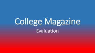
- The cover features a relaxed student to convey comfort. Font and layout aim to feel modern rather than traditional.
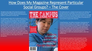
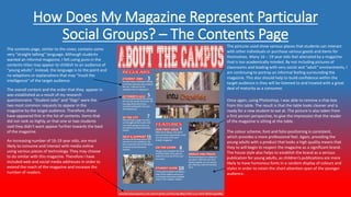
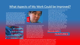
- The contents page continues themes of informality and maturity. Pictures show social spaces and language is straightforward.
- Student feedback was positive about the bold colors, readable fonts, and messages of understanding their interests.
- Areas for improvement include adding more cover text, changing the cover photo angle, and increasing font sizes for sections on the contents page. Better planning of photo locations could also aid the editing process.