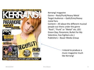
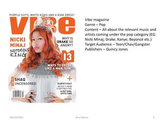
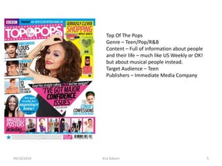
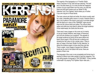
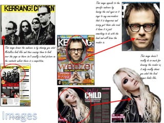
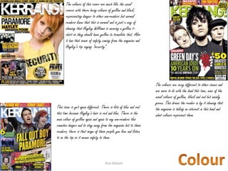
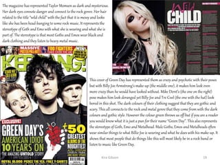
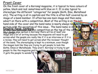
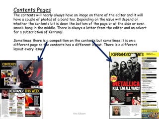
The document discusses various music magazines including Kerrang!, Vibe, and Top of the Pops. Details provided on Kerrang! include that it covers rock, punk, and heavy metal genres and targets goth, emo, and heavy metal fans. Analysis is also provided of Kerrang! magazine covers and articles, discussing typical styles, layouts, and how they represent bands and genres. The document also includes a questionnaire responses about music magazine preferences, with most responses focused on rock magazines.
This document analyzes various elements of Kerrang! magazine issues, including covers, contents pages, and double page spreads. It discusses typical features like certain color schemes, styles of writing, and stereotypical representations of genres. The analyses note how elements are both consistent with and different from Kerrang!'s usual house style. Images are frequently used to draw in readers through appealing to bands and stereotypes while also providing information.
The magazine covers the new Blade Runner 2049 film. On the front cover, the dominant image is of Deckard and K from the film. It also advertises exclusive access and quotes from Harrison Ford to generate hype. The target audience is fans of cinema ages 15-35, specifically those interested in Blade Runner and similar films. It will be distributed both digitally and in print.
This double-page magazine spread features an interview-style article about pop star Justin Bieber. It targets teenage girls aged 16-19. The page uses Justin Bieber's large image on the cover and header to attract attention. The article has an unbalanced ratio of text to one large picture of Justin. It uses red lines and a mix of black, white, and red colors throughout to make it visually appealing while linking to themes of love that relate to Justin Bieber's image.
The document analyzes representations of rock bands in the magazine Kerrang. It discusses how Kerrang portrays bands on its covers and in photos as rebellious by using dark colors and vague facial expressions. This is meant to draw in impressionable young readers and relate to depressed or angry teens. It also notes that rock music appeals more to males ages 14-23. An example photo shows a member of Blink-182 playing guitar on stage in rough clothes, meant to excite fans. Linkin Park is described as looking more casual but still edgy, dangerous, and nonchalant in photos to seem easygoing while maintaining an aggressive rock image.
The magazine cover uses sans-serif fonts and cracked text to seem relaxed yet urgent. Images of Green Day and Foo Fighters will attract fans. The layout follows conventions with the title at top and stories below, while bright colors and an anarchy symbol make it appealing and rebellious.
Task 3 Brand Identity And Mode Of Addressjoeeroper
Kerrang magazine consistently uses the same house style across issues. The front cover features the magazine name at the top and a headline about contents. It also displays the main story title in white or yellow text in the center. The contents page includes a brief story excerpt, subscription advertisement, related image, and quote. It lists sections in yellow text on black with red page numbers. Double page spreads primarily feature a large artist image and excerpt laid out in an unconventional "scruffy" manner to engage readers.
The group has decided to create a soap opera called "Heartbreak United" for Channel 5. It will focus on the drama surrounding a fictional under-18 football team, the Staines Town Saints. They chose this project and channel because Channel 5 lacks a British soap and they feel their skills are best suited to this genre. Over the next three weeks, they will finalize characters, write a first draft script, do a location recce, storyboard, and begin casting. Edgar will work on the storyboard, Ollie the script, and Mark will find actors and a filming location.
This document analyzes the cover of the British film magazine Total Film. It examines the different design elements including the masthead, main image, sell lines, additional text, and other features. The analysis finds that the magazine aims to attract readers through exclusive content, star appeal, promoting value with free items, and highlighting a variety of popular film genres. These techniques are intended to influence the design of the student's own magazine cover for their film by employing compelling sell lines and maintaining a consistent color scheme, while recognizing limitations around using star appeal with an independent film.
The trailer for Mean Girls follows conventions of the teen drama genre. It introduces Cady, a new student from Africa adjusting to life in an American high school. She befriends the popular clique known as the "Plastics" but they turn out to be the antagonists who cause drama. The trailer uses fast pacing, montages and music changes to build excitement around the school cliques, romance, and conflicts that emerge between the girls. It concludes by hinting at resolution while also leaving questions unanswered to encourage viewers to see the full film.
This 3 paragraph summary provides the key details from the multi-page magazine article about Lady Gaga:
Lady Gaga has become one of the biggest pop stars in the world with over 8 million album sales. The article profiles her unconventional style and provocative performances that push boundaries and comment on issues like sexuality. This has led to both immense popularity and controversy, with some criticizing her as an "attention whore." The profile describes her journey from singing in clubs as a teenager to breaking through with hits like "Poker Face" and "Bad Romance." It analyzes how she draws influence from diverse figures like David Bowie and uses shock value to spark important discussions.
The trailer summarizes the plot of the film "Mean Girls" and introduces the main characters. It shows Cady, a student from Africa, struggling to fit into her new high school in America. She befriends the popular clique known as the "Plastics" but eventually has a falling out with them. The trailer uses many techniques common to teen drama genres like stereotypes, focus on friendship and popularity, and features a climactic montage to build anticipation for the film's resolution. It concludes with the film title and studio logo as expected.
The document discusses the pros and cons of print magazines versus digital magazines. Some of the pros of print magazines are that readers are more likely to read issues they purchased physically and can collect rare issues. However, print magazines have drawbacks like wear and tear over time and higher production costs. Digital magazines have advantages such as lower costs, global accessibility, and not producing physical waste. Their downsides include requiring internet access and being harder to read on screens.
This page from a pop magazine uses bright colors, fun layout, and relatable content to appeal to its young readership. The title "OMG!" in pink and yellow capital letters references the target audience's language and pop culture. The page features embarrassing celebrity stories and reader submissions rated on a "shame-otter-meter" to create rapport. Images like a talking lipstick are humorously used. The layout and famous guests like Ariana Grande and Nick Jonas are designed to engage and bond the readership over shared experiences.
This document analyzes and compares the target audiences of three music magazines: Kerrang, DJ, and Top of the Pops. Kerrang targets an older audience that is into heavy metal music, as evidenced by scruffy musicians on the cover and use of intense imagery. DJ targets a mixed gender audience ages 20-35 with a focus on electronic music, using bright colors and images of women. Top of the Pops targets teenage girls with pink colors, topics they can relate to, and images of young popular artists.
This document analyzes and compares the target audiences of three music magazines: Kerrang, DJ, and Top of the Pops. Kerrang targets an older, heavy metal audience as indicated by scruffy musicians on the cover and intense imagery. DJ targets a younger, 20-35 audience with references to partying and a scantily clad woman on the cover. Top of the Pops targets teenage girls with pink coloring, celebrities appealing to girls, and appropriate imagery of a covered female celebrity.
The target audience for the music magazine will be people interested in pop and indie music between the ages of 18-25. Research found most potential readers listen to a variety of music genres but prefer pop, rock, and indie. They want headlines and articles about their favorite artists along with interesting pictures. Advertisements for concerts and new music would attract readers the most. The magazine should focus on real music artists rather than just celebrities.
The target audience for the music magazine is young people interested in pop and indie music based on research. Most respondents were ages 18-25 and listened to a variety of music genres including pop, hip hop, rap, indie, and rock. While few regularly buy music magazines, they look for headlines and articles about their favorite celebrities along with interesting pictures. The magazine will aim to cover these music styles with relevant content to appeal to this audience.
The document discusses research conducted with 10 people ages 12-18 through surveys about their movie watching habits. Key findings include that 40% watch films regularly, with the majority streaming online. 50% go to the cinema usually with friends. The most popular genres are horror, action, and comedy. Research on film audiences ages 15-24 provides promising statistics for marketing the film. The film "9:00" is targeted at male audiences ages 12-18 and older comedy fans. Posters and competitors are analyzed to inform the marketing strategy. Various draft posters are presented and refined based on feedback.
This document analyzes and summarizes the cover of the magazine "We Love Pop". It discusses various design elements of the cover including the title, cover lines, lead article, main image, and overall look. The title uses the personal pronoun "We" to create a sense of involvement for readers. Cover lines advertise articles to attract readers' interest using topics like boy bands and fashion trends. The lead article features Cher Lloyd, a popular singer, to appeal to the target audience of girls aged 8-16.
This magazine article discusses the new Blade Runner 2049 film. The front cover features a large image of the main characters Deckard and K that will attract readers. It also includes quotes from Harrison Ford to generate hype. The target audience is male fans of sci-fi cinema aged 15-35. The magazine aims to entertain these readers with the latest film industry news and create an online community to discuss upcoming movies.
The magazine cover features pink and green colors which symbolize friendship, love, and femininity, suggesting its target audience is female. The genre of rock music is evident from the band poses and expressions on the cover. The lead singer is placed slightly in front of the others, marking him as the focal point. Multiple banners draw attention with pink backgrounds, promoting the featured artists inside. The target audience is likely teenage females interested in the band 5 Seconds of Summer, given their prominent display and appeal to that demographic.
The document analyzes the front covers of several magazines. It discusses elements like the masthead fonts, main images of celebrities, layout colors, and cover lines. Across the magazines, common design elements are used to attract audiences. This includes studio photos of famous people making eye contact, catchy text with buzzwords, and clean layouts with core colors and simple fonts. The covers aim to draw readers in with promises of exclusive celebrity stories and gossip through interactive images and intriguing cover lines.
This document outlines the concept and scenes for a music video. The video will tell the story of a daughter missing her father while he is away through animated pages in a scrapbook. As the scrapbook pages turn, lyrics from the song will appear along with images representing the daughter and father's longing for each other, such as letters and postcards. Different fonts will be used to represent the handwritten correspondence between the two. The video aims to elicit an emotional response through the parallel storytelling of the lyrics and scrapbook concept.
https://journalistethics.com/
Book available at this link (c) Jyonah Jericho
Premise
Every once in a blue moon, we may be lucky to engage a person who shares a simple,
memorable idea that guides us positively for life. A June afternoon in Sydney, Australia
2008 is an exemplary example of such rare encounters.
“Got the day off from work today have ya?” I said to our building’s newest
resident with a warm smile in the underground garbage depot. It was the first time that
we had crossed paths within speaking distance since he moved in a few weeks prior.
I rarely accost unknown people for casual banter nowadays. Maybe it’s me, but I
often receive a subtle frown, silence, a stony-faced vague reply, or a combination thereof.
“Nah, buddy” the stranger replied with a more generous grin. “I work-from-home
and write best sellers” he said.
It was refreshing to receive a positive energy reply, even a showoff one like this. I
could tell from his instant mega smile that this neighbor is a people lover – an extrovert.
Mister mid-40s in flannelette pajamas proudly produced a check out of his shabby
once white bathrobe pocket and flashed it before my face. “I just got this $25,000 advance
today from my publisher for my next bestseller” he boasted shamelessly.
A modest man I thought. I intuitively liked him less than I did five seconds prior.
“Cool” I replied. “What sort of books do you write?” I asked as we walked in synch
towards the elevator.
“Detective crime stories and that sorta stuff” he said.
“I admire fiction book writers” I replied earnestly as we entered the elevator. Must
be a lot harder than just writing short academic articles like I do” I said.
“Academic hey”, he said, eyebrows raised as he made intimate eye-to-eye
contact for the first time. “I’m studying English Lit at Sydney and would love to pick
your brains for ideas sometime soon” he said.
“Yeh, let’s meet up over drinks and swap notes” I said.
“Definitely. How about the Bank Bar?” he answered.
“Great choice” I said as my neighbor fumbled his keys in Apartment 501’s keyhole.
“How about today after lunch at 3?” he asked.
“Sure, see you in the garden bar at three” I said as I walked towards my door, 506.
Recognitions
The lives and accomplishments of individuals and entities can be acknowledged and
celebrated in public domains in several ways. Pan American World Airways (Pan Am) is
an example of a famed institution that no longer exists since 1991. RIP Pan Am.
Obituaries and eulogies are popular written formats that celebrate the lives of people who
have passed. The 408 words article overleaf titled ‘Motown Chic’ is a tribute to the late
Nina Simone. The word ‘tribute’ may convey a less morbid connotation than alternatives
such as In Memoriam. Public tributes may honor the living and those who have passed.
This document appears to be a script for a documentary interviewing a couple, Harold and Leonora, about their long relationship and "fairy tale" love story. Over the course of multiple interviews with friends and family, the couple tells the story of how they met, their early dating struggles, a brief break up, and eventual marriage and children together. They discuss the highs and lows of their decades-long relationship and why they believe they have endured as a couple for so long. The documentary aims to explore if "fairy tale" happy endings can still exist through hearing about Harold and Leonora's relationship.
The document provides an analysis of an NME feature article about the supergroup Them Crooked Vultures, made up of Dave Grohl, John Paul Jones, and Josh Homme. It summarizes the article's coverage of how the band was formed in secret, came together at a chance meeting at Dave Grohl's birthday party at Medieval Times, and had their first intense jam session at Josh Homme's studio where they quickly realized their musical chemistry was undeniable. The analysis also touches on details like the informal tone of the article and layout across double page spreads with photos.
The document discusses how the media product represents particular social groups through research and analysis of horror film opening sequences. It was decided that the protagonists would be two teenage girls of different ethnic backgrounds (one English, one African-Caribbean) to appeal to the female demographic that most frequently attends cinema. Elements like the tent, camping setting, and iPhone usage were included to relate to and depict the fears and behaviors of teenage audiences. Representing teenagers as vulnerable through lighting, sound, and a brief conversation about a boy aims to tension female viewers and relate to their experiences.
The document discusses the benefits of exercise for mental health. Regular physical activity can help reduce anxiety and depression and improve mood and cognitive functioning. Exercise causes chemical changes in the brain that may help protect against mental illness and improve symptoms.
1) A poesia é definida como uma forma de comunicação e resistência à globalização homogeneizadora. 2) A poesia equilibra inspiração lírica e mensagem literária de forma a emocionar sem perder certezas. 3) A poesia transcende a materialidade da vida através de palavras que elevam ideias e pensamentos.
Dealsothon is an ISO-certified e-commerce company that sells a variety of products across different categories. It is conducting a limited entry contest where customers can register for Rs. 4999 to become eligible to win prizes. The contest will take place in North India and winners will be informed via call and email. Customers can choose from combo offers or individual products available on the website. Payment can be made online or via COD with an extra charge for COD. The contest registration deadline is tentatively December 31, 2014. Customers are encouraged to register soon due to limited seats.
Thin Line Between Privileges of Rank and Misuse of OfficeNilendra Kumar
A superior or a commander is provided certain benefits or privileges to facilitate proper performance of his duties. These advantages are to be used in public interest. An element of personal interest would go to vitiate the exercise of authority. Such a situation in military may lead to erosion in authority of the superior bringing out adverse consequences, more so in combat.
Este documento descreve a Questão Coimbrã, um debate literário que ocorreu em Portugal entre 1865-1866 entre a geração romântica ultraconservadora liderada por António Feliciano de Castilho e a geração contestatária de 1870 liderada por Antero de Quental. O debate envolveu cartas, artigos e até um duelo e levantou questões sobre o papel da literatura na sociedade. A geração de 1870 defendia uma abordagem mais política e socialmente engajada em contraste com o romantismo oficial da g
The document provides details about various music magazines, including their target audiences, cover designs, and content layouts. NME targets 15-24 year old males but includes various artists to attract a wider audience. Top of the Pops targets 11-16 year old girls with bright colors, jokes, and prizes. Kerrang uses dark colors and images of rock bands to appeal to fans of rock music. The magazines employ various design techniques tailored to their target demographics.
This document analyzes magazine covers and articles from Kerrang! magazine and Scoot-Mag. For the Kerrang! magazine cover, the summary notes the bright colors and use of words like "awesome" suggest a younger target audience of 13+. A double page article is also described as using an untidy font and focusing more on images than text. For the Scoot-Mag cover, the summary explains the main rider featured does an insane trick to attract younger readers, and the colors match his favorite color. A double page article about a new sponsored rider keeps the writing brief and features varied images of the rider.
This document analyzes and compares the covers of multiple music magazines. It notes similarities and differences between the covers in terms of color schemes, target audiences, and layouts. The magazines share some common colors like black, white, and red. They also take splash photos in a studio at a medium-long shot angle. The target audiences vary between genres like dance, rock, and indie. Differences include the amount of text, positioning of elements, and level of clutter. The document examines individual magazine covers in more depth, analyzing aspects like colors, images, fonts, and how well the covers appeal to their intended readerships.
The document analyzes and compares the front covers of two music magazines: Kerrang! issue 1341 and Vibe from August/September 2010.
For Kerrang!, the target audience is younger rock music fans aged 14-18. The front cover uses symmetry, close-up shots, and bands pointing at the viewer to engage this audience. In contrast, Vibe targets an older audience aged 16-34 interested in R&B, hip hop, and rap. Its cover features three artists standing seriously and stylishly to portray an image that is sleek and serious.
While the magazines differ in their audiences and styles, they both make effective use of color palettes and layout principles to attract buyers. Kerr
This document analyzes and compares the covers of multiple music magazines. It notes similarities and differences between the covers in terms of color schemes, target audiences, and layouts. The magazines share a common use of black, white, and red colors. Their target audiences vary from dance to rock music fans. The covers differ in their positioning of text, amount of text used, and level of clutter. The document also analyzes individual magazine covers like Mix Mag, Q, and Billboard in more detail, noting design elements, models, and how they appeal to intended readers.
This magazine cover targets teenage girls and young women. The main image features two smiling members of the boy band Union J, appealing to fans of mainstream pop music. Smaller images promote celebrities like Rita Ora and One Direction that would be attractive to the target audience. Sell lines advertise content on fashion, beauty, and celebrities. A quiz and posters of One Direction aim to engage readers and encourage purchases. The masthead, price, and bubbly font create an upbeat, feminine style appropriate for the young female target market.
The document analyzes and compares the covers of two magazines - TeenNow and Kerrang. TeenNow targets teenage females and uses bright colors, images of popular artists, and personalized language to directly address readers. Kerrang targets rock music fans and uses darker colors and grittier fonts and graphics to create a louder, more masculine style. Both magazines use cover lines and free poster promotions to entice readers and hint at the featured content inside.
The document analyzes the front covers of three rock music magazines: Kerrang!, Uncut, and The Rock Sound. For Kerrang!, the summary notes that the target audience is teenagers aged 15-20, and the cover uses red, black, and white colors to symbolize aggression and danger associated with rock music. For Uncut, the target audience is older and more sophisticated, and the cover evokes the 1970s with a black and white photo and references to a band's 40th anniversary. For The Rock Sound, the cover features four band members and uses bright colors, with free CDs and competitions to attract various audiences including teenagers and adults.
The document provides an analysis of magazine front covers and contents pages from various rock magazines, including Kerrang!, Uncut, Rock Sound, and NME. It examines design elements like images, colors, fonts, layout, and features to understand how they appeal to different target audiences and convey information about the magazine's content. Key aspects analyzed include the use of aggressive imagery and colors on Kerrang! to attract young rock fans, Uncut's sophisticated black and white aesthetic for older readers, and how various magazines employ images, headlines and features to engage audiences.
The document analyzes and compares the covers of multiple music magazines. It notes that most covers use black, white and red as core colors. It also discusses similarities in photo angles and studio shots. The target audiences vary by genre but include dance, rock, and indie music fans. Layouts and amount of text differ by magazine as well. "Mix Mag" is described as more sophisticated than others that appear more cluttered.
The dominant image on the front cover of the magazine is the band All Time Low. The writing and images are designed to attract a teenage/young adult audience with short, bold text and a prominent image of the band. The magazine uses bright colors like red to stand out and features the band prominently to draw attention.
The contents page also features a dominant image of Fall Out Boy reading a Kerrang! magazine. Images of bands and section titles are in bold, bright colors to attract readers' eyes. A small image of another band is included without drawing too much attention away from the main image.
This document summarizes the key elements of a Kerrang magazine cover. The target audience is males aged 15-34 interested in rock and heavy metal music. The main image features the band Black Veil Brides to appeal to fans and draw readers in. Intriguing cover lines about the band and other artists like Asking Alexandria aim to provoke curiosity and encourage people to purchase the magazine to learn more. Bold colors, fonts and graphics are used consistently across issues to reinforce the magazine's brand identity within the rock/metal genre.
The document analyzes and compares the covers of two music magazines - Kerrang and NME. Kerrang targets 15-25 year old males and focuses on rock and heavy metal music. Its cover uses bold colors like black, red, and yellow that represent danger and rebellion fitting its genre. NME targets 16-35 year olds of both genders and focuses on indie/alternative music. Its cover has softer pink and white colors and presents information in a more traditional column format compared to Kerrang's use of images. While the magazines differ in audience and style, they both use bright colors in key areas to draw reader attention.
The document analyzes several magazine covers and contents pages. It examines design elements like images, fonts, colors and layouts and how they target specific audiences. Key points analyzed include using popular bands and celebrities to attract readers, highlighting freebies and prices to increase sales, and employing rebellious imagery and informal language to appeal to teenage audiences. Color schemes and mastheads are also designed to stand out and engage readers.
The document provides an analysis of the Kerrang! magazine cover. It summarizes the different elements of the cover including the title, masthead, strapline, main image of Gerard Way, additional band images, cover lines, and colors/graphics used. The language and design elements are described as being aggressive and loud to match the rock music genre targeted at readers aged 16-25. Overall the analysis finds the cover achieves a unified house style through its use of bold capitalized text, bright colors, and crackled graphics to appeal to its target audience of rock music fans.
The document analyzes the layout, design elements, images and text used across multiple pages of a magazine to determine the target audience. Key points include:
- Bold text, bright colors and cluttered layout with small band images indicate a target of teenage males.
- A front cover with Frank Iero in the center using direct address alongside competitions and poster collectors items also aims at teenagers.
- In contrast, a mature layout with large celebrity images, minimal text and neutral colors presents an older, more sophisticated audience.
- Placement of mastheads, page numbers, titles and other elements follow conventions to effectively guide the eye across the page.
This document analyzes magazine double page spreads from different genres including house/clubland magazines. It examines five double page spreads, describing elements like layout, use of images, colors, text formatting and pull quotes. Key points analyzed include how the spreads attract their target audiences and intrigue readers to learn more about the articles.
The document analyzes the design elements of magazine covers for NME, Kerrang!, and Q magazines. It discusses how each magazine's masthead, images, sell lines, colors, and other features are deliberately designed to represent the magazines' brands and target audiences. The mastheads and colors aim to convey rebellion for NME or loudness for Kerrang!, while Q uses simplicity. Images of bands are prominently displayed and positioned to highlight popular members. Sell lines advertise additional content to draw readers. Colors and freebies are used to attract attention and interest readers in the magazines' music content.
The document provides an analysis of the front cover and contents page layout of two magazines - Kerrang! and We Love Pop.
For the Kerrang! cover, the key signifier is Gerard Way of My Chemical Romance in a red outfit. Colors and fonts are chosen to appear alternative and rebellious. The contents page features Metallica in black and white to represent nostalgia, with a competition to attract readers.
The We Love Pop cover's key signifier is Olly Murs in a bright jumper. Pink is used to appeal to the target audience of young females. The contents page again features Olly Murs with articles about romance and bromances between boy band members.
Overall
This presentation includes basic of PCOS their pathology and treatment and also Ayurveda correlation of PCOS and Ayurvedic line of treatment mentioned in classics.
This presentation was provided by Steph Pollock of The American Psychological Association’s Journals Program, and Damita Snow, of The American Society of Civil Engineers (ASCE), for the initial session of NISO's 2024 Training Series "DEIA in the Scholarly Landscape." Session One: 'Setting Expectations: a DEIA Primer,' was held June 6, 2024.
This slide is special for master students (MIBS & MIFB) in UUM. Also useful for readers who are interested in the topic of contemporary Islamic banking.
हिंदी वर्णमाला पीपीटी, hindi alphabet PPT presentation, hindi varnamala PPT, Hindi Varnamala pdf, हिंदी स्वर, हिंदी व्यंजन, sikhiye hindi varnmala, dr. mulla adam ali, hindi language and literature, hindi alphabet with drawing, hindi alphabet pdf, hindi varnamala for childrens, hindi language, hindi varnamala practice for kids, https://www.drmullaadamali.com
Strategies for Effective Upskilling is a presentation by Chinwendu Peace in a Your Skill Boost Masterclass organisation by the Excellence Foundation for South Sudan on 08th and 09th June 2024 from 1 PM to 3 PM on each day.
How to Add Chatter in the odoo 17 ERP ModuleCeline George
In Odoo, the chatter is like a chat tool that helps you work together on records. You can leave notes and track things, making it easier to talk with your team and partners. Inside chatter, all communication history, activity, and changes will be displayed.
3. Kerrang! magazine
Genre – Rock/Punk/Heavy Metal
Target Audience – Goth/Emo/Heavy
metal fans
Content – All about the different musical
people out there under the genre
“Rock”, “Punk” or “Metal” etc. (EG:
Green Day; Paramore; Bullet For My
Valentine; Foo Fighters etc.)
Publishers – Bauer Media Group
I intend to produce a
music magazine much
like Kerrang!
Kira Gibson09/10/2014 3
4. Vibe magazine
Genre – Pop
Content – All about the relevant music and
artists coming under the pop category (EG:
Nicki Minaj; Drake; Kanye; Beyoncé etc.)
Target Audience – Teen/Chav/Gangster
Publishers – Quincy Jones
Kira Gibson09/10/2014 4
5. Top Of The Pops
Genre – Teen/Pop/R&B
Content – Full of information about people
and their life – much like US Weekly or OK!
but about musical people instead.
Target Audience – Teen
Publishers – Immediate Media Company
Kira Gibson09/10/2014 5
7. There aren’t many images on the cover as it is mainly
of one girl (Hayley Williams; lead singer of Paramore)
and how she answers your questions. This appeals to
the target audience by giving off the same yellow and
black colours again in the top that she is wearing and
showing her hair colour to be a similar colour. There is
also an image of the band “Bullet For My Valentine” to
attract the audience again to show what they look like.
There is again, more images of people from different
bands as you look to the bottom left corner; there are
posters of them now.
The majority of the typography is in “Franklin Gothic
Heavy” because it is big, bold and eye catching. The bold
text in the title draws you in to look at what the magazine
is about. As your eyes flicker over the cover, you see that
there are bold band names such as “Bullet For My
Valentine” and “Foo Fighters” which draws you in further
if you are a big fan of those bands.
The main colours are black and white; the colours usually used
for a dark, miserable gothic scene in a movie. However there is
also a lot of yellow in this issue’s cover and it connotes danger
with the black as in many of the “DANGER” signs around,
there are the colours black and yellow. The colours black,
yellow and white are more likely to attract the target audience
of the metal-heads; the Goths and the emos.
The language of the cover is very acceptable and formal due to
wanting to attract more older people to read the magazine. The
only slang people of language is “ON YER BIKE!”. It then clarifies
underneath it by saying “Foo Fighters Taylor rides solo…”
Kira Gibson09/10/2014 7
8. The typography of the contents is in “Franklin Gothic Heavy” to
attract the target audience. The normal typography is quite small so
you would need the big bold writing in capitals to see what the
articles are about.
The layout is very cluttered as there are a lot of pages to go through
and in this particular issue; there is a competition on so they would
want to make that bigger than the rest of the adverts or the letter
from the editor. The letter from the editor is quite small compared to
what it would usually be because of the competition.
The colours are quite dark and dangerous again, just like the cover.
It has yellow, black, white and this time; some red. The red is to
attract the Metallica fans as it is a Metallica competition. Each
subheading is in yellow with black surrounding it, again giving off
the danger tape effect. There is a patch of slightly different colours
in the bottom right hand corner of the page advertising a
subscription to Kerrang! for £15. The colours are blue, yellow and a
small amount of black.
There is only 5 images on this page due to it being the contents: the
vans on the competition part (both pairs); the picture of Metallica;
the picture of the magazines in the advert and the messed up image
of the editor. The images of the vans shoes are only there to show
people what they would want.
The language is quite brief and like taking notes with a small
explanation underneath. However it is formal with there being no
slang and “teenage talk”.
Kira Gibson09/10/2014 8
9. The typography is quite small for an interview on a
double page spread. However the title is very big to
attract the audience and draw them into reading the
article.
The layout is not like you would expect as it has 2
columns of writing and over one page is a picture or
Taylor Momsen. It has a insert over the image of
something she said.
The colours aren’t as dangerous looking as before.
These colours are black, grey and purple. The give
the effect of looking funky and “cool” to attract the
audience to the page.
The only image on the double page spread is of the
lead singer of the band “The Pretty Reckless”. It is a
big one, again to attract the audience and people
just randomly flicking through the page. It is bigger
than you would expect as if you are going to have a
picture over a page it would not overlap unless it is a
poster.
You can’t really tell what the language is as the
writing is very small. However there is a rhetorical
question “Is The Pretty Reckless 17-year-old
frontwoman as crazy as she seems?” in the
description under the title “wild child”.
Kira Gibson09/10/2014 9
11. Analysing the latest issue of Kerrang! magazine the cover is completely different. It has more variety of colours and fonts; it isn’t all
in capital letters.
Brand Identity
It has more colour: black; blue; grey; yellow; red and orange. Kerrang! obviously wants the image on each issue to cover half
of the title. This issue has got the someone from the band “Weezer” and his head covers the letters “rra” from Kerrang!. It also
has red eyes signalling that the man is evil and dangerous. Kerrang! clearly wants the non readers to think that it is a
dangerous and scary magazine.
House Style
Kerrang!’s preferred way of presenting their written material is to practically
shout it at people by putting it all in capital letters. However this issue is
different by having less capitals. Kerrang! prefers to have their issue covers
cluttered with writing and images; all to attract the target audience.
Mode of Address
The way that this text speaks to the audience is that it is often eye
catching with the capital letters and colours. The language is very abrupt
but formal as if you were briefing a search and rescue team. The
rhetorical questions keep you thinking so on this issue the question is “A
Day To Remember; Will you forgive them?” and it makes you think ‘Why,
what have they done wrong?’.
Kira Gibson09/10/2014 11
12. Analysing the contents of an issue of Kerrang! magazine. This issue is quite different as it is mainly images and the letter from the
editor is at the side of the page and not at the bottom.
Brand Identity
It has more colour and Kerrang! magazine wants people to think that
there are a lot of bands that they cover and they show this by giving
us lots of images to look at of these bands. In this issue it shows us
Blink 182 and Paramore.
House Style
Kerrang!’s way of presenting this written material is to have it in
capital letters and in colours. It can be shouted at you in capitals
like the cover or it can be written nicely AND shouted at you like it
is here.
Mode of Address
The way that this text speaks to the audience is that it is quite big
and colourful so that the reader can see what they want to see or
read the letter from the editor.
Kira Gibson09/10/2014 12
13. Analysing this double page spread is
quite different in some ways to the first
one and similar in others.
Brand Identity
These two pages are hugely
different with there being way less
written text than the previous
double page spread. This one has
a small interview, 2 reviews of
different bands and a “what did you
think?” box with 3 peoples different
opinions of the bands. In a way,
there is more written text than
before. Also there are images and I
mean that there are loads! There
are 8 photos of the bands whilst
performing in Cardiff. Kerrang! is
probably trying to clutter the page
with more information to try and get
more people reading the page.
House Style
The house style is quite different to other pages and
the cover. Its design is not to shout at you but to draw
you in with the tonnes of information about A Day To
Remember’s latest gig and the latest gig from Emily’s
Army. The images also draw you in as there are not 5,
6, 7, 8 but 9 photos!
Mode of Address
The way that this text speaks to the audience is that it is small,
readable from the paper (not the computer) and it is still making
you think about what A Day To Remember might have done
“ADTR come back to torch Cardiff, apology accepted!” if you are
not that interested in band gossip and mainly just enjoy the music.
Kira Gibson09/10/2014 13
15. The language of these 3
images are all different.
This appeals the target
audience by having the
name of the band in big
red letters and the
caption underneath
saying “ADTR COME
BACK TO TORCH CARDIFF,
APOLOGY ACCEPTED!”.
This banner has alliteration of the words “Pop-Punk
Picnic” and then draws the audience in by saying that
our invite to the picnic is inside the issue.
This piece has a rhetorical
question on it making the
reader want to know more
about her and if the
prediction about Taylor
Momsen is true or false.
Kira Gibson09/10/2014 15
16. This image appeals to the
specific audience by
having the red eyes so it
says to any non-readers
that it is dangerous and
scary yet those who read
it know it is just
something to do with the
band and will draw the
reader in.
This image draws the audience in by showing you what
Metallica look like and then causing them to look
over the page as there isn’t usually a band picture on
the contents unless there is a competition.
This image doesn’t
really do so much for
drawing the reader in;
it only really shows
you what the lead
singer looks like.
Kira Gibson09/10/2014 16
17. The colours are very different to other issues and
are more to do with the band this time; none of the
usual colours of yellow, black and red but mainly
green. This draws the reader in by it showing that
the magazine is taking an interest in this band and
what colours represent them.
The colours of this cover are much like the usual
covers with there being colours of yellow and black,
representing danger to other non-readers but normal
readers know that this is normal and is just a way of
showing that Hayley Williams is wearing a yellow t-
shirt so they should have yellow to translate that. Also
it has that sense of safety coming from the magazine and
Hayley’s top saying “security”.
This issue is yet again different. There is lots of blue and red
this time because Hayley’s hair is red and blue. There is the
main colour of yellow again and again to any non-readers this
connotes danger and to stay away from the magazine but to those
readers; there is that image of those people you love and listen
to on the top so it means safety to them.
Kira Gibson09/10/2014 17
19. The magazine has represented Taylor Momsen as dark and mysterious.
Her dark eyes connote danger and connect to the rock genre. Her hair
related to the title “wild child” with the fact that it is messy and looks
like she has been head-banging to some rock music. It represents the
stereotype of Goth and Emo with what she is wearing and what she is
part of. The stereotype is that most Goths and Emos wear black and
dark clothing and they listen to heavy metal music.
This cover of Green Day has represented them as crazy and psychotic with their poses
but with Billy-Joe Armstrong’s make-up (the middle one), it makes him look even
more crazy than he would have looked without. Mike Dirnt’s (the one on the right)
pose makes him look deranged yet Billy-Joe and Tre Cool (the one with the hat) look
bored in this shot. The dark colours of their clothing suggest that they are gothic and
scary. This all connects to the rock and metal genre that they come from with the dark
colours and gothic style. However the colour green throws us off but if you are a reader
you would know what it is just a pun for their name “Green Day”. This also represents
the stereotype of Goth, Emo and Metalhead. Male Goths, Emos and Metalheads often
wear similar things to what Billie-Joe is wearing and what he does with his make-up. It
shows that most people that do things like this will most likely be in a rock band or
listen to music like Green Day.
Kira Gibson09/10/2014 19
21. Front Cover
On the front cover of a Kerrang! magazine, it is typical to have colours of
yellow, black and red; sometimes with blue on it. It is also typical to
stereotype the different “categories” for people (Goth, Emo, Metalhead
etc). The writing is all in capitals and the title is often half covered by an
image of a band member. It often has one main image and then some
advert on there with a competition. Most of the writing is on the left
hand side of the cover and the band name is nearly always next to the
picture with the exception of this issue… The band name is in the middle.
It also nearly always has the competition on the top of the cover or in
the corner.
Double Page Spread
On a double page spread in Kerrang! there will be at least one
image and a lot of writing because the magazine will need to get
across what the people are really like if it is an interview or if it is
a review, they will need to get across what the reviewer thought
of the band. The stereotyping is kept to a minimum, even though
the images look like they are trying to get people to look like
Goths, Emos or Metalheads. They aren’t. Kerrang! is trying to get
people to like the magazine and by putting up stereotypical photos,
it gets the people to wonder if that is really what they are like.
Kira Gibson09/10/2014 21
22. Contents Pages
The contents will nearly always have an image on there of the editor and it will
have a couple of photos of a band too. Depending on the issue will depend on
whether the contents bit is down the bottom of the page or at the side or even
smack-bang in the middle. There is always a letter from the editor and an advert
for a subscription of Kerrang!
Sometimes there is a competition on the contents but sometimes it is on a
different page so the contents has a different layout. There is a different
layout every issue.
Kira Gibson09/10/2014 22
24. This is my questionnaire and I asked
people to answer it as it is very
general and I wanted to know what
sort of things people liked in the
magazines. Most of the people
(there was only 11 answers)
answered about the rock magazines.
Kira Gibson09/10/2014 24
31. Alex Knoll – What is your favourite genre? What is it about (insert genre)
that makes it your favourite? My favourite music magazine is Kerrang!.
What is yours? What artists would you like to be in this magazine and why?
Why do you think that this magazine would be a good idea? What should it
be called? What would you usually expect in a music magazine? What do
you like and dislike about this magazine cover and contents?
Kira Gibson09/10/2014 31
32. Matthew Hewitt - What is your favourite genre? What is it about (insert genre) that
makes it your favourite? My favourite music magazine is Kerrang!. What is yours?
What artists would you like to be in this magazine and why? Why do you think that
this magazine would be a good idea? What should it be called? What would you
usually expect in a music magazine? What do you like and dislike about this
magazine cover and contents?
Kira Gibson09/10/2014 32
33. Corinna Gibson - What is your favourite genre? What is it about (insert genre)
that makes it your favourite? My favourite music magazine is Kerrang!. What is
yours? What artists would you like to be in this magazine and why? Why do you
think that this magazine would be a good idea? What should it be called? What
would you usually expect in a music magazine? What do you like and dislike
about this magazine cover and contents?
Kira Gibson09/10/2014 33
35. 09/10/2014 Kira Gibson 35
This layout if the
first one I
created, the blue
bit along the top
is the title and
then you have
images across the
cover in red. The
green is the
editors column
and the light blue
is the advert for a
subscription.
Purple is the
“what’s
happening” part.
This layout is
slightly different to
the other in which
the title is slanted
across the top and
the image (yellow)
is across the entire
page. The circle is
how it advertises
the competition
and the parts at the
side are the “what’s
happening”
columns.
36. 09/10/2014 Kira Gibson 36
These are the polls I sent out for
my magazine. I have had 1/2
replies so far but I am hoping to
get more. So far, people think I
should use red and either it
should be called black heart or
rock smash. Also the fonts used
should be either Goudy Stout or
Kremlin.
37. 09/10/2014 Kira Gibson 37
This is the latest layout, I will be doing
more to it, the more results I get the
more will be done. The images aren’t
the ones I will be doing but they are of
the same band. My dad took these
photos on the layout and to be honest,
they are the only rock band I know of
locally haha :)