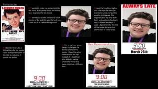
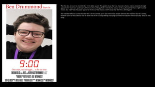
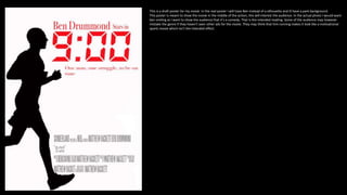
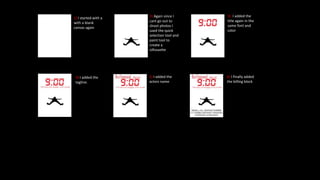
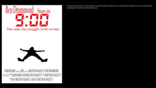
9:00 Posters
I asked gave surveys to 10 people between the ages of 12 and 18. This survey asked questions like: how often do you watch movies ? do you stream movies ? Do you go to the cinema regularly ? Do
you go to the cinema alone or with friends ? What streaming services do you use ? What genres are your favorites ? I found from my research that 40% of people in this age group watch films regularly
and of those films they do watch the large majority where online through streaming sites like Netflix and Disney plus. I found that people in this age group 50 % go to the cinema, usually with friends. I
found that that the three most popular genres with this age group are horror, action and comedy; there's more women who are drawn to horror and more men drawn to action however both genders
enjoy comedy movies.
According to the BFI in 2014 31% of UK cinema audiences were men ages 15 – 24. This is good for my film as its going to be marketed at a male audience between 12-18. According to the same report
by the BFI in 2014 for 22 jump street 68% of their audience was 15 – 24 and the inbetweeners 2 had 49% of their audiences 15 – 24. This is from a figure that showed films that ages 15 – 24 had the
greatest audience share in. This is excellent news for my movie these two movies are both teen comedy's. Another great figure in this report is that audiences don’t get split on gender in comedies. My
film is primarily targeted towards men but so was inbetweeners 2 however for that movie 53% were men and 47% were women.
Research
My film is called 9:00 and is about Ben who is going to be late to college; we follow his over-the-top journey to college. The first target audience for this movie is 12 and above the secondary target audience is an older audience
who appreciate teen comedies of the past like Ferris Buller and Superbad. I am going for a younger target audience so the social grade will be between e and C2. The psychographics will be that which typically enjoy comedies
so: strugglers, succeeders, mainstreamers and explorers. A survey by comedy central says that young men seek comedic content more than any other genre.
Most teen comedy’s these days appeal to the female teen audience. Netflix would be my competitor as they produce the most content for teenagers. The teen comedies these days are
meant to be progressive often feature female leads with lgbt side characters. The target audience will be for this film mainly female teens. The intended interpretation would be that these
three people in the poster are in a love triangle as they are literally standing in a triangle. Most of the audience will interpret this however some may think that this film is targeted at just
white peoples there’s not a diverse cast.
This poster is from 2010 and has the same target audience I have. Male teens. This poster has just a male on the poster and came about a time where
superhero movies were up and coming. This film was meant to be an alternative super hero film meant for older teens. The intent of this poster that it’s
a film about a teen who becomes a superhero and that the film is a comedy. However, some people may believe the film is lacking a strong female lead;
strange that they didn’t put the female who is in the movie on the poster. Maybe they thought that putting a female on the poster may convey that the
film isn’t mainly for men, maybe they thought people would assume it’s a rom com.
This is teen comedy that came out last year. It has two female leads so the target audience will be teenaged women. However, it doesn’t use bright colors
and the expressions of the women are serious so we can assume, unlike most teen comedies these days, that it’s not a rom com. This could attract a male
audience too. This posters intent is to show a teen comedy with female leads about serious topics. Most audience will think this too but some may wonder
why there’s a lack of diversity on the poster.
My main competitor is Netflix as according to the independent in the UK 16 – 24 spend more time watching Netflix an any other streaming service. Netflix also make a lot of teen comedy's whether it's
as a show or as a movie; movies like the Kissing booth 1 and 2, tall girl, dude, the last summer, after, reality high. These are all Netflix produced teen movies. Its clear to see Netflix knows a lot of their
viewers are teens and have been producing a lot of teen movies to appeal to that audience. However all these movies are targeted towards women. Theres a gap in the market for male teen movies
which is what I want to exploit.
Competitors
Title generator
There were two other titles I came up with but ultimately chose 9:00. One was ‘college speed run’ and the other was ‘late’. I believe that these are good titles but audiences felt that 9:00 felt more in touch with the plot Ben
needs to get to college for 9:00 which is why I've chosen this title.
Idea generator
Click to add text
I chose this font for two reasons. Firstly it links with the narrative and the main prop of the movie being the alarm clock which starts
the story. Also its good for pulling in my secondary audience with the digital look being something people might feel nostalgic
about
I chose red as it’s a color that stands out from the white. I was thinking about using cyan, but it didn’t professional. In one draft of
my poster, I used black for the title, but audience feedback said it looked as if the title wasn’t memorable because of the color.
Therefore, I've chosen red
Production log
1) I wanted to make my poster look like
the Ferris Buller poster since this movie
is an inspiration for my movie.
2) I went to the studio and took a lot of
photos of Ben and this was the best one.
I then put it on a white background.
3) I put the headline, tagline
and title with the main cat
members name and put the
date for the release. This
originally was my final draft
but I and audience feedback
said it looked amateur. I
used a digital font for the title
of the movie because the
alarm clock is a vital prop.
4) I decided to create a
billing block for my poster.
I also changed the color of
the title to red since it
stands out better.
5) This is my final poster
design. I changed the
format of the Ferris
poster. I have the actors
name across the top
instead of a headline. I
also added a tagline
under the title in the
same color but a different
font.
This first idea is meant to resemble the Ferris Buller poster. This poster shows the lead character who's a male so instantly it might
appeal to the male teen audience; furthermore he's smiling which is intended to convey to the audience that this is a light hearted
movie. Also it will help the poster appeal to the fans of that movie and it'll covey that this film is of that genre.
The intended effect is to show that the film is of the comedy genre and I think most people will think this from the fact he's smiling.
However some of the audience may be think that the fil is cash grabbing and trying to imitate Ferris Buller without actually being its own
thing.
Audience feed back
This was my first draft of my poster. I asked a couple of people who were in
the age group of this movie their thoughts and they said it looked amateur.
I agree to be honest. There is a lot of room for improvement. Like that
there isn’t a billing block instantly shows its not a real movie poster.
This is my final draft of the poster. I asked the same audience who I asked last
time and they thought is was a huge improvement. They believed it looked a lot
more professional because I changed the font in the tagline and changed the
headline to the actors name instead.
1) I started with a
with a blank
canvas
2) I fond a photo of someone
running and used the quick
selection tool too grab the
figure of the person and then
painted them black to get the
silhouette. I'm only using a
silhouette because I cant go out
to take photos so this is just a
draft.
3) I then added the title of
the movie. Again I used
red and the digital font.
This is to create cohesion
across all posters. This is
important to make sure
the audience recognize
these as the same product.
6) I added the
billing block
4) I added the
same tagline as
last time. Again, in
the same color
and font.
5) I added the
actor's name
This is a draft poster for my movie. In the real poster I will have Ben instead of a silhouette and ill have a park background.
This poster is meant to show the movie in the middle of the action; this will interest the audience. In the actual photo I would want
ben smiling as I want to show the audience that it’s a comedy. That is the intended reading. Some of the audience may however
mistake the genre if they haven't seen other ads for the movie. They may think that him running makes it look like a motivational
sports movie which isn't the intended effect.
1) I started with a
with a blank
canvas again
2) Again since I
cant go out to
shoot photos I
used the quick
selection tool and
paint tool to
create a
silhouette
3) I added the
title again in the
same font and
color
5) I added the
actors name
6) I finally added
the billing block
4) I added the
tagline.
This poster like my last is just showing what I want the poster too look like but I will use Ben to model for it and ill use the park for
my background instead of a white background.

Unit 15 30th

  • 1.
  • 2.
    I asked gavesurveys to 10 people between the ages of 12 and 18. This survey asked questions like: how often do you watch movies ? do you stream movies ? Do you go to the cinema regularly ? Do you go to the cinema alone or with friends ? What streaming services do you use ? What genres are your favorites ? I found from my research that 40% of people in this age group watch films regularly and of those films they do watch the large majority where online through streaming sites like Netflix and Disney plus. I found that people in this age group 50 % go to the cinema, usually with friends. I found that that the three most popular genres with this age group are horror, action and comedy; there's more women who are drawn to horror and more men drawn to action however both genders enjoy comedy movies. According to the BFI in 2014 31% of UK cinema audiences were men ages 15 – 24. This is good for my film as its going to be marketed at a male audience between 12-18. According to the same report by the BFI in 2014 for 22 jump street 68% of their audience was 15 – 24 and the inbetweeners 2 had 49% of their audiences 15 – 24. This is from a figure that showed films that ages 15 – 24 had the greatest audience share in. This is excellent news for my movie these two movies are both teen comedy's. Another great figure in this report is that audiences don’t get split on gender in comedies. My film is primarily targeted towards men but so was inbetweeners 2 however for that movie 53% were men and 47% were women. Research
  • 3.
    My film iscalled 9:00 and is about Ben who is going to be late to college; we follow his over-the-top journey to college. The first target audience for this movie is 12 and above the secondary target audience is an older audience who appreciate teen comedies of the past like Ferris Buller and Superbad. I am going for a younger target audience so the social grade will be between e and C2. The psychographics will be that which typically enjoy comedies so: strugglers, succeeders, mainstreamers and explorers. A survey by comedy central says that young men seek comedic content more than any other genre. Most teen comedy’s these days appeal to the female teen audience. Netflix would be my competitor as they produce the most content for teenagers. The teen comedies these days are meant to be progressive often feature female leads with lgbt side characters. The target audience will be for this film mainly female teens. The intended interpretation would be that these three people in the poster are in a love triangle as they are literally standing in a triangle. Most of the audience will interpret this however some may think that this film is targeted at just white peoples there’s not a diverse cast. This poster is from 2010 and has the same target audience I have. Male teens. This poster has just a male on the poster and came about a time where superhero movies were up and coming. This film was meant to be an alternative super hero film meant for older teens. The intent of this poster that it’s a film about a teen who becomes a superhero and that the film is a comedy. However, some people may believe the film is lacking a strong female lead; strange that they didn’t put the female who is in the movie on the poster. Maybe they thought that putting a female on the poster may convey that the film isn’t mainly for men, maybe they thought people would assume it’s a rom com. This is teen comedy that came out last year. It has two female leads so the target audience will be teenaged women. However, it doesn’t use bright colors and the expressions of the women are serious so we can assume, unlike most teen comedies these days, that it’s not a rom com. This could attract a male audience too. This posters intent is to show a teen comedy with female leads about serious topics. Most audience will think this too but some may wonder why there’s a lack of diversity on the poster.
  • 4.
    My main competitoris Netflix as according to the independent in the UK 16 – 24 spend more time watching Netflix an any other streaming service. Netflix also make a lot of teen comedy's whether it's as a show or as a movie; movies like the Kissing booth 1 and 2, tall girl, dude, the last summer, after, reality high. These are all Netflix produced teen movies. Its clear to see Netflix knows a lot of their viewers are teens and have been producing a lot of teen movies to appeal to that audience. However all these movies are targeted towards women. Theres a gap in the market for male teen movies which is what I want to exploit. Competitors
  • 5.
    Title generator There weretwo other titles I came up with but ultimately chose 9:00. One was ‘college speed run’ and the other was ‘late’. I believe that these are good titles but audiences felt that 9:00 felt more in touch with the plot Ben needs to get to college for 9:00 which is why I've chosen this title.
  • 6.
    Idea generator Click toadd text I chose this font for two reasons. Firstly it links with the narrative and the main prop of the movie being the alarm clock which starts the story. Also its good for pulling in my secondary audience with the digital look being something people might feel nostalgic about I chose red as it’s a color that stands out from the white. I was thinking about using cyan, but it didn’t professional. In one draft of my poster, I used black for the title, but audience feedback said it looked as if the title wasn’t memorable because of the color. Therefore, I've chosen red
  • 7.
    Production log 1) Iwanted to make my poster look like the Ferris Buller poster since this movie is an inspiration for my movie. 2) I went to the studio and took a lot of photos of Ben and this was the best one. I then put it on a white background. 3) I put the headline, tagline and title with the main cat members name and put the date for the release. This originally was my final draft but I and audience feedback said it looked amateur. I used a digital font for the title of the movie because the alarm clock is a vital prop. 4) I decided to create a billing block for my poster. I also changed the color of the title to red since it stands out better. 5) This is my final poster design. I changed the format of the Ferris poster. I have the actors name across the top instead of a headline. I also added a tagline under the title in the same color but a different font.
  • 8.
    This first ideais meant to resemble the Ferris Buller poster. This poster shows the lead character who's a male so instantly it might appeal to the male teen audience; furthermore he's smiling which is intended to convey to the audience that this is a light hearted movie. Also it will help the poster appeal to the fans of that movie and it'll covey that this film is of that genre. The intended effect is to show that the film is of the comedy genre and I think most people will think this from the fact he's smiling. However some of the audience may be think that the fil is cash grabbing and trying to imitate Ferris Buller without actually being its own thing.
  • 9.
    Audience feed back Thiswas my first draft of my poster. I asked a couple of people who were in the age group of this movie their thoughts and they said it looked amateur. I agree to be honest. There is a lot of room for improvement. Like that there isn’t a billing block instantly shows its not a real movie poster. This is my final draft of the poster. I asked the same audience who I asked last time and they thought is was a huge improvement. They believed it looked a lot more professional because I changed the font in the tagline and changed the headline to the actors name instead.
  • 10.
    1) I startedwith a with a blank canvas 2) I fond a photo of someone running and used the quick selection tool too grab the figure of the person and then painted them black to get the silhouette. I'm only using a silhouette because I cant go out to take photos so this is just a draft. 3) I then added the title of the movie. Again I used red and the digital font. This is to create cohesion across all posters. This is important to make sure the audience recognize these as the same product. 6) I added the billing block 4) I added the same tagline as last time. Again, in the same color and font. 5) I added the actor's name
  • 11.
    This is adraft poster for my movie. In the real poster I will have Ben instead of a silhouette and ill have a park background. This poster is meant to show the movie in the middle of the action; this will interest the audience. In the actual photo I would want ben smiling as I want to show the audience that it’s a comedy. That is the intended reading. Some of the audience may however mistake the genre if they haven't seen other ads for the movie. They may think that him running makes it look like a motivational sports movie which isn't the intended effect.
  • 12.
    1) I startedwith a with a blank canvas again 2) Again since I cant go out to shoot photos I used the quick selection tool and paint tool to create a silhouette 3) I added the title again in the same font and color 5) I added the actors name 6) I finally added the billing block 4) I added the tagline.
  • 13.
    This poster likemy last is just showing what I want the poster too look like but I will use Ben to model for it and ill use the park for my background instead of a white background.