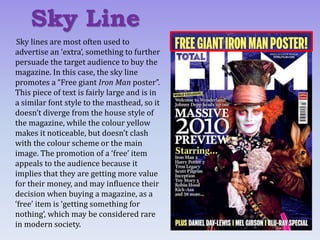
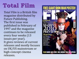
This document analyzes the cover of the British film magazine Total Film. It examines the different design elements including the masthead, main image, sell lines, additional text, and other features. The analysis finds that the magazine aims to attract readers through exclusive content, star appeal, promoting value with free items, and highlighting a variety of popular film genres. These techniques are intended to influence the design of the student's own magazine cover for their film by employing compelling sell lines and maintaining a consistent color scheme, while recognizing limitations around using star appeal with an independent film.
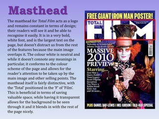
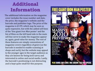
![The main sell line of a magazine cover
accompanies the main image and gives more
information about the primary feature of the
magazine. Above the sell line on this cover,
there is a banner that reads, “World
exclusive”, which implies to the audience
that the main story is only covered by this
magazine, therefore making it more
appealing in terms of its individuality and
implying that their readers are getting a
more exceptional experience if they choose
to purchase this one as opposed to its
competitors.
The line “Welcome to Wonderland! Johnny
Depp heads up our massive 2010 preview”
clarifies what the main image is related to
and makes use of star appeal, as Johnny
Depp is a very well-known and popular
actor.
Main Sell Line
[P1]](https://image.slidesharecdn.com/magazinetextualanalysispart1-161025171516/85/Magazine-Textual-Analysis-Part-1-5-320.jpg)
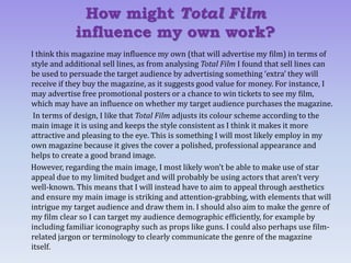
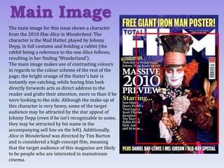
![The use of the noun “preview” implies that
this is something that hasn’t been seen
before; readers of Total Film will get the
first look, again giving the magazine an
advantage over its competitors. The sell
line also lists other big-name films such as
Harry Potter and Tron Legacy, which helps
to attract potential buyers who may be
interested in other genres besides the
fantasy theme of Alice in Wonderland. It is
a fairly varied list with a mix of genres,
ensuring a wider potential reach in terms
of demographics (age, gender, etc, as all of
these films will have differing target
audiences). The added line below the list,
“and 38 more...” suggests that there is lots
of content and therefore the audience are
getting value for their money.
Main Sell Line
[P2]](https://image.slidesharecdn.com/magazinetextualanalysispart1-161025171516/85/Magazine-Textual-Analysis-Part-1-6-320.jpg)