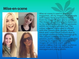
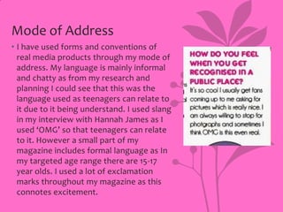
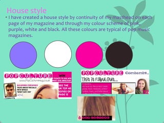
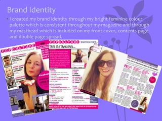
Download to read offline

The document discusses how the author's media magazine uses and develops conventions of real music magazines. It covers several key areas: the masthead uses a modern font and colors seen in other magazines; fonts and colors were chosen to connote youth; the central image challenges stereotypes while attracting the target audience; images use happy expressions and bright colors/styles; language is informal to relate to teens; continuity is created through a consistent color scheme, masthead and brand identity; coverlines use quotes and short phrases; and other typical magazine elements like barcodes and competitions are included. Overall, the author aimed to develop a house style while implementing many recognized conventions of pop music magazines.


