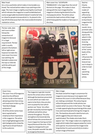
Mast head: 
Q is a less used letter which makes it memorable as a 
brand. The red and white makes it eye catching on the 
page. The main image is slightly covering the mast head 
which indicates the magazine is a well established and 
easily recognisable brand which doesn’t need to be fully 
on show for people to know what it is. Its placed in the 
top left third because that’s the most visible third when 
stacked on selves. 
Main cover line: ‘U2 EXPLAIN 
THEMSELEVES’ is far larger than the rest of 
the text on the page. This makes it clear 
(along with the main image) that the 
magazine is featuring the band U2 as the 
most popular article. The white colour 
contrasts the back section of the image 
which helps grab the readers or fans eyes in 
the shop. 
Main image: 
the black and white image is uncommon for 
magazine covers because it can appear dull 
however this issue is in this effect because they 
are making a comeback. This colouring can 
reflect the past and the inside articles can 
explain what’s to come in the future. The image 
is made appealing by the positioning of the cover 
lines and mast head which brings the image to 
life. The band are dressed in dark formal suits 
which suggests they are mature and 
sophisticated. The shades also make them 
appear ‘coo’. The image is taken at a slightly low 
angle which makes them appear powerful, iconic 
and superior. Its uncommon for images to be 
long shot but its used successfully to create a 
certain image of the band 
The bar code, date 
and issue number 
follow the 
conventions of 
magazines because 
it’s a legal 
requirement. The bar 
code is usually 
placed in the bottom 
left or right corner 
however to make the 
main cover line more 
eye catching, the 
barcode is place enar 
the top so it blends 
with the white part 
of the image. 
Cover lines: 
The cover lines of Q magazine 
advertise the different 
articles inside in the hope of 
attracting certain fans to buy 
and read more inside e.g. the 
‘Kate Bush 22page 
celebration.’ 
All of the artists names have 
been capitalised to 
emphasise their importance 
in the magazine. The white 
text is highlighted against the 
dark background to show the 
significance of each feature 
to the audience. 
The magazine is gender neutral 
due to the unisex colour scheme. 
Although the band are presented 
as icons which can make men 
aspire to be them, they are also 
seen as powerful men which 
women can ‘fancy’. Q is often 
gender neutral by maintaining the 
red black and white colour 
scheme throughout. This also 
strengthens the brand identity 
which follows the conventions of 
music magazines having a certain 
layout/theme all the time. If the 
magazine changed with each 
issue, the public wouldn’t be able 
to recognise the brand. 
Skyline: 
Clearly 
informs the 
reader of 
appealing 
offers to try 
and get them 
to buy future 
magazines for 
the next 
month. Its to 
promote sales. 
Along with the 
skyline the 
advert in the 
bottom left 
third. By 
showing the 
next 3 issues 
of the ‘come 
backs of the 
year’ it 
influences the 
audience to 
keep an eye 
out in shops in 
order to read 
about 
upcoming 
favourite 
artists.

Task 3 U2 front cover analysis (THIRD ANAYLSIS)

  • 1.
    Mast head: Qis a less used letter which makes it memorable as a brand. The red and white makes it eye catching on the page. The main image is slightly covering the mast head which indicates the magazine is a well established and easily recognisable brand which doesn’t need to be fully on show for people to know what it is. Its placed in the top left third because that’s the most visible third when stacked on selves. Main cover line: ‘U2 EXPLAIN THEMSELEVES’ is far larger than the rest of the text on the page. This makes it clear (along with the main image) that the magazine is featuring the band U2 as the most popular article. The white colour contrasts the back section of the image which helps grab the readers or fans eyes in the shop. Main image: the black and white image is uncommon for magazine covers because it can appear dull however this issue is in this effect because they are making a comeback. This colouring can reflect the past and the inside articles can explain what’s to come in the future. The image is made appealing by the positioning of the cover lines and mast head which brings the image to life. The band are dressed in dark formal suits which suggests they are mature and sophisticated. The shades also make them appear ‘coo’. The image is taken at a slightly low angle which makes them appear powerful, iconic and superior. Its uncommon for images to be long shot but its used successfully to create a certain image of the band The bar code, date and issue number follow the conventions of magazines because it’s a legal requirement. The bar code is usually placed in the bottom left or right corner however to make the main cover line more eye catching, the barcode is place enar the top so it blends with the white part of the image. Cover lines: The cover lines of Q magazine advertise the different articles inside in the hope of attracting certain fans to buy and read more inside e.g. the ‘Kate Bush 22page celebration.’ All of the artists names have been capitalised to emphasise their importance in the magazine. The white text is highlighted against the dark background to show the significance of each feature to the audience. The magazine is gender neutral due to the unisex colour scheme. Although the band are presented as icons which can make men aspire to be them, they are also seen as powerful men which women can ‘fancy’. Q is often gender neutral by maintaining the red black and white colour scheme throughout. This also strengthens the brand identity which follows the conventions of music magazines having a certain layout/theme all the time. If the magazine changed with each issue, the public wouldn’t be able to recognise the brand. Skyline: Clearly informs the reader of appealing offers to try and get them to buy future magazines for the next month. Its to promote sales. Along with the skyline the advert in the bottom left third. By showing the next 3 issues of the ‘come backs of the year’ it influences the audience to keep an eye out in shops in order to read about upcoming favourite artists.