In what ways does your media product use, develop or challenge forms
and conventions of real media products?
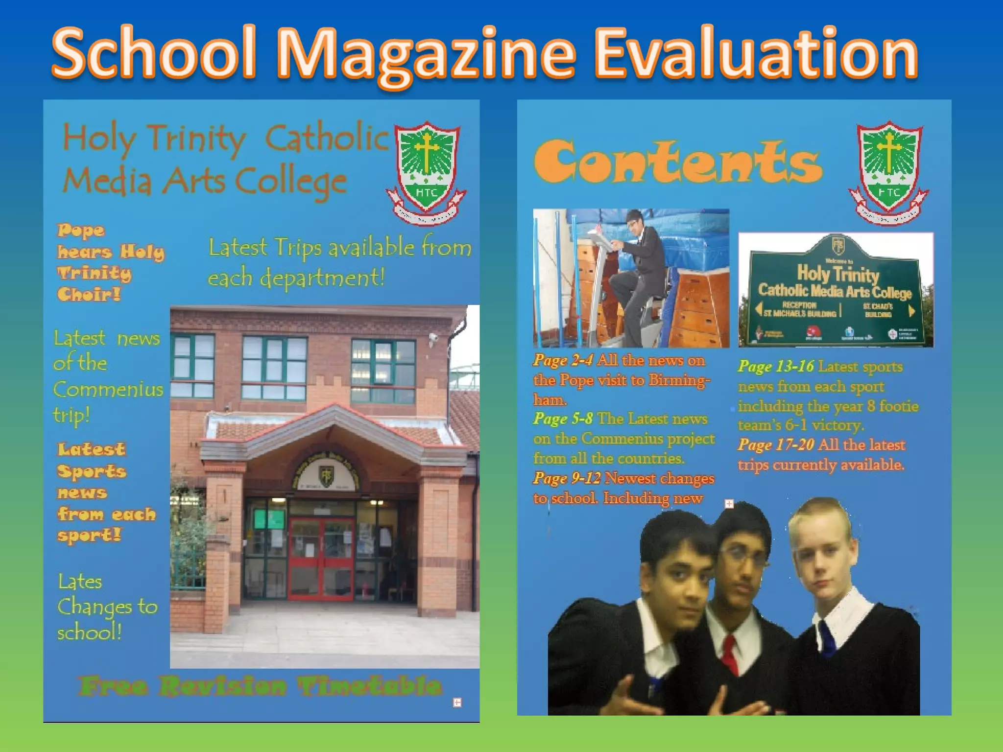
My Media product does not stick to the codes and conventions of a real magazine- especially
music magazines. You can see this in many instances. For example, my logo is on the right-hand
side and I have some articles on the right side so this shows I have not followed the rule of third
code. Also I have not got a completely central image, which most professional magazines do.
Another way my magazine challenged forms and conventions of a real media product was that I
never had a pug (place on the front cover where the date and price is) or a bar code. This meant
that my magazine could not be sold. However I knew that I did not have to follow the typical
codes and conventions due to many school magazines being handed out to students and not
shelved.
I did attempt to use some tricks and conventions that are used in real media products. I used an
appealing colour as my background, which was light blue. I thought it would be more appealing
to the audience when reading. I also used a freebie, used a great deal in many professional
magazines, to lure the reader into buying the magazine. Another trick I did was one all
professional magazines do and it is surprising how much it helps. This is to colour code my
magazine and, as a result, it looks much more appealing to the eye and professional. What's
more I tried to use colours that got selected in my audience research. Finally, I used a fun,
pleasing to the eye, font to soften the appearance of the magazine. This is unusual in most
magazines, even school magazines, because they want their product to have a high level of
clarity, although, I think my magazine is still clear and understandable.
How does your media product represent particular social groups?
My media product, Which is a school magazine, does not represent or mention many different
social groups in a particular way.
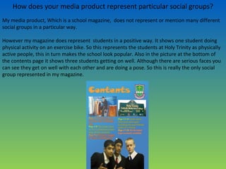
However my magazine does represent students in a positive way. It shows one student doing
physical activity on an exercise bike. So this represents the students at Holy Trinity as physically
active people, this in turn makes the school look popular. Also in the picture at the bottom of
the contents page it shows three students getting on well. Although there are serious faces you
can see they get on well with each other and are doing a pose. So this is really the only social
group represented in my magazine.
What kind of media institution might distribute your media product and
why?
There are, to a certain extent, many different institutions what could distribute my magazine.
Like parents, governors and the school- teachers and students.
The Parents would like to show what their children are up to, the governors will want to show
what a good school it is and the students would want to show their friends about what they get
up to during school hours. Yet I think that teachers would want to most distribute the magazine
because since they work there they would want a positive view of the school shown and they
know who would want to purchase the magazine. Also the teachers would be able to show to
other school and the teachers would give the parents, governors and students of the school so
everyone will view the magazine .
So I think the teachers would be most likely to distribute my media product because they would
want a positive picture shown and they have experience in distributing newsletters so they will
know what to do.
Who would be the audience for your media product?
The audience for my magazine is quite broad however I chose to target one mainly. Out of the
Parents, Governors and students I choose to target the students more although the other
audiences are targeted aswell.
You can see this by the colloquial language I use. It is not formal and it is simple to understand.
Also the font is not formal and it is quite colourful. Another thing is that for my survey I asked
only students so most of the things on my magazine is what pupils choose and liked.
Furthermore, another thing is that I have pictures of fellow pupils and peers to target the
younger audience who will probably recognise their peers. However in this way I have also
targeted parents and teachers because they enjoy watching the progress of the pupils and
seeing them enjoy themselves. You can see the parents are targeted because for some there
are some images of the main school office and the school sign with directions. Pupils and
teachers already recognise it but it gives parents an idea of the school. With the school logo you
can see it is targeting everyone who has links with Holy Trinity like parents, the students,
teachers and governors. Finally, you can see I am targeting the pupils because at the bottom of
the front page I have a freebie that benefits students greatly so they will be interested.
So the audience would be the pupils, teachers, parents and the governors; but the main
audience would be the pupils.
How did you attract/address your audience?
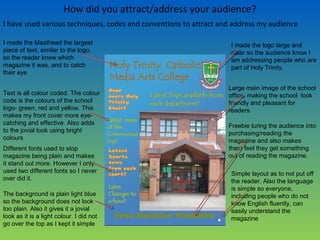
I have used various techniques, codes and conventions to attract and address my audience
I made the logo large and
clear so the audience know I
am addressing people who are
part of Holy Trinity.
I made the Masthead the largest
piece of text, similar to the logo,
so the reader knew which
magazine it was, and to catch
their eye
Text is all colour coded. The colour
code is the colours of the school
logo- green, red and yellow. This
makes my front cover more eye-
catching and effective. Also adds
to the jovial look using bright
colours
Different fonts used to stop
magazine being plain and makes
it stand out more. However I only
used two different fonts so I never
over did it.
Large main image of the school
office, making the school look
friendly and pleasant for
readers
The background is plain light blue
so the background does not look
too plain. Also it gives it a jovial
look as it is a light colour. I did not
go over the top as I kept it simple
Freebie luring the audience into
purchasing/reading the
magazine and also makes
them feel they get something
out of reading the magazine.
Simple layout as to not put off
the reader. Also the language
is simple so everyone,
including people who do not
know English fluently, can
easily understand the
magazine
What have you learnt about technologies from the process of
constructing this product?
I have learnt a great deal about technologies from the process of constructing the school
magazine.
I used a good few programs during the construction of my magazine. These include: Adobe
Photoshop, Adobe Indesign and Microsoft PowerPoint . Firstly I used a Nikon D90 to take some
images around the school of key features and people. Then after I took my images using the
camera I used Photoshop to make them look professional and sufficient. Although I had used
Adobe Photoshop in the past I learnt many new techniques like air brushing, this is a tool you
can use to blend or take away parts of a picture like if someone had a spot, which I used a great
deal. I also used Indesign and without it I would of not been able to construct a proficient
looking magazine. It was the first time using it and at first I did not understand how to use it. It
was a new and complicated program. However, after many a hour and help from a teacher, I
soon mastered its uses. I realised that on any other program I could not contract a high-quality
magazine. I learnt how to use the layers to make a magazine. I know this program will help me
in the future if I am ever making another magazine.
So I learnt that although many technologies can be complicated they are essential for a good
product and have many uses.

School Magazine Evaluation

  • 2.
    In what waysdoes your media product use, develop or challenge forms and conventions of real media products? My Media product does not stick to the codes and conventions of a real magazine- especially music magazines. You can see this in many instances. For example, my logo is on the right-hand side and I have some articles on the right side so this shows I have not followed the rule of third code. Also I have not got a completely central image, which most professional magazines do. Another way my magazine challenged forms and conventions of a real media product was that I never had a pug (place on the front cover where the date and price is) or a bar code. This meant that my magazine could not be sold. However I knew that I did not have to follow the typical codes and conventions due to many school magazines being handed out to students and not shelved. I did attempt to use some tricks and conventions that are used in real media products. I used an appealing colour as my background, which was light blue. I thought it would be more appealing to the audience when reading. I also used a freebie, used a great deal in many professional magazines, to lure the reader into buying the magazine. Another trick I did was one all professional magazines do and it is surprising how much it helps. This is to colour code my magazine and, as a result, it looks much more appealing to the eye and professional. What's more I tried to use colours that got selected in my audience research. Finally, I used a fun, pleasing to the eye, font to soften the appearance of the magazine. This is unusual in most magazines, even school magazines, because they want their product to have a high level of clarity, although, I think my magazine is still clear and understandable.
  • 3.
    How does yourmedia product represent particular social groups? My media product, Which is a school magazine, does not represent or mention many different social groups in a particular way. However my magazine does represent students in a positive way. It shows one student doing physical activity on an exercise bike. So this represents the students at Holy Trinity as physically active people, this in turn makes the school look popular. Also in the picture at the bottom of the contents page it shows three students getting on well. Although there are serious faces you can see they get on well with each other and are doing a pose. So this is really the only social group represented in my magazine.
  • 4.
    What kind ofmedia institution might distribute your media product and why? There are, to a certain extent, many different institutions what could distribute my magazine. Like parents, governors and the school- teachers and students. The Parents would like to show what their children are up to, the governors will want to show what a good school it is and the students would want to show their friends about what they get up to during school hours. Yet I think that teachers would want to most distribute the magazine because since they work there they would want a positive view of the school shown and they know who would want to purchase the magazine. Also the teachers would be able to show to other school and the teachers would give the parents, governors and students of the school so everyone will view the magazine . So I think the teachers would be most likely to distribute my media product because they would want a positive picture shown and they have experience in distributing newsletters so they will know what to do.
  • 5.
    Who would bethe audience for your media product? The audience for my magazine is quite broad however I chose to target one mainly. Out of the Parents, Governors and students I choose to target the students more although the other audiences are targeted aswell. You can see this by the colloquial language I use. It is not formal and it is simple to understand. Also the font is not formal and it is quite colourful. Another thing is that for my survey I asked only students so most of the things on my magazine is what pupils choose and liked. Furthermore, another thing is that I have pictures of fellow pupils and peers to target the younger audience who will probably recognise their peers. However in this way I have also targeted parents and teachers because they enjoy watching the progress of the pupils and seeing them enjoy themselves. You can see the parents are targeted because for some there are some images of the main school office and the school sign with directions. Pupils and teachers already recognise it but it gives parents an idea of the school. With the school logo you can see it is targeting everyone who has links with Holy Trinity like parents, the students, teachers and governors. Finally, you can see I am targeting the pupils because at the bottom of the front page I have a freebie that benefits students greatly so they will be interested. So the audience would be the pupils, teachers, parents and the governors; but the main audience would be the pupils.
  • 6.
    How did youattract/address your audience? I have used various techniques, codes and conventions to attract and address my audience I made the logo large and clear so the audience know I am addressing people who are part of Holy Trinity. I made the Masthead the largest piece of text, similar to the logo, so the reader knew which magazine it was, and to catch their eye Text is all colour coded. The colour code is the colours of the school logo- green, red and yellow. This makes my front cover more eye- catching and effective. Also adds to the jovial look using bright colours Different fonts used to stop magazine being plain and makes it stand out more. However I only used two different fonts so I never over did it. Large main image of the school office, making the school look friendly and pleasant for readers The background is plain light blue so the background does not look too plain. Also it gives it a jovial look as it is a light colour. I did not go over the top as I kept it simple Freebie luring the audience into purchasing/reading the magazine and also makes them feel they get something out of reading the magazine. Simple layout as to not put off the reader. Also the language is simple so everyone, including people who do not know English fluently, can easily understand the magazine
  • 7.
    What have youlearnt about technologies from the process of constructing this product? I have learnt a great deal about technologies from the process of constructing the school magazine. I used a good few programs during the construction of my magazine. These include: Adobe Photoshop, Adobe Indesign and Microsoft PowerPoint . Firstly I used a Nikon D90 to take some images around the school of key features and people. Then after I took my images using the camera I used Photoshop to make them look professional and sufficient. Although I had used Adobe Photoshop in the past I learnt many new techniques like air brushing, this is a tool you can use to blend or take away parts of a picture like if someone had a spot, which I used a great deal. I also used Indesign and without it I would of not been able to construct a proficient looking magazine. It was the first time using it and at first I did not understand how to use it. It was a new and complicated program. However, after many a hour and help from a teacher, I soon mastered its uses. I realised that on any other program I could not contract a high-quality magazine. I learnt how to use the layers to make a magazine. I know this program will help me in the future if I am ever making another magazine. So I learnt that although many technologies can be complicated they are essential for a good product and have many uses.