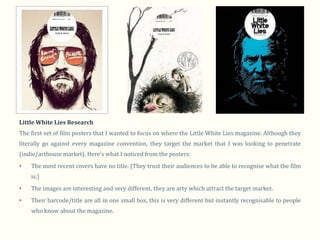
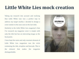
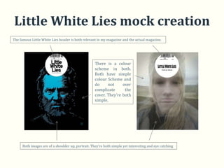
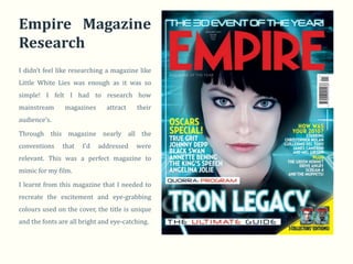
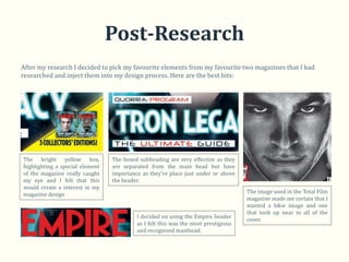
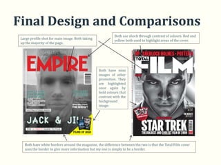
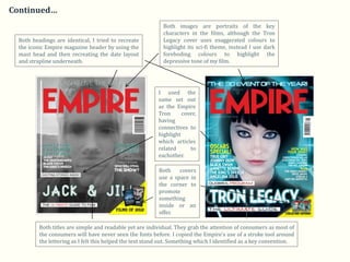
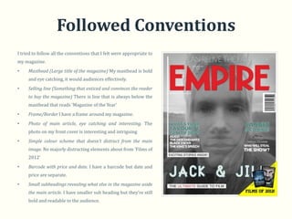
In what ways does your media
product     use,  develop    or
challenge forms and conventions
of    real   media    products?
Film Magazine
In the beginning…
I firstly began my research my addressing the key magazine conventions. I then researched magazines and
then finally created my own. Here are the key elements that I discovered:

•   Masthead (Large title of the magazine)

•   Selling line (Something that enticed and convinces the reader to buy the magazine)

•   Frame/Border.

•   Photo of main article, eye catching and interesting.

•   Simple colour scheme that doesn’t distract from the main image.

•   Barcode with price and date

•   Small subheadings revealing what else in the magazine aside the main article

I set out with the ambition of fulfilling most of these conventions that I had addressed from researching
successful magazine covers.
Little White Lies Research
The first set of film posters that I wanted to focus on where the Little White Lies magazine. Although they
literally go against every magazine convention, they target the market that I was looking to penetrate
(indie/arthouse market). Here’s what I noticed from the posters:
•   The most recent covers have no title. (They trust their audiences to be able to recognise what the film
    is.)
•   The images are interesting and very different, they are arty which attract the target market.
•   Their barcode/title are all in one small box, this is very different but instantly recognisable to people
    who know about the magazine.
Little White Lies mock creation
Taking my research into account and realising
that Little White Lies was a perfect way to
address my target market, I decided to design a
cover similar to the ones seen in the last slide.

Similarly to the Little White Lies magazine’s that
I’ve research my magazine cover is simple with
only the title but has an interesting image as the
focal point.

I have kept the main and only constant element of
Little White Lies magazines was the circle
containing the title, strapline and barcode. This is
the   element      that   makes     the    magazine
distinguishable.
Little White Lies mock creation
The famous Little White Lies header is both relevant in my magazine and the actual magazine.


                                                    There is a colour
                                                    scheme in both.
                                                    Both have simple
                                                    colour Scheme and
                                                    do     not     over
                                                    complicate      the
                                                    cover. They’re both
                                                    simple.


      Both images are of a shoulder up, portrait. They’re both simple yet interesting and eye catching
Empire Magazine
Research
I didn’t feel like researching a magazine like
Little White Lies was enough as it was so
simple! I felt I had to research how
mainstream      magazines      attract   their
audience’s.

Through this magazine nearly all the
conventions    that   I’d   addressed    were
relevant. This was a perfect magazine to
mimic for my film.

I learnt from this magazine that I needed to
recreate the excitement and eye-grabbing
colours used on the cover, the title is unique
and the fonts are all bright and eye-catching.
Total                             Film
Research
Total Film and Empire are both massive film
magazines and I felt that they both would
be good to research. This is one of my
favourite covers as I love the simplicity, the
red, white and blacks are so effective!

I hoped to recreate this simplicity in my
front cover. I learnt from this magazine that
a black and white image can be just as
effective as a colour.

This magazine once again conforms to the
typical film magazine conventions and like
the Little White Lies cover is has a full face
shot making eye contact with the consumer.
Post-Research
After my research I decided to pick my favourite elements from my favourite two magazines that I had
researched and inject them into my design process. Here are the best bits:


The bright yellow box,           The boxed subheading are very effective as they
highlighting a special element   are separated from the main head but have
of the magazine really caught    importance as they’re place just under or above
my eye and I felt that this      the header.
would create a interest in my
magazine design                                                                     The image used in the Total Film
                                                                                    magazine made me certain that I
                                                                                    wanted a b&w image and one
                                                                                    that took up near to all of the
                                          I decided on using the Empire header
                                                                                    cover.
                                          as I felt this was the most prestigious
                                          and recognised masthead.
Final Design and Comparisons
                                                           Both use shock through contrast of colours. Red and
 Large profile shot for main image. Both taking
                                                           yellow both used to highlight areas of the cover.
 up the majority of the page.


                                                  Both have mini
                                                  images of other
                                                  promotion. They
                                                  are highlighted
                                                  once again by
                                                  bold colours that
                                                  contrast with the
                                                  background
                                                  image.


   Both have white borders around the magazine, the difference between the two is that the Total Film cover
   uses the border to give more information but my one is simply to be a border.
Continued…
                                                             Both images are portraits of the key
                                                             characters in the films, although the Tron
  Both headings are identical, I tried to recreate           Legacy cover uses exaggerated colours to
  the iconic Empire magazine header by using the             highlight its sci-fi theme, instead I use dark
  mast head and then recreating the date layout              foreboding colours to highlight the
  and strapline underneath.                                  depressive tone of my film.


                                                           I used the
                                                           same set out
                                                           as the Empire
                                                           Tron      cover,
                                                           having
                                                           connectives to
                                                           highlight
                                                           which articles
                                                           related      to
                                                           eachother.

                                                           Both    covers
                                                           use a space in
                                                           the corner to
                                                           promote
                                                           something
                                                           inside or an
                                                           offer.

          Both titles are simple and readable yet are individual. They grab the attention of consumers as most of
          the consumers will have never seen the fonts before. I copied the Empire’s use of a stroke tool around
          the lettering as I felt this helped the text stand out. Something which I identified as a key convention.
Followed Conventions
I tried to follow all the conventions that I felt were appropriate to
my magazine.
•    Masthead (Large title of the magazine) My masthead is bold
     and eye catching, it would audiences effectively.
•    Selling line (Something that enticed and convinces the reader
     to buy the magazine) There is line that is always below the
     masthead that reads ‘Magazine of the Year’
•    Frame/Border I have a frame around my magazine.
•    Photo of main article, eye catching and interesting. The
     photo on my front cover is interesting and intriguing
•    Simple colour scheme that doesn’t distract from the main
     image. No majorly distracting elements about from ‘Films of
     2012’
•    Barcode with price and date. I have a barcode but date and
     price are separate.
•    Small subheadings revealing what else in the magazine aside
     the main article. I have smaller sub heading but they’re still
     bold and readable to the audience.

Evaluation Q1 Magazine

  • 1.
    In what waysdoes your media product use, develop or challenge forms and conventions of real media products? Film Magazine
  • 2.
    In the beginning… Ifirstly began my research my addressing the key magazine conventions. I then researched magazines and then finally created my own. Here are the key elements that I discovered: • Masthead (Large title of the magazine) • Selling line (Something that enticed and convinces the reader to buy the magazine) • Frame/Border. • Photo of main article, eye catching and interesting. • Simple colour scheme that doesn’t distract from the main image. • Barcode with price and date • Small subheadings revealing what else in the magazine aside the main article I set out with the ambition of fulfilling most of these conventions that I had addressed from researching successful magazine covers.
  • 3.
    Little White LiesResearch The first set of film posters that I wanted to focus on where the Little White Lies magazine. Although they literally go against every magazine convention, they target the market that I was looking to penetrate (indie/arthouse market). Here’s what I noticed from the posters: • The most recent covers have no title. (They trust their audiences to be able to recognise what the film is.) • The images are interesting and very different, they are arty which attract the target market. • Their barcode/title are all in one small box, this is very different but instantly recognisable to people who know about the magazine.
  • 4.
    Little White Liesmock creation Taking my research into account and realising that Little White Lies was a perfect way to address my target market, I decided to design a cover similar to the ones seen in the last slide. Similarly to the Little White Lies magazine’s that I’ve research my magazine cover is simple with only the title but has an interesting image as the focal point. I have kept the main and only constant element of Little White Lies magazines was the circle containing the title, strapline and barcode. This is the element that makes the magazine distinguishable.
  • 5.
    Little White Liesmock creation The famous Little White Lies header is both relevant in my magazine and the actual magazine. There is a colour scheme in both. Both have simple colour Scheme and do not over complicate the cover. They’re both simple. Both images are of a shoulder up, portrait. They’re both simple yet interesting and eye catching
  • 6.
    Empire Magazine Research I didn’tfeel like researching a magazine like Little White Lies was enough as it was so simple! I felt I had to research how mainstream magazines attract their audience’s. Through this magazine nearly all the conventions that I’d addressed were relevant. This was a perfect magazine to mimic for my film. I learnt from this magazine that I needed to recreate the excitement and eye-grabbing colours used on the cover, the title is unique and the fonts are all bright and eye-catching.
  • 7.
    Total Film Research Total Film and Empire are both massive film magazines and I felt that they both would be good to research. This is one of my favourite covers as I love the simplicity, the red, white and blacks are so effective! I hoped to recreate this simplicity in my front cover. I learnt from this magazine that a black and white image can be just as effective as a colour. This magazine once again conforms to the typical film magazine conventions and like the Little White Lies cover is has a full face shot making eye contact with the consumer.
  • 8.
    Post-Research After my researchI decided to pick my favourite elements from my favourite two magazines that I had researched and inject them into my design process. Here are the best bits: The bright yellow box, The boxed subheading are very effective as they highlighting a special element are separated from the main head but have of the magazine really caught importance as they’re place just under or above my eye and I felt that this the header. would create a interest in my magazine design The image used in the Total Film magazine made me certain that I wanted a b&w image and one that took up near to all of the I decided on using the Empire header cover. as I felt this was the most prestigious and recognised masthead.
  • 9.
    Final Design andComparisons Both use shock through contrast of colours. Red and Large profile shot for main image. Both taking yellow both used to highlight areas of the cover. up the majority of the page. Both have mini images of other promotion. They are highlighted once again by bold colours that contrast with the background image. Both have white borders around the magazine, the difference between the two is that the Total Film cover uses the border to give more information but my one is simply to be a border.
  • 10.
    Continued… Both images are portraits of the key characters in the films, although the Tron Both headings are identical, I tried to recreate Legacy cover uses exaggerated colours to the iconic Empire magazine header by using the highlight its sci-fi theme, instead I use dark mast head and then recreating the date layout foreboding colours to highlight the and strapline underneath. depressive tone of my film. I used the same set out as the Empire Tron cover, having connectives to highlight which articles related to eachother. Both covers use a space in the corner to promote something inside or an offer. Both titles are simple and readable yet are individual. They grab the attention of consumers as most of the consumers will have never seen the fonts before. I copied the Empire’s use of a stroke tool around the lettering as I felt this helped the text stand out. Something which I identified as a key convention.
  • 11.
    Followed Conventions I triedto follow all the conventions that I felt were appropriate to my magazine. • Masthead (Large title of the magazine) My masthead is bold and eye catching, it would audiences effectively. • Selling line (Something that enticed and convinces the reader to buy the magazine) There is line that is always below the masthead that reads ‘Magazine of the Year’ • Frame/Border I have a frame around my magazine. • Photo of main article, eye catching and interesting. The photo on my front cover is interesting and intriguing • Simple colour scheme that doesn’t distract from the main image. No majorly distracting elements about from ‘Films of 2012’ • Barcode with price and date. I have a barcode but date and price are separate. • Small subheadings revealing what else in the magazine aside the main article. I have smaller sub heading but they’re still bold and readable to the audience.