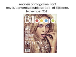
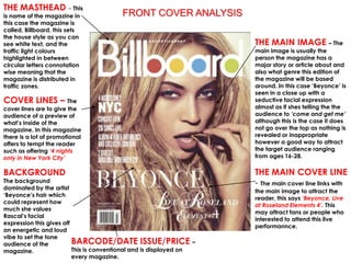
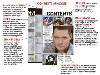
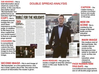
Analysis of magazine front
cover/contents/double spread of Billboard,
            November 2011
THE MASTHEAD – This
is name of the magazine in              FRONT COVER ANALYSIS
this case the magazine is
called, Billboard, this sets
the house style as you can
see white text, and the                                              THE MAIN IMAGE – The
traffic light colours                                                main image is usually the
highlighted in between                                               person the magazine has a
circular letters connotation                                         major story or article about and
wise meaning that the                                                also what genre this edition of
magazine is distributed in                                           the magazine will be based
traffic zones.                                                       around. In this case ‘Beyonce’ is
                                                                     seen in a close up with a
COVER LINES – The                                                    seductive facial expression
cover lines are to give the                                          almost as if shes telling the the
audience of a preview of                                             audience to ‘come and get me’
what’s inside of the                                                 although this is the case it does
magazine. In this magazine                                           not go over the top as nothing is
there is a lot of promotional                                        revealed or inappropriate
offers to tempt the reader                                           however a good way to attract
such as offering ‘4 nights                                           the target audience ranging
only in New York City’                                               from ages 16-28.

BACKGROUND                                                           THE MAIN COVER LINE
The background                                                       - The main cover line links with
dominated by the artist
                                                                     the main image to attract the
‘Beyonce’s hair which
                                                                     reader, this says ‘Beyonce, Live
could represent how
                                                                     at Roseland Elements 4’. This
much she values
                                                                     may attract fans or people who
Rascal’s facial
                                                                     interested to attend this live
expression this gives off
                                                                     performannce.
an energetic and loud
vibe to set the tone
audience of the           BARCODE/DATE ISSUE/PRICE –
magazine.                 This is conventional and is displayed on
                          every magazine.
CONTENTS ANALYSIS             BANNER –This is where
BILLBOARD MASTHEAD –                                           you would expect to see
This is the same colour as the                                 Banners on all
Masthead on the front                                          magazines, this also
cover, this comes across as                                    follows the house style.
professional and also a
consistent house style.

INDEX – The index of                                          MAIN IMAGE – The
Billboard shows the                                           main image is the focal point
audience immediately who                                      of this page as this is the
is top of the charts, however                                 biggest feature on the
outstanding colours are not                                   page, this grabs the
used as this looks quite                                      audiences attention and
dull, this may connotate                                      relates to the article in this
more information is given                                     case the artist ‘Michael Buble.
further in the magazine.                                      This is a close up so you are
                                                              able to see his facial
                                                              expression, this may also be
 SUB HEADING –                                                perceived as a seductive
 This is black text to                                        look but not as exaggerated
 contrast the white                                           in comparison to the front
 background of image.                                         cover.
 This is also the biggest
 text on the page, and a
 use of coloquial
 language gets the point
 across to the audience
 in order for them to read
 the brief description to
 then go on further and
 read the article.
                                              BRIEF DESCRIPTION – This is the summary
                                              of content and giving the reader an insight
                                              of what’s included in the magazine, this is
                                              in small black text. To persuade the reader
                                              to read on.
SUB HEADING – This is
brief information about             DOUBLE SPREAD ANALYSIS
what is to come in the
article, in this case this is                                                                         CAPTION       – The
description about                                                                                     caption saying, is
‘Michael Buble’ live                                                                                  another convention
performance on                                                                                        feature and usually
Saturday night live.                                                                                  recounts the article
                                                                                                      on this page.
COPY- this is
wrapped around
images this can                                                                                      MISE EN
show there
importance on this
                                                                                                     SCENE This is
                                                                                                     created by the
page. In addition
                                                                                                     image of Michael
to this there is no
                                                                                                     Buble and the
drop capital that
                                                                                                     industrial
you would expect
                                                                                                     background.
to find on a double
page spread.
COLOUMNS This
                                                                                                       MAIN IMAGE
                                                                                                       This medium shot of
is conventional
                                                                                                       Michael Buble, this
and in the third
                                                                                                       creates mise en
column the text
                                                                                                       scene as the
wraps around the
                                                                                                       background may
image to show the
                                                                                                       relate to his style of
importance of the
                                                                                                       music as they are
image.
                                                                                                       very
                                                                                                       industrial, urban
                                                  MAIN HEADLINE – This gives the                       classed as
                                                                                                       mainstream.
SECOND IMAGE – This is and image of               reader a insight of what the article is
                                                                                            PAGE NUMBER/NME
                                                  about, in this case ‘Buble for the
‘Micheal Buble’ on a live performance, and
has a brief caption about this. The reduces the
                                                  holidays’.                                TITLE/DATE – This
                                                                                            conventional and expected to
amount of information the reader is given.
                                                                                            see on all double page spread.
Billboard analysis

Billboard analysis

  • 1.
    Analysis of magazinefront cover/contents/double spread of Billboard, November 2011
  • 2.
    THE MASTHEAD –This is name of the magazine in FRONT COVER ANALYSIS this case the magazine is called, Billboard, this sets the house style as you can see white text, and the THE MAIN IMAGE – The traffic light colours main image is usually the highlighted in between person the magazine has a circular letters connotation major story or article about and wise meaning that the also what genre this edition of magazine is distributed in the magazine will be based traffic zones. around. In this case ‘Beyonce’ is seen in a close up with a COVER LINES – The seductive facial expression cover lines are to give the almost as if shes telling the the audience of a preview of audience to ‘come and get me’ what’s inside of the although this is the case it does magazine. In this magazine not go over the top as nothing is there is a lot of promotional revealed or inappropriate offers to tempt the reader however a good way to attract such as offering ‘4 nights the target audience ranging only in New York City’ from ages 16-28. BACKGROUND THE MAIN COVER LINE The background - The main cover line links with dominated by the artist the main image to attract the ‘Beyonce’s hair which reader, this says ‘Beyonce, Live could represent how at Roseland Elements 4’. This much she values may attract fans or people who Rascal’s facial interested to attend this live expression this gives off performannce. an energetic and loud vibe to set the tone audience of the BARCODE/DATE ISSUE/PRICE – magazine. This is conventional and is displayed on every magazine.
  • 3.
    CONTENTS ANALYSIS BANNER –This is where BILLBOARD MASTHEAD – you would expect to see This is the same colour as the Banners on all Masthead on the front magazines, this also cover, this comes across as follows the house style. professional and also a consistent house style. INDEX – The index of MAIN IMAGE – The Billboard shows the main image is the focal point audience immediately who of this page as this is the is top of the charts, however biggest feature on the outstanding colours are not page, this grabs the used as this looks quite audiences attention and dull, this may connotate relates to the article in this more information is given case the artist ‘Michael Buble. further in the magazine. This is a close up so you are able to see his facial expression, this may also be SUB HEADING – perceived as a seductive This is black text to look but not as exaggerated contrast the white in comparison to the front background of image. cover. This is also the biggest text on the page, and a use of coloquial language gets the point across to the audience in order for them to read the brief description to then go on further and read the article. BRIEF DESCRIPTION – This is the summary of content and giving the reader an insight of what’s included in the magazine, this is in small black text. To persuade the reader to read on.
  • 4.
    SUB HEADING –This is brief information about DOUBLE SPREAD ANALYSIS what is to come in the article, in this case this is CAPTION – The description about caption saying, is ‘Michael Buble’ live another convention performance on feature and usually Saturday night live. recounts the article on this page. COPY- this is wrapped around images this can MISE EN show there importance on this SCENE This is created by the page. In addition image of Michael to this there is no Buble and the drop capital that industrial you would expect background. to find on a double page spread. COLOUMNS This MAIN IMAGE This medium shot of is conventional Michael Buble, this and in the third creates mise en column the text scene as the wraps around the background may image to show the relate to his style of importance of the music as they are image. very industrial, urban MAIN HEADLINE – This gives the classed as mainstream. SECOND IMAGE – This is and image of reader a insight of what the article is PAGE NUMBER/NME about, in this case ‘Buble for the ‘Micheal Buble’ on a live performance, and has a brief caption about this. The reduces the holidays’. TITLE/DATE – This conventional and expected to amount of information the reader is given. see on all double page spread.