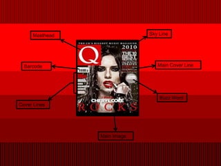
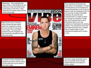
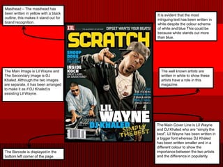
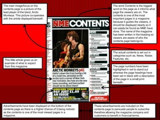
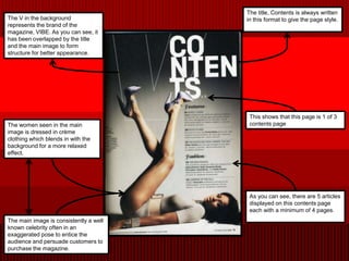
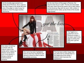
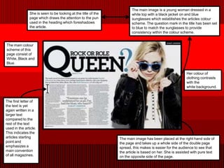
Analysis of Existing
    Magazines
      By Alvin Goolab
Masthead                Sky Line


  Barcode                       Main Cover Line


                                 Buzz Word
Cover Lines


                Main Image
Masthead – The masthead has              The importance of the text has
 been written in Red & Black for this     been colour co-ordinated in 3 levels
 article as it suits the Artists dress    of transparency to the background.
 code shown on the front, it also         Least important text is set in grey to
 illustrates the articles style and the   blend in with the background as it is
 artists personality.                     not a priority to being noticeable
                                          whereas, the second most
                                          important text is in black to stand
                                          out enough as important. Finally,
                                          the most important text is set in
Main Cover Line is, Eminem,               bold red to stand out to the
which shows the lead article              audience to foreshadow the leading
within the magazine is about              articles. The importance of the text
Eminem hence him being the                also determines the size, smallest
main image. This persuades                text is mostly written in grey
people to buy the magazine as             whereas the largest text is written
they would be interested to read          in red.
about the article.


 Contrast is shown between the            The main image dominates and is
 background colour and the colour         shot at eye-level which catches
 of the outfit worn by the artist in      peoples attention and depicts a
 the main image.                          serious article.
Masthead – The masthead has
been written in yellow with a black    It is evident that the most
outline, this makes it stand out for   intriguing text has been written in
brand recognition.                     white despite the colour scheme
                                       of white and blue This could be
                                       because white stands out more
                                       than blue.


The Main Image is Lil Wayne and          The well known artists are
The Secondary Image is DJ                written in white to show these
Khaled. Although the two images          artists have a role in this
are separate, it has been arranged       magazine.
to make it as if DJ Khaled is
assisting Lil Wayne.


                                       The Main Cover Line is Lil Wayne
                                       and DJ Khaled who are “simply the
                                       best”. Lil Wayne has been written in
                                       a bigger font whereas DJ Khaled
                                       has been written smaller and in a
                                       different colour to show the
The Barcode is displayed in the        importance between the two artists
bottom left corner of the page         and the difference in popularity.
The main image/focus on the                                                    The word Contents is the biggest
contents page is a picture of the                                              word on the page as it informs what
lead player of the band, Arctic                                                page the viewers are on. The
Monkeys. This picture co-operates                                              contents is one of the most
with the article displayed beneath.                                            important pages in a magazine
                                                                               because it guides the viewers, it
                                                                               should be displayed clearly so it
                                                                               can easily be found as NME have
                                                                               done. The name of the magazine
                                                                               has been written in the heading so
                                                                               viewers are aware of who the
                                                                               contents page belongs to.


                                                                               The actual contents is set out in
                                                                               categories such as, News, Radar,
 This little article gives us an                                               Features, etc.
 example of what to expect
 from this magazine.                                                           The page numbers have been
                                                                               highlighted in red to stand out
                                                                               whereas the page headings have
                                                                               been set in black with a description
                                                                               of the page in a small print
                                                                               beneath.


Advertisements have been displayed on the bottom of the         These advertisements are included on the
contents page as there is a higher chance of it being noticed   contents page to persuade people to subscribe
as the contents is one of the most viewed pages in a            therefore allowing the magazine company and
magazine.                                                       customers to benefit in financial terms.
The title, Contents is always written
The V in the background                 in this format to give the page style.
represents the brand of the
magazine, VIBE. As you can see, it
has been overlapped by the title
and the main image to form
structure for better appearance.


                                         This shows that this page is 1 of 3
The women seen in the main               contents page
image is dressed in crème
clothing which blends in with the
background for a more relaxed
effect.


                                         As you can see, there are 5 articles
                                         displayed on this contents page
                                         each with a minimum of 4 pages.
The main image is consistently a well
known celebrity often in an
exaggerated pose to entice the
audience and persuade customers to
purchase the magazine.
As this double page spread is an                                       As the main focus of this page is Florence, the
 article about Florence, she is used as                                 second main focus is USA. The two are associated
 the main image on the whole left hand                                  with each other hence the reason she is seen sitting
 side of the page to make it easy for                                   on the American flag with the word, USA, written in
 people to know this page revolves                                      bold behind which takes up two thirds of the double
 around her.                                                            page spread.


                                                                                                         This Tagline is a
                                                                                                         quote from one of
                                                                                                         Florence’s songs. It
                                                                                                         has been used in this
                                                                                                         page to portray that
                                                                                                         USA have “got the
                                                                                                         love”.

Her colour of clothing
contrasts with the
colours used in the
article which makes her
                                   Her name has been highlighted                  This has been written larger than
fashion sense stand
                                   here to show her importance and                any other text to indicate that it is
out. In my opinion, it
                                   almost a shock for what is said in             the beginning of the article. I
shows a sense of
                                   the articles summary.                          believe it also improves the
hatred towards
                                                                                  appearance.
America.
The main image is a young woman dressed in a
               She is seen to be looking at the title of the          white top with a black jacket on and blue
               page which draws the attention to the pun              sunglasses which establishes the articles colour
               used in the heading which foreshadows                  scheme. The question mark in the title has been set
               the article.                                           to blue to match the sunglasses to provide
                                                                      consistency within the colour scheme.


The main colour
scheme of this
page consist of
White, Black and
Blue.

                                                                                                        Her colour of
                                                                                                        clothing contrasts
                                                                                                        with the
                                                                                                        white background.


The first letter of
the text is yet
again written in a
larger text
compared to the
rest of the text
used in the article.
This indicates the
articles starting                                              The main image has been placed at the right hand side of
point and                                                      the page and takes up a whole side of the double page
emphasizes a                                                   spread, this makes is easier for the audience to see that
main convention                                                the article is based on her. She is assisted with pure text
of all magazines.                                              on the opposite side of the page.

Analysis of Existing Magazines

  • 1.
    Analysis of Existing Magazines By Alvin Goolab
  • 2.
    Masthead Sky Line Barcode Main Cover Line Buzz Word Cover Lines Main Image
  • 3.
    Masthead – Themasthead has The importance of the text has been written in Red & Black for this been colour co-ordinated in 3 levels article as it suits the Artists dress of transparency to the background. code shown on the front, it also Least important text is set in grey to illustrates the articles style and the blend in with the background as it is artists personality. not a priority to being noticeable whereas, the second most important text is in black to stand out enough as important. Finally, the most important text is set in Main Cover Line is, Eminem, bold red to stand out to the which shows the lead article audience to foreshadow the leading within the magazine is about articles. The importance of the text Eminem hence him being the also determines the size, smallest main image. This persuades text is mostly written in grey people to buy the magazine as whereas the largest text is written they would be interested to read in red. about the article. Contrast is shown between the The main image dominates and is background colour and the colour shot at eye-level which catches of the outfit worn by the artist in peoples attention and depicts a the main image. serious article.
  • 4.
    Masthead – Themasthead has been written in yellow with a black It is evident that the most outline, this makes it stand out for intriguing text has been written in brand recognition. white despite the colour scheme of white and blue This could be because white stands out more than blue. The Main Image is Lil Wayne and The well known artists are The Secondary Image is DJ written in white to show these Khaled. Although the two images artists have a role in this are separate, it has been arranged magazine. to make it as if DJ Khaled is assisting Lil Wayne. The Main Cover Line is Lil Wayne and DJ Khaled who are “simply the best”. Lil Wayne has been written in a bigger font whereas DJ Khaled has been written smaller and in a different colour to show the The Barcode is displayed in the importance between the two artists bottom left corner of the page and the difference in popularity.
  • 5.
    The main image/focuson the The word Contents is the biggest contents page is a picture of the word on the page as it informs what lead player of the band, Arctic page the viewers are on. The Monkeys. This picture co-operates contents is one of the most with the article displayed beneath. important pages in a magazine because it guides the viewers, it should be displayed clearly so it can easily be found as NME have done. The name of the magazine has been written in the heading so viewers are aware of who the contents page belongs to. The actual contents is set out in categories such as, News, Radar, This little article gives us an Features, etc. example of what to expect from this magazine. The page numbers have been highlighted in red to stand out whereas the page headings have been set in black with a description of the page in a small print beneath. Advertisements have been displayed on the bottom of the These advertisements are included on the contents page as there is a higher chance of it being noticed contents page to persuade people to subscribe as the contents is one of the most viewed pages in a therefore allowing the magazine company and magazine. customers to benefit in financial terms.
  • 6.
    The title, Contentsis always written The V in the background in this format to give the page style. represents the brand of the magazine, VIBE. As you can see, it has been overlapped by the title and the main image to form structure for better appearance. This shows that this page is 1 of 3 The women seen in the main contents page image is dressed in crème clothing which blends in with the background for a more relaxed effect. As you can see, there are 5 articles displayed on this contents page each with a minimum of 4 pages. The main image is consistently a well known celebrity often in an exaggerated pose to entice the audience and persuade customers to purchase the magazine.
  • 7.
    As this doublepage spread is an As the main focus of this page is Florence, the article about Florence, she is used as second main focus is USA. The two are associated the main image on the whole left hand with each other hence the reason she is seen sitting side of the page to make it easy for on the American flag with the word, USA, written in people to know this page revolves bold behind which takes up two thirds of the double around her. page spread. This Tagline is a quote from one of Florence’s songs. It has been used in this page to portray that USA have “got the love”. Her colour of clothing contrasts with the colours used in the article which makes her Her name has been highlighted This has been written larger than fashion sense stand here to show her importance and any other text to indicate that it is out. In my opinion, it almost a shock for what is said in the beginning of the article. I shows a sense of the articles summary. believe it also improves the hatred towards appearance. America.
  • 8.
    The main imageis a young woman dressed in a She is seen to be looking at the title of the white top with a black jacket on and blue page which draws the attention to the pun sunglasses which establishes the articles colour used in the heading which foreshadows scheme. The question mark in the title has been set the article. to blue to match the sunglasses to provide consistency within the colour scheme. The main colour scheme of this page consist of White, Black and Blue. Her colour of clothing contrasts with the white background. The first letter of the text is yet again written in a larger text compared to the rest of the text used in the article. This indicates the articles starting The main image has been placed at the right hand side of point and the page and takes up a whole side of the double page emphasizes a spread, this makes is easier for the audience to see that main convention the article is based on her. She is assisted with pure text of all magazines. on the opposite side of the page.