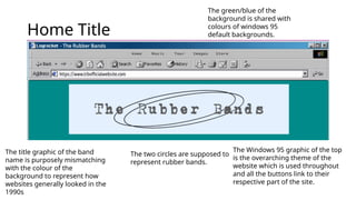
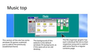
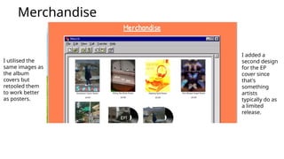
Media Studies Website
A PowerPoint showing screenshots of the competed website
section of the media studies coursework.
Home Title
The title graphic of the band
name is purposely mismatching
with the colour of the
background to represent how
websites generally looked in the
1990s
The two circles are supposed to
represent rubber bands.
The Windows 95 graphic of the top
is the overarching theme of the
website which is used throughout
and all the buttons link to their
respective part of the site.
The green/blue of the
background is shared with
colours of windows 95
default backgrounds.
Group Intro
The introduction starts the
cluttered desktop idea I
wanted to show with 'tabs'
being all over the place
Each of the three members
have their own images with the
arrows indicating what their
role in the band.
When they first show up on
the website, the images pop
in, linking to the windows 95
aesthetic with tabs opening
Music top
This section of the site has some
windows 95 games scattered
just to add to the previously
established theme
The background of this
website is the default
windows 95 background, as
if this were all on an old
desktop.
The file organiser graphic has
each individual file link to their
respective song and is used to
add some flare to a regular
contents page.
Music middle
This three piece layout of
album cover, song and
description is used
throughout this section
for each piece
The arrows added are
meant to indicate a
release order of the songs
Every cover, song, arrow and
description slide in as you scroll
to add some flare to an otherwise
rather basic design
Can't Stop
For my audio
visual piece, I
chose to use my
picture of a
signpost since I
thought that
worked with the
The boxes around these sections continue to
link with the them and the paint boxes are only
used on images as that makes sense logically
Tours
The tour dates use
various locations
around the Thanet
area (all of which
allow live music) but
they aren't clickable.
Around the tour
dates are time and
location related
images that scroll
past is as you scroll
to link to the section
and the website's
theme.
The header of the
website scrolls with the
rest of the website to
continue to show off
the 90s theme by
representing how old
windows 95 websites
looked.
Images
The scattering
of the images
continues the
cluttered
desktop idea
with the
differing frames
for the images
adding to it
more.
Each of the
images
individually
scroll to add
more flare to
them.
Footer
The footer of the blog copies
the footers of windows 95
websites and continues the pre-
established aesthetic.
The social media links add to the
convergence of the site and the
link to the blog is there to be an
easy way back it when editing the
website as well as potentially for
marking,.
Store Title
The orange and yellow colour switch is meant to be a clear contrast
similar to it is on the home page and the reutilisation of the logo is
meant to show that this is a separate part of the site as well as
continuing to built on the 'brand' of the group. It also works well with the
background and is a complementary colour to the bottle green of the
home page.
Merchandise
I utilised the
same images as
the album
covers but
retooled them
to work better
as posters.
I added a
second design
for the EP
cover since
that's
something
artists
typically do as
a limited
release.

Media Studies Website Screenshot Presentation

  • 1.
    Media Studies Website APowerPoint showing screenshots of the competed website section of the media studies coursework.
  • 2.
    Home Title The titlegraphic of the band name is purposely mismatching with the colour of the background to represent how websites generally looked in the 1990s The two circles are supposed to represent rubber bands. The Windows 95 graphic of the top is the overarching theme of the website which is used throughout and all the buttons link to their respective part of the site. The green/blue of the background is shared with colours of windows 95 default backgrounds.
  • 3.
    Group Intro The introductionstarts the cluttered desktop idea I wanted to show with 'tabs' being all over the place Each of the three members have their own images with the arrows indicating what their role in the band. When they first show up on the website, the images pop in, linking to the windows 95 aesthetic with tabs opening
  • 4.
    Music top This sectionof the site has some windows 95 games scattered just to add to the previously established theme The background of this website is the default windows 95 background, as if this were all on an old desktop. The file organiser graphic has each individual file link to their respective song and is used to add some flare to a regular contents page.
  • 5.
    Music middle This threepiece layout of album cover, song and description is used throughout this section for each piece The arrows added are meant to indicate a release order of the songs Every cover, song, arrow and description slide in as you scroll to add some flare to an otherwise rather basic design
  • 6.
    Can't Stop For myaudio visual piece, I chose to use my picture of a signpost since I thought that worked with the The boxes around these sections continue to link with the them and the paint boxes are only used on images as that makes sense logically
  • 7.
    Tours The tour datesuse various locations around the Thanet area (all of which allow live music) but they aren't clickable. Around the tour dates are time and location related images that scroll past is as you scroll to link to the section and the website's theme. The header of the website scrolls with the rest of the website to continue to show off the 90s theme by representing how old windows 95 websites looked.
  • 8.
    Images The scattering of theimages continues the cluttered desktop idea with the differing frames for the images adding to it more. Each of the images individually scroll to add more flare to them.
  • 9.
    Footer The footer ofthe blog copies the footers of windows 95 websites and continues the pre- established aesthetic. The social media links add to the convergence of the site and the link to the blog is there to be an easy way back it when editing the website as well as potentially for marking,.
  • 10.
    Store Title The orangeand yellow colour switch is meant to be a clear contrast similar to it is on the home page and the reutilisation of the logo is meant to show that this is a separate part of the site as well as continuing to built on the 'brand' of the group. It also works well with the background and is a complementary colour to the bottle green of the home page.
  • 11.
    Merchandise I utilised the sameimages as the album covers but retooled them to work better as posters. I added a second design for the EP cover since that's something artists typically do as a limited release.