This document provides an in-depth analysis of the layout, design, and techniques used in magazine double page spreads to attract young female readers. It examines in detail the images, colors, text, and other elements used across multiple celebrity-focused spreads. The goal is to understand how the magazines appeal to their target audiences and encourage purchases through visual interest and hints of exclusive insider information.
The document discusses how the media product uses, develops, or challenges conventions of real-life media products. It summarizes how the product sticks to conventions such as bright colors, high key lighting, and imperative verbs to look professional. It also challenges some conventions by focusing on an unconventional genre of house music and portraying an empowered female model rather than sexualizing her. The document analyzes where it meets and challenges conventions through choices of genre, lighting, locations, and focusing on the model's determination rather than sexuality.
The document compares the author's draft and actual front covers for their R&B magazine called "Desire". For the actual cover, the author zoomed in more on the model's face to make her the center of attention. Colors were changed to red, black, and white to appeal to the target audience. More text was added for more information. A barcode and issue number were included to make it seem more like a real magazine. The name "Desire" was chosen to create an association between the magazine and readers.
Survey Monkey and Social Media Responses From Questionnairechloecotterill1
This document contains the responses to a survey about music magazine preferences. Some key findings include:
- Women were more likely to participate in the survey than men, so the magazine will include quizzes and competitions to engage female readers.
- Most respondents were students aged 15-19, so the magazine will target this demographic with informal language, images, and distractions from schoolwork.
- Readers preferred to see features on musicians' tattoos, instruments, and exclusive interviews.
- The majority said they would pay between £1-1.99 for the magazine.
- Many were inspired to learn an instrument like guitar after listening to music, so lessons on playing different instruments will be included each issue
The document provides a detailed analysis and critique of a student-created magazine cover. Some key points:
- The student cover uses an effective color palette, layout, masthead, feature headline, plug, pull quotes, cover lines, and main image to target young female readers.
- The analysis critiques some minor weaknesses like unclear masthead text and placement of some elements.
- It also notes conventions the summarizer will apply to their own rock music magazine cover, like using iconic symbols, catchy language, and exclusive interviews to build audience interest.
The document discusses the design elements that will be used for the magazine "CRASH" including:
- The masthead will be the largest text to signify its importance and help the name gain recognition. It will be in a sans-serif font to look more visual and appeal to the target audience.
- The date, price, and cover lines are designed to attract readers by showing relevant content and being affordable. Images will feature male artists to follow rock conventions and build fan bases.
- Elements like the pull quote, plug, and banner are strategically placed and designed to draw attention and build excitement around exclusive news, competitions, and information.
- Consistent colors, fonts, logo placement, and
Natalie aimed her media product at females aged 17-25. She addressed this audience through the use of elegant fonts, images of groups of girls depicting friendship, and subtle colors like pinks that are known to attract females. Natalie conducted research including surveys that showed this audience would be interested in advertisements and content about music, fashion, and technology. She designed her magazine masthead and layout to stand out visually and address the interests and values of her target female audience.
The document discusses what technologies were used and learned during the process of constructing a magazine media product. Photoshop, InDesign, Microsoft Word, Google Chrome, video recording equipment, cameras, printers, and scanners were used. Skills with Photoshop, InDesign, and creating online blogs were developed. InDesign was particularly useful for combining images and text, while challenges were overcome in learning new software programs. The use of various technologies was essential to complete the planning, research, production and evaluation phases of the project.
The document discusses various design elements used in a music magazine to attract and engage readers. These include using bright, clashing colors in the color scheme and on different pages to draw attention. An attractive female model is used for features to appeal to readers' aspirations. Large, bold mastheads on each page clearly label sections. Catchy sell lines, puffs, and callouts pique readers' curiosity. Bright bursts and banners highlight key stories and opportunities exclusive to the magazine. Together, these visual design choices strategically attract and engage the target readership.
The document discusses the various design elements and content features used in a music magazine to attract and engage the target audience. These include using bright colors in the color scheme, attractive models, prominent mastheads, pull quotes, bursts highlighting key articles, listings of popular artists, and an interview-style article format. The document argues these elements catch the reader's eye, address them directly, convey a sense of exclusivity, and provide relevance to the audience's interests in order to attract them to the magazine.
This document discusses a celebrity gossip magazine called Heat. It provides details about the magazine's weekly publication schedule, target audience of women, use of colorful imagery and paparazzi photos on the cover and inside pages, and strategies for attracting and engaging readers through busy layouts, previews of stories, and double page spreads of key celebrity news stories. The document also considers some of the challenges of print magazines and opportunities they provide for interaction and advertising.
The document analyzes the ways in which the author's media product uses and develops conventions of real music magazines. It compares the author's magazine cover and contents page to a real magazine called "Top of the Pops". The author incorporated many standard elements such as mastheads, images, and pricing, but also challenged conventions by using a larger masthead and additional smaller images. The document also discusses how representations of women and youth in media can be viewed through feminist and sociological theories.
The document summarizes the process of creating a school magazine focused on pop music. It discusses researching conventions of magazines like Smash Hits and Top of the Pops to understand their layout, design, and target audiences. Conventions for the front cover, contents page, and double page spreads are analyzed. The intended audience is girls aged 9-15, and the magazine will be published by a company like Bauer Media or DC Thompson.
The document describes the conventions used in the student's media magazine project. It discusses using a contrasting masterhead with capital and lowercase letters. It includes a pull quote about a TV show. Images on the contents page include page numbers and the front cover. Columns are used to break up text. Double page spreads include a large poster image and columns for text. The target audience is represented as teenage girls through stereotypical images and references to social media and TV. Egmont publishing would be a good fit as they currently only have one teen music magazine. The audience is attracted through pink and purple color scheme, elegant yet readable fonts, and flattering images of girls with natural looks and outfits. The student learned new skills
This document summarizes and analyzes existing magazine products, including Cosmopolitan magazine, Cosmopolitan's website, Vanity Fair magazine, and Vanity Fair's website. Key elements that are examined include target audiences, mastheads, images, colors, fonts, and layouts. Similarities and differences between print and online versions are also noted. Overall, the document provides research on established magazines to help inform the design and content of a new magazine product.
The document summarizes the research and planning for a new print magazine called VIP. Questionnaires showed the target audience is females and males aged teenagers to 50s. Most readers preferred a monthly magazine that costs £2-4 and features 51-80 pages. Research found readers enjoy celebrity gossip (40%) and film/TV (67%), so the magazine will focus on interviews and stories not widely reported elsewhere. Detailed plans were made for the cover, sections, scheduling, and pitching the new print magazine.
The document describes a student's media magazine project. The student aimed to challenge conventions by including features typically found in female magazines, like beauty tips, in an indie music magazine. The two-page spread uses large pictures and bold colors like a music magazine. The contents page blends conventions from female and music magazines. The target audience is described as female teenagers interested in indie music. IPC Media would be a suitable distributor as it has experience promoting magazines to this audience. The student learned new technologies like digital photography, photo editing, magazine design software, and online publishing through completing this project.
The document discusses the author's music magazine media product and how it represents social groups and could be distributed. The magazine challenges stereotypes about young people by portraying a young female musician as strong, ambitious and breaking molds. The language and images aim to inspire youth. Due to declining print media, the magazine could be distributed through both traditional outlets and online promotion on television, radio, websites and social media to reach a wide audience.
The document describes a student's evaluation of their media studies coursework in which they created a music magazine called "Non-Stop Pop". The student reflects on how they effectively used conventions of real pop magazines in their three created pieces - a front cover, contents page, and double page spread. They used bright colors, images of a young girl band, and informal language to target their audience of 12-16 year old girls. The student also represents typical social groups featured in pop magazines such as female artists and bands.
The front cover uses bright colors and images of popular celebrities like Justin Bieber and One Direction to attract teenage readers. Popular phrases like "OMG" and direct quotes from celebrities are used to generate excitement and curiosity about the magazine's content. The layout follows conventions of music magazines with the large central image, additional articles highlighted on the left, and price listed discreetly at the bottom. Overall the cover aims to appeal to its teenage audience through an upbeat, casual tone and promises of learning the latest on popular artists.
The document discusses the author's music magazine media product and how it represents social groups. The magazine aims to challenge stereotypes of young people by portraying the main subject, an 18-year-old musician named Melody, as a strong, ambitious young woman who is establishing herself in the music industry without conforming to expectations. The magazine's images and language portray Melody and her generation in a positive light, as motivated and talented rather than lazy or troubled. The author believes distributing the magazine through a publishing company like the one that publishes inspiration magazine Vibe could help the product reach its target audience and succeed despite challenges in the print media industry.
The document discusses different masthead designs for a magazine called "Totally POP". It analyzes the font choices, colors, and symbolism used in three masthead ideas. The first uses a simple black font with a bold pink font to attract the target feminine audience. The second uses childish glittery font in pink and blue, colors that appeal to the young readers and create a calming effect. The third uses a slightly italic feminine script font in dark purple, symbolizing the royalty and wealth the readers aspire to, and rebellion, attracting the audience to help achieve their dreams.
This document summarizes how the media producer's magazine represents and attracts its target audience. The magazine targets teenagers aged 16-25 through its urban style featuring hip hop music and fashion. It uses vibrant colors of green, white, and black that appeal to black and Asian youth. Photos of black and Asian female models further represent these social groups. Teen language in headlines helps address this audience. The magazine would be distributed through websites like Facebook that target youth to promote the product to its intended audience.
The document provides an in-depth analysis of the design elements, conventions, and techniques used on the front cover of a pop magazine to target its young female audience. Key elements analyzed include the masthead, sell lines, quotes, images of celebrities, free gifts/posters, and use of color, shapes and layout to draw the eye to important areas and encourage sales. The analysis discusses how these elements appeal to the target audience and fulfill entertainment, escapism and information needs per Blumler and Katz's uses and gratifications theory of media consumption.
The document provides an in-depth analysis of the design elements, conventions, and techniques used on the front cover of a pop magazine to target its young female audience. Key elements analyzed include the masthead, sell lines, quotes, images of celebrities, free gifts/posters, and use of color, shapes and layout to draw the eye to important areas and encourage sales. The analysis discusses how these elements relate to audience interests and theories of magazine readership to effectively target and engage the target demographic.
This document analyzes the front cover design of a teen pop magazine. It discusses various design elements and how they target the young female audience. Key points include:
- The masthead maintains the magazine's brand identity through consistent placement, styling and colors.
- Celebrity photos and quotes are used throughout to attract readers and convey a sense of direct address.
- Articles and free gifts related to fashion, celebrities, and popular culture aim to engage and inform the target readership.
- Design conventions like placement of elements, colors, shapes and language aim to attract readers and signal the magazine's content and value.
The document provides an in-depth analysis of the design elements, conventions, and techniques used on the front cover of a pop magazine to target its young female audience. Key elements analyzed include the masthead, sell lines, quotes, images of celebrities, free gifts/posters, and use of color/layout to draw attention and encourage readers to purchase the magazine for entertainment, escapism, and information about their favorite artists. The analysis discusses how these elements align with audience motivations identified by communication theorists Blumler and Katz.
The document provides an in-depth analysis of the design elements, conventions, and techniques used on the front cover of a pop magazine to target its young female audience. Key elements analyzed include the masthead, sell lines, quotes, images of celebrities, free gifts/posters, and use of color, shapes and layout to draw the eye to important details and encourage purchasing. The analysis discusses how these elements appeal to the target audience and fulfill entertainment, escapism and information needs per Blumler and Katz's uses and gratifications theory of media consumption.
This document analyzes the front cover design of a teen pop magazine. It discusses various design elements and how they target the young female audience. Key points include:
- The masthead maintains the magazine's brand identity through consistent placement, styling and colors.
- Celebrity photos and quotes are used throughout to attract readers and convey a sense of direct address.
- Articles and free gifts related to fashion, celebrities, and entertainment appeal to the interests of teenage girls.
- Strategic placement of elements like sell lines, puffs and posters aim to encourage readers to purchase the magazine.
The front cover uses bright colors and images of popular artists like Cher Lloyd to appeal to its teenage audience. It promotes gossip, fashion, and stories about popular boys bands to draw readers in. The informal language and sans-serif font creates a casual, friendly tone. Images of the artists looking directly at the reader are intended to make them feel personally addressed. Additional features advertise exclusive interviews and a poster insert to further interest potential buyers.
The document provides details about the layout and design of a music magazine contents page targeted towards teenage girls. Various techniques are used to attract and engage the target audience, such as prominent images of popular celebrities, bright colors, simple fonts, and sections tailored to the interests of teenage girls such as fashion, quizzes and gossip. Branding elements like the magazine logo and consistent design are also employed to build audience familiarity and loyalty. The overall goal of the layout is to entice readers using their favorite artists while giving the illusion of more content than is actually present in the magazine.
This document summarizes the learning and progress made by the student in constructing a music magazine as a coursework project from an initial preliminary task. The student learned about designing magazine layouts, techniques like photo editing and object grouping, as well as targeting audiences. Key lessons included making contents pages more informative, using distinctive fonts, including more elements on the front cover, and designing an eye-catching masthead that enhances the main image. The full magazine showed improvement over the preliminary task in appearing more professional and appealing.
This document summarizes the learning and progress made by the student in constructing a music magazine as a coursework project from an initial preliminary task. The student learned about designing magazine layouts, techniques like photo editing and object grouping, as well as conventions for attracting audiences. Feedback from the preliminary task informed design choices for the full magazine product, such as using more detailed contents pages and prominent mastheads. Overall, the student gained skills in magazine design and understanding target audiences.
The document discusses how the magazine targets its audience through colors, images, and copy. On the cover, blues and purples attract female readers while greys and blacks attract male readers. The cover image of a girl appeals to but does not overly sexualize female readers. Headlines and artist names grab readers' attention and encourage purchase. Inside, consistent colors identify the issue and images of both male and female models appeal to both genders. However, feedback showed the contents page and some images could be improved professionally.
The document discusses how the magazine targets its audience through various design elements. It uses colors like blue and purple to attract female readers and greys and blacks for male readers. The front cover image of a girl is meant to appeal to but not seduce female readers. Headlines and artist names are used to grab attention and advertise content. Images of both male and female artists are included throughout to represent both genders. Feedback showed the contents page could be improved with better layout and copy.
The document discusses how the magazine targets its audience through various design elements. It uses colors like blue and purple to attract female readers and greys and blacks for male readers. The front cover image of a girl is meant to appeal to but not seduce female readers. Headlines and artist names are used to grab attention and advertise content. Images of both male and female artists are included throughout to represent both genders. Feedback showed the contents page could be improved with better layout and copy. The double page spread uses a large central image and quotes to engage readers.
The document provides an analysis of the layout, images, and design elements used across multiple pages of an NME magazine. Various techniques are used to draw in readers and convey information about the music and artists featured, including disordered designs that match the music style, prominent images that capture attention, and colors and fonts that target younger audiences. Placement of the magazine's name establishes its brand recognition without needing conventional title positioning.
The document summarizes the coursework for a music magazine project. It discusses how the magazine uses conventions from real publications, represents its celebrity subject as down-to-earth, and would appeal to a target audience of 13+ interested in pop-rock music. The document also reflects on technologies used, like photo editing, and lessons learned between the preliminary and full projects, such as including more detailed contents pages.
This document provides an analysis of the design elements used in a magazine cover and interior pages targeted towards young girls. Key elements discussed include using pink fonts and colors that appeal to the target gender, smiling images of pop stars that make readers feel welcomed, fashion articles that interest girls, and clear labeling of content to help readers find articles easily. Pull quotes and casual photography are used to intrigue readers and convey an informal, friendly tone. The consistent branding and focus on celebrities as role models aims to connect with and engage the intended audience.
The document describes the process of creating a magazine cover and contents page. It discusses brainstorming name and design ideas, choosing a target audience, developing a house style, taking photos, and refining the layout. Several revisions are made to refine the visual design and ensure the magazine conveys the right genre. The finished products include a striking red cover featuring a pop artist, and a contents page with previews of articles linked to the "Obsessions" magazine name.
The document describes the process of creating a magazine cover and contents page. It discusses brainstorming name and design ideas, choosing a target audience, developing a house style, taking photos, and revising designs based on feedback. The final magazine is aimed at young women interested in music. It features a cover story on an up-and-coming pop/folk artist named Lilly Rose.
The document describes the process of designing a magazine cover and contents page. The author brainstormed name and design ideas before deciding on "Obsession" as the magazine title focused on music. Various designs were tried before settling on a simple elegant style targeting young women interested in music. Pictures were taken and layout was refined, changing the color scheme and adding elements like the masthead, cover story, cell lines and barcode to make it look like a professional music magazine.
The document describes the process of designing a magazine cover and contents page. The author brainstormed name and design ideas before deciding on "Obsession" as the magazine title focused on music. Various designs were tried before settling on a simple elegant style targeting women interested in music. Pictures were taken and layout was refined, changing the target age range older. The final cover and contents page incorporated conventions like cell lines, pictures, and page numbers to attract the target audience.
The document lists the cast of characters for a film or story including a villain named Matthew Jones, 4 victims named Scarlett Hayward, Katy Harrison, Hannah Becket with Lucy Broker as the final girl, a boss named Terry Henderson, and a character named Jake played by Oliver Humphris.
The document discusses the selection of the name "Movie Talk" for the group's horror magazine. They chose this name because it sounds professional and implies the magazine will discuss movies in theaters. They also wanted a general film magazine rather than one focused solely on horror. When asking members of the target audience which name seemed most professional, "Movie Talk" was preferred. The group did not select other proposed names like "Total Horror" due to being too similar to an existing magazine or not fitting the target demographic and content.
1) The group researched taglines to find one relating to their slasher film's narrative and subgenre. They conducted a focus group to get audience input on potential options.
2) Effective existing taglines hint at the narrative without spoiling the plot, drawing audiences in.
3) The group chose "He is what he eats" based on focus group feedback that it relates well to the genre and film's narrative of a killer who eats victims.
This document discusses camera techniques used in horror film trailers and plans for a student film trailer. It notes that extreme close-ups are often used to show victims' emotions and jump scares with villains. Wide shots set the scene before the horror begins. Camera height can create power dynamics between characters. Quick or slow camera movements can build suspense or frighten viewers. Shots planned for the student trailer include close-ups of victims' faces during torture, a close-up of the villain for a jump scare, and high angles to show the villain's dominance over victims.
This document provides a history of the horror genre from the 1920s to the 2010s. It summarizes the evolution of horror films over the decades by highlighting representative films from each era and how they reflected the fears of society at that time. Key developments included the introduction of sound and technology, evolving monsters and villains from mythical creatures to human killers, and changing narrative structures. Overall, the history shows how the horror genre has adapted to continue scaring audiences by targeting their new fears in each generation.
This production call sheet outlines the filming schedule and cast details for the film "The Human Carvery" over several days in November. It lists the shooting locations which include a house, road, fields and school. The cast includes Matt as the Villain and Scarlett, Katy, Hanaha and Lucy as Victims. Their roles and makeup requirements are provided. Oliver will also play the role of Jake. The sheets provide the producer, director and scenes for each shoot date.
The filming schedule outlines scenes to be filmed from November 11th to November 21st in various locations including Scarlett's Garage, cars, A40 Fields, and a school. On November 11th and 12th, scenes taking place in Scarlett's Garage will be filmed using props like a wheelchair, prosthetic hand, and pig mask. Gory scenes involving fake blood and organs will also be filmed on the 12th. Later dates include scenes filming kids running from a pig man in the A40 Fields and teens being stalked in a park. Establishing shots of the school and a scene of a character being fired are also scheduled.
This magazine front cover analysis document summarizes the key design elements and conventions used across two different movie magazine covers - Empire magazine's cover for the film Interstellar and Total Film magazine's cover for the film Maleficent. For the Interstellar cover, the masthead font reflects the space theme, different sell lines try to attract various audiences, and the color scheme matches the film's narrative. For the Maleficent cover, the masthead is partially covered allowing more focus on the main Angelina Jolie image, the background resembles the film's setting, and buzzwords like "epic" are used to promote the film. Both covers effectively utilize color, images, and text to relate to their featured films and
This poster for the film The Conjuring 2 effectively promotes the supernatural horror film. It depicts a young girl at a window with her arms outstretched, surrounded by a halo of light. Religious iconography like the cross suggests supernatural elements. Minimal lighting and fog at the bottom create an eerie atmosphere. Positioning and lighting draw viewers' eyes to focus on the girl, establishing her importance to the plot. Overall, the poster uses common horror conventions like an isolated setting and religious symbols to attract audiences to the supernatural thriller.
The trailer is for the 2016 psychological horror film Hush, directed by Mike Flanagan. It stars Kate Siegel as Maddie, a young deaf woman living alone in an isolated house in the woods. The trailer establishes the setting and Maddie's disability through text and imagery, creating an unsettling atmosphere. It then sets up the plot - an intruder is outside with the intent to kill Maddie. Due to her being deaf, she is reliant on visuals and has heightened senses of unease. The trailer uses the setting, lighting, sounds and lack of dialogue to reflect Maddie's vulnerability and build suspense for the killer's threat.
The trailer introduces the plot of the film "Insidious" through a series of shots and scenes. It follows a family that moves into a new home where supernatural events begin to occur after their son falls into a coma. Various film techniques like lighting, editing, and sound are used to build tension and mystery around the cause of the son's condition. The trailer then reveals that a paranormal investigator will help the family investigate what is haunting their home and son. It ends by hinting that the son himself may be the source of the supernatural presence.
This document contains an outline for scenes in a horror film featuring a butcher seeking revenge by killing teenagers. It includes scenes of the butcher being fired from his job, preparing his tools and props, stalking the teenagers in his car, killing one teenager by dragging their body, multiple killings showing removed organs, and a dinner scene of the butcher eating the internal organs of his victims. Musical cues and camera shots are described to build tension and drama throughout the scenes.
The document analyzes eight film posters from the horror genre to identify common features and conventions. It finds that most posters feature bold white text, red and black colors, images of the villain, and weapons to attract audiences without revealing too much of the plot. Common elements help link different media within the genre in a symbiotic relationship. For example, most posters feature the "final girl" character archetype through use of innocent white clothing and positioning closest to danger. Layout and design conventions also aim to guide the eye across the poster according to principles like the rule of thirds. Overall, the posters effectively promote films in the slasher genre while encouraging curiosity through limited revealing of the story.
The document discusses several conventions of the slasher film genre. It describes the tropes of the final girl, who is typically innocent and survives, and the first girl, who is promiscuous and dies first. It also outlines conventions for the villain's costume including masks, the signature weapon or prop they use, and how mass killings are used to create fear and suspense. Finally, it notes that slasher films commonly take place in isolated locations that trap the victims.
The focus group was conducted to determine what elements would attract the target horror film audience to a trailer, poster, and magazine cover. Key findings included that the audience preferred posters featuring the villain prominently with the weapon, a font resembling blood splatter, the tagline "He is what he eats", diegetic and foley sounds in the trailer, close-up shots of the villain's face on the magazine cover, a meat cleaver as the weapon, and a costume combining a mask and suit. These elements align with horror conventions and will be incorporated into the media pieces to appeal to the target group.
The document summarizes the results of a questionnaire conducted to gather information from teenagers about their preferences and interests related to horror films. The questionnaire asked about respondents' age, favorite horror films, preferred horror sub-genres, fears, how often they watch horror films, if trailers and posters influence viewing decisions, and what elements make for effective horror trailers. The results will help the document's authors create compelling marketing materials for a slasher film project by highlighting elements shown to appeal to their target demographic.
This document summarizes four main horror sub-genres: slasher, gothic, psychological, and supernatural. It provides examples for each sub-genre, including films like Scream for slasher, Dracula for gothic, The Strangers for psychological, and The Conjuring for supernatural. Each sub-genre is described in terms of its common themes, tropes, settings, and conventions.
The target audience is a male aged 15-23 who is educated, outgoing, reliable, and open-minded. He has interests in psychology, slasher films, and becoming a detective. He studies criminology in university and enjoys researching infamous killings and torture. Relationships with family and friends are important to him, and he socializes regularly. In his free time, he enjoys the gym, swimming, films by directors like Stanley Kubrick, and psychological novels. He has a passion for horror films based on true events and appreciates realistic films that required effort to produce.
The document outlines a promotional package for an upcoming horror film that will include a trailer, poster, and magazine article. It will follow conventions of the psychological slasher genre to quickly engage audiences in an exciting yet thrilling way through gripping scenes and suspense. By analyzing existing media pieces, the team aims to familiarize themselves with typical conventions to incorporate into their own work promoting the villain as easily recognizable. They will collectively produce the three media texts while distributing work equally and communicating effectively as a team.
Physiology and chemistry of skin and pigmentation, hairs, scalp, lips and nail, Cleansing cream, Lotions, Face powders, Face packs, Lipsticks, Bath products, soaps and baby product,
Preparation and standardization of the following : Tonic, Bleaches, Dentifrices and Mouth washes & Tooth Pastes, Cosmetics for Nails.
Executive Directors Chat Leveraging AI for Diversity, Equity, and InclusionTechSoup
Let’s explore the intersection of technology and equity in the final session of our DEI series. Discover how AI tools, like ChatGPT, can be used to support and enhance your nonprofit's DEI initiatives. Participants will gain insights into practical AI applications and get tips for leveraging technology to advance their DEI goals.
हिंदी वर्णमाला पीपीटी, hindi alphabet PPT presentation, hindi varnamala PPT, Hindi Varnamala pdf, हिंदी स्वर, हिंदी व्यंजन, sikhiye hindi varnmala, dr. mulla adam ali, hindi language and literature, hindi alphabet with drawing, hindi alphabet pdf, hindi varnamala for childrens, hindi language, hindi varnamala practice for kids, https://www.drmullaadamali.com
A workshop hosted by the South African Journal of Science aimed at postgraduate students and early career researchers with little or no experience in writing and publishing journal articles.
How to Fix the Import Error in the Odoo 17Celine George
An import error occurs when a program fails to import a module or library, disrupting its execution. In languages like Python, this issue arises when the specified module cannot be found or accessed, hindering the program's functionality. Resolving import errors is crucial for maintaining smooth software operation and uninterrupted development processes.
A Strategic Approach: GenAI in EducationPeter Windle
Artificial Intelligence (AI) technologies such as Generative AI, Image Generators and Large Language Models have had a dramatic impact on teaching, learning and assessment over the past 18 months. The most immediate threat AI posed was to Academic Integrity with Higher Education Institutes (HEIs) focusing their efforts on combating the use of GenAI in assessment. Guidelines were developed for staff and students, policies put in place too. Innovative educators have forged paths in the use of Generative AI for teaching, learning and assessments leading to pockets of transformation springing up across HEIs, often with little or no top-down guidance, support or direction.
This Gasta posits a strategic approach to integrating AI into HEIs to prepare staff, students and the curriculum for an evolving world and workplace. We will highlight the advantages of working with these technologies beyond the realm of teaching, learning and assessment by considering prompt engineering skills, industry impact, curriculum changes, and the need for staff upskilling. In contrast, not engaging strategically with Generative AI poses risks, including falling behind peers, missed opportunities and failing to ensure our graduates remain employable. The rapid evolution of AI technologies necessitates a proactive and strategic approach if we are to remain relevant.
Main Java[All of the Base Concepts}.docxadhitya5119
This is part 1 of my Java Learning Journey. This Contains Custom methods, classes, constructors, packages, multithreading , try- catch block, finally block and more.
This presentation includes basic of PCOS their pathology and treatment and also Ayurveda correlation of PCOS and Ayurvedic line of treatment mentioned in classics.
Exploiting Artificial Intelligence for Empowering Researchers and Faculty, In...Dr. Vinod Kumar Kanvaria
Exploiting Artificial Intelligence for Empowering Researchers and Faculty,
International FDP on Fundamentals of Research in Social Sciences
at Integral University, Lucknow, 06.06.2024
By Dr. Vinod Kumar Kanvaria
Thinking of getting a dog? Be aware that breeds like Pit Bulls, Rottweilers, and German Shepherds can be loyal and dangerous. Proper training and socialization are crucial to preventing aggressive behaviors. Ensure safety by understanding their needs and always supervising interactions. Stay safe, and enjoy your furry friends!
Macroeconomics- Movie Location
This will be used as part of your Personal Professional Portfolio once graded.
Objective:
Prepare a presentation or a paper using research, basic comparative analysis, data organization and application of economic information. You will make an informed assessment of an economic climate outside of the United States to accomplish an entertainment industry objective.
Introduction to AI for Nonprofits with Tapp NetworkTechSoup
Dive into the world of AI! Experts Jon Hill and Tareq Monaur will guide you through AI's role in enhancing nonprofit websites and basic marketing strategies, making it easy to understand and apply.
Introduction to AI for Nonprofits with Tapp Network
Double page spread analysis
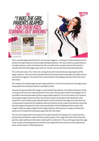
1. Thisis a double page spreadfromthe ‘we love pop’magazine. Itfollowsitstraditionallayoutwhich
attracts the target audience withthe bigheadingsandphotos.The colourscheme usuallyrelatesto
itstarget audience orthe artistsfeaturing.The use of the pinkisusedto representthe article,it
contraststhe title of the page as girlswhoare ‘trouble’are notcommonlyassociatedwithpink.
Thisis the coverstory.This isthe main sellingarticle whichshouldattracta large majorityof the
target audience.Thismainarticle shouldhave the bestcontentandshouldmake the readerwantto
purchase the magazine.The contenthere isdetailedandisthe backgroundstoryof the mainartist
CherLloyd.
The image for the double page spreadislarge and bold.It islike thistostand outon the page andto
stoppeople fromreadingonwithoutreadingthisarticle.
The pose beingusedwithinthe image isusedtoattract the audience.The clothesbeingwornrelate
to the genre of musicshe singsandwhat herfansenjoy.The pose alsorelatestothe popgenre as it
resemblesacheekyphototakenbythe youngertargetaudience.The use of a camera isto relate to
the youngesttargetaudience astheymaynot have a phone to be able to take the photos.Cher
Lloydshairis alsocreatedto speciallyportraythe sell line andtitle of the page.One side of herhair
isshavedwhichrepresentsthe rebelliousside toherthatthe article isabout,thisdirectlylinkstothe
ideathe magazine hasgone for whenatthe photoshoot.Artificiallightinghasbeenusedinthis
image to make herappearbrighterto the targetaudience,thishowever,inawaycontradictsthe
article as she itbrightand showinghergoodside off inthe shoot.
The use of an image withinthe textgivesthe readerabreakfromreading,thisisusedtobuildup
excitementandmake the readerfeel theyneedtoreadon.The image will relate tothe article and
give the readeradditional informationunderneathinsmallerprint.The use of image makesthe page
more visuallyinterestingandensuresthatthe starimage of the artist can be communicatedmore
easily,aswell asgenre reflectedproperly.
2. The page numberandwebsite are usedforadditional information.The page numbergivesthe
readerthe layout on eachpage so theyknow where tofindit.The website istogive the reader
additional informationaboutsome of the articlesandothermagazine issues.
The use of the quotation“I wasthe girl parentsblamedfortheirkidsturningoutwrong”interests
the readeras theywouldnotknowmuch aboutCherLloyd’searlierlifeandwhatshe actedlike asa
child.Theywouldwanttoknowabout whathappenedwhenshe wasyoungertohave hergetthat
name.The readerwouldalsowantto hear herside of the story andhow she feelslookingbackonit
now.Theywouldwantto knowthe impactit has hadon her life andwhatherchildhoodwaslike as
a resultof it. Thisiscommon technique usedbythe magazine asitmakesthe readerwantto readon
to knowmore. The use of a well knowartistinthisdouble page spreadattractsa widertarget
audience asmore people willlikehermusicorwantto keepup withthe latestnews.
Highlightingkeypartsof the textas it itwere a highlighterwill attractthe targetaudience astheyare
school kidsandthisis whattheytypicallyspendtime doing.Thisalsoshowsthe audiencethe key
parts of the textandwhat theyshouldtake mostkote of whenreadingthroughit. CherLloydused
to portray the negative perception,butshe hasmanagedto turnit aroundnow.The interview
reflectsCherLloydpositivelyandhowitisnot actuallyherfault.
The standfirstattracts the targetaudience because theyare beingtoldtheydonotknow anything
aboutthe ‘real’CherLloyd.Thiswould make themwanttoread because theywanttosee whatthe
article istellingthemcomparedtowhattheyalreadythinktheyknow.Thistechnique isusedtopull
inthe targetaudience asitis makingthemdoubttheirknowledge aboutthe artist.
The drop cap ‘W’ isusedin thisarticle tostand outon the page.Because the page is laidoutquite
hectic,itis helpingthe targetaudiencefindwherethe article firstbegins.The use of colourandthe
backgroundshape showsusthat indeeditistryingtostand out,the black W on the pinkbackground
shape isdesignedtocatch the reader'seye.The use of shapesonthispage are again usedto catch
the reader'sattentionandto setthe boundariesof the page.
Double page spreadsinpopmagazinesare usuallyan interview structure,thisisbecause itinterests
the target audience astheyfeel theywill findoutnew informationaboutthe artist.Aninterview also
give an illusiontothe audience asitlookslike there ismore contentasitcan be laidoutneatly,
howeveritisstill easilyreadableforthe youngtargetaudience.
The smallerimage usedinthe centre of the firstpage is usedto show the goodside of CherLloyd,it
featuresherduringa redcarpet walkina white costume.Thisshowsthe brightand goodside to her
character that usuallyshe wantthe mediatosee.Thisportraysheras a rolemodeltoherfans,this
contradictsthe article as it istalkingaboutwhatshe alwaysgodblamedforwhat herfriends
misbehaved.
3.
4. The use of a Christmaseditiontitle attractsthe audience astheyfeeltheywill onlybe able toreadit
once due to Christmasonlybeingone day,thismakesthemfeel theyneedtomake the mostof the
magazine.The use of “christmurs”makesthe targetaudience relate tothe article astheyare young
and theyfeel asitis cheekyandwill make themgiggle.
The use of an extraimage here at the top makesthe youngertargetaudience feel theyhave more to
lookat, thistechnique isusedtoattract theminto buyingthe nextissue of the magazine.The use of
the phrase signed,sealed,delivered beinginadifferentcolourhelpsitstandouttothe othertext
and therefore attractingmore people.
The use of the title OllyMurson thispage helpsthe readeridentifythe artistsif theyare unsure or
do notknowwho he is.In thiscase,it makesthe readerfeel asif the magazine islookingoutfor
themso itmakesthemwant to readthe article anywaywithoutknowingwhothe artistsis.The use
of yellow reflects the sunny,funstarimage thatOllyhas.The font usediswe love popssignature
fontand so maintainsbrandidentity.Italsomakesthispage easilyidentifiable tothe brandif it is
seenbyanyone.Thisfontisusedbecause itattracts the target audience because itisboldand
standsout on the redbackground.
The photo of OllyMurs istakingup a whole page to attract the readerand to make themfeel they
mustread the article as itis important.Hispose istryingto be cool tothe female audience as he is
tryingto attract them.He isusingdirectaddressto make the readerfeel theycanrelate tohimand
theyare the targetfor thisarticle,thiswill make themmore likelytoreadit.Hisoutfithe haschosen
to wearis relatingtothe popgenre as thisis whatisseenas fashionablewithinit.
The use of a bannerhere isto stand out,the textinside issomethingthe readercanthinkof as
cheekyandso theywouldwanttoread it.Thistechnique usuallyworksasitissomethingthatmay
not be thoughtof as intheirage group.
The article starts witha standout letterwhichsymbolisessignificance.The use of differentcolour
highlightwithinthe textmakesthemstandouttothe reader.The interview headingquestionsare
speciallythoughtoutinto howtheywouldattract the readerto carefullyreadthe article.
Again,the use of Christmasclothingmakesthe readerfeel theyare onlyable tosee itonce,italso
putsthemin a good moodas everyone lovesChristmaswithinthe Poptargetaudience which is
younggirls. The usesof quoteswithinthe picture makesthe readerfeel theyare beingtargetedby
Ollyhimselfandwill like toreadwhathe said.
The standfirstattracts the targetaudience because the linktoothercelebselevatesthe statusof
Olly,makingthe audience admirehimmore.Usingthisfontmakesitstandouton the page andget it
noticed,thissentencebasicallysumsupwhatyouare aboutto read.The use of rhyme attracts the
target audience becausetheyare youngandtheywill like tohearthis.Thismakesthemwanttoread
on because theycansee he is talkingaboutotherhughe celebrities,the reference toCaroline Flack
will alsomake themwantto readon because thatwas hisco presenterforthe Xtrafactor, heywill
wantto know all the gossipandbackgrounddetails.
The captionunderneaththe image thatsays“ Rylanwalkedaroundme nakedformostof the time”
encouragesthe audience toredonbecause theywill wanttoknow whyhe didthisand what
5. happenedwithOllysreaction.The camaraderie sharedbythe magand the TA in the respectthat
fancyingOllyunitesthem.Itreflectsthe factthatthe audience hascrusheson popboys.
The shot usedisa mid hotfor OllyMurs mainpage.The facial expressionsusedisafriendlylookbut
it alsomakesthe girlsfeel attractedtohim.The bodylanguage usedmakeshimlookconfidentashe
has hishandsin hispockets.The image hashighkeylightingusedtoshow hisbestqualitiesandthe
goodside of him.
6. The title of thisarticle makesthe female targetaudience wanttoreadon.Thisis because the article
directlyrelatestotheirgenderandistalkingdownaboutthem.Thisintereststheminthe article so
theycan see whathe actuallysaidaboutthe female gender.
The use of thisimage isto attract the female targetaudience.The artistusedhasa highfemale fan
base whichfitsinwell tothe target audience of the magazine.
The pose beinguseditto draw eyedtothe image as itappearsthat he isfloating,thisattractsthe
readerto readthe article evenif theyare nota fan of thisparticularartist.
The use of facial expressionsistoattract the target audience,he isstaringdirectlyattheminan
attemptto relate.Thisiscalleddirectaddress, the facial expressionistoappeal tothe young
audience asitis an attemptto make themfindhimattractive.
The turn page iconisusedto tell the readerthatthe article isoverandthe page shouldbe turnedto
readthe nextone.
The dressingroomdemandsectionisusedtoattract the readeronce more to the article.Itis used
to make themaudience goawayand researchthe artistsbestlooks.
The use of an image withinthe textisusedasa gaze breakforthe reader,thismakesthembecome
attractedto the article asthere are lotsof differentfeatureswithit.
The use of red subheadingsare questionsfromthe interviewer.These allow the readerto
essentiallymake iteasiertoreadand skipto the goodbits. This breaksthe textupto make it seem
longerandmake themfeel theyare gettingmore fortheirmoney,thiswill encourage themto
purchase the magazine again.
7. The use of the word exclusive portraystothe readerthatthisis a one off.Thiswill make themwant
to readthisarticle to hear aboutthe interview thathastakenplace.The use of a popularartist with
a large pop fanbase is usedto drawall readersintothe double page spread.
The layoutand style of the page will appeal tothe targetaudience because ithaslotsof content.The
image of JustinBieberbeingpositionedinthiswaymakesthe girlsshopandhave anotherlook.The
layoutmakesthe page lookspaciousbutshowsthere'sstill lotsof content.Doingthismakesitseem
easiertoread forthe youngertargetaudience asitdoesnotlooklike toomuchcontent.
In the image,JustinBieberisattemptingtoconnecttohisfemale fansbythemseeinghimassexy.
His positionis invitingtoafemale andthe lookhe isgivingthemmakesthemfancyhimmore. His
costume,bodylanguage andcommonattractive boyhairmakeshimwant to beenseenascool and
sexy.The longshotisusedhere to showhiswhole bodywhichdisplayshisfashion.Again,like many
otherimages,the lightingishighkeytomake himeasilyrecognizable tothe audience.
I chose to studythisdouble page spreadbecause itisa completelydifferentlayouttowe love pop
and itsstyle ismaintainingtopof the pops ownbrandidentity.
The coloursusedin thisdouble page spreadencourage the readertobecome attractedasit isred
white andblack.The white backgroundallowscoloursandpicturestostandouton themand
therefore catchingthe targetaudience'seyes.
The actual articlesaimisto draw the readerinand informthemaboutwhatJustinBieberlikesand
doesnotlike.The sell line wouldhave attractedthemastheyare girlsand theywill lookuptohimas
an idol.Thisencouragesthemtowantto findoutwhat he istalkingabout.