
More Related Content
What's hot
What's hot (14)
Viewers also liked
Viewers also liked (14)
Similar to Media School Magazine Cover And Context Page Analysis
Similar to Media School Magazine Cover And Context Page Analysis (20)
Recently uploaded
Recently uploaded (20)
Media School Magazine Cover And Context Page Analysis
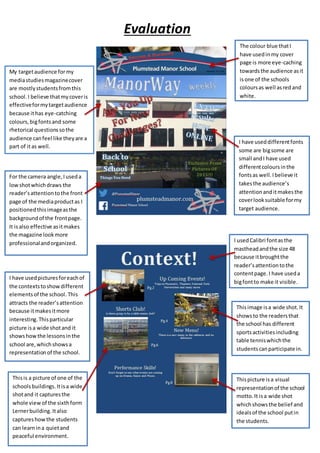
- 1. Evaluation My targetaudience formy mediastudiesmagazinecover are mostlystudentsfromthis school. I believe thatmycoveris effectiveformytargetaudience because ithas eye-catching colours,bigfontsand some rhetorical questionssothe audience canfeel like theyare a part of itas well. The colour blue thatI have usedinmy cover page is more eye-caching towardsthe audience asit isone of the schools coloursas well asredand white. I have useddifferentfonts some are bigsome are small andI have used differentcoloursinthe fontsas well.Ibelieve it takesthe audience’s attentionanditmakesthe coverlooksuitable formy target audience. For the camera angle,Iuseda lowshotwhichdraws the reader’sattentiontothe front page of the mediaproductas I positionedthisimageasthe backgroundof the frontpage. It isalso effective asitmakes the magazine lookmore professionalandorganized. I usedCalibri fontasthe mastheadandthe size 48 because itbroughtthe reader’sattentiontothe contentpage.I have useda bigfontto make it visible. Thisimage isa wide shot.It showsto the readersthat the school has different sportsactivitiesincluding table tenniswhichthe studentscanparticipate in. I have usedpicturesforeachof the contextstoshowdifferent elementsof the school. This attracts the reader’sattention because itmakesitmore interesting.Thisparticular picture isa wide shotand it showshowthe lessonsinthe school are,whichshowsa representationof the school. Thisis a picture of one of the schoolsbuildings.Itisa wide shotand it capturesthe whole viewof the sixthform Lernerbuilding.Italso captureshowthe students can learnina quietand peaceful environment. Thispicture isa visual representationof the school motto.It isa wide shot whichshowsthe belief and idealsof the school putin the students.