Evaluation of my school 
magazine.
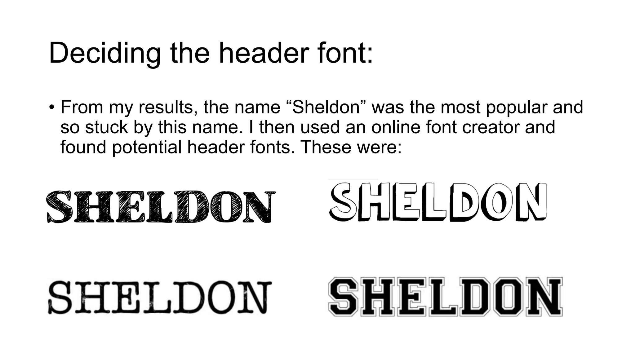
Deciding the header font: 
• From my results, the name “Sheldon” was the most popular and 
so stuck by this name. I then used an online font creator and 
found potential header fonts. These were:
• I decided on this font, as the magazine it aimed at school 
children aged 12-18, I thought this font represented this age 
group well by the bubble writing style. 
• However, to fit in with my chosen colour scheme of blue and 
white, I changed the black on the header to be blue.
The cover.. 
• I chose this photo as the subject is 
looking off centre and is different. 
• He’s smiling and so gives a positive 
impression onto the magazine. 
• His face has good tonal areas and is 
well detailed, however I still used 
Photoshop before I used it as my 
cover.
Using Photoshop.. 
I first made a new layer, so I could change the colour of his shirt to link in 
with my colour scheme. I did this by cutting one layer (his shirt) and 
replacing it with a blue one. I used the lasso tool to do this.
This was the end result 
from this. I believe that by 
changing the colour of his 
shirt shows that I have 
thought about the colour 
schemes within my 
magazine and so co-ordinated 
my model to link 
in.
Again, I made another layer to then edit the background to make it darker so 
white column inches would be seen. I did this by changing the brightness and 
contrast of the photo, however as I did not want my model to become 
contrasted (left) I used the lasso tool and cut around his body so only the 
background would then be edited in contrast and brightness. I think that by 
doing this made the subject stand out more and made it so my column inches 
could be white, sticking with my colour scheme.
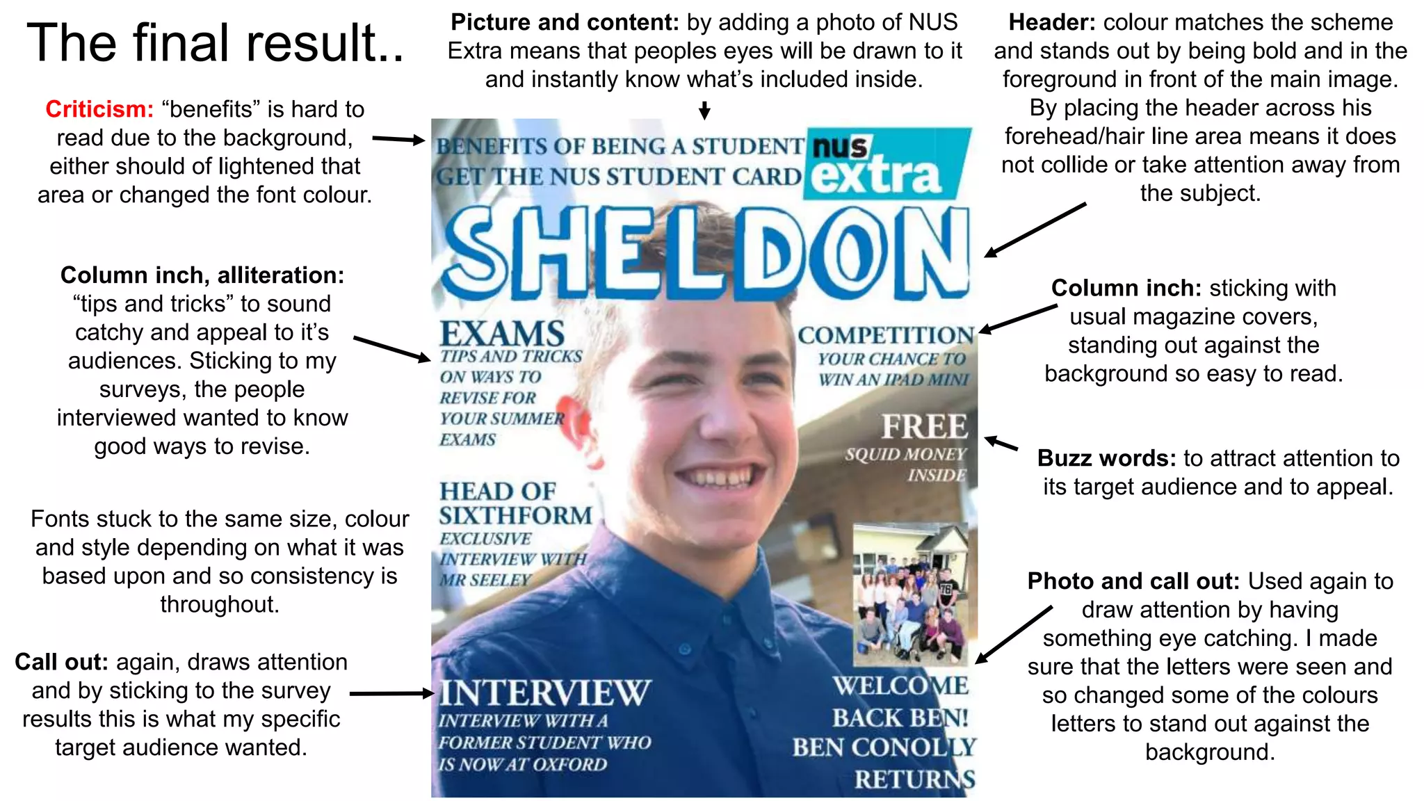
The final result.. Header: colour matches the scheme 
and stands out by being bold and in the 
foreground in front of the main image. 
By placing the header across his 
forehead/hair line area means it does 
not collide or take attention away from 
the subject. 
Column inch: sticking with 
usual magazine covers, 
standing out against the 
background so easy to read. 
Buzz words: to attract attention to 
its target audience and to appeal. 
Photo and call out: Used again to 
draw attention by having 
something eye catching. I made 
sure that the letters were seen and 
so changed some of the colours 
letters to stand out against the 
background. 
Criticism: “benefits” is hard to 
read due to the background, 
either should of lightened that 
area or changed the font colour. 
Picture and content: by adding a photo of NUS 
Extra means that peoples eyes will be drawn to it 
and instantly know what’s included inside. 
Column inch, alliteration: 
“tips and tricks” to sound 
catchy and appeal to it’s 
audiences. Sticking to my 
surveys, the people 
interviewed wanted to know 
good ways to revise. 
Fonts stuck to the same size, colour 
and style depending on what it was 
based upon and so consistency is 
throughout. 
Call out: again, draws attention 
and by sticking to the survey 
results this is what my specific 
target audience wanted.
My mock up 
contents page 
I had less time working on 
making a high quality contents 
page and so rushed. But I quite 
like the final outcome of it. 
Subject is smiling and so 
gives a positive feel again to 
the magazine. 
Criticisms: 
• Would of preferred to edit 
the models shirt to link in 
with colour scheme slightly. 
• Make it more eye catching 
by maybe attaching more 
images to catch the readers 
eye 
Using callouts and 
buzzwords: 
to attract attention when 
reading what’s inside the 
magazine. Making it appealing 
to all ages of the target 
audience specifically set. 
Making it realistic by adding 
page numbers that potentially 
could of featured in the 
magazine, including some to be 
double page spreads. 
Header: I decided to split the 
word and make it one sided and 
not central for a different effect 
of uniqueness. I also attached 
the magazine header “Sheldon” 
to be at an angle to be different 
and let readers clearly know the 
magazine header.
•How does your magazine attempt to satisfy the target audience? 
My target audience for my magazine was school children aged 12-18 years old. The main features I included to 
draw my target audience in was in my header, it being bubble writing style and so appeals to a younger 
audience. I also included things that in my survey results showed an impact of what people wanted to be 
included within the magazine. I also used the colours blue and white which again proved to be most popular in 
my survey results, yet blue is a primary colour and so is considered to appeal to a younger audience. 
•How was research and planning useful to your production? 
It was useful by knowing exactly what conventions I needed to include to appeal to my target audience, making 
it eye catching and including things that were shown to be popular in my survey results. It was also useful to 
know what to include and how to go about my magazine, knowing what things people wanted to feature in the 
magazine. I benefitted well by carrying out surveys as I used these as a guideline. 
•How does your magazine represent the school/ students? 
It gives a positive vibe to the school, as both main images are of boys from the school smiling, which obviously 
symbolises for being happy. It also makes it sound positive and inviting by attracting attention for exclusive 
interviews with lecturers and winning iPads which again appeals to its audiences by offering great opportunities. 
•What have you learnt about digital technologies so far? 
I’ve learnt that Photoshop can do many things like change and edit images to make them “better”. I’ve learnt 
that Photoshop is very complex in which at first I struggled but then coped by roughly having an idea of what to 
do.

Evaluation

  • 1.
    Evaluation of myschool magazine.
  • 3.
    Deciding the headerfont: • From my results, the name “Sheldon” was the most popular and so stuck by this name. I then used an online font creator and found potential header fonts. These were:
  • 4.
    • I decidedon this font, as the magazine it aimed at school children aged 12-18, I thought this font represented this age group well by the bubble writing style. • However, to fit in with my chosen colour scheme of blue and white, I changed the black on the header to be blue.
  • 5.
    The cover.. •I chose this photo as the subject is looking off centre and is different. • He’s smiling and so gives a positive impression onto the magazine. • His face has good tonal areas and is well detailed, however I still used Photoshop before I used it as my cover.
  • 6.
    Using Photoshop.. Ifirst made a new layer, so I could change the colour of his shirt to link in with my colour scheme. I did this by cutting one layer (his shirt) and replacing it with a blue one. I used the lasso tool to do this.
  • 7.
    This was theend result from this. I believe that by changing the colour of his shirt shows that I have thought about the colour schemes within my magazine and so co-ordinated my model to link in.
  • 8.
    Again, I madeanother layer to then edit the background to make it darker so white column inches would be seen. I did this by changing the brightness and contrast of the photo, however as I did not want my model to become contrasted (left) I used the lasso tool and cut around his body so only the background would then be edited in contrast and brightness. I think that by doing this made the subject stand out more and made it so my column inches could be white, sticking with my colour scheme.
  • 9.
    The final result..Header: colour matches the scheme and stands out by being bold and in the foreground in front of the main image. By placing the header across his forehead/hair line area means it does not collide or take attention away from the subject. Column inch: sticking with usual magazine covers, standing out against the background so easy to read. Buzz words: to attract attention to its target audience and to appeal. Photo and call out: Used again to draw attention by having something eye catching. I made sure that the letters were seen and so changed some of the colours letters to stand out against the background. Criticism: “benefits” is hard to read due to the background, either should of lightened that area or changed the font colour. Picture and content: by adding a photo of NUS Extra means that peoples eyes will be drawn to it and instantly know what’s included inside. Column inch, alliteration: “tips and tricks” to sound catchy and appeal to it’s audiences. Sticking to my surveys, the people interviewed wanted to know good ways to revise. Fonts stuck to the same size, colour and style depending on what it was based upon and so consistency is throughout. Call out: again, draws attention and by sticking to the survey results this is what my specific target audience wanted.
  • 10.
    My mock up contents page I had less time working on making a high quality contents page and so rushed. But I quite like the final outcome of it. Subject is smiling and so gives a positive feel again to the magazine. Criticisms: • Would of preferred to edit the models shirt to link in with colour scheme slightly. • Make it more eye catching by maybe attaching more images to catch the readers eye Using callouts and buzzwords: to attract attention when reading what’s inside the magazine. Making it appealing to all ages of the target audience specifically set. Making it realistic by adding page numbers that potentially could of featured in the magazine, including some to be double page spreads. Header: I decided to split the word and make it one sided and not central for a different effect of uniqueness. I also attached the magazine header “Sheldon” to be at an angle to be different and let readers clearly know the magazine header.
  • 11.
    •How does yourmagazine attempt to satisfy the target audience? My target audience for my magazine was school children aged 12-18 years old. The main features I included to draw my target audience in was in my header, it being bubble writing style and so appeals to a younger audience. I also included things that in my survey results showed an impact of what people wanted to be included within the magazine. I also used the colours blue and white which again proved to be most popular in my survey results, yet blue is a primary colour and so is considered to appeal to a younger audience. •How was research and planning useful to your production? It was useful by knowing exactly what conventions I needed to include to appeal to my target audience, making it eye catching and including things that were shown to be popular in my survey results. It was also useful to know what to include and how to go about my magazine, knowing what things people wanted to feature in the magazine. I benefitted well by carrying out surveys as I used these as a guideline. •How does your magazine represent the school/ students? It gives a positive vibe to the school, as both main images are of boys from the school smiling, which obviously symbolises for being happy. It also makes it sound positive and inviting by attracting attention for exclusive interviews with lecturers and winning iPads which again appeals to its audiences by offering great opportunities. •What have you learnt about digital technologies so far? I’ve learnt that Photoshop can do many things like change and edit images to make them “better”. I’ve learnt that Photoshop is very complex in which at first I struggled but then coped by roughly having an idea of what to do.