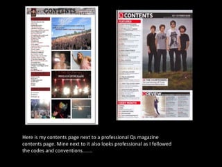
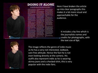
The document discusses how the author's magazine "Live" uses and develops conventions of professional music magazines like Q and NME. It analyzes the design of the magazine's front cover, contents page, and a sample double-page article spread. Key elements that make the author's magazine look professional include using a simple color scheme, large memorable titles, artist photography that appeals to indie fans, and clear structured layouts that break up text and images. The goal is to attract readers and indie music fans by following established magazine conventions.