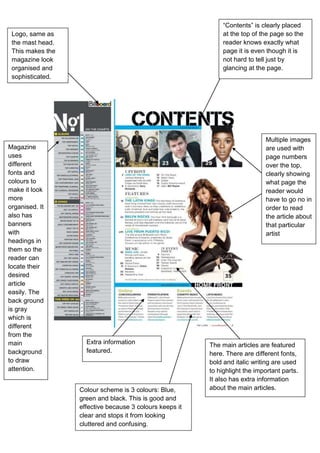
“Contents” is clearly placed
 Logo, same as                                                at the top of the page so the
 the mast head.                                               reader knows exactly what
 This makes the                                               page it is even though it is
 magazine look                                                not hard to tell just by
 organised and                                                glancing at the page.
 sophisticated.


                                                                             Multiple images
Magazine                                                                     are used with
uses                                                                         page numbers
different                                                                    over the top,
fonts and                                                                    clearly showing
colours to                                                                   what page the
make it look                                                                 reader would
more                                                                         have to go no in
organised. It                                                                order to read
also has                                                                     the article about
banners                                                                      that particular
with                                                                         artist
headings in
them so the
reader can
locate their
desired
article
easily. The
back ground
is gray
which is
different
from the
main                Extra information                    The main articles are featured
background          featured.                            here. There are different fonts,
to draw                                                  bold and italic writing are used
attention.                                               to highlight the important parts.
                                                         It also has extra information
                  Colour scheme is 3 colours: Blue,      about the main articles.
                  green and black. This is good and
                  effective because 3 colours keeps it
                  clear and stops it from looking
                  cluttered and confusing.

Billboard contents page analysis

  • 1.
    “Contents” is clearlyplaced Logo, same as at the top of the page so the the mast head. reader knows exactly what This makes the page it is even though it is magazine look not hard to tell just by organised and glancing at the page. sophisticated. Multiple images Magazine are used with uses page numbers different over the top, fonts and clearly showing colours to what page the make it look reader would more have to go no in organised. It order to read also has the article about banners that particular with artist headings in them so the reader can locate their desired article easily. The back ground is gray which is different from the main Extra information The main articles are featured background featured. here. There are different fonts, to draw bold and italic writing are used attention. to highlight the important parts. It also has extra information Colour scheme is 3 colours: Blue, about the main articles. green and black. This is good and effective because 3 colours keeps it clear and stops it from looking cluttered and confusing.