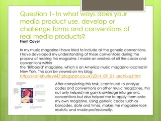
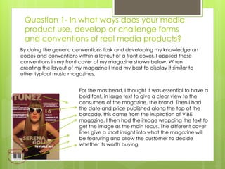
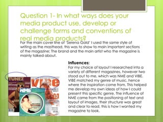
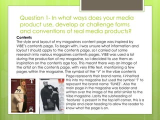
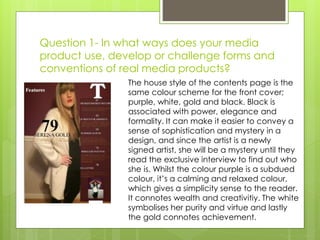
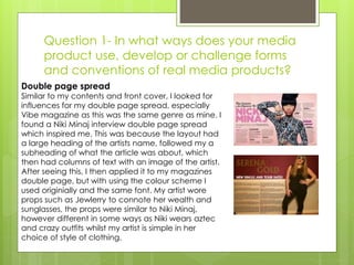
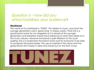
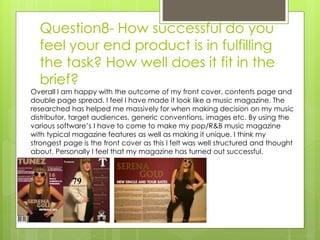
This document discusses Katie Hurley's media product, a music magazine called TUNEZ. It summarizes how Katie researched conventions from real magazines like VIBE and Billboard to develop the layout, design and content of TUNEZ. Key elements of TUNEZ that are influenced by other magazines include the masthead, cover lines, contents page, double page spread, target audience, and color scheme. The document also discusses the technologies Katie used like Microsoft Word, Publisher, and Paint.net and what she learned about their strengths and weaknesses.
This document contains an evaluation of a student's media production project. It provides feedback on how the student's magazine used and developed conventions of real magazines. It notes that the student followed conventions from music magazines like NME in layout, design elements, and use of convergence. The evaluation praises how the student modeled aspects of their magazine after NME to effectively target their audience of 16-27 year olds. It also comments on technologies the student learned in constructing the magazine project.
Here are 4 annotations of my contents page with red arrows and appropriate media language:
1. Contents Listing: This lists the articles and features contained within the magazine issue. It allows readers to navigate to sections that interest them.
2. Page Numbers: The page numbers help readers locate each article or feature easily.
3. Feature Image: A large eye-catching image promotes and entices readers to turn to the double page interview feature.
4. Magazine Name/Issue: The masthead and issue details identify the magazine and lets readers know they have the correct publication.
This document contains an evaluation of a media product proposal by Jess Gregory. It includes details about the target audience for the proposed magazine such as young women aged 17-23 interested in music, fashion, and trends. Similar existing magazines that were influences are mentioned like Billboard and Top of the Pops. The proposed distribution partner is Prometheus Global Media, the same company that distributes Billboard, due to the similar audiences. Conventions from real magazines like Billboard are built upon and developed for the magazine's layout, design, and content.
Evaluation on front cover, contents page and double page spreadJade Foreman
My media product develops conventions used in real magazines, such as a masthead in the top left corner with the magazine's name ('K') in a dark red font on a red background. The front cover features the artist's name written across their body with a customized line underneath, and cover lines on the left side about the artist. The contents page includes a variety of images representing what's in the magazine, and text about artists/groups. The double page spread begins with the artist's name in a font representing their style to give feeling. Images are used to represent the artist's genre and personality. The magazine would appeal to a wide audience aged approximately 12-30, featuring a variety of music genres and both male and female
Evaluation on front cover, contents page and double page spreadJade Foreman
My media product develops conventions used in real magazines, such as a masthead in the top left corner with the magazine's name ('K') in a house style combining red, black, white and blue. The front cover features the artist's name across their body with a customized line underneath, and cover lines on the left side about the artist. The large central image establishes the artist's genre through their expression. The contents page includes a variety of images representing the magazine's content, and text about artists/groups. The double page spread begins with the artist's name in a font conveying their feeling, with an image projecting their confident attitude and genre. Feedback from focus groups showed the products successfully looked professional and met audiences' needs
The document provides instructions for a media studies evaluation assignment involving the planning and production of a music magazine. It outlines seven questions to be addressed in the evaluation and expectations for formatting the response in PowerPoint. Some key points:
- There are seven questions relating to planning, production, audience, representation, distribution, technologies used, and lessons learned.
- A minimum of five slides per question is recommended, using images, color coding, and other visual elements.
- The evaluation is worth 20 marks and each question must be addressed separately with details.
- Good communication skills should be demonstrated in submitting and presenting the evaluation.
AS Media Studies - Music Magazine Evaluation SundasBostan
The document discusses the author's choice to create a hip-hop music magazine targeted towards 16-24 year olds. A survey found this age group prefers hip-hop music because it relates to their generation and lifestyle. The magazine, called "Amplify", uses conventions from real music magazines such as positioning exclusive interviews in the left third and including a strap line under the masthead. Images on the cover and inside pages feature urban styles and poses to appeal to readers.
The document discusses how a magazine product uses conventions of real magazines to attract its target audience of 14-19 year old females interested in pop music. Key conventions included a masthead to establish the genre, cover lines highlighting articles, bright colors, prominent images, and interviews. Market research found the target audience prefers these visual elements over text. The magazine would appeal to an aspirational psychographic segment and aims to distribute through a company experienced in music magazines like IPC.
The document discusses how a magazine product uses conventions of real magazines to attract its target audience of 14-19 year old females interested in pop music. Key conventions included a masthead to establish the genre, cover lines highlighting articles, bright colors, prominent images of artists, and interviews. Market research found the target audience prefers these visual elements and content about their favorite pop groups. The magazine would appeal to an aspirational psychographic segment seeking status from pop culture.
Katie Denn evaluates her media product, a music magazine. She aims to represent the social group of late teens and mid-twenties interested in indie music. To do so, she challenges conventions by featuring a female artist looking directly at the camera in a casual yet intimidating pose. This is meant to give readers a sense of the artist's music and attract their interest. Her magazine is influenced by NME, known for its strong attitude appealing to indie audiences. She uses conventions like cover lines and mastheads but also challenges norms by focusing solely on up-and-coming artists. The goal is to inform readers about new music and increase awareness of the indie genre.
Katie Denn provides an evaluation of her media magazine product. She answers 8 questions about how her product used conventions of real magazines, represented social groups, its intended audience and distribution. For question 1, she details how she incorporated typical magazine codes and conventions into her design through research. She challenged conventions by focusing on up-and-coming artists rather than mainstream ones. For question 2, she aimed her magazine at indie music fans aged 17-26 by showcasing edgy photography and locations. She distributed her magazine digitally, like NME, targeting their same 18-22 year old audience. Through contents, images and articles, she addressed her audience's interests in new music and culture. She learned about designing pages in
The document discusses how a magazine product uses conventions of real magazines to attract its target audience of 14-19 year old females interested in pop music. Key conventions included a masthead to establish the genre, cover lines highlighting articles, bright colors, prominent images, and interviews. Market research found the target audience prefers these visual elements and bright colors to engage with their favorite artists. The magazine would appeal to aspirational youth seeking status and appeal.
Kieron Savage created a magazine focusing on hip-hop and R&B music. He looked to established magazines like Vibe for conventions to follow, such as consistent color schemes and centering the cover image on the artist. Savage also included headlines of popular artists to attract readers. While following conventions, Savage challenged some by using simple, unedited photos on a double page spread to portray the featured new artist authentically. Through the process, Savage learned new skills with software like Photoshop and how to properly attract his target audience of teenagers and young adults.
This document summarizes the key things the author learned from creating a preliminary school magazine to developing a full music magazine product. The author gained skills in InDesign and improved their photography technique. Their initial images lacked quality but they later conducted a planned photoshoot. The author also broadened their style to be more varied and professional. Overall, the author maintained some consistent elements like free offers and catchy headlines between the magazines, while improving technological skills and magazine design quality.
This document analyzes a magazine cover created by the author for a music magazine called "Dynamic." It discusses design elements like the tagline, kicker, masthead, and color scheme. It also compares the author's magazine cover design to real magazines like "Billboard" and "Q" to show how it follows conventions of the genre but also challenges some conventions. The document discusses how the magazine represents its target audience of teenage and young adult girls who love music and fashion. It aims to distribute through a major publisher to reach a wide global audience.
The document provides an evaluation of the student's media coursework in which they created a music magazine called "RHYTHM." The summary discusses how the student used conventions from real music magazines in their design, such as still images, color schemes, and continuity of fonts. It also discusses how the student developed these conventions through image manipulation programs and challenged conventions by targeting a younger student audience. The student represented new and upcoming musicians and learned new technologies like Photoshop through the process of constructing their media product.
The document evaluates how Jessica Thorpe's magazine, Simply Pop Magazine, uses conventions of real media products. It discusses how the magazine uses conventions such as a masthead to establish the genre, cover lines, drop caps, pull quotes, slogans, dates and pricing. It also includes features commonly found in pop magazines like an editor's article and multiple images. The target audience is identified as mainly 14-19 year old females interested in pop music. Research with the target audience informed design choices to attract and address this group.
The document evaluates how Jessica Thorpe's magazine, Simply Pop Magazine, uses conventions of real media products. It discusses how the magazine uses conventions such as a masthead to establish the genre, cover lines, drop caps, pull quotes, slogans, dates and pricing. It also includes features commonly found in pop magazines like an editor's article. The target audience is described as mainly 14-19 year old females, and the magazine aims to attract this group through its bright colors, focus on pop artists, and inclusion of content they expressed interest in. IPC is identified as the most suitable media institution to distribute the magazine given their experience with music magazines.
Oliver Snowdon created a music magazine called "Retro" to showcase popular artists like Burnsy from the band Shiz'Le'Dogs. He aimed the magazine at trendy 16-25 year old males interested in music and fashion. To make the magazine appealing to his target audience, Oliver replicated conventions from real magazines like Vibe and Q that feature prominent artists and a focus on music and style. He learned key design skills using Adobe programs to lay out the magazine and edit photos to complement the articles. Oliver also included contests and discounts to further engage readers.
The document describes a music magazine created for 14-16 year old girls. It discusses how the magazine follows conventions of real music magazines through elements like catchy titles, celebrity photos, and informal writing. The magazine's unique selling point is promoting pop stars' fashion styles. The magazine represents teenage pop stars and their fashionable, feminine styles. IPC Media would be a suitable publisher as they produce popular magazines for this demographic. The target audience is young teenage girls who are fans of pop music and fashion.
1. The document summarizes the process of creating a magazine media product and what was learned. Key software used included Microsoft Publisher, Photoshop, and free font websites.
2. Feedback was gathered through a questionnaire to understand the target audience. The magazine was aimed at teenagers aged 13-17 by using popular artists like Paramore and N-Dubz.
3. Learning included improving layout and design skills to make the magazine more professional and appealing to different music genres beyond just rock. Progression was shown from an initial preliminary task.
The document is a reflection by a student on their final media studies project creating a magazine. It discusses how the magazine used conventions of real magazines while also trying to be unique. It targeted teenagers and young adults interested in indie music. The student believes music stores and festivals would be most likely to distribute the magazine to its target audience. Through images and style, the student aimed to attract and address this target audience. The process taught the student new skills with software like Photoshop and helped improve planning from the preliminary project.
Evaluation on front cover, contents page and double page spreadJade Foreman
My media product develops conventions used in real magazines, such as a masthead in the top left corner with the magazine's name ('K') in a house style combining red, black, white and blue. The front cover features the artist's name across their body with a customized line underneath, and cover lines on the left side about the artist. The contents page shows a variety of pictures representing what's inside, and the double page spread begins with the artist's name in a font reflecting their style. Through its representations of different social groups, variety of music genres, and images of both male and female artists, the magazine aims to appeal to a wide audience aged 12-30. Bauer Media would be a suitable publisher as it releases
My target audience was teenagers to 20+ year olds from working-lower class backgrounds. I represented them through including lesser known indie bands from the 1980s-2000s that this demographic would be familiar with. My magazine was inspired by Q magazine and used a similar colorful layout in Photoshop. Through featuring nostalgic artists, I aimed to provide a sense of escapism for my target readers.
This document is a resume for Mansour H. Al-Qadri. It includes contact information, objective, personal details, skills, extensive education and training history, work experience including roles as an accounts payable accountant and SAP senior general ledger accountant, and interests. Al-Qadri has over 15 years of accounting experience, is proficient in various accounting software and Microsoft programs, and seeks a challenging job utilizing his skills.
Mercado Abierto Electrónico, MAE, informe diario, situación economica, dolar,...Marcelo Pablo Mercs
El informe diario resume la actividad del Mercado Abierto Electrónico del día miércoles 6 de mayo de 2015, incluyendo montos negociados en renta fija, pases, forex y otros instrumentos financieros. Además, presenta índices del mercado, curvas de rendimiento, precios de cierre de títulos públicos y otra información relevante del día.
Curious about how analysts, investors and activists value your company? Join the Canadian Investor Relations Institute for this one-day intensive workhop.
You will learn how to:design and layout a financial model clearly; create clearly defined inputs and assumptions;
forecast a company's revenues and expenses;
incorporate and build a company's income statement, balance sheet and cash flor statement; create the necessary schedules; and MUCH MORE!
This document lists several image and clipart websites that can be used for images and graphics. The websites include clipartpanda.com, clker.com, cliparts.com, funny-pictures.picphotos.net, Clipproject.info, pixshark.com and cliparts101.com. All of the websites seem focused on providing clipart, images, and graphics that can be used for various projects.
David papini escape emotional intelligence trapsDavid Papini
What happens to emotional IQ in a daily practice to pursue freedom? Answer is in the way we use language and body.
In the session attendees will learn how to connect emotional intelligence theory with clean linguistic and cognitive practices. They will experiment simple techniques to leverage emotions in any goal-oriented setting, be it their work, their teamwork or their relationships. They will learn also to convert very common misconceptions about emotions in powerful, mindset changing and practical behaviors. The tools that we’ll use in the session are language and body. We will learn that language can be effective or not in emotional intelligence, depending on how we use it (and we’ll see the four main uses of language) and also that speech and body are not alternative means of getting things done and goals achieved.
The document discusses the various software programs and equipment used during the creation of a music video portfolio piece. WordPress was used to create a blog to host and present all work. Cameras were used for filming the music video and taking photos. Premiere Pro was the video editing software used to edit videos throughout the process. Adobe Audition was used to edit out swearing in the song by reversing it. The internet was crucial for research, planning, construction, and displaying the final video online. Prezi was used for visually appealing research and planning presentations. Other programs were used to create animated videos and voiceovers for evaluations. YouTube allowed uploading and embedding of videos created during the process.
Himanshu Shrivastava successfully completed the Commodity Exam for the Bloomberg Essentials Training Program in January 2016. The certificate acknowledges his completion of the exam, which was part of the Bloomberg Essentials Training Program. Tom Secunda of Bloomberg congratulated Himanshu on successfully finishing the exam.
ACF - CAPTACIÓN DE EXPERIENCIAS DE AGUA, SANEAMIENTO E HIGIENE (WASH) EN EL D...Melissa Restrepo Arturo
“Está publicación se realiza en el marco del proyecto:
“Mejora de las condiciones de salud de la población afectada por el conflicto armado a través del acceso a agua segura y saneamiento básico, en los Departamentos de Córdoba y Putumayo, Colombia, financiado por la agencia suiza para el desarrollo y la cooperación COSUDE”.
Miexperienciaenelcolegioloyola 150413190634-conversion-gate012 jv j,Felipe Restrepo Parra
El estudiante se ha adaptado bien a su nuevo colegio desde el comienzo del año, encontrando a los docentes y la administración acogedores. Se ha sentido cómodo participando en actividades grupales y microproyectos, aunque ha tenido algunas dificultades cuando los equipos cambiaron, pero ahora se lleva bien con sus compañeros de equipo actual. En general, le gusta la metodología del colegio y se siente bien en él.
Este documento presenta información sobre el diseño curricular y el Proyecto Educativo Institucional (PEI) de un instituto superior de educación público en Chiclayo, Perú. Describe conceptos clave como las características de un diseño curricular diversificable, flexible y abierto, así como los objetivos y estrategias de este. También explica que el PEI es un instrumento de gestión que presenta una propuesta singular para dirigir los procesos educativos de una institución de manera coherente.
[Portugal] o serviço de atendimento como o novo marketingE.LIFE
O documento descreve a trajetória e serviços da empresa E.life, especializada em social CRM. A empresa iniciou em 2004 com monitoramento de redes sociais e análises de dados, expandindo para gestão de relacionamento em 2009. Atualmente oferece plataforma de business intelligence baseada em monitoramento, relacionamento e desempenho em mídias sociais.
Compared to domestic relocation, relocating globally is a whole different ball game. We dispel the top 5 myths associated with relocating internationally.
Price and Quality of PV selfconsumption kits - two unknowns at the same equationHugo Silva
Este documento discute a importância de testes de qualidade para kits de autoconsumo fotovoltaico devido aos riscos de componentes defeituosos. A Lógica E.M., S.A. desenvolveu testes para módulos, inversores e estruturas de fixação para avaliar a qualidade antes da instalação. Defeitos como microfraturas nas células podem reduzir significativamente o desempenho, com impactos maiores em sistemas menores. Garantir a qualidade dos componentes e manutenção preventiva é essencial
Katie Denn evaluates her media product, a music magazine. She addresses 8 questions about how her magazine uses conventions of real magazines, represents social groups, its target audience and distribution. She learned about magazine codes and conventions by analyzing examples. Her magazine targets 17-26 year old indie music fans. She attracts her audience through relevant content, colors, and images that appeal to them. In creating her magazine, she learned about using page plus software and the technologies involved in constructing a media product.
Katie Denn evaluates her media magazine project. She summarizes how she used conventions from real music magazines in her design, such as including a masthead, cover lines, and color scheme. She researched magazines like NME for inspiration on layouts. Her magazine represents indie music fans in their late teens to mid-twenties. She chose a casual yet intriguing cover star photo to attract this audience and showcase new indie artists. Her goal was to authentically portray indie style and culture for readers.
The document summarizes the progression and development of a student's media magazine project from preliminary tasks to the final product. It reflects on how researching similar magazines helped the student understand conventions to make the magazine look professional. The student aimed to attract a teenage audience and represents the hip hop genre. Feedback on the final product is positive, noting it successfully uses conventions like mastheads and cover lines to fit the brief of creating a realistic magazine.
The document is a student's analysis of how their media product compares to and challenges conventions of real music magazines. The student compares their front cover design to NME magazine covers. They used similar conventions like artist name placement and color matching but challenged conventions through simpler design and darker background color. For the contents page, they conformed to conventions like banner headings but challenged the background color. Their double page spread challenged conventions with plain design and focus on the artist photo. They represented indie artists and addressed their target audience of 15-22 year olds who listen to indie music through the model's style and references to popular indie artists.
The document describes the process of creating a music magazine media product. It discusses learning about codes and conventions through research and a preliminary task. The biggest challenges were developing the masthead and cover images. Research into similar magazines like NME helped with layout elements. Technologies like Publisher, Page Plus and Paint.NET were used, each with strengths and weaknesses. Blogger was used to document the planning and drafting process. Overall, the producer feels the final product successfully uses conventions and fits the brief of creating an indie/rock music magazine.
The document discusses the development and challenges of creating a music magazine to meet industry conventions. It describes researching conventions from magazines like NME and incorporating elements such as the masthead, cover lines, and images. Developing the masthead and cover images posed initial challenges. The target audience is identified as teenagers aged 14-20 based on a survey. Content and images aim to attract this audience by focusing on an indie musician and incorporating props related to rock/indie music. The magazine would be distributed by The Wire, an independent magazine covering alternative music genres aligned with the magazine's content.
The document summarizes the process of creating an indie music magazine as an individual media project over 10 weeks. Key points include:
- The magazine used conventions of real music magazines such as a masthead, strap lines, photographs, and color scheme to match the indie genre.
- Some conventions were challenged, like placing text in boxes and using two strap lines for variety.
- The contents page photo showed the band from above in a high angle shot rather than a typical medium close up.
- The feature article used a different color scheme to portray the band and had catchy quotes in blue for emphasis.
The document discusses the decisions made in designing a music magazine called "Quaint". It describes choosing to feature a single main image on the cover to avoid appearing crowded. It also discusses setting an affordable price of £2.49 based on market research showing prices between £2-3 sold best. Fashion was an important consideration, aiming for a shabby chic, high fashion vintage feel by carefully selecting the model's costumes, props, and makeup. The chosen genre was indie-pop to make it unique while targeting interested audiences. Color schemes and other design elements were selected based on research of existing magazines and feedback from questionnaires and peers.
The student evaluated their magazine product by summarizing how it used conventions of real magazines. The magazine included a masthead to establish the genre. It also included cover lines, a drop cap, brightly highlighted articles, pull quotes, slogans, dates and pricing to match conventions. The content and layout was designed to represent and attract the target 14-19 year old, female audience that enjoys pop music. Research was done with this audience to inform the design.
G321 Media Studies Evaluation Vince ReyesVince Reyes
This document contains Vince Reyes' responses to evaluation questions about a media studies assignment to create a magazine. Vince analyzed existing magazines to understand conventions and targeted his magazine at teenagers and young adults interested in hip hop. He incorporated appropriate conventions into elements like the cover, masthead, and contents page. Vince selected Eldridge Industries as a suitable publisher given they release similar hip hop magazines. He aimed to attract his target audience through the use of dark colors, intimidating cover star imagery, and hip hop relevant language. Vince learned new skills using software like PagePlus and Publisher to construct the magazine. He felt his final product better fulfilled the brief compared to his preliminary task by more fully incorporating industry conventions.
The document discusses magazine covers and their use of conventions. It provides examples of magazine covers that both follow and break conventions. Typical conventions for music magazine covers are listed, such as having the masthead at the top, a large central photo, clear subtitles, and a consistent color scheme. The document discusses how the author's magazine cover follows conventions by including the masthead at the top, cover lines in a bold color, and additional information like the date and price. It also discusses how the author's magazine articles and contents page follow conventions through use of formatting, colors, and images. The target audience is identified as teenage girls aged 13-18, and an example reader named Lucy is described who fits the target demographic and enjoys pop
The document summarizes the process and decisions made in creating a magazine cover and contents for a hip-hop/R&B genre. Key aspects included using color schemes, layouts, and images from real magazines like Vibe as inspiration. The target audience of 14-25 year olds was considered through bold visual designs, unisex colors, and featuring popular artists. Learning new software like InDesign and Photoshop expanded the creator's technical skills and allowed for a more professional magazine to be designed.
The document provides guidance for a student's evaluation for a media studies coursework assignment. It outlines the seven questions that will be asked as part of the evaluation and provides advice on how to structure the response for each question. For question one on identifying the target audience, it recommends including research like an audience questionnaire, photos from a scrapbook, and diagrams to illustrate the key attributes of the target audience. It also provides sample slides responding to question one, identifying the target audience as 16-24 year old females interested in indie music and fashion.
The document outlines 7 questions that must be addressed in an evaluation of a media product. It then provides responses to each question from the perspective of a magazine the author has created. The responses discuss how the magazine uses conventions from other magazines, represents a middle-aged, middle-class audience, and would be distributed by TimeInc due to their experience with similar magazines. The responses also discuss how the author attracted their target audience and what technologies they learned in creating the magazine.
The magazine uses conventions from real music magazines like NME, such as featuring artists on the cover and including articles about new musical talent. However, it also challenges some conventions by using original photography on the cover and not including freebies. The magazine represents social groups like college students and young workers aged 16-25 by using models in that age range and portraying an "indie" style that stands out from other magazines through its unique presentation and variety of rock/indie artists featured.
The document discusses how the author's media products use conventions of real music magazines in their design. Specifically, the front cover uses conventions like featuring a solo artist and including a "puff" to draw attention. Interior pages also follow conventions, like using a plain background and long shots of the artist on the contents page. The double-page spread includes a large embedded quote from an interview, as is typical. Overall, the author's media products emulate many visual and structural conventions of real music magazines to make their designs look professional and appeal to target audiences.
The document summarizes a student's media studies project where they created a print music magazine. The magazine follows conventions of real music magazines, targeting 12-16 year old females. It includes a front cover, contents page, and feature article on a fictional pop girl group. The student conducted research showing pop was the most popular genre. Their magazine combines elements of lifestyle and music magazines, representing their target audience and popular music stars/celebrities. The student believes IPC Media would be a good media institution to produce and distribute the magazine due to their large reach.
The document summarizes a student's music magazine project. The student aimed to create a magazine that conformed to conventions of rock magazines by including things like barcodes, large images and titles, headings, and advertisements. The student included similar features on the contents page and article pages as professional magazines. The magazine represented teenagers and aspiring musicians through the images and content. The target audience was identified as males aged 14-19.
Kurt Sumner created a rock music magazine that uses many traditional magazine conventions such as a barcode, large title, images, headings, and advertisements on the cover and contents page. The magazine represents teenagers and aspiring musicians through the clothing, poses, and locations in the photos. The target audience is males aged 14-19, and the magazine aims to attract them through informal design, relevant content, and photos that connect with the reader. Through making the magazine, Kurt learned how to use software like Photoshop and InDesign and improved his skills in planning and design compared to his preliminary task.
Nikita Da Silva created a music magazine as part of their media studies coursework. They conducted research on existing magazines, including Billboard, to inform the design of their own magazine. Nikita took photos of themselves posing as the magazine's cover star and for interior features. Through feedback from their target audience, Nikita identified key elements for an effective media product, such as consistent color scheme, bold headlines, prominent cover star, and opportunities for audience interaction through convergence and competitions. Nikita created hand-drawn drafts to plan layouts before producing the final magazine.
How to Fix the Import Error in the Odoo 17Celine George
An import error occurs when a program fails to import a module or library, disrupting its execution. In languages like Python, this issue arises when the specified module cannot be found or accessed, hindering the program's functionality. Resolving import errors is crucial for maintaining smooth software operation and uninterrupted development processes.
A workshop hosted by the South African Journal of Science aimed at postgraduate students and early career researchers with little or no experience in writing and publishing journal articles.
This presentation includes basic of PCOS their pathology and treatment and also Ayurveda correlation of PCOS and Ayurvedic line of treatment mentioned in classics.
it describes the bony anatomy including the femoral head , acetabulum, labrum . also discusses the capsule , ligaments . muscle that act on the hip joint and the range of motion are outlined. factors affecting hip joint stability and weight transmission through the joint are summarized.
Strategies for Effective Upskilling is a presentation by Chinwendu Peace in a Your Skill Boost Masterclass organisation by the Excellence Foundation for South Sudan on 08th and 09th June 2024 from 1 PM to 3 PM on each day.
Main Java[All of the Base Concepts}.docxadhitya5119
This is part 1 of my Java Learning Journey. This Contains Custom methods, classes, constructors, packages, multithreading , try- catch block, finally block and more.
2. Question 1
In what ways does your media product use, develop or
challenge forms and conventions of real media products?
3. Question 1- In what ways does your
media product use, develop or
challenge forms and conventions of
real media products?
After completing this task, I continued to analyse
codes and conventions on other music magazines, this
not only helped me gain knowledge into generic
conventions but also helped me to apply them onto
my own magazine. Using generic codes such as
barcodes, date and times, makes the magazine look
realistic and made professionally.
Front Cover
In my music magazine I have tried to include all the generic conventions.
I have developed my understanding of these conventions during the
process of making this magazine. I made an analysis of all the codes and
conventions within
the ‘Billboard’ magazine, which is an America music magazine located in
New York. This can be viewed on my blog:
http://katiehurley447.blogspot.co.uk/2014_09_01_archive.html
4. Question 1- In what ways does your media
product use, develop or challenge forms
and conventions of real media products?
For the masthead, I thought it was essential to have a
bold font, in large text to give a clear view to the
consumers of the magazine, the brand. Then I had
the date and price published along the top of the
barcode, this came from the inspiration of VIBE
magazine. I then had the image wrapping the text to
get the image as the main focus. The different cover
lines give a short insight into what the magazine will
be featuring and allow the customer to decide
whether its worth buying.
By doing the generic conventions task and developing my knowledge on
codes and conventions within a layout of a front cover, I applied these
conventions in my front cover of my magazine shown below. When
creating the layout of my magazine I tried my best to display it similar to
other typical music magazines.
5. Question 1- In what ways does your
media product use, develop or
challenge forms and conventions of
real media products?
Influences:
For my choice of layout I researched into a
variety of different magazines, however two
stood out to me, which was NME and VIBE.
VIBE matched my genre of music, hence
where the inspiration come from. This helped
me develop my own ideas of how I could
present this specific genre. The influence of
NME came from the positioning of text and
layout of images, their structure was great
and clear to read, this is how I wanted my
magazine to look.
For the main cover line of ‘Serena Gold’ I used the same style of
writing as the masthead, this was to show to main important sections
of the magazine; The brand and the main artist who the magazine is
mainly talked about.
6. Question 1- In what ways does your
media product use, develop or
challenge forms and conventions of
real media products?
Influences
I got the influence of the genre of music I wanted to present in my
magazine through VIBE, I also got their style of writing from them. I thought
their text was catchy, clear and easy to follow, so I decided to do a similar
font and style which enabled me to get a cool pop music style of my
magazine. When I researched different VIBE magazines the one below
really inspired me, by the colour co-ordination, the idea that the ethos fits
in with the style of magazine and the main artists is the main focus. This is
how I developed my ideas onto my magazine. I got my magazine to have
a colour scheme to make it look attractive and professional.
Also the different poses were deeply thought
and researched about, seeing Niki Minaj, with
her hands on her hips, makes her look a dominant
female and confident. This look inspired me, which
I then applied to my photography.
7. Question 1- In what ways does your media
product use, develop or challenge forms
and conventions of real media products?
Contents
The style and layout of my magazines content page was inspired by
VIBE’s contents page. To begin with, I was unsure what information and
layout I should apply to the contents page, so I carried out some
research into various magazines contents pages. VIBE was used a lot
during the production of my magazine, so I decided to use them as
inspiration on the contents age too. This meant there was an image of
the artist on the contents page, with very little text, mentioning a few
pages within the magazine. The symbol of the ‘V’ in the vibe contents
Page represents their brand name, I inherited
this into my magazine but used the symbol ‘T’ to
represent the brand name ‘TUNEZ’. Also the
main page in the magazine was bolder and
written over the image of the artist similar to the
Vibe magazine. Lastly the subheading of
‘features’ is present in the top left corner, this is a
simple and clear heading to allow the reader to
know what the page is on.
8. Question 1- In what ways does your media
product use, develop or challenge forms and
conventions of real media products?
The house style of the contents page is the
same colour scheme for the front cover;
purple, white, gold and black. Black is
associated with power, elegance and
formality. It can make it easier to convey a
sense of sophistication and mystery in a
design, and since the artist is a newly
signed artist, she will be a mystery until they
read the exclusive interview to find out who
she is. Whilst the colour purple is a subdued
colour, it’s a calming and relaxed colour,
which gives a simplicity sense to the reader.
It connotes wealth and creativitiy. The white
symbolises her purity and virtue and lastly
the gold connotes achievement.
9. Question 1- In what ways does your media
product use, develop or challenge forms
and conventions of real media products?
Double page spread
Similar to my contents and front cover, I looked for
influences for my double page spread, especially
Vibe magazine as this was the same genre as mine. I
found a Niki Minaj interview double page spread
which inspired me. This was because the layout had
a large heading of the artists name, followed my a
subheading of what the article was about, which
then had columns of text with an image of the artist.
After seeing this, I then applied it to my magazines
double page, but with using the colour scheme I
used originially and the same font. My artist wore
props such as Jewlerry to connote her wealth and
sunglasses, the props were similar to Niki Minaj,
however different in some ways as Niki wears aztec
and crazy outfits whilst my artist is simple in her
choice of style of clothing.
11. Question 2-How does your media
product represent particular social
groups?
My magazines target audience was mainly aimed at teenagers, but
mainly ages ranging from 16 to 21. This was due to pop and R&B
music being really popular in todays society with young teenagers.
Cover star
My cover star is called ‘Serena Gold’. This is her in the original
photography, who is a confident and dominant woman. This is the sort of
image I wanted to portray for my artist. This specific image to put across
was done because she is a new signed artist, who has become
something bigger, she began with youtube videos and now she has a
record deal, this dominance is shown through her success, to how she has
got to where she is now, her new career of getting signed is spoken about
in the interview. She can be seen as a massive role model to many
teenagers, as this may be a dream similar to theirs. Mostly females would
be the wider audience of this particular artists as her songs are pop which
young girls typically listen to, however males are also targeted.
12. Question 3
What kind of media institution might distribute your media product
and why?
13. Question 3 – What kind of media
institution might distribute your media
product and why?
My music magazine ‘TUNEZ’ has a similar audience to the magazine I was
influenced by, which are major distribution companies. I researched into
different major music distributor companies, one I decided to use
InterMedia Partners which is a private equity. They own other companies
such as WAPA-TV (Radio Station). This company is a distributor of Vibe
magazine however vibe gained their success through other media
institutions, they distribute their magazines through their online websites
which provides some articles from the magazine, an there magazines get
distributed to a variety of shops ranging from corner shops to
supermarkerts and lastly they make catchy offers so that the public will be
tempted to buy their magazine.
15. Question 4 – who would be the
audience for your media product.
My magazine has a target audience of young adults aged 16-21
I created a questionaire to help me decide on who I should aim my magazine at;
http://katiehurley447.blogspot.co.uk/2014/10/target-audience-survey.html
This helped me see the different age ranges who patricipated in the survey whom
liked pop and R&B music, after a couple of weeks I looked at the results of the
surveys and presented this on my blog ;
http://katiehurley447.blogspot.co.uk/2014/11/target-audience.html
The results showed me the genre of music I was featuring in my magazine, was
mostly liked by ages 16-21. this made my decision of having this age range. This
audience is very similar to Vibe magazine who have a target audience of ages
18-34. Their age range is slightly higher than mine, however I wanted more
younger people.
17. Question 5 – how did you
attract/address your audience?
Masthead
The name of my masthead is ‘TUNEZ’, this relates to music, and what the
younger generation call a ‘good song’ in todays world. I think this is a
good brand name for my magazine as it is aimed at the younger
generation and therefore should have reference to what they relate to in
the music industry. However the brand is spelt different to the usual
spelling, this is to emphasise the brand name and for everyone to be able
to recognise the brand easier. The use of capitals in the name and the
goldy-brown font makes it clear and stands out on the front cover.
18. Question 5 – how did you
attract/address your audience?
Colours
Before I created my magazine, I carried out a lot of research on what
connotations different colours have. For example Gold has a connotation of
achievement and White connotes purity. The researched I did is visible on my
blog;http://katiehurley447.blogspot.co.uk/2014/10/screen-shot-of-research-
and-planning.html
Vibe magazine who my magazine was inspired by tend to use a variety of
different colours, each time they usually use black and white as bold titles on
the contents page etc. However they change the colour of their masthead
based on the house style and the clothing of the artist being featured on their
front cover. For example on the Niki Minaj cover, she was wearing orange
clothing, which they then linked the masthead with the colour scheme of the
magazine; orange.
19. Question 5 – how did you
attract/address your audience?
Cover lines
The cover lines are an important part of a magazine as these have an impact
on whether the customer will purchase the magazine or not. If the cover lines
are uninteresting and don’t catch the readers attention, it is likely that there
wont be many buyers. Whereas if the cover lines grab the reader attention,
and sound interesting, there are likely to be people buying it. For my
magazine I used interesting cover lines mainly based on the music industry.
The main cover line is simple and unrevealing; ‘reveals all’. This is short and
straight to the point but makes the reader question what this is all about,
which can make them want to buy it to read into what is being ‘revealed’.
Most of my coverlines are based on new music, events. However one of my
cover lines is ‘how is America winning?’ This is a more factual cover line, I did
this so the whole magazine didn’t consist of one main topic.
20. Question 5 – how did you
attract/address your audience?
Images
All of my images within the three parts of my magazine, are of the same artist.
The images make my artist look dominant and confident, which is the image I
wanted to portray. This was done through the body language she posed
through the images and her facial expressions. I made sure the cover star was
looking directly at the camera to give direct address to the audience in every
photo, however the front cover she has sunglasses on, this was done
deliberatly and she is a mystery, because no one knows who she is as she is a
new signed artist, this will then be revealed in the contents page where she is
still looking directly at the audience with no glasses on. Having the cover star
look directly at the audience helps build a relationship with the audience.
21. Question 6
What have you learnt about technologies from the process of
constructing the product?
22. Question 6- what have you learnt
about technologies from the process of
constructing the product?
Throughout producing my magazine and researching into what I need in a
magazine, I had to use various softwares such as paint.net, Microsoft word and
publisher. STRENGTHS:
Microsoft Word
I found that using Microsoft word for putting my research into, so it was easy to
look back, was easy and logical to use. Its simple to use by changing fonts and
sizes and colours I intend to use, and add images and crop and move them
around. Also if I need a word which I am unsure on how to spell, I have spell
check which stops my grammar errors as well and spelling.
Page Plus
Page Plus is also a very easy software to use, it enables me to add images, text
and shapes. Drag them into any position I would like, add effects and filters to
images instead of having to use a different software to edit the image and
then upload it onto page plus. It also offers me to have a layout where I can
put all three of my designs into one document rather than having three
separate documents. I can change the font, size and colour. It also gives me
tools such as erasing unwanted parts of images and gives me the option of
choosing a background. And lastly it allows to me to save it as a JPEG or a PSD
file.
23. Question 6- what have you learnt
about technologies from the process of
constructing the product?
Publisher
Publisher is an easy software and easy to understand, we are able to choose
a range of different templates; leaflets, posters. We can also choose what
angle we want to present our work, whether it is horizontal or landscape. We
are able to insert images as well as text. We can change the colour, size and
font. Also save the document as JPEG. If I made a mistake, it was an easy
process to go back and change mistakes or delete them.
Paint.net
Paint.net is easy to use and understand, once being taught all of the different
tools. You can add effects to images and crop and cut round backgrounds.
You can add text and shapes similar to page plus. It gives you the option to
change the canvas size, in this case, it made my magazine look more realistic
as it was the magazine size.
24. Question 6- what have you learnt about
technologies from the process of constructing
the product?However some softwares have their weaknesses.
Microsoft Word
You are unable to save documents as JPEGS and it can be difficult to move
images, as you have to go through a procedure of making the image tight.
Page Plus
The effects don’t compliment the image, the effects can sometimes have a
negative impact on the quality of the image. And you have only a small
choice of brush effects and shapes.
Publisher
There are only basic tools to choose from and didn’t always give my
magazine the look I wanted to put across. Also there was no cropping tools
to cut round the image.
Paint.net
The cut out tool doesn’t always take away all the area you want it to
dissolve. This was very frustrating, and you cant have more than one thing in
the same layer, which was confusing by having several layers.
25. Question 6- what have you learnt
about technologies from the process of
constructing the product?
Drafting and planning
At the beginning of the course, I done several drafts as to how I will present my
magazine, looking back at the very first drafts, I have made massive
improvements, the presentation, colours, images and generic conventions has
improved over time. This is shown on my blog from the first draft of my contents
page to the my final content page.
http://katiehurley447.blogspot.co.uk/2014/11/drafting-and-planning-contents-
page.html
Throughout the time of my first draft to my final draft, i had to research several
music magazines similar to mine to help me develop my understanding of how
to present the magazine. There was one thing i struggled with, which was when
i wanted to cut out the entire background out, so i was left with just the cover
star. However i kept practicing at this and i got better at it.
26. Question 6- what have you learnt
about technologies from the process of
constructing the product?
Photographic Choices
Before taking photographs of my cover star I researched other female artists
who inspire me, and who I listen to. This was people like Iggy Azalea and Niki
Minaj etc.
http://katiehurley447.blogspot.co.uk/2014/10/inspired-similar-artists-r-
hopsoulpop.html
This enabled me to do different photoshoots of my coverstar striking different
poses to make her look dominant. This research helped me to get the right
look for my artists and portray the type of person I wanted my artist to be.
27. Question 6- what have you learnt
about technologies from the process of
constructing the product?
Blogger
This was how I uploaded my progress of creating and researching my
magazine. It was very effective when I wanted to upload analysis of other
magazines and drafts of my own magazine. It allows me to access any of my
work I have uploaded on here at any time and keeps it organised by
categorising it into folders on years and months. I can also title each blog I
post, which makes it more clear on what each post is about. It makes
uploading work much easier and enjoyable.
28. Question 7
Looking back at your preliminary task, what do you feel you have
learnt in the progression from it to the full product?
29. Question 7 – Looking back to your
preliminary task, what do you feel that
you have learnt in the progression from
it to the full product.
Preliminary Task Final Task
In my preliminary task, there is not enough cover lines, and the colours don’t blend
nicely together. Whilst my final task has the correct number of cover lines but not to
much and the colour scheme is consistent. I feel I have learnt how to give a
magazine a specific look, I also learnt the house style has to match the ethos of the
magazine in order for it to look realistic and professional.
31. Question8- How successful do you
feel your end product is in fulfilling
the task? How well does it fit in the
brief?
Overall I am happy with the outcome of my front cover, contents page and
double page spread. I feel I have made it look like a music magazine. The
researched has helped me massively for when making decision on my music
distributor, target audiences, generic conventions, images etc. By using the
various software’s I have to come to make my pop/R&B music magazine
with typical magazine features as well as making it unique. I think my
strongest page is the front cover as this I felt was well structured and thought
about. Personally I feel that my magazine has turned out successful.