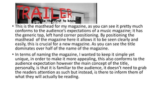
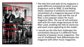
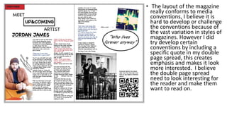
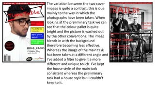
The document discusses how the student's media product compares to real media products in its use of conventions and forms. It describes how the masthead conforms to expectations by being positioned in the top left corner but challenges conventions with its unique title font. The layout conforms to magazine conventions but includes developed elements like a quote in the double page spread. The student learned about using tools in Photoshop and InDesign to edit images and layout pages professionally. Overall it improved from the preliminary task by having a more balanced and appealing design.
Model Attribute Check Company Auto PropertyCeline George
In Odoo, the multi-company feature allows you to manage multiple companies within a single Odoo database instance. Each company can have its own configurations while still sharing common resources such as products, customers, and suppliers.
2024.06.01 Introducing a competency framework for languag learning materials ...Sandy Millin
http://sandymillin.wordpress.com/iateflwebinar2024
Published classroom materials form the basis of syllabuses, drive teacher professional development, and have a potentially huge influence on learners, teachers and education systems. All teachers also create their own materials, whether a few sentences on a blackboard, a highly-structured fully-realised online course, or anything in between. Despite this, the knowledge and skills needed to create effective language learning materials are rarely part of teacher training, and are mostly learnt by trial and error.
Knowledge and skills frameworks, generally called competency frameworks, for ELT teachers, trainers and managers have existed for a few years now. However, until I created one for my MA dissertation, there wasn’t one drawing together what we need to know and do to be able to effectively produce language learning materials.
This webinar will introduce you to my framework, highlighting the key competencies I identified from my research. It will also show how anybody involved in language teaching (any language, not just English!), teacher training, managing schools or developing language learning materials can benefit from using the framework.
We all have good and bad thoughts from time to time and situation to situation. We are bombarded daily with spiraling thoughts(both negative and positive) creating all-consuming feel , making us difficult to manage with associated suffering. Good thoughts are like our Mob Signal (Positive thought) amidst noise(negative thought) in the atmosphere. Negative thoughts like noise outweigh positive thoughts. These thoughts often create unwanted confusion, trouble, stress and frustration in our mind as well as chaos in our physical world. Negative thoughts are also known as “distorted thinking”.
How to Split Bills in the Odoo 17 POS ModuleCeline George
Bills have a main role in point of sale procedure. It will help to track sales, handling payments and giving receipts to customers. Bill splitting also has an important role in POS. For example, If some friends come together for dinner and if they want to divide the bill then it is possible by POS bill splitting. This slide will show how to split bills in odoo 17 POS.
Welcome to TechSoup New Member Orientation and Q&A (May 2024).pdfTechSoup
In this webinar you will learn how your organization can access TechSoup's wide variety of product discount and donation programs. From hardware to software, we'll give you a tour of the tools available to help your nonprofit with productivity, collaboration, financial management, donor tracking, security, and more.
Operation “Blue Star” is the only event in the history of Independent India where the state went into war with its own people. Even after about 40 years it is not clear if it was culmination of states anger over people of the region, a political game of power or start of dictatorial chapter in the democratic setup.
The people of Punjab felt alienated from main stream due to denial of their just demands during a long democratic struggle since independence. As it happen all over the word, it led to militant struggle with great loss of lives of military, police and civilian personnel. Killing of Indira Gandhi and massacre of innocent Sikhs in Delhi and other India cities was also associated with this movement.
The Art Pastor's Guide to Sabbath | Steve ThomasonSteve Thomason
What is the purpose of the Sabbath Law in the Torah. It is interesting to compare how the context of the law shifts from Exodus to Deuteronomy. Who gets to rest, and why?
The Roman Empire A Historical Colossus.pdfkaushalkr1407
The Roman Empire, a vast and enduring power, stands as one of history's most remarkable civilizations, leaving an indelible imprint on the world. It emerged from the Roman Republic, transitioning into an imperial powerhouse under the leadership of Augustus Caesar in 27 BCE. This transformation marked the beginning of an era defined by unprecedented territorial expansion, architectural marvels, and profound cultural influence.
The empire's roots lie in the city of Rome, founded, according to legend, by Romulus in 753 BCE. Over centuries, Rome evolved from a small settlement to a formidable republic, characterized by a complex political system with elected officials and checks on power. However, internal strife, class conflicts, and military ambitions paved the way for the end of the Republic. Julius Caesar’s dictatorship and subsequent assassination in 44 BCE created a power vacuum, leading to a civil war. Octavian, later Augustus, emerged victorious, heralding the Roman Empire’s birth.
Under Augustus, the empire experienced the Pax Romana, a 200-year period of relative peace and stability. Augustus reformed the military, established efficient administrative systems, and initiated grand construction projects. The empire's borders expanded, encompassing territories from Britain to Egypt and from Spain to the Euphrates. Roman legions, renowned for their discipline and engineering prowess, secured and maintained these vast territories, building roads, fortifications, and cities that facilitated control and integration.
The Roman Empire’s society was hierarchical, with a rigid class system. At the top were the patricians, wealthy elites who held significant political power. Below them were the plebeians, free citizens with limited political influence, and the vast numbers of slaves who formed the backbone of the economy. The family unit was central, governed by the paterfamilias, the male head who held absolute authority.
Culturally, the Romans were eclectic, absorbing and adapting elements from the civilizations they encountered, particularly the Greeks. Roman art, literature, and philosophy reflected this synthesis, creating a rich cultural tapestry. Latin, the Roman language, became the lingua franca of the Western world, influencing numerous modern languages.
Roman architecture and engineering achievements were monumental. They perfected the arch, vault, and dome, constructing enduring structures like the Colosseum, Pantheon, and aqueducts. These engineering marvels not only showcased Roman ingenuity but also served practical purposes, from public entertainment to water supply.
Overview on Edible Vaccine: Pros & Cons with Mechanism
Media Magazine Evaluation - Sabina hoque
1. In what way does
your media product
use, develop or
challenge forms and
conventions of real
media products?
2. • This is the masthead for my magazine, as you can see it pretty much
conforms to the audience’s expectations of a music magazine; it has
the generic top, left hand corner positioning. By positioning the
masthead of the magazine here it allows it to be seen clearly and
easily, this is crucial for a new magazine. As you can see the title
dominates over half of the name of the magazine.
• In terms of naming the magazine, I wanted to keep it simple yet
unique, in order to make it more appealing, this also conforms to the
audience expectation however the main concept of the title,
personally, is that it is familiar to the audience, it doesn’t need to grab
the readers attention as such but instead, is there to inform them of
what they will actually be reading.
3. • The title font and style of my magazine is
quite different compared to other music
magazines such as NME, Q and Rolling
Stone, however it conforms to certain
conventions of a magazine because of the
bold, capital letters used and the use of
Red, a very popular colour for music
magazine titles. The use of red contrasts
well with the main image because of the
filter used, enabling the title to stand out
and seem more appealing to the reader.
• I would say the title font challenges the
conventions because it is different from
majority of popular music magazines. The
use of ‘chalkboard’ font differentiates the
magazine with other music magazines.
4. • The layout of the magazine
really conforms to media
conventions, I believe it is
hard to develop or challenge
the conventions because of
the vast variation in styles of
magazines. However I did
try develop certain
conventions by including a
specific quote in my double
page spread, this creates
emphasis and makes it look
more interested. I believe
the double page spread
need to look interesting for
the reader and make them
want to read on.
5. • My contents page really conforms
to the conventions of a music
magazine because of the split
columns and labelled categories; I
believe this is a good presentation
technique. I kept the title for the
contents as ‘Trailer Contents’, that
way it is quite straight forward and
it fits in nicely with the title of the
magazine.
6. How does your media
product represent
particular social
groups?
7. • I believe my magazine does not represent only one specific music
genre, I’ve designed it so it appeals to different social groups,
however specifically for those who are into new, raw talent or looking
to be discovered. There is no specific class and for this magazine
however it is less likely to appeal to those of an upper class due to its
laid back appearance. The images used in the magazine are of
unknown or new artist, which can draw people into the magazine in
order to acknowledge who it is. Also I intentionally did not include
any top artist as it can send out mix messages to the reader and
overpower other articles.
• The image used in the double page spread was taken at a coffee place
and was shown in that way to reflect on the magazines personality
and relate with people who may read the magazine, as I believe
people who would read this is most likely to be middle class,
struggling artists or established artists looking for raw talent.
8. What kind of media
institution might
distribute your media
product and why??
9. • My target audience is based upon people aged from mid teens towards
late thirties; this means that they will desire a reasonably priced magazine
which is easy to pick up in a convenient store. I think that my magazine
would be best distributed in stores like WHSmiths, maybe even
supermarkets chains such as Tesco metro. As well as this it could be
distributed to smaller stores which specialised to music, for example HV
and smaller localised stores. Another way of buying and selling goods that
has become quite popular over the few years is via the internet. Having an
online distribution will help get the magazine around further. Going further
on the use of internet selling a rapidly growing craze is to issue
downloadable apps that supply magazine subscriptions through mobile
devices. This is a new and smart way of distributing magazines especially to
those who are unable to purchase them from stores.
• In terms of availability to buy the magazine, I think the best method for this
would be the option of buying weekly and also the option of buying a
subscription. This allows the customer to pick and choose when they want
to buy the magazine.
10. • IPC distribute many magazines such NME, Woman’s weekly, Uncut, TV
easy and many more. This is a spread of magazines which are very
well known and so there is an identity between IPC and the
audiences. By choosing IPC I can take advantage of the connection
between the company and the buyers therefore promoting my
magazine with the well known standard of service the company has.
• Another company that distribute magazines is the Bauer media
company; however, I decided that this was not suitable for my
magazine as the type of media it deals with are very different to the
kind of company that I’m looking for despite it’s already well know
name.
11. Who would be the audience
for your media product??
12. • My target audience for my music magazine would be aged between
the late teens and their late thirties, this is quite a range but I believe
it is suitable for the kind of magazine I am promoting, this is backed
up further by the price of the magazine, it has to be affordable
because of the age of the audience, I’d like to think that my target
audience would also contain of both male and female, even if this
issue of the magazine seems to include mostly male profiles, however
it’s placed and written in a way to appeal to both genders. Another
thing to consider when talking about target audience is their taste in
music, quite obviously. I think my target audience would have what I
consider a varied taste in music, they don’t just prefer to stick to one
genre of music but look to embrace other types. I think the main aim
for me with my target audience is someone who has real appreciation
for music and musicians.
15. I used a simple font, so it was clear for my audience to read, but I
varied my font style and size to make the writing more exciting.
Another thing, my regular audience would be interested in interacting
with the music magazine company, there fore I had mention a
‘supporters column’ in my Coverlines, to make them want to open my
magazine and read further.
After researching prices of other popular
music magazines and just magazines in
general I noticed most of them varied
between £1-£4. hence why I decided to go
with a price of £1.99, which is the most
common price I had found. Also this price
is affordable for my target audience.
16. I used this particular puff for my front cover
because this appeals to my target audience,
as the modern generation are all about
downloadable music and advertising
anything for free attracts attention and is
appealing to a range of ages.
18. For my audience to be attracted to the image, I
needed to pose my model in a fun and unique pose.
On this photo, I included the term ‘rising star’ to
attract readers.
I used an enlarged font size for the page
numbers of the features mentioned on my
contents page as this makes it easier for
my readers to see what they want to look
at and flick straight to the page and article
they want to read. This is particularly
aimed at my younger audience, as they are
known for not wanting to read too much
text. This feature is a common technique
used by other magazines of the same and
different genre.
20. I used a large font in my heading to emphasis the
artists name. this attracts my audience as once they
have acknowledged the artist, they will want to read
more. I kept the heading in Bold to make it stand out
compared to the other text.
This is a pull quote, by using this it gives the reader
an initial look into the interview without having to
read the whole thing. By reading the pull quote, it
will encourage the audience into wanting to find
out more about the artist.
The section title is located on the top left corner of the
page, this will help the reader in finding the page in
which the interview is on. By having this it attracts the
audience attention and encourages them to read on.
21. Having an image of the album helps in promoting the artist and
captures the readers attention as my target audience is based on
people who have a passion for music. Having this image makes the
page a touch more appealing.
Having this exclusive feature entices the audience into finding out more
about the music magazine and the artist in the interview. This is a new
feature that will appeal to my target audience as majority of the present
generation is into new and developed technology, making this feature
even more useful in attracting the reader.
22. What have you learnt
about technology
from the process of
constructing this
product??
23. • Equipment based I used a ‘Sony Cyber shot Camera DSCH200’ and My
smart phone ‘Apple IPhone 4S’ to take the pictures I have used in my music
magazine. These two were very useful as one allowed me to take really
good quality images, where the other allowed me to fiddle around with
different effects while taking the actual picture. I also used a Laptop to
store and operate the programmes I used to edit the music magazine
together.
• For the Cover of the magazine and majority of the image editing I used
Photoshop. Through this process I learnt how to use he tools on the
programme effectively and I learnt different ways of improving the images
quality. The main tools I used include the crop tool, text tool, lasso tools. I
also used InDesign for both my Contents page and double page spread as I
found it was the best choice for the layout and tools needed. This is
because InDesign allow me to create guidelines for columns and rows for
my text on both the double page spread and contents page. I also used
Microsoft word when making notes and writing up the interview I had
carried out for my double page spread. Lastly I used Microsoft PowerPoint
to create my evaluation as I am aware of it’s features and how to use it ,
therefore finding it appropriate.
• I also used Blogger to upload my music magazine work online.
25. Looking back at your
preliminary task,
what do you feel you
have learnt in the
progression from it to
the full product??
26. • These are the two mastheads I have used in my work, in terms of layout
they a very different pieces of work. By looking at the first images
(preliminary work) you can see that the title is spread across the whole top
section of the page and slightly tilted, I wouldn’t say that this looks
particularly professional or effective, however comparing it to the second
piece of work you can see signs of improvement. The improvement comes
from the positioning of the title amongst other aspects. As you can see the
masthead dominates over two thirds of the page, this is creating a
balanced sense fro the page in which the focus is not only on the one side
of the page. The font is also an aspect that adds to the difference of the
two pages, as you can see the text in the preliminary task looks much
softer, smaller and therefore less effective, whereas the main task has a
title that uses Bold capital letters, this looks far more effective and
professional. I have also included a slogan on my masthead just to soften it
a little bit.
27. The variation between the two cover
images is quite a contrast, this is due
mainly to the way in which the
photographs have been taken. When
looking at the preliminary task we can
see that the colour pallet is quite
bright and the picture is washed out
by the other conventions. The image
blends in with the background
therefore becoming less effective.
Whereas the image of the main task
has been taken at a different angle and
I’ve added a filter to give it a more
different and unique touch. I’ve kept
the house style of the main task
consistent whereas the preliminary
task had a house style but I couldn’t
keep to it.
28. Looking at the layout
between the two tasks
you can see they are
drastically different. On
the preliminary task I
wanted to create a
timetable themed
contents page to match
with the type of magazine
I am creating.
Unfortunately I was
unable to officially finish
my contents page
because of my lack of
time management
skills. The preliminary task doesn’t have quite a structured layout, however, I think
after looking into the conventions of magazines more, I was able to develop a better
and far more professional looking layout which is separated up and easy to look at.
The contents page for the main task is laid out far more neatly and looks more
appealing to the eye.