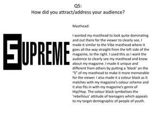
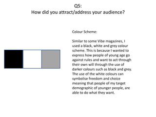
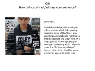
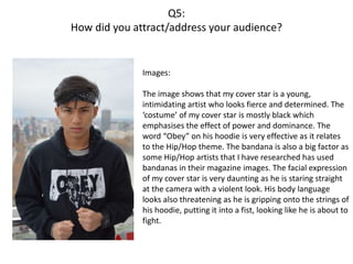
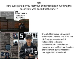
G321 Media Studies
Evaluation
Vince Reyes
Question 1:
In what ways does your media product use, develop or challenge forms and conventions of real
media products?
Question 2:
How does your media product represent particular social groups?
Question 3:
What kind of media institution might distribute your media product and why?
Question 4:
Who would be the audience for your media product?
Question 5:
How did you attract/address your audience?
Question 6:
What have you learnt about technologies from the process of constructing the product?
Question 7:
Looking back to your preliminary task, what do you feel that you have learnt in the progression
from it to the full product?
Question 8:
How successful do you feel your end product is in fulfilling the task? How well does it fit the
brief?
Q1:
In what ways does your media product use,
develop or challenge forms and
conventions of real media products?
Q1:
In what ways does your media product use, develop or challenge
forms and conventions of real media products?
In my magazine, I had to include the codes and conventions of a real magazine. In order to learn
how to do this, I analysed many popular magazines such as ‘XXL’, ‘Q’ and ‘Vibe’ which helped me
point out the codes and conventions and what effect it has on the magazine.
https://4.bp.blogspot.com/-xxPH6XYIFl4/V-
PDPyE3c3I/AAAAAAAAACw/nAfgt36vJSIFqt1KR38uVoylwFqjHCO9QCLcB/s1600/Hip-
Hop%2Bmagazine%2Banalysis.jpg
After learning the codes and conventions, I
applied them into a made up magazine that I had
to produce.
http://vincereyesmedia.blogspot.co.uk/2016/11/
layout-exercise.html
This task enabled me to understand where to put
my cover lines and what type of cover lines to
use with which genre. It also helped me pick
what cover lines to use in my own magazine.
Q1:
In what ways does your media product use, develop or challenge
forms and conventions of real media products?
Front Cover:
After learning how to put the generic
conventions, I applied my profound knowledge
into making my own magazine.
I thought about how to put each convention in
the front cover whilst keeping in mind the rules
and conventions of a typical music magazine.
I made sure that the cover lines surrounded
the cover star so that the viewer’s eye would
be focused on the main image of the cover star.
From this, I made sure that my main cover line
got the attention of the viewer first rather than
the cover lines grabbing the viewer’s eye first.
Q1:
In what ways does your media product use, develop or challenge
forms and conventions of real media products?
Influences: http://vincereyesmedia.blogspot.
co.uk/2016/12/drafting-planning-
masthead-influence.html
http://vincereyesmedia.blogspot.
co.uk/2016/11/research-into-
similar-products.html
The “F” in this Fader
masthead gave me
an idea to have this
border around my
“S” in my Supreme
masthead to make it
look more appealing.
I liked the way how the name of
the cover star and the main
cover line is presented in this
cover and so It influenced me
to make it similar to how it is
presented in my front cover.
Q1:
In what ways does your media product use, develop or challenge
forms and conventions of real media products?
http://vincereyesmedia.blo
gspot.co.uk/2016/12/drafti
ng-planning-contents-
page.html
Contents Page:
My influence in making my
contents page was a “Billboard”
contents page which involved the
main cover star in the middle of the
page, viewed clearly with some
secondary cover artists on the side.
I really liked this idea of having the
main cover star in the middle and
having secondary cover stars on the
side so I included 2 of my
secondary cover stars and put them
on the side of the contents page. I
also made it that my main cover
star is clearly visible in the page.
Q1:
In what ways does your media product use, develop or challenge
forms and conventions of real media products?
http://vincereyesmedia.blogspo
t.co.uk/2016/12/drafting-and-
planning-double-page.html
Double Page Spread:
I was influenced by a “Jared Leto” double page spread
cover when thinking about how to present/set out my
own double page.
I liked the way how the text on the left side of the page
is set out and wanted to make my description similar to
this. However, I didn’t want everything to be the same
as I wanted the whole two pages to have the
background of the image instead of having a blank
white page on 1 and an image on the another.
Q2:
How does your media product represent
particular social groups?
Q2:
How does your media product represent particular social
groups?
My magazine is aimed towards teenagers and
young adults in their low 20’s who are inspired
and absorbed in the Hip/Hop music culture
and style. Magazine’s such as “Vibe” and “XXL”
contributed with my understanding of how to
apply a sense of ‘intimidation’ and ‘aggression’
into my magazine which is a huge aspect in the
Hip/Hop world.
I gave my cover star “King Rey”, the look of a
determined, but “been through tough times”
type of person as a typical Hip/Hop artist has a
dark past where they have struggled to get
where they are today. This can encourage
teenagers to feel more confident to work for
their success if they are from a bad
background or have a undesirable past.
Q2:
How does your media product represent particular social
groups?
These images of my secondary cover
stars further emphasises my magazine’s
genre of ‘Hip/Hop’ since the colour
black is used quite often throughout my
magazine (in text, images and even the
costume of the cover stars).
The colour black can symbolise the
youth being ‘rebellious’ or ‘defiant’
which fits into the mood or genre of my
magazine.
I have also made it that my magazine
consists of only males. This is due to
how males are the ones who are
stereotypically known to be the more
‘dominant’ and ‘disobedient’
individuals which is why I kept to this
stereotype.
Q3:
What kind of media institution might distribute your
media product and why?
Q3:
What kind of media institution might distribute your media
product and why?
I have research many different publishing companies to see which company
would suit my magazine’s genre.
http://vincereyesmedia.blogspot.co.uk/2016/11/research-into-similar-
products-magazine.html
http://vincereyesmedia.blogspot.co.uk/2016/10/research-into-similar-
products_17.html
http://vincereyesmedia.blogspot.co.uk/2016/10/research-into-similar-
products_16.html
Q3:
What kind of media institution might distribute your media
product and why?
The media institution that I chose to distribute my
media product is Eldridge Industries
https://en.wikipedia.org/wiki/Eldridge_Industries
This institution publishes “Vibe” magazines, which is a popular magazine in the
world. It also publishes content similar to my magazine genre which would work
well with the company and so we would both benefit. Since it publishes regular
‘Hip/Hop’ content, the institution must already have urban fans and so my
magazine would fit exceptionally with the institution. The target audience for
“Vibe” is from 18 to 34 which is similar to my magazine target audience. This
would further emphasise how my magazine would fit with the institution’s image.
Q4:
Who would be the audience for your media
product?
Q4:
Who would be the audience for your media product?
My magazine targets urban, hip/hop followers
who are teenagers and young adults in their low
20’s. as I want my magazine to attract people in
their youth.
Vibe also has a similar target
audience and so the ‘Remake
Remodel’ task has helped me
understand how Vibe’s magazine is
laid out and how the cover star
should look/act.
The target audience of Vibe is from
18-34 which helped me create an
idea of how to present my cover
star which would be best suitable
to people of this age.
http://vincereyesmedia.blogspot.co
.uk/2016/11/target-audience-
identifying-demographic.html
Q5:
How did you attract/address your audience?
Q5:
How did you attract/address your audience?
Masthead:
I wanted my masthead to look quite dominating
and out there for the viewer to clearly see. I
made it similar to the Vibe masthead where it
goes all the way straight from the left side of the
magazine, to the right. I used this as I want the
audience to clearly see my masthead and know
about my magazine. I made it unique and
different from others by putting a ‘block’ on the
“S” of my masthead to make it more memorable
for the viewer. I also made it a colour black as It
matches with my magazine’s colour scheme and
it also fits in with my magazine’s genre of
Hip/Hop. The colour black symbolises the
‘rebellious’ attitude of teenagers which appeals
to my target demographic of people of youth.
Q5:
How did you attract/address your audience?
Colour Scheme:
Similar to some Vibe magazines, I
used a black, white and grey colour
scheme. This is because I wanted to
express how people of young age go
against rules and want to act through
their own will through the use of
darker colours such as black and grey.
The use of the white colours can
symbolise freedom and choice
meaning that people of my target
demographic of younger people, are
able to do what they want.
Q5:
How did you attract/address your audience?
Cover lines:
I used simple black, white and grey
colour scheme which links into my
magazine genre of Hip/Hop. I also
used language relating to Hip/Hop so
that it appeals to the urban fans. The
language also fits the age group of
teenagers and young adults. My main
cover line “Protect your throne”
hugely relates to my Hip/Hop genre
which may appeal to urban fans.
Q5:
How did you attract/address your audience?
Images:
The image shows that my cover star is a young,
intimidating artist who looks fierce and determined. The
‘costume’ of my cover star is mostly black which
emphasises the effect of power and dominance. The
word “Obey” on his hoodie is very effective as it relates
to the Hip/Hop theme. The bandana is also a big factor as
some Hip/Hop artists that I have researched has used
bandanas in their magazine images. The facial expression
of my cover star is very daunting as he is staring straight
at the camera with a violent look. His body language
looks also threatening as he is gripping onto the strings of
his hoodie, putting it into a fist, looking like he is about to
fight.
Q6:
What have you learnt about technologies from the process of
constructing the product?
Q6:
What have you learnt about technologies from the process of
constructing the product?
Page Plus Paint. Net Microsoft Publisher
Able to save file as a PDF file Perfect for making a magazine as
you can manipulate photos as such
Easy to learn and understand how to
use
Contains a range of fonts which you
could use to pick for your genre of
magazine
Able to layer your photos to pick
which goes in front of what photo
Able to save the document as a JPEG
Able to layer your photos to pick
which goes in front of what photo
Different tools such as ‘lasso’ tool to
select selected parts of an image.
Able to crop photos
Easy to use Canvas size can be changed to give a
realistic feel when making the
magazine
During the process of constructing my product, I used several
software's to help create my magazine. In the table below, I will
show the strengths of these software's.
Q6:
What have you learnt about technologies from the process of
constructing the product?
Page Plus Paint. Net Microsoft Publisher
Quality of effect applied to an image
is not in good quality
Can take a lot of time as cutting tool
is difficult to use
Limited amount of things to do in
this programme
Limited choices such as shapes and
brush effects
Once you type a piece of text onto
the photo, after you click off of it,
you cannot edit it again
Not efficient programme to use
when making a magazine
Less professional and not as efficient
as PagePlus
Weaknesses of the software’s:
Q6:
What have you learnt about technologies from the process of
constructing the product?
Drafting & Planning:
When making my magazine, I saved different images and drafts of my front
cover/double page spread as I wasn’t sure what layout to use at the time.
http://vincereyesmedia.blogspot.co.uk/2017/01/planning-drafting-double-page-
idea.html
http://vincereyesmedia.blogspot.co.uk/2017/01/drafting-planning-front-cover-
options.html
Q6:
What have you learnt about technologies from the process of
constructing the product?
Blogger was a great experience
in general. It allowed me to
show my first steps in my
product until the final piece.
Blogger is quite simple and
easy to use as we can just make
new posts and upload our
work. Also, blogger is
accessible to everyone and so
we are able to see anyone’s
blog.
Q7:
Looking back to your preliminary task, what do you feel that you
have learnt in the progression from it to the full product?
Q7:
Looking back to your preliminary task, what do you feel that you
have learnt in the progression from it to the full product?
Preliminary Task: Final Product:
In the preliminary task, it is
clear to see what had to be
improved and what was
wrong in this piece. My
coverlines were very
limited, the font was quite
simple and overall my
magazine was basic and did
not fit the conventions of a
typical magazine.
However, in my final piece, I
included all of the
conventions of a magazine
and made it as close to a
professional magazine front
cover as possible.
Q7:
Looking back to your preliminary task, what do you feel that you
have learnt in the progression from it to the full product?
Preliminary Task:
Final Product:From my preliminary task, I have
clearly improved significantly due
to my knowledge of codes &
conventions of a contents page.
My preliminary task had limited
description and the font was very
simple and the layout of the page
was very basic.
In my final piece, It was clearly
more professional and included
conventions of a typical contents
page, having more description
and having ‘Extras’ and
secondary images.
Q8:
How successful do you feel your end product is in fulfilling the
task? How well does it fit the brief?
Overall, I feel proud with what I
created and I believe that it fits the
Hip/Hop genre quite well. I
followed the codes and
conventions of a typical music
magazine and so I feel that I made a
professional Hip/Hop magazine
that appeals to urban fans!

G321 Media Studies Evaluation Vince Reyes

  • 1.
  • 2.
    Question 1: In whatways does your media product use, develop or challenge forms and conventions of real media products? Question 2: How does your media product represent particular social groups? Question 3: What kind of media institution might distribute your media product and why? Question 4: Who would be the audience for your media product? Question 5: How did you attract/address your audience? Question 6: What have you learnt about technologies from the process of constructing the product? Question 7: Looking back to your preliminary task, what do you feel that you have learnt in the progression from it to the full product? Question 8: How successful do you feel your end product is in fulfilling the task? How well does it fit the brief?
  • 3.
    Q1: In what waysdoes your media product use, develop or challenge forms and conventions of real media products?
  • 4.
    Q1: In what waysdoes your media product use, develop or challenge forms and conventions of real media products? In my magazine, I had to include the codes and conventions of a real magazine. In order to learn how to do this, I analysed many popular magazines such as ‘XXL’, ‘Q’ and ‘Vibe’ which helped me point out the codes and conventions and what effect it has on the magazine. https://4.bp.blogspot.com/-xxPH6XYIFl4/V- PDPyE3c3I/AAAAAAAAACw/nAfgt36vJSIFqt1KR38uVoylwFqjHCO9QCLcB/s1600/Hip- Hop%2Bmagazine%2Banalysis.jpg After learning the codes and conventions, I applied them into a made up magazine that I had to produce. http://vincereyesmedia.blogspot.co.uk/2016/11/ layout-exercise.html This task enabled me to understand where to put my cover lines and what type of cover lines to use with which genre. It also helped me pick what cover lines to use in my own magazine.
  • 5.
    Q1: In what waysdoes your media product use, develop or challenge forms and conventions of real media products? Front Cover: After learning how to put the generic conventions, I applied my profound knowledge into making my own magazine. I thought about how to put each convention in the front cover whilst keeping in mind the rules and conventions of a typical music magazine. I made sure that the cover lines surrounded the cover star so that the viewer’s eye would be focused on the main image of the cover star. From this, I made sure that my main cover line got the attention of the viewer first rather than the cover lines grabbing the viewer’s eye first.
  • 6.
    Q1: In what waysdoes your media product use, develop or challenge forms and conventions of real media products? Influences: http://vincereyesmedia.blogspot. co.uk/2016/12/drafting-planning- masthead-influence.html http://vincereyesmedia.blogspot. co.uk/2016/11/research-into- similar-products.html The “F” in this Fader masthead gave me an idea to have this border around my “S” in my Supreme masthead to make it look more appealing. I liked the way how the name of the cover star and the main cover line is presented in this cover and so It influenced me to make it similar to how it is presented in my front cover.
  • 7.
    Q1: In what waysdoes your media product use, develop or challenge forms and conventions of real media products? http://vincereyesmedia.blo gspot.co.uk/2016/12/drafti ng-planning-contents- page.html Contents Page: My influence in making my contents page was a “Billboard” contents page which involved the main cover star in the middle of the page, viewed clearly with some secondary cover artists on the side. I really liked this idea of having the main cover star in the middle and having secondary cover stars on the side so I included 2 of my secondary cover stars and put them on the side of the contents page. I also made it that my main cover star is clearly visible in the page.
  • 8.
    Q1: In what waysdoes your media product use, develop or challenge forms and conventions of real media products? http://vincereyesmedia.blogspo t.co.uk/2016/12/drafting-and- planning-double-page.html Double Page Spread: I was influenced by a “Jared Leto” double page spread cover when thinking about how to present/set out my own double page. I liked the way how the text on the left side of the page is set out and wanted to make my description similar to this. However, I didn’t want everything to be the same as I wanted the whole two pages to have the background of the image instead of having a blank white page on 1 and an image on the another.
  • 9.
    Q2: How does yourmedia product represent particular social groups?
  • 10.
    Q2: How does yourmedia product represent particular social groups? My magazine is aimed towards teenagers and young adults in their low 20’s who are inspired and absorbed in the Hip/Hop music culture and style. Magazine’s such as “Vibe” and “XXL” contributed with my understanding of how to apply a sense of ‘intimidation’ and ‘aggression’ into my magazine which is a huge aspect in the Hip/Hop world. I gave my cover star “King Rey”, the look of a determined, but “been through tough times” type of person as a typical Hip/Hop artist has a dark past where they have struggled to get where they are today. This can encourage teenagers to feel more confident to work for their success if they are from a bad background or have a undesirable past.
  • 11.
    Q2: How does yourmedia product represent particular social groups? These images of my secondary cover stars further emphasises my magazine’s genre of ‘Hip/Hop’ since the colour black is used quite often throughout my magazine (in text, images and even the costume of the cover stars). The colour black can symbolise the youth being ‘rebellious’ or ‘defiant’ which fits into the mood or genre of my magazine. I have also made it that my magazine consists of only males. This is due to how males are the ones who are stereotypically known to be the more ‘dominant’ and ‘disobedient’ individuals which is why I kept to this stereotype.
  • 12.
    Q3: What kind ofmedia institution might distribute your media product and why?
  • 13.
    Q3: What kind ofmedia institution might distribute your media product and why? I have research many different publishing companies to see which company would suit my magazine’s genre. http://vincereyesmedia.blogspot.co.uk/2016/11/research-into-similar- products-magazine.html http://vincereyesmedia.blogspot.co.uk/2016/10/research-into-similar- products_17.html http://vincereyesmedia.blogspot.co.uk/2016/10/research-into-similar- products_16.html
  • 14.
    Q3: What kind ofmedia institution might distribute your media product and why? The media institution that I chose to distribute my media product is Eldridge Industries https://en.wikipedia.org/wiki/Eldridge_Industries This institution publishes “Vibe” magazines, which is a popular magazine in the world. It also publishes content similar to my magazine genre which would work well with the company and so we would both benefit. Since it publishes regular ‘Hip/Hop’ content, the institution must already have urban fans and so my magazine would fit exceptionally with the institution. The target audience for “Vibe” is from 18 to 34 which is similar to my magazine target audience. This would further emphasise how my magazine would fit with the institution’s image.
  • 15.
    Q4: Who would bethe audience for your media product?
  • 16.
    Q4: Who would bethe audience for your media product? My magazine targets urban, hip/hop followers who are teenagers and young adults in their low 20’s. as I want my magazine to attract people in their youth. Vibe also has a similar target audience and so the ‘Remake Remodel’ task has helped me understand how Vibe’s magazine is laid out and how the cover star should look/act. The target audience of Vibe is from 18-34 which helped me create an idea of how to present my cover star which would be best suitable to people of this age. http://vincereyesmedia.blogspot.co .uk/2016/11/target-audience- identifying-demographic.html
  • 17.
    Q5: How did youattract/address your audience?
  • 18.
    Q5: How did youattract/address your audience? Masthead: I wanted my masthead to look quite dominating and out there for the viewer to clearly see. I made it similar to the Vibe masthead where it goes all the way straight from the left side of the magazine, to the right. I used this as I want the audience to clearly see my masthead and know about my magazine. I made it unique and different from others by putting a ‘block’ on the “S” of my masthead to make it more memorable for the viewer. I also made it a colour black as It matches with my magazine’s colour scheme and it also fits in with my magazine’s genre of Hip/Hop. The colour black symbolises the ‘rebellious’ attitude of teenagers which appeals to my target demographic of people of youth.
  • 19.
    Q5: How did youattract/address your audience? Colour Scheme: Similar to some Vibe magazines, I used a black, white and grey colour scheme. This is because I wanted to express how people of young age go against rules and want to act through their own will through the use of darker colours such as black and grey. The use of the white colours can symbolise freedom and choice meaning that people of my target demographic of younger people, are able to do what they want.
  • 20.
    Q5: How did youattract/address your audience? Cover lines: I used simple black, white and grey colour scheme which links into my magazine genre of Hip/Hop. I also used language relating to Hip/Hop so that it appeals to the urban fans. The language also fits the age group of teenagers and young adults. My main cover line “Protect your throne” hugely relates to my Hip/Hop genre which may appeal to urban fans.
  • 21.
    Q5: How did youattract/address your audience? Images: The image shows that my cover star is a young, intimidating artist who looks fierce and determined. The ‘costume’ of my cover star is mostly black which emphasises the effect of power and dominance. The word “Obey” on his hoodie is very effective as it relates to the Hip/Hop theme. The bandana is also a big factor as some Hip/Hop artists that I have researched has used bandanas in their magazine images. The facial expression of my cover star is very daunting as he is staring straight at the camera with a violent look. His body language looks also threatening as he is gripping onto the strings of his hoodie, putting it into a fist, looking like he is about to fight.
  • 22.
    Q6: What have youlearnt about technologies from the process of constructing the product?
  • 23.
    Q6: What have youlearnt about technologies from the process of constructing the product? Page Plus Paint. Net Microsoft Publisher Able to save file as a PDF file Perfect for making a magazine as you can manipulate photos as such Easy to learn and understand how to use Contains a range of fonts which you could use to pick for your genre of magazine Able to layer your photos to pick which goes in front of what photo Able to save the document as a JPEG Able to layer your photos to pick which goes in front of what photo Different tools such as ‘lasso’ tool to select selected parts of an image. Able to crop photos Easy to use Canvas size can be changed to give a realistic feel when making the magazine During the process of constructing my product, I used several software's to help create my magazine. In the table below, I will show the strengths of these software's.
  • 24.
    Q6: What have youlearnt about technologies from the process of constructing the product? Page Plus Paint. Net Microsoft Publisher Quality of effect applied to an image is not in good quality Can take a lot of time as cutting tool is difficult to use Limited amount of things to do in this programme Limited choices such as shapes and brush effects Once you type a piece of text onto the photo, after you click off of it, you cannot edit it again Not efficient programme to use when making a magazine Less professional and not as efficient as PagePlus Weaknesses of the software’s:
  • 25.
    Q6: What have youlearnt about technologies from the process of constructing the product? Drafting & Planning: When making my magazine, I saved different images and drafts of my front cover/double page spread as I wasn’t sure what layout to use at the time. http://vincereyesmedia.blogspot.co.uk/2017/01/planning-drafting-double-page- idea.html http://vincereyesmedia.blogspot.co.uk/2017/01/drafting-planning-front-cover- options.html
  • 26.
    Q6: What have youlearnt about technologies from the process of constructing the product? Blogger was a great experience in general. It allowed me to show my first steps in my product until the final piece. Blogger is quite simple and easy to use as we can just make new posts and upload our work. Also, blogger is accessible to everyone and so we are able to see anyone’s blog.
  • 27.
    Q7: Looking back toyour preliminary task, what do you feel that you have learnt in the progression from it to the full product?
  • 28.
    Q7: Looking back toyour preliminary task, what do you feel that you have learnt in the progression from it to the full product? Preliminary Task: Final Product: In the preliminary task, it is clear to see what had to be improved and what was wrong in this piece. My coverlines were very limited, the font was quite simple and overall my magazine was basic and did not fit the conventions of a typical magazine. However, in my final piece, I included all of the conventions of a magazine and made it as close to a professional magazine front cover as possible.
  • 29.
    Q7: Looking back toyour preliminary task, what do you feel that you have learnt in the progression from it to the full product? Preliminary Task: Final Product:From my preliminary task, I have clearly improved significantly due to my knowledge of codes & conventions of a contents page. My preliminary task had limited description and the font was very simple and the layout of the page was very basic. In my final piece, It was clearly more professional and included conventions of a typical contents page, having more description and having ‘Extras’ and secondary images.
  • 30.
    Q8: How successful doyou feel your end product is in fulfilling the task? How well does it fit the brief? Overall, I feel proud with what I created and I believe that it fits the Hip/Hop genre quite well. I followed the codes and conventions of a typical music magazine and so I feel that I made a professional Hip/Hop magazine that appeals to urban fans!