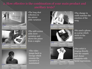
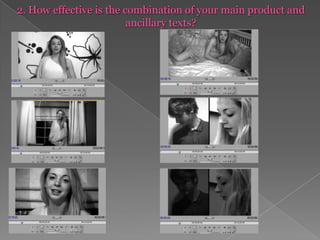
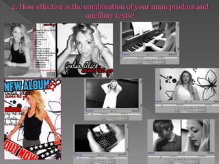
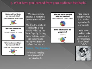
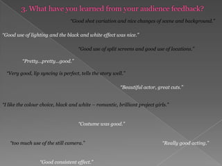
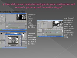
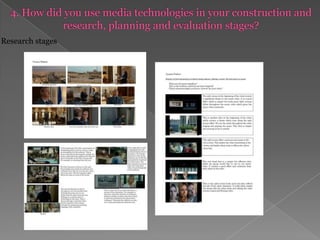
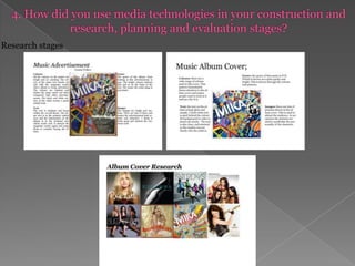
This document discusses the evaluation of a student media project creating a music video. It addresses how the video used or challenged conventions of real music videos through its camera shots, editing, sound, and more. Feedback on the video was also positive, praising the shot variation, lighting, split screens, and storytelling. In planning and construction, the students used Adobe Premier to add text and change the video to black and white. They also created a storyboard and schedule in PowerPoint and a proposal and shot list in Publisher.
2. 1. In what ways does your media product use, develop or challenge forms and conventions of real media products? We aimed to create a typical pop music video which stuck to the conventions of a pop music video. We looked at other videos which did this and then began to research, plan and make our video. Cry Me Out – Pixie Lott Issues – The Saturdays Halo - Beyonce
3.
4. The shots we used reflect the lyrics of our song.
12. We could of experimented with other techniques to break the conventions such as having a conversation between the characters.If I Were Boy – Beyonce
13. 2. How effective is the combination of your main product and ancillary texts?
14. 2. How effective is the combination of your main product and ancillary texts? 1 2 3
18. This shot shows the piano and indicates what genre the song is.
19. The long shots showed emotions and also showed the change in costume
20.
21. The change in outfit matches the emotion of the song
22. We used a phone as a prop which sticks to the narrative
23. The split screen adds more variation and shows the piano from 2 angles
24. Our artist is singing directly into the camera and shows emotions with facial expressions.
25.
26. 2. How effective is the combination of your main product and ancillary texts?
27.
28. We tried to make it similar to a pop music video by the Saturdays by having the artist singing at the camera and using costumes to reflect the mood.
30. We used a song by Pixie Lott which agreed with our results
31. We have tried to make our album cover simple like Cheryl Cole’sIssues – The Saturdays
32. 3. What have you learned from your audience feedback? “Good shot variation and nice changes of scene and background.” “Good use of lighting and the black and white effect was nice.” “Good use of split screens and good use of locations.” “Pretty...pretty...good.” “Very good, lip syncing is perfect, tells the story well.” “Beautiful actor, great cuts.” “I like the colour choice, black and white – romantic, brilliant project girls.” “Costume was good.” “Really good acting.” “too much use of the still camera.” “Good consistent effect.”
33.
34. We changed the whole of the video to black and white as we felt it looked good and matched the genre of the song.
35.
36. 4. How did you use media technologies in your construction and research, planning and evaluation stages? Research stages
37.
Editor's Notes
All of the videos we gained inspiration from stuck to the conventions of a pop music video. All of the artists sing directly into the camera, which we aimed to create ourselves. The songs are relatively slow and emotional – we chose Cry Me Out by Pixie Lott as we felt it would be a good song to work on.
We created an emphasis on our artist, location and emotions by using a range of shots such as long shots, close ups and mid shots which is a typical convention of a modern pop music video. We also challenged the conventions of a typical music video by using varying shots such as over the shoulder and a low angle shot to reflect the lyrics of the song which was Pixie Lott – Cry Me Out. We used varying props such as ballet shoes, a phone and piano which reflect the mood and lyrics in the song. The outfits also reflected the mood of the song, at the start the singer is wearing darker clothes however, to the end she is wearing a white dress. We used high key lighting which looked natural and professional and used low key lighting to emphasise a reflection later on in the song. We used a variety of locations including a dance studio, places in our college and locations outside because in music videos of this genre usually use a range of locations.
We generally stuck to the conventions of a music video when we were editing. We stuck to a narrative which was interesting and effective for the audience in which we also mixed in a good performance. When editing we lip-synced our artist and she was singing directly at the camera which stuck with the conventions of a pop music video. We used inter-cutting well which gave us variation and an interesting pop music video. We used split screens to show the contrast between the two characters in our narrative which is typical of a music video. We made the whole video black and white to emphasise the mood of the song.
All of our sound is the song itself which is a typical convention of a music video. However, we could of experimented and transformed our music video into more of a “short film”, similar to If I Were a Boy – Beyonce which has a conversation between the two characters and the song stops whilst we hear the characters speak to each other.
When creating our album over we gained inspiration from Cheryl Cole’s album cover and Pixie Lott’s. We used the black and white effect which from our audience research, we found out people preferred this for a pop music album cover. We used a close up picture on the front cover and a mid-shot picture on the back which we got from Pixie Lott’s album cover. The clothes which our artist wear are fairly casual and create a simple but effective look. The red jumps out at the customer and we believe our album cover looks professional and attention grabbing.
Our album advertisement successfully grabs peoples attention by being bright and colourful. The words “NEW ALBUM” and “OUT NOW” are the main words we see which are also the most important words. The photo is a long shot and has been brightened to create the ‘pop’ look. It is exciting and has all the essential information on for an advertisement. We made three album advertisements but felt that the first one was the best and the most attention grabbing. The words “NEW ALBUM” are larger. Although the black and white advertisement would have combined well with the album cover and the video, we thought a bright advertisement would be better and attract a pop audience. Compared to the album cover, it offers a contrast with it being bright and colourful. However, we maintained a consistent house style but using the same fonts, using the colour red and black and also having our artist directly looking at the camera.
The song we chose was Cry Me Out by Pixie Lott, it lasts 3 minutes and we believe in this time we successfully used good use of camera, editing, sound and mise en scene to create an interesting and effective pop music video.The first minute starts with a simple introduction to the video, the artist is looking down at the piano and the name of the song and the artist is on the screen. The over the shoulder shot follows the introduction, shows the singer and the piano and has indications to what genre the song is. We used a low angle shot to put emphasis on our artist, the outfits have changed to show the change in the narrative. We used another character to furthermore progress the narrative, this gave the video more of a meaning and made the video interesting. We also used long shots during the dancing scene to show the character well and the change in costume again. She is directly singing into the camera which is effective and also works well with the album cover and advertisement as she is looking directly into the camera on those too.
The second minute starts with the chorus. In the chorus we have used a mirror reflection with Julia dancing. This is effective as it is something different from your normal music video, however sticks to the genre of the music, pop. The split screen in the second verse is effective as it doesn't just show one shot. It shows variation to the music video as you can see Julia playing the piano from more than one angle. The video then jump cuts to George again, this is effective as it jumps back to a previous shot of him, which ensures the order of the narrative is kept and that the audience know the song is about him. The 4th shot shows Julia against the window, in a reflection. This is something a bit different from a usual pop music video as you don’t often see it. Also, another change in her outfit matches the emotions in the narrative as the black and white contrasts throughout the narrative. The jump cut to the phone also continues the narrative, it allows variation and makes the video more interesting. Our artist shows varying emotions by singing directly at the camera and using different positions and facial expressions.
Our third minute has lots of intercutting, the intercutting speeds up as the song’s tempo goes higher. We were able to use varying shots such as mid shots, close ups and long shots to allow variation. The artist continues to look and sing directly into the camera which is the case throughout the rest of the video. We made a split screen at the end of the video to show the contrast between the two characters. The split screen fades to black as the song fades out. We used a ‘dip to black’ fade on the split screen and a ‘constant gain’ fade on the mp3 track which we believed worked well together and gave a nice effect. Our third minute particularly shows how the artist has progressed and culmination of all the emotions through the song.
The combination of our main product and our ancillary texts all work together well. The photographs used on the album cover and album advertisement are set in a room which also appears in our video. We made the album cover black and white which is the same as our video throughout. However, our album advertisement is in colour and contains bright text – this was to offer some variation and to advertise the album we throughout a brighter poster would be more appropriate. We believe that the combination of all our finished work all work well together and contain a consistent house style.
As part of our aim to stick to the conventions of a pop music video and to make out video pleasing to watch for the audience we conducted audience research to help us achieve this. The survey showed that our audience would like A narrative The favourite pop group was ‘The Saturdays’ The location was a house They’re favourite style icon was Pixie Lott and that they thought Cheryl Cole’s album cover was the best
Our audience feedback received some very good replies. We were happy with the comments from our audience. We received some criticism such as too much use of a still camera, but we believe this was done to add to the mood of the song and created a simplistic look to the music video.
Throughout our project we used a range of media technologies in order to produce a music video, to edit the music video, to evaluate our own work, to carry out research, to create an advertisement, an album cover and upload all of our work onto an internet blog. We used media technologies in our construction, research, planning and evaluation stages these included.. A video camera A digital camera Adobe Premier Adobe PhotoshopBlogging Power points HyperlinksSpreadsheetsAll of these enabled us to develop technical skills and create a effective music video and overall good project. We learnt a lot about media technologies when creating and editing our music video. We used a video camera and Adobe Premier to edit our video where we created split screens, added text, changed the video to black and white which matched the genre of the song. We found Adobe Premier fairly easy to use and found that a generally good music video was created.
We researched other music videos and films by mainly using the internet, eg. Sites such as www.youtube.com and www.imdb.com and presented our information found on Microsoft Publisher. The research we carried out helped us gain inspiration for our own video as it allowed us to have more of an understanding about the different shots we could use and how they create a particular effect. The internet proved extremely useful, as it would of been much more difficult to conduct our research without it. It allowed us to view many different music videos and films instantly through YouTube and we were able to screenshot specific parts to show our research.
We researched existing music advertisements and album covers by searching them on www.google.com. Once we searched a pop advertisement/album we saved the images and put them onto a Publisher document. Then, we were able to annotate them which let us understand how they are appealing. The album cover and music advertisement by Mika, which we researched were colourful, pop inspired and used the Guttenberg diagram well. By researching typical pop music covers and advertisements we were then able to start making our own music advertisement and album cover by using Adobe Photoshop.
We used a power point to create our storyboard in a concise which made it easier for us to see the steps we had to make for the video. We organised the storyboard in verses and matched pictures to each line in the song. However, when filming the video, we decided that other methods of filming the video worked well, and would look more professional than what we had originally planned. For example, using dancing in the video seemed more interesting than just the artists face. We designed a production schedule on power point in which we decided where and when we were filming and what we had to do in order to film it. This allowed us to organise what order we were filming in.
We also used publisher to design a proposal form which explained what shots we were going to include and also talked about the location, costumes and make up. We used publisher again to design a shot list of what we were going to do on that particular day. This allowed us to understand what we were doing and in what order.
We used Microsoft power point to do our media evaluation on so we could show our presentation to an audience in an effective way and also put links on so we are able to show our music video easily. We embedded our power points into our evaluation, used spreadsheets to show our questionnaire results and also embedded YouTube videos to show examples of other videos we gained inspiration from. We believe we did a good and detailed evaluation which explained all the stages we went through to create our final products.