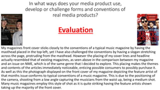
1. In what ways does your media product use,
develop or challenge forms and conventions of
real media products?
My magazines front cover sticks closely to the conventions of a typical music magazine by having the
masthead placed in the top left, yet I have also challenged the conventions by having a slogan stretching
across the page, protruding from the masthead. However the placing of my cover lines and headline
actually resembled that of existing magazines, as seen above in the comparison between my magazine
and an issue on NME, which is of the same genre that I decided to explore. This placing makes the themes
and contents of the articles immediately noticeable, enticing possible consumers to possibly purchase it.
As well as this the photograph displayed on the front cover of my magazine depicting the feature artist of
that months issue conforms to typical conventions of a music magazine. This is due to the positioning of
the camera, shooting from a low angle capturing the musicians from the waist up, being a medium shot.
Many music magazines employ this style of shot as it is quite striking having the feature artists shown
taking up the majority of the front cover.
Evaluation
2. How does your media product represent particular social groups?
Within my magazine a very specific social group is targeted through the
issues cover artists ‘The Mallrats’, being young urban teens sporting
streetwear brands, yet the genre of this band is a fusion of grunge and pop.
Suggesting that the representation of this style of music has changed since
its inception in the early 90s. However whether this represents the audience
of my magazine is questionable as I was originally attempting to create an
indie magazine, yet the appearance of the band members does not conform
to the typical indie style.
Being teenagers/young adults the way the models on my front cover are
depicted seems to represent this age group as quite urban, with their
streetwear garments, such as the skate brand palace. The location being set
in front of a worn out brick wall further projects this age group as being
urban and not complying to social norms. This fits in with stereotypical
views of teenagers within the media as they are typically viewed as
troublemakers. The colour scheme with the browns and blacks creates a
quite grimy dark tone to the magazine, furthering the despondent youth
stereotype.
3. Due to the likeness In genre between my magazine and Time Inc.'s own music
magazine NME I believe this would be the prime media institution to distribute
my magazine. As they already have such a huge and dedicated audience for
NME there would already be a platform for my magazine to perform well on.
The genre of music explored in NME and my magazine Be is also very similar so
they have experience in the field and audience I am trying to reach. Also due to
their broad reach and amount of content they produce they would be able to
cast my magazine out to a large audience. Some other magazines that Time Inc.
distribute are Travel+leisure and What's On Tv, therefore they have an even
more intricate understanding of how to distribute an entertainment themed
(Music, Televsion) magazine to a mass audience.
What kind of media institution might
distribute your media product and why?
4. Who would be the audience for your media product?
The social group I had originally chosen as my target audience
were of the ‘teen indie kid’ scene. This particular sector of
society float on the wings of the latest trends, such as the
newest interesting genre of music or newest popular fashion.
The feature artist of my media product are an up and coming
band ‘The Mallrats’. In correlation with what I found out about
my targeted audience, I sculpted this bands characteristics
and genre to fit the idea that ‘indie kids’ appreciate the new.
Therefore the genre of music of this band is a new unheard
fusion of grunge and pop. Due to this being a new alternative,
Independent style of music, the audience I have explored will be attracted to it as it is exciting and current
in the music scene. As well as this ‘indie kids’ are interested in the popular modern fashion and as of late
the ‘streetwear’ trend has been sweeping across Britain with brands such as ‘Palace’ (visible in the
costumes of the band). This goes to show how a even a music magazine can influence pop culture and
new trends. The costumes of the band will even attract ‘indie kids’ as they could use it to base their
newest fashion off of. The age group of my audience is teens as of the appearance of the models, as the
urban trend mainly appeals to them rather than older more traditional readers.
5. I had researched such magazines as NME and DIY which are
primarily aimed at that crowd, therefore I attempted to
incorporate some of the styles of shots, color schemes etc. into my
own media product. Take for example my Double Page Spread to
the left, the cream effect layer I used as my background is a warm
stylish shade often used in NME, as is the red colour I used for the
text, these are both key parts of the color scheme used in NME.
Therefore I have more of a chance to connect with their audience,
which as previously mentioned is rather indie itself. However the
appearance of the band and the locations displayed in my
magazine are slightly more urban than those seen in magazines
like NME, so may attract a different sort of crowd. For example in
professional music magazines such as Mojo much of the
photography will be done in a studio with the musicians in
costumes, making the bands appear cool and composed. I went for
a more natural setting with the artists wearing their own desired
clothing as the name of my magazine is ‘Be’ which has the
connotations of being and doing whatever you want to be, which
links in with the indie way of life. In the sense of addressing my
audience I targeted them through the text in my double page
spread featuring a lyric phrase from one of their songs which
addresses the attitudes of many teens, ‘feel the sun and the air
feel the apathy’.
How did you attract/address your audience?
6. What have you learnt about technologies the process
of constructing this product?
Throughout the production and research of this task I used a wide array of technologies. Within
the research aspect I began with the simple, easy to use Microsoft PowerPoint, which was used
to produce this evaluation. As well as this to conduct research into my actual audience I used the
website ‘surveymonkey’, which taught me how to gather information from multiple sources,
being those who took my survey. Most of the technology used in the research section of this task
was relatively easy and simple to grasp and had used much of it previously. However when I
came to the production of my magazine some challenges with technologies that were new to me
arisen. Yet even before I began the production of my music magazine I undertook a preliminary
task in which I had to produce a magazine front cover and contents page for my college. For
these I used Microsoft publisher and Photoshop. Of which I was new to both and as visible below
my skills on both were very limited.
Upon entering the creation of my music magazine my skills on
Photoshop strengthened. However not immediately with the original
draft of my front cover being rather poor, as seen to the left. Many
changes were made to the main image and some tag lines and images
were removed to make the front cover more professional and
appealing to the audience.