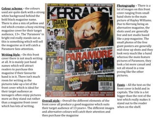
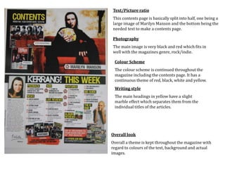
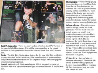
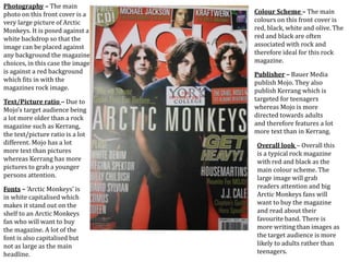
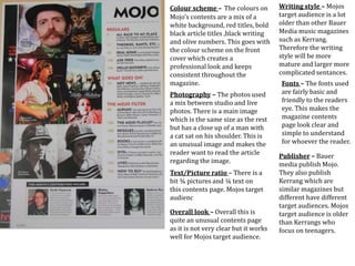
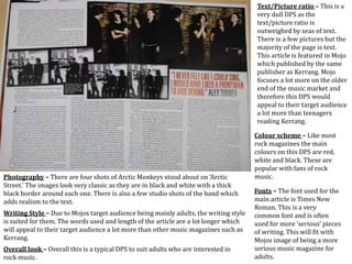
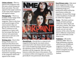
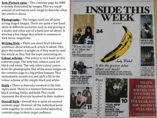
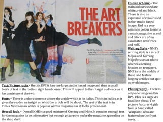
This document provides an analysis of the design elements used across various magazine covers and pages, including their colour schemes, photography, writing styles, text to picture ratios, fonts, and overall looks. Specific magazines analyzed include Kerrang, Mojo, and NME. Key points made include how elements are tailored for different target audiences, from teenagers for Kerrang to adults for Mojo, and how consistency in branding is maintained across issues.