SlideShare a Scribd company logo
Overall look The over all look of the magazine is eye catching,  the use of the bold fonts in bright colours attracts a pop/indie audience, mainly teenagers up to 25 year olds.  The band featured on the magazine are a well known indie band, and are quite liked by the audience that the magazine is aiming for.  The photography used on the magazine is a studio shot and is posed,  this suggests that the magazine is aiming for a  pop audience. The band in the photograph are pulling serious faces, and the outfits they are wearing gives us an impression of the genre of music they play. The photograph isn’t dark and rebellious which also tells us that the band dont have an outgoing personality about them, and that they are understated but talented. Colour scheme The main colours used on this front cover are white, pink, and black. the colours chosen have been used to appeal to an audience of mainly teenagers, who are into pop/indie music, these are the people who are most likely to buy the magazine. The colours are bright and the bright pink of the titles are quite eye catching.  Photography  The photography is a large picture of the band Foals. The photograph is posed and taken in a studio, probably for this magazine specially. The band are all pulling serious faces and looking straight at the camera, and the photograph is quite bright on their faces, with a grey and white background behind them. This photograph is simple and shows that they are not a bold outgoing band, and just do acoustic sets.  As the photograph is posed and photographed in a studio this suggests that the magazine wants to appeal to the audience as a pop genre magazine, but the band is quite an ‘indie’ band, which could open the magazine to a wider audience.  Fonts  The fonts of the magazine are bold, and are in bold colours. The title of the magazine matches with the title of the main article, which are both bright pink, bold, in capital letters and are eye catching to the audience. The other titles are in a slightly different font in white, these stand out from the picture and the background of the magazine.
Colour scheme The colour scheme used on this magazine is white, gray and a little  bit of black. The colour scheme suggests that the magazine is for an audiene that it slightly older,, around 20-30 years old, who are into classic rock.  The colours are quite calm and are not outgoing, which also can suggest to the reader who the publisher is aiming to buy the magazine.  Overall look The overall look of the magzine suggests that the reader is an older male, nearer the ages of 25-30, who is into classic rock music. The photography shows this as it is of the beatles which is a classic old band. The colours in the photograph are plain and have a vintage look about it. The colours of the font match with the colours of the photograph, matching it with the vintage look. The fonts used are simple, plain and easy to read which gives off the feel that it is aimed at an older audience.  Photography  The photography in this image is done in a studio and is posed, the band are  wearing sunglasses which  is a well known image that The Beatles have. Their look is dated and reflects the classic  theme of the magazine. The colours and the Mise-en-scene of the photograph and the colours in it suggest its for an audience who  mainly like classic rock music.  Fonts The fonts used on the cover of this magazine and plain and simple to read. This suggests that the potential audience  is of a slightly older reader and for males who are into classic rock music.
Colour scheme The colour scheme used on this magazine is black, white and red. This is a typical colour scheme for a music magazine and gives an indication that the magazine is aiming for an audience aged around 15-25. The colours are bright and bold which gives an indication that its aiming for an audience who like  rock/metal music.  Overall look The overall look of the magazine has a very rock theme to it, and the colour scheme and fonts indicate that  the magazine is aiming at an audience aged 15-25, of any gender. The photography is staged, you are man BiffyClyro and this is emphasised because he is wearing white and the other ones are wearing black. The colours  in the photograph have high contrast which make them brighter and stand out from the background.  Photography  The photography used on the cover of KERRANG! is a large picture of BiffyClyro. The picture is staged, you can tell this because they are looking straight into the camera, and the outfits they are wearing are planned out, the front man is wearing white and the other two men are wearing black, adding contrast and showing us who the most important is. The background is a black background with white lines through, which also show that the photograph is taken in a studio because the background isn’t natural and looks photoshopped Fonts The fonts used on the cover are bold, and in plain colours. There isn’t much variation in the fonts and you can tell that the magazine is aiming for an audience that like rock/metal music from the colours and types of fonts they have used.
KERRANG! Colour Scheme The choice of colours used are black, white and red. This is a typical colour scheme in music magazines and is affective to the audience of people who like rock music.  This gives us an indication of the audience the magazine is aiming for.  Photography The photography used on the magazine is a mixture of the band playing live and them in the studio. The pictures are not staged,  and as they are photographs  are mainly live, or natural shots done in a recording studio this indicates that  the magazine is aiming for an audience who are into rock music. Overall look  The overall look of the page is that its plain, dark, and aiming for a rock/metal/punk genre. I can tell this by the colours used, red, white, black. These are the normal colours used for the genre the magazine is aiming at. The fonts are plain and bold, and the text/picture ratio is more photos to the writing  which suggests a younger audience. Text/picture ratio The majority of the page is taken by pictures rather than writing, this could indicate the audience would be of a younger generation i.e 15-25 year olds. Fonts  The fonts used are plain, and in bold white or red. This shows that the magazine is aiming for an audience of  15-25 who like rock/metal music.
NME Colour scheme The colour scheme on this page is plain, the main colours are white and black. The only red in the page is on the photograph. This is indicating that the magazine is aiming for a slightly less rock genre and a bit more pop.  Photography There is only one photograph on the DPS but it takes up around a third of the page. The red shirt that Lily Allen is wearing makes the photograph eye catching as it stands out from the white background and the black writing text/picture ratio  Most of the page is  taken up by the title which is a quote. The rest of the page is mainly writing with one large picture. This suggests that the audience is slightly older, i.e 25. and are into more  pop rather than rock music Overall look The overall look of the  DPS suggests that the magazine is aiming towards an audience of 15-25 who are into pop music, and are mainly girls. The colour scheme is calm and plain, but the title is the eye catching and makes you want to read the article. The photography is just a simple photograph of Lily Allen, she is wearing a red shirt which stands out from the white background. The photograph is posed and done in a studio which also suggests that the magazine is aiming at an audience who is into pop music.  Fonts The font in the title is like letter cut out from a newspaper which is an interesting title and makes the article stands out when flicking through the magazine.
MOJO Colour scheme The colour scheme in this DPS is mainly black and white with a little but of a gold colour. This is different to the usual colour scheme to the type of music magazines I have been looking at. I think this colour scheme is suggesting an audience that is into a bit more heavy rock, and a little metal. This could be for an audience around 20-25 because of the colours  and would probably be mainly males. Photography  The photography is posed but it is not done in a studio, the background is in a natural environment. The fact that the photograph is posed suggest a pop audience but the natural background suggests a more rock audience.  However because of what the background is of I would  say that from the photograph,  the magazine is aiming for an audience that is into rock music. Overall look The overall look of the DPS suggests that the magazine is aiming for an audience that is into rock music  aged between 15-25, and are probably male. The colour scheme is dark and the whole page is in black and white with only a slight bit of gold and the photography is in black and white which also suggests that the magazine is aiming for an audience who likes rock music. The text/picture ratio is a picture is bigger than the amount of writing which suggests that the magazine is aiming for an audience of around 15+  Text/picture ratio The text/picture ratio on this DPS is that the  picture takes up around 2/3rds  of the page and  the text is only a small column on the side.  This could  suggest that its for a younger audience of around 15-25. Fonts The fonts used are “gothic” and are suggestive of an audience that like rock music,  and who are mainly male.
Colour scheme The colour scheme on this page is black, white, red and a small bit of yellow. This is a wide range of colours for a music magazine which suggests that its aiming to an audience that like pop music., because the magazine is aiming for an audience who like pop music this suggests that the age range would be younger, around 15-25 Overall look  The overall look of the page is that there is a lot more text than pictures and the pictures that are on the page are live photos and are not staged. This suggests that the magazine is aiming for an audience that like rock music. It could also suggest that the magazine has included gig reviews which is something that people look for in a music magazine. The fonts used on the page are plain and simple and are mainly in black on a white background. This is a simple layout and helps suggest the possible audience, males/females ages 15-25, who like rock/pop music. Photography The photography on this page is limited. The photographs are not very good quality and they are live photographs that are not posed or staged, this suggests that the magazine is aiming to rock/pop audience. Text/picture ratio The text picture ratio is obviously there is more text than pictures. This page is the contents page and therefore this would be expected.  Fonts The fonts used are plain and simple and are all the same font. The main text is black on a white background.
Colour scheme The colour scheme on the contents page of KERRANG! Is mainly white, black and yellow. This is different to the usual black white and red. The background is white and the text is black, and the page names and numbers and in yellow. This is a simple layout which seems to be the same type of layout that most other music magazines use for there contents page. Overall look The overall look of the page is the writing is small and is mainly pushed to the side or at the top of the page.  The pictures take up the  majority of the page. The colour scheme is different to the usual colour scheme in a music magazine, the white background makes it feel plain but the pictures adds more colour. The fonts used are simple bold fonts, the main titles have a black background and the font is in yellow. This is for all the pages so they stand out and makes the reader look at what is inside the magazine Photography The photography used on the page, the majority of it is staged photographs. All the photographs used on the contents page are of the bands that are featured in the magazine. This could be an idea to use in my own magazine.  Fonts  The fonts used are plain, and are in a range of colours. The font suggests that the potential audience is male between the ages of 15-25, who are into rock/metal music. Text/picture ratio The text picture ratio on this contents page is more pictures than writing. This is because all the writing is small and pushed together in the top and side of the page and the pictures are spread out among the rest of the page.
Overall look The overall look of the magazine is a vintage look. The magazine page looks like its from an old original copy of MOJO. The photograph has a tint on it that is the same colour as the background. The photograph is posed and is done in a studio, which often means that the magazine is aiming at an audience who like pop music. The fonts and the colours of the fonts are plain and the page numbers are in a different colour to the text, which makes the titles of the articles stand out. Generally the overall look of this page has a vintage look and suggests an audience of pop/indie genre.  Colour scheme The colour scheme of this contents page is very different to the other colour schemes I have looked at from other music magazines. The colours are blue, black and yellow.   This colour scheme  suggests to me that this magazine is aimed more at an audience  who are interested in pop. The layout and the colours on the page gives it a vintage look. This layout could be an old copy of MOJO.   Photography The photography used on the contents page is simple, it is just one photograph in comparison to the other contents pages I have looked at from other magazines which have a few photographs on them. The photograph on this page is  posed and is clearly done in a studio. This suggests that the magazine is aiming for an audience that like pop music.  Fonts  The fonts used are plain and in black and a yellow colour. The yellow colour doesn’t stand out from the background much, but this seems to make the black text stand out a lot, and this is what the articles are in. Text/picture ratio The text/picture ratio on this contents page is one large picture that takes up half of the page, with around the same amount of writing.

More Related Content

What's hot

Mojo’ magazine analysis
Mojo’ magazine analysisMojo’ magazine analysis
Mojo’ magazine analysis
asmediac14
 
Textual analysis - Front covers
Textual analysis - Front coversTextual analysis - Front covers
Textual analysis - Front coversNicoline Granheim
 
Magazine research final
Magazine research finalMagazine research final
Magazine research finaltashaa_smith
 
Research similar product analysis articles
Research similar product analysis articlesResearch similar product analysis articles
Research similar product analysis articles
hollyetty123
 
Task 5 – deciding which genre and style
Task 5 – deciding which genre and styleTask 5 – deciding which genre and style
Task 5 – deciding which genre and style
AS Media Column D
 
Analysis of chosen magazine
Analysis of chosen magazineAnalysis of chosen magazine
Analysis of chosen magazine
AS Media Column D
 
Magazine front cover research
Magazine front cover researchMagazine front cover research
Magazine front cover researchtashaa_smith
 
Analysing Existing Products
Analysing Existing ProductsAnalysing Existing Products
Analysing Existing ProductsRachAH
 
Analysing Existing Products
Analysing Existing ProductsAnalysing Existing Products
Analysing Existing ProductsRachAH
 
Analysing Existing Products
Analysing Existing ProductsAnalysing Existing Products
Analysing Existing ProductsRachAH
 
Music Magazine analysis
Music Magazine analysis  Music Magazine analysis
Music Magazine analysis
elliescobell
 
Magazine research
Magazine researchMagazine research
Magazine researchEirinnGM
 
Genres of music magazines
Genres of music magazinesGenres of music magazines
Genres of music magazines
ShahEman
 
Liarr analysis
Liarr analysisLiarr analysis
Liarr analysischloelav
 
Formal magazine proposal
Formal magazine proposalFormal magazine proposal
Formal magazine proposal
AS Media Column D
 
Mojo magazine analysis
Mojo magazine analysisMojo magazine analysis
Mojo magazine analysisLittlePainter
 
Analysis of a media product
Analysis of a media productAnalysis of a media product
Analysis of a media product
Ellie Marsh
 
Rolling Stone Magazine Analysis
Rolling Stone Magazine Analysis Rolling Stone Magazine Analysis
Rolling Stone Magazine Analysis Fatima Iftikhar
 

What's hot (20)

Mojo’ magazine analysis
Mojo’ magazine analysisMojo’ magazine analysis
Mojo’ magazine analysis
 
Textual analysis - Front covers
Textual analysis - Front coversTextual analysis - Front covers
Textual analysis - Front covers
 
Existing Product Research
Existing Product Research Existing Product Research
Existing Product Research
 
Magazine research final
Magazine research finalMagazine research final
Magazine research final
 
Research similar product analysis articles
Research similar product analysis articlesResearch similar product analysis articles
Research similar product analysis articles
 
Task 5 – deciding which genre and style
Task 5 – deciding which genre and styleTask 5 – deciding which genre and style
Task 5 – deciding which genre and style
 
Analysis of chosen magazine
Analysis of chosen magazineAnalysis of chosen magazine
Analysis of chosen magazine
 
Magazine front cover research
Magazine front cover researchMagazine front cover research
Magazine front cover research
 
Analysing Existing Products
Analysing Existing ProductsAnalysing Existing Products
Analysing Existing Products
 
Analysing Existing Products
Analysing Existing ProductsAnalysing Existing Products
Analysing Existing Products
 
Analysing Existing Products
Analysing Existing ProductsAnalysing Existing Products
Analysing Existing Products
 
Music Magazine analysis
Music Magazine analysis  Music Magazine analysis
Music Magazine analysis
 
R&b magazines
R&b magazinesR&b magazines
R&b magazines
 
Magazine research
Magazine researchMagazine research
Magazine research
 
Genres of music magazines
Genres of music magazinesGenres of music magazines
Genres of music magazines
 
Liarr analysis
Liarr analysisLiarr analysis
Liarr analysis
 
Formal magazine proposal
Formal magazine proposalFormal magazine proposal
Formal magazine proposal
 
Mojo magazine analysis
Mojo magazine analysisMojo magazine analysis
Mojo magazine analysis
 
Analysis of a media product
Analysis of a media productAnalysis of a media product
Analysis of a media product
 
Rolling Stone Magazine Analysis
Rolling Stone Magazine Analysis Rolling Stone Magazine Analysis
Rolling Stone Magazine Analysis
 

Similar to Magazine analysis

Product research, analysis 1
Product research, analysis 1Product research, analysis 1
Product research, analysis 1danobrien93
 
My magazine research
My magazine researchMy magazine research
My magazine researchadinewenner
 
My magazine research
My magazine research My magazine research
My magazine research adinewenner
 
My magazine research
My magazine research My magazine research
My magazine research adinewenner
 
Genre convention in music magazine
Genre convention in music magazineGenre convention in music magazine
Genre convention in music magazine
anaiadai
 
Kerrang! cover deconstruction
Kerrang! cover deconstructionKerrang! cover deconstruction
Kerrang! cover deconstruction
Fallon Young
 
Conventions of music mags
Conventions of music magsConventions of music mags
Conventions of music magsellsrose
 
Music magazine genre
Music magazine genreMusic magazine genre
Music magazine genre
CaponEmily
 
Magazine Anaylsis
Magazine AnaylsisMagazine Anaylsis
Magazine Anaylsis
abbeycoleman10
 
Genre convention in music magazine
Genre convention in music magazineGenre convention in music magazine
Genre convention in music magazine
anaiadai
 
Music magazine analysis
Music magazine analysisMusic magazine analysis
Music magazine analysis
Kirsty Hamilton-Emery
 
Pop music magazines
Pop music magazines Pop music magazines
Pop music magazines
gozdetezcan
 
Lo3- Be able to develop ideas by creating proposals and sample materials for ...
Lo3- Be able to develop ideas by creating proposals and sample materials for ...Lo3- Be able to develop ideas by creating proposals and sample materials for ...
Lo3- Be able to develop ideas by creating proposals and sample materials for ...
Harrison Cole
 
Magazine cover analysis
Magazine cover analysisMagazine cover analysis
Magazine cover analysis
HSFC14150645
 
Q Magazine Analysis
Q Magazine AnalysisQ Magazine Analysis
Q Magazine Analysispriasandhu
 
Researching magazine genres
Researching magazine genresResearching magazine genres
Researching magazine genrespangratiou
 
Music magazines
Music magazinesMusic magazines
Music magazines
Elliezambakides
 
Hannah Wood Music Magazine Analysis
Hannah Wood Music Magazine Analysis Hannah Wood Music Magazine Analysis
Hannah Wood Music Magazine Analysis
hannahwood88
 

Similar to Magazine analysis (20)

Product research, analysis 1
Product research, analysis 1Product research, analysis 1
Product research, analysis 1
 
My magazine research
My magazine researchMy magazine research
My magazine research
 
My magazine research
My magazine research My magazine research
My magazine research
 
My magazine research
My magazine research My magazine research
My magazine research
 
Genre convention in music magazine
Genre convention in music magazineGenre convention in music magazine
Genre convention in music magazine
 
Research 2
Research 2Research 2
Research 2
 
Kerrang! cover deconstruction
Kerrang! cover deconstructionKerrang! cover deconstruction
Kerrang! cover deconstruction
 
Conventions of music mags
Conventions of music magsConventions of music mags
Conventions of music mags
 
Music magazine genre
Music magazine genreMusic magazine genre
Music magazine genre
 
Magazine Anaylsis
Magazine AnaylsisMagazine Anaylsis
Magazine Anaylsis
 
Genre convention in music magazine
Genre convention in music magazineGenre convention in music magazine
Genre convention in music magazine
 
Music magazine analysis
Music magazine analysisMusic magazine analysis
Music magazine analysis
 
Pop music magazines
Pop music magazines Pop music magazines
Pop music magazines
 
Lo3- Be able to develop ideas by creating proposals and sample materials for ...
Lo3- Be able to develop ideas by creating proposals and sample materials for ...Lo3- Be able to develop ideas by creating proposals and sample materials for ...
Lo3- Be able to develop ideas by creating proposals and sample materials for ...
 
Magazine cover analysis
Magazine cover analysisMagazine cover analysis
Magazine cover analysis
 
Q Magazine Analysis
Q Magazine AnalysisQ Magazine Analysis
Q Magazine Analysis
 
3 magazines
3 magazines3 magazines
3 magazines
 
Researching magazine genres
Researching magazine genresResearching magazine genres
Researching magazine genres
 
Music magazines
Music magazinesMusic magazines
Music magazines
 
Hannah Wood Music Magazine Analysis
Hannah Wood Music Magazine Analysis Hannah Wood Music Magazine Analysis
Hannah Wood Music Magazine Analysis
 

More from loorushworth

Codesandconventions
CodesandconventionsCodesandconventions
Codesandconventionsloorushworth
 

More from loorushworth (8)

Storyboards
StoryboardsStoryboards
Storyboards
 
Storyboards
StoryboardsStoryboards
Storyboards
 
Storyboards
StoryboardsStoryboards
Storyboards
 
Storyboards
StoryboardsStoryboards
Storyboards
 
Style sheet1
Style sheet1Style sheet1
Style sheet1
 
Codesandconventions
CodesandconventionsCodesandconventions
Codesandconventions
 
Reader Profile
Reader ProfileReader Profile
Reader Profile
 
Style sheet1
Style sheet1Style sheet1
Style sheet1
 

Magazine analysis

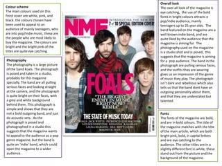
  • 1. Overall look The over all look of the magazine is eye catching, the use of the bold fonts in bright colours attracts a pop/indie audience, mainly teenagers up to 25 year olds. The band featured on the magazine are a well known indie band, and are quite liked by the audience that the magazine is aiming for. The photography used on the magazine is a studio shot and is posed, this suggests that the magazine is aiming for a pop audience. The band in the photograph are pulling serious faces, and the outfits they are wearing gives us an impression of the genre of music they play. The photograph isn’t dark and rebellious which also tells us that the band dont have an outgoing personality about them, and that they are understated but talented. Colour scheme The main colours used on this front cover are white, pink, and black. the colours chosen have been used to appeal to an audience of mainly teenagers, who are into pop/indie music, these are the people who are most likely to buy the magazine. The colours are bright and the bright pink of the titles are quite eye catching. Photography The photography is a large picture of the band Foals. The photograph is posed and taken in a studio, probably for this magazine specially. The band are all pulling serious faces and looking straight at the camera, and the photograph is quite bright on their faces, with a grey and white background behind them. This photograph is simple and shows that they are not a bold outgoing band, and just do acoustic sets. As the photograph is posed and photographed in a studio this suggests that the magazine wants to appeal to the audience as a pop genre magazine, but the band is quite an ‘indie’ band, which could open the magazine to a wider audience. Fonts The fonts of the magazine are bold, and are in bold colours. The title of the magazine matches with the title of the main article, which are both bright pink, bold, in capital letters and are eye catching to the audience. The other titles are in a slightly different font in white, these stand out from the picture and the background of the magazine.
  • 2. Colour scheme The colour scheme used on this magazine is white, gray and a little bit of black. The colour scheme suggests that the magazine is for an audiene that it slightly older,, around 20-30 years old, who are into classic rock. The colours are quite calm and are not outgoing, which also can suggest to the reader who the publisher is aiming to buy the magazine. Overall look The overall look of the magzine suggests that the reader is an older male, nearer the ages of 25-30, who is into classic rock music. The photography shows this as it is of the beatles which is a classic old band. The colours in the photograph are plain and have a vintage look about it. The colours of the font match with the colours of the photograph, matching it with the vintage look. The fonts used are simple, plain and easy to read which gives off the feel that it is aimed at an older audience. Photography The photography in this image is done in a studio and is posed, the band are wearing sunglasses which is a well known image that The Beatles have. Their look is dated and reflects the classic theme of the magazine. The colours and the Mise-en-scene of the photograph and the colours in it suggest its for an audience who mainly like classic rock music. Fonts The fonts used on the cover of this magazine and plain and simple to read. This suggests that the potential audience is of a slightly older reader and for males who are into classic rock music.
  • 3. Colour scheme The colour scheme used on this magazine is black, white and red. This is a typical colour scheme for a music magazine and gives an indication that the magazine is aiming for an audience aged around 15-25. The colours are bright and bold which gives an indication that its aiming for an audience who like rock/metal music. Overall look The overall look of the magazine has a very rock theme to it, and the colour scheme and fonts indicate that the magazine is aiming at an audience aged 15-25, of any gender. The photography is staged, you are man BiffyClyro and this is emphasised because he is wearing white and the other ones are wearing black. The colours in the photograph have high contrast which make them brighter and stand out from the background. Photography The photography used on the cover of KERRANG! is a large picture of BiffyClyro. The picture is staged, you can tell this because they are looking straight into the camera, and the outfits they are wearing are planned out, the front man is wearing white and the other two men are wearing black, adding contrast and showing us who the most important is. The background is a black background with white lines through, which also show that the photograph is taken in a studio because the background isn’t natural and looks photoshopped Fonts The fonts used on the cover are bold, and in plain colours. There isn’t much variation in the fonts and you can tell that the magazine is aiming for an audience that like rock/metal music from the colours and types of fonts they have used.
  • 4. KERRANG! Colour Scheme The choice of colours used are black, white and red. This is a typical colour scheme in music magazines and is affective to the audience of people who like rock music. This gives us an indication of the audience the magazine is aiming for. Photography The photography used on the magazine is a mixture of the band playing live and them in the studio. The pictures are not staged, and as they are photographs are mainly live, or natural shots done in a recording studio this indicates that the magazine is aiming for an audience who are into rock music. Overall look The overall look of the page is that its plain, dark, and aiming for a rock/metal/punk genre. I can tell this by the colours used, red, white, black. These are the normal colours used for the genre the magazine is aiming at. The fonts are plain and bold, and the text/picture ratio is more photos to the writing which suggests a younger audience. Text/picture ratio The majority of the page is taken by pictures rather than writing, this could indicate the audience would be of a younger generation i.e 15-25 year olds. Fonts The fonts used are plain, and in bold white or red. This shows that the magazine is aiming for an audience of 15-25 who like rock/metal music.
  • 5. NME Colour scheme The colour scheme on this page is plain, the main colours are white and black. The only red in the page is on the photograph. This is indicating that the magazine is aiming for a slightly less rock genre and a bit more pop. Photography There is only one photograph on the DPS but it takes up around a third of the page. The red shirt that Lily Allen is wearing makes the photograph eye catching as it stands out from the white background and the black writing text/picture ratio Most of the page is taken up by the title which is a quote. The rest of the page is mainly writing with one large picture. This suggests that the audience is slightly older, i.e 25. and are into more pop rather than rock music Overall look The overall look of the DPS suggests that the magazine is aiming towards an audience of 15-25 who are into pop music, and are mainly girls. The colour scheme is calm and plain, but the title is the eye catching and makes you want to read the article. The photography is just a simple photograph of Lily Allen, she is wearing a red shirt which stands out from the white background. The photograph is posed and done in a studio which also suggests that the magazine is aiming at an audience who is into pop music. Fonts The font in the title is like letter cut out from a newspaper which is an interesting title and makes the article stands out when flicking through the magazine.
  • 6. MOJO Colour scheme The colour scheme in this DPS is mainly black and white with a little but of a gold colour. This is different to the usual colour scheme to the type of music magazines I have been looking at. I think this colour scheme is suggesting an audience that is into a bit more heavy rock, and a little metal. This could be for an audience around 20-25 because of the colours and would probably be mainly males. Photography The photography is posed but it is not done in a studio, the background is in a natural environment. The fact that the photograph is posed suggest a pop audience but the natural background suggests a more rock audience. However because of what the background is of I would say that from the photograph, the magazine is aiming for an audience that is into rock music. Overall look The overall look of the DPS suggests that the magazine is aiming for an audience that is into rock music aged between 15-25, and are probably male. The colour scheme is dark and the whole page is in black and white with only a slight bit of gold and the photography is in black and white which also suggests that the magazine is aiming for an audience who likes rock music. The text/picture ratio is a picture is bigger than the amount of writing which suggests that the magazine is aiming for an audience of around 15+ Text/picture ratio The text/picture ratio on this DPS is that the picture takes up around 2/3rds of the page and the text is only a small column on the side. This could suggest that its for a younger audience of around 15-25. Fonts The fonts used are “gothic” and are suggestive of an audience that like rock music, and who are mainly male.
  • 7. Colour scheme The colour scheme on this page is black, white, red and a small bit of yellow. This is a wide range of colours for a music magazine which suggests that its aiming to an audience that like pop music., because the magazine is aiming for an audience who like pop music this suggests that the age range would be younger, around 15-25 Overall look The overall look of the page is that there is a lot more text than pictures and the pictures that are on the page are live photos and are not staged. This suggests that the magazine is aiming for an audience that like rock music. It could also suggest that the magazine has included gig reviews which is something that people look for in a music magazine. The fonts used on the page are plain and simple and are mainly in black on a white background. This is a simple layout and helps suggest the possible audience, males/females ages 15-25, who like rock/pop music. Photography The photography on this page is limited. The photographs are not very good quality and they are live photographs that are not posed or staged, this suggests that the magazine is aiming to rock/pop audience. Text/picture ratio The text picture ratio is obviously there is more text than pictures. This page is the contents page and therefore this would be expected. Fonts The fonts used are plain and simple and are all the same font. The main text is black on a white background.
  • 8. Colour scheme The colour scheme on the contents page of KERRANG! Is mainly white, black and yellow. This is different to the usual black white and red. The background is white and the text is black, and the page names and numbers and in yellow. This is a simple layout which seems to be the same type of layout that most other music magazines use for there contents page. Overall look The overall look of the page is the writing is small and is mainly pushed to the side or at the top of the page. The pictures take up the majority of the page. The colour scheme is different to the usual colour scheme in a music magazine, the white background makes it feel plain but the pictures adds more colour. The fonts used are simple bold fonts, the main titles have a black background and the font is in yellow. This is for all the pages so they stand out and makes the reader look at what is inside the magazine Photography The photography used on the page, the majority of it is staged photographs. All the photographs used on the contents page are of the bands that are featured in the magazine. This could be an idea to use in my own magazine. Fonts The fonts used are plain, and are in a range of colours. The font suggests that the potential audience is male between the ages of 15-25, who are into rock/metal music. Text/picture ratio The text picture ratio on this contents page is more pictures than writing. This is because all the writing is small and pushed together in the top and side of the page and the pictures are spread out among the rest of the page.
  • 9. Overall look The overall look of the magazine is a vintage look. The magazine page looks like its from an old original copy of MOJO. The photograph has a tint on it that is the same colour as the background. The photograph is posed and is done in a studio, which often means that the magazine is aiming at an audience who like pop music. The fonts and the colours of the fonts are plain and the page numbers are in a different colour to the text, which makes the titles of the articles stand out. Generally the overall look of this page has a vintage look and suggests an audience of pop/indie genre. Colour scheme The colour scheme of this contents page is very different to the other colour schemes I have looked at from other music magazines. The colours are blue, black and yellow. This colour scheme suggests to me that this magazine is aimed more at an audience who are interested in pop. The layout and the colours on the page gives it a vintage look. This layout could be an old copy of MOJO. Photography The photography used on the contents page is simple, it is just one photograph in comparison to the other contents pages I have looked at from other magazines which have a few photographs on them. The photograph on this page is posed and is clearly done in a studio. This suggests that the magazine is aiming for an audience that like pop music. Fonts The fonts used are plain and in black and a yellow colour. The yellow colour doesn’t stand out from the background much, but this seems to make the black text stand out a lot, and this is what the articles are in. Text/picture ratio The text/picture ratio on this contents page is one large picture that takes up half of the page, with around the same amount of writing.