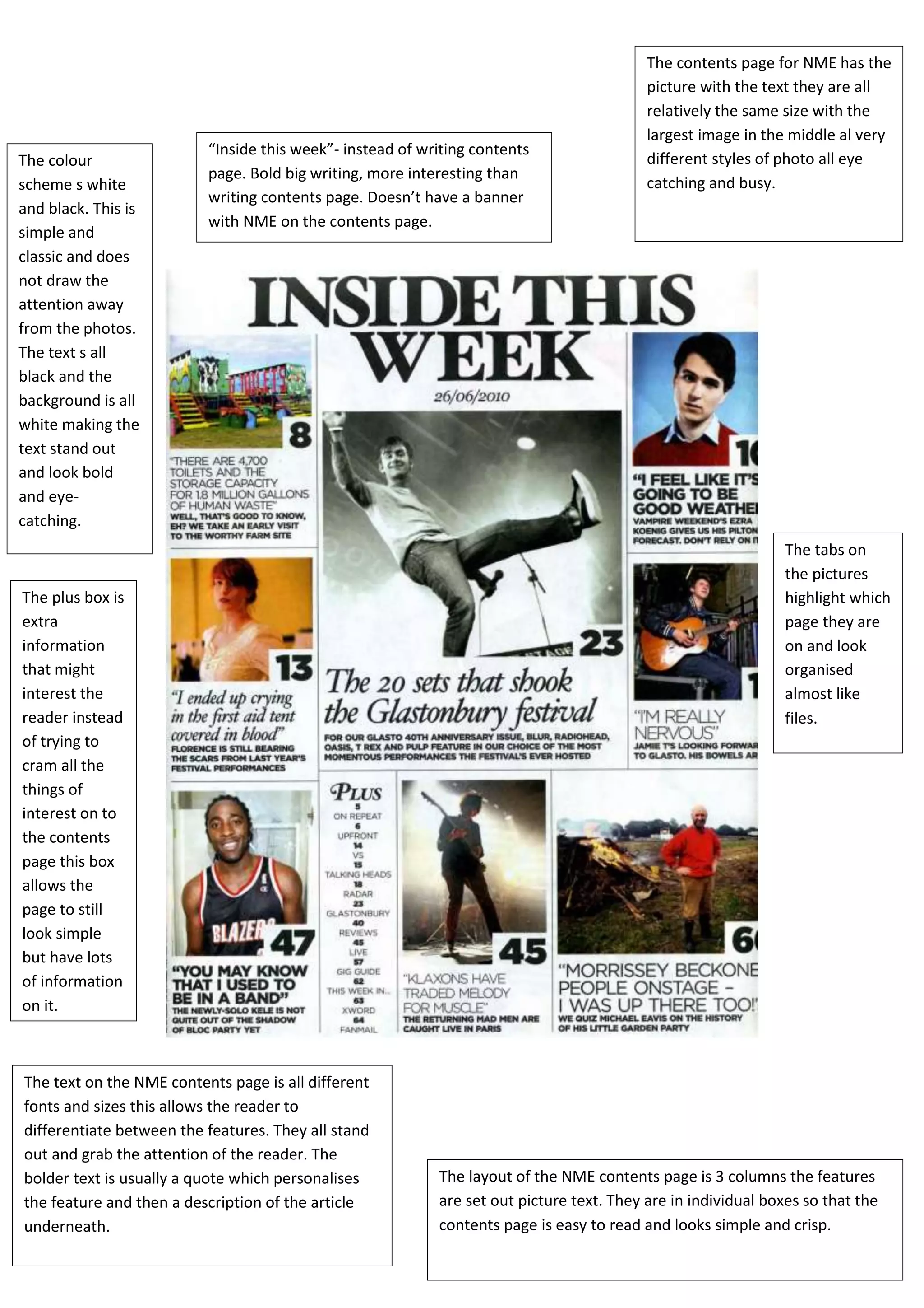
The contents page for NME has the
                                                                                          picture with the text they are all
                                                                                          relatively the same size with the
                                                                                          largest image in the middle al very
                          “Inside this week”- instead of writing contents
The colour                                                                                different styles of photo all eye
                          page. Bold big writing, more interesting than
scheme s white                                                                            catching and busy.
                          writing contents page. Doesn’t have a banner
and black. This is
                          with NME on the contents page.
simple and
classic and does
not draw the
attention away
from the photos.
The text s all
black and the
background is all
white making the
text stand out
and look bold
and eye-
catching.
                                                                                                               The tabs on
                                                                                                               the pictures
The plus box is                                                                                                highlight which
extra                                                                                                          page they are
information                                                                                                    on and look
that might                                                                                                     organised
interest the                                                                                                   almost like
reader instead                                                                                                 files.
of trying to
cram all the
things of
interest on to
the contents
page this box
allows the
page to still
look simple
but have lots
of information
on it.


The text on the NME contents page is all different
fonts and sizes this allows the reader to
differentiate between the features. They all stand
out and grab the attention of the reader. The
bolder text is usually a quote which personalises          The layout of the NME contents page is 3 columns the features
the feature and then a description of the article          are set out picture text. They are in individual boxes so that the
underneath.                                                contents page is easy to read and looks simple and crisp.

Media 10

  • 1.
    The contents pagefor NME has the picture with the text they are all relatively the same size with the largest image in the middle al very “Inside this week”- instead of writing contents The colour different styles of photo all eye page. Bold big writing, more interesting than scheme s white catching and busy. writing contents page. Doesn’t have a banner and black. This is with NME on the contents page. simple and classic and does not draw the attention away from the photos. The text s all black and the background is all white making the text stand out and look bold and eye- catching. The tabs on the pictures The plus box is highlight which extra page they are information on and look that might organised interest the almost like reader instead files. of trying to cram all the things of interest on to the contents page this box allows the page to still look simple but have lots of information on it. The text on the NME contents page is all different fonts and sizes this allows the reader to differentiate between the features. They all stand out and grab the attention of the reader. The bolder text is usually a quote which personalises The layout of the NME contents page is 3 columns the features the feature and then a description of the article are set out picture text. They are in individual boxes so that the underneath. contents page is easy to read and looks simple and crisp.