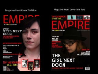
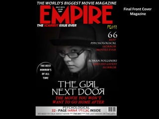
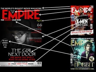
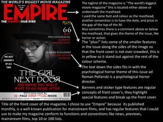
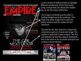
Front cover magazine Evaluation
Rebecca Paterson
Magazine Front Cover Trial One Magazine Front Cover Trial Two
Final Front Cover
Magazine
The tagline of the magazine is “The world’s biggest
movie magazine” this is located either above or
underneath the masthead.
I used the same font and colour as the masthead,
another convention is to have the date, and price in
the gap of the top of the M.
Also sometimes there is a comment above or below
the masthead, that gives the theme of the issue, like
horror or action.
The “plus!” lists some of the smaller features
in the issue along the sides of the image so
that the front cover is not over crowded, this is
in yellow so it stand out against the rest of the
colour scheme.
The text down the sides fits in with the
psychological horror theme of this issue ad
Roman Pollanski is a psychological horror
director.
Banners and sticker type features are regular
concepts of front cover’s, they highlight
special features and break up the front cover.
Title of the front cover of the magazine, I chose to use “Empire” because its published
monthly, is a well known publication for mainstream films, and has regular features that I could
use to make my magazine conform to functions and conventions like news, previews,
mainstream films, top 10 or 100 lists.
I used a variety of different texts to highlight
different components of the front cover,
using a unique font can attract the readers
eye, as can the colour of the text.
The image is centered and the villain is
looking straight out at the audience. The
black and white image links in with the
colour scheme and this makes the red
stand out.
The text for the main feature is unique and
centered as well so it frames the image. The
caption is witty and creates enigma. The ‘R’s
are reflected so that they appear backwards,
this is the same as on my poster and gives my
product a brand identity.

Front cover magazine evaluation new

  • 1.
    Front cover magazineEvaluation Rebecca Paterson
  • 2.
    Magazine Front CoverTrial One Magazine Front Cover Trial Two
  • 3.
  • 5.
    The tagline ofthe magazine is “The world’s biggest movie magazine” this is located either above or underneath the masthead. I used the same font and colour as the masthead, another convention is to have the date, and price in the gap of the top of the M. Also sometimes there is a comment above or below the masthead, that gives the theme of the issue, like horror or action. The “plus!” lists some of the smaller features in the issue along the sides of the image so that the front cover is not over crowded, this is in yellow so it stand out against the rest of the colour scheme. The text down the sides fits in with the psychological horror theme of this issue ad Roman Pollanski is a psychological horror director. Banners and sticker type features are regular concepts of front cover’s, they highlight special features and break up the front cover. Title of the front cover of the magazine, I chose to use “Empire” because its published monthly, is a well known publication for mainstream films, and has regular features that I could use to make my magazine conform to functions and conventions like news, previews, mainstream films, top 10 or 100 lists.
  • 6.
    I used avariety of different texts to highlight different components of the front cover, using a unique font can attract the readers eye, as can the colour of the text. The image is centered and the villain is looking straight out at the audience. The black and white image links in with the colour scheme and this makes the red stand out. The text for the main feature is unique and centered as well so it frames the image. The caption is witty and creates enigma. The ‘R’s are reflected so that they appear backwards, this is the same as on my poster and gives my product a brand identity.