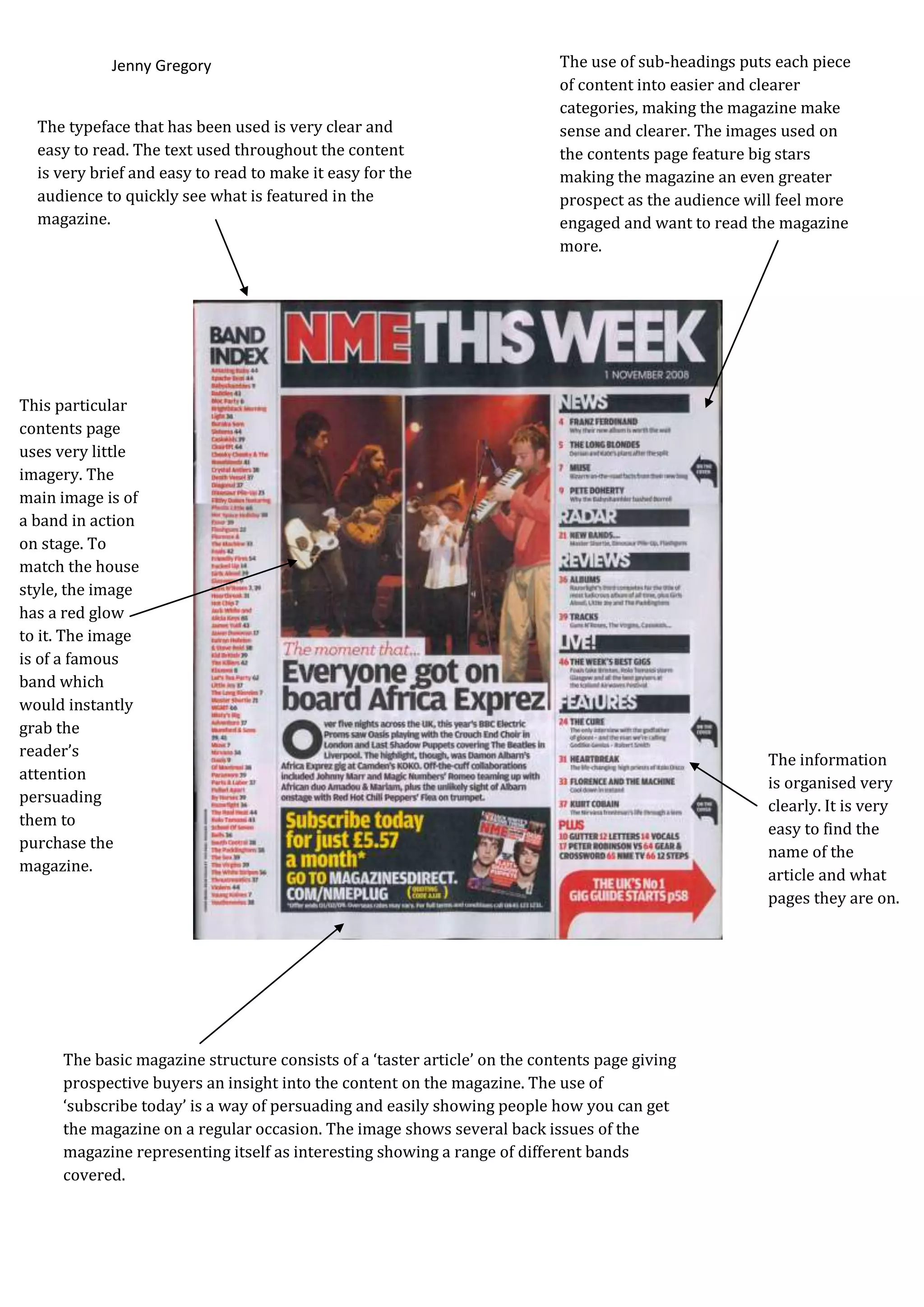
Jenny Gregory                                                  The use of sub-headings puts each piece
                                                                           of content into easier and clearer
                                                                           categories, making the magazine make
  The typeface that has been used is very clear and                        sense and clearer. The images used on
  easy to read. The text used throughout the content                       the contents page feature big stars
  is very brief and easy to read to make it easy for the                   making the magazine an even greater
  audience to quickly see what is featured in the                          prospect as the audience will feel more
  magazine.                                                                engaged and want to read the magazine
                                                                           more.


This particular
contents page
uses very little
imagery. The
main image is of
a band in action
on stage. To
match the house
style, the image
has a red glow
to it. The image
is of a famous
band which
would instantly
grab the
reader’s
                                                                                                      The information
attention
                                                                                                      is organised very
persuading
                                                                                                      clearly. It is very
them to
                                                                                                      easy to find the
purchase the
                                                                                                      name of the
magazine.
                                                                                                      article and what
                                                                                                      pages they are on.


     The basic magazine structure consists of a ‘taster article’ on the contents page giving
     prospective buyers an insight into the content on the magazine. The use of
     ‘subscribe today’ is a way of persuading and easily showing people how you can get
     the magazine on a regular occasion. The image shows several back issues of the
     magazine representing itself as interesting showing a range of different bands
     covered.
Jenny Gregory


                                                              On the contents page from Q magazine a mixture of serif
                                                              fonts have been used which portray that the magazine
The house style of the contents page is white, red
                                                              overall is aimed at an older generation as it gives off a
and black. In the top left hand corner the Q logo is
                                                              formal image which mirrors the house style used
a red background with a contrasting white Q to
                                                              throughout the entire magazine, for e.g. the same colours;
stand out and also define itself as a logo that
                                                              black white and red and the same font styles.
readers can instantly identify.


                                                                        The language used is simple but more directed to
     All the words featured on the contents page are of                 the older target market so therefore does not use
     the same font which makes it simple and easy to                    any slang.
     read. The title which reads ‘Contents’ is placed on a
     red background with black writing to emphasis it
     and catch the reader’s attention. The main headings
     in the contents section ‘features’ and ‘regulars’ have
     a white background with black writing, underlined
     in red to make them stand out and clear to the
     readers which pages each article is on in the
     magazine, making it easy to see what’s featured in
     the magazine at a quick glance.

Nme contents page analysis

  • 1.
    Jenny Gregory The use of sub-headings puts each piece of content into easier and clearer categories, making the magazine make The typeface that has been used is very clear and sense and clearer. The images used on easy to read. The text used throughout the content the contents page feature big stars is very brief and easy to read to make it easy for the making the magazine an even greater audience to quickly see what is featured in the prospect as the audience will feel more magazine. engaged and want to read the magazine more. This particular contents page uses very little imagery. The main image is of a band in action on stage. To match the house style, the image has a red glow to it. The image is of a famous band which would instantly grab the reader’s The information attention is organised very persuading clearly. It is very them to easy to find the purchase the name of the magazine. article and what pages they are on. The basic magazine structure consists of a ‘taster article’ on the contents page giving prospective buyers an insight into the content on the magazine. The use of ‘subscribe today’ is a way of persuading and easily showing people how you can get the magazine on a regular occasion. The image shows several back issues of the magazine representing itself as interesting showing a range of different bands covered.
  • 2.
    Jenny Gregory On the contents page from Q magazine a mixture of serif fonts have been used which portray that the magazine The house style of the contents page is white, red overall is aimed at an older generation as it gives off a and black. In the top left hand corner the Q logo is formal image which mirrors the house style used a red background with a contrasting white Q to throughout the entire magazine, for e.g. the same colours; stand out and also define itself as a logo that black white and red and the same font styles. readers can instantly identify. The language used is simple but more directed to All the words featured on the contents page are of the older target market so therefore does not use the same font which makes it simple and easy to any slang. read. The title which reads ‘Contents’ is placed on a red background with black writing to emphasis it and catch the reader’s attention. The main headings in the contents section ‘features’ and ‘regulars’ have a white background with black writing, underlined in red to make them stand out and clear to the readers which pages each article is on in the magazine, making it easy to see what’s featured in the magazine at a quick glance.