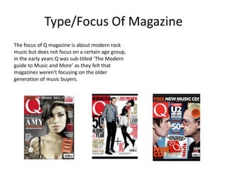
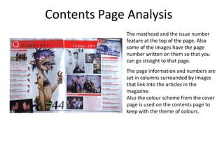
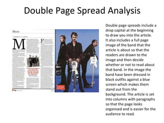
Case Study Notes
  Q Magazine
Type/Focus Of Magazine
The focus of Q magazine is about modern rock
music but does not focus on a certain age group,
in the early years Q was sub-titled ‘The Modern
guide to Music and More’ as they felt that
magazines weren't focusing on the older
generation of music buyers.
Publishing Company
• Bauer Media Group is a multinational media
  company headquartered in Hamburg,
  Germany which operates in 15 countries
  worldwide. Since the company was founded
  in 1875, it has been privately owned and
  under management by the Bauer family.
• Worldwide circulation of Bauer Media
  Group's magazine titles amounts to 38 million
  magazines a week
Editor, Publishing & Price


Editors name – Andrew Harrison

Date of first publication – October 1986

Frequency of Publication - Monthly

Price - £3.99

Distribution - Newsagents, supermarkets,
music shops
Front Cover Analysis
         On this magazine, the colour scheme is Red,
         Black and White which follows the rule of
         magazine covers having no more than 5
         colours. For the main image they have used a
         lead singer in a band showing the top half of
         his body.
         The cover line is clear on the page by having
         the biggest font over the main image and the
         masthead is placed in the top left corner of
         the page, using a white Q against a red
         background making it bold so it is the first
         thing you notice about the front cover. The
         price is shown at the bottom of the page.
Contents Page Analysis
              The masthead and the issue number
              feature at the top of the page. Also
              some of the images have the page
              number written on them so that you
              can go straight to that page.
              The page information and numbers are
              set in columns surrounded by images
              that link into the articles in the
              magazine.
              Also the colour scheme from the cover
              page is used on the contents page to
              keep with the theme of colours.
Double Page Spread Analysis
                  Double page spreads include a
                  drop capital at the beginning
                  to draw you into the article.
                  It also includes a full page
                  image of the band that the
                  article is about so that the
                  readers are drawn to the
                  image and then decide
                  whether or not to read about
                  that band. In the image the
                  band have been dressed in
                  black outfits against a blue
                  screen which makes them
                  stand out from the
                  background. The article is set
                  into columns with paragraphs
                  so that the page looks
                  organised and is easier for the
                  audience to read.

Case study notes (q)

  • 1.
  • 2.
    Type/Focus Of Magazine Thefocus of Q magazine is about modern rock music but does not focus on a certain age group, in the early years Q was sub-titled ‘The Modern guide to Music and More’ as they felt that magazines weren't focusing on the older generation of music buyers.
  • 3.
    Publishing Company • BauerMedia Group is a multinational media company headquartered in Hamburg, Germany which operates in 15 countries worldwide. Since the company was founded in 1875, it has been privately owned and under management by the Bauer family. • Worldwide circulation of Bauer Media Group's magazine titles amounts to 38 million magazines a week
  • 4.
    Editor, Publishing &Price Editors name – Andrew Harrison Date of first publication – October 1986 Frequency of Publication - Monthly Price - £3.99 Distribution - Newsagents, supermarkets, music shops
  • 5.
    Front Cover Analysis On this magazine, the colour scheme is Red, Black and White which follows the rule of magazine covers having no more than 5 colours. For the main image they have used a lead singer in a band showing the top half of his body. The cover line is clear on the page by having the biggest font over the main image and the masthead is placed in the top left corner of the page, using a white Q against a red background making it bold so it is the first thing you notice about the front cover. The price is shown at the bottom of the page.
  • 6.
    Contents Page Analysis The masthead and the issue number feature at the top of the page. Also some of the images have the page number written on them so that you can go straight to that page. The page information and numbers are set in columns surrounded by images that link into the articles in the magazine. Also the colour scheme from the cover page is used on the contents page to keep with the theme of colours.
  • 7.
    Double Page SpreadAnalysis Double page spreads include a drop capital at the beginning to draw you into the article. It also includes a full page image of the band that the article is about so that the readers are drawn to the image and then decide whether or not to read about that band. In the image the band have been dressed in black outfits against a blue screen which makes them stand out from the background. The article is set into columns with paragraphs so that the page looks organised and is easier for the audience to read.