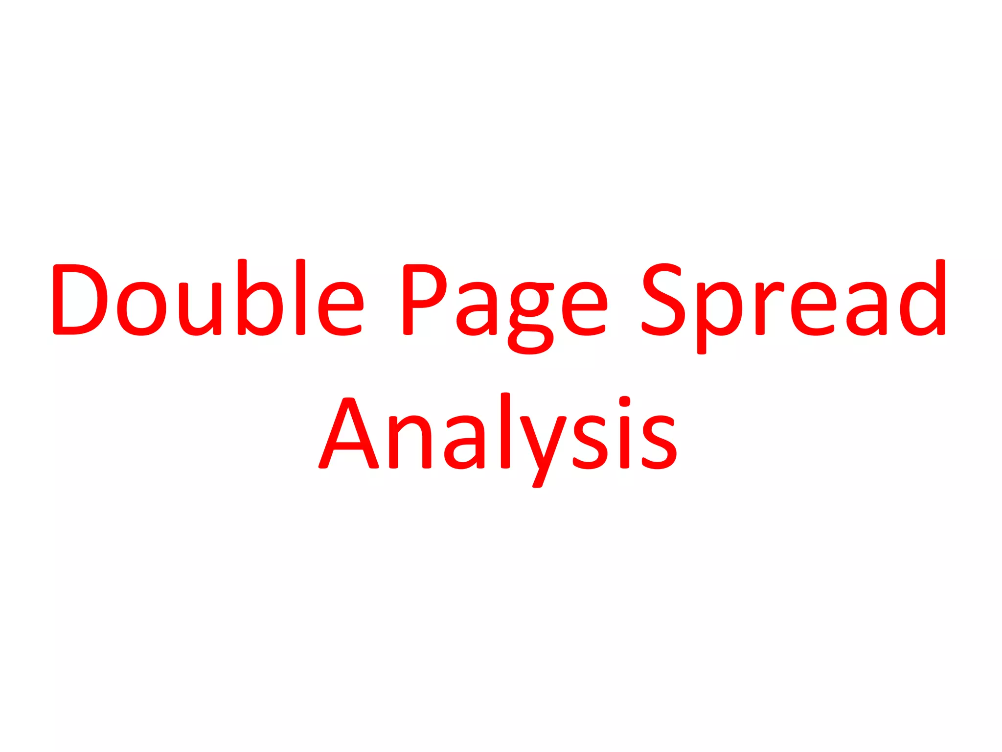
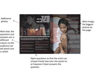
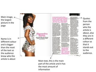
The document provides a visual analysis of a double page spread layout. It identifies key elements like the main image, main text, quotes, name of the person in a different color, and additional photos. These elements are arranged and styled in ways to guide the audience through the information and help the important parts stand out, such as using different colors, sizes, and bold text.
2. Additional
photos Main image,
the biggest
picture on
the page.
Main text, the
questions and
answers are in
different
colours so the
audience can
tell which one
is which
Open questions so that the artist can
answer freely how ever she wants to
or however it best answers the
question
3. Main image,
Quotes
the largest
from the
picture in the
person
page
who the
article is
about, also
they are in
Name is in a different
different colour colour so
and is bigger that it
than the reset stands out
of the text so to the
the audience audience.
know who the
article is about
Main text, this is the main
part of the article and it has
the most amount of
information
4. Main image, it’s the
biggest picture on the
page and the only
Additional picture with colour so
pictures her dress stands out
Main text
The writing in this part is
The name is a different in bold so it stands out to
colour to the rest of the text the audience which
which makes it stand out to means that it is the most
the audience important text on page